My Account
My Slides
Search by Category
Companies
Slide Type
Use Case
Industry
Pricing
Templates
View All Templates
Download Template Slides
✦ AI Search
Feedback
Login
Logout
Get Started
Browse all Slides
Browse all Slides
Create a FREE Account
Instant access to 1,000+ real slides from top companies like McKinsey, BCG, Goldman Sachs, Google and many more!
First Name
Last Name
Email
Password
I agree to all
Terms & Privacy Policy
Thank you! Your submission has been received!
Oops! Something went wrong while submitting the form.
Have an account?
Sign in
Saved Slides
Features a column chart detailing 'Copernicus economic impact (2018)' for air quality monitoring, alongside key products and a detailed text description of applications.
Regulatory and Compliance
Environmental Services & Sustainability
Discusses the applications and benefits of using Copernicus data for air quality monitoring, emphasizing the improvement in data quality and accessibility, and its impact on policy making and environmental compliance.
Air Quality, Monitoring, Copernicus
Mixed Chart
PwC/Strategy&
Saved
Features a column chart displaying 'Asset & Wealth Management Net Revenues' and a financial results table detailing various types of fees and revenues, with year-over-year and quarter-over-quarter comparisons.
Investment Analysis
Financial Services
The slide provides a financial summary of the Asset & Wealth Management sector, showing revenue generation from management fees, private banking, and investments. Useful for evaluating financial health and opportunities in asset management.
Asset Management, Wealth Management, Net Revenue, Management Fees, Private Banking, Investment, Revenue Analysis, Financial Results
Mixed Chart
Goldman Sachs
Saved
Featuring pie charts and a vertical column chart, this slide visualizes the CRE portfolio by region and sector, and investment exposures by type. The design is straightforward, using different colors for various categories.
Investment Analysis
Real Estate & Construction
This slide details the distribution and risk management of a commercial real estate portfolio, emphasizing geographic diversity and sponsorship strength. It's particularly useful for discussions on sector-specific investments and risk assessments in real estate markets.
CRE, investment, real estate, risk management
Multiple Chart
Deutsche Bank
Saved
The slide has a text area with a header and two line graphs comparing the perspectives of millennials and Gen Z on businesses' societal impact from 2016 to 2021. The design is straightforward with a mix of green and yellow lines against a white backdrop.
Organizational Structure and Change
Technology & Software
This slide reflects the shifting perspectives of millennials and Gen Z regarding the role of businesses in society. It discusses a trend where fewer individuals view businesses as a force for good, with line graphs showing the percentage of those who agree with this sentiment from 2016 to 2021. The information is vital for understanding corporate reputation and social responsibility practices.
Business Impact, Society, Millennials, Gen Z, Line Graph, Corporate Responsibility, Trends, Sentiment Analysis
Mixed Chart
Deloitte
Saved
The slide includes column charts, bubble charts, and text descriptions. It is visually detailed with data on energy resource utilization, population growth, and electrification rates.
Strategic Planning
Energy & Utilities
The slide highlights the balance between climate sustainability and socio-economic development in Indonesia's energy sector. It discusses the potential and utilization rates of various renewable energy sources, the forecasted population growth, and the expansion of electrification. The slide also addresses the need for non-renewable sources to support socio-economic development and the importance of sustainable electrification strategies.
Climate sustainability, renewable energy, socio-economic development, electrification
Multiple Chart
PwC/Strategy&
Saved
This slide contains a table and two bar graphs on a split background, depicting the number of households prioritizing essential tasks and the breakdown of time spent on specific tasks.
Market Analysis and Trends
Technology & Software
It provides data on how 5.6 million households use the nbn network primarily for essential tasks, detailing the most important tasks and average hours spent.
nbn network, household data, essential tasks, online activity, user data, average hours, task importance
Multiple Chart
Accenture
Saved
Two graphs displaying cost trends for space technologies over time, using a simple yet effective visual representation on a dark background.
Market Analysis and Trends
Technology & Software
Explains the reduction in costs for space technology and its implications for industry use cases, with a focus on economic accessibility.
space technology, cost trends, LEO, GEO satellites, data accessibility
Multiple Chart
McKinsey
Saved
A blue column chart shows the 2019 ROE, followed by incremental changes leading to future ROTE, with blocks indicating contributing factors.
Strategic Planning
Financial Services
This slide plots a strategy for increasing returns, breaking down the contributions of different efficiency and optimization initiatives to ROTE.
ROE, ROTE, returns, litigation, expense efficiencies, funding optimization, client initiatives, financial strategy
Single Chart
Goldman Sachs
Saved
This slide features a title at the top, a multi-bullet point section on the left outlining key assumptions, and a line graph depicting unemployment rate scenarios. On the right is a data table with net credit loss projections.
Risk Assessment and Management
Financial Services
Discussing the impact of various unemployment rates on credit card loss scenarios, the slide provides an analysis for planning under different economic conditions.
stress scenario, credit card, unemployment rate, loss projections, economic conditions, baseline, moderate recession
Mixed Chart
JP Morgan
Saved
Single orange line graph (1999–2025) with annotations for key peaks and troughs (e.g. 2008 crash, 2022 peak); major events labeled.
Market Analysis and Trends
Government & Public Sector
Focuses on the public's perception of the economy as a top issue, highlighting spikes during major economic or political events. Shows historical high (2008) and recent peak (2022).
economy, Ipsos, public concern, financial crisis, political events, UK, trends
Single Chart
IPSOS
Saved
Single-country (Argentina) line chart tracking sentiment since 2013; highlight at 22% in Nov 2024.
Financial Performance
Financial Services
Argentina’s economic sentiment surpasses 20% for the first time since 2018. The line chart chronicles fluctuation in perceived economic health, underscoring recent improvement and renewed public confidence.
Argentina, economic improvement, trend, Ipsos, sentiment, public confidence, financial outlook, long-term chart
Single Chart
IPSOS
Saved
Includes a list on the left detailing financial metrics and two column charts on the right visualizing 'Total Assets' and 'Total Equity' over time. The slide uses contrasting colors for easy differentiation between liquid and total assets.
Financial Performance
Financial Services
Exhibits the company’s financial robustness by showcasing key figures such as total assets and equity. The visual data emphasizes liquidity and growth, presenting a snapshot of the company’s financial health and stability without long-term debt.
Financial Strength, Total Assets, Total Equity, Liquidity, Growth, Stability
Multiple Chart
Goldman Sachs
Saved
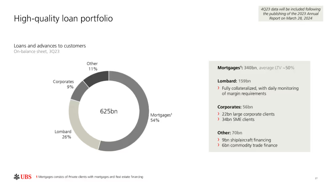
Pie chart showing high quality credit portfolio distribution and strategies for risk management.
Investment Analysis
Financial Services
Details the diversification of Credit Suisse’s portfolio and approaches to enhance risk management.
diversification, portfolio, risk management, credit quality, investment strategies
Mixed Chart
Credit Suisse
Saved
The slide uses a bar chart to show the satisfaction index of luxury brands among Millennials, compared to True-Luxury Consumers. Brands are ranked based on the percentage of respondents who will increase vs. reduce their luxury spending.
Customer and Market Segmentation
Consumer Goods
This slide illustrates how some luxury brands achieve higher satisfaction among Millennials compared to True-Luxury Consumers, using a satisfaction index to compare brand performance.
Millennials, satisfaction, luxury, brands, index
Single Chart
BCG
Saved
Slide with a column chart showing RWA outlook to 2026, including annotations on NCL reduction, model updates, and Basel III finalization.
Risk Assessment and Management
Financial Services
The slide projects a decrease in RWA by approximately 35 billion due to optimization and NCL unwind, with detailed breakdowns and timelines.
RWA outlook, NCL reduction, Basel III, model updates, UBS risk management
Mixed Chart
UBS
Saved
The slide uses a scatter plot to display the distribution of organizations based on their AI capabilities. Different colors indicate various categories of AI proficiency.
Performance Metrics and KPIs
Technology & Software
It identifies different levels of AI adoption among organizations, categorizing them into Achievers, Builders, Innovators, and Experimenters based on their AI capabilities and performance.
AI achievers, capabilities, scatter plot, performance, categorization
Mixed Chart
Accenture
Saved
The slide uses bullet points and icons to present key findings from the 2024 Global Survey on the impact of the US BIOSECURE Act, with clear headings and supporting details.
Market Analysis and Trends
Healthcare & Pharmaceuticals
The slide summarizes key findings on the impact of the US BIOSECURE Act, highlighting changes in confidence, operational impacts, precautionary actions, and future partnership likelihoods.
BIOSECURE Act, survey, findings, impact, healthcare
Table
LEK
Saved
Line chart comparing spending expectations across various categories for those working from home vs. those working away.
Market Analysis and Trends
Retail & E-commerce
This slide analyzes how working from home vs. working away impacts consumer spending expectations in different categories.
consumer spending, expectations, working from home, categories, comparison
Multiple Chart
PwC/Strategy&
Saved
Identical format to 18831. Horizontal bar chart ranks countries by confidence in hacking response. Side panel repeats the survey question focused on cyber attacks.
Risk Assessment and Management
Government & Public Sector
Displays public perception across 30 countries regarding their government’s ability to respond to hacking incidents. Visual emphasis is again placed on Canada and the US with comparative average confidence rates and year-over-year changes.
cybersecurity, hacking, public confidence, cyber response, information security, threat readiness, Ipsos, comparative analysis
Mixed Chart
IPSOS
Saved
Horizontal waterfall bar chart showing breakdown from gross adjusted costs (€5,276m) to ex-items total (€4,976m); explanation panel at right.
Financial Performance
Financial Services
Dissects Q4 2024 adjusted costs and reconciles exceptional items like FX impacts, UK bank levy, and real estate measures. Ex-item total shows a 6% YoY reduction, aligning with prior guidance.
adjusted costs, FX, UK levy, real estate, Q4 2024, expenses, guidance
Mixed Chart
Deutsche Bank
Saved
Diagram layout showcasing various business functions critical for a public company. Uses icons and color-coded blocks to represent different areas like finance and governance.
Organizational Structure and Change
Professional Services
Details the essential business functions a company should assess and enhance before going public, emphasizing a holistic approach.
readiness, framework, public company, diagram, organizational change, assessment
Framework
PwC/Strategy&
Saved
Column chart showing the perceived value of digital health solutions across various SEA countries.
Technology and Digital Transformation
Healthcare & Pharmaceuticals
This slide presents the value derived from digital health solution adoption in SEA, emphasizing better patient care and new revenue streams.
Digital health, SEA, patient care, revenue streams, adoption
Multiple Chart
LEK
Saved
The slide includes a bubble chart showing correlations and returns of alternative assets over a 10-year period. Bubbles are color-coded by asset type.
Investment Analysis
Financial Services
The slide examines the correlations, returns, and yields of various alternative asset classes over a decade, used for evaluating investment strategies.
alternative assets, correlations, returns, yields, investment analysis, financial performance, risk assessment, asset comparison
Single Chart
JP Morgan
Saved
The slide presents three columns, each listing example companies under different themes: carbon management, direct mitigation, and climate risk management. Each column contains company names, logos, and brief descriptions of their activities.
Technology and Digital Transformation
Financial Services
The slide showcases example companies within the Climate FinTech sector, categorized by themes: carbon management, direct mitigation, and climate risk management. It includes brief descriptions of the companies' activities and their contributions to these themes.
Example companies, Climate FinTech, carbon management, direct mitigation, climate risk management
Pillar
Barclays
Saved
This slide presents a map and diagram of Ukraine's grain supply chain, showing major production areas and transport routes, along with comparative logistics data.
Operational Efficiency
Transportation & Logistics
The slide discusses Ukraine's grain supply chain, comparing transport distances and port infrastructure with those of Australia, and highlighting areas for potential improvement and investment.
Supply chain, Ukraine, logistics, transport distances, port infrastructure, grain production, harvest, storage, transportation, efficiency
Graphic
LEK
Saved
Next
If nothing, comes up, please save your slides first
Create a FREE account to continue browsing
Receive Instant Access to 1,000+ slides from companies like McKinsey, Google, and Goldman Sachs
First Name
Last Name
Email
Password
I agree to all
Terms & Privacy Policy
Thank you! Your submission has been received!
Oops! Something went wrong while submitting the form.
Have an account?
Sign in
Column Chart
Heatmap
Chevron
Org Chart
Infographic
Callouts
Timeline
List
Graphic
Picture
Process Flow
Diagram
Paragraph
Map
Table
Framework
Subtitle
Takeaway Box
Icon
Other Chart
Radar Chart
Waterfall Chart
Mekko Chart
Pie Chart
Scatter Plot
Line Chart
Bar chart
Bullet points