My Account
My Slides
Search by Category
Companies
Slide Type
Use Case
Industry
Pricing
Templates
View All Templates
Download Template Slides
✦ AI
AI Prompt Library
AI Search
Feedback
Login
Logout
Get Started
Browse all Slides
Browse all Slides
Create a FREE Account
Instant access to 1,000+ real slides from top companies like McKinsey, BCG, Goldman Sachs, Google and many more!
First Name
Last Name
Email
Password
I agree to all
Terms & Privacy Policy
Thank you! Your submission has been received!
Oops! Something went wrong while submitting the form.
Have an account?
Sign in
Saved Slides
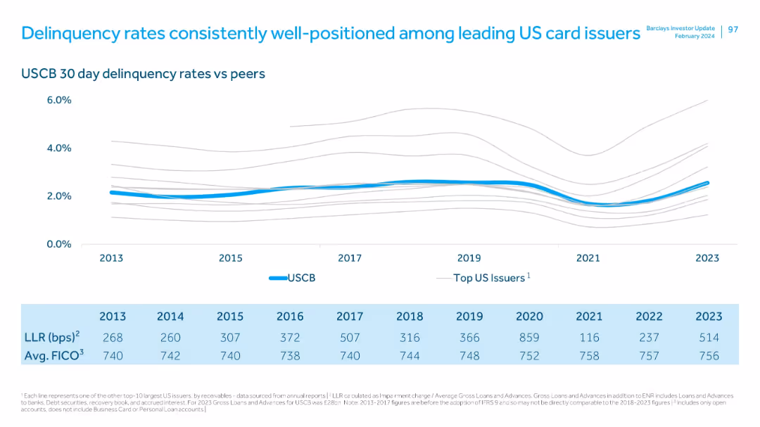
Line graph comparing USCB delinquency rates to peers, with tabulated LLR and FICO scores by year (2013–2023).
Risk Assessment and Management
Financial Services
Illustrates how USCB has maintained low 30-day delinquency rates relative to other major issuers, supported by consistent FICO scores and moderate loan loss rates. Signals superior credit risk management.
delinquency, risk management, FICO, LLR, card issuers, benchmarking, credit quality
Mixed Chart
Barclays
Saved
Features a large split column chart showing assets and liabilities balanced at €1.007 trillion as of June 30, 2023.
Financial Performance
Financial Services
Displays the financial stability of Deutsche Bank with a detailed breakdown of assets and liabilities, highlighting liquidity reserves.
balance sheet, assets, liabilities, financial, stability, bar graph, liquidity, banking, June 2023, reserves
Multiple Chart
Deutsche Bank
Saved
The slide includes a pie chart and a list of areas of expertise in market and opinion research.
Strategic Planning
Professional Services
The slide highlights Ipsos' comprehensive offerings in market and opinion research across different sectors.
expertise, market research, opinion research, Ipsos, sectors, services
Single Chart
IPSOS
Saved
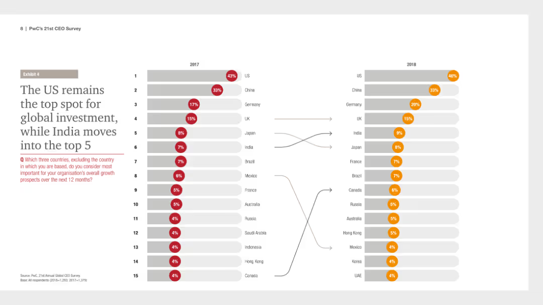
The slide features a column chart comparing the top countries for global investment in 2017 and 2018, with countries listed and color-coded to show changes in ranking.
Investment Analysis
Financial Services
It presents data showing that the US remains the top destination for global investment in 2018, with India entering the top 5, indicating shifts in global investment preferences.
global investment, US, India, top destinations, 2017 vs 2018, financial survey, PwC, CEO Survey, column chart
Multiple Chart
PwC/Strategy&
Saved
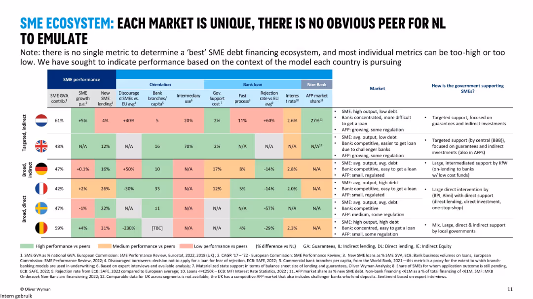
Comparative country-level table with metrics spanning SME performance, orientation, bank loans, and non-bank financing; flags and performance colored heatmap; right-side summary of support models.
Market Analysis and Trends
Financial Services
The slide compares SME financing ecosystems across six European countries using multiple indicators such as SME growth, lending, government support, and bank rejection rates. It highlights that there is no clear benchmark for the Netherlands to emulate due to varying models.
SME, GVA, bank lending, market comparison, government support, NL, UK, BE
Mixed Chart
Oliver Wyman
Saved
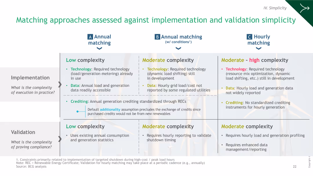
A comparative table evaluating the complexity of implementation and validation of different green hydrogen matching strategies.
Operational Efficiency
Energy & Utilities
The slide evaluates the implementation and validation complexities of different hydrogen matching approaches, assessing technology, data, and crediting.
hydrogen, implementation, validation, strategies, complexity
Table
BCG
Saved
Slide shows column charts comparing GDP, IT & Business Services, and Accenture's CAGR across different fiscal years, using shades of purple.
Financial Performance
Technology & Software
This slide illustrates Accenture’s growth compared to general economic indicators like GDP and sector-specific growth in IT and Business Services, highlighting the company's strong market performance.
growth, GDP, IT, services, CAGR, Accenture, market performance, economic, sector-specific, comparison
Multiple Chart
Accenture
Saved
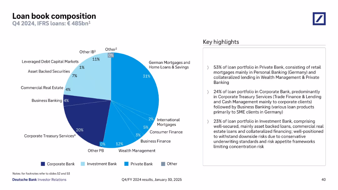
Pie chart of Q4 2024 loan book composition by business unit; key highlights in box on right
Product and Service Analysis
Financial Services
Illustrates the distribution of the €485bn loan portfolio across business units. The Private Bank holds the majority with 53%, mostly retail mortgages. Corporate Treasury Services and Investment Bank also contribute, highlighting a diversified and risk-managed portfolio across sectors and geographies.
loan portfolio, Private Bank, Investment Bank, diversification, Q4 2024
Mixed Chart
Deutsche Bank
Saved
The slide presents a dark background with text and icons. Four numbered points highlight key debate topics with accompanying icons representing trustworthiness, explainability, application prioritization, and other risks related to AI.
Risk Assessment and Management
Technology & Software
This slide discusses crucial debate topics surrounding AI trends, such as the importance of trustworthiness, the necessity of explainability, the benefits of application prioritization, and the spectrum of other relevant risks, including cybersecurity, regulatory compliance, privacy, and fairness issues.
AI Ethics, Trustworthiness, Explainability, Risk Assessment
Header Vertical
McKinsey
Saved
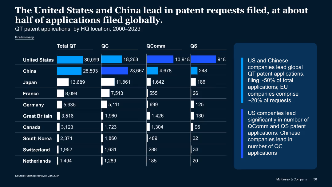
Similar structure to previous slide, showing bar chart of quantum patent applications (2000–2023) by country and QT type.
Strategic Planning
Technology & Software
Compares quantum tech patent filings, showing U.S. and China dominate with ~50% of global submissions. Breaks down QC, QComm, QS patent applications. Notes China leads QC filings; U.S. leads QComm and QS.
patent applications, QT, China, U.S., QC, QComm, QS, IP filings
Mixed Chart
McKinsey
Saved
This slide includes column chart showing revenue trends and a table comparing company rankings. The color scheme is primarily blue and white.
Risk Assessment and Management
Financial Services
It analyzes the firm's response to market changes with data on revenue trends and market risk reduction, leading to a top 3 industry ranking.
revenue, rankings, market risk, global markets, disciplined response, financial performance, change management
Mixed Chart
Goldman Sachs
Saved
Features a large central image with three text sections on the sides, focusing on challenges and discussions around digital trust.
Technology and Digital Transformation
Telecommunications
Details the debates regarding stakeholder expectations, data and privacy regulation, and risk area identification.
digital trust, stakeholder expectations, privacy regulation, risk identification
Header Vertical
McKinsey
Saved
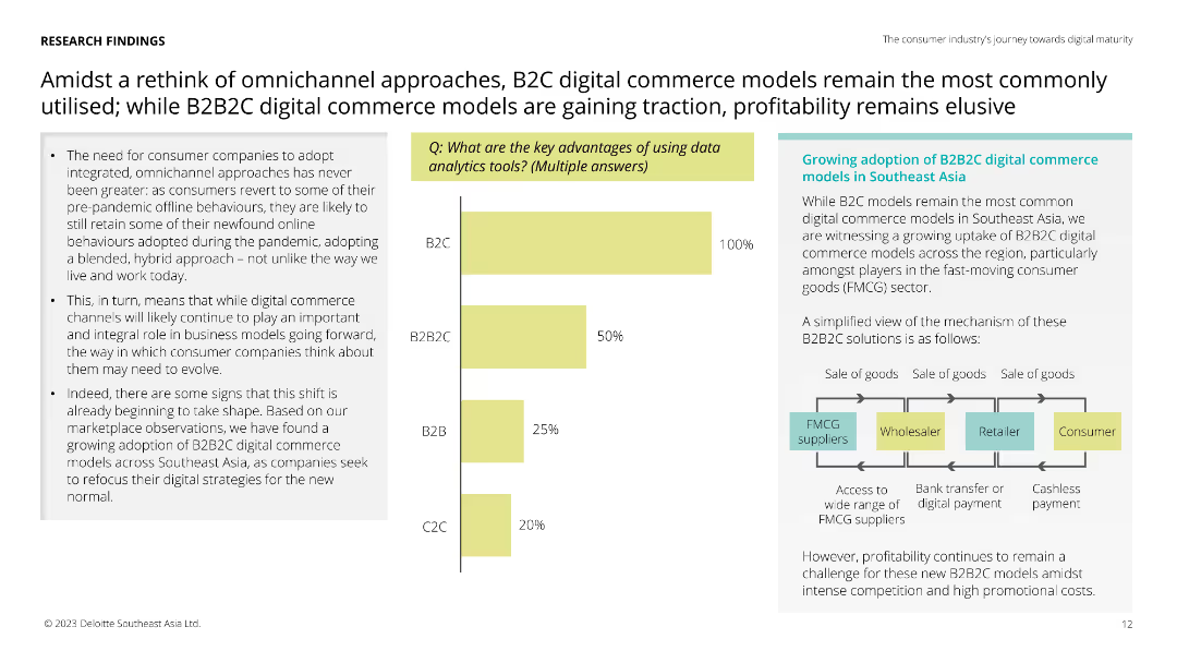
Features a vertical column chart showing the key advantages of data analytics tools with percentages for B2C, B2B2C, B2B, and C2C. Text boxes and an illustrative flowchart are present on the right.
Market Analysis and Trends
Retail & E-commerce
The slide compares the adoption of omnichannel approaches in retail, highlighting the rise of B2B2C models and their advantages in the Southeast Asia market.
omnichannel, B2C, B2B2C, retail, e-commerce, market analysis, data analytics, consumer behavior, Southeast Asia
Mixed Chart
Deloitte
Saved
Features three column charts comparing the annual sales, revenue, and attrition rates between customers who redeem Ultimate Rewards® once, multiple times, or not at all. There's a clear focus on the benefits of engagement.
Client Case Studies
Financial Services
Analyzes the positive impact of the Ultimate Rewards® program on customer engagement, showing how redeemers contribute to higher sales and revenue and lower attrition rates.
customer engagement, rewards program, sales, revenue, attrition
Multiple Chart
JP Morgan
Saved
Text and graphical data including a table of survey respondents by country and industry, with bar charts showing industry and company size distributions among respondents.
Market Analysis and Trends
Professional Services
This slide provides demographics from the Work Reimagined 2022 Survey, including respondent distribution by country, industry representation, and company size range.
Survey demographics, respondents, country distribution, industry representation, company size
Multiple Chart
EY
Saved
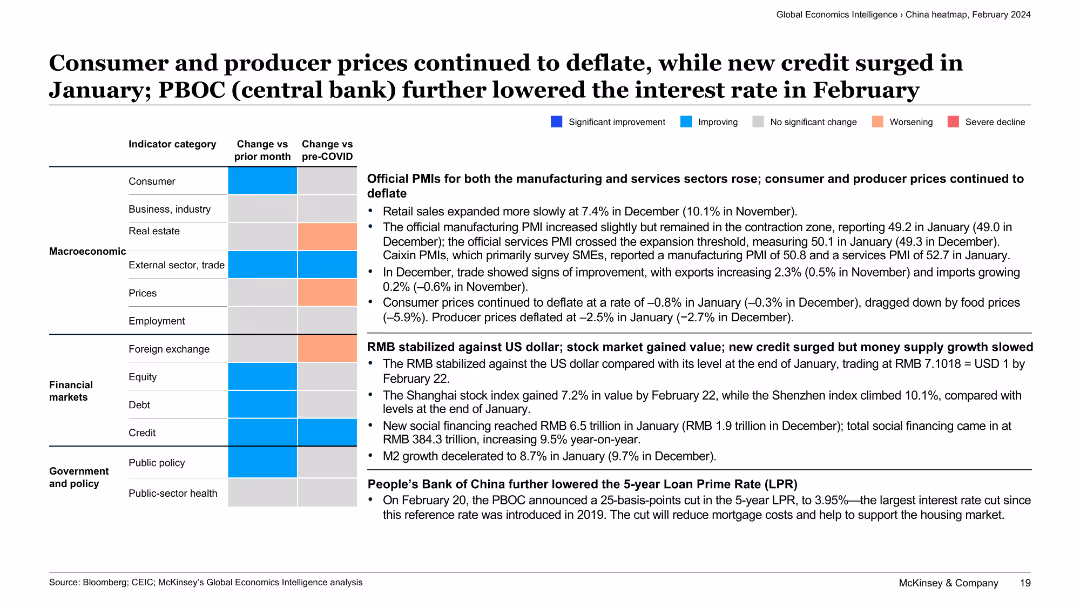
The slide presents a categorized summary of various economic indicators with text descriptions. Color-coded boxes indicate the direction and extent of changes for each category.
Market Analysis and Trends
Financial Services
This slide discusses the continued deflation of consumer and producer prices, the stabilization of RMB against the US dollar, and the People’s Bank of China’s interest rate cut, providing a comprehensive view of economic trends in China.
deflation, consumer prices, producer prices, RMB stabilization, interest rate cut
Table
McKinsey
Saved
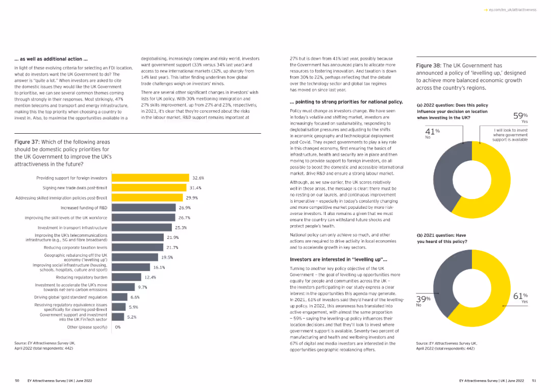
Text and a bar chart. The chart lists policy priorities for the UK government to improve attractiveness post-Brexit.
Regulatory and Compliance
Financial Services
The slide outlines policy priorities for the UK government to enhance attractiveness, focusing on foreign investment and trade deals.
policy priorities, UK government, post-Brexit, foreign investment, column chart
Multiple Chart
EY
Saved
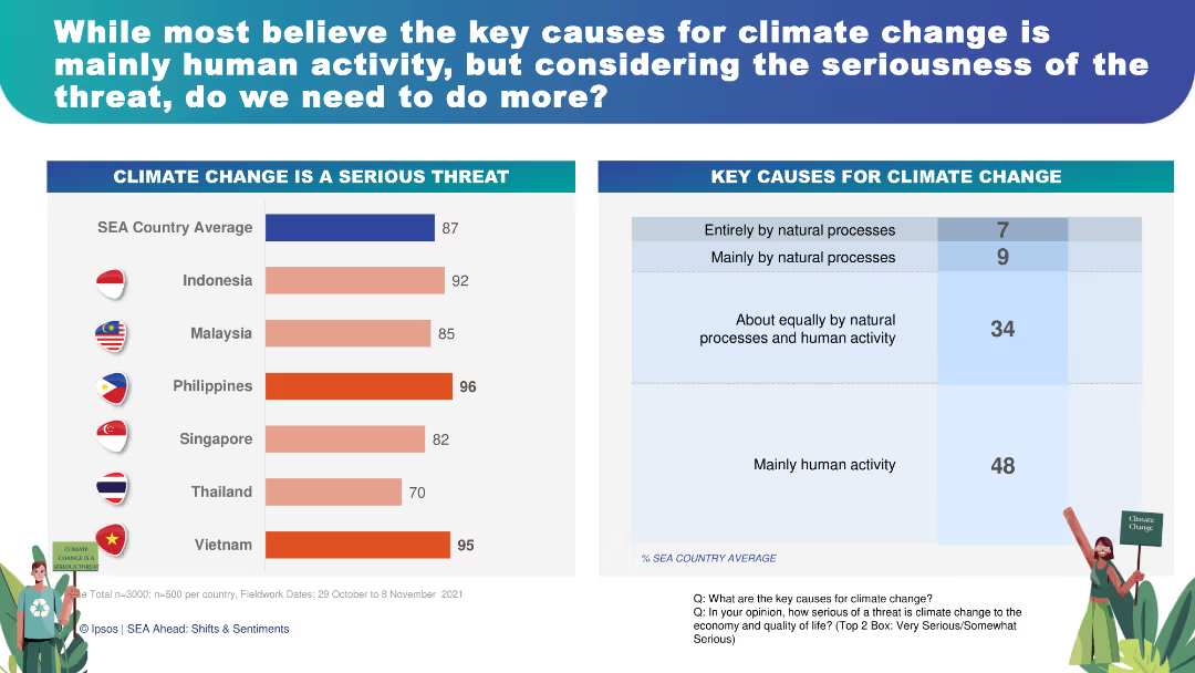
This slide features a combination of horizontal and vertical bar charts showing perceptions of climate change as a serious threat and its key causes. The charts are color-coded for easy interpretation, with accompanying text for clarity.
Risk Assessment and Management
Environmental Services & Sustainability
The slide presents survey results showing 87% of respondents consider climate change a serious threat, with 48% attributing it mainly to human activity. This can be used to discuss the urgency of climate action, public opinion on environmental issues, and strategies for risk management and mitigation.
climate change, public opinion, environmental risk, human activity, sustainability
Multiple Chart
IPSOS
Saved
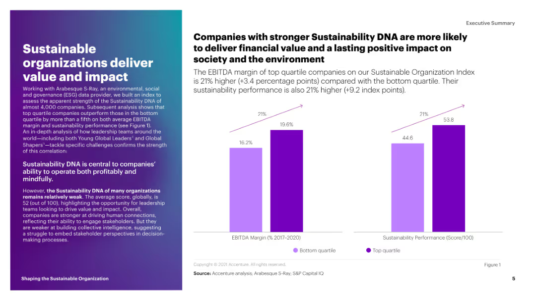
This slide includes a column chart comparing the EBITDA margin and sustainability performance score of top quartile companies to those in the bottom quartile. The bars are in shades of purple.
Strategic Planning
Environmental Services & Sustainability
The slide shows that companies with stronger sustainability DNA have higher EBITDA margins and sustainability performance scores. It emphasizes the financial and societal benefits of sustainability.
sustainability, EBITDA, performance, impact, top quartile
Mixed Chart
Accenture
Saved
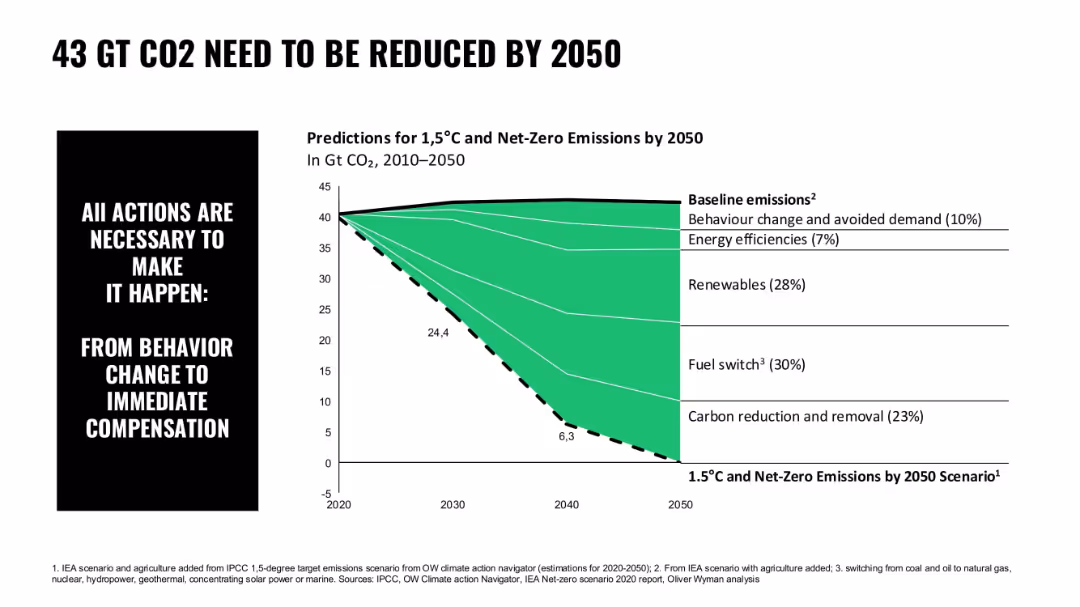
Area chart in green with segmented contributions to carbon reduction; simple typography; left-aligned callout box
Risk Assessment and Management
Environmental Services & Sustainability
The chart depicts required CO2 reduction levels by 2050 to reach 1.5°C targets, breaking it down by behavioral changes, renewables, fuel switch, and carbon removal.
CO2 reduction, emissions, net-zero, renewables, fuel switch, climate action, IEA scenario
Mixed Chart
Oliver Wyman
Saved
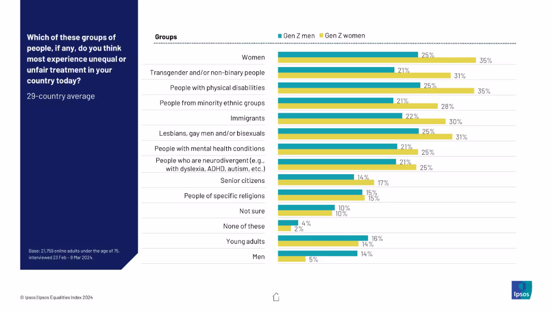
Bar chart comparing responses of Gen Z men vs. Gen Z women. Dual color-coded bars on right side, left-aligned group labels and title.
Market Analysis and Trends
Government & Public Sector
This slide illustrates Gen Z gender-specific perceptions of who faces the most inequality, highlighting that Gen Z women consistently rate higher concern across nearly all categories, especially for women, minorities, and LGBTQ+ individuals. It reflects awareness gaps and empathy differences between young men and women.
gender differences, inequality, Gen Z, women, minority groups, LGBTQ+, disability, survey, Ipsos
Mixed Chart
IPSOS
Saved
Contains a circular ecosystem diagram showcasing connections between different roles like Circular Designer, and IT-sharing platform provider, supported by icons and arrows.
Operational Efficiency
Industrial & Manufacturing
Discusses the collaboration across the value chain to maximize resource efficiency in machinery and equipment, featuring role descriptions and industry examples.
ecosystem, collaboration, value chain, circular economy, roles
Diagram
Accenture
Saved
Line charts showing trends in institutional quality scores over time.
Regulatory and Compliance
Government & Public Sector
Examines the role of quality governance in enhancing business confidence and reducing corruption in South Africa.
Governance, Service Delivery, Corruption, Institutional Quality, South Africa
Mixed Chart
PwC/Strategy&
Saved
The slide features a large blue column chart for the Shared National Credits portfolio, leveraged lending and auto manufacturing exposure, and text boxes for detailed annotations.
Risk Assessment and Management
Financial Services
Discusses the bank's credit portfolio quality, focusing on the Shared National Credit portfolio, leveraged lending exposures, and the auto manufacturing sub-sector.
credit quality, national credit portfolio, leveraged lending, auto manufacturing, risk
Mixed Chart
Goldman Sachs
Saved
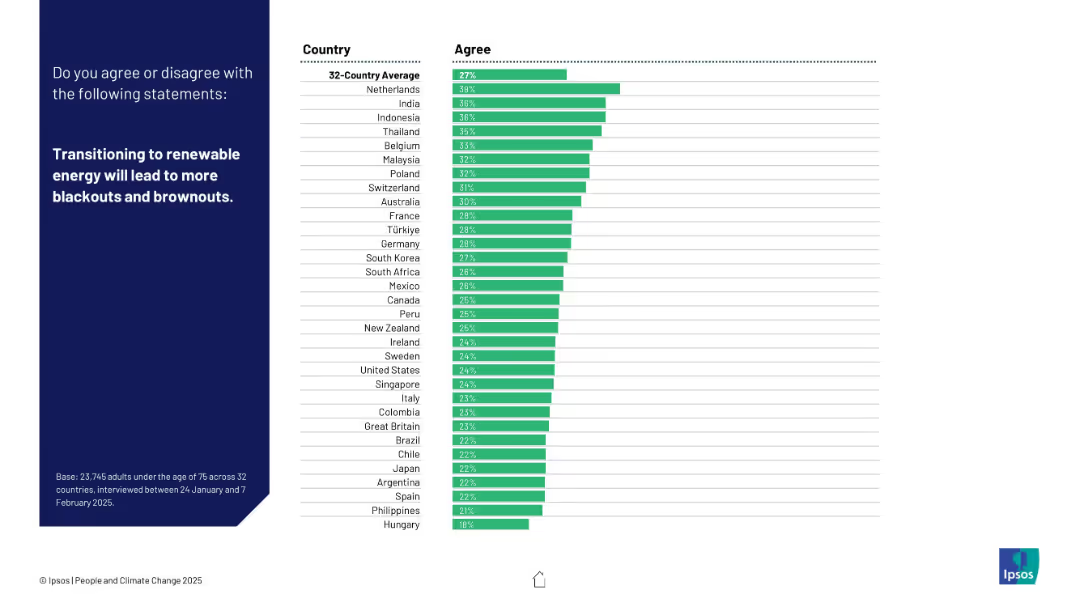
Dark left panel, right side shows ranked bar chart with 32 countries based on agreement level.
Market Analysis and Trends
Energy & Utilities
This slide explores public concerns about the reliability of renewable energy, specifically the risk of blackouts. The Netherlands has the highest concern rate.
blackouts, renewable energy, power grid, energy transition, reliability, public concern, Ipsos, energy security, brownouts, country opinion
Mixed Chart
IPSOS
Saved
Previous
Next
If nothing, comes up, please save your slides first
Create a FREE account to continue browsing
Receive Instant Access to 1,000+ slides from companies like McKinsey, Google, and Goldman Sachs
First Name
Last Name
Email
Password
I agree to all
Terms & Privacy Policy
Thank you! Your submission has been received!
Oops! Something went wrong while submitting the form.
Have an account?
Sign in
Column Chart
Heatmap
Chevron
Org Chart
Infographic
Callouts
Timeline
List
Graphic
Picture
Process Flow
Diagram
Paragraph
Map
Table
Framework
Subtitle
Takeaway Box
Icon
Other Chart
Radar Chart
Waterfall Chart
Mekko Chart
Pie Chart
Scatter Plot
Line Chart
Bar chart
Bullet points