Create a FREE Account
Instant access to 1,000+ real slides from top companies like McKinsey, BCG, Goldman Sachs, Google and many more!
First Name
Last Name
Email
Password
I agree to all
Terms & Privacy Policy
Thank you! Your submission has been received!
Oops! Something went wrong while submitting the form.
Have an account?
Sign in
Library
Templates
Courses
Pricing
My Account
My Slides
My Templates
✦ AI
AI Prompt Library
AI Search
Sign in
Start Here
Logout
My Saved Slides
This slide presents a horizontal bar chart detailing the high-end levelized cost components for various renewable and conventional energy technologies, including capital, fixed O&M, variable O&M, and fuel costs.
Operational Efficiency
Energy & Utilities
The slide analyzes the high-end levelized cost components for different energy sources, emphasizing the cost structures and potential areas for reducing overall costs in renewable and conventional energy generation.
LCOE Components, High-End Cost, Energy Efficiency, Cost Breakdown, Renewable Energy
Single Chart
Roland Berger
Saved
Horizontal bar chart with segmented agreement levels by country; includes historical comparison table (2016–2023) on the right and a bolded left-side title panel
Market Analysis and Trends
Government & Public Sector
The slide shows the level of agreement in 28 countries with the idea that employers should prioritize hiring nationals over immigrants when jobs are scarce. 59% globally agree, with particularly high support in Indonesia, Hungary, and Thailand.
immigration, employment, public opinion, nationalism, workforce, Ipsos, survey, global comparison, job scarcity, hiring priorities
Mixed Chart
IPSOS
Saved
A column chart comparing emission profiles and commitments
Regulatory and Compliance
Government & Public Sector
Compares the Philippines' climate action and policies against ASEAN peers, highlighting areas of improvement and governmental commitments.
Philippines, ASEAN, climate action, policy, comparison
Header Horizontal
Bain
Saved
Horizontal bar chart on dark background showing QT investments by country and investor type; annotations and color-coded segments distinguish investor types.
Investment Analysis
Financial Services
The United States leads QT investments, primarily from private and corporate sources. UK, Canada, and EU follow, with varying levels of public and special investment. The slide highlights a $300M investment post-Cambridge Quantum merger.
QT investment, US, investor type, corporate, public funding
Single Chart
McKinsey
Saved
Bar chart with teal bars on white background showing percentage by country, blue panel on left side
Market Analysis and Trends
Government & Public Sector
This slide presents a country-wise breakdown of perceptions regarding unequal treatment faced by lesbians, gay men, and/or bisexuals. It compares responses from 33 countries, showing where the perception of unfairness is highest, with Poland, Brazil, and Peru at the top.
LGBT, inequality, global survey, country comparison, Ipsos, discrimination, public opinion, bar chart, fairness, 2023
Mixed Chart
IPSOS
Saved
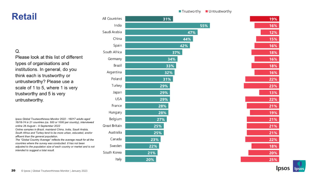
Horizontal bar chart with country-wise data, agree/disagree percentages; blue and red color scheme.
Market Analysis and Trends
Retail & E-commerce
This slide shows how people across different countries perceive the leadership of the retail sector. India, Saudi Arabia, and China lead in agreement percentages.
leadership, perception, global, Ipsos, survey, retail, trust, countries, comparison, opinions
Mixed Chart
IPSOS
Saved
This slide displays a column chart ranking the top 10 countries by share of authors contributing to quantum-relevant publications in 2022. Countries include China, EU, USA, UK, Japan, and others.
Market Analysis and Trends
Technology & Software
The slide illustrates the leading countries in terms of contributions to quantum-relevant scientific publications, with China and the European Union topping the list.
Scientists, Publications, Quantum, China, EU
Single Chart
McKinsey
Saved
Displays column charts showing global and Indian OTT video revenues from 2020 to 2025, with significant growth noted in India.
Market Analysis and Trends
Media & Entertainment
Highlights the booming growth of the OTT video segment, particularly in India, with detailed revenue projections up to 2025.
OTT video, revenue growth, India, global trends, 2025 forecast, digital content
Multiple Chart
PwC/Strategy&
Saved
Contains a horizontal bar chart indicating various future expectations of family businesses over the next two years.
Market Analysis and Trends
Professional Services
This slide forecasts the strategic moves family businesses plan to make in the next two years, including digital advancements and market expansions.
family business, future planning, digital capabilities, market expansion, strategic moves
Mixed Chart
PwC/Strategy&
Saved
Two side-by-side donut charts with percentages, colors (orange, blue, gray), and concise questions related to AI's impact on current job roles.
Market Analysis and Trends
Artificial Intelligence
This slide illustrates New Zealanders’ perceptions of AI’s impact on their jobs within 5 years. One chart shows 47% believe AI will change how they work, while 23% believe AI will replace their job.
AI, job impact, replacement, workplace change, perception, survey, New Zealand, donut charts, 5-year outlook, Ipsos
Single Chart
IPSOS
Saved
Features one column chart displaying 'Economic benefits of Copernicus through its contribution to marine exploitation and preservation' and a flow diagram showing economic impacts with icons representing various sectors such as fishing and ship routing.
Market Analysis and Trends
Environmental Services & Sustainability
The slide outlines the economic benefits from using Copernicus-derived products, focusing on improvements in ship routing and fisheries, with potential market and job creation impacts highlighted.
Economic Benefits, Copernicus, Fisheries, Ships
Mixed Chart
PwC/Strategy&
Saved
Slide presents column charts showing transaction volumes and serviceable markets with projections up to 2027.
Market Analysis and Trends
Financial Services
Examines the serviceable market and growth potential in the B2B and B2C sectors with future growth projections.
market size, growth projections, B2B, B2C, SAM
Multiple Chart
BCG
Saved
The slide showcases column charts and percentages reflecting diversity within the company. The design includes a clean layout with blue tones, and strategic use of white space that aids in focusing on the data presented.
Human Resources and Talent Management
Financial Services
The content emphasizes the strategic importance of diversity within the company, presenting data on gender and ethnic diversity and trends over time. It is likely used to communicate the company's commitment to inclusive practices.
diversity, inclusion, gender, ethnicity, trends, bar graphs, strategic importance
Multiple Chart
Goldman Sachs
Saved
This slide features a flow diagram depicting the distribution between tax revenue and non-tax revenue, and different types of tax revenues (customs & excise, VAT, individual income tax, corporate income tax, other taxes). Uses contrasting colors for clarity. The layout is straightforward, taking central focus surrounded by explanatory text.
Financial Performance
Government & Public Sector
The slide provides an overview of Namibia's tax revenue sources for the fiscal year 2021/22, highlighting the proportion of tax vs. non-tax revenue and the breakdown of different tax types. This visualization aids in understanding the government's main revenue sources and their proportions, which is essential for stakeholders analyzing fiscal policies or the economic situation of the region.
budget, tax revenue, fiscal policy, Namibia, VAT
Vertical Flow
PwC/Strategy&
Saved
The slide features a donut chart showing the responses to a question about inflation knowledge, with a breakdown of correct, incorrect, and unsure answers. The layout is moderately complex.
Performance Metrics and KPIs
Financial Services
This slide measures Canadians' understanding of inflation, revealing that 64% answered correctly about the impact of inflation on savings. It aims to assess public knowledge about inflation.
inflation, knowledge, savings, Canadians, understanding
Single Chart
IPSOS
Saved
The slide features a comparative analysis with column charts illustrating refueling speed, space requirements, and investment costs for petrol, H2 station, and electric fast charger.
Operational Efficiency
Energy & Utilities
The slide compares hydrogen refueling with petrol and electric fast chargers in terms of refueling speed, space requirements, and investment costs, highlighting efficiency benefits.
hydrogen, refueling, space, investment, efficiency
Multiple Chart
Kearney
Saved
This slide has two sets of column charts comparing percentages of agreement on identity and transgender rights across different age groups.
Market Analysis and Trends
Government & Public Sector
It analyzes attitudes towards identity and transgender rights, showing how these beliefs are distributed across various age groups, from 16-24 to 55-74 years old.
identity, age groups, transgender rights, agreement, column chart, percentages
Multiple Chart
IPSOS
Saved
Dual bar chart layout comparing total and risk-adjusted returns for various assets and sectors; simple, color-coded format
Performance Metrics and KPIs
Financial Services
The slide ranks year-to-date (YTD) total and Sharpe ratio (risk-adjusted) returns across major sectors and asset classes. Bitcoin and Communication Services lead in total returns, while HY Credit and Gold top risk-adjusted performance.
YTD returns, Sharpe ratio, sector performance, asset classes, risk-adjusted return, Bitcoin
Multiple Chart
Goldman Sachs
Saved
This slide features an abstract design with bright lines connecting various aircraft, reflecting a network or system. The image occupies the entire slide, with a red title bar at the top for contrast.
Strategic Planning
Government & Public Sector
The visual suggests strategic connections within the defense network, suitable for presentations focusing on strategic planning within the defense sector or for illustrating integrated defense systems.
Strategy, Defense, Aircraft, System, Network, Integration
Text Only
PwC/Strategy&
Saved
The slide features a series of bar charts comparing the importance and maturity levels of companies in the food ecosystem across various revenue bands. The color palette is blue, with clear labels and a clean layout, facilitating easy interpretation of data.
Customer and Market Segmentation
Agriculture & Food Production
This slide assesses the maturity levels of companies in the food ecosystem, segmented by revenue size, from less than 50M € to over 5B €. It discusses how these companies view their maturity in achieving future food targets, useful for market analysis or business strategy sessions.
food ecosystem, maturity assessment, revenue segmentation, companies, market analysis, business strategy, food sector
Mixed Chart
Deloitte
Saved
Slide includes a table with different metrics like 'Revenue' and 'Expense' plotted over three years, supplemented with trend arrows and brief annotations.
Operational Efficiency
Financial Services
JP Morgan's improvement in operating leverage over time is conveyed, highlighting investment, expense, and headcount trends. It's designed for financial analysis and illustrating efficiency improvements to investors or analysts.
Operating Leverage, Revenue, Expense, Efficiency, Investment
Table
JP Morgan
Saved
Contains a color-coded map of Australia with detailed GDP uplift and job creation figures for each state and territory. Various colors represent different levels of economic benefit.
Market Analysis and Trends
Telecommunications
Analyzes the economic benefits of the nbn network across Australia, detailing GDP uplift, job creation, and business development in each state and territory from 2012 to 2022.
nbn, Economic, Australia, States, GDP
Graphic
Accenture
Saved
The slide includes a flow diagram illustrating funding distribution and a comparison between New Hampshire and New England penetration rates. The layout is moderately detailed with supporting data in boxes and charts.
Strategic Planning
Government & Public Sector
Slide includes charts, flow diagrams, and text blocks. Displays funding breakdowns and potential revenue opportunities.
Analyzes opportunities for increasing federal IV-E funding, detailing current funding, eligibility requirements, and potential revenue from increased penetration rates.
Mixed Chart
Alvarez & Marsal
Saved
The slide includes a column chart showing anticipated challenges for CFOs, focusing on business environment changes and automation.
Market Analysis and Trends
Financial Services
This slide presents the top three expected challenges for CFOs in the coming year: dynamic business changes, automation, and IT system changes.
Future Challenges, CFOs, Column Chart, PwC, Survey, 2022, Automation
Mixed Chart
PwC/Strategy&
Saved
Two-column layout comparing progress in AI adoption by country with horizontal bar charts
Strategic Planning
Financial Services
This slide tracks AI adoption in financial reporting across 10 industrialized countries. It shows the growth in adoption over six months and contrasts it with slower progress in some EU markets. It also discusses the impact of Gen AI on reporting.
AI reporting, financial reporting, country comparison, Gen AI, strategic planning, KPMG survey, adoption trends
Mixed Chart
KPMG
Saved
Previous
Next
If nothing, comes up, please save your slides first
Create a FREE account to continue browsing
Receive Instant Access to 1,000+ slides from companies like McKinsey, Google, and Goldman Sachs
First Name
Last Name
Email
Password
I agree to all
Terms & Privacy Policy
Thank you! Your submission has been received!
Oops! Something went wrong while submitting the form.
Have an account?
Sign in
Column Chart
Heatmap
Chevron
Org Chart
Infographic
Callouts
Timeline
List
Graphic
Picture
Process Flow
Diagram
Paragraph
Map
Table
Framework
Subtitle
Takeaway Box
Icon
Other Chart
Radar Chart
Waterfall Chart
Mekko Chart
Pie Chart
Scatter Plot
Line Chart
Bar chart
Bullet points