Create a FREE Account
Instant access to 1,000+ real slides from top companies like McKinsey, BCG, Goldman Sachs, Google and many more!
First Name
Last Name
Email
Password
I agree to all
Terms & Privacy Policy
Thank you! Your submission has been received!
Oops! Something went wrong while submitting the form.
Have an account?
Sign in
Library
Templates
Courses
Pricing
My Account
My Slides
My Templates
✦ AI
AI Prompt Library
AI Search
Sign in
Start Here
Logout
My Saved Slides
The slide includes a column chart showing levels of familiarity with crypto assets among participants, rated from 1 to 7.
Market Analysis and Trends
Financial Services
This slide examines how familiar participants are with crypto assets, presenting data on the distribution of familiarity ratings.
Familiarity, crypto assets, knowledge, survey, participants
Mixed Chart
IPSOS
Saved
Bar chart showing opinion split on whether elites are a “closely connected group” or a “loose group” across 28 countries; trends for 2021 and 2023 included
Strategic Planning
Government & Public Sector
This slide explores perceptions of national elites—62% globally see elites as a closely connected group. Countries like South Korea and Singapore show particularly high agreement, with a trend comparison to 2021 on the right.
elites, power, influence, perceptions, politics, society, public opinion, Ipsos, social structure, governance
Mixed Chart
IPSOS
Saved
Classic Ipsos layout with green/red bar charts. Countries ranked by agreement with transparency statement; disagreement visualized on the right.
Market Analysis and Trends
Energy & Utilities
The chart ranks perceptions of transparency in the oil & gas sector, with highest agreement in China, India, and Saudi Arabia. Western nations exhibit more skepticism, reflected in high disagreement scores.
Transparency, Oil & Gas, Global Poll, Public Trust, Sector Ethics, Perceptions, Openness, Ipsos, Energy Markets, Country Comparison
Mixed Chart
IPSOS
Saved
Line chart showing the trend of key interest rates (overnight lending rate and five-year government bond yield) from January 2009 to a forecast in July 2021.
Market Analysis and Trends
Real Estate & Construction
This slide forecasts the continuation of low borrowing costs into 2021, based on trends in key interest rates.
borrowing costs, interest rates, forecast, 2021, trends, overnight lending rate, government bond yield
Single Chart
IPSOS
Saved
The slide features three donut charts showing the diversification of UBS's wholesale funding by source, maturity, and currency for 2Q23, providing a visual representation of funding distribution.
Financial Performance
Financial Services
The slide explains UBS's wholesale funding diversification, highlighting the distribution of funding by source, maturity, and currency for the second quarter of 2023, to showcase the bank's funding strategy and risk management.
wholesale funding, diversification, source, maturity, currency
Multiple Chart
UBS
Saved
The slide includes a line chart showing the global supply chain pressure index over time, with key events annotated and a commentary section explaining the trends.
Risk Assessment and Management
Transportation & Logistics
The slide discusses the normalization of global supply chain pressures to pre-pandemic levels and identifies potential future risks.
supply chain, pressure, index, global, trends
Mixed Chart
Accenture
Saved
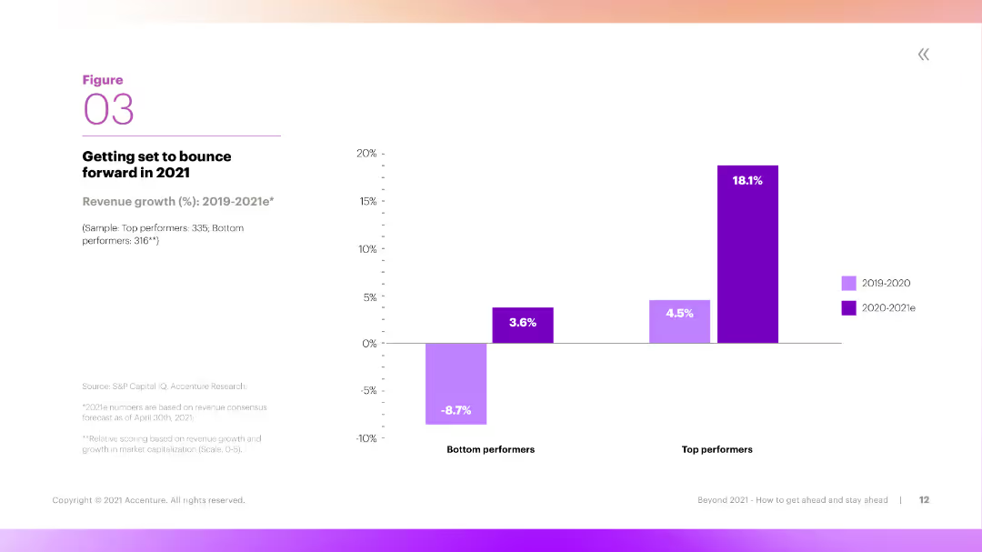
A slide with a large column chart showing the percentage of leaders and laggards who believe in the importance of decoupling IT systems for adaptability.
Technology and Digital Transformation
Technology & Software
The slide emphasizes the belief among leaders that decoupling IT systems is crucial for creating adaptable systems, which is less recognized among laggards, highlighting a key difference in strategic approaches.
decoupling, adaptable systems, leaders, laggards, IT systems, belief, importance, adaptability, strategy, approaches
Mixed Chart
Accenture
Saved
Bar graph showcasing job vulnerability across different occupational categories with color coding based on median annual wage.
Risk Assessment and Management
Professional Services
Analyzes the vulnerability of various jobs during the COVID-19 crisis, highlighting those at higher risk.
jobs, vulnerability, COVID-19, occupational categories, risk assessment
Single Chart
McKinsey
Saved
Bar chart with stacked economic impact contributions and bullet-point summary below
Investment Analysis
Media & Entertainment
Shows Texas generated $100.4M economic impact from the ICC T20 event. Key spend categories include accommodation, F&B, travel. Future tourism impact noted.
ICC, T20, Texas, economic impact, tourism, accommodation, F&B, Nielsen, sports economy, event analysis
Mixed Chart
Nielsen
Saved
The slide features a column chart showing the distribution yield per share compared to the share price for various companies.
Financial Performance
Real Estate & Construction
This slide illustrates the distribution yields of different real estate investment companies, with the yields compared to their share prices as of December 31, 2023.
distribution, yield, real estate, investment, companies
Single Chart
Credit Suisse
Saved
Content-rich slide with bullet points and a vertical bar graph of India's deal activity (2018–2021).
Investment Analysis
Financial Services
India attracted over $2 billion in H1’21 fintech investment, nearly matching 2020’s total. The slide details major deals, trends in digital banking and insurtech, and shows a deal volume chart by quarter.
India, Fintech, VC, PE, Insurtech, Investment, Digital Banking
Mixed Chart
KPMG
Saved
The slide contains four doughnut charts illustrating attitudes towards ESG risks and opportunities among investors. Accompanied by bullet points, each chart is encircled by a yellow ring indicating percentage agreement. The slide's background is white with minimal design elements to emphasize the data.
Market Analysis and Trends
Financial Services
This slide evaluates the economic impacts and challenges related to ESG (Environmental, Social, and Governance) factors in investment decisions. It highlights that a significant percentage of investors consider ESG risks important and expect companies to integrate ESG targets into executive pay, despite potential impacts on short-term profitability.
ESG, Investors, Risks, Opportunities, Executive Pay, Profitability, Doughnut Chart
Multiple Chart
PwC/Strategy&
Saved
Shows two column charts on revenue and operating margin over time, with text on the left highlighting key performance achievements.
Financial Performance
Financial Services
Evaluates the performance of Securities Services, highlighting revenue growth and operating margin improvement, reinforced by data on two column charts.
Performance, Revenue, Operating Margin, Securities Services
Multiple Chart
JP Morgan
Saved
The slide includes a pie chart showing the percentage of Americans who have used virtual care and a grid chart on satisfaction with virtual care.
Technology and Digital Transformation
Healthcare & Pharmaceuticals
This slide discusses the adoption of telehealth, with 51% of Americans having used virtual care and 89% of those users being satisfied. It emphasizes the potential of telehealth to improve patient wellness.
Telehealth, virtual care, patient satisfaction, digital health, wellness
Mixed Chart
IPSOS
Saved
The slide presents a heatmap showing headline consumer prices across various developed and emerging markets over time. Different shades indicate whether inflation is below, at, or above trend.
Market Analysis and Trends
Financial Services
The slide offers an analysis of global inflation trends, comparing headline consumer prices across multiple markets. It helps in understanding inflationary pressures and their implications on the economy.
inflation, global prices, consumer trends, developed markets, emerging markets, economic analysis, price comparison
Table
JP Morgan
Saved
Bar graph with six categories comparing successful and unsuccessful businesses on practices used.
Operational Efficiency
Professional Services
The slide highlights six business practices—such as data-backed decision making and scaling processes—more common in successful new businesses. A bar graph shows percentage gaps between successful and unsuccessful businesses.
decision-making, scaling, agile, vendors, data, new business, McKinsey, success practices
Mixed Chart
McKinsey
Saved
The slide features a bar chart on the left displaying currency movements in 2024 vs. USD for developed and emerging markets. The right chart is a line chart showing the U.S. dollar index and interest rate differential.
Market Analysis and Trends
Financial Services
This slide provides an analysis of global currency movements and the U.S. dollar's performance, useful for understanding currency trends and their impact on the global market.
Global currencies, USD index, interest rate, currency movements, financial analysis, developed markets, emerging markets
Multiple Chart
JP Morgan
Saved
Features a pie chart detailing various segments of national expenditure such as personnel costs, goods and services, and interest payments.
Financial Performance
Government & Public Sector
Breaks down Namibia's government expenditure for 2018/19 into major categories, providing a fiscal snapshot useful for financial analysis and planning. The slide helps in understanding how public funds are distributed across different governmental activities.
Expenditure, Budget, Personnel, Services
Single Chart
PwC/Strategy&
Saved
Column charts and pie charts showing private banking and asset management metrics, including AuM, PTI, and industry growth.
Strategic Planning
Financial Services
Presents IWM’s performance in wealth and asset management, highlighting industry growth, assets under management, and profitability.
Wealth management, asset management, IWM, AuM, PTI
Multiple Chart
Credit Suisse
Saved
The slide includes column charts for IPO performance in main and junior markets, tables for stock exchanges and sectors, and highlights of the largest IPOs by proceeds.
Market Analysis and Trends
Financial Services
This slide examines the European IPO market, focusing on the challenging market sentiment and the performance of main and junior markets, with details on top exchanges, sectors, and notable IPOs.
IPO, Europe, market sentiment, financial
Multiple Chart
EY
Saved
The slide contains two line charts: 'Average Spread (bps)' and 'Annual Default Rate' with a legend and data table. The charts show trends over time from 2014 to 2024, with varying line styles for different corporate bonds. The layout is clean with clear axis labels and a comparison table.
Market Analysis and Trends
Financial Services
This slide analyzes corporate bond market trends by depicting the average spread in basis points and the annual default rates over a decade. It compares high-yield and investment-grade corporate bonds, providing a quick visual summary of the market's performance, suitable for financial analysts or investors looking at historical trends and current market conditions.
Bonds, Default Rate, Spread, Corporate, Financial Market
Multiple Chart
Morgan Stanley
Saved
Displays a line chart for average hedge yield and column charts for gross structural hedge income. Text boxes highlight future projections.
Financial Performance
Financial Services
Details the predictable income uplift from structural hedges, showing past and projected hedge yields and income, emphasizing future income security.
structural hedge, income, hedge yield, financial performance, future projections, swap rate, gross income, financial security, hedging strategy
Multiple Chart
Barclays
Saved
This slide uses pie charts and text annotations to present the main barriers to digital adoption, focusing on ease of use, price, and product availability.
Strategic Planning
Technology & Software
Discusses the key barriers to digital adoption, emphasizing the need to improve ease of use, price, and product availability to unlock Indonesia's digital potential.
barriers, digital adoption, ease of use, price, product availability, Indonesia, strategy
Header Vertical
Kearney
Saved
The slide features column charts displaying total investments, deal types, and deal sizes within the real estate sector across different quarters. The charts use distinct colors to differentiate quarters.
Market Analysis and Trends
Financial Services
This slide focuses on real estate investments, providing detailed information on total invested amounts, types of deals, and sizes, essential for analyzing real estate investment trends.
Real estate, investments, deal types, deal sizes
Multiple Chart
EY
Saved
Column chart comparing satisfaction levels based on who installed the charging infrastructure (OEM/Dealer, Utility company, own technician, or self-installation). The chart uses percentages and a Net Promoter Score (NPS) line graph to show satisfaction.
Customer and Market Segmentation
Transportation & Logistics
This slide compares customer satisfaction levels with the charging installation process, showing higher satisfaction when the customer installs it themselves or through a recommended technician compared to other methods.
installation process, customer satisfaction, charging infrastructure, NPS, EV owners
Single Chart
PwC/Strategy&
Saved
Previous
Next
If nothing, comes up, please save your slides first
Create a FREE account to continue browsing
Receive Instant Access to 1,000+ slides from companies like McKinsey, Google, and Goldman Sachs
First Name
Last Name
Email
Password
I agree to all
Terms & Privacy Policy
Thank you! Your submission has been received!
Oops! Something went wrong while submitting the form.
Have an account?
Sign in
Column Chart
Heatmap
Chevron
Org Chart
Infographic
Callouts
Timeline
List
Graphic
Picture
Process Flow
Diagram
Paragraph
Map
Table
Framework
Subtitle
Takeaway Box
Icon
Other Chart
Radar Chart
Waterfall Chart
Mekko Chart
Pie Chart
Scatter Plot
Line Chart
Bar chart
Bullet points