Create a FREE Account
Instant access to 1,000+ real slides from top companies like McKinsey, BCG, Goldman Sachs, Google and many more!
First Name
Last Name
Email
Password
I agree to all
Terms & Privacy Policy
Thank you! Your submission has been received!
Oops! Something went wrong while submitting the form.
Have an account?
Sign in
Library
Templates
Courses
Pricing
My Account
My Slides
My Templates
✦ AI
AI Prompt Library
AI Search
Sign in
Start Here
Logout
My Saved Slides
Split layout with bullet insights and bar-line graph for quarterly investments in Australia.
Market Analysis and Trends
Financial Services
Australia’s fintech sector saw a strong H1’21 with $890 million in investment. The slide details contributions from digital banks, B2B, payments, and BaaS platforms. A graph tracks deal volume from 2018 to 2021.
Australia, Fintech, VC, BaaS, Investment, Digital Banking
Mixed Chart
KPMG
Saved
Column chart showing price-to-forward earnings ratios adjusted for S&P 500 earnings weights.
Investment Analysis
Financial Services
Discusses the lack of compelling reasons to overweight EAFE or EM equities compared to US equities based on earnings ratios.
equities, EAFE, EM, US, earnings ratios
Mixed Chart
Goldman Sachs
Saved
Detailed graphs and a comprehensive breakdown of specific investment opportunities in SEA countries like Malaysia, Philippines, Indonesia, Vietnam, and Thailand.
Market Analysis and Trends
Energy & Utilities
Evaluates specific solar investment opportunities and utility-scale projects, providing growth projections and potential market sizes.
solar energy, SEA countries, investment opportunities, market growth, utility projects
Header Horizontal
Bain
Saved
This slide includes a bar chart with horizontal bars showing survey responses on employer performance during the pandemic. The chart is complemented by a detailed text analysis on the left side.
Operational Efficiency
Professional Services
The slide evaluates how employers responded to the pandemic, with high scores in communication, employee support, and maintaining operations. It highlights the positive feedback from Millennials and Gen Z regarding their employers' crisis management strategies, providing a benchmark for effective organizational responses in future crises.
Pandemic Response, Employer, Millennials, Gen Z, Survey
Mixed Chart
Deloitte
Saved
This advanced slide contains two vertical stacked column charts representing changes in loan mix and noninterest income from 2012 to the present. It uses shades of blue, green, and other colors to differentiate between segments. Textual content is provided on the right to give context to the graphs, and bullet points below the graphs highlight key takeaways.
Strategic Planning
Financial Services
The slide outlines the strategic diversification of the company’s balance sheet and fee revenue to perform well in different economic environments. It presents changes in loan mix and noninterest income, emphasizing the reduction of cyclical impacts and improving fee diversification. Intended for strategic financial planning.
Balance Sheet, Diversification, Loan Mix, Revenue, Strategic Planning, Noninterest Income, Fee Diversification, Economic Performance
Multiple Chart
Morgan Stanley
Saved
A mix of text, graphics, and data points addressing the need for digital trust technologies due to growing cybersecurity threats.
Technology and Digital Transformation
Technology & Software
Emphasizes the importance of cybersecurity in light of increasing threats, rising costs, and the need for regulatory compliance.
cybersecurity, digital trust, risk management, technology impact
Text Only
McKinsey
Saved
The slide includes a line chart with a single dark blue line representing the price of Butadiene in Europe from 2016 to 2023. The design is straightforward with vertical gridlines and a clear indication of the time scale.
Market Analysis and Trends
Industrial & Manufacturing
Presenting the historical price data for Butadiene in Europe, this line chart is likely used to analyze the impact of raw material costs on production or to forecast future price movements. It could be particularly relevant to companies in the synthetic rubber or plastics manufacturing sectors.
Butadiene, price history, Europe, line chart
Single Chart
Morgan Stanley
Saved
The slide features an illustrative map with arrows and bubbles indicating the magnitude of cross-border data flows among different regions. A sidebar provides a color-coded key for bandwidth ranges, with larger bubbles on the map representing greater interregional bandwidth usage.
Market Analysis and Trends
Technology & Software
The slide communicates the exponential growth in cross-border data flows, emphasizing a 45x increase since 2008. The map and side key effectively showcase the regional disparities in data flow volume, providing a clear visualization of how digital connectivity is evolving globally. This serves as an indicator of international digital communication and business collaboration trends.
Data Flows, Global Connectivity, Bandwidth, Regions, Digital Communication, Business Collaboration, Growth, Telecommunications
Multiple Chart
McKinsey
Saved
Similar to previous; shows responses to knowing someone bisexual; bar chart with country comparisons.
Market Analysis and Trends
Government & Public Sector
The chart shows the proportion of people in different countries who know someone bisexual. Brazil and South Africa top the list, while Japan and South Korea are at the bottom.
bisexual, relationships, awareness, LGBT+, countries, visibility
Mixed Chart
IPSOS
Saved
Contains a series of tables and bar graphs comparing quarterly financial data and sector performance.
Financial Performance
Financial Services
Reviews financial metrics and sector-specific performance of an investment bank in Q4 2023, key for financial analysts and stakeholders.
investment bank, financial analysis, Q4, sector performance, metrics
Mixed Chart
Deutsche Bank
Saved
Split table and bar chart layout; left side contains metrics vs benchmark, right side has BARRA tilt indicators and market cap breakdown
Investment Analysis
Financial Services
Compares portfolio and benchmark characteristics, such as market cap, P/E ratio, EPS growth, beta, turnover, and tracking error. Also includes BARRA factor tilts and market cap exposure bars to highlight the portfolio’s structural and style differences versus the Russell 1000 Growth Index.
portfolio, benchmark, characteristics, market cap, BARRA, tilts, beta, P/E, J.P. Morgan
Multiple Chart
JP Morgan
Saved
A scatter plot showing the relationship between system strength and revenue growth during the pandemic. Accompanied by a strategy recommendation text.
Strategic Planning
Technology & Software
This slide provides strategic recommendations based on system strength and IT budget allocation, illustrated by a scatter plot showing revenue growth trends.
Systems Strength, Revenue Growth, Strategy, Pandemic, Recommendations
Single Chart
Accenture
Saved
The slide features text discussing efficiency measures in pharma and a line chart comparing TSR of pharma against other stock markets.
Financial Performance
Healthcare & Pharmaceuticals
This slide highlights how efficiency measures in the pharma industry have driven strong investor returns, with comparative data on stock performance.
efficiency measures, investor returns, TSR, stock markets, pharma industry
Multiple Chart
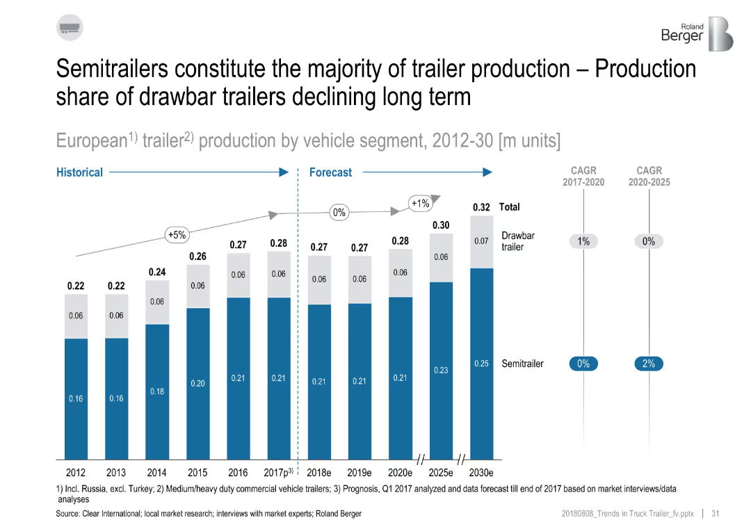
Roland Berger
Saved
Bubble chart showing size and liquidity of different indices with average traded daily value and market cap. Bubble size represents market cap in USD billions.
Investment Analysis
Financial Services
Compares the market cap and liquidity of various global indices, highlighting differences in traded value and constituent count.
index, market cap, liquidity, bubble chart, financial analysis, global indices, daily value, investment, market size
Single Chart
JP Morgan
Saved
Displays a comparative table of key performance indicators (KPIs) for Australia, the US Northeast, and France, with color-coded performance ratings.
Performance Metrics and KPIs
Industrial & Manufacturing
Benchmarks the supply chain performance of Australia against the US Northeast and France. Identifies areas for improvement in trucking and coastal shipping costs and highlights key metrics.
Supply chain, performance metrics, Australia, US Northeast, France
Table
LEK
Saved
The slide features a red and grey donut chart contrasting "Audio Only" and "Video-Enabled" podcast revenue shares for 2020, with large text highlighting the main statistic.
Market Analysis and Trends
Media & Entertainment
This slide presents the 2020 revenue share between audio-only and video-enabled podcasts, showing a significant majority in audio-only.
podcasts, revenue share, advertising, media, video-enabled, audio-only, 2020, comparison
Single Chart
PwC/Strategy&
Saved
The slide presents a world map with highlighted countries, each showing projected GDP growth rates for 2018. The countries are marked with weather icons indicating economic conditions. An orange color scheme is used for labels and icons, and growth rates are displayed in percentage.
Market Analysis and Trends
Financial Services
This slide provides a visual overview of global GDP growth rates with a focus on the Eurozone and UK. The weather icons indicate economic conditions, while the map and data points highlight the projected growth rates for various countries in 2018.
Global growth, GDP rates, economic conditions, Eurozone, UK, PwC analysis, world map
Graphic
PwC/Strategy&
Saved
The slide contains a column chart and text, illustrating progress towards renewable electricity targets and exploring alternative energy sources.
Strategic Planning
Energy & Utilities
The slide discusses the transition to 100% renewable electricity, highlighting achievements in 76 countries and exploring further renewable energy pathways.
renewable electricity, carbon energy, transition, targets, achievements, alternative energy
Mixed Chart
PwC/Strategy&
Saved
This slide compares 'Updated' and 'Previous' financial scenarios for the year 2023, focusing on volumes, cost inflation, net price-mix vs. cost inflation factors, cash-out capex, segment operating income, and free cash flow. It uses a tabular layout with color-coded text to distinguish between the updated and previous figures. The background is a subtle gradient with the Michelin logo.
Financial Performance
Financial Services
The content outlines revised financial expectations for 2023, including volume projections and cost inflation. It provides updated guidance on cash flow and operating income, indicating the company's financial direction and strategic planning insights. The slide is likely used to communicate to stakeholders or in financial planning sessions to discuss financial health and expectations.
financial, scenario, guidance, volumes, inflation, income, cash flow, Michelin, performance, strategy
Table
Morgan Stanley
Saved
An image displaying a staircase infographic with five steps labeled with major policy reforms in Namibia, such as the Public Procurement Act and the NEEEF Bill.
Strategic Planning
Government & Public Sector
Provides an overview of significant structural policy reforms in Namibia, depicted through a staircase graphic. This visual representation aids in understanding the sequential importance and impact of each policy.
policy, Namibia, government reforms, legislation
Vertical Flow
PwC/Strategy&
Saved
Dual-chart slide: left shows top countries by assurance % with flags; right has sector-based bar chart showing assurance rate trends over time. Visually segmented top 5 and bottom 5 sectors.
Performance Metrics and KPIs
Professional Services
The slide ranks countries by their N100 assurance reporting and displays sector-based assurance rate trends. France and Taiwan lead in assurance adoption, while TMT and Automotive sectors show high assurance rates, contrasting with lagging sectors like Healthcare.
assurance, countries, sectors, France, Taiwan, TMT, automotive, KPMG
Mixed Chart
KPMG
Saved
Standard bar chart layout. China, Poland, and Saudi Arabia show higher importance placed on value alignment.
Market Analysis and Trends
Professional Services
This slide evaluates how alignment of values affects trust. Cultural differences are evident, with Western countries generally placing less emphasis than Eastern ones.
shared values, personal beliefs, trust alignment, Ipsos, international differences
Mixed Chart
IPSOS
Saved
The slide features a dark background with white and yellow text, highlighting survey results with column charts.
Market Analysis and Trends
Healthcare & Pharmaceuticals
It discusses the importance of healthcare experience for consumers, with survey results showing 44% above average, 26% average, and 30% below average rating.
healthcare, consumer, experience, survey, England
Mixed Chart
EY
Saved
The slide is minimalistic with a single bar chart depicting the growth of the internet economy in the Philippines. The projected growth is also indicated.
Financial Performance
Technology & Software
Highlights the doubling of the Philippines' internet economy in 2021 and its expected future value, emphasizing the impact of the pandemic and government initiatives.
Internet economy, Growth forecast, Government initiatives, Pandemic impact
Single Chart
Bain
Saved
A line graph showing total shareholder return over time, comparing tech-forward companies to others. Text analyzes financial performance trends before, during, and after the pandemic.
Performance Metrics and KPIs
Technology & Software
The slide compares the total shareholder return of tech-forward companies with other companies, using a line graph to illustrate performance over different periods.
Shareholder Return, Financial Performance, Pandemic, Tech-Forward, Comparison
Mixed Chart
Accenture
Saved
Previous
Next
If nothing, comes up, please save your slides first
Create a FREE account to continue browsing
Receive Instant Access to 1,000+ slides from companies like McKinsey, Google, and Goldman Sachs
First Name
Last Name
Email
Password
I agree to all
Terms & Privacy Policy
Thank you! Your submission has been received!
Oops! Something went wrong while submitting the form.
Have an account?
Sign in
Column Chart
Heatmap
Chevron
Org Chart
Infographic
Callouts
Timeline
List
Graphic
Picture
Process Flow
Diagram
Paragraph
Map
Table
Framework
Subtitle
Takeaway Box
Icon
Other Chart
Radar Chart
Waterfall Chart
Mekko Chart
Pie Chart
Scatter Plot
Line Chart
Bar chart
Bullet points