My Account
My Slides
Search by Category
Companies
Slide Type
Use Case
Industry
Pricing
Templates
View All Templates
Download Template Slides
✦ AI
AI Prompt Library
AI Search
Feedback
Login
Logout
Get Started
Browse all Slides
Browse all Slides
Create a FREE Account
Instant access to 1,000+ real slides from top companies like McKinsey, BCG, Goldman Sachs, Google and many more!
First Name
Last Name
Email
Password
I agree to all
Terms & Privacy Policy
Thank you! Your submission has been received!
Oops! Something went wrong while submitting the form.
Have an account?
Sign in
Saved Slides
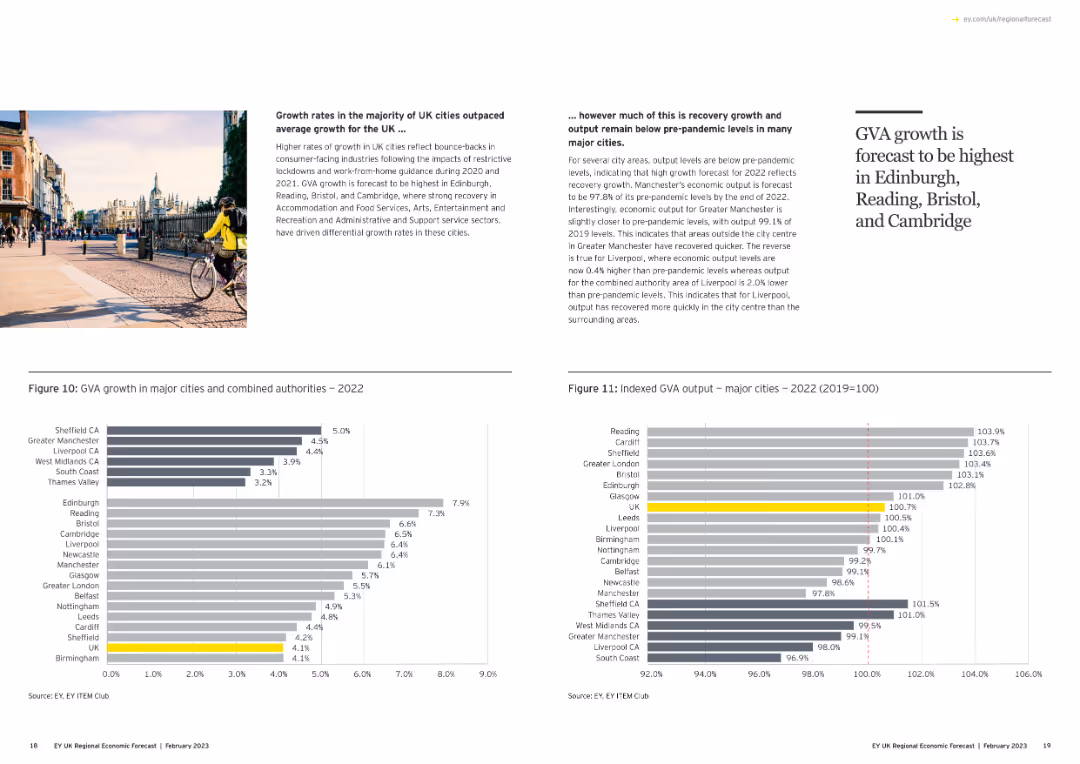
Contains two column charts: one showing GVA growth in major cities and another showing indexed GVA output for 2022.
Market Analysis and Trends
Government & Public Sector
Analyzes GVA growth rates in major UK cities, comparing recovery levels to pre-pandemic benchmarks, and highlighting leading cities.
GVA growth, major cities, recovery, pre-pandemic, column chart
Multiple Chart
EY
Saved
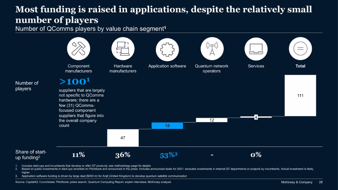
Bar chart categorizing QComms players by value chain segments and their share of funding.
Financial Performance
Telecommunications
While the number of QComms players is highest in components, the bulk of funding (53%) goes to application software, driven by major investments like Arqit ($400M). Hardware follows with 36% of funds. The chart shows a misalignment between player count and capital allocation.
QComms, funding, applications, value chain, Arqit, investment, segments
Single Chart
McKinsey
Saved
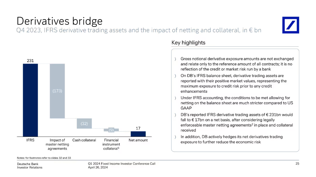
Column chart showing IFRS derivative trading assets and net amounts with key highlights on the right.
Risk Assessment and Management
Financial Services
Explains the impact of netting and collateral on derivative trading assets, highlighting the gross and net amounts reported under IFRS.
derivatives, IFRS, trading assets, netting, collateral, exposure, financial reporting
Mixed Chart
Deutsche Bank
Saved
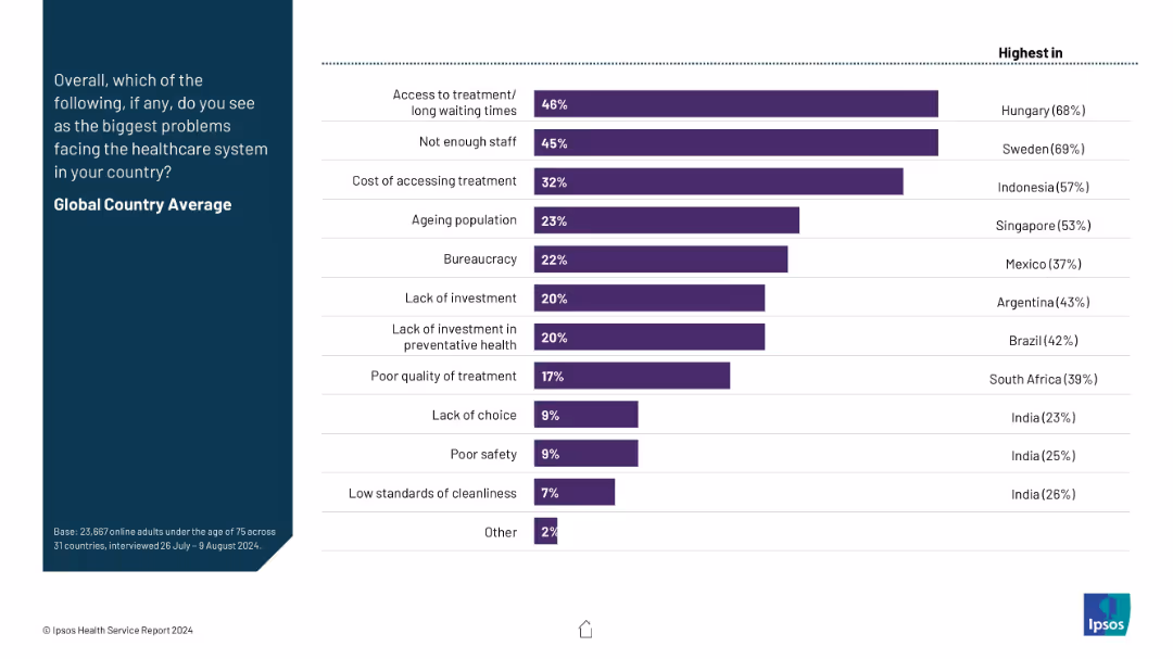
Horizontal bar chart on the right with ranked global country average issues; no yearly data trend. Left side contains a title and brief explanation.
Risk Assessment and Management
Healthcare & Pharmaceuticals
This slide summarizes the top healthcare system challenges globally, such as long wait times, staff shortages, treatment costs, bureaucracy, and lack of investment. The chart highlights both global averages and countries with the highest concern levels for each problem.
healthcare issues, access, staffing, cost, bureaucracy, public concerns, global average, Ipsos, investment, wait times
Mixed Chart
IPSOS
Saved
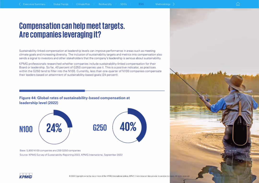
Split design with fishing scene and a large infographic showing rates of sustainability-based compensation.
Human Resources and Talent Management
Professional Services
This slide highlights how sustainability-linked compensation is used to align leadership performance with ESG goals. It reveals only 24% of N100 and 40% of G250 companies use such incentives.
compensation, ESG goals, performance metrics, executive pay, sustainability, leadership incentives, G250, N100
Mixed Chart
KPMG
Saved
Includes a column chart for sustainable finance volumes, lists, and bullet points highlighting key activities and achievements.
Operational Efficiency
Environmental Services & Sustainability
Highlights Deutsche Bank's Q1 2023 sustainability efforts, focusing on increased finance volumes, new policies, and significant achievements in promoting sustainability in banking practices.
sustainability, finance volumes, policies, Q1 2023, banking
Mixed Chart
Deutsche Bank
Saved
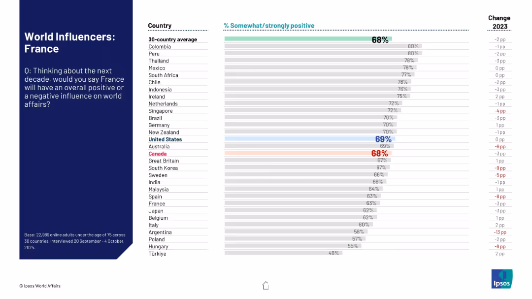
Country ranking showing public opinion on France’s future influence on world affairs; includes change from previous year.
Strategic Planning
Government & Public Sector
This slide assesses global attitudes toward France’s projected global role over the next decade. It includes a 30-country comparison of positive sentiment and yearly change data, positioning France among peers.
France, international opinion, geopolitical role, global affairs, public perception, soft power, Ipsos data
Mixed Chart
IPSOS
Saved
Contains column charts illustrating the projected operational maturity impact on margins between 2019-2025.
Financial Performance
Financial Services
Analyzes the financial benefits of reaching high operational maturity, forecasting a significant margin increase for companies by 2025.
financial, maturity, performance, forecast, margins
Mixed Chart
Accenture
Saved
Two bar charts comparing PMPM costs in New England and with comparable enrollees. Text boxes explain key points and data. Moderate layout.
Financial Performance
Government & Public Sector
Comparison of MMIS spending per member per month (PMPM) in New Hampshire versus other states, suggesting cost minimization strategies.
PMPM, MMIS, Costs, Comparison, Strategy
Multiple Chart
Alvarez & Marsal
Saved
The slide features a column chart comparing group underlying revenues/RWA for UBS FY22, CS FY22, 2H23 annualized post-merger, and projected 2026 exit rate. Text on the left lists actions: >6bn capital release by 2026, reduction of low-return exposures, alignment of return hurdle frameworks, and optimization of models and hedging activities.
Financial Performance
Financial Services
The slide outlines strategies to optimize financial resources for sustainable growth and higher returns. It includes actions for capital release, reduction of low-return exposures, and optimization of financial models. This slide is suitable for discussing financial strategy and performance improvement with stakeholders.
optimization, financial resources, sustainable growth, returns, capital
Mixed Chart
UBS
Saved
The slide features bar charts showing risks and opportunities percentages. Text boxes detail risks and opportunities, and a summary box highlights key takeaways.
Market Analysis and Trends
Transportation & Logistics
It presents survey results indicating a need for repositioning in aerospace and defense functions due to digitalization, with focus on production and logistics.
Digitalization, aerospace, defense, risks, opportunities, production, logistics
Multiple Chart
Roland Berger
Saved
This slide features a matrix highlighting key actions for health organizations to improve consumer perceptions, categorized by performance and importance of health system aspects.
Strategic Planning
Healthcare & Pharmaceuticals
It identifies key opportunity areas for health organizations to improve consumer perceptions, focusing on aspects rated as important but with lower performance, such as mental health and sustainability.
health organizations, consumer perceptions, key actions, performance, importance
Mixed Chart
EY
Saved
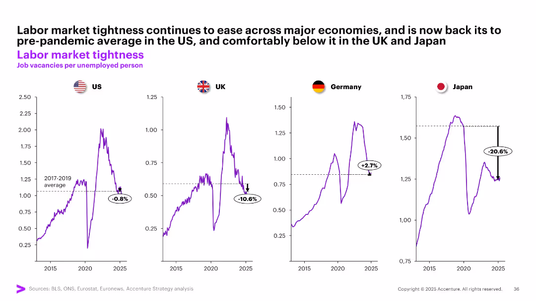
Four separate line graphs show job vacancies per unemployed person for US, UK, Germany, and Japan, benchmarked against pre-pandemic averages.
Human Resources and Talent Management
Professional Services
The slide tracks labor market tightness by measuring job vacancies per unemployed person. It reveals easing labor conditions across major economies, with Japan and UK notably below pre-pandemic levels, while Germany remains tighter.
labor market, job vacancies, unemployment, tightness, post-COVID, US, UK, Germany, Japan, workforce dynamics
Multiple Chart
Accenture
Saved
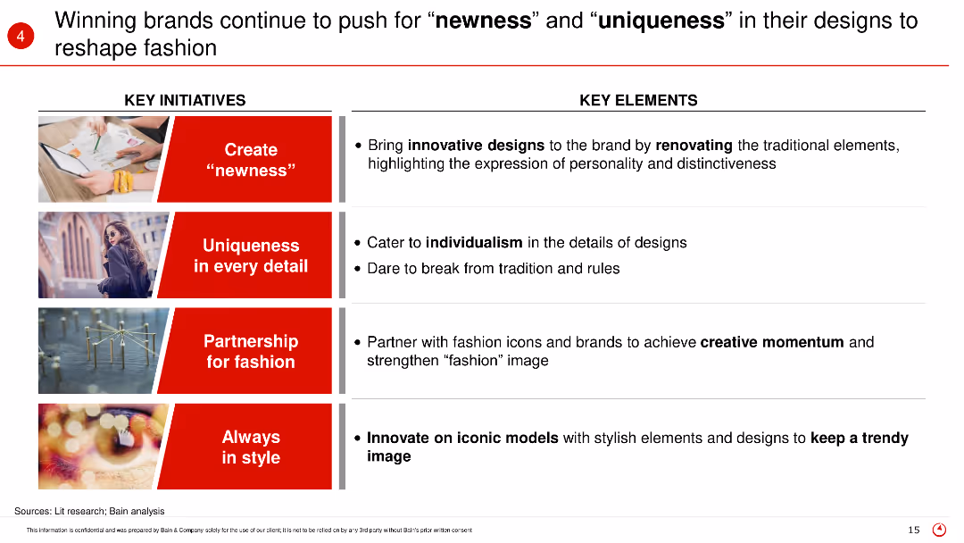
The slide highlights key initiatives and elements such as creating newness, uniqueness in every detail, partnerships for fashion, and staying in style, with supporting images for each point.
Product and Service Analysis
Retail & E-commerce
The slide discusses how winning brands in fashion are focusing on innovation, individuality, partnerships, and continuous style evolution to stay ahead in the market.
Fashion innovation, brand strategies, newness, uniqueness, design trends
Table
Bain
Saved
The slide features a column chart illustrating the energy potential of different feedstock types for the year 2060. The chart is color-coded, with each type of feedstock represented in different shades of purple. The data ranges are indicated above each column.
Market Analysis and Trends
Energy & Utilities
This slide highlights the two main sources of biomass supply by 2060, namely agricultural residues and energy crops, showcasing their potential energy contributions.
biomass supply, energy potential, agricultural residues, energy crops, 2060, feedstock, theoretical, technical, sustainable, energy
Single Chart
Kearney
Saved
The slide contains text and triangular charts depicting the excitement of software engineering leaders for various Generative AI applications and the planned uses by supply chain leaders.
Financial Performance
Technology & Software
This slide highlights the enthusiasm of software engineering leaders for Generative AI applications like code generation and the intended uses for supply chain leaders.
Generative AI, Use Cases, Software Engineering, Supply Chain, Code Generation
Multiple Chart
Gartner
Saved
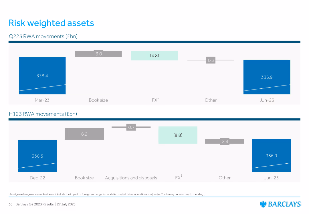
This slide features two column charts illustrating Q223 and H123 RWA (Risk Weighted Assets) movements in billion euros, showing changes in book size, FX impact, acquisitions, and other factors between periods.
Risk Assessment and Management
Financial Services
The slide highlights movements in Risk Weighted Assets for Q223 and H123, showing the factors contributing to changes in asset values such as book size, foreign exchange, and acquisitions.
RWA, book size, FX impact, acquisitions, risk management
Multiple Chart
Barclays
Saved
The slide displays two column charts showing survey responses by country with varying data-to-ink ratios.
Technology and Digital Transformation
Professional Services
The slide explains Tufte's data-to-ink ratio principle, demonstrating how reducing non-data ink can make charts clearer and more efficient.
Tufte, data-to-ink, ratio, survey, responses, visualization, chart, efficiency, clarity, design
Multiple Chart
EY
Saved
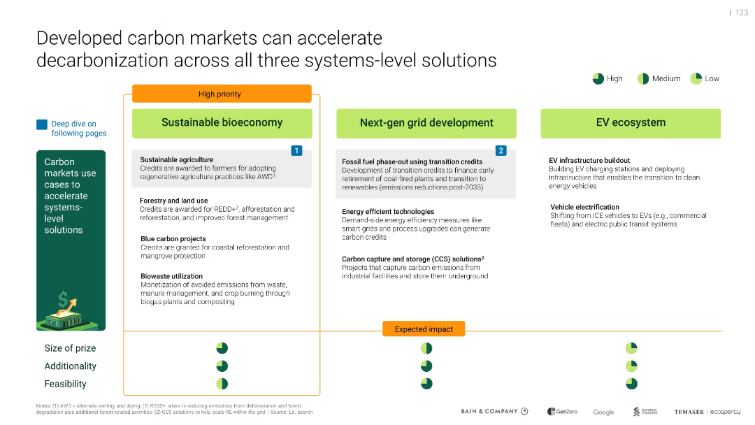
Three-block layout of system-level solutions (bioeconomy, grid, EV ecosystem), with icons indicating priority and feasibility; color-coded impact indicators below.
Product and Service Analysis
Environmental Services & Sustainability
Highlights how carbon markets support systemic decarbonization. Prioritizes sustainable bioeconomy (agriculture, forestry), next-gen grid (CCS, phase-out), and EV infrastructure. Rates each for feasibility and impact.
carbon markets, decarbonization, bioeconomy, CCS, EV, grid
Mixed Chart
Bain
Saved
Matrix showing the involvement of different stakeholders in the health insurance value chain, highlighting trends in product development, sales, underwriting, and claims.
Market Analysis and Trends
Financial Services
Analyzes the evolving landscape of health insurance, detailing how various stakeholders are expanding their roles across the value chain to enhance their value propositions.
health insurance, value chain, stakeholders, trends
Single Chart
Roland Berger
Saved
A map highlighting Central American countries with icons indicating their roles in the semiconductor production value chain, such as assembly and test or manufacturing equipment.
Human Resources and Talent Management
Education & Training
The slide identifies Central American countries with skilled workforces capable of participating in the semiconductor production value chain, emphasizing roles in assembly, testing, and manufacturing.
Workforce, semiconductor, Central America, skills, map
Graphic
Deloitte
Saved
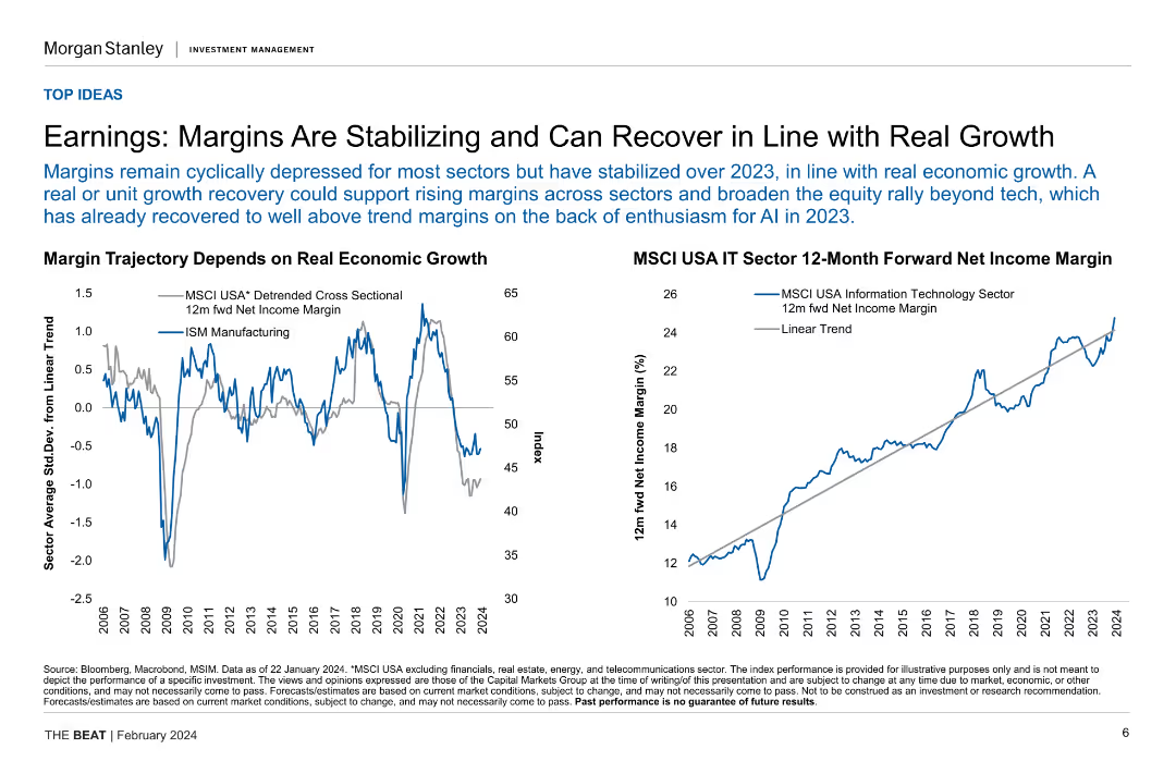
Two line charts illustrating margin trajectory based on real economic growth and MSCI USA IT sector 12-month forward net income margin.
Financial Performance
Financial Services
This slide analyzes the stabilization and potential recovery of earnings margins in relation to real economic growth, focusing on specific sector performance.
earnings, margins, economic growth, IT sector, financial performance
Multiple Chart
Morgan Stanley
Saved
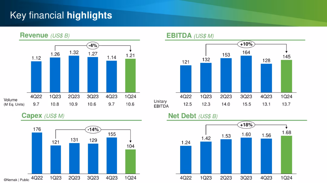
Four quadrant bar chart layout; metrics for Revenue, EBITDA, Capex, and Net Debt shown with color-coded bars
Financial Performance
Industrial & Manufacturing
This slide highlights quarterly performance metrics: revenue, EBITDA, capex, and net debt from Q4 2022 to Q1 2024. Trends and percentage changes are clearly marked to emphasize performance fluctuations and financial trajectory.
Revenue, EBITDA, Capex, Net Debt, Financials, Quarterly, Performance, Manufacturing, Metrics, Trends
Single Chart
Barclays
Saved
Column and line charts correlating deal activity in the transport and logistics sector with global GDP growth.
Mergers and Acquisitions
Transportation & Logistics
Discusses the correlation between economic performance and merger activities in the transportation sector.
Transportation, Logistics, GDP, Deals, Mergers, Acquisitions, Economic, Correlation
Mixed Chart
PwC/Strategy&
Saved
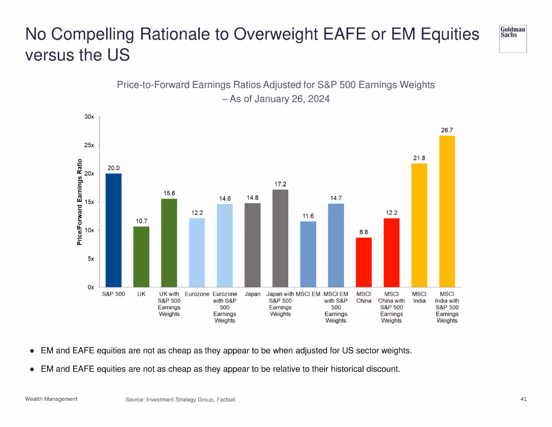
Column chart showing price-to-forward earnings ratios adjusted for S&P 500 earnings weights.
Investment Analysis
Financial Services
Discusses the lack of compelling reasons to overweight EAFE or EM equities compared to US equities based on earnings ratios.
equities, EAFE, EM, US, earnings ratios
Mixed Chart
Goldman Sachs
Saved
Previous
Next
If nothing, comes up, please save your slides first
Create a FREE account to continue browsing
Receive Instant Access to 1,000+ slides from companies like McKinsey, Google, and Goldman Sachs
First Name
Last Name
Email
Password
I agree to all
Terms & Privacy Policy
Thank you! Your submission has been received!
Oops! Something went wrong while submitting the form.
Have an account?
Sign in
Column Chart
Heatmap
Chevron
Org Chart
Infographic
Callouts
Timeline
List
Graphic
Picture
Process Flow
Diagram
Paragraph
Map
Table
Framework
Subtitle
Takeaway Box
Icon
Other Chart
Radar Chart
Waterfall Chart
Mekko Chart
Pie Chart
Scatter Plot
Line Chart
Bar chart
Bullet points