Create a FREE Account
Instant access to 1,000+ real slides from top companies like McKinsey, BCG, Goldman Sachs, Google and many more!
First Name
Last Name
Email
Password
I agree to all
Terms & Privacy Policy
Thank you! Your submission has been received!
Oops! Something went wrong while submitting the form.
Have an account?
Sign in
Library
Templates
Courses
Pricing
My Account
My Slides
My Templates
✦ AI
AI Prompt Library
AI Search
Sign in
Start Here
Logout
My Saved Slides
Contains a large pie chart detailing the frequency of Generative AI usage among users, accompanied by a bar graph showing specific usage rates from daily to less frequent.
Market Analysis and Trends
Technology & Software
Discusses the infrequent use of Generative AI tools by those who have tried them, pointing to potential usability or interest barriers.
Generative AI, usage frequency, user engagement, technology utilization, survey data
Mixed Chart
Deloitte
Saved
Contains three pie charts comparing digital marketing maturity between APAC, India, and Europe. The layout is simple and clean, focusing on the comparative data.
Market Analysis and Trends
Media & Entertainment
Compares digital marketing maturity scores across APAC, India, and Europe, indicating similar levels of maturity and highlighting best practices among leading brands. This slide is useful for understanding regional differences and identifying areas of improvement in digital marketing strategies.
digital marketing, APAC, India, Europe, maturity comparison, best practices, regional analysis, improvement areas, pie chart, marketing strategies
Multiple Chart
BCG
Saved
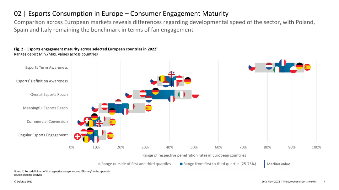
Scatter plot with flags representing European countries, comparing various esports engagement metrics like awareness and commercial conversion.
Market Analysis and Trends
Media & Entertainment
Compares esports engagement maturity across different European countries, showing variances in awareness, engagement, and commercial conversion rates.
esports, engagement, maturity, comparison, countries, Europe, conversion
Single Chart
Deloitte
Saved
Presents a timeline and a column chart reflecting the growth in FoodTech investments over the years, identifying key areas of focus like AgTech and Food Science. Includes annotations for significant startups and initiatives.
Investment Analysis
Agriculture & Food Production
Provides a comprehensive view of the investment landscape in the European FoodTech sector, with specific emphasis on sustainable and technology-driven initiatives.
FoodTech, investment, Europe, sustainability, AgTech
Mixed Chart
Accenture
Saved
The slide features column charts showing shareholder distributions and line charts depicting dividend initiations by Russell 1000 companies.
Strategic Planning
Financial Services
The slide explores the shift in corporate priorities between growth investments and shareholder returns, emphasizing the impact of rising rates on dividends and buybacks. It suggests a re-evaluation of growth versus shareholder return strategies. This slide is suitable for discussions on strategic planning and corporate finance.
shareholder returns, growth, dividends, buybacks, strategic planning
Multiple Chart
JP Morgan
Saved
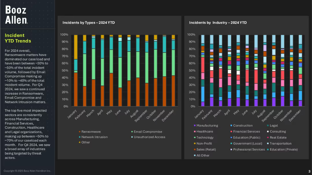
Two vertical stacked bar charts tracking incident types and industry impacts across months in 2024; left section includes narrative summary; dark background with vivid color blocks.
Risk Assessment and Management
Technology & Software
This slide presents year-to-date trends for cybersecurity incidents, showing that ransomware has consistently been the most common threat, followed by email compromise and network intrusion. The most affected sectors are manufacturing, financial services, healthcare, construction, and legal. Q4 saw a broad expansion of targeted industries.
ransomware, incident trends, cyber threats, industry impact, Booz Allen, monthly analysis, YTD data, email compromise, network intrusion
Multiple Chart
Booz Allen Hamilton
Saved
This slide presents a bar chart detailing expenditure allocations for top 15 ministries for the fiscal year 2019/20, displayed in descending order of funding.
Regulatory and Compliance
Government & Public Sector
Showcases budget allocations across different government ministries, emphasizing financial priorities and allocations.
Budget allocation, government ministries, fiscal management
Single Chart
PwC/Strategy&
Saved
Slide contains a combination of graphs and lists detailing revenue enabled, growth rates, and data utilization across Europe.
Market Analysis and Trends
Technology & Software
Analyzes the economic benefits derived from satellite data by intermediate users in Europe, highlighting growth rates and revenue across different sectors.
Satellite data, revenue, growth rate, Europe, economic impact
Multiple Chart
PwC/Strategy&
Saved
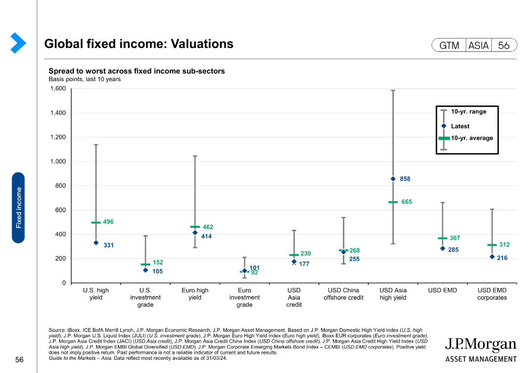
The slide features a scatter plot showing the spread to worst across fixed income sub-sectors over the last 10 years.
Market Analysis and Trends
Financial Services
The slide analyzes valuations in global fixed income markets, focusing on spreads across various sub-sectors. It is used for market analysis and investment decision-making.
Global fixed income, valuations, spreads, sub-sectors, market analysis, investment
Single Chart
JP Morgan
Saved
The slide displays a complex vertical column chart tracing the company's profitability over the years, with a timeline of milestones beneath the chart.
Financial Performance
Financial Services
Reviews Macquarie's historical profitability and growth, ideal for investor relations or financial history presentations.
Profitability, Shareholder Return, Growth, Financial History, Milestones
Single Chart
Morgan Stanley
Saved
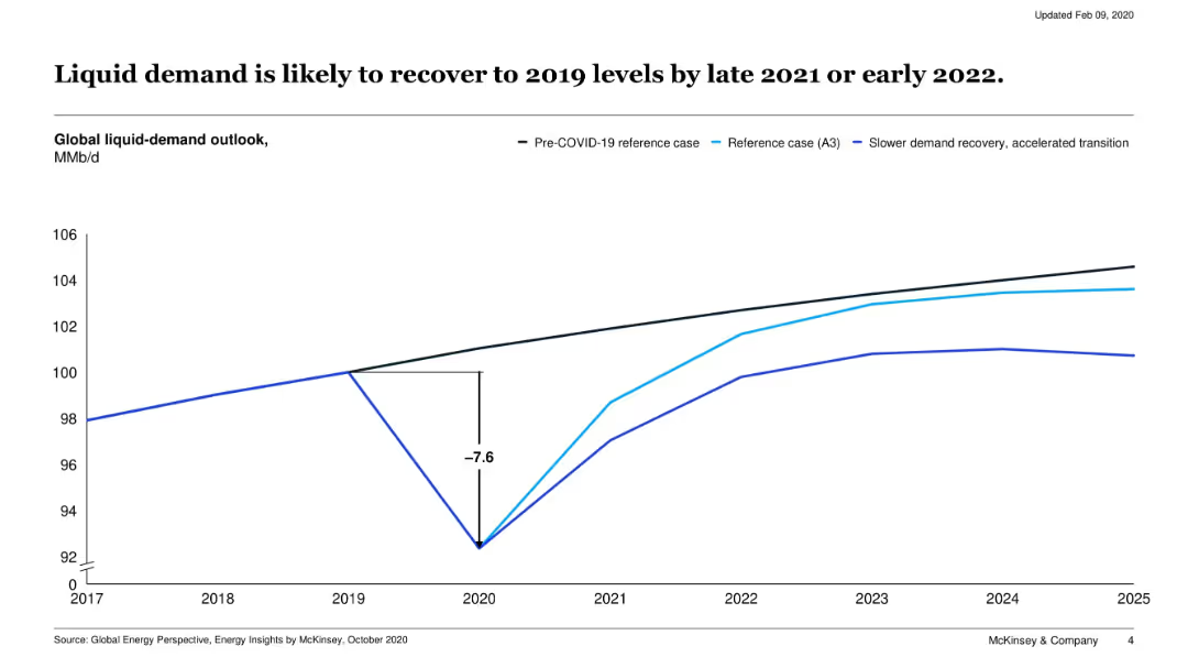
Line chart showing three global liquid-demand outlook scenarios from 2017 to 2025: pre-COVID, reference case, and accelerated transition.
Market Analysis and Trends
Energy & Utilities
This slide models the impact of COVID-19 on global liquid fuel demand, showing a sharp dip in 2020 followed by a recovery trajectory. It compares multiple scenarios including slower and faster transitions.
oil demand, COVID-19 impact, recovery, energy demand, liquid fuels, 2020, forecast
Single Chart
McKinsey
Saved
Features column charts showing the growth of loans originated and deposits, with a side bar detailing key attributes of the Marcus platform. The design is clean, with visual emphasis on data points.
Product and Service Analysis
Financial Services
Highlights the performance of Marcus, a consumer lending platform, with emphasis on technology, risk management, and growth since its inception, as well as customer-friendly features and deposit growth.
Marcus, Consumer Lending, Technology, Risk Management, Growth, Deposits, Loans Originated, Customer Experience, NerdWallet
Multiple Chart
Goldman Sachs
Saved
The slide depicts a circular diagram with four quadrants, each containing an icon and text. The purple central circle anchors the design, while arrows point outward to the individual pathways described.
Strategic Planning
Technology & Software
Outlines four strategic pathways that High Tech companies can pursue to expand industry boundaries, such as mergers & acquisitions, strategic alliances, demand sensors, and leveraging the installed base for expansion into adjacent areas.
High Tech, mergers & acquisitions, strategic alliances, demand sensors, adjacent areas, industry ecosystems, leapfrog growth, market-relevant joint offerings, bespoke solutions, installed base
Diagram
Accenture
Saved
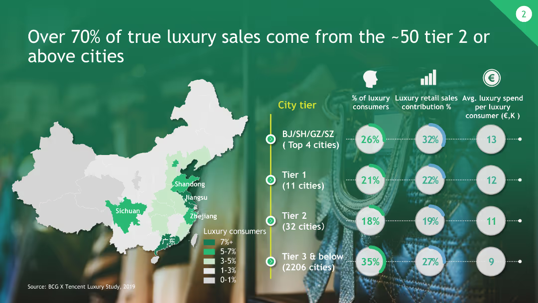
The slide includes a map of China highlighting tiered cities and their contribution to luxury sales, along with circular graphs representing consumer percentages and average spend.
Market Analysis and Trends
Consumer Goods
This slide shows that the majority of luxury sales come from approximately 50 tier 2 or above cities in China, with detailed data on consumer contributions and spending.
Luxury Sales, Tier Cities, Market Contribution, China, Consumer Data
Multiple Chart
BCG
Saved
The slide shows a series of vertical stack coin icons representing the value distribution of household investments.
Financial Performance
Financial Services
The slide illustrates the distribution of household investment values, ranging from under $50K to over $1M.
Household, Investments, Value, Distribution, Wealth
Single Chart
IPSOS
Saved
The slide presents a column chart comparing average 2022 costs by technology, including CDPs, identity solutions, DMPs, CMPs, and DCRs, with costs ranging from $376K to $437K.
Technology and Digital Transformation
Technology & Software
The slide outlines the compounded costs of using data clean rooms (DCRs) alongside other privacy-preserving technologies, showing the potential for annual costs to exceed $2 million.
DCR costs, privacy technologies, annual costs, financial
Mixed Chart
IPSOS
Saved
Contains a waterfall chart illustrating short and medium-term cost reduction potential across various expense categories.
Operational Efficiency
Industrial & Manufacturing
Demonstrates the potential for cost reduction without significantly impacting output, detailing short-term and medium-term savings across different expenses.
cost reduction, potential, expenses, short-term, medium-term, savings, waterfall chart
Single Chart
EY
Saved
The slide uses a simple text layout, listing two case studies. It employs minimal design elements, with each case study presented in bullet points and accompanied by a small, relevant image. The design is clean, using a black and white theme with blue accents.
Client Case Studies
Energy & Utilities
Highlighting how Ørsted and Iberdrola have made significant strides in reducing emissions through the adoption of clean-energy technologies, this slide serves as a case study for the positive impact and scalability of such initiatives. It is useful for discussions on best practices in sustainability within the energy sector, demonstrating tangible outcomes and strategies employed by leading companies.
clean energy, emissions reduction, case study, Ørsted, Iberdrola, sustainability, renewable energy, biomass, smart grids, hydrogen, strategic implementation
Header Vertical
McKinsey
Saved
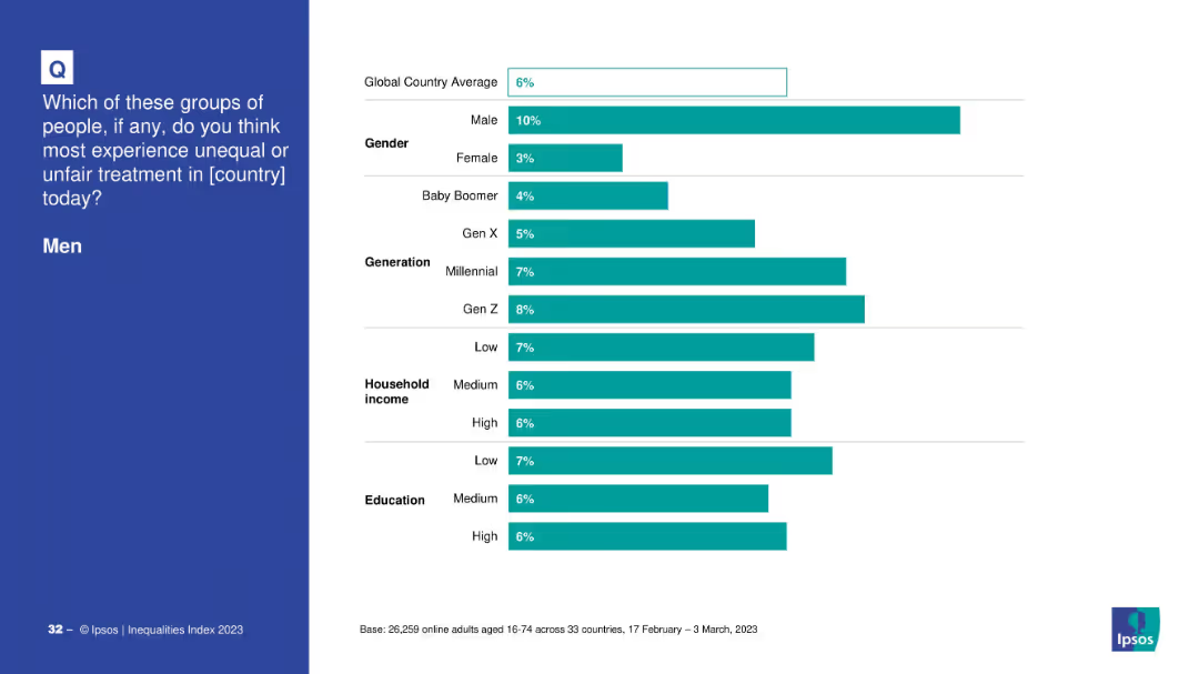
Demographic breakdown of perceptions about men experiencing unequal treatment.
Customer and Market Segmentation
Government & Public Sector
The slide disaggregates opinions by gender, generation, income, and education about whether men face unfair treatment, showing higher belief among men and younger generations.
inequality, men, perception, demographics, generational views, gender differences
Mixed Chart
IPSOS
Saved
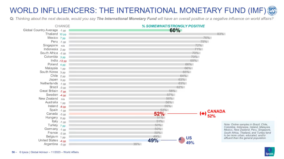
Horizontal bar chart with ranked countries, % values, and change indicators. Global and country averages shown. Flags highlight US and Canada positions.
Market Analysis and Trends
Financial Services
This slide presents global perceptions of the IMF’s influence over the next decade. The majority (60%) view the IMF positively, with strong support in Thailand and Mexico. US and Canadian views are lower than the global average.
IMF, global opinion, perception, influence, trends, country comparison, approval rating, international affairs
Single Chart
IPSOS
Saved
Displays three pie charts showing the evolution of podcast advertising campaigns by type from 2018 to 2020, highlighting a shift towards branding.
Strategic Planning
Media & Entertainment
Evaluates changes in the types of advertising campaigns in podcasts, moving from direct response to a focus on branding.
podcast advertising, campaign types, branding, direct response, 2018-2020
Multiple Chart
PwC/Strategy&
Saved
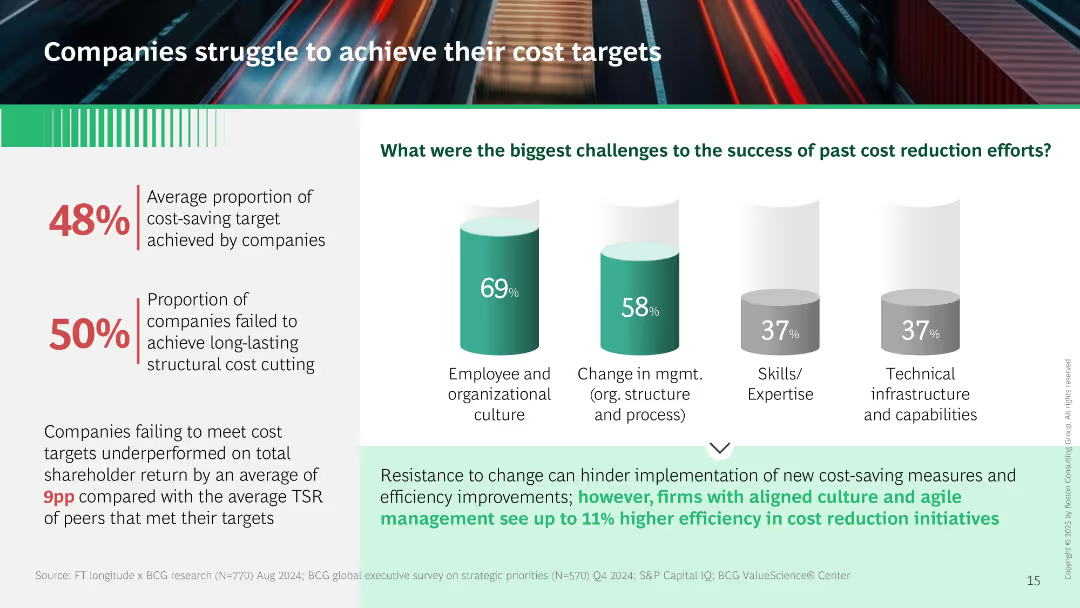
Left panel shows metrics on underperformance. Right has vertical bar charts showing barriers to cost reduction (culture, management, skills). Footer text links resistance to change to cost-saving failures.
Performance Metrics and KPIs
Professional Services
Demonstrates that only 48% of cost-saving targets are met, with organizational culture and management structure as key obstacles. Links cost target failures to lower shareholder return. Suggests culture alignment improves outcomes.
cost reduction, culture, performance, shareholder return, management change, implementation barriers
Mixed Chart
BCG
Saved
The slide showcases a column chart displaying a decrease in branch transactions against an increase in other channel transactions, along with a list of technological levers and movement to more efficient channels.
Operational Efficiency
Financial Services
It contrasts the decline in branch transactions with growth in digital channel usage, underscoring the efficiency driven by technology in banking operations. Ideal for analyzing technology's role in operational efficiency.
Efficiency, Digital Channels, Branch Transactions, Technological Levers, Automation, Process Improvement
Multiple Chart
Morgan Stanley
Saved
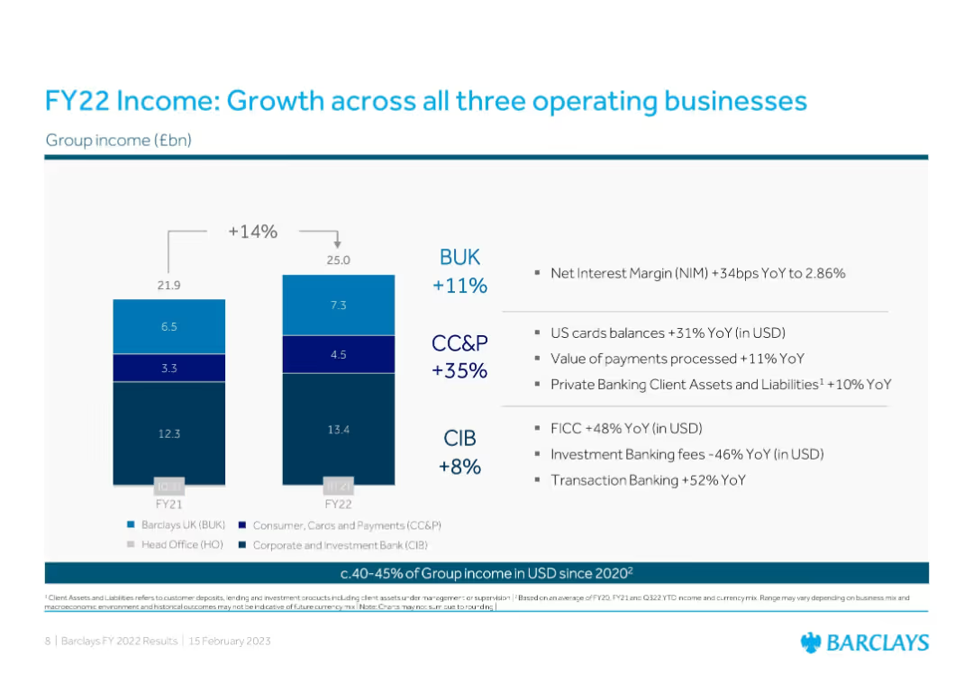
Stacked bar charts + bullet insights; YoY group income growth across BUK, CC&P, and CIB
Strategic Planning
Financial Services
Compares income across three Barclays business units in FY21 vs. FY22 with YoY percentage changes. Bullet points outline business segment growth drivers like US card balances, transaction banking, and FICC performance.
Income Growth, Operating Units, BUK, CC&P, CIB, YoY, Strategy, Revenue, Barclays
Mixed Chart
Barclays
Saved
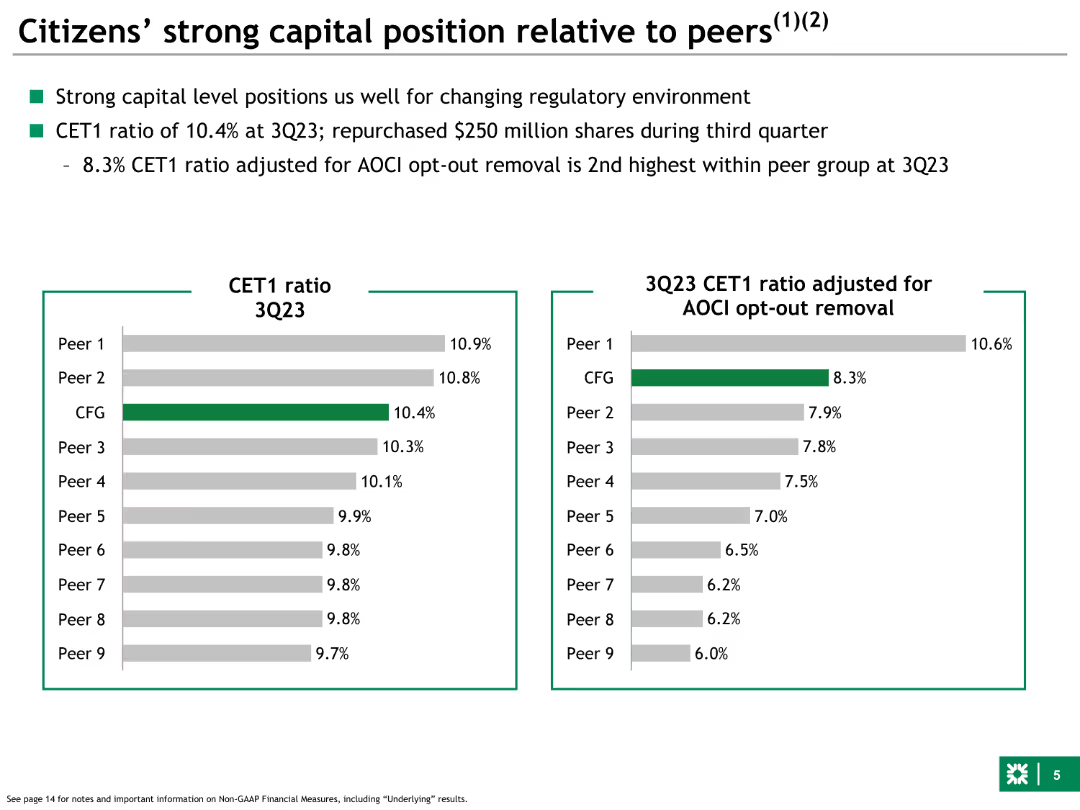
Left side features a bar chart comparing CET1 ratios of Citizens and peers. Right side adjusts CET1 ratios for AOCI opt-out removal, showing comparative financial positions.
Competitive Landscape
Financial Services
Compares Citizens' CET1 capital ratios to peers, both standard and adjusted for AOCI opt-out removal, highlighting strong capital positioning within the industry.
capital, position, Citizens, peers, CET1, comparative, AOCI, financial, ratios
Multiple Chart
Goldman Sachs
Saved
Previous
Next
If nothing, comes up, please save your slides first
Create a FREE account to continue browsing
Receive Instant Access to 1,000+ slides from companies like McKinsey, Google, and Goldman Sachs
First Name
Last Name
Email
Password
I agree to all
Terms & Privacy Policy
Thank you! Your submission has been received!
Oops! Something went wrong while submitting the form.
Have an account?
Sign in
Column Chart
Heatmap
Chevron
Org Chart
Infographic
Callouts
Timeline
List
Graphic
Picture
Process Flow
Diagram
Paragraph
Map
Table
Framework
Subtitle
Takeaway Box
Icon
Other Chart
Radar Chart
Waterfall Chart
Mekko Chart
Pie Chart
Scatter Plot
Line Chart
Bar chart
Bullet points