Create a FREE Account
Instant access to 1,000+ real slides from top companies like McKinsey, BCG, Goldman Sachs, Google and many more!
First Name
Last Name
Email
Password
I agree to all
Terms & Privacy Policy
Thank you! Your submission has been received!
Oops! Something went wrong while submitting the form.
Have an account?
Sign in
Library
Templates
Courses
Pricing
My Account
My Slides
My Templates
✦ AI
AI Prompt Library
AI Search
Sign in
Start Here
Logout
My Saved Slides
Two line charts depicting Eurozone real investment and investment confidence on the left, and Eurozone credit conditions on the right. Key indicators include non-residential investment, lending standards tightening, and more.
Investment Analysis
Financial Services
This slide compares Eurozone real investment growth and investment confidence with Eurozone credit conditions, showing trends over time and their impact on businesses and consumers.
investment, credit conditions, Eurozone, lending standards, business confidence
Multiple Chart
JP Morgan
Saved
This slide uses multiple color-coded column charts to depict podcast ad revenue share by industry category between 2021 and 2022. Each industry's revenue share is represented by two bars (for each year), with annotations for percentages.
Market Analysis and Trends
Media & Entertainment
Highlights the diversity in podcast ad revenue distribution by industry, showing growth in sectors like retail and stability in others. Useful for market analysis and understanding industry-specific advertising trends.
Podcast Advertising, Industry Distribution, Revenue Trends, Media
Mixed Chart
PwC/Strategy&
Saved
The slide includes a line chart comparing unemployment rates and average hourly earnings over time. The layout is simple and clear.
Market Analysis and Trends
Financial Services
This slide tracks the unemployment rate and average hourly earnings, showing correlations and trends over time, especially during recession periods.
unemployment rate, hourly earnings, recession trends, labor market, economic indicators
Single Chart
JP Morgan
Saved
Left text explains trend toward corporate activism; right-side bar chart shows agreement levels across countries. Uses teal and navy for agree/disagree.
Strategic Planning
Professional Services
Illustrates global attitudes about business leaders’ responsibility to address social and political issues. Over two-thirds in South Africa and India agree with this role. Slide notes the growing visibility and expectation of activism among CEOs across regions.
corporate activism, leadership, Ipsos, social issues, responsibility, global sentiment
Mixed Chart
IPSOS
Saved
Three-column layout with vertical bar charts and icons for national, regional, and sectoral breakdowns
Market Analysis and Trends
Professional Services
Displays the geographic and sectoral breakdown of the G250 sample for sustainability reporting. Includes national (by country), regional (Americas, Asia Pacific, Europe, MEA), and sectoral (by industry) proportions.
G250, national breakdown, regional breakdown, sector analysis, bar chart, KPMG, sustainability, survey, sample demographics, industry sectors
Multiple Chart
KPMG
Saved
Matrix chart with color-coded impact scores across value chain sub-functions
Product and Service Analysis
Financial Services
Highlights specific GenAI use cases and their relative impact across asset management functions—from marketing and research to compliance and operations—using a color-coded grid for quick reference.
GenAI impact, asset management, use cases, sub-functions, color matrix
Table
McKinsey
Saved
Slide features two line charts comparing changes in advertising spending and GDP over time. Text blocks provide contextual information and a global perspective on economic impacts on advertising.
Strategic Planning
Media & Entertainment
Analyzes the disproportionate impact of economic shocks on advertising spend compared to GDP, highlighting historical trends and predicting future behaviors in the advertising market.
Advertising, GDP, Economic Shock, Impact, Historical Trends, Future Prediction, Media, Global Perspective
Single Chart
Accenture
Saved
Circle chart and bar charts showing perceptions of difficulty in succeeding despite hard work in SEA.
Market Analysis and Trends
Financial Services
The slide shows that a majority of respondents find it harder to succeed despite working hard, highlighting regional variations.
difficulty, success, hard work, SEA, perceptions
Multiple Chart
IPSOS
Saved
Informative text with supporting icons and diagrams focusing on KPIs and predictive modeling, emphasizing a customer-centric measurement approach.
Technology and Digital Transformation
Retail & E-commerce
Suggests a paradigm shift in success measurement, advocating for customer-centric KPIs and predictive models for accurate ROI analysis.
KPIs, ROI, Customer-Centric, Predictive Modeling, Success Metrics, Channel Strategy
Header Horizontal
BCG
Saved
The slide contains a horizontal timeline highlighting significant events in Booz Allen's history from its founding in 1914 to recent achievements in 2023. Each milestone is marked by a bubble with text descriptions below.
Industry Overview
Professional Services
This slide provides a historical overview of Booz Allen, showcasing key milestones and developments over the years. It illustrates the company's growth, strategic acquisitions, and significant contracts, emphasizing its long-standing industry leadership.
company history, timeline, milestones, growth, achievements
Linear Flow
Booz Allen Hamilton
Saved
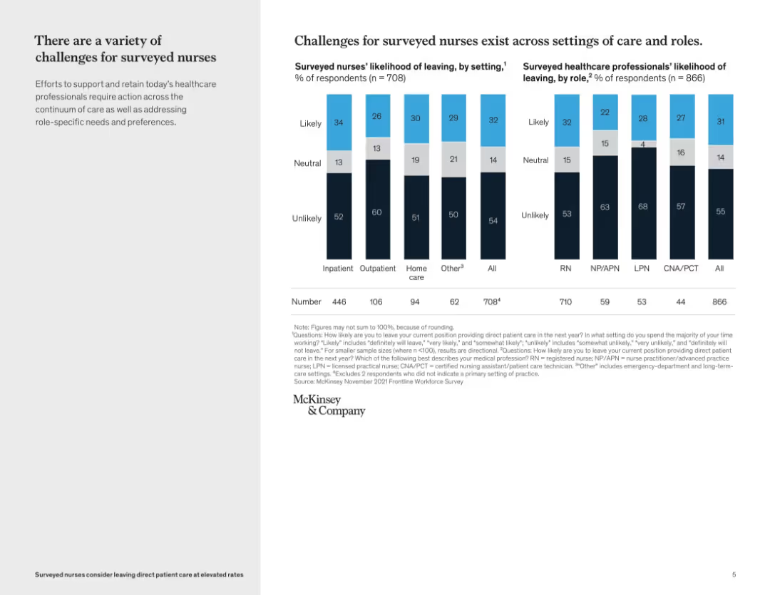
The slide includes a bar chart showing the factors influencing customers' decisions to subscribe, categorized by different subscription types such as digital services, consumable products, and e-commerce.
Customer and Market Segmentation
Consumer Goods
The slide identifies key factors that drive customers to subscribe, including financial incentives, convenience, and access to premium offerings, with varying importance across subscription types.
decision factors, subscription, financial incentives, convenience, premium offerings
Multiple Chart
Deloitte
Saved
The slide includes a bar chart showing bear market drawdowns and recovery times for different asset allocation mixes, from 100% stocks to 100% bonds.
Risk Assessment and Management
Financial Services
The slide discusses strategies to mitigate portfolio volatility by adjusting asset allocation, highlighting the importance of having a financial buffer.
Portfolio, Volatility, Buffer, Asset Allocation, Risk
Single Chart
UBS
Saved
The slide includes a scatter plot showing DPO (Days Payable Outstanding) against asset days for various industries. Dots are color-coded to indicate improvement or deterioration from 2016 to 2017. Industries are labeled around the dots, providing a clear comparison of performance.
Risk Assessment and Management
Financial Services
This slide presents a detailed analysis of DPO and asset days across industries, showing trends in payables and asset management. The scatter plot visualizes how different sectors have improved or worsened in these metrics, offering insights into risk management and operational efficiency.
DPO, asset days, scatter plot, industry comparison, performance trends, risk management
Single Chart
PwC/Strategy&
Saved
Line graph with labeled key events (e.g., general elections) plotted over time (2016–2025); peak annotations and clean layout on white background.
Market Analysis and Trends
Government & Public Sector
Shows the trend in public concern over politicians/politics in Britain, peaking at 26% in June 2022. Includes markers for general elections and data collection notes.
politics, trust, UK, Ipsos, public opinion, trends, elections, issues index, concern levels
Single Chart
IPSOS
Saved
Features a combination of column charts and text, comparing IFRS and US GAAP credit loss expenses. The layout is moderately complex with detailed data comparisons.
Regulatory and Compliance
Financial Services
The slide compares credit loss expenses and allowances under IFRS and US GAAP, highlighting differences in financial impact, useful for compliance and financial reporting.
Credit, Loss, Comparison, IFRS, GAAP
Mixed Chart
UBS
Saved
The slide includes two charts: one showing the power balance of a new green H2 project over time and another showing the existing grid power mix with saturation hours.
Market Analysis and Trends
Energy & Utilities
This slide assesses the emissions impacts of annual matching based on the hourly grid mix, presenting data on oversupply and undersupply periods, and the resulting imbalances in carbon displacement during saturation hours.
green hydrogen, annual matching, emissions impact, hourly grid mix, power balance
Multiple Chart
BCG
Saved
This slide uses a combination of column charts and textual analysis to compare the economic performance of different regions like China, Europe, and the Americas. It includes percentage changes and highlights notable trends with arrows to denote increases or decreases.
Market Analysis and Trends
Consumer Goods
This comparative analysis slide highlights regional variations in consumer behavior and market performance within the luxury goods sector during a challenging economic period. It emphasizes differences in recovery speeds and the impact of external factors like lockdowns and political instability.
regional analysis, luxury goods, economic impact, market trends
Mixed Chart
Bain
Saved
Slide contains two scatter plots on a single frame comparing EBITDA growth and margin among various companies in renewable energy sectors like hydrogen and solar. The data points are color-coded by sector.
Market Analysis and Trends
Energy & Utilities
Discusses the financial performance of companies in the renewable sector by comparing growth and EBITDA margin, highlighting market trends and company positions within the industry.
renewable energy, EBITDA, market analysis, growth, financial performance
Multiple Chart
Barclays
Saved
Split-panel layout with a dark blue sidebar containing the question text and a bar chart on the right showing responses across countries.
Market Analysis and Trends
Artificial Intelligence
The slide presents a global comparison of public opinion on whether AI will improve, worsen, or not affect the economy in the next 3–5 years. Results are shown for multiple countries, highlighting optimism in places like China and Indonesia.
AI impact, global economy, country comparison, public opinion, Ipsos, survey, optimism, AI perception, economic outlook, trends
Mixed Chart
IPSOS
Saved
The slide shows a scatter plot chart indicating the projected years for industries to achieve net zero under consensus pathways.
Risk Assessment and Management
Environmental Services & Sustainability
The slide assesses the progress of various industries in meeting net zero targets by 2050, indicating that many are off track and need accelerated efforts.
net zero, 2050, industries, consensus pathways, emissions reduction, acceleration, projected year, achievement
Single Chart
Accenture
Saved
The slide includes text sections and small graphs detailing upcountry receival, rail transport, and domestic port costs comparisons.
Risk Assessment and Management
Transportation & Logistics
The slide discusses international benchmarking of Australia's rail and port charges, showing they are higher compared to Canada and Ukraine, impacting efficiency.
Rail, Port, Costs, Benchmarking, Comparison
Pillar
LEK
Saved
Horizontal flowchart from left to right illustrating 5 levels of complexity with icons/logos of retailers.
Operational Efficiency
Retail & E-commerce
Outlines a maturity curve for COGS reduction, from basic transparency to international alliances. Lists value drivers per stage. Shows examples from Walmart, Lidl, Carrefour, EDEKA, and others.
COGS strategy, sourcing, alliances, complexity, procurement
Pillar
McKinsey
Saved
The slide shows a process flow diagram with icons representing various stages of returns handling in the fashion industry, including sorting, refunding, and recycling.
Operational Efficiency
Retail & E-commerce
This slide explains the flow of returns within the fashion ecosystem, highlighting the key stages and actions involved in managing returns efficiently and sustainably.
Returns, Recycling, Sorting, Process flow, Fashion industry
Diagram
Roland Berger
Saved
Multiple line charts comparing GDP growth scenarios and their impacts on the transportation and logistics sector.
Market Analysis and Trends
Transportation & Logistics
Discusses potential future impacts of various economic scenarios on the T&L industry.
Transportation, Logistics, GDP, Growth, Impact, Economic, Scenarios, Industry Analysis
Multiple Chart
PwC/Strategy&
Saved
Two charts: a bar chart showing global corporate debt maturities by year and a line chart tracking corporate bankruptcy trends alongside non-investment grade corporate yields, emphasizing financial stress from high-interest rates.
Financial Performance
Financial Services
The slide predicts amplified financial stress and bankruptcy pressures for corporations due to the likelihood of sustained high-interest rates, with significant refinancing needs emerging in 2024 and beyond.
Bankruptcy, Interest Rates, Corporate Debt, Financial Stress, Refinancing
Multiple Chart
Accenture
Saved
Previous
Next
If nothing, comes up, please save your slides first
Create a FREE account to continue browsing
Receive Instant Access to 1,000+ slides from companies like McKinsey, Google, and Goldman Sachs
First Name
Last Name
Email
Password
I agree to all
Terms & Privacy Policy
Thank you! Your submission has been received!
Oops! Something went wrong while submitting the form.
Have an account?
Sign in
Column Chart
Heatmap
Chevron
Org Chart
Infographic
Callouts
Timeline
List
Graphic
Picture
Process Flow
Diagram
Paragraph
Map
Table
Framework
Subtitle
Takeaway Box
Icon
Other Chart
Radar Chart
Waterfall Chart
Mekko Chart
Pie Chart
Scatter Plot
Line Chart
Bar chart
Bullet points