Create a FREE Account
Instant access to 1,000+ real slides from top companies like McKinsey, BCG, Goldman Sachs, Google and many more!
First Name
Last Name
Email
Password
I agree to all
Terms & Privacy Policy
Thank you! Your submission has been received!
Oops! Something went wrong while submitting the form.
Have an account?
Sign in
Library
Templates
Courses
Pricing
My Account
My Slides
My Templates
✦ AI
AI Prompt Library
AI Search
Sign in
Start Here
Logout
My Saved Slides
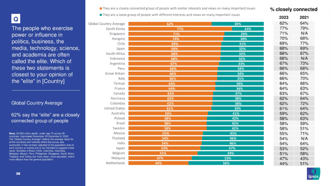
Bar chart showing opinion split on whether elites are a “closely connected group” or a “loose group” across 28 countries; trends for 2021 and 2023 included
Strategic Planning
Government & Public Sector
This slide explores perceptions of national elites—62% globally see elites as a closely connected group. Countries like South Korea and Singapore show particularly high agreement, with a trend comparison to 2021 on the right.
elites, power, influence, perceptions, politics, society, public opinion, Ipsos, social structure, governance
Mixed Chart
IPSOS
Saved
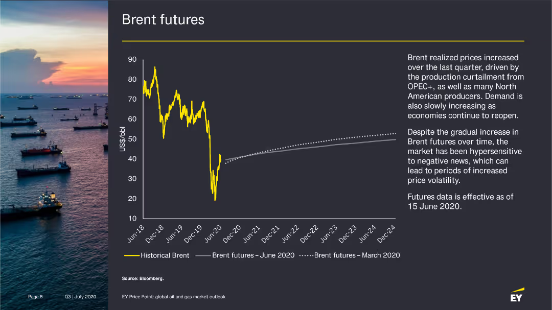
The slide presents a line chart showing historical Brent prices and Brent futures as of June 2020, with an accompanying narrative on the factors influencing these trends.
Market Analysis and Trends
Energy & Utilities
Analyzes the increase in Brent futures prices due to production cuts and rising demand, with projections for future price trends.
Brent futures, oil prices, market trends, 2020
Mixed Chart
EY
Saved
The slide combines text and a bar chart to show what consumers expect from brands, focusing on social causes and CSR initiatives. The design is moderately dense.
Market Analysis and Trends
Professional Services
This slide discusses the importance of brand promises and social responsibility, highlighting consumer expectations for brands to support social causes and CSR initiatives.
brand promise, social causes, CSR, consumer expectations, marketing
Mixed Chart
Nielsen
Saved
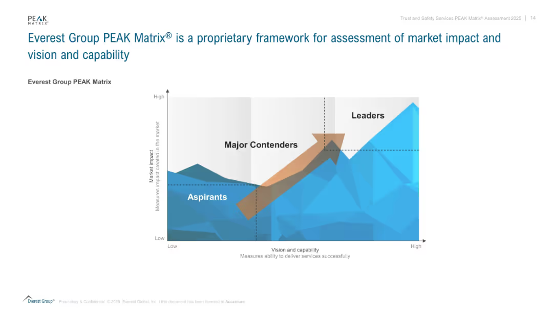
A quadrant-style matrix diagram with a 3D mountain range background and labeled axes for "Market impact" and "Vision and capability". Uses blue tones and gradient shading. Includes arrow to show movement from Aspirants to Leaders.
Competitive Landscape
Professional Services
This slide introduces the Everest Group PEAK Matrix®, a visual framework that classifies organizations into three categories—Aspirants, Major Contenders, and Leaders—based on their market impact and delivery capability. It is used to evaluate players in a competitive landscape and indicates movement toward leadership with an upward arrow.
PEAK Matrix, Everest Group, vision, capability, market impact, framework, strategy, assessment, competitive position
Single Chart
Accenture
Saved
The slide contains an area chart showing the projected economic impact of COVID-19 on New York's GDP, compared to the pre-COVID baseline. It visually represents data points through shading and text annotations to highlight key figures like total economic loss.
Financial Performance
Government & Public Sector
Provides detailed projections of the economic impact of COVID-19 on New York, including total loss and timeline to recovery. Valuable for discussions on fiscal planning and economic strategies in response to pandemics.
COVID-19, economic impact, GDP, New York, projections, recovery, fiscal planning
Mixed Chart
BCG
Saved
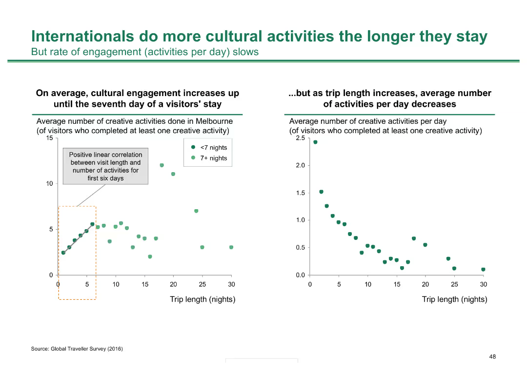
Two scatter plots: one shows a positive correlation between visit length and number of activities in Melbourne; the other shows the average number of activities per day decreases as stay lengthens.
Market Analysis and Trends
Hospitality & Tourism
Analyzes how international visitors' engagement with cultural activities in Melbourne increases with longer stays, though the rate of daily activities decreases over time.
cultural activities, visitor engagement, Melbourne, stay length, tourism
Multiple Chart
BCG
Saved
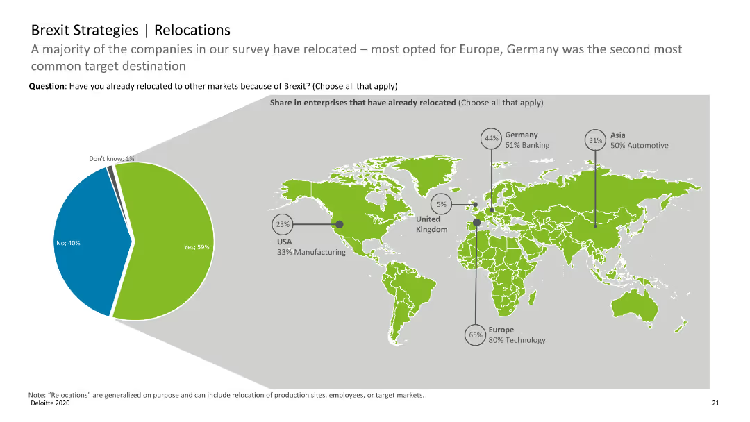
World map with pie charts indicating the share of enterprises that have relocated due to Brexit, with regional data.
Strategic Planning
Professional Services
Highlights the relocation trends of companies post-Brexit, with Europe and Germany being key relocation destinations.
Brexit, relocations, enterprises, map, trends
Mixed Chart
Deloitte
Saved
Features a flowchart linking strategies from simplifying business operations to aligning compensation with shareholder returns, interspersed with descriptive icons.
Strategic Planning
Financial Services
Outlines corporate strategies aimed at improving operational efficiency and shareholder value, focusing on cost management and strategic business alignment.
strategy, business, efficiency, shareholder, alignment
Linear Flow
Barclays
Saved
Line graph showing historical US GDP changes, with blue shades indicating projected impacts under mild and extreme scenarios. A clear timeline from 1900 to 2020.
Market Analysis and Trends
Financial Services
Illustrates the potential impact of COVID-19 on the US economy by comparing historical GDP data and future projections.
GDP, COVID-19, impact, projections, economy, historical, US, scenarios
Single Chart
McKinsey
Saved
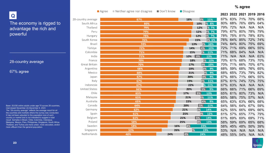
Horizontal bar chart with segmented agreement levels; sidebar with title and average.
Market Analysis and Trends
Financial Services
Displays agreement levels with the statement that the economy benefits the rich and powerful. The 28-country average is 67%. South Africa, Thailand, and Peru show the highest agreement, indicating widespread skepticism about economic fairness.
economy, inequality, rigged system, public opinion, economic perception
Mixed Chart
IPSOS
Saved
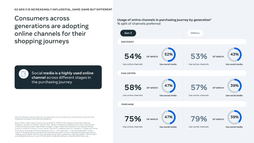
Simple left-aligned text with a three-stage funnel chart (discovery, evaluation, purchase) comparing Gen Z vs. others.
Technology and Digital Transformation
Retail & E-commerce
This slide outlines the adoption of online channels during the shopping process across age groups. It emphasizes the strong role of social media in discovery and evaluation, particularly for Gen Z.
e-commerce, online shopping, social media, Gen Z, purchase journey, consumer behavior, discovery, evaluation, purchase, digital influence
Mixed Chart
Bain
Saved
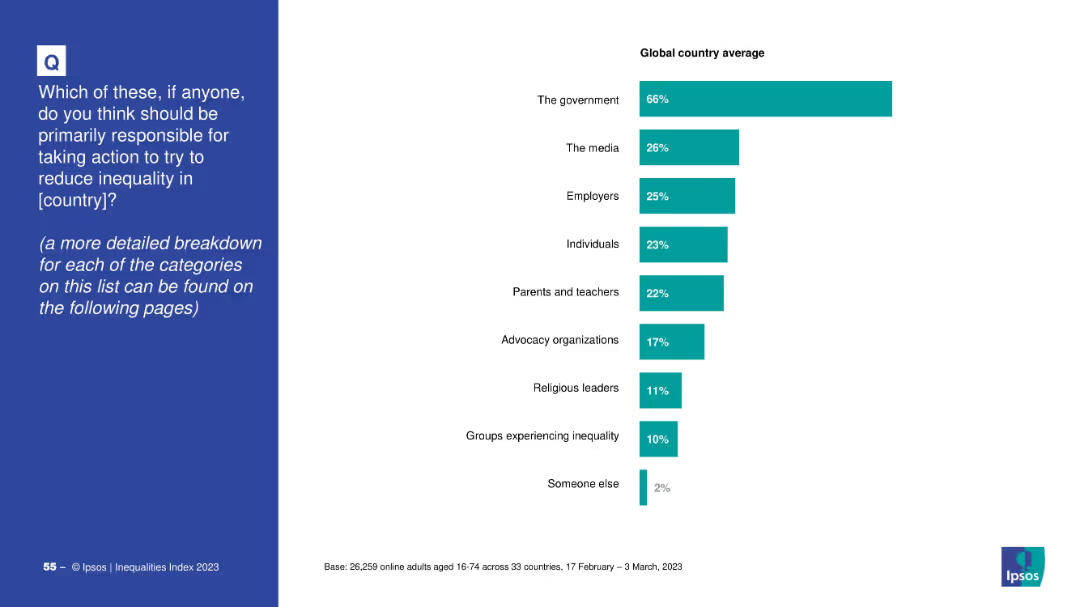
Split slide: left side has question text in a blue box; right side is a horizontal bar chart with global averages.
Market Analysis and Trends
Government & Public Sector
This slide presents global public opinion on who should be primarily responsible for reducing inequality. A horizontal bar chart shows that 66% believe the government should lead, followed by media, employers, and individuals.
inequality, responsibility, government, media, employers, public opinion, global survey, Ipsos, 2023, bar chart
Mixed Chart
IPSOS
Saved
Column charts for industry performance and backlogs of work, with a line graph for selected industries' PMI output/activity
Market Analysis and Trends
Financial Services
The slide details the performance of various industries in the US, focusing on output, backlogs of work, and industry performance.
US outlook, industry performance, PMI, backlogs, trends
Multiple Chart
Accenture
Saved
The slide presents a series of stacked column charts with highlights, showcasing asset management across investments, deposits, and loans. The design uses blue and purple hues, with annotations for key data.
Financial Performance
Financial Services
It shows year-end balances for investments, deposits, and loans, with highlights on significant achievements, indicating a robust asset management strategy focused on serving clients comprehensively.
Asset Management, Investments, Deposits, Loans, Client Service, Balance Sheet, Financial Services, Highlights, Growth
Multiple Chart
JP Morgan
Saved
Contains three pie charts and descriptive texts with a minimalistic blue and black design. Visual elements are used to emphasize the data points, highlighting various aspects of transformation shortcomings.
Operational Efficiency
Professional Services
Explores reasons transformations don’t fully succeed by discussing goals, delivery pace, and sustainability. Could be used in management meetings to discuss improvement areas.
transformation, success, goals, pace, sustainability, management, strategy, pie charts, professional services
Pillar
McKinsey
Saved
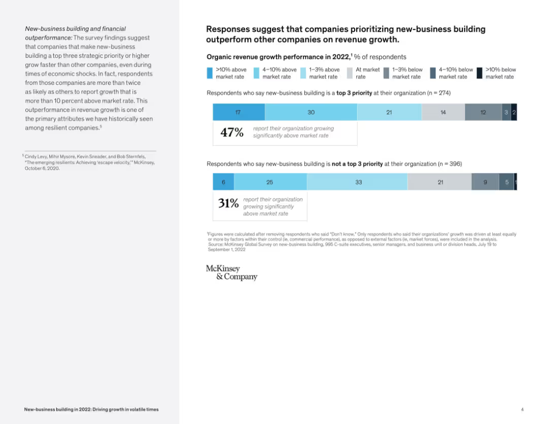
Stacked bar charts comparing revenue growth with and without prioritization of new-business building; paired with summary text.
Performance Metrics and KPIs
Professional Services
The slide presents data showing that companies making new-business building a top priority report significantly higher revenue growth than those that do not, supporting the link between strategic prioritization and performance.
revenue growth, new-business building, performance, strategic priority, survey results, market rate
Mixed Chart
McKinsey
Saved
This slide is comprised of three visual elements: a line chart showing a declining delinquency rate, a column chart showing a decrease in net charge-offs, and another column chart showing a significant reduction in risky loans. Each chart is accompanied by descriptive text that provides context to the data. The design is straightforward, aiming to communicate improvements in credit quality.
Risk Assessment and Management
Financial Services
The slide demonstrates improvements in the credit quality of the bank's loan portfolio, showing decreased delinquency and charge-off rates, as well as a healthier loan composition. It is ideal for presenting financial stability and risk management progress to stakeholders.
credit quality, loan portfolio, delinquency rate, risk management
Multiple Chart
JP Morgan
Saved
Contains a mixed display of bullet points and column chart showing government stimulus efforts globally and industry shifts toward onshoring. The narrative includes both textual analysis and data presentation.
Regulatory and Compliance
Financial Services
Analysis of how governmental economic measures and free-market adaptations during crises influence corporate strategy and operations, focusing on shifting production strategies and onshoring.
stimulus, regulations, onshoring, government, market shifts
Mixed Chart
McKinsey
Saved
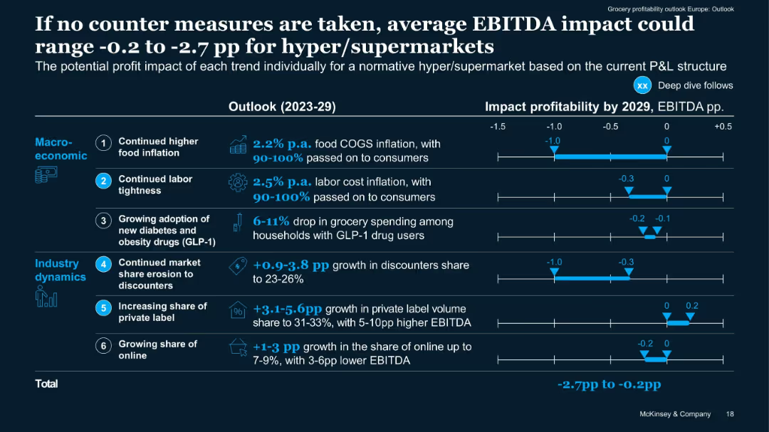
Horizontal bar impact chart quantifying EBITDA effect per trend from 2023–2029. Blue shaded bars show range.
Risk Assessment and Management
Retail & E-commerce
Quantifies potential downside to EBITDA if current trends continue without mitigation. Segments macroeconomic vs industry dynamics and provides projected ranges per trend. Total potential impact: -2.7pp to -0.2pp EBITDA.
EBITDA risk, impact forecast, industry dynamics, cost drivers, 2029
Mixed Chart
McKinsey
Saved
This slide contains multiple vertical bar graphs with color coding for Millennials and Gen Z. It also includes a text block explaining the context of the data.
Market Analysis and Trends
Financial Services
Illustrates Millennials and Gen Z's perceptions of the factors contributing to wealth inequality and their views on systemic barriers.
Wealth, Inequality, Millennials, Gen Z, Survey, Systemic, Barriers, Executive Pay, Education
Multiple Chart
Deloitte
Saved
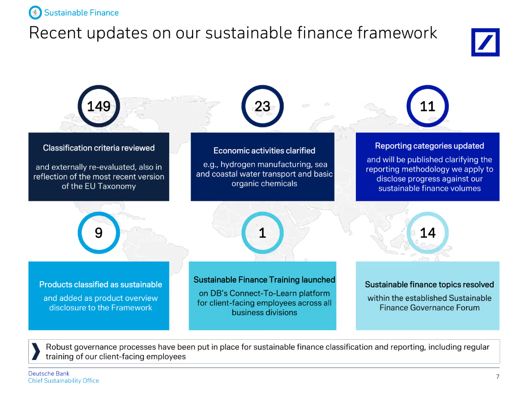
The slide contains text and numbered points summarizing recent updates to the sustainable finance framework, including criteria reviews and economic activity clarifications.
Regulatory and Compliance
Financial Services
Highlights Deutsche Bank's recent updates to their sustainable finance framework, including classification criteria, economic activities, and reporting category updates.
Updates, sustainable, finance, framework, criteria, economic, activities, reporting, banking, ESG
Graphic
Deutsche Bank
Saved
The slide contains a combination of icon-based bar charts and isometric illustrations. There are three key statistics presented with corresponding icons: a baby carriage, pencils, and desks. Colors are blue, grey, and green.
Customer and Market Segmentation
Education & Training
This slide highlights statistics regarding access to education and childcare services. It showcases specific deficits in education availability, such as adult education and childcare, using graphical representations to clearly communicate the data.
education, childcare, statistics, access, deficits
Single Chart
Deloitte
Saved
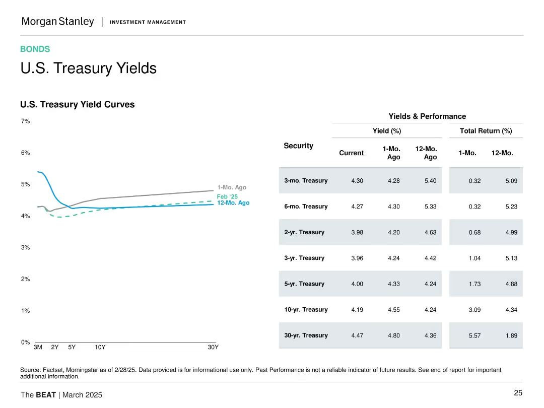
Left: U.S. Treasury yield curve over 3 time points. Right: Yield and return table for various tenors. Minimalist design with small color coding.
Financial Performance
Financial Services
This slide provides a snapshot of the U.S. Treasury yield curve and recent performance by tenor. It highlights recent downward shifts in yields and strong 12-month total returns, particularly for longer-dated securities, reflecting changing market sentiment.
U.S. Treasuries, yield curve, total return, short-term vs long-term, interest rate trend, bond performance, investment returns
Mixed Chart
Morgan Stanley
Saved
Five icons with descriptions for leading countries' investments in frontier technologies. Countries include the US, EU, France, Germany, and China, with respective investment plans in technologies.
Technology and Digital Transformation
Technology & Software
The slide highlights significant investments in frontier technologies by leading countries, including the US, EU, France, Germany, and China. It showcases various initiatives, such as the US investment in EV infrastructure and China's commitment to AI and 5G development, emphasizing the centrality of technology to their economic strategies.
Investments, Frontier Technologies, Leading Countries
Pillar
Roland Berger
Saved
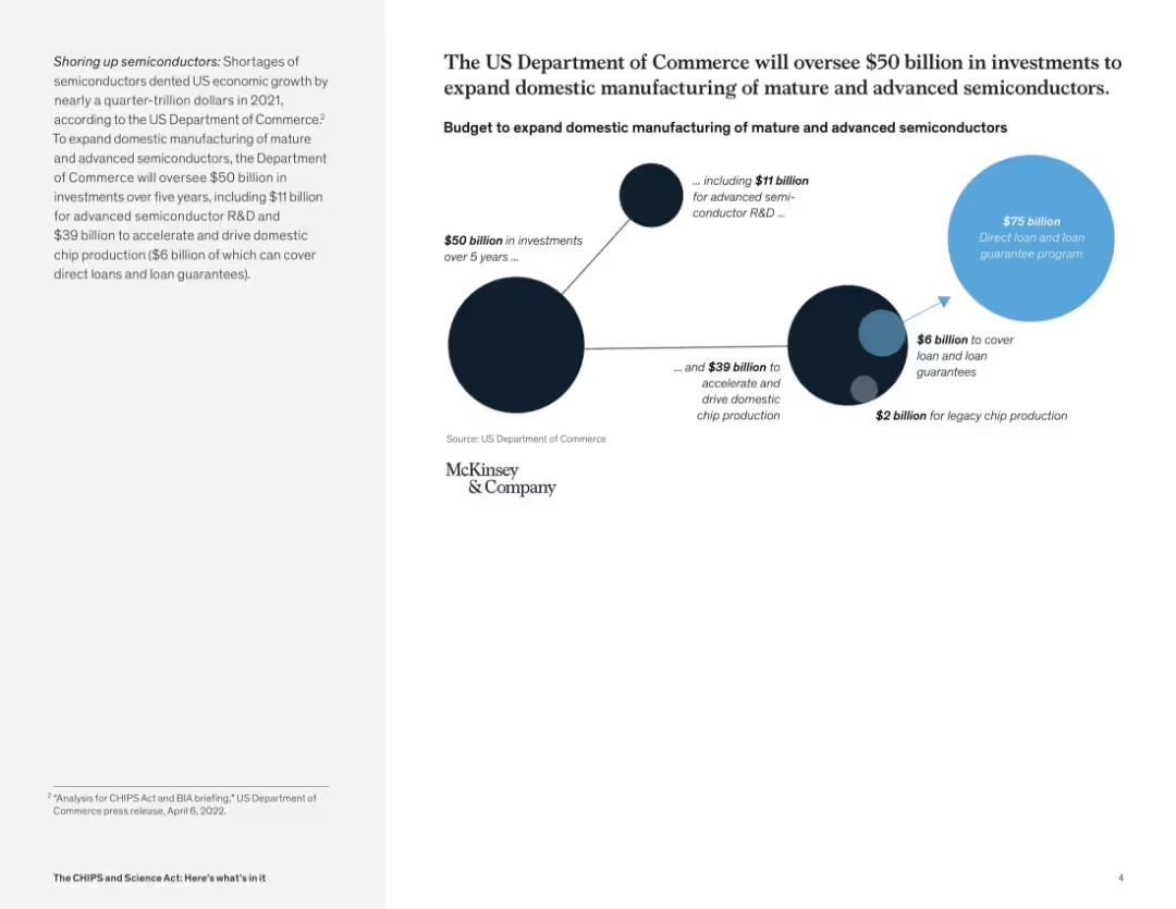
Circular infographic showing funding breakdowns for R&D, production, and loan guarantees; paired with summary text
Strategic Planning
Government & Public Sector
This slide details a $50 billion investment plan managed by the U.S. Department of Commerce to enhance domestic semiconductor manufacturing. The visual shows allocation to advanced R&D, domestic chip production, and legacy chip production, emphasizing long-term strategic growth.
U.S. manufacturing, CHIPS funding, semiconductor strategy, federal investment, R&D funding, economic development
Mixed Chart
McKinsey
Saved
Previous
Next
If nothing, comes up, please save your slides first
Create a FREE account to continue browsing
Receive Instant Access to 1,000+ slides from companies like McKinsey, Google, and Goldman Sachs
First Name
Last Name
Email
Password
I agree to all
Terms & Privacy Policy
Thank you! Your submission has been received!
Oops! Something went wrong while submitting the form.
Have an account?
Sign in
Column Chart
Heatmap
Chevron
Org Chart
Infographic
Callouts
Timeline
List
Graphic
Picture
Process Flow
Diagram
Paragraph
Map
Table
Framework
Subtitle
Takeaway Box
Icon
Other Chart
Radar Chart
Waterfall Chart
Mekko Chart
Pie Chart
Scatter Plot
Line Chart
Bar chart
Bullet points