Create a FREE Account
Instant access to 1,000+ real slides from top companies like McKinsey, BCG, Goldman Sachs, Google and many more!
First Name
Last Name
Email
Password
I agree to all
Terms & Privacy Policy
Thank you! Your submission has been received!
Oops! Something went wrong while submitting the form.
Have an account?
Sign in
Library
Templates
Courses
Pricing
My Account
My Slides
My Templates
✦ AI
AI Prompt Library
AI Search
Sign in
Start Here
Logout
My Saved Slides
Similar to the previous slide but focuses on marketing insights, with interconnected text boxes explaining various aspects of strategic marketing.
Strategic Planning
Technology & Software
Details Experian's marketing strategies utilizing auto data to provide detailed consumer insights, enhancing target marketing efforts and campaign measurement in the automotive sector.
marketing strategy, auto data, consumer insights, campaign measurement, target marketing
Table
Barclays
Saved
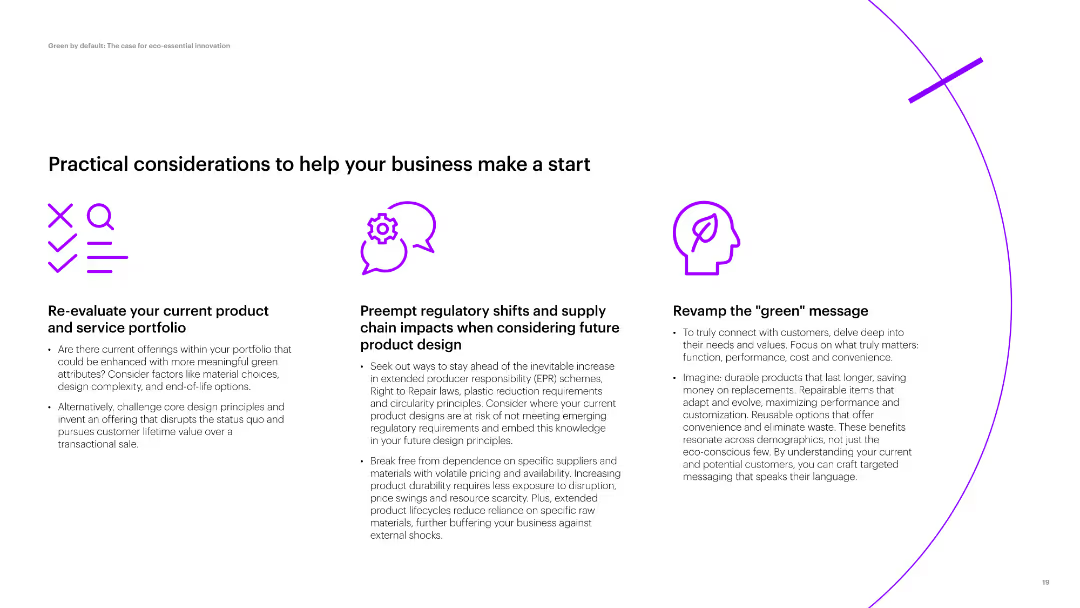
Three sections with icons and text, discussing product evaluation, regulatory impacts, and green messaging. Simple layout with moderate text density.
Strategic Planning
Environmental Services & Sustainability
Discusses practical steps for businesses to enhance their product portfolio with green attributes, consider regulatory impacts, and revamp their messaging for eco-conscious consumers.
product portfolio, regulatory impacts, green messaging, eco-friendly, business start
Pillar
Accenture
Saved
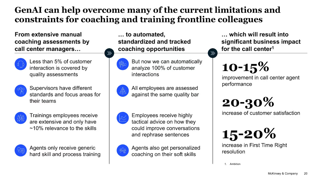
Three-column layout transitioning from current coaching issues to AI-based coaching and expected impact
Operational Efficiency
Telecommunications
Describes how GenAI can transform call center coaching from manual assessments to automated analysis and personalized training. Quantified benefits include performance, customer satisfaction, and resolution improvements.
call center, coaching, automation, performance, training, personalization, AI benefits
Linear Flow
McKinsey
Saved
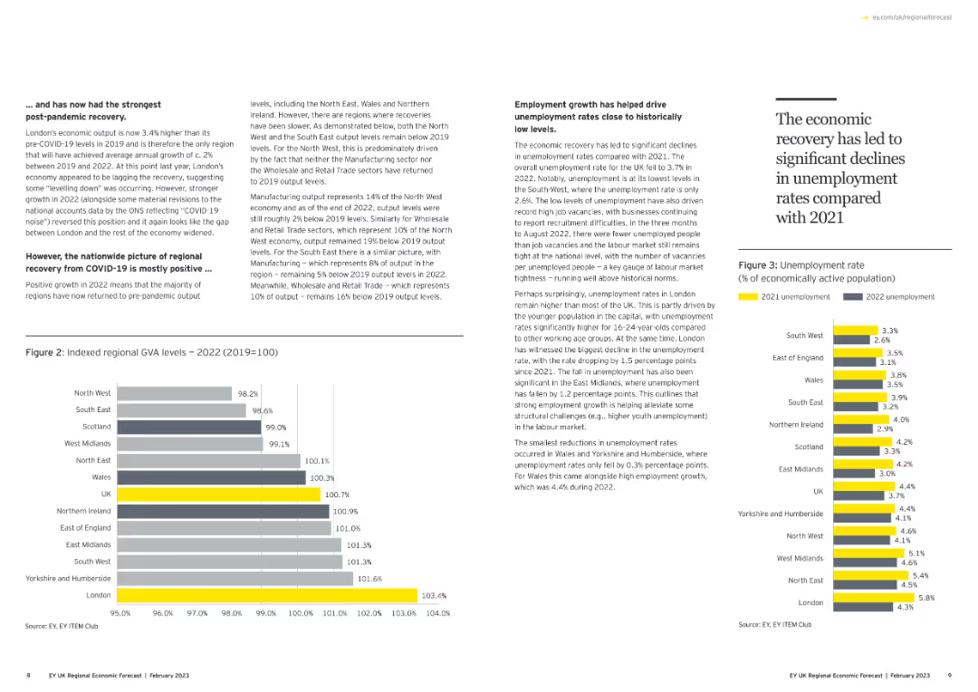
Contains a column chart showing indexed regional GVA levels and another column chart showing unemployment rates. Text discusses economic recovery trends.
Market Analysis and Trends
Government & Public Sector
Analyzes regional GVA levels post-COVID-19 and the employment growth that has helped drive down unemployment rates to historically low levels.
GVA, unemployment, economic recovery, regional analysis, column chart
Multiple Chart
EY
Saved
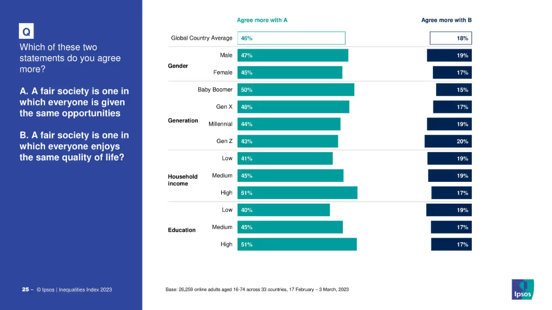
Two-column layout with a survey question on the left in a blue box and bar charts on the right comparing responses across segments.
Market Analysis and Trends
Government & Public Sector
This slide presents global survey results on the definition of a fair society. It contrasts agreement with two concepts: equal opportunity vs. equal quality of life, segmented by gender, generation, income, and education level.
fairness, equality, survey, demographics, opportunity, quality of life, perceptions
Mixed Chart
IPSOS
Saved
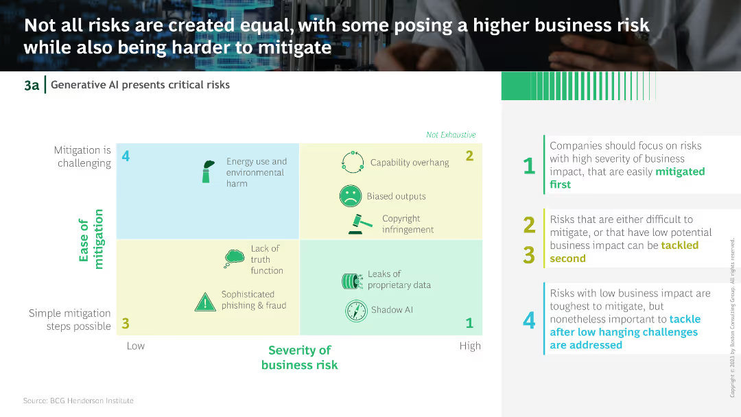
A grid comparing different risks of Generative AI in terms of ease of mitigation and severity of business impact, color-coded for clarity.
Risk Assessment and Management
Technology & Software
This slide categorizes the risks of Generative AI by their ease of mitigation and severity of business impact, suggesting a prioritization strategy for addressing these risks.
Generative AI, risks, mitigation, business impact, strategy
Diagram
BCG
Saved
Slide with world map and pyramids representing the distribution of investment professionals, detailed with statistics, against a white and blue background.
Market Analysis and Trends
Financial Services
Showcases the global distribution of investment professionals within a firm and highlights their contribution to the firm's success.
Global Distribution, Investment Professionals, Statistics, Americas, EMEA, APAC, Tenure
Table
Goldman Sachs
Saved
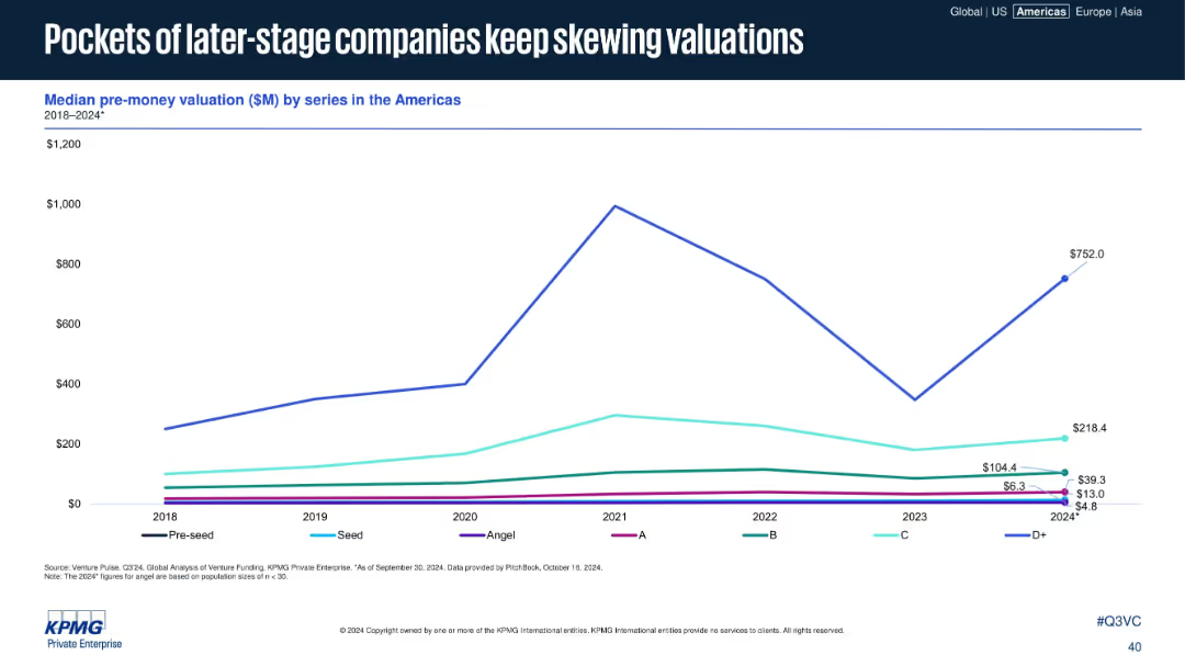
Line graph of median pre-money valuations by funding series from 2018–2024.
Investment Analysis
Financial Services
The slide depicts the median pre-money valuations across various VC funding stages, with later-stage D+ companies significantly impacting valuation trends. Despite lower early-stage valuations, a few high-value deals skew overall metrics.
valuations, pre-money, D+ rounds, VC, skewed metrics, startup funding, stage comparison, Americas
Single Chart
KPMG
Saved
Column chart with a radar chart overlay showing indicators like income per client, income per employee, and cost-to-income ratio. Indicators are displayed for 2018, 2021, and 2023.
Financial Performance
Financial Services
Highlights the significant growth in income and profitability for European retail banks in 2023 compared to previous years.
income, profitability, retail banking, Europe, radar
Single Chart
Kearney
Saved
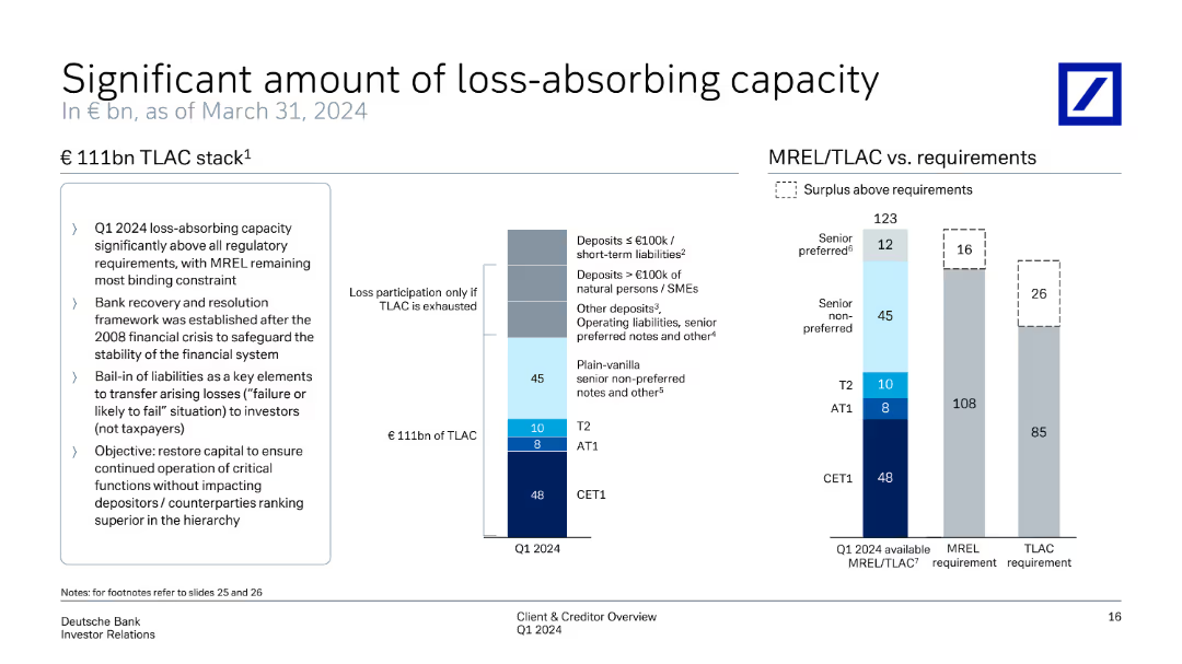
Features a column chart representing €111bn TLAC stack. It explains different tiers and their contributions. On the right, another chart compares MREL/TLAC requirements vs available capacity, highlighting surplus above requirements.
Risk Assessment and Management
Financial Services
Provides a comprehensive view of loss-absorbing capacity, showing how TLAC meets regulatory requirements and safeguards financial stability. It details the distribution of capital across different tiers and surplus management to ensure robust loss absorption.
TLAC, MREL, loss-absorbing capacity, regulatory requirements, financial stability
Multiple Chart
Deutsche Bank
Saved
The slide presents a bar chart listing key criteria for selecting third-party DCRs, such as confidentiality, privacy by design, availability of enrichment partners, etc.
Technology and Digital Transformation
Technology & Software
The slide identifies the primary reasons why users select data clean rooms (DCRs), focusing on privacy protection, data control, and interoperability as critical factors.
DCR selection, privacy, data control, interoperability
Mixed Chart
IPSOS
Saved
The slide displays a column chart showing agreement levels on trust in the internet across various countries.
Customer and Market Segmentation
Telecommunications
The slide shows the decline in internet trust over time, with a detailed breakdown by country.
trust, internet, agreement levels, countries, decline, 2020 findings, Ipsos
Single Chart
IPSOS
Saved
Advanced complexity with graphical data representations and text analysis.
Financial Performance
Financial Services
Offers projections of inflation and GDP growth, comparing Southeast Asia with other markets, thus aiding in understanding regional economic trends and making informed decisions.
economic projections, GDP, inflation, Southeast Asia, growth
Multiple Chart
Bain
Saved
The slide is text-heavy, highlighting key financial and business achievements with bullet points, such as 'History of Strong Operating Performance & Investment Grade Credit Metrics'. It has a blue and white color scheme with bold headings for each section.
Financial Performance
Financial Services
This slide provides an overview of the company's creditworthiness, showcasing diverse revenue streams, strong management, and robust financial metrics. Aimed at investors or stakeholders for evaluating the company's operational success and strategic direction.
creditworthiness, revenue, EBITDA, management, growth
Table
Goldman Sachs
Saved
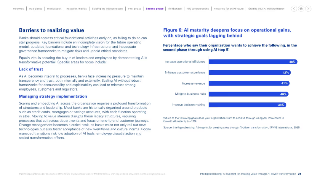
Left-aligned paragraphs describe challenges. Right side has a bar chart listing top AI goals. Balanced layout with headers in blue and clean structure.
Risk Assessment and Management
Financial Services
This slide discusses key obstacles banks face in AI scaling, such as lack of trust and difficulty managing strategic change. It emphasizes transparency, leadership alignment, and breaking down legacy silos. A chart shows the main goals during AI maturity, with a continued focus on efficiency, experience, and revenue.
AI barriers, strategy, trust, legacy systems, maturity, change management
Mixed Chart
KPMG
Saved
The slide contains a mixture of pie chart and statistical data presentations. The layout is moderately dense with a clear division between graphical and textual information. Colored icons are used to represent different market segments.
Financial Performance
Financial Services
This slide presents financial data and market engagement statistics, such as net profit contribution, years in markets, and client relationships. It is meant to showcase the company’s financial standing and breadth in the commodities and global markets.
Finance, Global Markets, Commodities, Client Relationships, Profit
Mixed Chart
Goldman Sachs
Saved
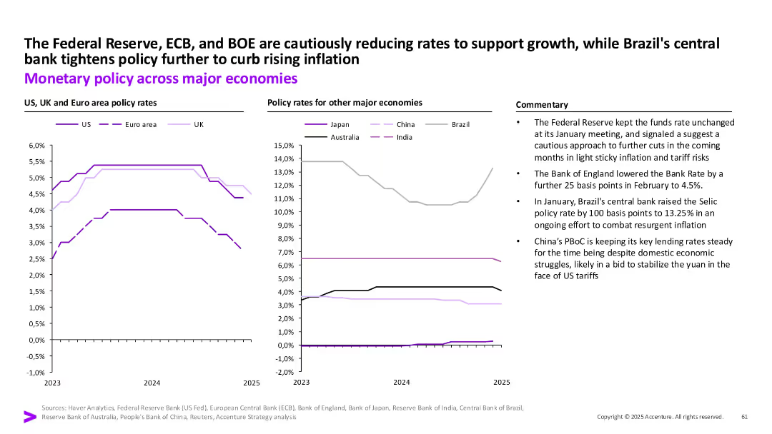
Two comparative line charts by region on policy rates with textual commentary.
Strategic Planning
Financial Services
The slide contrasts monetary policy decisions across major economies in response to inflation and growth concerns. The Fed, ECB, and BOE show rate reductions, while Brazil tightens and China remains steady.
Interest rates, inflation, central banks, Fed, ECB, BOE, Brazil, China, monetary policy
Multiple Chart
Accenture
Saved
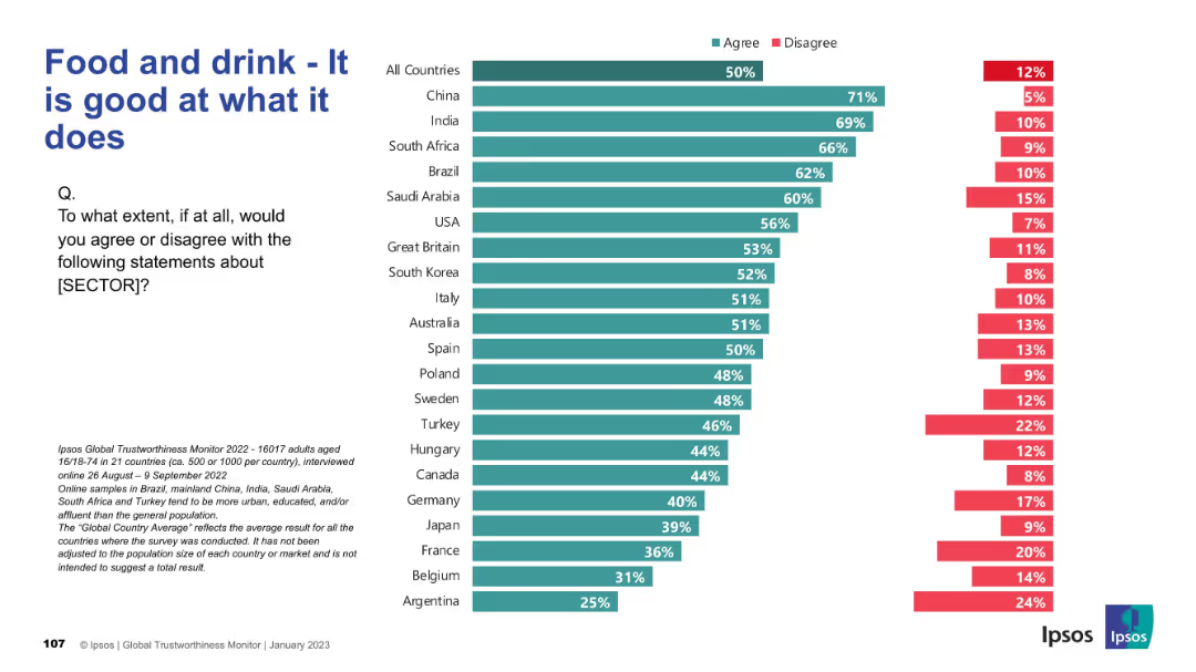
Similar bar chart design but covering the food and drink sector. Rankings by country on competence perception.
Product and Service Analysis
Consumer Goods
Surveys consumer confidence in the competence of the food and drink sector. China, India, and Brazil show high agreement that this sector performs well. Trust in product quality is central to the insights provided.
food industry, competence, trust, consumer perception, Ipsos, services
Mixed Chart
IPSOS
Saved
Circular diagram showing the product lifecycle stages (Pre-Launch, At Launch, In Market) and associated services Ipsos offers, with text descriptions of each stage.
Strategic Planning
Professional Services
Outlines the different stages of a product lifecycle and the various services Ipsos provides to support clients at each stage. Emphasizes strategic planning and service integration.
Product Lifecycle, Strategic Planning, Services, Ipsos
Diagram
IPSOS
Saved
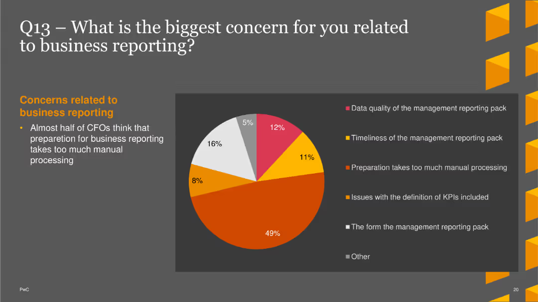
A pie chart showing the percentage of resources that could be saved by improving closing procedures. Segments represent different levels of potential savings
Operational Efficiency
Financial Services
This slide explores CFO opinions on the potential resource savings from more effective closing procedures, with different percentages of potential savings.
operational efficiency, resource savings, closing procedures, CFO opinions, effectiveness
Single Chart
PwC/Strategy&
Saved
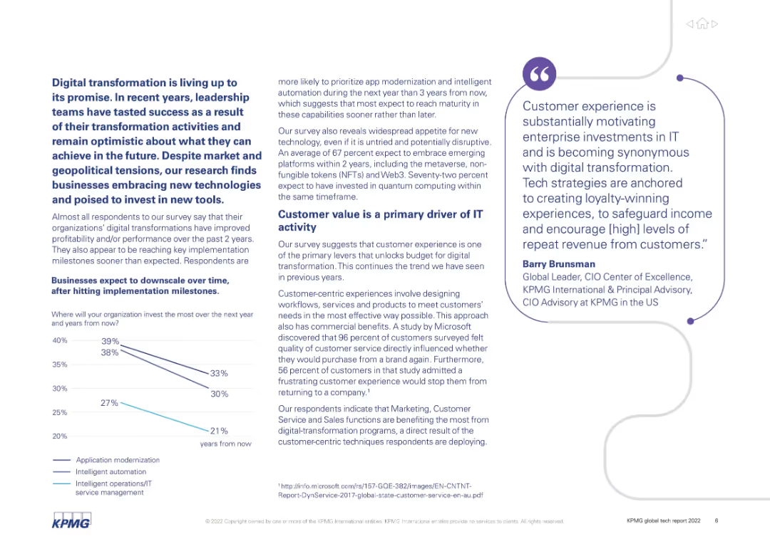
Text-heavy layout with supporting line chart. Focuses on business sentiment, priorities, and outcomes from digital transformation.
Technology and Digital Transformation
Technology & Software
Emphasizes the positive outcomes of digital transformation initiatives across organizations. Key findings include faster ROI, downscaling after milestones, and growing interest in emerging tech like AI, NFTs, and Web3. Highlights customer value as a major driver.
digital transformation, ROI, customer value, AI, Web3, automation, survey
Mixed Chart
KPMG
Saved
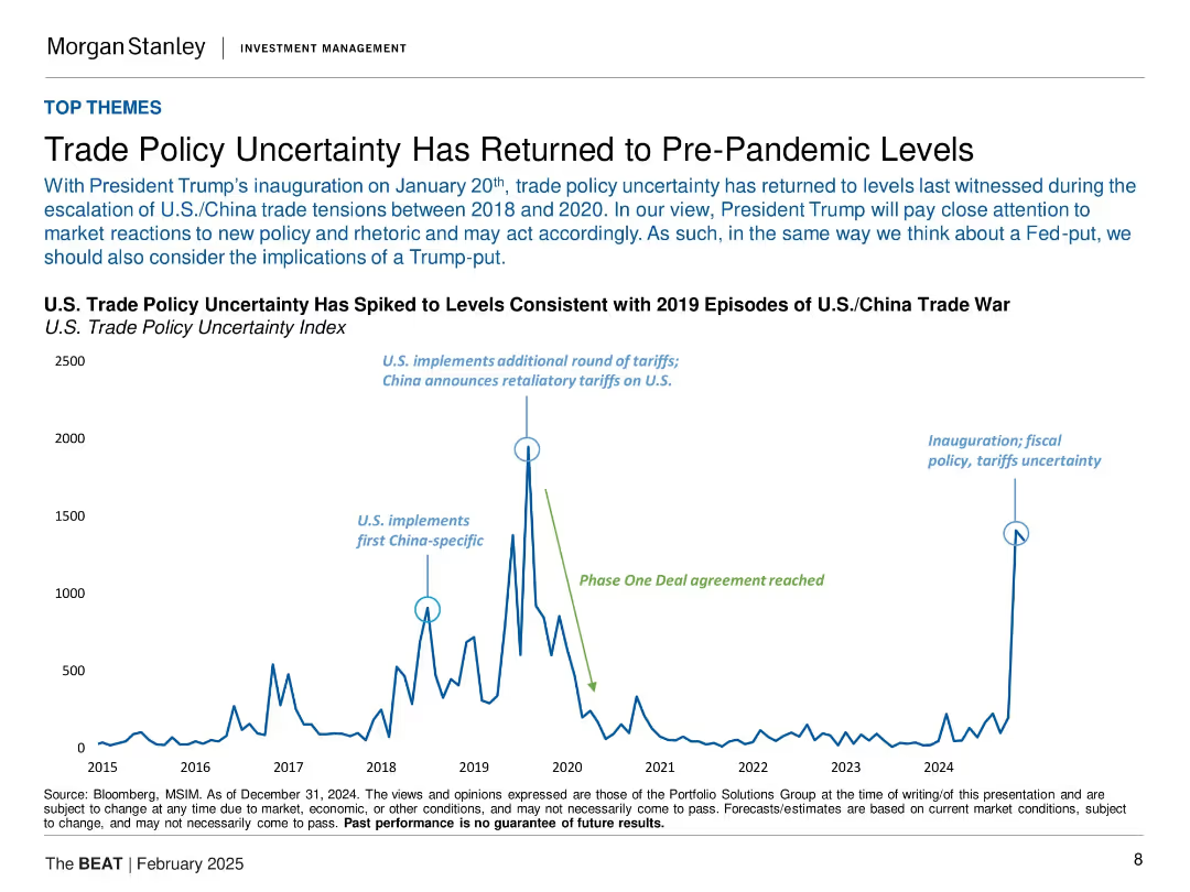
Time-series line chart (2015–2024) showing spikes in U.S. trade policy uncertainty with annotated historical events.
Risk Assessment and Management
Government & Public Sector
This slide discusses the sharp rise in U.S. trade policy uncertainty back to levels seen during the 2018–2020 U.S./China trade war. It attributes this to the inauguration of President Trump and renewed tariff-related concerns. The slide includes key events like tariff announcements and agreements, indicating a re-escalation in policy risks for investors and global markets.
trade policy, tariffs, Trump, uncertainty, U.S.-China, inauguration, risk, market volatility, economic policy
Single Chart
Morgan Stanley
Saved
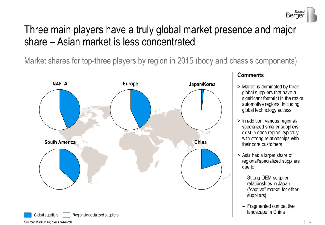
World map background with five pie charts over key regions showing global vs. regional supplier share in 2015. Comment section on the right.
Competitive Landscape
Industrial & Manufacturing
The slide reveals supplier concentration in major regions. Global suppliers dominate NAFTA and Europe, while Asia is fragmented with strong regional supplier presence due to OEM partnerships.
suppliers, global presence, regional market, fragmentation, OEM relationships, Asia
Mixed Chart
Roland Berger
Saved
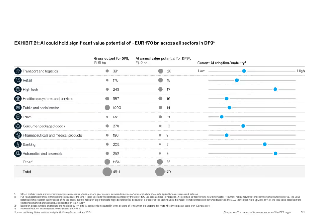
Tabular format with columns and dot-bar visualization for maturity; icons for each sector
Product and Service Analysis
Artificial Intelligence
Shows AI’s value potential across sectors in DF9, totaling EUR 170 bn annually. Sectors like transport, retail, and high tech are detailed with gross output and AI value potential. Also includes a visual representation of current AI adoption maturity for each sector.
Sector value, AI adoption, DF9, AI maturity, EUR 170 bn, industry impact
Multiple Chart
McKinsey
Saved
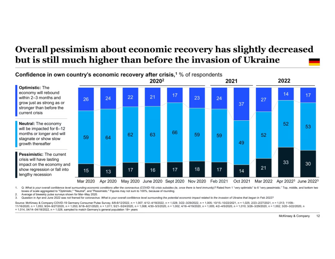
Vertical stacked bar chart timeline (Mar 2020–Jun 2022); bars segmented into "Optimistic," "Neutral," and "Pessimistic" confidence levels. German flag icon in top-right corner. Title at top, legend left side, data sourced from McKinsey surveys at bottom.
Market Analysis and Trends
Financial Services
This slide shows how German consumer sentiment on economic recovery has evolved since March 2020. While optimism slightly increased in June 2022, pessimism remains significantly higher than pre-Ukraine invasion levels. The chart illustrates the fluctuating recovery confidence over time.
economic recovery, consumer sentiment, Germany, optimism, pessimism, Ukraine invasion, timeline, confidence levels, McKinsey, survey results
Single Chart
McKinsey
Saved
Previous
Next
If nothing, comes up, please save your slides first
Create a FREE account to continue browsing
Receive Instant Access to 1,000+ slides from companies like McKinsey, Google, and Goldman Sachs
First Name
Last Name
Email
Password
I agree to all
Terms & Privacy Policy
Thank you! Your submission has been received!
Oops! Something went wrong while submitting the form.
Have an account?
Sign in
Column Chart
Heatmap
Chevron
Org Chart
Infographic
Callouts
Timeline
List
Graphic
Picture
Process Flow
Diagram
Paragraph
Map
Table
Framework
Subtitle
Takeaway Box
Icon
Other Chart
Radar Chart
Waterfall Chart
Mekko Chart
Pie Chart
Scatter Plot
Line Chart
Bar chart
Bullet points