Create a FREE Account
Instant access to 1,000+ real slides from top companies like McKinsey, BCG, Goldman Sachs, Google and many more!
First Name
Last Name
Email
Password
I agree to all
Terms & Privacy Policy
Thank you! Your submission has been received!
Oops! Something went wrong while submitting the form.
Have an account?
Sign in
Library
Templates
Courses
Pricing
My Account
My Slides
My Templates
✦ AI
AI Prompt Library
AI Search
Sign in
Start Here
Logout
My Saved Slides
Two-panel line charts: Left shows business confidence indicators; Right shows PMI capital expenditure outlook across India, US, Euro area, UK, Japan.
Strategic Planning
Professional Services
The slide compares business sentiment and capex expectations globally. India and the US show stronger optimism, while Europe and Japan remain more subdued. It uses PMI and business confidence indicators to illustrate diverging economic outlooks.
business confidence, capex, India, US, Euro area, PMI, optimism, sentiment
Multiple Chart
Accenture
Saved
Contains two line charts showing historical IPO and FO activity with accompanying pie charts for top locations in 2021. Text blocks provide summary insights.
Financial Performance
Financial Services
It provides an overview of global IPO and FO activities over recent years, highlighting top regions and growth trends for 2021.
Global IPO, FO Activity, Historical Trends, Top Locations, 2021 Overview
Multiple Chart
PwC/Strategy&
Saved
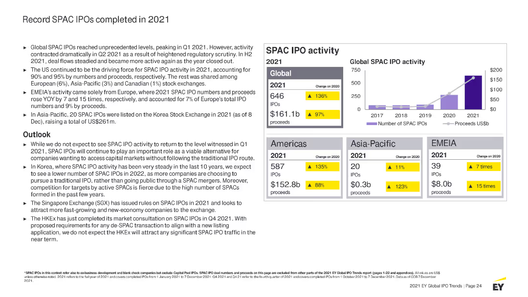
Combines column charts and tables to show the number and proceeds of IPOs across EMEIA regions, with a focus on cross-border activity.
Market Analysis and Trends
Financial Services
The slide presents an overview of IPO performance in EMEIA, detailing cross-border activity and performance metrics.
EMEIA, IPOs, cross-border, performance, metrics
Multiple Chart
EY
Saved
Bar charts and side-by-side comparisons of value volume (EUR m) for CV components in 2016 vs. 2022
Strategic Planning
Industrial & Manufacturing
This slide emphasizes the growing value of CV components in Europe and globally from 2016 to 2022. Braking systems lead in absolute growth, followed by ADAS and powertrain. The right panel shows the difference in value growth per component. Total growth reaches €2.2 billion globally.
braking systems, ADAS, powertrain, steering, value growth, CV systems, 2022
Multiple Chart
Roland Berger
Saved
Multi-line chart with a similar format to slide 17241, tracking P/B ratios for Chase, US Bank, BofA, and Wells Fargo from 2019–2023.
Financial Performance
Financial Services
This slide presents the P/B ratio trends for four major diversified financial institutions—Chase, US Bank, BofA, and Wells. It highlights relative performance, with Chase leading in P/B ratio most of the time.
diversified issuers, Chase, Wells Fargo, BofA, P/B ratio, financial valuation, banking sector, equity, performance metrics
Single Chart
McKinsey
Saved
The slide has a table with three columns comparing potential partnerships: Backwards integration, Long-term supply contracts & partnerships, and Green partnerships.
Strategic Planning
Industrial & Manufacturing
The slide outlines strategies for securing high-quality stock and mitigating commodity pressure through different types of partnerships.
supply chain, commodity pressure, partnerships, high-quality stock, strategies
Mixed Chart
McKinsey
Saved
The slide features pie charts and bar graphs detailing firms' reliance on foreign exchange, improvements in accessibility, and sources of forex.
Risk Assessment and Management
Financial Services
The slide discusses the challenges local firms face in accessing foreign exchange, sources of forex, and the impact on business operations.
foreign exchange, accessibility, forex challenges, local firms, operations
Multiple Chart
EY
Saved
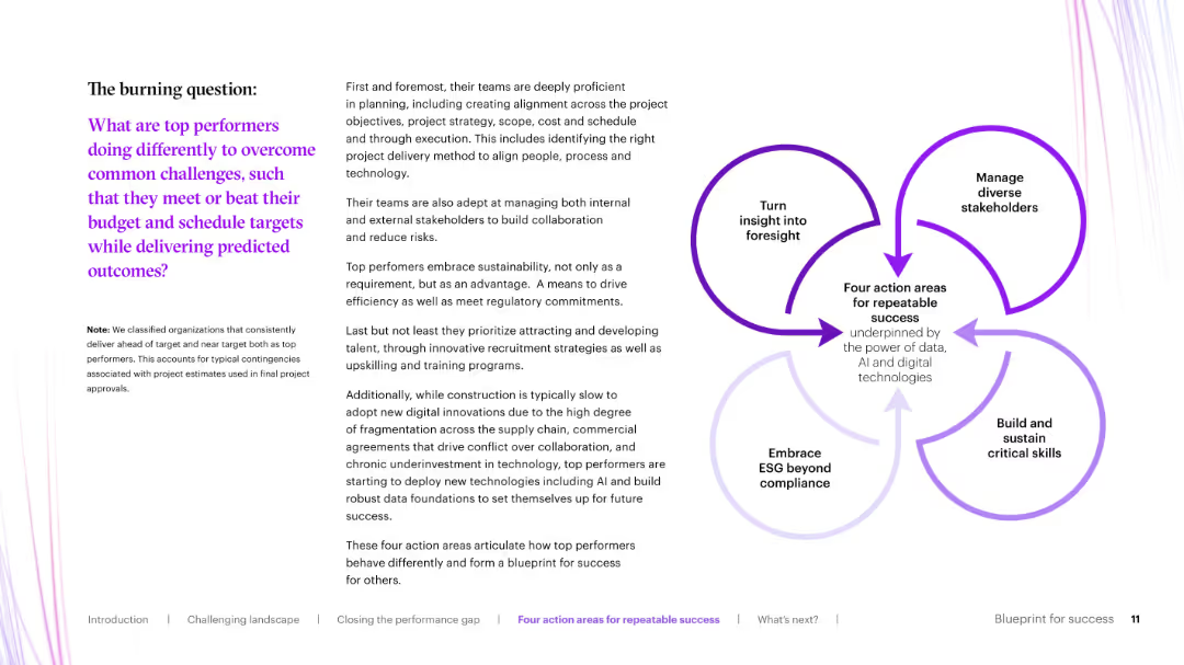
Diagram slide showing a circular process for increasing tech and digital efficiency and ROI, with sections for enabling business growth, reducing risk, and disentangling technology.
Strategic Planning
Technology & Software
The slide emphasizes the importance of tech and digital capabilities in building business resilience, with a focus on efficiency, risk reduction, and enabling growth.
tech, digital, resilience, business growth, efficiency
Boxed
BCG
Saved
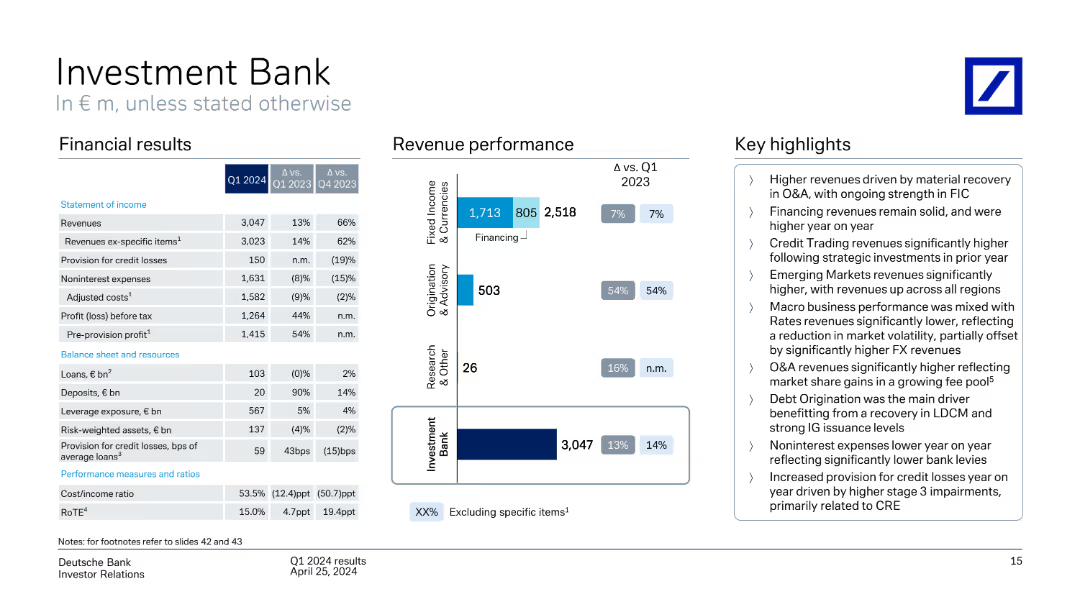
Multiple donut charts showing CRE stress testing exposure by region and sector; text box outlines risk mitigation and portfolio quality.
Risk Assessment and Management
Financial Services
Covers Deutsche Bank’s €37bn non-recourse CRE portfolio, with €30bn in stress testing. Portfolio is diversified by region and sector, with most risk in US office segment. Stress testing identifies refinancing risk, and Q3 2024 CRE CLPs total €409m, largely driven by US office exposure.
CRE, non-recourse, stress testing, US office, CLPs, risk, Deutsche Bank, Q3 2024
Mixed Chart
Deutsche Bank
Saved
The slide uses a comparative layout to show the shift in global political, economic, and trade trends, with bar charts indicating the percentage of CEOs supporting different viewpoints.
Market Analysis and Trends
Financial Services
It outlines the increasing fragmentation in global trends, with a significant majority of CEOs perceiving the world as moving towards multiple, fragmented ecosystems rather than singular, seamless ones.
global trends, fragmentation, political, economic, trade, CEO viewpoints, PwC, CEO Survey, comparative slide, 2018
Mixed Chart
PwC/Strategy&
Saved
This slide contains two bar charts. The left chart illustrates the U.S. distressed loan volume outstanding in USD billions, while the right chart shows business bankruptcy filings by year from 2008 to 1Q24 in thousands.
Risk Assessment and Management
Financial Services
The slide highlights the volume of distressed loans and the trend in business bankruptcies over time, providing insights into financial distress and economic conditions.
distressed loans, bankruptcy, financial distress, loan volume, economic conditions
Multiple Chart
JP Morgan
Saved
Line chart with male and female lines across four generations
Risk Assessment and Management
Government & Public Sector
This slide shows generational perceptions of transgender discrimination. Female respondents increasingly perceive high levels of discrimination from Baby Boomers to Gen Z. Male perceptions remain largely stable, with a slight increase among Gen Z.
transgender, discrimination, perception, gender difference, generation gap, Ipsos
Mixed Chart
IPSOS
Saved
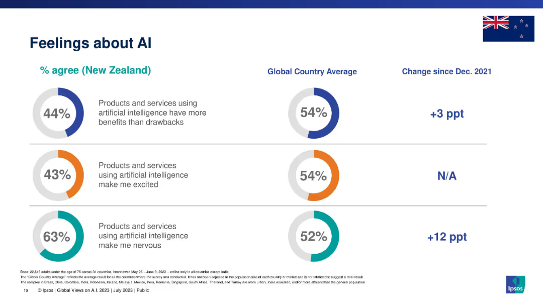
Vertical bars representing belief that AI-using companies will protect personal data, by country/demographic.
Risk Assessment and Management
Artificial Intelligence
Highlights global trust levels in data protection by AI-using companies, comparing demographic and national responses. Overall global trust is at 50%, with wide variation.
data privacy, AI, consumer trust, cybersecurity, global sentiment, Ipsos
Multiple Chart
IPSOS
Saved
This slide presents a series of heatmaps showing 1-Month, 1-Year, and 3-Year returns for Large Cap, Mid Cap, and Small Cap stocks, categorized by Value, Core, and Growth. The heatmaps use color gradients to represent the performance data.
Financial Performance
Financial Services
The slide analyzes the market performance of different stock categories over various time frames, using heatmaps to visualize returns for large, mid, and small caps.
Market performance, returns, large cap, mid cap, small cap, heatmaps
Table
Morgan Stanley
Saved
Data table showing digital influence across various demographics, including age, gender, income, and city-tier.
Customer and Market Segmentation
Media & Entertainment
This slide challenges industry beliefs by showing significant digital influence among diverse demographics in India, including over-35s and small-town residents.
digital, influence, demographics, India, segmentation
Table
BCG
Saved
Line chart tracking public sentiment over time; two lines (good vs. bad); minimal text; annotated endpoints.
Market Analysis and Trends
Financial Services
The slide shows a long-term trend of public perception regarding national economic situations globally. Since 2020, sentiment has been increasingly negative, with a persistent majority rating conditions as "bad."
economy, perception, Ipsos, long-term trend, financial sentiment, economic health, global view, timeline, data tracking, public outlook
Multiple Chart
IPSOS
Saved
Purple dominant color, timeline, and puzzle pieces graphics representing different stages of Samsung's growth.
Market Analysis and Trends
Technology & Software
The slide traces Samsung's evolution and strategic moves that have cemented its position in the semiconductor supply chain. It provides a comparative market cap analysis from 2011 to January 2021. This can be used to illustrate a case study on market growth, strategy development, and supply chain fortification in the tech industry.
Samsung, Semiconductor, Market Growth, Strategy, Supply Chain, Technology, Evolution, Market Cap, Comparative Analysis, Case Study
Diagram
Accenture
Saved
Stacked bar chart showing global averages of how likely people believe five economic events will occur in 2025, including prices, taxes, inflation, etc.
Strategic Planning
Financial Services
A global snapshot of predicted economic conditions for 2025, including anticipated changes in prices, taxes, inflation, unemployment, and interest rates. Most expectations trend toward worsening conditions.
economy, global trends, inflation, taxes, unemployment, strategic forecast, Ipsos, 2025
Mixed Chart
IPSOS
Saved
A line graph depicts the digital adoption curve over time, contrasting metropolitan areas with tier 2 and 3 cities, alongside descriptive texts.
Strategic Planning
Technology & Software
The slide predicts the digital adoption trends in Indonesia, with tier 2 and 3 cities catching up to the digital habits of tier 1 cities within the next five years.
digital adoption, trend analysis, metropolitan areas, tier cities, Indonesia, technology use
Mixed Chart
Kearney
Saved
Left-aligned label; right side is a line graph tracking agreement with 3 key statements from 2015 to 2024.
Market Analysis and Trends
Government & Public Sector
This historical line chart visualizes the trend over time for global public agreement with statements about moral leadership, international cooperation, and domestic focus. It helps track shifts in global attitudes on foreign policy engagement.
trend analysis, global opinion, foreign policy, public sentiment, international cooperation, Ipsos data, time series, engagement
Mixed Chart
IPSOS
Saved
Simple gauge chart showing a split between traditional and online training with a marker for blended.
Human Resources and Talent Management
Education & Training
Compares the balance of traditional versus online training methodologies, emphasizing a blended approach.
training, traditional, online, blended, comparison
Single Chart
PwC/Strategy&
Saved
Line chart with US, Mexico, and Canada employment trends split by pre/post-recession CAGR.
Performance Metrics and KPIs
Industrial & Manufacturing
Analyzes auto employment trends from 1995–2014, attributing US job losses primarily to automation, while Mexico experienced growth due to labor-intensive manufacturing.
automotive jobs, automation, recession, US decline, Mexico growth
Mixed Chart
Roland Berger
Saved
Featuring pie charts and a vertical column chart, this slide visualizes the CRE portfolio by region and sector, and investment exposures by type. The design is straightforward, using different colors for various categories.
Investment Analysis
Real Estate & Construction
This slide details the distribution and risk management of a commercial real estate portfolio, emphasizing geographic diversity and sponsorship strength. It's particularly useful for discussions on sector-specific investments and risk assessments in real estate markets.
CRE, investment, real estate, risk management
Multiple Chart
Deutsche Bank
Saved
Stacked bar chart from 2012 to 2030 showing split between semitrailers and drawbar trailers.
Product and Service Analysis
Industrial & Manufacturing
The slide reveals a growing dominance of semitrailers over drawbar trailers in Europe. While total production grows slightly, semitrailers make up the majority. Drawbar trailer share declines, especially post-2020, with CAGR diverging by segment.
semitrailer, drawbar, trailer production, Europe, forecast, vehicle segment
Single Chart
Roland Berger
Saved
Matrix chart showing the dynamics of occupations due to automation, with job losses and gains across various sectors like transport, healthcare, and construction.
Market Analysis and Trends
Technology & Software
This slide analyzes the structural changes in the labor market due to automation, robotics, and AI. It presents a matrix of job dynamics, highlighting which sectors are likely to experience job losses or gains, and emphasizes the transformative impact of technology on employment.
Labor Market, Automation, Robotics, Job Dynamics
Table
Roland Berger
Saved
Previous
Next
If nothing, comes up, please save your slides first
Create a FREE account to continue browsing
Receive Instant Access to 1,000+ slides from companies like McKinsey, Google, and Goldman Sachs
First Name
Last Name
Email
Password
I agree to all
Terms & Privacy Policy
Thank you! Your submission has been received!
Oops! Something went wrong while submitting the form.
Have an account?
Sign in
Column Chart
Heatmap
Chevron
Org Chart
Infographic
Callouts
Timeline
List
Graphic
Picture
Process Flow
Diagram
Paragraph
Map
Table
Framework
Subtitle
Takeaway Box
Icon
Other Chart
Radar Chart
Waterfall Chart
Mekko Chart
Pie Chart
Scatter Plot
Line Chart
Bar chart
Bullet points