Create a FREE Account
Instant access to 1,000+ real slides from top companies like McKinsey, BCG, Goldman Sachs, Google and many more!
First Name
Last Name
Email
Password
I agree to all
Terms & Privacy Policy
Thank you! Your submission has been received!
Oops! Something went wrong while submitting the form.
Have an account?
Sign in
Library
Templates
Courses
Pricing
My Account
My Slides
My Templates
✦ AI
AI Prompt Library
AI Search
Sign in
Start Here
Logout
My Saved Slides
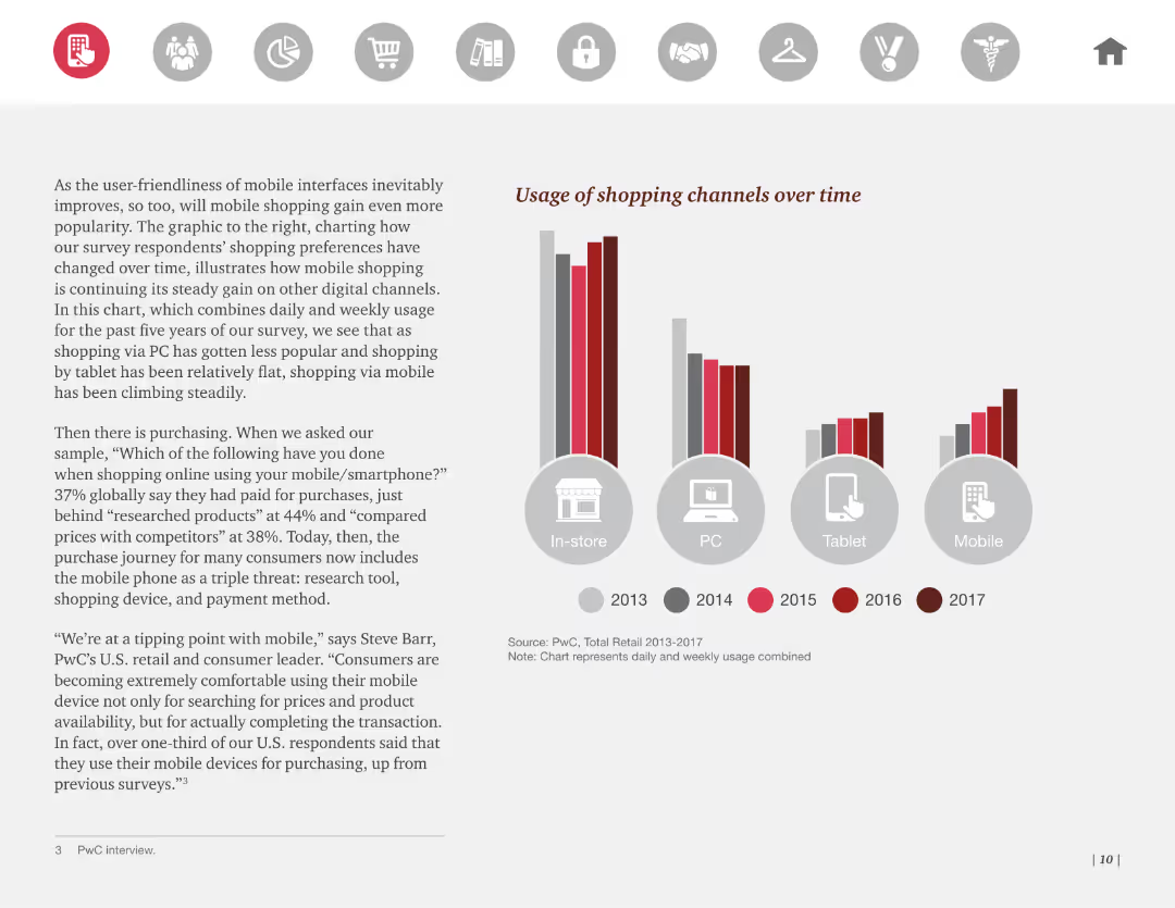
Column chart showing the usage of various shopping channels (in-store, PC, tablet, mobile) over multiple years, highlighting the growth of mobile shopping.
Market Analysis and Trends
Retail & E-commerce
This slide presents the usage of different shopping channels over time, emphasizing the growth in mobile shopping. Useful for tracking changes in consumer shopping behavior.
shopping, channels, usage, trends, mobile
Mixed Chart
PwC/Strategy&
Saved
Contains column charts comparing expected and 2022 EPS growth for various regions and S&P 500 sectors. The bars are color-coded for clarity, with labels clearly indicating the percentages. The layout is organized, allowing for quick visual comparisons.
Investment Analysis
Financial Services
Geared towards investment analysts, this slide provides insights into corporate earnings growth, contrasting expectations with actual growth across regions and sectors. It's key for evaluating company performances and future earning potentials, vital for crafting earnings-based investment strategies.
Earnings Growth, EPS, S&P 500, Regions, Sector Analysis
Multiple Chart
Morgan Stanley
Saved
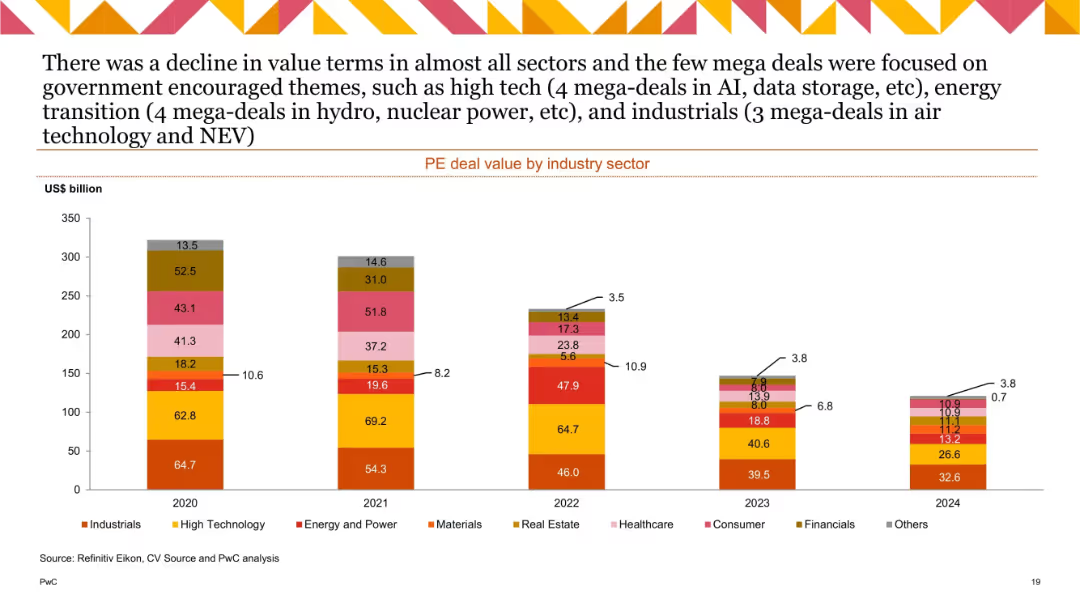
Stacked bar chart with 5 bars (2020–2024), segmented by industry and labeled with US$ billion values.
Financial Performance
Financial Services
This slide depicts the total value of private equity deals by industry from 2020 to 2024. A notable decline in value is observed across all sectors, with some mega-deals in industrials, energy, and high tech standing out due to government support themes such as AI and energy transition.
PE deal value, industry breakdown, mega-deals, AI, energy transition, decline trend, annual data
Single Chart
PwC/Strategy&
Saved
A bar graph comparing gross and EBITDA margins across various distribution companies, titled "Distribution businesses can have very different margin profiles."
Financial Performance
Financial Services
This data-driven slide shows the margin profiles of different distribution companies, highlighting the variability in profitability across the sector.
distribution companies, gross margin, EBITDA, profitability, financial performance, bar graph
Single Chart
EY
Saved
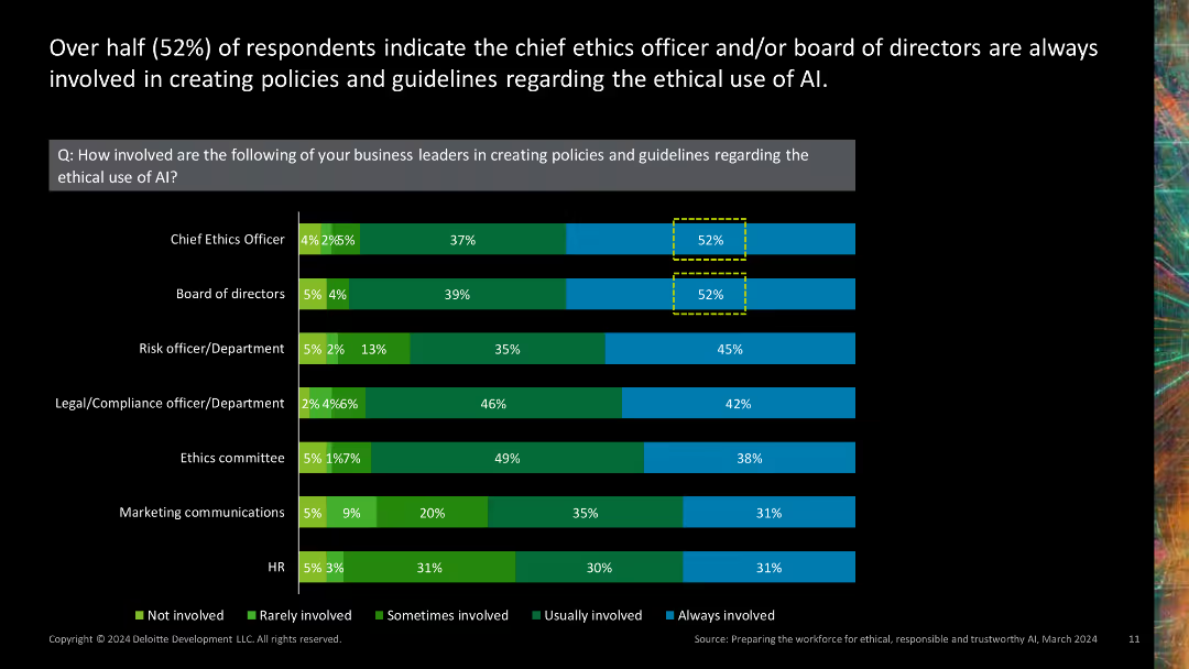
Stacked bar chart showing involvement of various business leaders in creating AI ethics policies.
Regulatory and Compliance
Technology & Software
Highlights the involvement of different business leaders, such as chief ethics officers and boards of directors, in developing AI ethics policies.
AI ethics policies, business leaders, chief ethics officer, board of directors, policy development
Single Chart
Deloitte
Saved
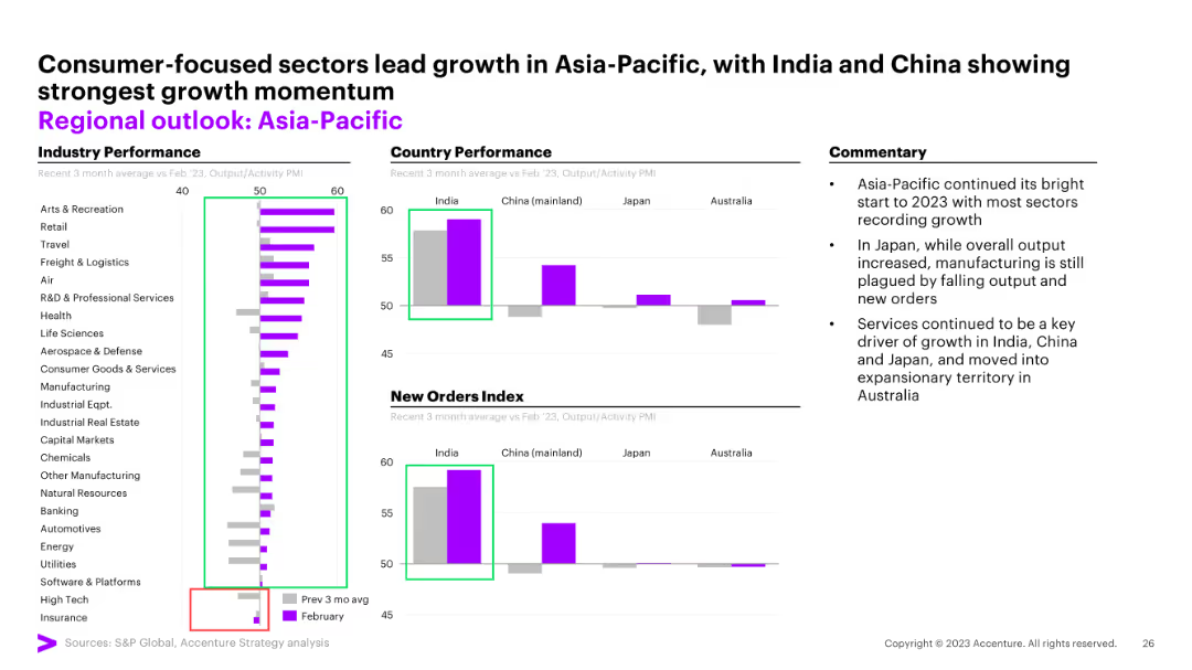
Column charts for industry performance, country performance, and new orders index
Market Analysis and Trends
Financial Services
The slide analyzes the performance of the Asia-Pacific region, highlighting consumer-focused sectors and growth momentum.
Asia-Pacific, regional outlook, industry performance, growth momentum, new orders
Multiple Chart
Accenture
Saved
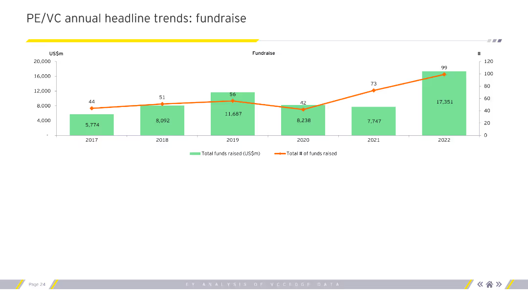
The slide features a column chart with a line graph overlay. The green columns represent the total funds raised (US$m), and the orange line represents the total number of funds raised.
Market Analysis and Trends
Financial Services
This slide shows the annual fundraising trends in private equity and venture capital from 2017 to 2022, indicating growth in total funds raised and number of funds over the years.
Fundraising, trends, PE/VC, funds raised, annual
Single Chart
EY
Saved
This slide compares investment trends across early-stage, growth-stage, and late-stage companies, using overlapping area charts for each stage to represent the private funding value from H1 2019 to H1 2022. Text annotations summarize the trend insights for each stage, such as growing early-stage investments and late-stage downturns.
Investment Analysis
Financial Services
An analysis of investment patterns, contrasting early, growth, and late-stage investments over time, with an emphasis on the flourishing early-stage sector and the challenges faced by late-stage investments due to diminished IPO prospects.
investments, early-stage, growth-stage, late-stage, IPO, trends, private funding
Multiple Chart
Bain
Saved
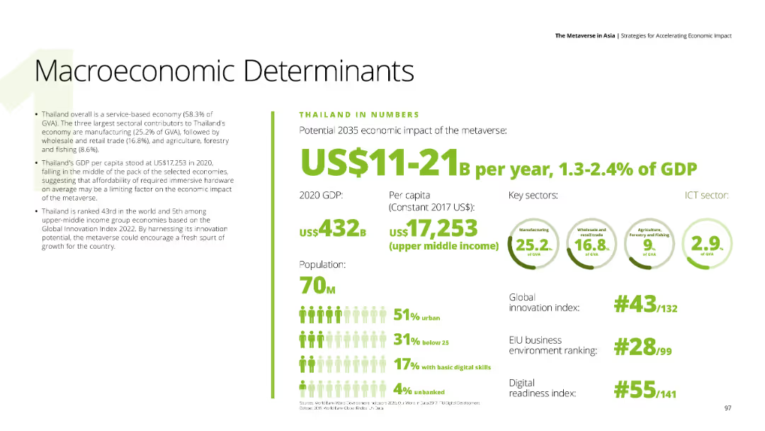
The slide features textual content on the left detailing Thailand's economic strengths and challenges. Key economic indicators are presented on the right, with a focus on potential economic impacts in the metaverse.
Market Analysis and Trends
Financial Services
Covers Thailand's economic indicators, including GDP, population, and sectoral contributions, with potential metaverse impacts estimated at US$11-21 billion annually.
GDP, economic impact, metaverse, Thailand, market analysis
Mixed Chart
Deloitte
Saved
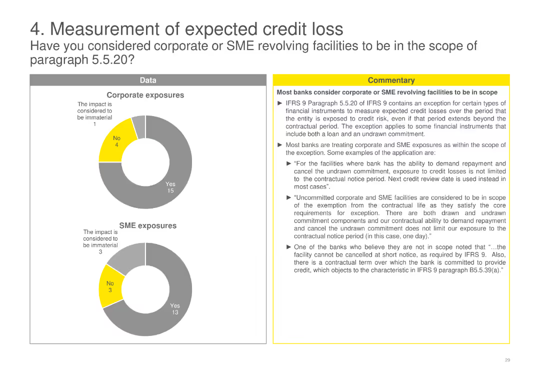
Pie charts depicting the consideration of corporate and SME revolving facilities within the scope of certain regulatory paragraphs, accompanied by detailed commentary.
Financial Performance
Financial Services
Discusses how banks consider corporate and SME revolving facilities within the scope of regulatory requirements, including specific examples and exceptions.
ECL, corporate, SME, revolving, facilities, scope, regulatory, banks, requirements, exceptions
Multiple Chart
EY
Saved
Classic Ipsos format with white-on-blue text left and bar chart right showing perceptions of clergy/priests across 31 countries.
Risk Assessment and Management
Government & Public Sector
This slide presents the trust index for clergy/priests. Indonesia leads in perceived trustworthiness; Argentina and Chile score lowest with high distrust levels.
clergy, religion, public trust, priest, faith, Ipsos, bar chart, 2023
Mixed Chart
IPSOS
Saved
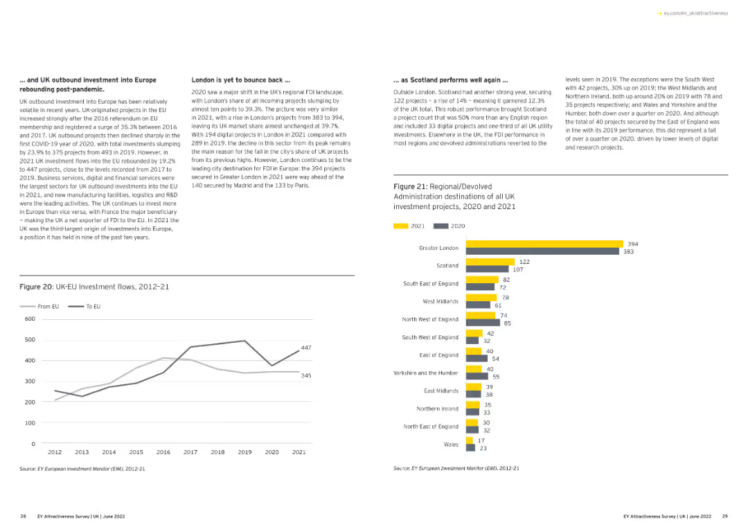
Features a pie chart showing the origin of all investment projects into Europe in 2021, with slices representing different countries' contributions.
Market Analysis and Trends
Financial Services
This slide illustrates the contribution of various countries to investment projects in Europe in 2021, showing the geographical distribution of investments.
investment origin, Europe, 2021, pie chart, countries
Multiple Chart
EY
Saved
The slide includes three distinct sections with icons representing vision, governance, and teamwork. Each section includes bullet points summarizing key activities and strategic approaches in a straightforward layout.
Organizational Structure and Change
Industrial & Manufacturing
Discusses how a transformation team can improve outcomes and enable circular business models by clarifying, aligning, and measuring changes. It highlights the roles of vision, governance, and the transformation team itself.
Vision, Governance, Transformation, Strategy, Teamwork
Table
Accenture
Saved
Presents a column chart and a data box detailing the current and potential increase in cold storage capacity due to solar power adoption, with straightforward layout and color coding.
Strategic Planning
Agriculture & Food Production
Examines how expanding solar-powered cold storage could help achieve FGN's food loss reduction targets by enhancing infrastructure capacity.
solar capacity, infrastructure, food loss, storage capacity, FGN targets
Multiple Chart
BCG
Saved
Donut chart showing percentages of employee access to HRIS, with 55% having access, 24% having limited access, and 21% with no access.
Human Resources and Talent Management
Professional Services
Explores how employees can access their data on HR information systems, showing a majority have some form of access.
HRIS, employee access, data records, donut chart
Single Chart
PwC/Strategy&
Saved
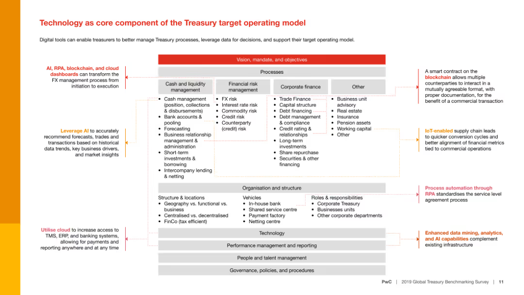
A complex slide with a diagram displaying different processes within the Treasury target operating model. It includes various elements such as arrows and text blocks.
Technology and Digital Transformation
Financial Services
This slide discusses how technology, including AI, RPA, blockchain, and cloud dashboards, can enhance Treasury processes and support decision-making.
Technology, AI, RPA, blockchain, cloud, Treasury
Diagram
PwC/Strategy&
Saved
A split design features two comparison charts. On the left, a dual-line graph shows the trends for 'GEARING' and 'EQUITY RATIO,' crossing at strategic target levels. On the right, a combined line graph presents 'NET DEBT / ADJUSTED EBITDA RATIO' and 'INTEREST COVER RATIO,' converging towards the end of the observed period. Visual interest is added by images of people in various business and learning settings, connecting the financial data to real-world implications.
Strategic Planning
Financial Services
Demonstrates the company’s financial position in terms of gearing and debt ratios, significant for strategic planning and target assessments.
gearing ratio, equity ratio, net debt, EBITDA, interest cover, financial ratios, strategic targets, financial health, company performance
Multiple Chart
Goldman Sachs
Saved
A flow diagram illustrating inefficiencies in linear value chains and potential interventions. Contains icons and labeled stages from product design to end-of-life disposal.
Strategic Planning
Environmental Services & Sustainability
This slide explains the concept of the circular economy by identifying key inefficiencies in traditional linear business models and suggesting strategic interventions to mitigate these inefficiencies, thereby creating business value through sustainability practices.
circular economy, sustainability, business strategy, value chain, inefficiencies
Linear Flow
Accenture
Saved
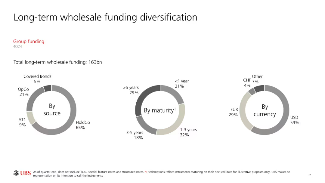
Three donut charts categorizing long-term funding (163bn) by source, maturity, and currency. Minimalist, data-centered layout.
Corporate Finance and Valuation
Financial Services
Visualizes the diversification of UBS’s long-term wholesale funding, identifying concentration by issuer type (e.g., HoldCo, OpCo), maturity horizon, and currency distribution. Highlights dependency on USD and long-term maturities.
wholesale funding, long-term debt, maturity, currency, HoldCo, UBS
Single Chart
UBS
Saved
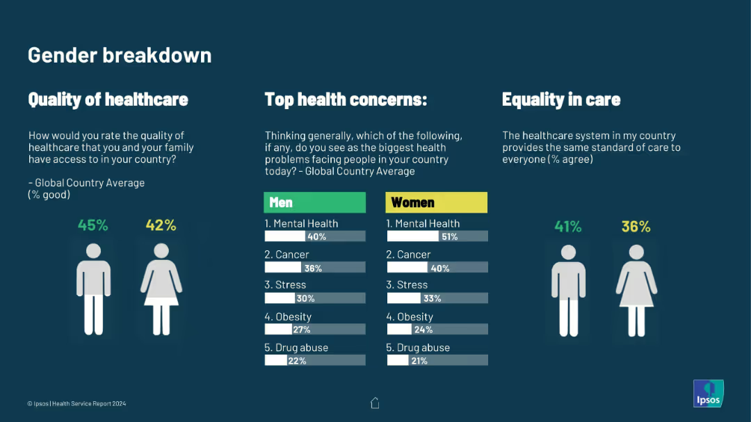
Clean infographic with male/female icons and horizontal bar charts. Covers quality perception, top health concerns, and care equality
Customer and Market Segmentation
Healthcare & Pharmaceuticals
Gender-specific breakdown of healthcare perception and concerns. Women more frequently cite mental health as a top concern; equality in care is also shown to be lower for women.
gender differences, healthcare quality, mental health, health priorities, care equity, Ipsos health data, public perception
Multiple Chart
IPSOS
Saved
This slide features column charts and forecasts showcasing growth in the digital economy, with a focus on e-commerce, online travel, and media. It is color-coded in blue tones and uses arrows for growth trajectory, accompanied by CAGR percentages. The information is clearly structured and presented in a professional layout.
Market Analysis and Trends
Technology & Software
The slide details the substantial growth of the digital economy in 2022 with projections for 2025, emphasizing the burgeoning e-commerce sector. It provides a snapshot of market potential and is likely aimed at investors or stakeholders considering digital economy ventures.
digital economy, e-commerce, online travel, media, CAGR, market growth, 2022 projections, 2025 forecast
Multiple Chart
Bain
Saved
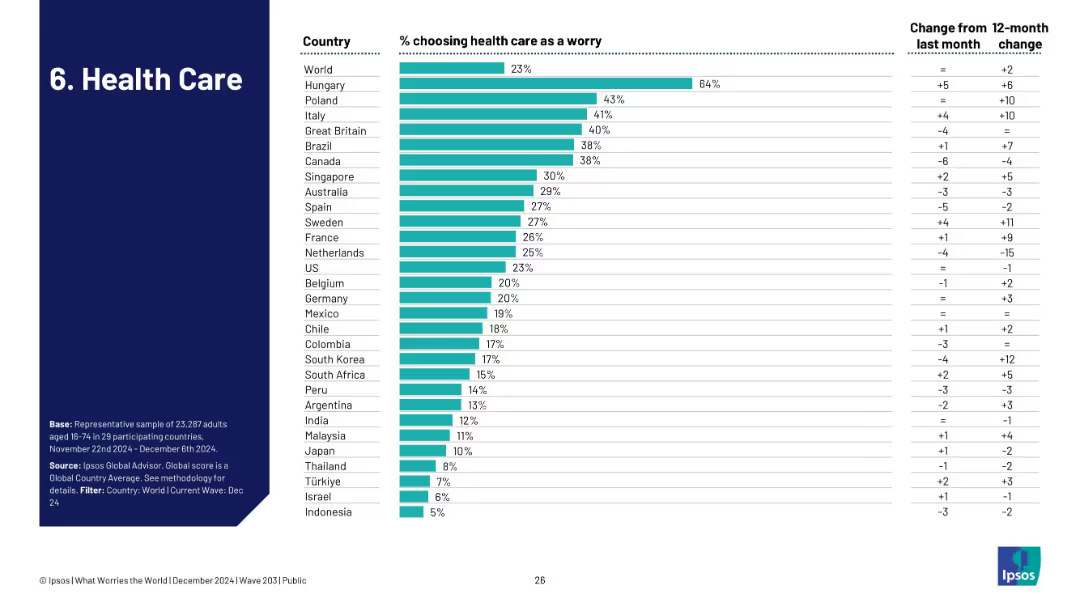
Bar chart showing how many in each country identify health care as a top concern, including trends from the previous month/year.
Risk Assessment and Management
Healthcare & Pharmaceuticals
The slide shows healthcare concerns at 23% globally, led by Hungary (64%). It provides a comparative look at how health systems and concerns differ by region, tracking recent perception changes.
healthcare, system strain, patient care, Ipsos, global health, concern levels
Single Chart
IPSOS
Saved
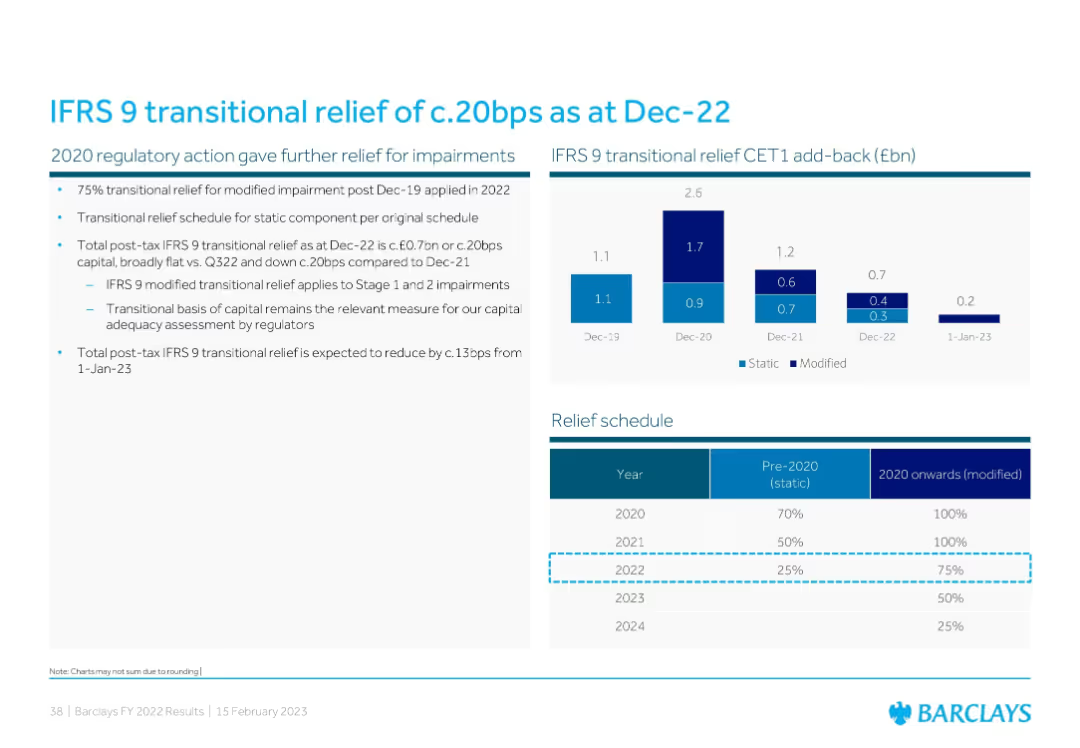
Combination of a bar chart showing IFRS 9 CET1 add-back history and a tabular relief schedule detailing pre-2020/static vs 2020 onward/modified relief percentages.
Regulatory and Compliance
Financial Services
This slide explains IFRS 9 transitional relief and its effect on Barclays’ CET1 capital. It presents CET1 add-back data from 2019–2022 and outlines how transitional relief for impairments will decline over time, affecting future capital adequacy metrics.
IFRS 9, transitional relief, CET1, impairment, regulation
Mixed Chart
Barclays
Saved
This slide includes a column chart comparing port costs in Australia, the US, and France, with bullet points discussing various factors affecting port costs and their implications for supply chains.
Market Analysis and Trends
Transportation & Logistics
It evaluates the direct port costs in Australia compared to the US and France, highlighting factors that influence these costs and the competitive position of Australian ports within the global market.
port costs, Australia, US, France, supply chain, comparison
Mixed Chart
LEK
Saved
The slide features a donut chart showing responses to a question about the relationship between interest rates and bond prices, with breakdowns of correct and incorrect answers. The layout is moderately complex.
Performance Metrics and KPIs
Financial Services
This slide assesses knowledge about the impact of interest rates on bond prices, showing mixed understanding among Canadians. It aims to evaluate public knowledge on financial concepts.
interest rates, bond prices, knowledge, financial, Canadians
Single Chart
IPSOS
Saved
Previous
Next
If nothing, comes up, please save your slides first
Create a FREE account to continue browsing
Receive Instant Access to 1,000+ slides from companies like McKinsey, Google, and Goldman Sachs
First Name
Last Name
Email
Password
I agree to all
Terms & Privacy Policy
Thank you! Your submission has been received!
Oops! Something went wrong while submitting the form.
Have an account?
Sign in
Column Chart
Heatmap
Chevron
Org Chart
Infographic
Callouts
Timeline
List
Graphic
Picture
Process Flow
Diagram
Paragraph
Map
Table
Framework
Subtitle
Takeaway Box
Icon
Other Chart
Radar Chart
Waterfall Chart
Mekko Chart
Pie Chart
Scatter Plot
Line Chart
Bar chart
Bullet points