My Account
My Slides
Search by Category
Companies
Slide Type
Use Case
Industry
Pricing
Templates
View All Templates
Download Template Slides
✦ AI
AI Prompt Library
AI Search
Feedback
Login
Logout
Get Started
Browse all Slides
Browse all Slides
Create a FREE Account
Instant access to 1,000+ real slides from top companies like McKinsey, BCG, Goldman Sachs, Google and many more!
First Name
Last Name
Email
Password
I agree to all
Terms & Privacy Policy
Thank you! Your submission has been received!
Oops! Something went wrong while submitting the form.
Have an account?
Sign in
Saved Slides
Features a complex stacked column chart showing revenue growth over several years, including acquisitions.
Financial Performance
Financial Services
The slide likely aims to illustrate financial growth and strategic acquisitions for stakeholders or analysts.
Organic Growth, Revenue, Acquisitions, Financial, Analysis, CAGR, Trend, Performance
Single Chart
Goldman Sachs
Saved
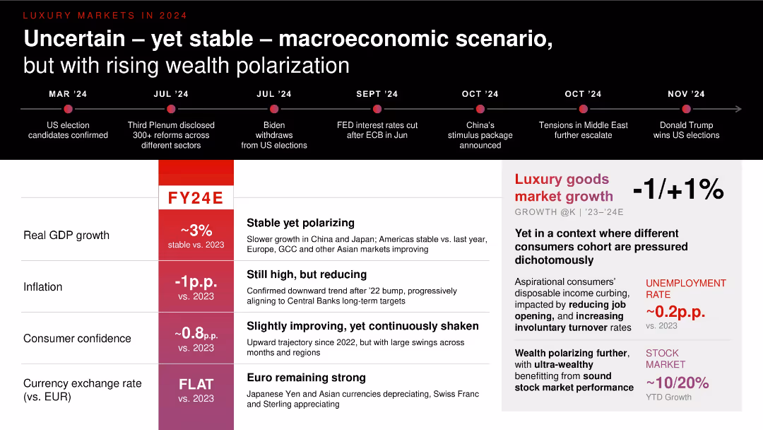
Timeline on top with economic projections for FY24E in red columns. Right panel outlines market growth forecasts; left table presents GDP, inflation, consumer confidence, and FX rates.
Strategic Planning
Consumer Goods
Presents a 2024 macroeconomic forecast relevant to luxury markets. Despite uncertainty (e.g., elections, interest rate changes), GDP remains stable. Inflation is declining, while wealth polarization intensifies. Luxury goods growth remains flat (-1% to +1%) amid varying consumer sentiment and employment trends.
GDP, inflation, macroeconomics, consumer confidence, luxury growth, 2024 forecast
Table
Bain
Saved
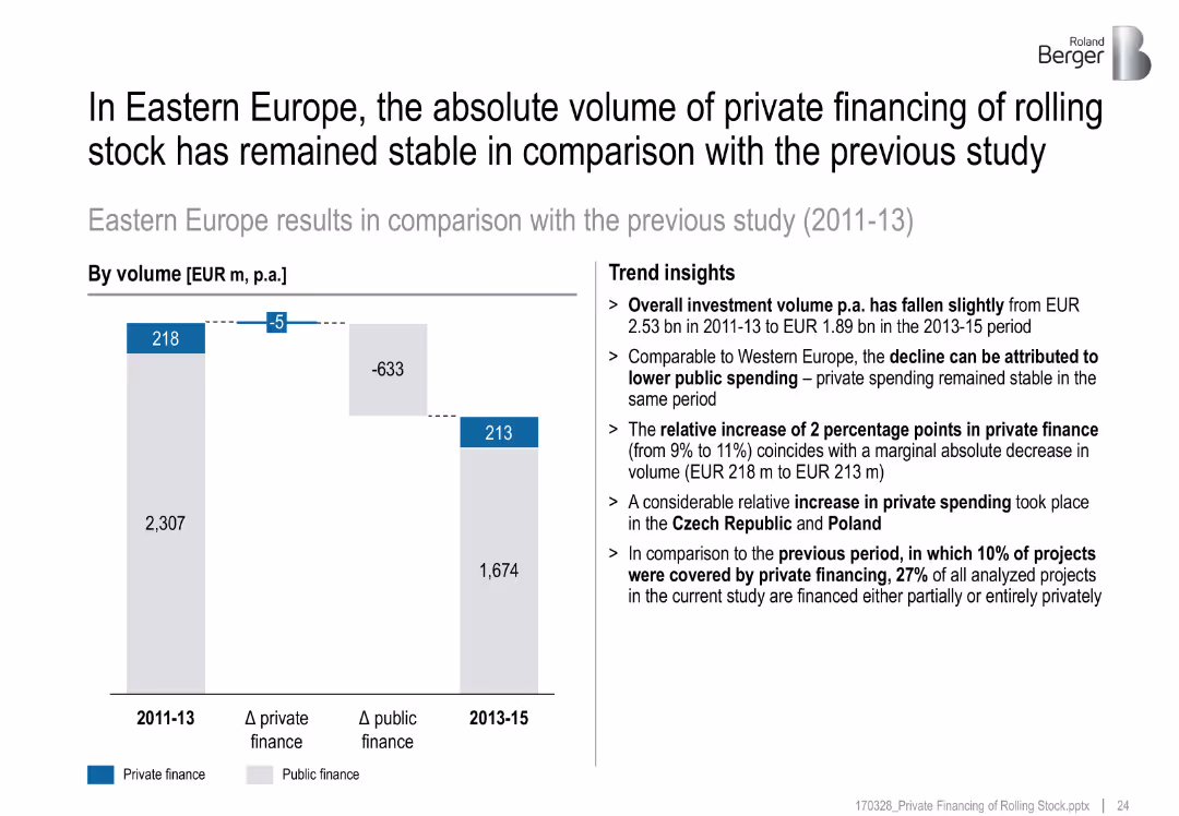
Bar comparison chart, trend insights on right, color-coded bars
Financial Performance
Transportation & Logistics
Private financing in Eastern Europe remained stable (EUR 213M), while public spending dropped. Overall investment volume declined. Czech Republic and Poland contributed to a relative increase in private share.
investment volume, Eastern Europe, stable financing, public vs private, comparison, Czech, Poland
Mixed Chart
Roland Berger
Saved
Includes a line graph and a pie chart showing market share and revenue mix with institutional and corporate clients from 2014 to 2018.
Financial Performance
Financial Services
Analyzes JP Morgan's market share growth with institutional and corporate clients, showing sustained growth and client diversity.
market growth, institutional clients, corporate clients, revenue
Multiple Chart
JP Morgan
Saved
Two pie charts showing asset allocation changes between 2019 and 2020, accompanied by a list of offered solutions.
Risk Assessment and Management
Financial Services
Depicts how asset allocation in UHNW RM book is expected to change due to negative interest rates, with a projected margin uplift of +20bps.
Asset allocation, negative interest rates, UHNW, RM book, solutions
Multiple Chart
Credit Suisse
Saved
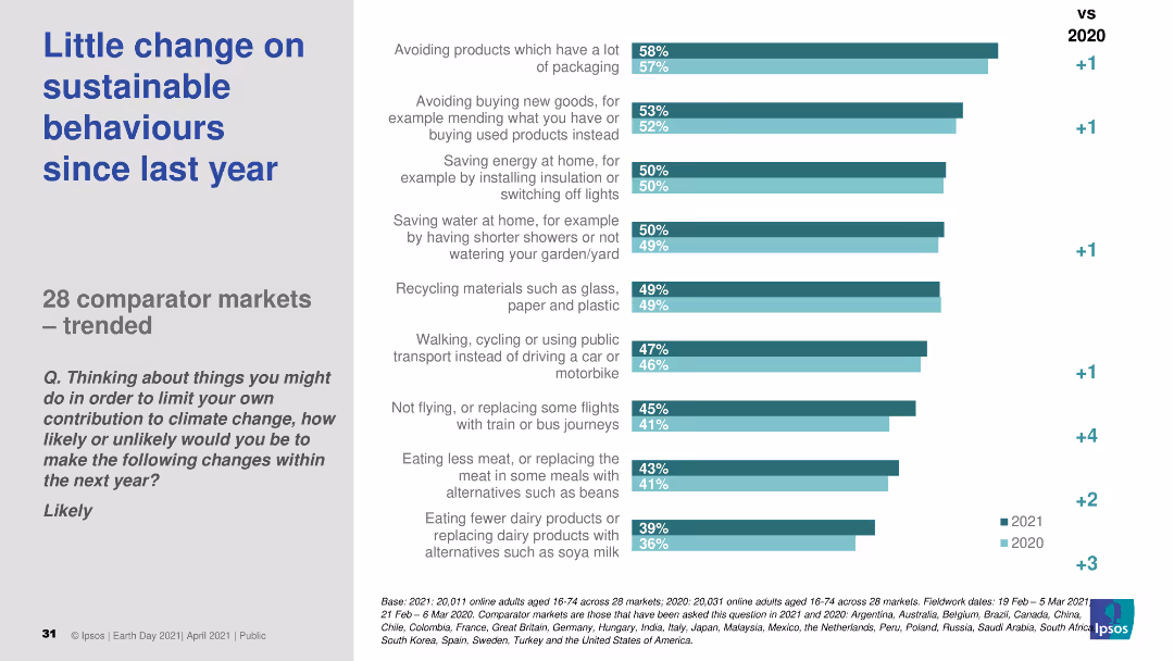
The slide features a column chart comparing sustainable behavior changes across 28 markets from 2020 to 2021. The chart displays percentages for different actions, with a comparison to the previous year.
Market Analysis and Trends
Environmental Services & Sustainability
The slide shows survey results on sustainable behaviors across 28 markets, indicating little change in engagement from 2020 to 2021.
sustainable behaviors, market trends, survey, year comparison, 2021
Single Chart
IPSOS
Saved
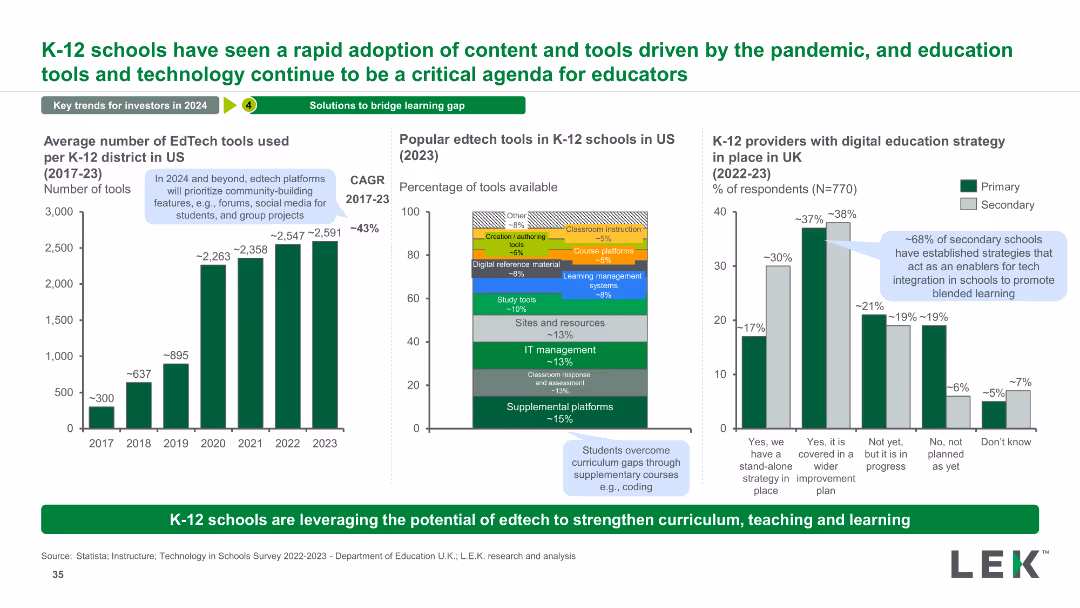
The slide has three charts: a column chart showing the average number of EdTech tools used from 2017 to 2023, a stacked bar chart of popular EdTech tools in 2023, and a column chart of UK schools with digital education strategies.
Technology and Digital Transformation
Education & Training
This slide highlights the rapid adoption of EdTech tools in K-12 schools, showing growth trends, popular tools, and digital strategies in UK schools.
EdTech, Tools, Adoption, K-12, Technology, Trends, Growth, Education, Digital, Strategy
Multiple Chart
LEK
Saved
The slide features multiple bar charts and a bar chart, detailing changes in DE&I spending by company size, sales, and economic sectors. Colors are red and grey.
Market Analysis and Trends
Professional Services
Details DE&I spending trends across various company sizes and sectors, highlighting significant increases in B2C sectors and larger firms.
DE&I, marketing, trends, B2C, spending, company size, retail, communications, real estate, economic sector
Multiple Chart
Deloitte
Saved
Two column charts and one data box illustrate the benefits of solar over diesel-powered cold storage, highlighting cost, electricity, and emission metrics. The visual is direct with clear comparative statistics.
Strategic Planning
Agriculture & Food Production
Highlights the advantages of solar-powered cold storage systems over conventional systems, focusing on lower costs and reduced CO2 emissions. Aims to support FGN's food preservation goals.
solar power, cold storage, CO2 emissions, cost benefits, diesel alternative
Multiple Chart
BCG
Saved
This slide contains multiple column charts across a timeline from 1996 to 2019, separated into phases labeled "Sortie du temple," "Democratization," "Crisis," and others.
Market Analysis and Trends
Consumer Goods
The slide presents a timeline of the luxury goods market growth from 1996 to 2019, highlighting various market phases and projecting growth. It is used to analyze market trends.
Luxury goods, Market growth, Crisis, Projection
Single Chart
Bain
Saved
Includes bar charts and a pie chart detailing the adoption of robotic process automation (RPA) within shared services. The layout integrates text and charts smoothly.
Technology and Digital Transformation
Technology & Software
Examines the adoption rates and anticipated benefits of robotic process automation in shared services, highlighting potential savings and operational impacts. This slide is key for discussions on technological advancements in service delivery.
RPA, shared services, technology adoption, operational efficiency, cost savings
Multiple Chart
Deloitte
Saved
Includes bar graphs and pie charts analyzing the internet coverage and connectivity needs across Indonesian districts, focusing on school connectivity.
Strategic Planning
Telecommunications
Discusses potential strategies for improving internet coverage and network quality in Indonesian schools, essential for enhancing educational outcomes.
internet coverage, network quality, Indonesia, schools, connectivity improvement, educational outcomes
Multiple Chart
BCG
Saved
Timeline representation with key milestones and decisions made by India, Australia, and Spain regarding lockdown measures in response to COVID-19.
Risk Assessment and Management
Government & Public Sector
Outlines the progression of lockdown measures and responses to possible second waves in various countries.
COVID-19, Lockdown Measures, Second Wave, Policy Response
Linear Flow
BCG
Saved
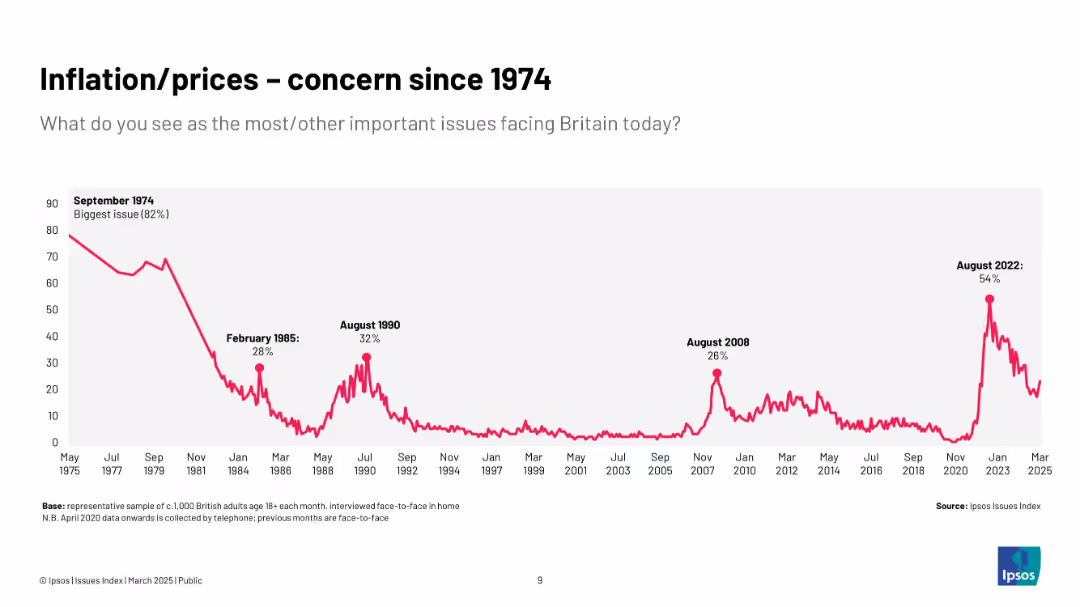
Extended historical chart (1974–2025) with inflation concern peaks in 1974, 1985, 1990, 2008, and 2022; all-time high in 1974.
Market Analysis and Trends
Government & Public Sector
Provides a historical context of inflation as a top public concern, emphasizing long-term trends and cyclical patterns over five decades, showing the recurring nature of inflationary fears.
historical trends, inflation, public opinion, Ipsos, UK, economy, long-term, prices
Single Chart
IPSOS
Saved
The slide features a vertical column chart showing internet advertising revenue from 2018 to 2020, with colors representing each year. Annotations provide percentage growth rates.
Market Analysis and Trends
Media & Entertainment
Analyzes the growth trends in internet advertising revenues over three years, highlighting the sustained double-digit growth despite the pandemic's impact.
advertising, revenue, growth, internet, COVID-19, media, technology, trends
Single Chart
PwC/Strategy&
Saved
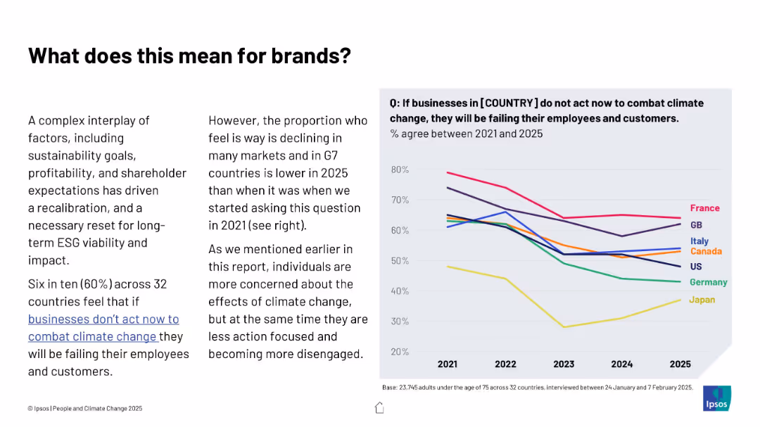
Text and line graph combination; left features contextual explanation, right shows trend lines for multiple countries from 2021 to 2025
Strategic Planning
Professional Services
The slide explores declining belief in corporate responsibility to combat climate change across G7 nations. A downward trend suggests companies may face lower public pressure, despite ongoing environmental challenges.
ESG, brands, climate responsibility, trends, business impact, public opinion, Ipsos, G7, consumer expectations
Mixed Chart
IPSOS
Saved
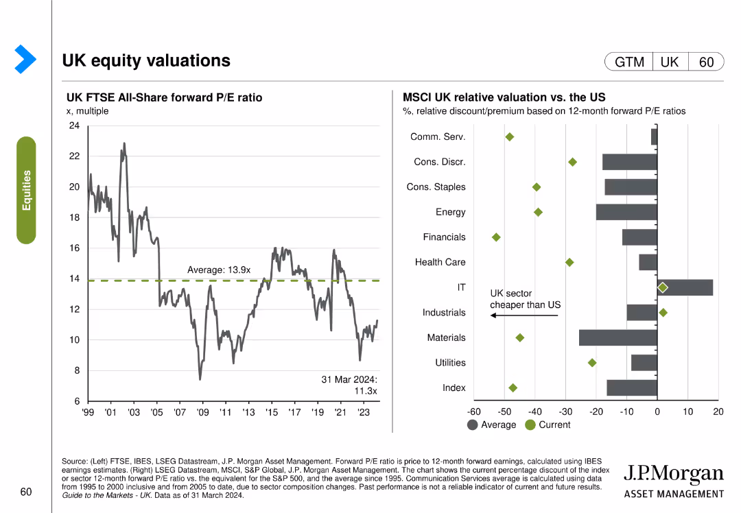
This slide includes two column charts. The first chart shows the UK FTSE All-Share forward P/E ratio over time. The second chart compares MSCI UK relative valuation vs. the US across different sectors.
Investment Analysis
Financial Services
The slide provides an analysis of the UK FTSE All-Share forward P/E ratio and its relative valuation compared to the US, aiding in investment decisions.
UK, equity, valuations, FTSE, MSCI, P/E ratio, US, comparison
Multiple Chart
JP Morgan
Saved
The slide features text and icons representing different client segments and services offered. Sections provide details on corporate and personal banking.
Strategic Planning
Financial Services
This slide describes UBS's balanced mix of personal and corporate banking, highlighting the client base and services offered.
UBS, Banking, Client Segments, Services, Strategic Planning
Multiple Chart
UBS
Saved
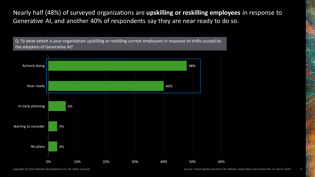
Single column chart showing the extent of organizations upskilling or reskilling employees for AI adoption.
Human Resources and Talent Management
Technology & Software
Displays survey results on the extent to which organizations are preparing their workforce for generative AI by upskilling or reskilling employees.
upskilling, reskilling, AI adoption, workforce preparation, human resources
Single Chart
Deloitte
Saved
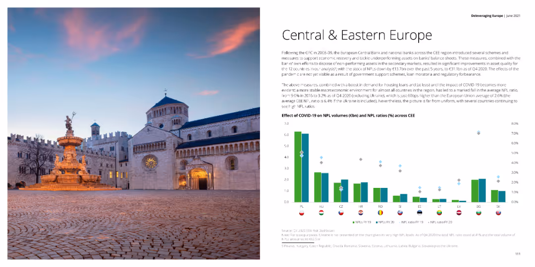
The slide includes a column chart showing the effect of COVID-19 on NPL volumes and ratios across CEE countries, with a text block summarizing the impacts and measures taken by banks. The left side contains an image of a cathedral.
Market Analysis and Trends
Financial Services
The slide analyzes the impact of COVID-19 on NPL volumes and ratios across Central and Eastern Europe, highlighting measures taken by banks and government schemes to support the financial sector.
NPL, COVID-19, financial impact, CEE, measures
Mixed Chart
Deloitte
Saved
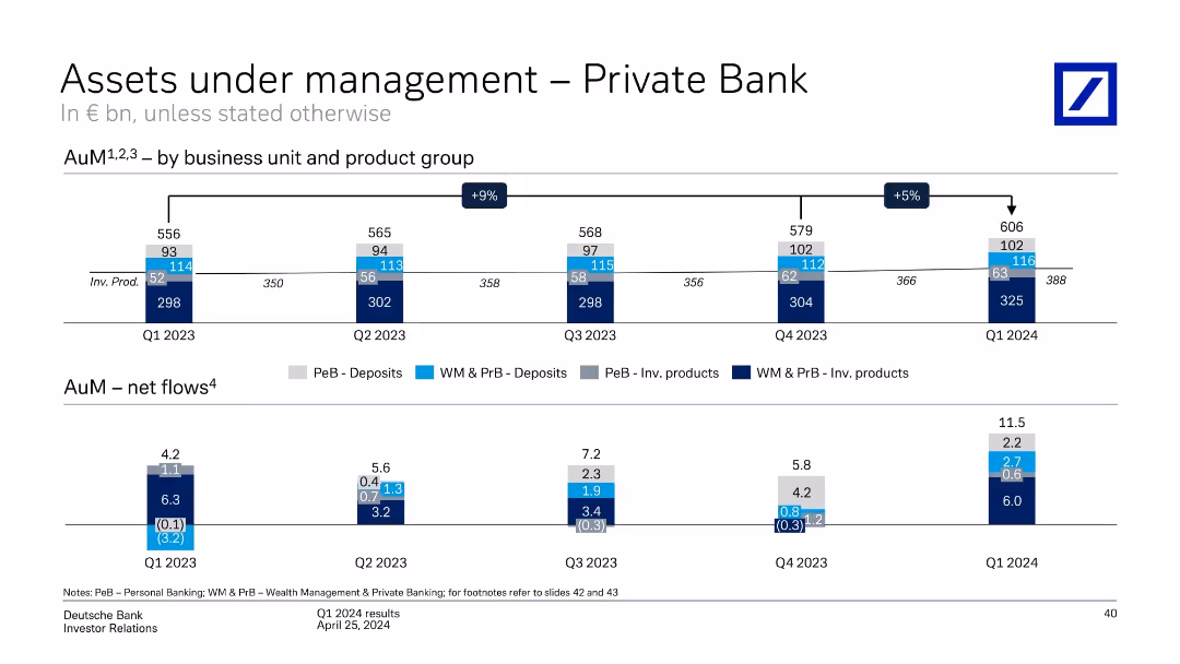
Split into top and bottom sections. Top shows stacked bar chart over time, bottom shows bar charts of net flows by quarter and category.
Financial Performance
Financial Services
The slide tracks AuM evolution across business units and products in Deutsche Bank’s Private Bank from Q1 2023 to Q1 2024. It highlights growth (+5% QoQ), net flows, and diversification across deposits and investment products.
AuM, Private Bank, Net Flows, Deposits, Investment Products, Growth, Q1 2024, KPIs, Revenue
Single Chart
Deutsche Bank
Saved
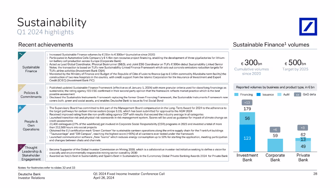
Mixed layout with text, bullet points, and bar charts, highlighting recent achievements and sustainable finance volumes.
Regulatory and Compliance
Environmental Services & Sustainability
Summarizes recent achievements in sustainability initiatives, including policies, commitments, and reported volumes in sustainable finance.
sustainability, finance, achievements, policies, commitments, volumes
Mixed Chart
Deutsche Bank
Saved
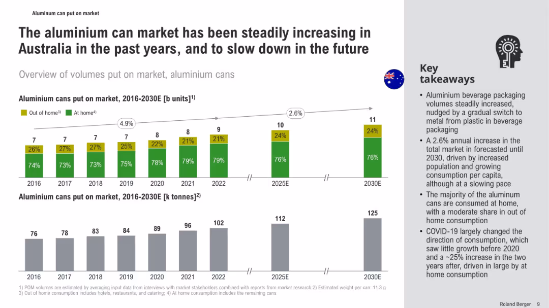
Bar graphs showing units and weight of aluminum cans over time with a takeaway text box on the side. Clean, visual-heavy layout.
Market Analysis and Trends
Consumer Goods
The slide tracks the aluminum can market in Australia from 2016 to 2030E, showing growth and projected stabilization. It highlights consumption trends, including the COVID-19 shift to at-home use, and packaging material shifts.
aluminum cans, market trends, Australia, beverage packaging, consumption, COVID-19, forecast, market growth
Multiple Chart
Roland Berger
Saved
The slide contains a column chart comparing R&D expenses among top companies in crop science. Key points about the company's R&D capabilities and investments are listed.
Financial Performance
Agriculture & Food Production
This slide highlights the company's leadership in R&D investment within the crop science industry, comparing R&D expenses and outlining the company's extensive R&D capabilities and global presence.
R&D Investment, Crop Science, Bayer, Profitability, Global Presence
Mixed Chart
Credit Suisse
Saved
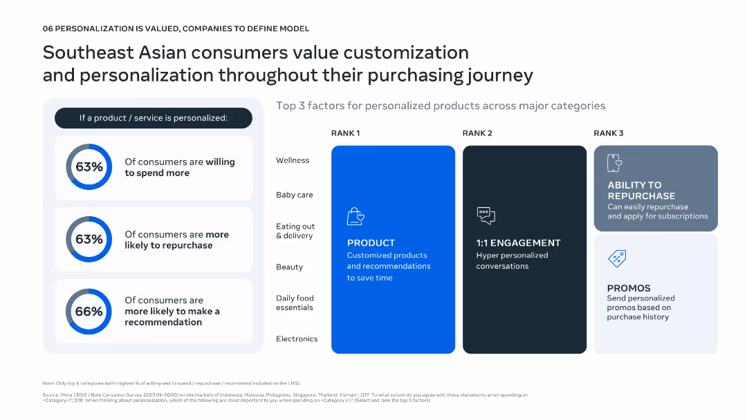
Left: three circular metrics highlight % willing to spend/repurchase/recommend; Right: ranked grid showing top 3 personalization factors per category.
Customer and Market Segmentation
Consumer Goods
Emphasizes the value Southeast Asian consumers place on product personalization. Over 60% are willing to spend more and repurchase when offerings are personalized. Key personalization elements include product customization, 1:1 engagement, and ease of repurchase across categories like wellness, baby care, and electronics.
personalization, repurchase, customer journey, customization, SEA
Mixed Chart
Bain
Saved
Previous
Next
If nothing, comes up, please save your slides first
Create a FREE account to continue browsing
Receive Instant Access to 1,000+ slides from companies like McKinsey, Google, and Goldman Sachs
First Name
Last Name
Email
Password
I agree to all
Terms & Privacy Policy
Thank you! Your submission has been received!
Oops! Something went wrong while submitting the form.
Have an account?
Sign in
Column Chart
Heatmap
Chevron
Org Chart
Infographic
Callouts
Timeline
List
Graphic
Picture
Process Flow
Diagram
Paragraph
Map
Table
Framework
Subtitle
Takeaway Box
Icon
Other Chart
Radar Chart
Waterfall Chart
Mekko Chart
Pie Chart
Scatter Plot
Line Chart
Bar chart
Bullet points