Create a FREE Account
Instant access to 1,000+ real slides from top companies like McKinsey, BCG, Goldman Sachs, Google and many more!
First Name
Last Name
Email
Password
I agree to all
Terms & Privacy Policy
Thank you! Your submission has been received!
Oops! Something went wrong while submitting the form.
Have an account?
Sign in
Library
Templates
Courses
Pricing
My Account
My Slides
My Templates
✦ AI
AI Prompt Library
AI Search
Sign in
Start Here
Logout
My Saved Slides
Contains diagrams and pie chart describing changes in retail strategies for the luxury market from 2019 to 2025F.
Strategic Planning
Retail & E-commerce
Discusses the need for luxury retailers to adapt to new consumer behaviors by rethinking store roles and customer experiences.
retail, luxury, transformation, 2025, strategy
Multiple Chart
Bain
Saved
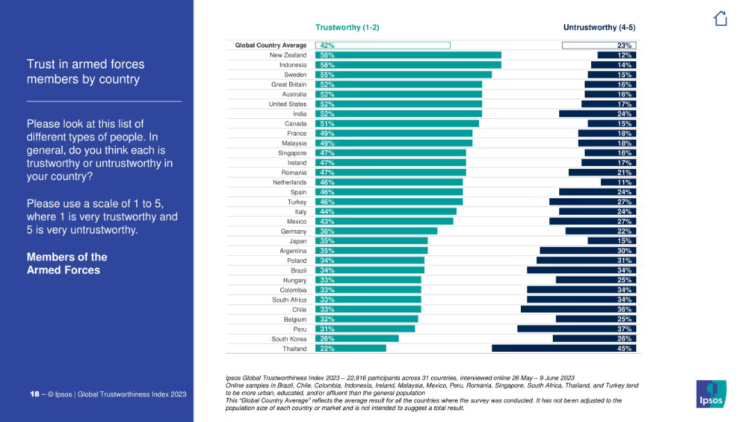
Country ranking bar chart on trust in the armed forces. Global average benchmark is 42%. Darker and lighter bars differentiate trust levels.
Customer and Market Segmentation
Government & Public Sector
This slide presents trust scores for members of the armed forces across various countries. New Zealand and Indonesia score highest; South Korea and Thailand score lowest. It reflects how military perception varies globally.
military trust, armed forces, global opinion, Ipsos, national differences, perception
Mixed Chart
IPSOS
Saved
The slide features a column chart depicting managers' top three talent management priorities. On the left side, there is an image of a group of professionals in a meeting. The chart uses a mix of orange and red shades to represent different priorities.
Human Resources and Talent Management
Financial Services
The slide highlights that retaining talent is the top priority for managers, followed by hiring/recruiting and ensuring an inclusive culture. It shows that talent retention is critical, particularly in EMEA and Asia-Pacific regions.
Talent retention, recruiting, inclusive culture, diversity, hybrid work, employee productivity
Mixed Chart
EY
Saved
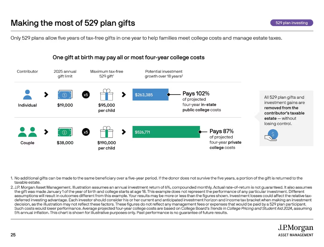
Icon row, side-by-side comparisons of individual vs. couple contributions with gift limits and investment projections.
Investment Analysis
Financial Services
This slide shows how front-loading 529 plan gifts can significantly fund future college expenses while reducing estate taxes. It compares the financial impact of individual vs. couple contributions and demonstrates how a lump sum at birth can cover nearly all four-year public college costs.
estate planning, 529 gifting, college savings, compound growth, tax-free
Mixed Chart
JP Morgan
Saved
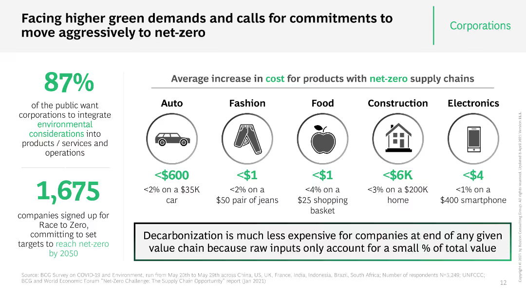
The slide has multiple icons and a comparative table showing the cost increase for various products if they adopt net-zero supply chains. It uses bright colors and bold text to emphasize key statistics and public opinion data.
Market Analysis and Trends
Professional Services
The slide highlights public demand for corporations to adopt environmental considerations and the average cost increase for products with net-zero supply chains. It also shows the percentage of companies committed to reaching net-zero by 2050.
net-zero, cost increase, public demand, corporations, supply chain
Header Vertical
BCG
Saved
The slide includes tables showing the cancellation policies and meal expense limits for various healthcare companies.
Regulatory and Compliance
Healthcare & Pharmaceuticals
Details cancellation policies and meal limits for HCPs, useful for companies managing healthcare events and compliance.
healthcare companies, meal expenses, cancellation policies, compliance, event management
Multiple Chart
Deloitte
Saved
The slide features three sections titled Respondent Access, Survey, and Analysis & Reporting, each with icons and brief descriptions. It uses a three-column layout with hexagonal shapes and company logos.
Technology and Digital Transformation
Technology & Software
The slide details the capabilities and benefits of an end-to-end proprietary platform, highlighting respondent access, survey capabilities, and analysis & reporting functionalities.
Proprietary, platform, survey, analysis, reporting, capabilities, respondent, access, AI, efficiency
Linear Flow
IPSOS
Saved
Contains vertical column charts showing the number of spinouts from Manchester universities, with descriptions of notable spinouts.
Industry Overview
Education & Training
Discusses spinouts from Manchester universities, focusing on their number, active status, and contributions to technology and clinical diagnostics.
Manchester, universities, spinouts, innovation, University of Manchester, Salford University, technology transfer, academic impact, healthcare sector, wastewater treatment
Mixed Chart
Barclays
Saved
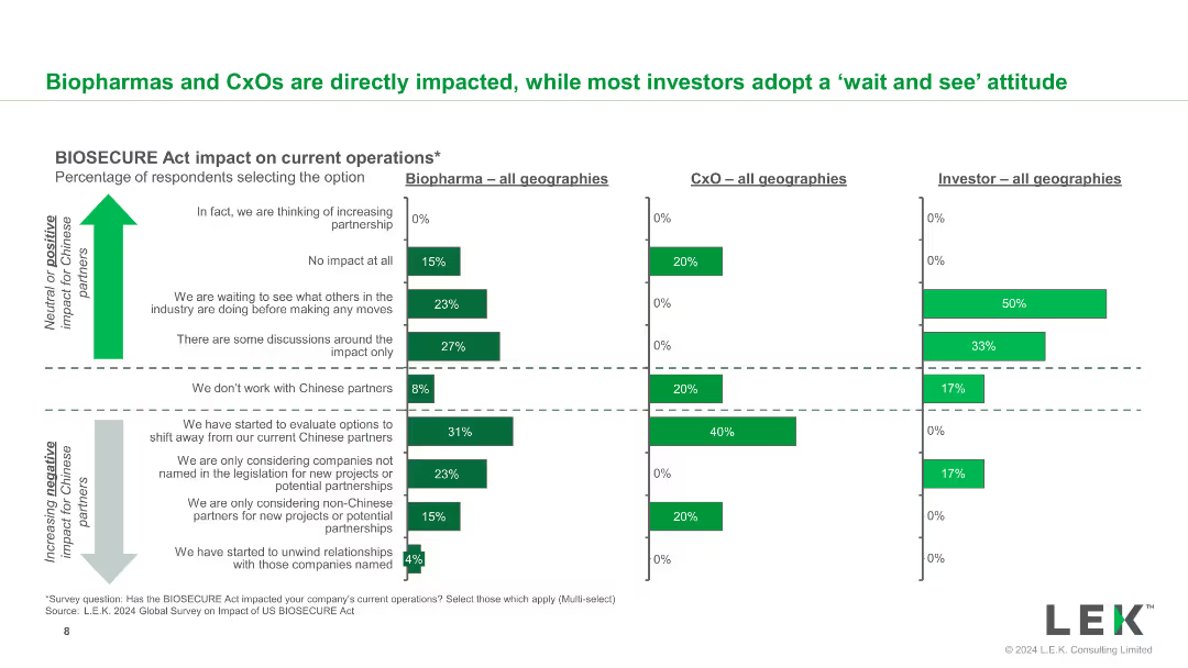
This slide includes a set of bar charts displaying the BIOSECURE Act's impact on current operations for biopharma, CxO, and investors, across all geographies.
Market Analysis and Trends
Healthcare & Pharmaceuticals
It details how the BIOSECURE Act has impacted operations within different segments of the healthcare industry, providing a segmented view of the effects.
BIOSECURE Act, biopharma, CxO, investors, operational impact, segmentation
Multiple Chart
LEK
Saved
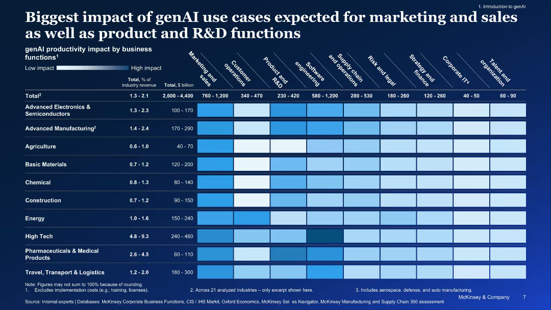
Detailed heatmap matrix showing industry-wise productivity impact across business functions
Performance Metrics and KPIs
Artificial Intelligence
Visualizes productivity impact of genAI across industries and business functions. Greatest impact is projected in marketing, sales, R&D, and software engineering for industries like High Tech and Manufacturing.
genAI, productivity, industry impact, business functions, heatmap, use cases
Single Chart
McKinsey
Saved
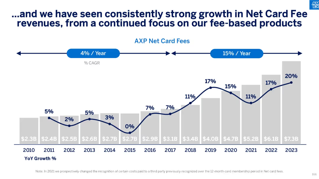
Vertical bar chart with year-over-year growth rates and Net Card Fees in $B from 2010 to 2023; CAGR annotations
Performance Metrics and KPIs
Financial Services
Demonstrates strong historical and recent growth in net card fees, with a notable acceleration to 15% CAGR in recent years. Highlights year-by-year growth percentages and emphasizes the success of fee-based business strategy.
net card fees, CAGR, year-over-year growth, fee products, revenue stream, financial metrics
Single Chart
McKinsey
Saved
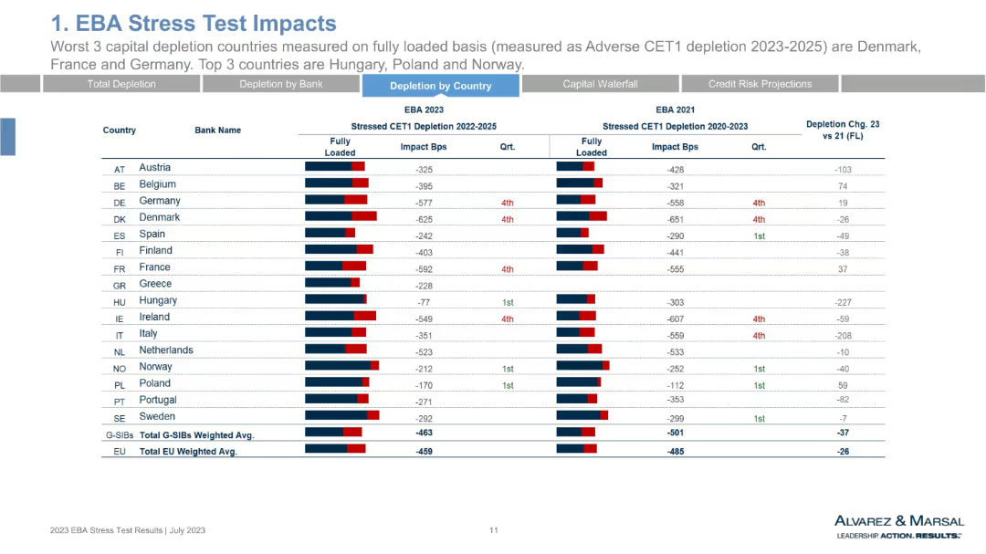
Data table by country rather than bank. Lists average CET1 depletion by nation. Includes 2023 vs. 2021 comparisons and rankings. Uses red/blue bar visuals.
Risk Assessment and Management
Financial Services
This slide aggregates CET1 stress test results at the national level. Denmark, France, and Germany show the worst capital depletion, while Hungary, Poland, and Norway perform best. The visual emphasizes geographical disparities in resilience and risk tolerance among EU member countries.
CET1 by country, stress test 2023, Denmark, Germany, Hungary, national averages, depletion
Single Chart
Alvarez & Marsal
Saved
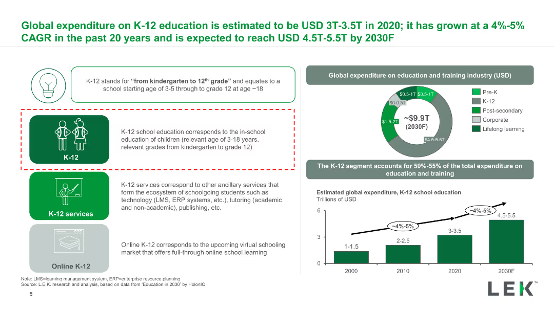
The slide features a column chart, pie chart, and text boxes. It is moderately dense with visual elements and data.
Market Analysis and Trends
Education & Training
Describes the global expenditure on K-12 education, its growth rate, and future projections.
K-12, expenditure, education, CAGR, global, services
Multiple Chart
LEK
Saved
Slide displays a line chart comparing the nominal GDP growth of BRICS, MINT, Next 11, and MIST countries up to 2030. Uses a simple color scheme and clear labels for easy understanding.
Market Analysis and Trends
Financial Services
This slide analyzes the GDP growth trajectories of various country groups, illustrating which might lead in economic growth. Used to highlight investment or development opportunities in these regions.
GDP, economic growth, BRICS, MINT, investment, development
Mixed Chart
Roland Berger
Saved
Includes bar graphs showing the cost of mobile broadband compared to fixed broadband as a percentage of income in Indonesia and other countries.
Strategic Planning
Telecommunications
Analyzes the affordability of mobile versus fixed broadband in Indonesia, discussing how this impacts consumer access to internet services.
broadband costs, affordability, Indonesia, mobile broadband, fixed broadband, internet access
Multiple Chart
BCG
Saved
Light background with green accents, multiple bar charts comparing cyber maturity levels and their impact on business, with explanatory text in columns.
Strategic Planning
Technology & Software
The slide explains how different levels of cyber maturity affect business outcomes, with examples of cyber planning strategies and activities from high-maturity organizations.
Cyber maturity, business impact, planning strategies, survey, bar charts
Mixed Chart
Gartner
Saved
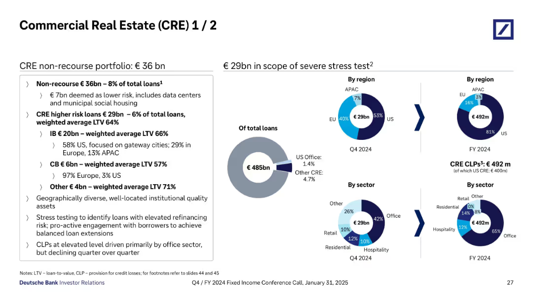
Split into two sections: left text box summarizing CRE portfolio composition; right side includes pie charts by region and sector and loan scope under stress test.
Risk Assessment and Management
Financial Services
Breaks down Deutsche Bank’s €36bn non-recourse CRE portfolio, highlighting €29bn in higher-risk loans and their geographic and sectoral distribution. Provides stress test scope and Credit Loss Provision data, notably focused on US office exposure.
CRE, stress test, LTV, CLPs, office loans, US exposure, EU, APAC, sectors
Mixed Chart
Deutsche Bank
Saved
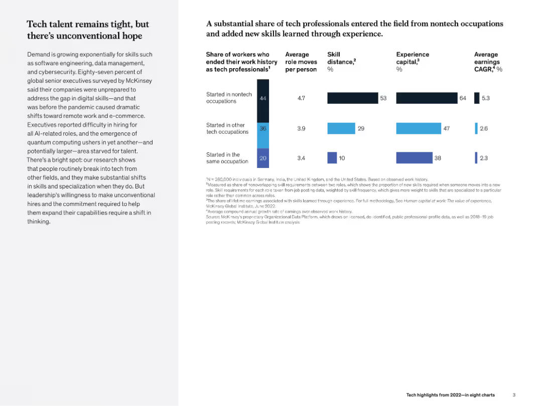
Two-part layout: left column of narrative text; right-side bar charts comparing nontech vs. tech transitions and skill growth metrics.
Human Resources and Talent Management
Technology & Software
This slide discusses how non-tech professionals are entering tech roles and gaining skills on the job. Charts show differences in role changes, skill distance, experience capital, and earnings growth based on occupational origin.
tech talent, nontech to tech, experience capital, skill growth, career mobility, McKinsey, hiring
Multiple Chart
McKinsey
Saved
This slide presents a structured list with the table of contents for the ESG report, detailing different sections such as leadership, business, and approaches to ESG.
Regulatory and Compliance
Professional Services
The table of contents for the 2022 ESG report, outlining key sections and page numbers, functioning as a navigational guide for readers.
Contents, ESG, Sections, Structure, Professional
Agenda
Booz Allen Hamilton
Saved
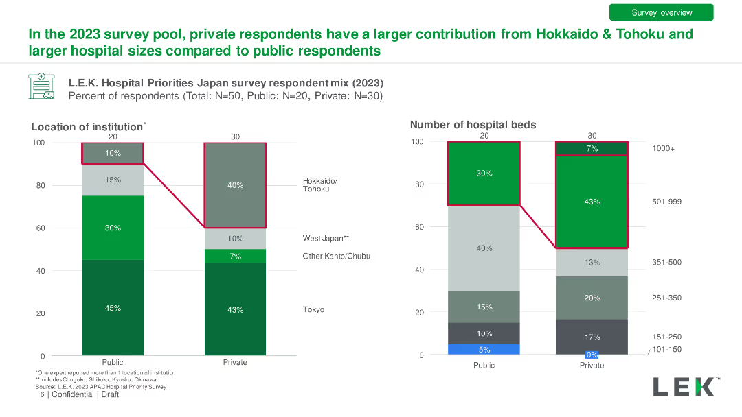
Bar charts comparing private vs. public hospital respondent mix by location and hospital size in 2023. Detailed with percentage differences.
Market Analysis and Trends
Healthcare & Pharmaceuticals
Comparison of survey responses from public and private hospitals, showing differences in regional representation and hospital sizes.
Private Hospitals, Public Hospitals, Respondents, Comparison, Location
Multiple Chart
LEK
Saved
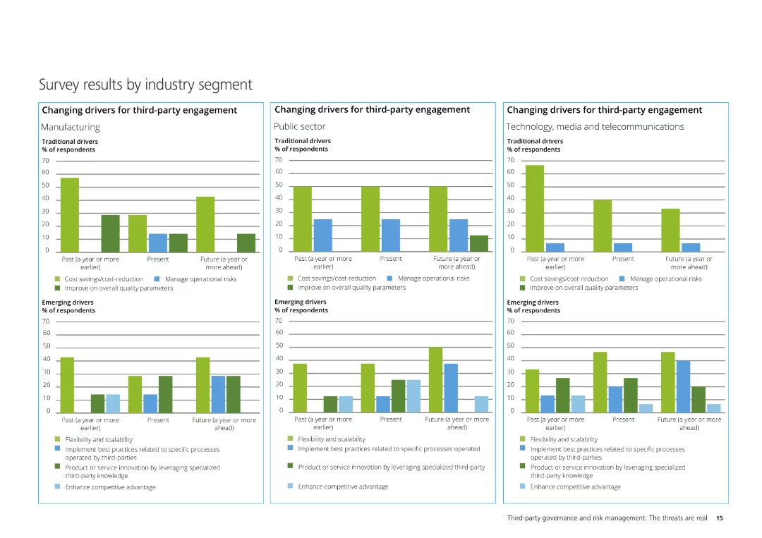
The slide contains three column charts illustrating the changing drivers for third-party engagement in Manufacturing, Public Sector, and Technology, Media & Telecom.
Market Analysis and Trends
Professional Services
It analyzes survey results segmented by industry, showing traditional and emerging drivers for third-party engagement across different industries.
Manufacturing, Public Sector, Technology, Media, Telecommunications, third-party engagement, survey results
Multiple Chart
Deloitte
Saved
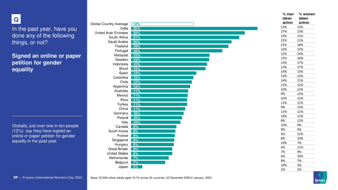
Blue panel on left with explanatory text; bar chart on right showing country-by-country comparison
Regulatory and Compliance
Government & Public Sector
The slide illustrates how many people in different countries signed petitions—either online or on paper—supporting gender equality. It also shows gender-based differences in participation rates.
petition, activism, gender rights, global survey, civic action, gender equality, Ipsos
Mixed Chart
IPSOS
Saved
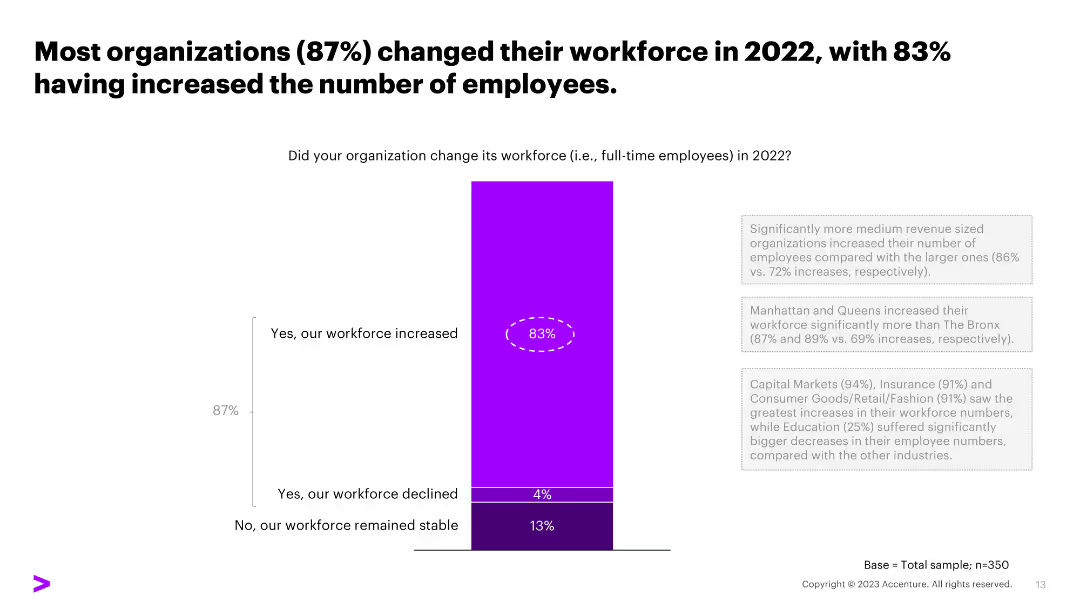
The slide features a column chart showing the percentage of organizations that changed their workforce in 2022. The layout includes text and visual elements in a dense format.
Human Resources and Talent Management
Professional Services
Details the percentage of organizations that increased, decreased, or maintained their workforce in 2022.
workforce, changes, employees, increase, decrease, stability
Mixed Chart
Accenture
Saved
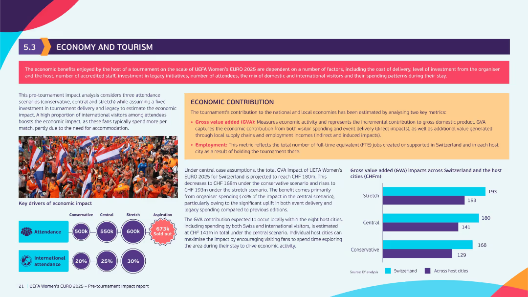
Orange-accented layout with left column on attendance forecasts and right column on economic contribution. Contains bar chart on Gross Value Added (GVA) and colorful infographics.
Investment Analysis
Hospitality & Tourism
This slide assesses the projected economic impact of UEFA Women’s EURO 2025 on Switzerland. It estimates GVA based on three attendance scenarios and outlines benefits including job creation and increased tourist spending. Visuals highlight key economic drivers.
economic impact, tourism, GVA, UEFA, employment, spending patterns, host cities
Mixed Chart
EY
Saved
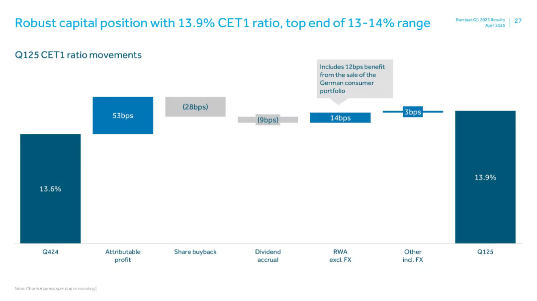
Waterfall bar chart with labeled segments showing CET1 ratio movements from Q424 to Q125
Financial Performance
Financial Services
Illustrates the movement in Barclays' CET1 ratio from Q424 to Q125, highlighting positive and negative contributors such as attributable profit, share buybacks, and RWA changes, ending at 13.9%.
CET1, capital ratio, profit, RWA, share buyback, FX, Q125
Single Chart
Barclays
Saved
Previous
Next
If nothing, comes up, please save your slides first
Create a FREE account to continue browsing
Receive Instant Access to 1,000+ slides from companies like McKinsey, Google, and Goldman Sachs
First Name
Last Name
Email
Password
I agree to all
Terms & Privacy Policy
Thank you! Your submission has been received!
Oops! Something went wrong while submitting the form.
Have an account?
Sign in
Column Chart
Heatmap
Chevron
Org Chart
Infographic
Callouts
Timeline
List
Graphic
Picture
Process Flow
Diagram
Paragraph
Map
Table
Framework
Subtitle
Takeaway Box
Icon
Other Chart
Radar Chart
Waterfall Chart
Mekko Chart
Pie Chart
Scatter Plot
Line Chart
Bar chart
Bullet points