Create a FREE Account
Instant access to 1,000+ real slides from top companies like McKinsey, BCG, Goldman Sachs, Google and many more!
First Name
Last Name
Email
Password
I agree to all
Terms & Privacy Policy
Thank you! Your submission has been received!
Oops! Something went wrong while submitting the form.
Have an account?
Sign in
Library
Templates
Courses
Pricing
My Account
My Slides
My Templates
✦ AI
AI Prompt Library
AI Search
Sign in
Start Here
Logout
My Saved Slides
A mixed chart showing the short- and long-term impacts of various marketing channels. The chart uses bars and lines to depict the effectiveness of channels like TV, social media, and print in driving sales and brand awareness.
Market Analysis and Trends
Media & Entertainment
This slide analyzes the effectiveness of different marketing channels in driving both short-term sales and long-term brand awareness. It highlights the impact of channels like TV, social media, and print on overall marketing effectiveness.
Channels, Impact, Marketing, Effectiveness, Sales
Mixed Chart
Nielsen
Saved
The slide is a vibrant mix of textual content and complementary visuals, including bar graphs and stylized illustrations. It's divided into segments showing statistics and user activities.
Customer and Market Segmentation
Technology & Software
It details the value derived by Australian households from conducting essential tasks and engaging in enrichment activities online, highlighting the nbn™ network's impact on their lives.
Online Tasks, Entertainment, Socializing, nbn, Value, Connectivity, Remote Work, Market Segmentation
Mixed Chart
Accenture
Saved
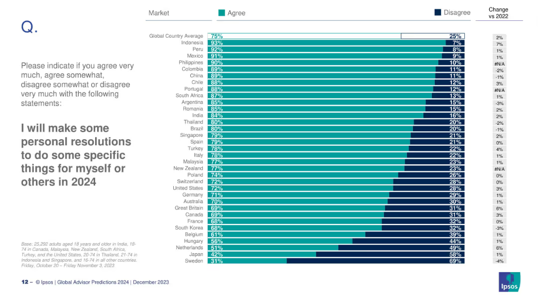
Bar chart ranking countries by agreement with the resolution statement; includes global average and change vs 2022.
Human Resources and Talent Management
Professional Services
This slide ranks countries by intent to make personal resolutions in 2024. Indonesia (93%) and Peru (92%) lead, while Sweden (31%) and Japan (42%) are lowest.
resolutions, 2024, personal goals, cross-country, Ipsos, intentions, habits
Mixed Chart
IPSOS
Saved
The slide presents a complex, color-coded chart structure with seven key sections: AI Adoption Strategy, Control Framework, Use case/POV, Data Ecosystems, Techniques & Tools, Solution Development/Integration, and Operate & Monitor. Each section includes bullet points listing specific items related to AI and risk management strategies. The layout is grid-like with each section clearly numbered and titled.
Risk Assessment and Management
Technology & Software
This slide outlines various aspects of risk management throughout the AI development lifecycle, from strategy adoption to operation and monitoring. It is likely used in presentations addressing the integration of risk management into AI development processes, discussing detailed points like data privacy, cloud use, validation metrics, and deployment pipelines among others. This makes it suitable for audiences involved in AI development and risk management within the technology sector.
AI, risk management, data privacy, cloud, validation
Linear Flow
PwC/Strategy&
Saved
A world map highlights global office locations with blue dots. Key figures about the company's size and scope are presented in an easy-to-read format on the side.
Industry Overview
Professional Services
Introduces Alvarez & Marsal, detailing its global presence and core figures such as office locations, number of employees, and industries served. This slide is designed to give a snapshot of the firm's worldwide operations and industry reach.
global presence, professional services, employees, offices, industries
Graphic
Alvarez & Marsal
Saved
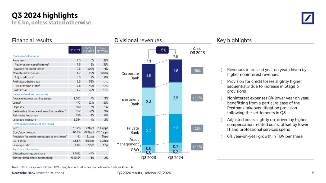
Three-column layout with financials table, revenue bar chart, and bullet highlights.
Financial Performance
Financial Services
Highlights Q3 2024 performance, including revenues, credit loss provisions, adjusted costs, and divisional performance. Key points cover credit losses, cost dynamics, and TBV per share growth. Revenue increased 5% YoY.
Q3 earnings, credit losses, adjusted costs, TBV, revenue growth
Mixed Chart
Deutsche Bank
Saved
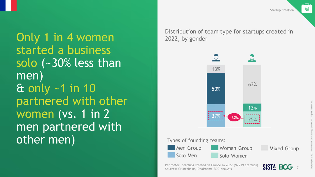
Column chart showing percentage of startups created in 2022 per industry, broken down by women-only, men-only, and mixed founding teams.
Market Analysis and Trends
Professional Services
The slide illustrates that women tend to start businesses in specific industries like fashion and wellness more than in other sectors.
women entrepreneurs, industry concentration, startups
Mixed Chart
BCG
Saved
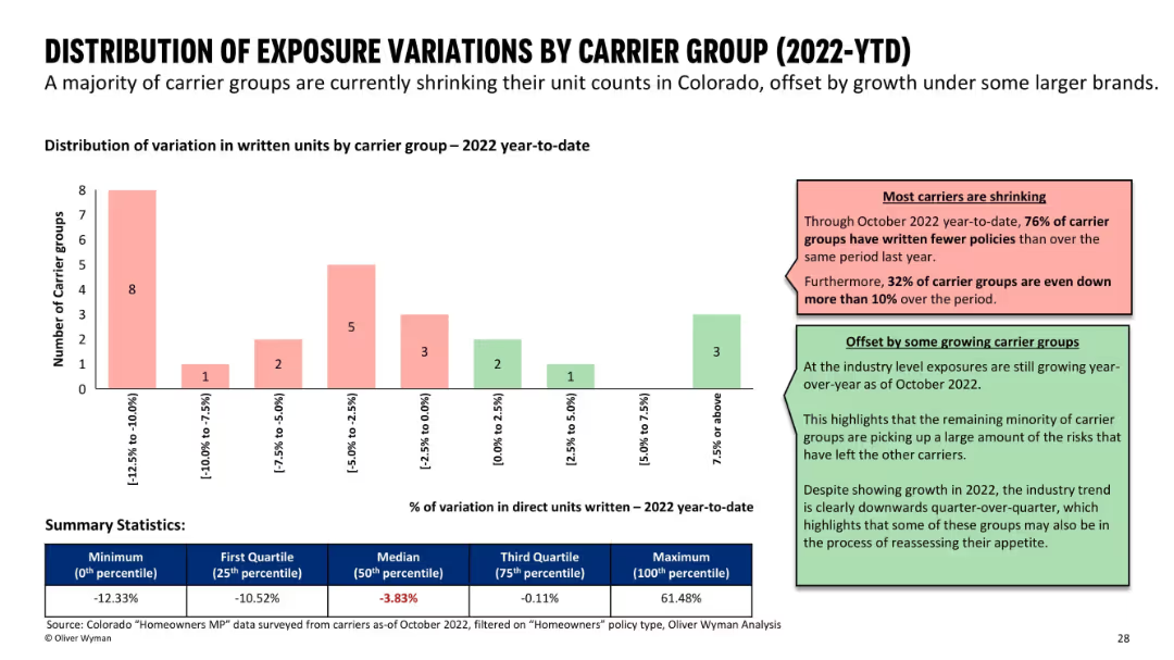
Bar chart grouped by unit variation ranges; supported by color-coded comments and summary stats at the bottom.
Risk Assessment and Management
Financial Services
Analyzes changes in written units by carrier groups in 2022. Most carriers are shrinking, with 76% reducing exposure, while a few are growing. A summary table shows statistics like median and quartile values for unit variation percentages.
insurance carriers, exposure variation, market trends, growth vs shrinkage
Mixed Chart
Oliver Wyman
Saved
Contains pie charts and a sector diagram to showcase sales distribution and operating margins by business group. Rich in visual data and structured layout.
Competitive Landscape
Transportation & Logistics
Highlights Faurecia's global leadership and sales figures across different business groups, demonstrating its strong market position and development potential within the automotive sector.
global leadership, sales, market position, automotive, development
Multiple Chart
Deutsche Bank
Saved
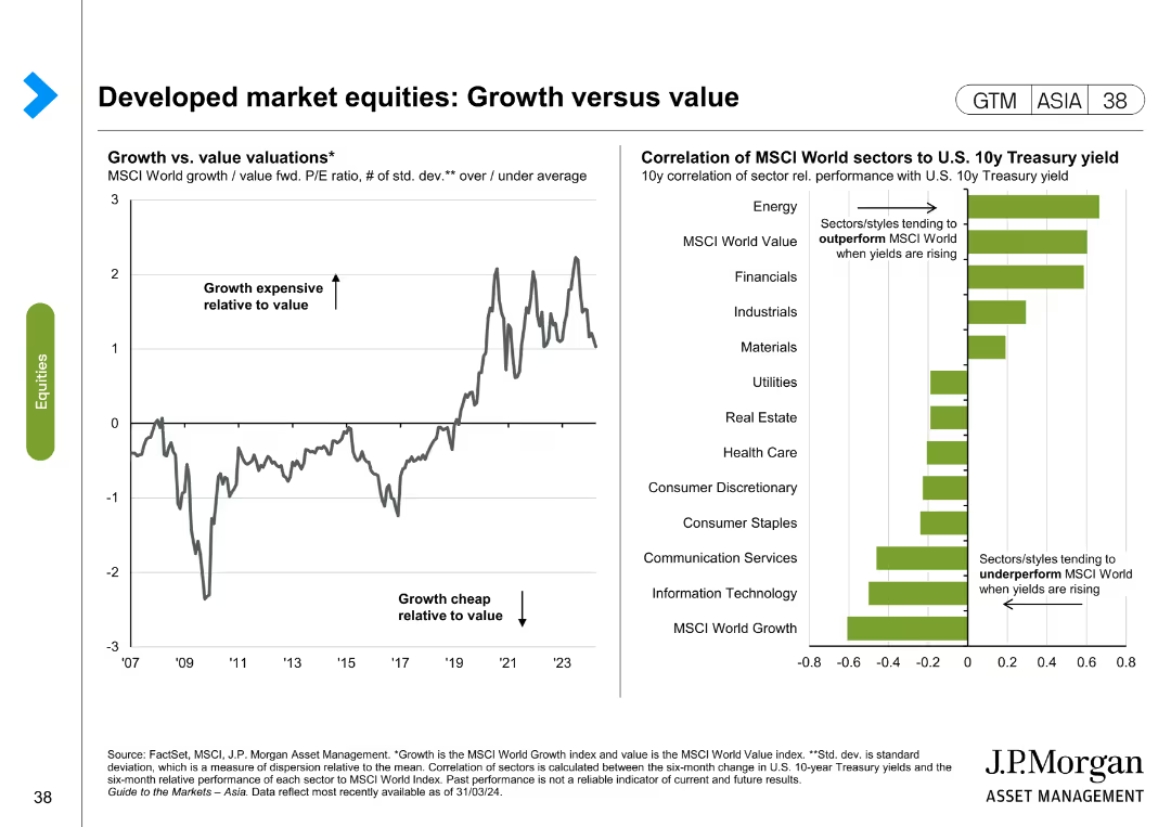
The left side of the slide presents a line chart showing the growth vs. value valuations over time, and the right side features a bar chart illustrating the correlation of MSCI World sectors to U.S. 10-year Treasury yield.
Market Analysis and Trends
Financial Services
The slide compares growth and value valuations in developed markets, highlighting trends and sector correlations with Treasury yields. It is used to identify market trends and investment opportunities.
Growth, value, developed markets, MSCI, Treasury yield, market trends, investment, sector correlation
Multiple Chart
JP Morgan
Saved
The slide contains a table comparing dividend, net income, payout ratio, and return over multiple years, with highlighted projections for the year 2022. It includes a sidebar with dividend and share buy-back policy details and targets. The visual elements are supported by the brand color scheme and include the Michelin logo at the bottom left.
Financial Performance
Financial Services
Detailing the shareholder return policy with a focus on dividends and share buy-backs, this slide outlines Michelin's financial commitment towards its shareholders. It is likely used in annual general meetings or investor briefings to discuss shareholder value and financial strategies.
shareholder, return, policy, dividend, Michelin, net income, payout ratio, investment, finance, strategy
Table
Morgan Stanley
Saved
Multiple percentages in sections detailing actions and adaptations by companies. Clean layout with green and blue colors.
Regulatory and Compliance
Environmental Services & Sustainability
Evaluates current sustainability efforts, the difficulty in implementing impactful actions, and the corporate focus on sustainability.
Sustainability, corporate efforts, impact, actions
Header Vertical
Deloitte
Saved
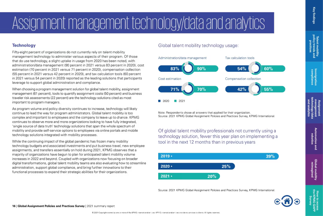
Text on left; bar and donut charts on right showing tool usage and future plans.
Technology and Digital Transformation
Technology & Software
Shows usage statistics for global mobility technologies, with highest adoption in admin/data management and tax tools. Notes declining intent to adopt new tech and highlights trends in integrating systems for better data transparency.
mobility technology, admin tools, tax tools, cost estimation, data management, digital transformation
Multiple Chart
KPMG
Saved
This slide features multiple line charts illustrating the year-over-year change in ridership for various NY transportation authorities. Annotations and a clear color-coded legend are included.
Operational Efficiency
Transportation & Logistics
Focuses on the drastic reduction in ridership across different public transportation modes in New York during the COVID-19 pandemic, highlighting significant drops and a comparative analysis with previous months.
Transportation, NY, COVID-19, Ridership, Decline
Multiple Chart
BCG
Saved
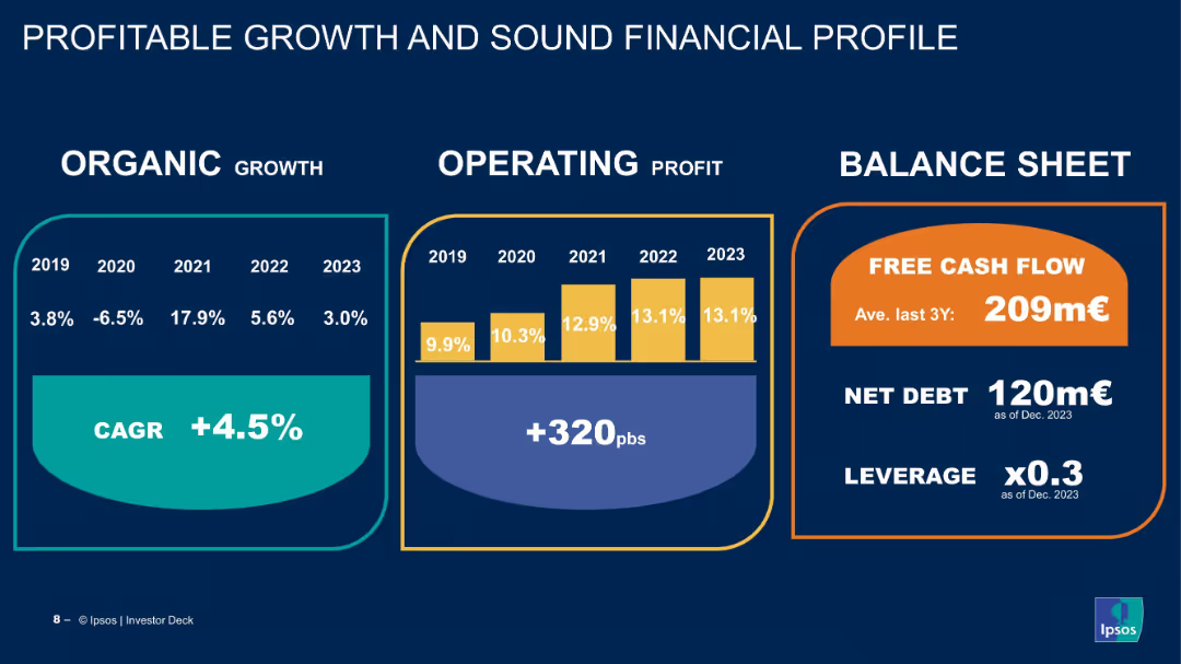
Three-panel infographic showing organic growth, operating profit, and balance sheet strength.
Financial Performance
Financial Services
The slide presents financial metrics from 2019–2023, demonstrating consistent operating margin growth and healthy cash flow, debt, and leverage indicators, reinforcing Ipsos’ financial strength.
financials, CAGR, profit margin, free cash flow, leverage, organic growth, Ipsos, performance metrics, investor information
Mixed Chart
IPSOS
Saved
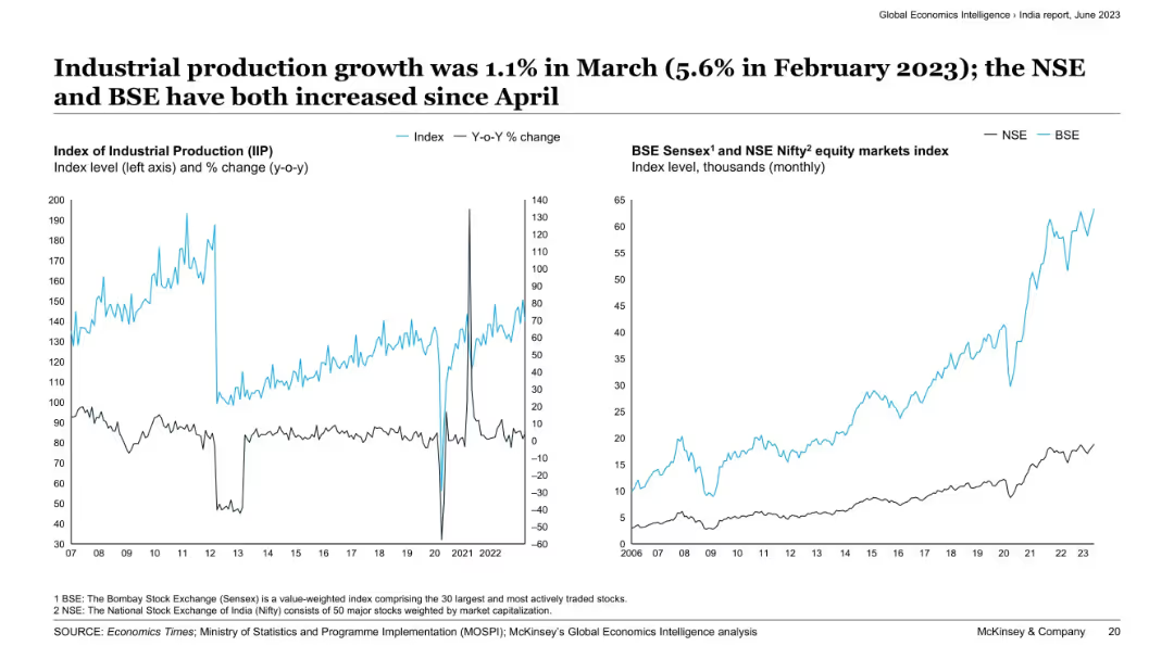
Dual-panel charts with IIP index and YoY growth (left) and stock index performance of NSE and BSE (right).
Performance Metrics and KPIs
Industrial & Manufacturing
The slide illustrates India’s industrial production performance with a modest YoY growth in March. Equity market indices (BSE and NSE) have increased since April, signaling investor confidence and possible economic recovery in the manufacturing and industrial sectors.
industrial production, India, IIP, BSE, NSE, stock market, growth, equity index, manufacturing, recovery
Multiple Chart
McKinsey
Saved
Features a dual-axis line chart comparing accelerator attendance and equity investment in Manchester, with textual analysis of trends.
Market Analysis and Trends
Technology & Software
Analyzes the impact of accelerators on Manchester's tech sector, noting a correlation between accelerator activity and equity investment, with predictions for post-2020 recovery.
Manchester, accelerators, investment, equity trends, pandemic impact, business startups, local economy, government support, future outlook
Mixed Chart
Barclays
Saved
Two column charts: Left chart illustrates asset growth in billions from Q4 2019 to Q1 2022. Right chart shows bank assets as a percentage of firmwide assets from Q4 2019 to Q1 2022. A box lists key growth drivers. The footer includes strategic statements about asset utilization.
Financial Performance
Financial Services
This slide compares the growth of assets over time and the allocation of assets within bank entities, highlighting key drivers such as financing activities and liquidity. The focus is on strategic asset growth and bank support for client activities.
asset growth, financing activities, liquidity, bank entities, strategic placement, column chart
Multiple Chart
Goldman Sachs
Saved
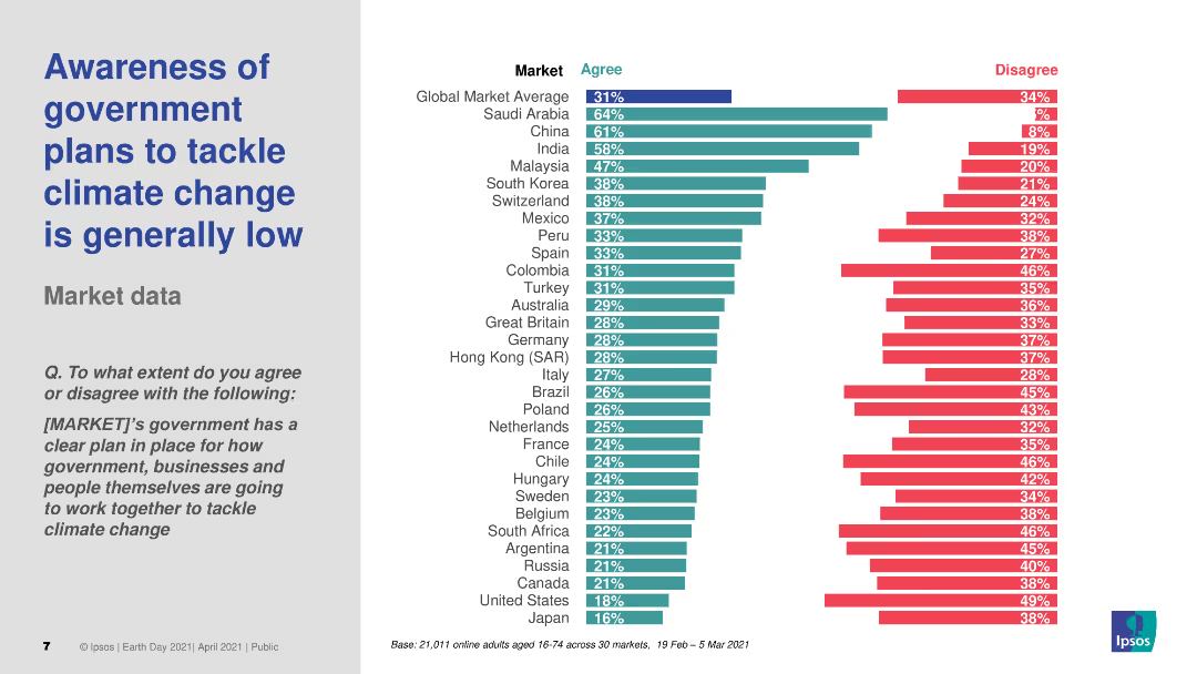
The slide includes a header, a text block, and a column chart. The column chart shows survey data on public awareness of government plans to tackle climate change across various markets, with different colors representing levels of agreement and disagreement.
Market Analysis and Trends
Environmental Services & Sustainability
Discusses the low awareness of government plans to tackle climate change across different countries. The column chart presents survey data on public agreement with the statement that their government's plans are clear, comparing awareness levels across multiple markets.
Climate change, government plans, awareness, survey, markets
Multiple Chart
IPSOS
Saved
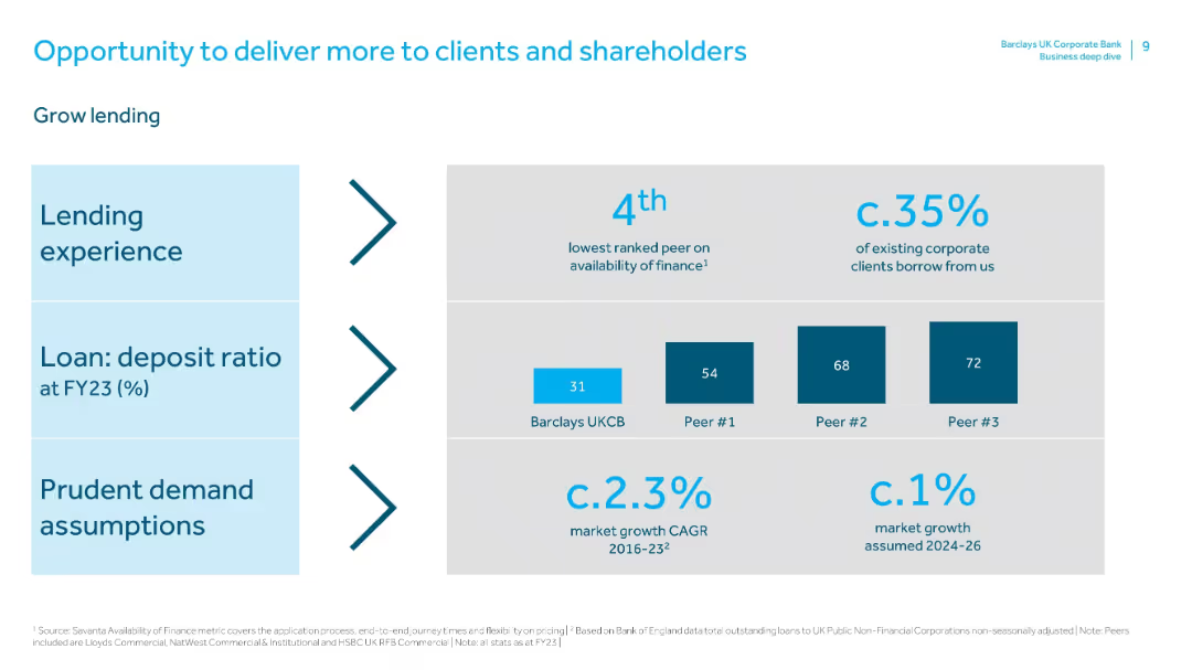
Similar layout to previous slide. Sections for lending experience, loan:deposit ratio, and demand assumptions with relevant benchmarks.
Sales and Business Development
Financial Services
Focuses on growing lending as a strategic priority. Barclays UKCB is underperforming in loan:deposit ratio compared to peers, indicating an opportunity. It notes current client borrowing levels (35%) and conservative growth forecasts.
lending, borrowing, loan:deposit ratio, market assumptions, peer comparison, business development, client financing
Mixed Chart
Barclays
Saved
This slide features a column chart with a timeline from 2010 to 2019, depicting market share and investment banking rank. The chart is annotated with percentage figures and gaps between the ranks.
Market Analysis and Trends
Financial Services
The slide illustrates the #1 rank in Global Investment Banking fees and a 9.0% market share in 2019, highlighting the company's leadership over the decade.
Investment Banking, Market Share, Rank, Column Chart, Decade, Leadership, Percentage, Global, Finance
Single Chart
JP Morgan
Saved
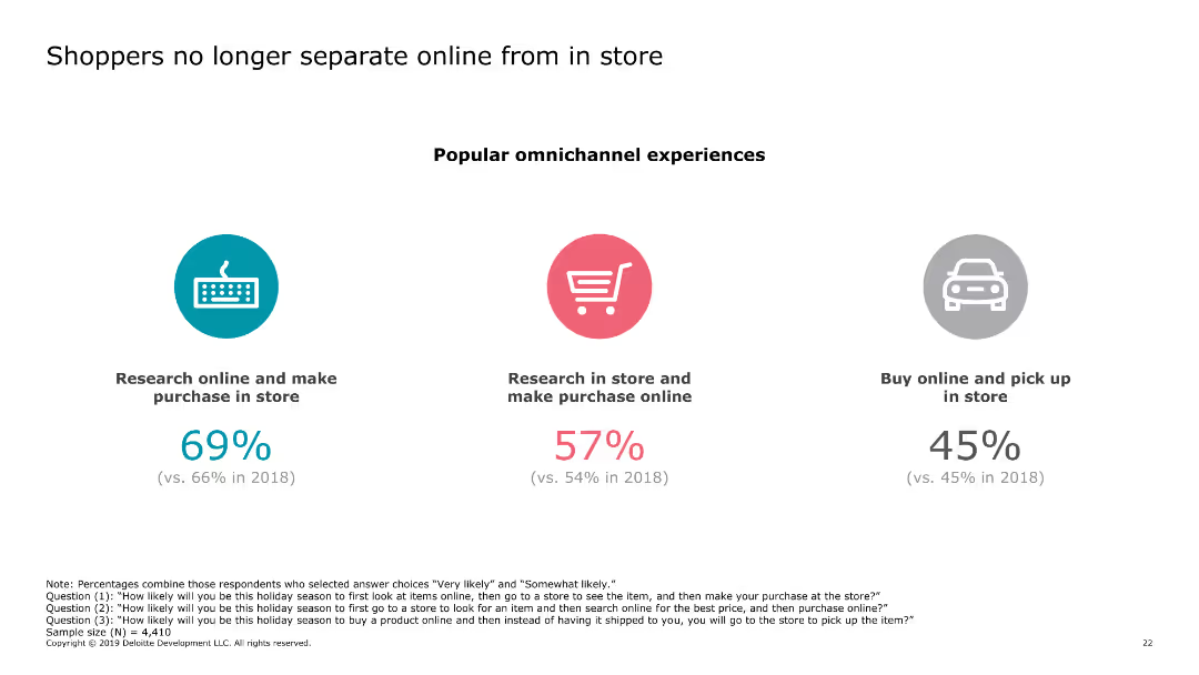
The slide contains three circular icons, each representing a different shopping behavior (research online and make purchase in store, research in store and make purchase online, buy online and pick up in store). Each icon has a corresponding percentage below it.
Market Analysis and Trends
Retail & E-commerce
The slide highlights the trend of shoppers blending online and in-store experiences, showing the percentages of different omnichannel shopping behaviors. This indicates growing integration between online and offline shopping.
online shopping, in-store shopping, omnichannel, consumer behavior, retail trends
Pillar
Deloitte
Saved
The slide showcases a Sankey diagram illustrating the flow of meter point analytics data, detailing agent handover processes. The diagram uses various color-coded paths to represent data flow and changes.
Operational Efficiency
Energy & Utilities
This slide offers an analysis of meter point data, focusing on agent handovers within the utility sector, using a Sankey diagram to visualize the flow and changes in data.
Meter Point, Analytics, Agent Handover, Data Flow, Visualization
Single Chart
EY
Saved
This slide uses line charts to show the Net Interest Margin (NIM) development for different banking sectors over time, presented in a clean and organized manner.
Financial Performance
Financial Services
Discusses the impact of interest rates on Net Interest Margin in different banking sectors, providing insights into financial trends and earnings. This slide is valuable for financial presentations focusing on interest rate impacts and profitability.
NIM, interest rates, banking, finance, profitability
Multiple Chart
Deutsche Bank
Saved
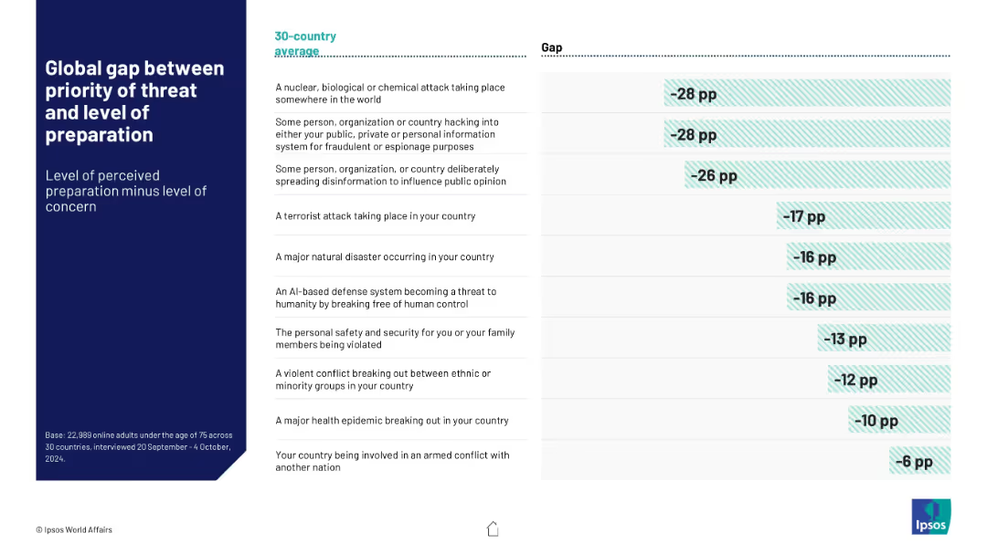
Table with two columns: threat types and corresponding global preparedness gap (concern minus confidence). Horizontal bars visualize the negative gaps.
Risk Assessment and Management
Government & Public Sector
Visualizes the global discrepancy between concern about various threats and perceived governmental preparedness. Highlights largest concern-preparedness gaps in NBC attacks and hacking across a 30-country average.
preparedness gap, risk perception, global concern, NBC threats, cyber attacks, Ipsos data
Mixed Chart
IPSOS
Saved
Previous
Next
If nothing, comes up, please save your slides first
Create a FREE account to continue browsing
Receive Instant Access to 1,000+ slides from companies like McKinsey, Google, and Goldman Sachs
First Name
Last Name
Email
Password
I agree to all
Terms & Privacy Policy
Thank you! Your submission has been received!
Oops! Something went wrong while submitting the form.
Have an account?
Sign in
Column Chart
Heatmap
Chevron
Org Chart
Infographic
Callouts
Timeline
List
Graphic
Picture
Process Flow
Diagram
Paragraph
Map
Table
Framework
Subtitle
Takeaway Box
Icon
Other Chart
Radar Chart
Waterfall Chart
Mekko Chart
Pie Chart
Scatter Plot
Line Chart
Bar chart
Bullet points