Create a FREE Account
Instant access to 1,000+ real slides from top companies like McKinsey, BCG, Goldman Sachs, Google and many more!
First Name
Last Name
Email
Password
I agree to all
Terms & Privacy Policy
Thank you! Your submission has been received!
Oops! Something went wrong while submitting the form.
Have an account?
Sign in
Library
Templates
Courses
Pricing
My Account
My Slides
My Templates
✦ AI
AI Prompt Library
AI Search
Sign in
Start Here
Logout
My Saved Slides
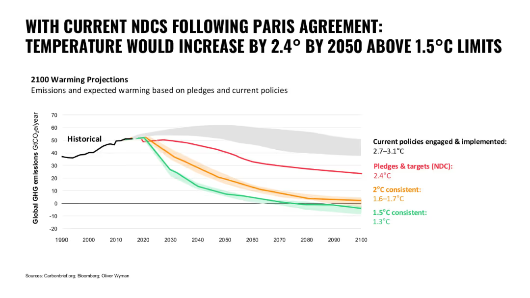
Line graph with colored paths representing different emission scenarios; bold black title and clean white background
Regulatory and Compliance
Environmental Services & Sustainability
The slide illustrates global warming projections based on current NDCs and policies versus different consistency targets. It shows the gap between policy implementation and climate goals.
climate change, NDCs, Paris Agreement, emissions, global warming, policy gap, temperature projection
Single Chart
Oliver Wyman
Saved
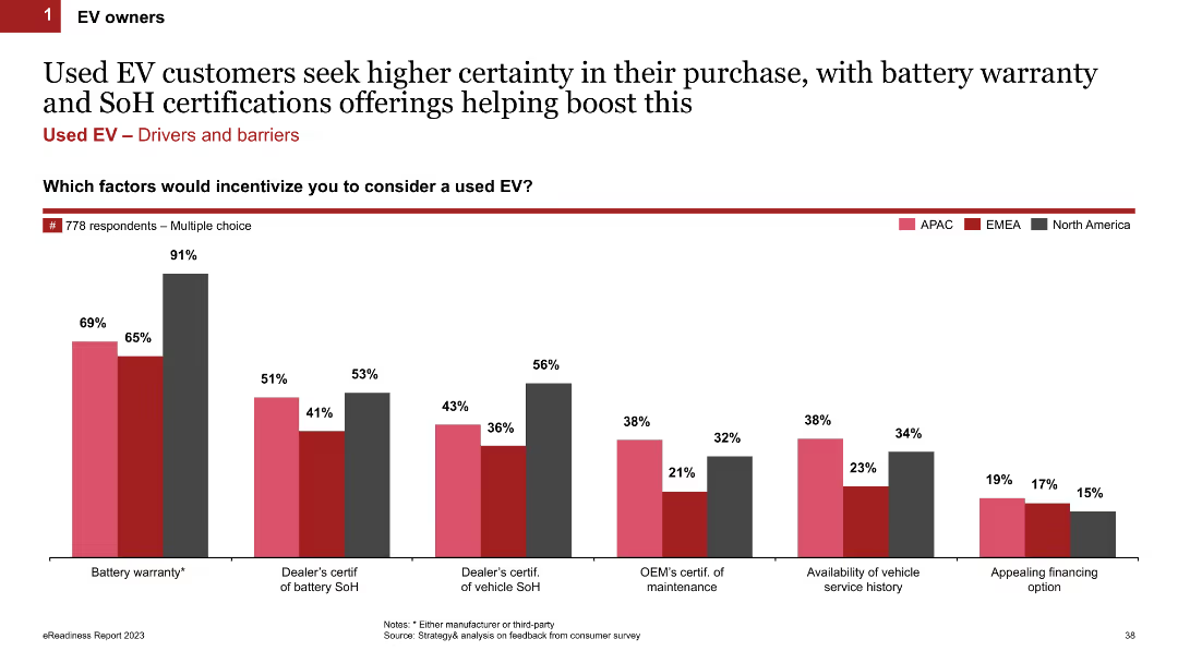
The slide includes a column chart showing factors that would incentivize customers to consider a used EV, with regional breakdowns (APAC, EMEA, North America). Key factors include battery warranty, dealer certifications, and vehicle service history.
Product and Service Analysis
Transportation & Logistics
The slide highlights the key factors that would encourage customers to buy used EVs, such as battery warranty and certifications of battery state of health (SoH). It provides regional insights into customer preferences and concerns.
used EVs, incentives, battery warranty, certifications, SoH, regional data
Single Chart
PwC/Strategy&
Saved
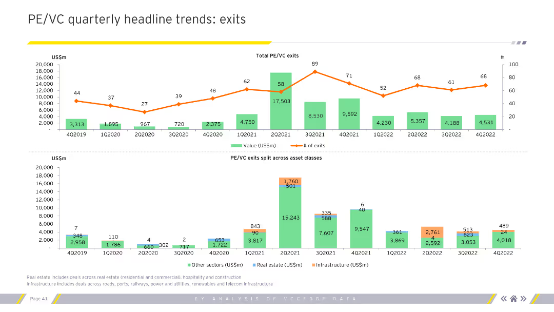
Features line and column charts showing total PE/VC exits by value and number across quarters, split by asset classes. Visual complexity is moderate.
Market Analysis and Trends
Financial Services
Highlights quarterly trends in private equity and venture capital exits, detailing values, number of exits, and sector-specific data. Essential for financial analysts and strategists.
PE, VC, exits, trends, financial, analysis
Multiple Chart
EY
Saved
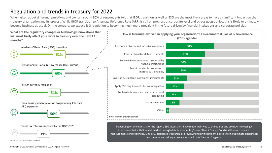
Multiple icons with percentages; column charts detailing involvement in ESG agenda, IBOR transition, etc.
Regulatory and Compliance
Financial Services
Covers regulatory changes and technology innovations affecting treasury work, with a focus on ESG criteria and IBOR transition.
Regulatory changes, ESG, treasury, IBOR, trends
Multiple Chart
Deloitte
Saved
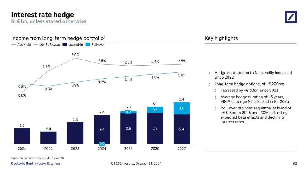
Line and stacked bar chart illustrating hedge income from long-term portfolio (2021–2027), showing locked-in and roll-over values; commentary highlights hedge strategy and benefits.
Risk Assessment and Management
Financial Services
This slide presents Deutsche Bank’s hedge income trends and projections. It shows a growing contribution to NII, with a ~€230bn notional hedge portfolio. Roll-overs in 2025–26 are expected to offset declining rates. Duration averages 5 years with 90% locked for 2025.
interest rate, hedge, portfolio, income, duration, NII, rollover
Mixed Chart
Deutsche Bank
Saved
Pie chart and bullet points detailing emissions reduction methods and economic benefits. Text highlights farmer contributions and potential income from carbon projects.
Technology and Digital Transformation
Agriculture & Food Production
Highlights the role of Australian farmers in reducing emissions through various technologies and practices, emphasizing economic and environmental benefits.
Farmers, Emissions Reduction, Agriculture, Technology, Carbon Projects, Economic Benefits, Environmental Impact
Multiple Chart
EY
Saved
Features a bar graph showing the confidence levels of businesses in managing major risks identified since 2012, across categories like financial, operational, and disruptive technology risks.
Risk Assessment and Management
Financial Services
Evaluates businesses' confidence in their risk management capabilities, highlighting areas where confidence is low and the need for improved risk strategies is high. Useful for risk management training and development.
risk management confidence, business strategies, operational risks, technology risks
Mixed Chart
Accenture
Saved
A dual-chart layout, one depicting yield/duration for various financial instruments and the other showing correlation with U.S. Treasuries, to compare rate risks and credit exposure.
Risk Assessment and Management
Financial Services
The slide contrasts the yield/duration metrics of different investment vehicles with their correlation to U.S. Treasuries, useful in risk management and investment strategy formulation.
yield, duration, rate risk, credit exposure, investment vehicles, correlation, US Treasuries, strategy
Multiple Chart
Morgan Stanley
Saved
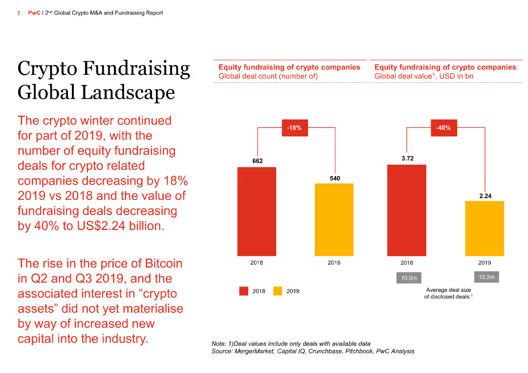
The slide has a column chart showing the decline in equity fundraising deals for crypto companies from 2018 to 2019, with a text summary of the continued "crypto winter" and its impact on fundraising activities.
Market Analysis and Trends
Financial Services
The slide provides an overview of the global landscape for crypto fundraising, highlighting a significant decrease in deal volume and value in 2019 compared to 2018, and the challenges faced by the industry.
Crypto fundraising, global landscape, equity deals, deal volume, deal value, crypto winter, financial services, market analysis, investment trends, 2018 vs 2019
Mixed Chart
PwC/Strategy&
Saved
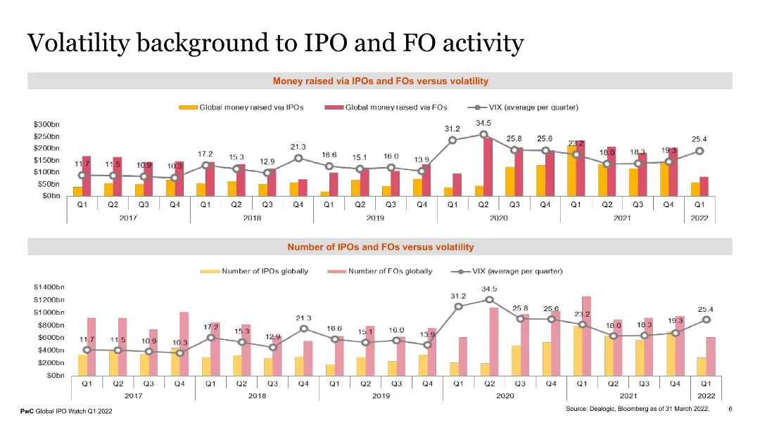
The slide features two column charts comparing money raised via IPOs and FOs versus volatility and the number of IPOs and FOs versus volatility from 2017 to Q1 2022. Each chart uses colored bars and a line graph to depict data points.
Market Analysis and Trends
Financial Services
This slide shows the relationship between market volatility and the financial activities of IPOs and FOs over several years. It highlights trends in capital raised and number of deals, providing insights for financial analysts and investors.
IPOs, FOs, volatility, financial trends, capital raised
Multiple Chart
PwC/Strategy&
Saved
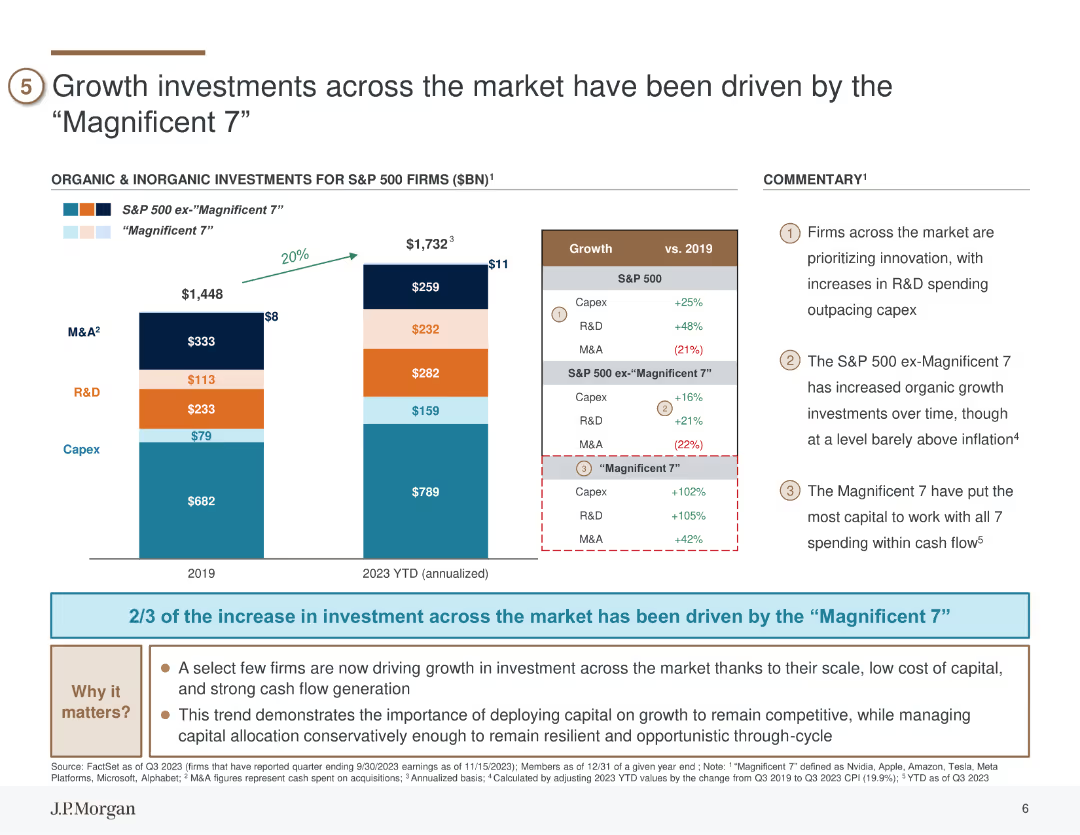
The slide features column charts comparing organic and inorganic investments in S&P 500 firms, highlighting differences between the "Magnificent 7" and the rest of the market.
Investment Analysis
Financial Services
The slide details the significant growth investments made by the top seven firms in the S&P 500, noting their dominant role in driving overall market growth. It highlights increased spending in R&D, capex, and M&A activities, underscoring the strategic importance of these investments. The slide can be used to analyze investment trends and capital allocation strategies.
investments, Magnificent 7, R&D, capex, M&A
Mixed Chart
JP Morgan
Saved
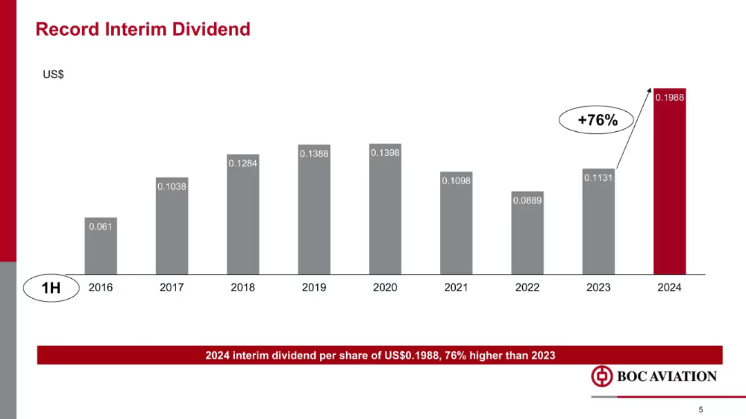
Vertical bar chart showing interim dividend growth over years 2016–2024, with a +76% increase in 2024 highlighted in red.
Financial Performance
Transportation & Logistics
This slide highlights a record interim dividend of $0.1988 per share in 1H 2024, representing a 76% increase over 2023. It shows historical dividend trends and underscores BOC Aviation’s financial strength and shareholder returns.
dividends, interim payout, historical trend, shareholder value, BOC Aviation, financial returns, growth
Single Chart
Goldman Sachs
Saved
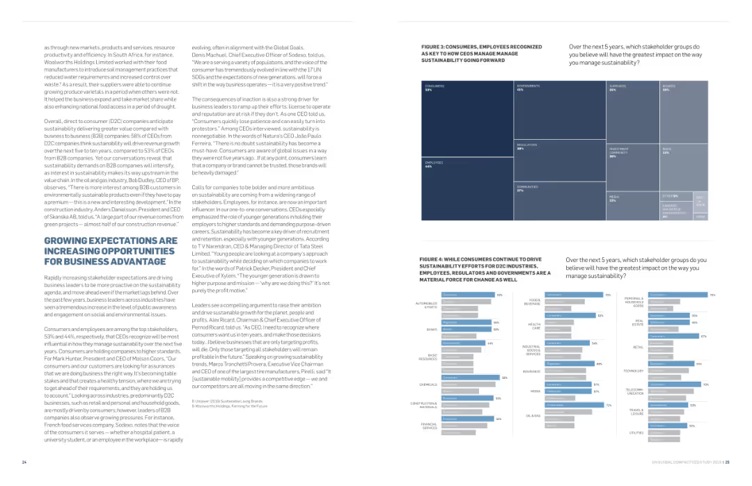
Contains text in two columns with a treemap on the right showing stakeholder groups impacting sustainability. Uses a white background with blue highlights and clear typography.
Strategic Planning
Professional Services
Explores how growing expectations for sustainability are creating business opportunities. The treemap highlights key stakeholder groups like consumers and employees, emphasizing their impact on driving sustainability efforts forward.
sustainability, opportunities, business advantage, expectations, stakeholders
Multiple Chart
Accenture
Saved
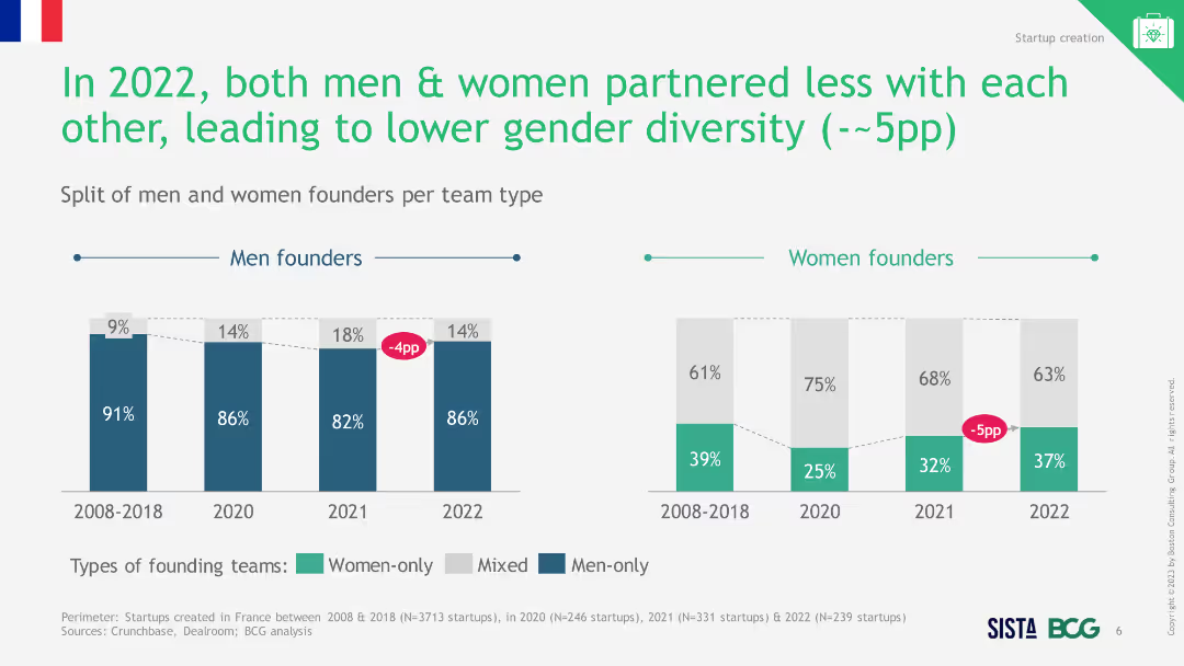
Text and column chart showing the distribution of team types for startups by gender in 2022, highlighting solo and group startups for men and women.
Market Analysis and Trends
Professional Services
The slide indicates that fewer women start businesses solo compared to men and highlights the disparity in partnership types by gender.
women entrepreneurs, solo business, gender disparity
Multiple Chart
BCG
Saved
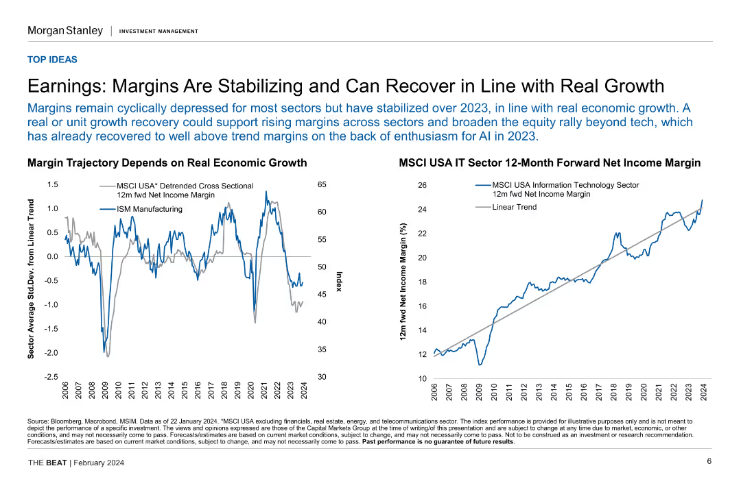
Two line charts illustrating margin trajectory based on real economic growth and MSCI USA IT sector 12-month forward net income margin.
Financial Performance
Financial Services
This slide analyzes the stabilization and potential recovery of earnings margins in relation to real economic growth, focusing on specific sector performance.
earnings, margins, economic growth, IT sector, financial performance
Multiple Chart
Morgan Stanley
Saved
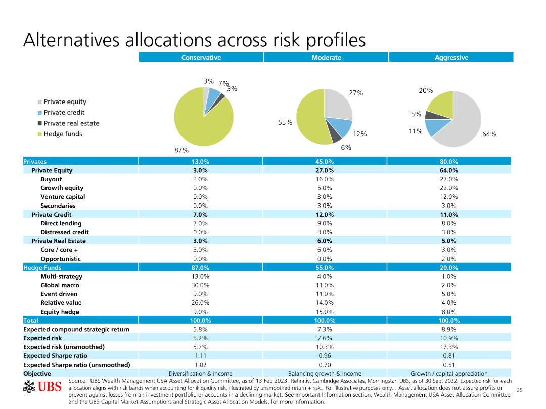
Pie charts and a table showing allocations across different risk profiles (Conservative, Moderate, Aggressive) for various investment types.
Investment Analysis
Financial Services
The slide details how different types of investments (equity, credit, real estate, hedge funds) are allocated based on risk profiles, providing expected returns and risks.
Allocations, Risk Profiles, Private Equity, Hedge Funds, Expected Returns
Multiple Chart
UBS
Saved
Column chart showing change in hospital expenditure on medical devices/equipment over the past three years.
Market Analysis and Trends
Healthcare & Pharmaceuticals
This slide details the expected increase in spending on medical devices across various APAC countries.
medical devices, expenditure, APAC, healthcare, growth
Single Chart
LEK
Saved
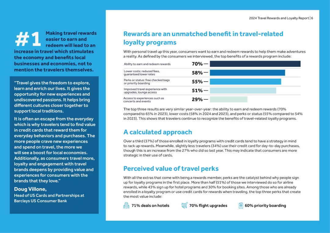
Multi-section layout with horizontal bar chart, quotes, and supporting commentary. Blue and white color scheme.
Customer and Market Segmentation
Financial Services
Details top perceived benefits of travel loyalty programs (e.g., reward redemption, lower costs, perks), alongside stats on calculated card use and value perceptions across customer types.
rewards, loyalty benefits, survey insights, travel perks, credit cards, redemption, consumer behavior, Barclays
Mixed Chart
Barclays
Saved
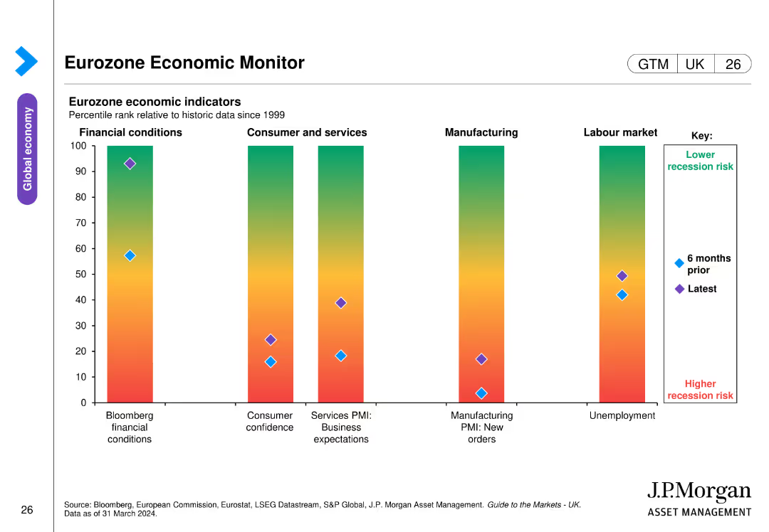
The slide includes a bar chart displaying eurozone economic indicators. The bars show percentile ranks relative to historic data across different economic conditions, consumer confidence, business expectations, manufacturing orders, and unemployment.
Market Analysis and Trends
Financial Services
This slide monitors eurozone economic health by presenting various economic indicators over time, aiding in the assessment of recession risks and economic stability.
eurozone, economic indicators, recession risk, consumer confidence, manufacturing orders
Single Chart
JP Morgan
Saved
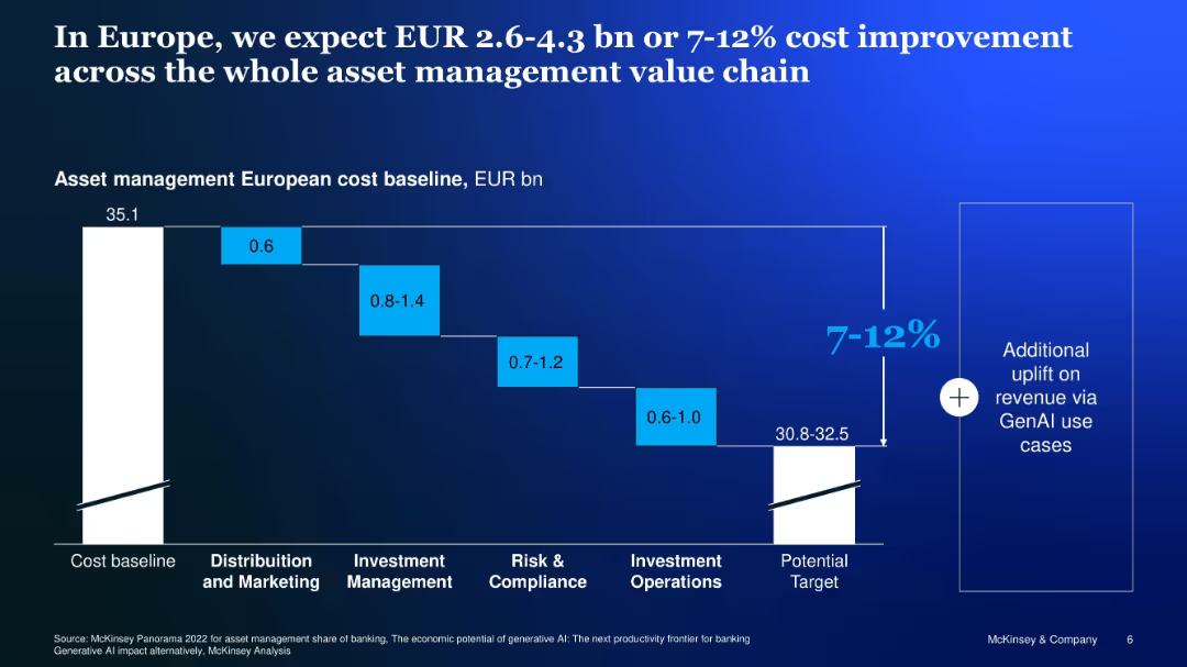
Waterfall chart showing potential GenAI-related cost reduction across asset management functions
Financial Performance
Financial Services
Analyzes cost-saving potential of GenAI across European asset management, estimating 7–12% savings from process efficiencies across marketing, investment, compliance, and operations.
Europe, cost savings, asset management, GenAI, waterfall, value chain
Single Chart
McKinsey
Saved
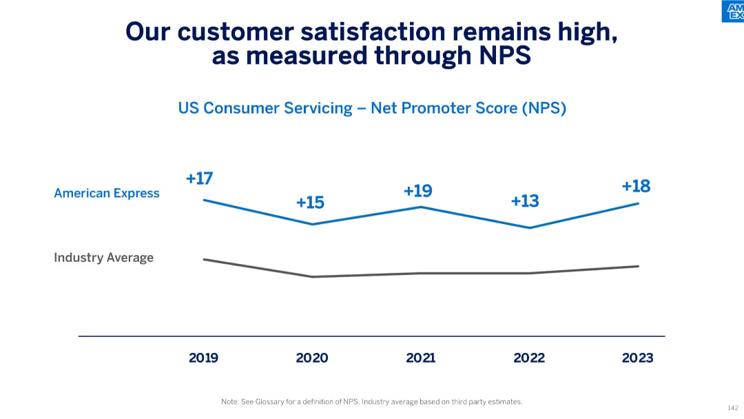
Line graph comparing Net Promoter Score (NPS) of American Express vs industry average from 2019–2023.
Performance Metrics and KPIs
Financial Services
This slide communicates strong customer satisfaction in U.S. consumer servicing, as reflected in American Express’ consistently high NPS, which remained above industry averages from 2019 through 2023, peaking at +19 in 2021 and rebounding to +18 in 2023.
NPS, customer satisfaction, consumer servicing, benchmark, Net Promoter Score, industry average, loyalty, performance
Single Chart
McKinsey
Saved
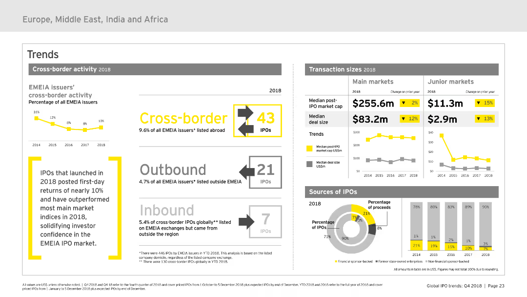
The slide focuses on cross-border activity within the EMEIA IPO market, using various charts and infographics to display outbound and inbound IPOs, transaction sizes, and sources of IPOs. The visual layout is moderately complex, balancing text and visual elements for clarity.
Market Analysis and Trends
Financial Services
Analyzes cross-border IPO activities in EMEIA for 2018, detailing outbound and inbound IPOs, transaction sizes, and origins. Highlights key trends and provides a comprehensive overview of market movements.
cross-border, IPO, EMEIA, trends, transactions
Multiple Chart
EY
Saved
The slide uses column charts to compare labor availability issues in France from 2022 to 2023 across all industries, with contextual insights from industry professionals about regional recruitment challenges.
Human Resources and Talent Management
Professional Services
Explores the labor shortage crisis in France, detailing sector-specific challenges and geographic disparities in labor availability, and assessing the impact on industries such as logistics and high-tech.
labor shortage, France, industry impact, recruitment challenges, regional analysis
Mixed Chart
Bain
Saved
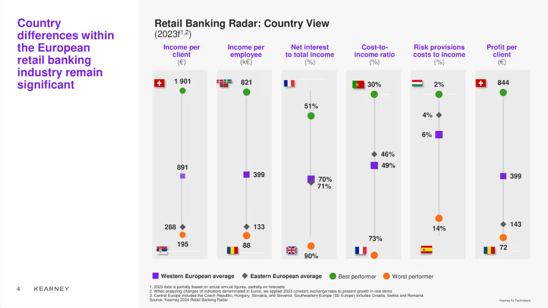
Column chart comparing different metrics (income per client, income per employee, etc.) across various European countries. Uses color-coded markers for Western and Eastern Europe.
Market Analysis and Trends
Financial Services
Analyzes significant country differences in the European retail banking industry, comparing key financial indicators across countries.
country view, income, comparison, Europe, retail banks
Single Chart
Kearney
Saved
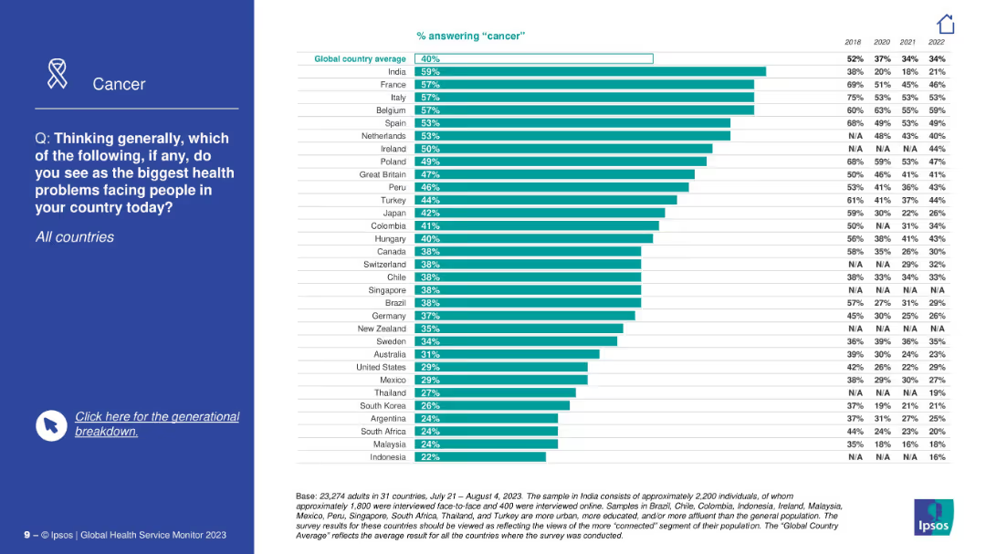
Side title with focus on cancer; right contains a bar chart comparing countries’ concern about cancer, with historic trends shown for each.
Market Analysis and Trends
Healthcare & Pharmaceuticals
This slide explores the public perception of cancer as a major health issue. India, France, and Italy show the highest concern. Historical percentages are included to illustrate how concern has evolved since 2018.
cancer, public health, disease awareness, historical data, Ipsos, major health problem, trends, global ranking, concern evolution
Mixed Chart
IPSOS
Saved
Previous
Next
If nothing, comes up, please save your slides first
Create a FREE account to continue browsing
Receive Instant Access to 1,000+ slides from companies like McKinsey, Google, and Goldman Sachs
First Name
Last Name
Email
Password
I agree to all
Terms & Privacy Policy
Thank you! Your submission has been received!
Oops! Something went wrong while submitting the form.
Have an account?
Sign in
Column Chart
Heatmap
Chevron
Org Chart
Infographic
Callouts
Timeline
List
Graphic
Picture
Process Flow
Diagram
Paragraph
Map
Table
Framework
Subtitle
Takeaway Box
Icon
Other Chart
Radar Chart
Waterfall Chart
Mekko Chart
Pie Chart
Scatter Plot
Line Chart
Bar chart
Bullet points