My Account
My Slides
Search by Category
Companies
Slide Type
Use Case
Industry
Pricing
Templates
View All Templates
Download Template Slides
✦ AI
AI Prompt Library
AI Search
Feedback
Login
Logout
Get Started
Browse all Slides
Browse all Slides
Create a FREE Account
Instant access to 1,000+ real slides from top companies like McKinsey, BCG, Goldman Sachs, Google and many more!
First Name
Last Name
Email
Password
I agree to all
Terms & Privacy Policy
Thank you! Your submission has been received!
Oops! Something went wrong while submitting the form.
Have an account?
Sign in
Saved Slides
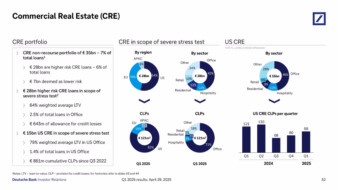
Multi-chart layout with pie charts and bar graphs analyzing CRE portfolio risk by region, sector, and loss provisioning (CLPs). Uses contrasting color schemes for segmentation.
Risk Assessment and Management
Real Estate & Construction
Deutsche Bank’s CRE exposure is analyzed, focusing on €28bn of higher-risk loans, stress testing, regional and sectoral distribution (especially US and Office sector), and provisions for credit losses. It also tracks quarterly trends in US CLPs, providing context on CRE risk concentration and mitigation strategies.
CRE, risk, CLP, stress test, loan-to-value, US exposure, sector analysis
Multiple Chart
Deutsche Bank
Saved
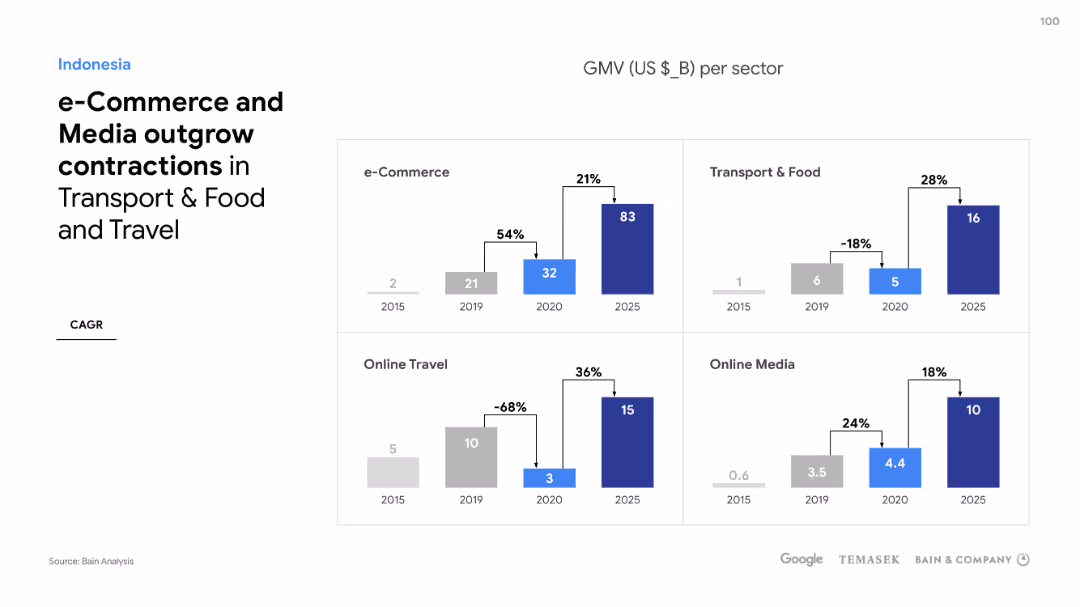
Four separate column charts compare sector growths such as e-Commerce, Online Travel, Transport & Food, and Online Media in Indonesia, with percentage changes.
Market Analysis and Trends
Technology & Software
Discussing sector performance in Indonesia's digital economy, the slide shows e-Commerce and Media outgrowing other sectors despite market downturns.
e-Commerce, Media, Sector growth, Indonesia, Digital economy, Market downturns, Online Travel, Transport & Food
Multiple Chart
Bain
Saved
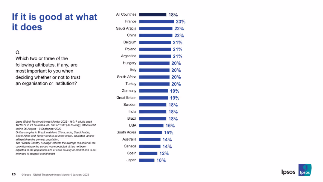
Title in large font, bar chart ranks countries by importance placed on competence. All countries average at top, followed by individual country values.
Market Analysis and Trends
Professional Services
Highlights country-level perspectives on the importance of organizational competence in trust decisions. France and Saudi Arabia rank highest; Japan ranks lowest.
competence, trust factors, country comparison, Ipsos, capability, trustworthiness
Mixed Chart
IPSOS
Saved
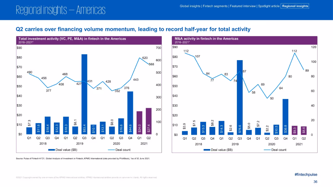
Dual bar charts showing investment and M&A activity quarterly from 2018 to 2021; purple bars for 2021 H1; clean timeline format
Financial Performance
Financial Services
Q2 2021 continues the upward trend in fintech investment and M&A activity, contributing to a record-setting first half. The charts track deal value and count quarterly, with Q2 2021 showing strong deal volume and sustained momentum across investment and M&A in the Americas.
Q2 2021, deal volume, investment trends, M&A activity, fintech, historical data, H1 record
Multiple Chart
KPMG
Saved
Slide with number 2, several column charts showing startups by country and stage, a pie chart depicting startup distribution by sector, and bullet points summarizing the data.
Market Analysis and Trends
Technology & Software
This slide offers a detailed view of startups in Southeast Asia, focusing on their distribution across countries, development stages, and sectors. It highlights the concentration of startups in Singapore, Indonesia, and Vietnam, mainly in the eCommerce sector, reflecting market trends and potential investment targets.
SEA, startups, concentration, stages, eCommerce, market distribution, sector analysis
Multiple Chart
Bain
Saved
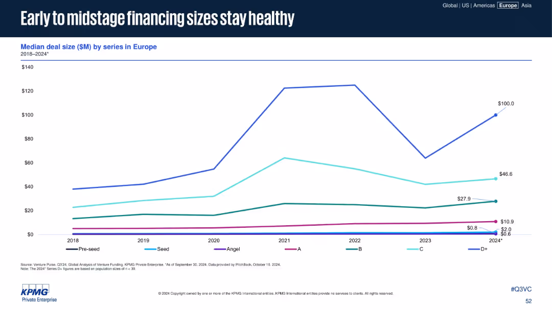
Line chart showing deal size by funding series (Pre-seed to D+) from 2018 to 2024
Performance Metrics and KPIs
Financial Services
This slide tracks the median deal size by funding series in Europe, with strong growth in D+ rounds rebounding in 2024. Early and mid-stage rounds (Series A to C) maintain consistent or growing deal sizes, signaling investor confidence.
Series A, Series B, VC financing, deal size, startup growth
Single Chart
KPMG
Saved
Pie chart and descriptive statistics compare subsector growth rates with and without FGA acquisitions. It uses blue tones and is paired with detailed text explanations.
Market Analysis and Trends
Technology & Software
Comparing subsector growth rates in the presence and absence of FGA acquisitions, this slide provides insights into FGA's market influence, ideal for market segment analysis.
FGA, Subsectors, M&A, Growth Rates, Market Analysis
Mixed Chart
Oliver Wyman
Saved
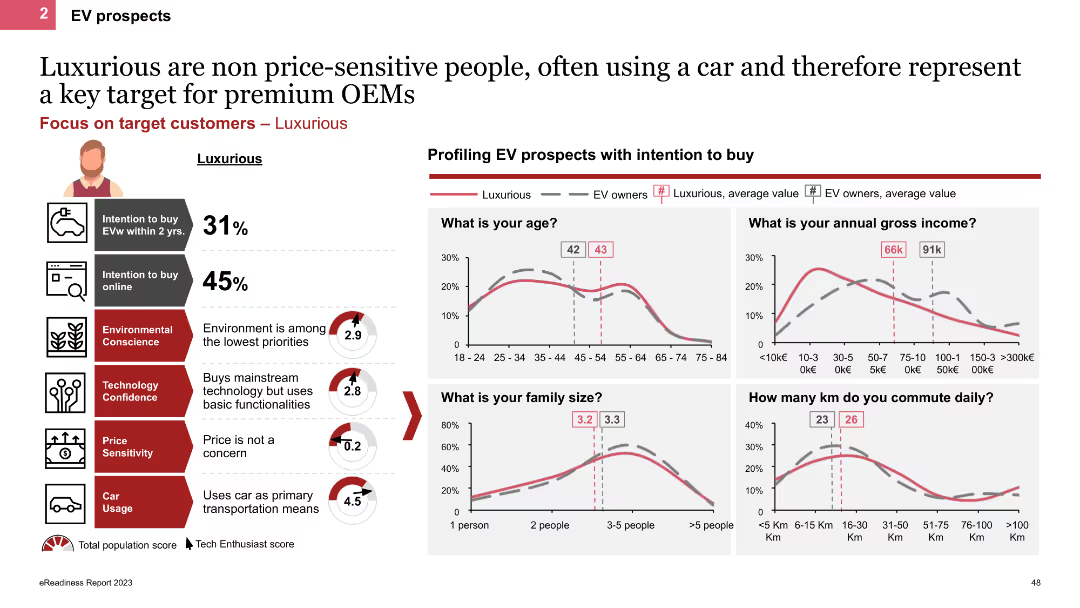
The slide profiles Luxurious personas using line charts and icons, showing demographic details like age, income, and family size. It highlights their high car usage and low price sensitivity, with charts comparing their characteristics to other EV owners.
Customer and Market Segmentation
Transportation & Logistics
This slide describes Luxurious personas, emphasizing their high income, frequent car usage, and lack of price sensitivity. It provides demographic comparisons and insights into their EV purchase behaviors and preferences.
EV prospects, Luxurious, line charts, demographics, high income
Multiple Chart
PwC/Strategy&
Saved
Features column charts comparing education funding levels and allocations within the Indonesian government budget over several years. Additional bar charts compare Indonesia's education spending to neighboring countries, with annotations highlighting key statistics and trends.
Financial Performance
Education & Training
Reviews the sustainability of government funding for education in Indonesia, comparing it to neighboring countries and discussing potential impacts of policy changes on funding levels. Offers insights into the challenges and opportunities within the education funding landscape.
demand, subsidy
Multiple Chart
BCG
Saved
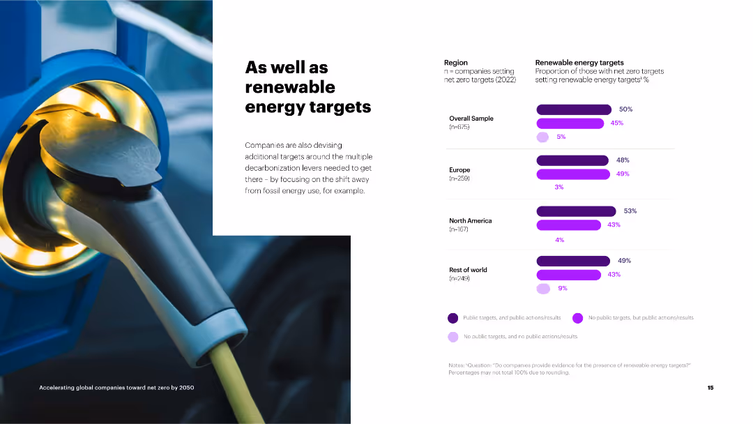
The slide contains a column chart on the right showing the proportion of companies setting renewable energy targets by region.
Strategic Planning
Environmental Services & Sustainability
The slide discusses the adoption of renewable energy targets by companies as part of their broader net zero strategies, with regional breakdowns.
renewable energy, targets, net zero, overall sample, Europe, North America, rest of world, public targets
Mixed Chart
Accenture
Saved
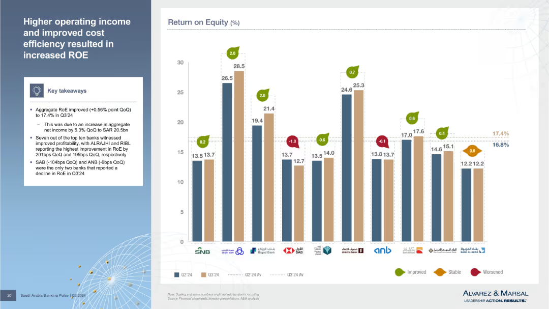
Bar chart comparing Return on Equity (RoE) across banks for Q2 and Q3’24, including change annotations. Left-side summary box offers context.
Financial Performance
Financial Services
RoE improved to 17.4% QoQ due to higher net income. ALRAJHI and RIBL led gains, while SAB and ANB declined. Slide compares Q2 and Q3’24 to show where profitability improved or worsened. Visual indicators make changes across banks easy to interpret.
return on equity, profitability, ALRAJHI, RIBL, SAB, ANB, Q3 2024
Mixed Chart
Alvarez & Marsal
Saved
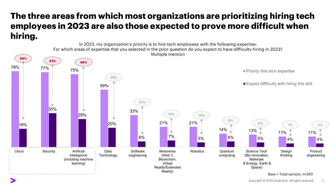
A column chart comparing the prioritization and difficulty of hiring tech skills, showing a discrepancy between priorities and hiring challenges.
Human Resources and Talent Management
Professional Services
The slide compares areas prioritized for tech hiring in 2023 with the expected difficulty in hiring, highlighting potential recruitment challenges.
hiring challenges, tech skills, recruitment, priorities
Single Chart
Accenture
Saved
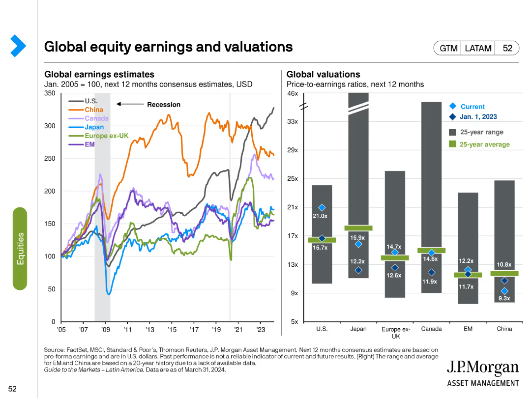
This slide includes a line chart for global earnings estimates and a bar chart for global valuations. Different colors represent various regions and time periods, highlighting trends and comparisons.
Financial Performance
Financial Services
It provides a comparison of earnings estimates and valuation metrics across global equity markets, helping to identify trends and potential investment opportunities based on relative valuations.
Global equities, earnings estimates, valuations, comparative analysis, trends
Multiple Chart
JP Morgan
Saved
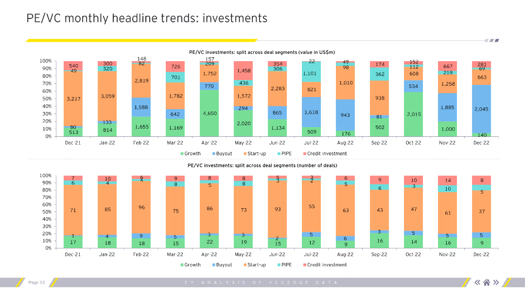
Displays stacked column charts for PE/VC investments split across deal segments by value and number of deals monthly. Uses multiple colors for segmentation. Visual complexity is moderate.
Market Analysis and Trends
Financial Services
Provides a detailed monthly breakdown of PE/VC investments by deal segments (growth, buyout, startup), both in value and number. Useful for market analysts and investors.
PE, VC, investments, deal segments, monthly
Multiple Chart
EY
Saved
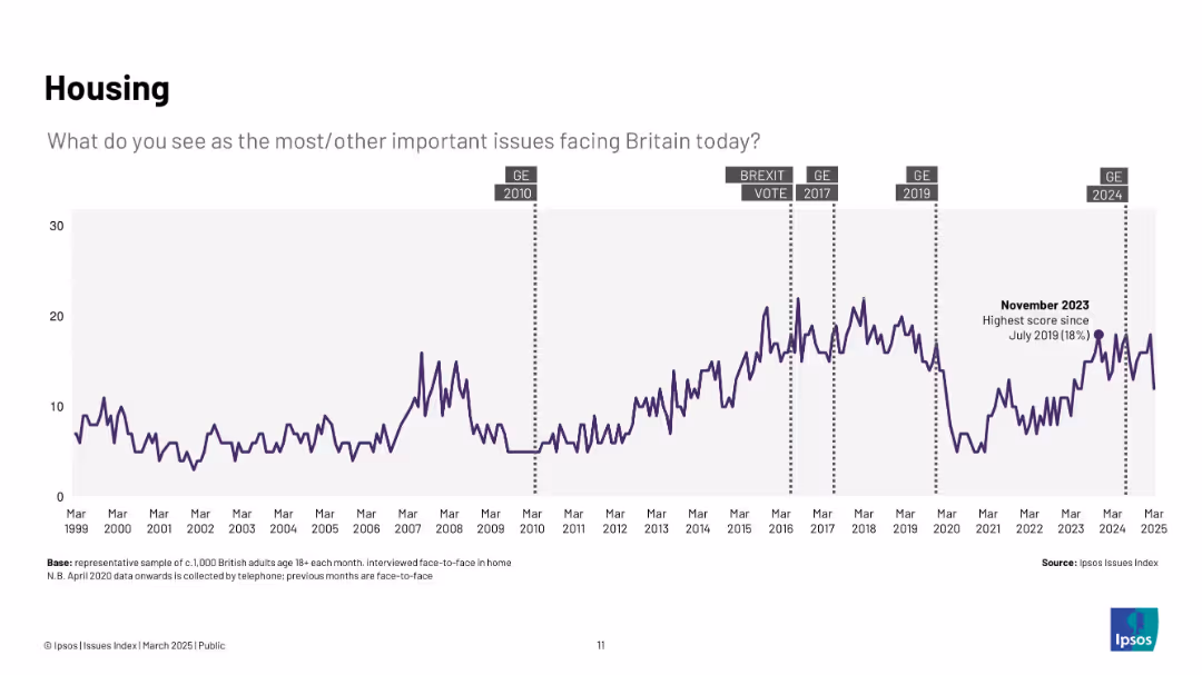
Purple line chart (1999–2025) showing rising concern about housing, peaking in late 2023; includes annotations for general elections and Brexit.
Market Analysis and Trends
Real Estate & Construction
Shows long-term increase in concern about housing, with recent spikes indicating growing pressure on affordability and availability. Peaks are tied to economic and political milestones.
housing, affordability, UK, public opinion, Ipsos, construction, real estate, elections
Single Chart
IPSOS
Saved
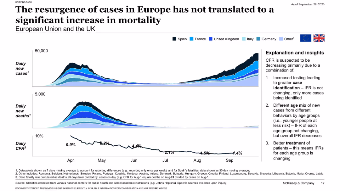
Dual area and line charts showing new cases, deaths, and CFR across European countries with explanation sidebar.
Risk Assessment and Management
Healthcare & Pharmaceuticals
Highlights the European resurgence in COVID-19 cases with no equivalent rise in mortality. Attributes the decoupling of cases and deaths to improved detection, younger age distribution, and better treatment.
Europe, COVID-19 resurgence, CFR, case detection, mortality
Mixed Chart
McKinsey
Saved
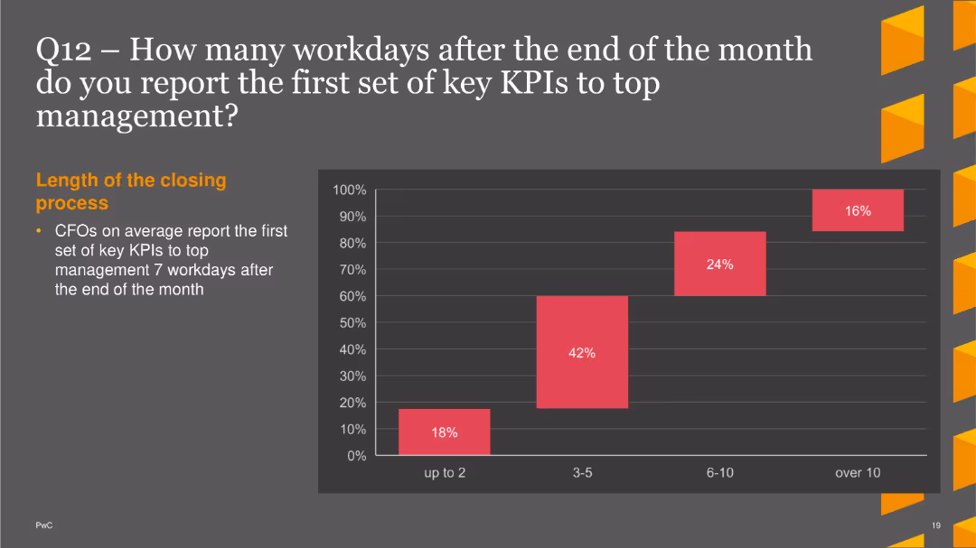
A pie chart showing the distribution of concerns related to business reporting. Different segments represent various concerns like data quality and processing
Risk Assessment and Management
Financial Services
This slide identifies the primary concerns CFOs have regarding business reporting, with a focus on manual processing and data quality issues.
business reporting, concerns, data quality, manual processing, CFO concerns
Single Chart
PwC/Strategy&
Saved
Contains line graphs showing progress against emissions targets for various sectors within Barclays' portfolio.
Risk Assessment and Management
Government & Public Sector
Highlights Barclays' progress in reducing emissions in various sectors, aligning with global sustainability targets.
emissions, targets, progress, sustainability, financial services, risk management, environmental impact
Multiple Chart
Barclays
Saved
The slide contains two main sections each with a distinct visual graph: the left section has a column chart comparing cost of vanadium redox flow batteries between countries; the right section has a bar chart detailing the composition of manufacturing costs in Australia.
Market Analysis and Trends
Energy & Utilities
Discusses the potential for Australian producers to reduce costs in vanadium redox flow battery manufacturing by focusing on electrolyte costs, comparing to costs in China and the US.
cost reduction, battery manufacturing, electrolyte, vanadium, Australia, China, US, comparative analysis, industry costs
Multiple Chart
Accenture
Saved
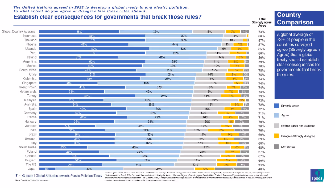
Horizontal stacked bar chart comparing country-level agreement rates. Text box summarizes key insight with visual on the right.
Regulatory and Compliance
Environmental Services & Sustainability
The slide presents country-by-country agreement levels on establishing consequences for rule-breaking governments under a global plastic treaty. Highest support is seen in Indonesia, Uganda, and Thailand, with a 73% global average.
international treaty, plastic rules, accountability, country comparison, environmental regulation, Ipsos survey, global consensus, compliance
Mixed Chart
IPSOS
Saved
The slide contains a column chart showing the global temperature anomaly from 1900 to 2023 on the left, and a pie chart on the right depicting global greenhouse gas emissions by source in 2019. The column chart has vertical bars representing temperature changes, while the pie chart is color-coded to show different emission sources. Overall layout is balanced with equal emphasis on both charts.
Market Analysis and Trends
Environmental Services & Sustainability
This slide analyzes the historical global temperature anomaly and the distribution of global greenhouse gas emissions by various sources in 2019. It is intended to illustrate the impact of different sectors on climate change and highlight the increasing trend in global temperatures over the years.
Global warming, greenhouse gases, temperature anomaly, emissions, climate change, data visualization, environmental impact
Multiple Chart
JP Morgan
Saved
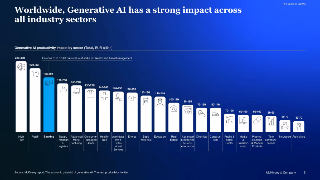
Bar chart comparing GenAI productivity impact in EUR across sectors
Investment Analysis
Artificial Intelligence
Shows estimated GenAI-driven productivity impact by sector, highlighting high-tech, retail, and banking as top contributors, and noting EUR 15–20B stake for wealth and asset management.
productivity impact, sector, EUR billion, industry, GenAI, value
Single Chart
McKinsey
Saved
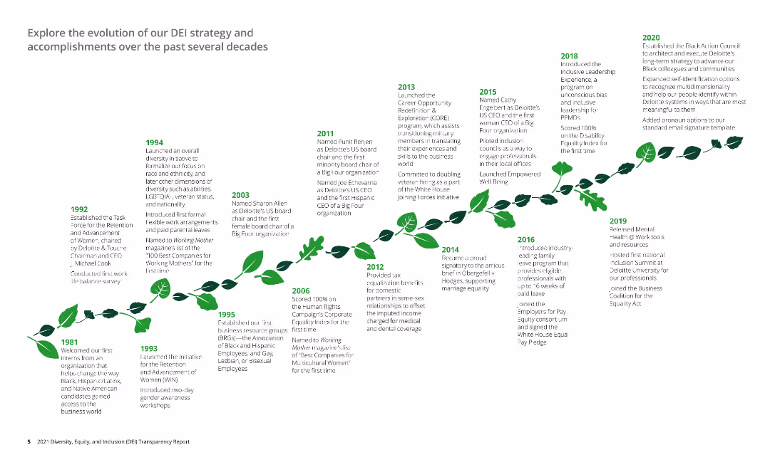
The slide features a timeline detailing the evolution of a company's DEI strategy from 1981 to 2020, with key milestones and achievements noted. The timeline is visually represented as a growing plant, symbolizing development and progress.
Organizational Structure and Change
Professional Services
The slide provides a historical overview of the company's Diversity, Equity, and Inclusion (DEI) strategy, highlighting significant milestones, initiatives, and accomplishments over several decades, from 1981 to 2020.
DEI strategy, timeline, milestones, diversity, inclusion
Linear Flow
Deloitte
Saved
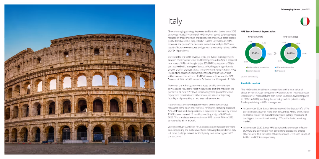
A photo of the Colosseum with circular charts showing NPE stock growth expectation and a detailed text explanation.
Market Analysis and Trends
Financial Services
This slide analyzes Italy's banking system and NPE stock growth expectations, discussing economic impacts and future outlooks.
Italy, NPE stock, banking, financial services, market analysis
Mixed Chart
Deloitte
Saved
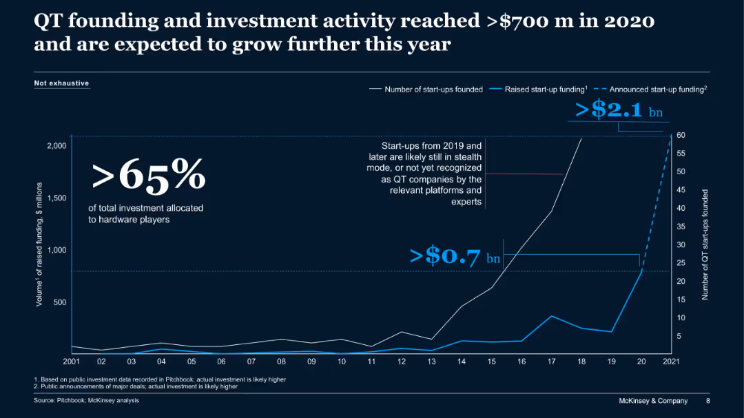
Line chart showing trends in QT start-up funding and number of start-ups from 2001 to 2021, with annotations for stealth and hardware players.
Sales and Business Development
Artificial Intelligence
This slide tracks growth in quantum technology (QT) funding and start-up activity, highlighting over $700M in 2020 and projections for continued growth, particularly in hardware-focused investments.
QT, quantum tech, start-ups, funding, venture capital, hardware, McKinsey
Single Chart
McKinsey
Saved
Previous
Next
If nothing, comes up, please save your slides first
Create a FREE account to continue browsing
Receive Instant Access to 1,000+ slides from companies like McKinsey, Google, and Goldman Sachs
First Name
Last Name
Email
Password
I agree to all
Terms & Privacy Policy
Thank you! Your submission has been received!
Oops! Something went wrong while submitting the form.
Have an account?
Sign in
Column Chart
Heatmap
Chevron
Org Chart
Infographic
Callouts
Timeline
List
Graphic
Picture
Process Flow
Diagram
Paragraph
Map
Table
Framework
Subtitle
Takeaway Box
Icon
Other Chart
Radar Chart
Waterfall Chart
Mekko Chart
Pie Chart
Scatter Plot
Line Chart
Bar chart
Bullet points