Create a FREE Account
Instant access to 1,000+ real slides from top companies like McKinsey, BCG, Goldman Sachs, Google and many more!
First Name
Last Name
Email
Password
I agree to all
Terms & Privacy Policy
Thank you! Your submission has been received!
Oops! Something went wrong while submitting the form.
Have an account?
Sign in
Library
Templates
Courses
Pricing
My Account
My Slides
My Templates
✦ AI
AI Prompt Library
AI Search
Sign in
Start Here
Logout
My Saved Slides
This slide contains a column chart depicting the growth of the North American market for vitamins and dietary supplements from 2018 to 2023, with separate data for the USA and Canada. Additional text provides key drivers and market dynamics.
Market Analysis and Trends
Healthcare & Pharmaceuticals
The slide forecasts the growth of the North American market for vitamins and dietary supplements, with a detailed breakdown for the USA and Canada. It discusses key drivers such as regulatory changes, consumer health awareness, and product trends, projecting a higher growth rate compared to historical trends.
North American market, vitamins, dietary supplements, growth forecast, USA, Canada
Mixed Chart
PwC/Strategy&
Saved
Matrix layout: four major pain point categories across top, each with corresponding red icons and bulleted descriptions below. Solutions for each category are outlined at the bottom of the slide in light pink boxes.
Customer and Market Segmentation
Consumer Goods
This slide offers a structured framework to address luxury retail pain points across personalization, in-store friction, staff expertise, and aftersales. Suggested solutions include tech integration, training, communication improvements, and enhanced service standards.
omnichannel, customer service, personalization, staff training, luxury retail, tech-driven solutions, aftersales
Mixed Chart
McKinsey
Saved
Uses bar charts to compare market sizes and serviceable addressable market (SAM) across sectors like airtime and electricity.
Market Analysis and Trends
Telecommunications
Analyzes the B2C market dynamics, highlighting sectors with growth potential and those facing decline.
B2C, market dynamics, telecommunications, growth, SAM
Single Chart
BCG
Saved
Text on left, and a grouped bar chart on right showing developer sentiment improvements (e.g., happiness, focus, flow state) with and without generative AI.
Human Resources and Talent Management
Technology & Software
Developers using generative AI tools report higher levels of happiness, focus, and "flow" compared to those who don’t. The data highlights gen AI’s potential to enhance the developer experience.
developer experience, generative AI, productivity, flow state, job satisfaction, retention
Mixed Chart
McKinsey
Saved
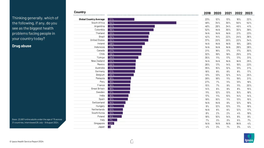
The slide features a column chart comparing optimism about health futures among different ethnic groups across several health-related categories.
Market Analysis and Trends
Healthcare & Pharmaceuticals
This slide presents survey data on optimism regarding future health across different ethnic groups in the U.S., highlighting disparities in expectations about personal health, healthcare quality, and availability.
Health optimism, ethnic groups, survey, healthcare, future trends
Mixed Chart
IPSOS
Saved
Shows column charts detailing the duration of the implementation project through 2018, segmented by time frames from less than 3 months to more than 12 months, with commentary on the project duration and implementation challenges.
Operational Efficiency
Financial Services
Examines the duration of IFRS 9 implementation projects, providing insights into the time frames banks experienced during the transition and the associated challenges, emphasizing the need for ongoing transition activities.
implementation project, duration, IFRS 9, transition challenges, financial services
Mixed Chart
EY
Saved
The slide contains three column charts comparing YoY % change in real wages and contributions from nominal wage growth and inflation for the US, UK, and Euro area from 2020 to 2023.
Market Analysis and Trends
Professional Services
The slide shows real wage growth is now positive across the US, UK, and Euro area amidst subsiding inflation.
wage growth, real wages, inflation, US, UK, Euro area, column chart
Multiple Chart
Accenture
Saved
The slide features a large image at the top left with text on the right, including a trend assessment with bar charts.
Technology and Digital Transformation
Retail & E-commerce
Discusses voice commerce, highlighting the use of smart speakers and voice commands to enhance online shopping experiences.
Voice Commerce, Smart Speakers, Voice Commands, Retail, Shopping, AI, Personalization, Customer Interaction
Mixed Chart
Deloitte
Saved
The slide features a column chart comparing rail transport costs per tonne per kilometer across various Australian states and other countries. It also includes key metrics and explanations.
Operational Efficiency
Transportation & Logistics
The slide compares rail freight costs in Australia to other countries, highlighting that Australian costs are significantly higher despite shorter haul distances, with detailed notes on contributing factors.
Rail freight, Australia, cost comparison, transportation, logistics, haulage distances, operational efficiency
Mixed Chart
LEK
Saved
Column chart showing RWA changes and key lending metrics. Insights into real estate and leverage finance.
Risk Assessment and Management
Financial Services
Discusses disciplined risk management in Barclays' CIB with focus on RWA changes, lending, and real estate.
risk management, CIB, RWA, lending, real estate
Mixed Chart
Barclays
Saved
The slide includes a vertical column chart showing the percentage of income/profits taken up by taxes/levies. An image of a man with a tablet is on the right side.
Financial Performance
Financial Services
It discusses the percentage of income or profits that businesses allocate to taxes and levies, with 49% of SMEs paying between 20-40%. It also highlights the impact of local government charges on overall tax compliance.
Taxes, Income, Profits, Business, PwC
Mixed Chart
PwC/Strategy&
Saved
Includes a line chart that outlines the UK's market share of European projects by sector from 2012 to 2021, with lines for different sectors.
Market Analysis and Trends
Financial Services
This slide analyzes the UK's share of European projects by sector over the years, showing which sectors have gained or lost market share.
market share, UK, European projects, sectors, 2012-21
Multiple Chart
EY
Saved
Left column of explanatory text; right column features a line graph comparing Digital Core Index Scores between top and bottom quartiles across categories like CCP, Integration, Cloud, etc.
Performance Metrics and KPIs
Technology & Software
Highlights how top-performing companies lead in digital core capabilities like integration and visibility. The graph shows a 2x difference between top and bottom quartiles across digital components.
integration, visibility, digital score, cloud, AI, data, performance, benchmarking
Mixed Chart
Accenture
Saved
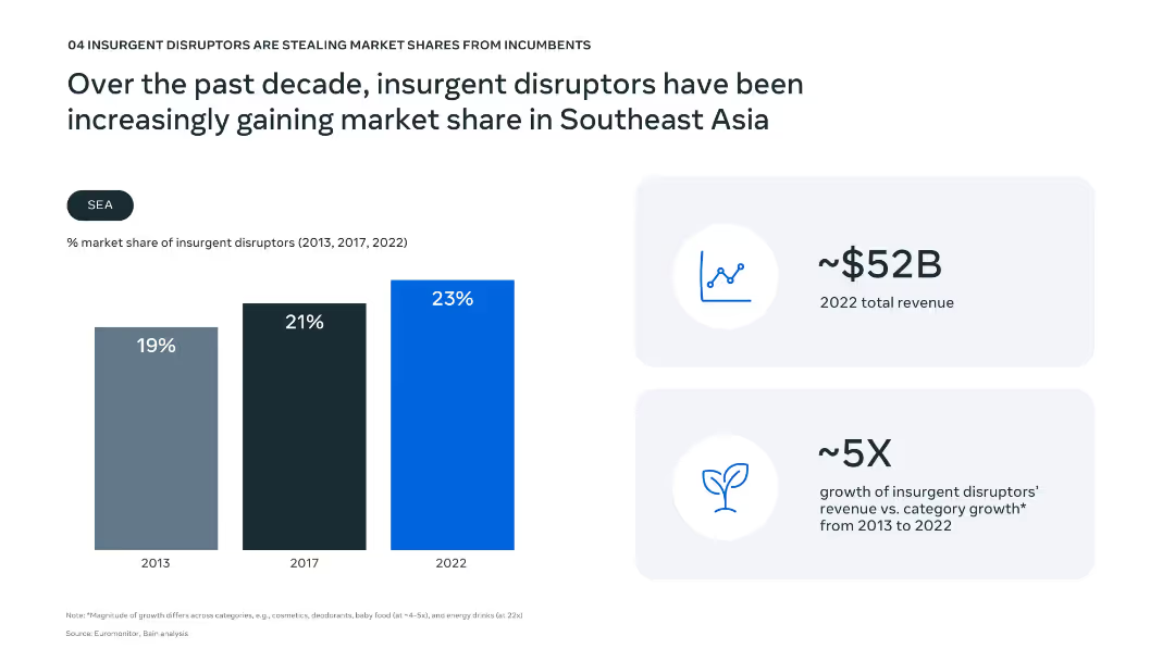
Vertical bar chart comparing renewable energy shares across years; takeaway text on the right
Performance Metrics and KPIs
Energy & Utilities
Reviews the growth in solar and wind energy share across SEA countries. It finds that most remain at ~4%, with Vietnam as the only country showing material increase due to favorable policies. The region's reliance on fossil fuels continues to offset renewable energy adoption.
renewable energy, SEA, solar, wind, Vietnam, energy transition, policy, electricity share
Multiple Chart
Bain
Saved
This slide features four colored circles representing "Capacity," "Cost," "Capability," and "Composition" with associated questions. The right side has detailed descriptions related to each element. Simple layout with minimal visuals.
Human Resources and Talent Management
Financial Services
The slide discusses key factors insurers consider for future workforce needs: capacity, cost, capability, and composition. It emphasizes strategic planning and workforce adaptability.
Capacity, Cost, Capability, Composition, Workforce Planning, Insurers, Strategic Objectives, Measurement, Future Workforce
Framework
EY
Saved
A vibrant, color-coded infographic slide details incentives offered by companies to promote office collaboration. It provides quantitative data on various programs through large percentage figures.
Organizational Structure and Change
Professional Services
This slide communicates the extent of strategies implemented to encourage employees to work on-site. It's likely intended for managers seeking to enhance office collaboration.
Collaboration Incentives, Office Work, Employee Programs, Quantitative Data, On-site Work
Single Chart
EY
Saved
Features a sequence of column chart illustrating changes in the leverage ratio over a period, complemented by a smaller bar chart depicting tier 1 capital data. Key highlights are noted on the right for quick reference.
Financial Performance
Financial Services
Focuses on the stability of the leverage ratio within a financial institution over time, emphasizing changes in regulatory treatment and capital adjustments. It provides insights into strategic financial planning and regulatory compliance.
leverage, capital, financial, compliance, stability
Mixed Chart
Deutsche Bank
Saved
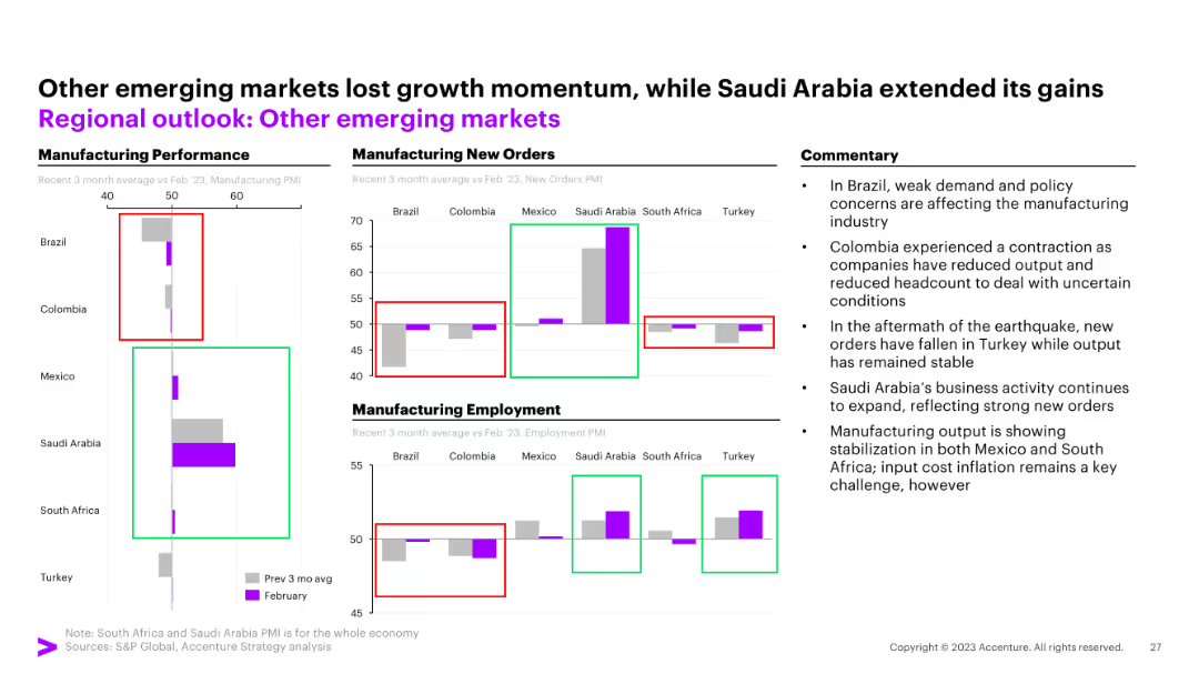
Two-panel line chart: Left shows US corporate net interest payments and profit share; Right shows bank lending standards for US, EU, UK.
Corporate Finance and Valuation
Financial Services
The slide examines US financial conditions, emphasizing reduced corporate interest burdens due to rate cuts and easing lending standards. It shows a favorable environment for business investment and financing.
interest rates, corporate finance, investment, lending standards, US, rate cuts
Multiple Chart
Accenture
Saved
Waterfall chart showing CET1 ratio movement with contributing factors and numerical labels. Includes summary of CET1 capital and RWA amounts for 2021 and 2022.
Corporate Finance and Valuation
Financial Services
This slide illustrates changes in Barclays’ CET1 capital ratio throughout FY22, starting from 15.1% and ending at 13.9%. It breaks down the components affecting the ratio, including attributable profit, distributions, pension, fair value adjustments, and FX impacts.
CET1 ratio, capital, risk-weighted assets, profit, distributions
Single Chart
Barclays
Saved
Includes a percentage bar chart with a purple theme. Each bar represents consumer agreement levels with statements about business responsibility.
Strategic Planning
Professional Services
Discusses expectations for businesses to act responsibly post-event, emphasizing the high consumer agreement on sustainable and fair solutions.
Corporate responsibility, Business ethics, Consumer expectations, Agreement levels, Sustainable solutions, Fair practices, Bar chart
Single Chart
Accenture
Saved
Multi-bar comparison across five inhibitors (returns, regulation, demand, finance, buy-in); includes contextual commentary
Risk Assessment and Management
Environmental Services & Sustainability
This slide identifies the major barriers to decarbonization faced by Middle East and GCC businesses, notably low returns and regulatory complexity. It suggests the need for policy alignment and financing strategies.
Decarbonization, Regulatory Barriers, Investment Returns, Climate Risk, Sustainability Challenges
Mixed Chart
PwC/Strategy&
Saved
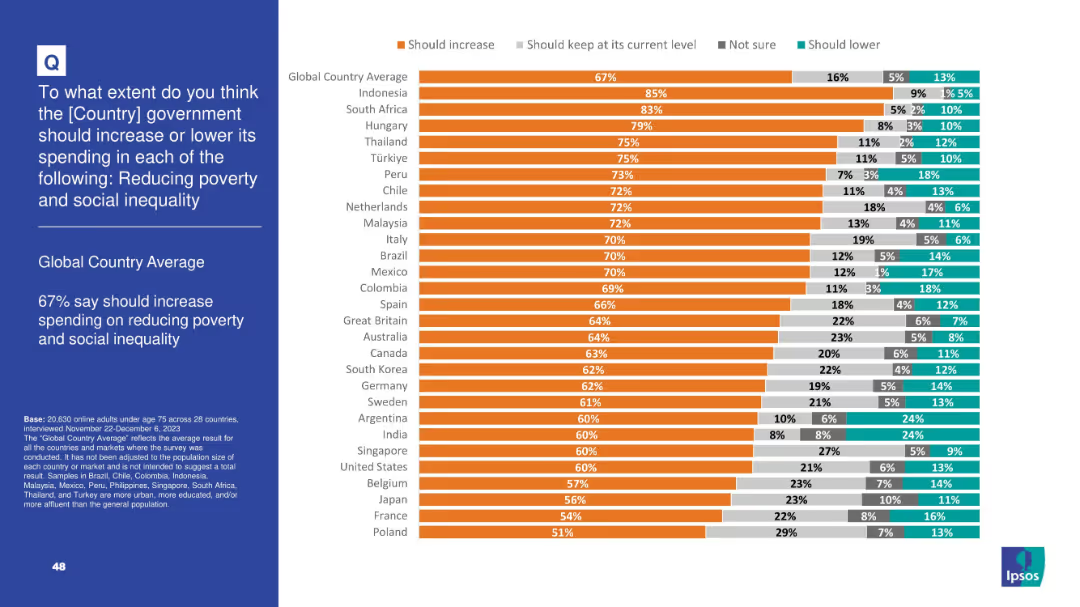
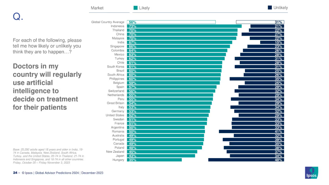
Horizontal bar chart comparing public agreement and disagreement on corporate versus government action on climate change across different markets.
Market Analysis and Trends
Government & Public Sector
Shows that the public believes both corporate and government actions are crucial in combating climate change, with high levels of agreement across many countries.
climate change, corporate action, government action, public mandate, survey
Multiple Chart
IPSOS
Saved
This slide includes tables comparing ownership structure, geographic footprint, port terminals, and recent investments of three major bulk handlers.
Competitive Landscape
Agriculture & Food Production
The slide compares three major bulk handlers in the grain industry, detailing their ownership, geographic reach, port terminal capacities, and recent investments.
Grain, Bulk Handlers, Comparison, Investment, Port
Multiple Chart
LEK
Saved
Line chart comparing reasons for leaving a provider among different customer segments.
Risk Assessment and Management
Financial Services
The slide outlines the top reasons consumers would leave their current financial service provider, with data security concerns being the most significant across all segments.
Consumer behavior, Data security, Financial services, Reasons for leaving, Customer retention
Mixed Chart
Accenture
Saved
Two sets of grouped vertical bar charts showing net revenues and noninterest expenses across business divisions, broken down by currency (EUR, GBP, USD, Other).
Risk Assessment and Management
Financial Services
Illustrates the currency mix of revenues and expenses for Deutsche Bank's divisions in Q2 2024. EUR dominates most segments, especially in Private Banking. Helps assess currency exposure and hedging needs.
currency exposure, EUR, USD, GBP, noninterest expenses, revenues
Single Chart
Deutsche Bank
Saved
Previous
Next
If nothing, comes up, please save your slides first
Create a FREE account to continue browsing
Receive Instant Access to 1,000+ slides from companies like McKinsey, Google, and Goldman Sachs
First Name
Last Name
Email
Password
I agree to all
Terms & Privacy Policy
Thank you! Your submission has been received!
Oops! Something went wrong while submitting the form.
Have an account?
Sign in
Column Chart
Heatmap
Chevron
Org Chart
Infographic
Callouts
Timeline
List
Graphic
Picture
Process Flow
Diagram
Paragraph
Map
Table
Framework
Subtitle
Takeaway Box
Icon
Other Chart
Radar Chart
Waterfall Chart
Mekko Chart
Pie Chart
Scatter Plot
Line Chart
Bar chart
Bullet points