Create a FREE Account
Instant access to 1,000+ real slides from top companies like McKinsey, BCG, Goldman Sachs, Google and many more!
First Name
Last Name
Email
Password
I agree to all
Terms & Privacy Policy
Thank you! Your submission has been received!
Oops! Something went wrong while submitting the form.
Have an account?
Sign in
Library
Templates
Courses
Pricing
My Account
My Slides
My Templates
✦ AI
AI Prompt Library
AI Search
Sign in
Start Here
Logout
My Saved Slides
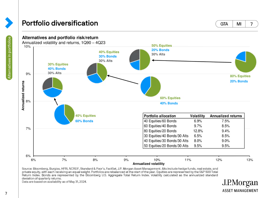
The slide features a column chart depicting asset class yields and a table showing public and private market correlations. It is moderately complex.
Market Analysis and Trends
Financial Services
The slide presents yields across various asset classes and correlations between public and private markets. It is used to analyze investment performance in global alternatives.
asset class yields, market correlations, equities, fixed income, alternatives, global investment, financial analysis, performance trends
Multiple Chart
JP Morgan
Saved
Line chart showing generational and gender breakdown of those who think climate change is a distant concern.
Risk Assessment and Management
Environmental Services & Sustainability
This visual highlights differences by age and gender in underestimating the immediacy of climate change. Gen Z males show highest levels of future deferral.
generational perception, climate delay, gender trends, urgency gap, Ipsos, Earth Day, belief systems
Mixed Chart
IPSOS
Saved
The slide has a column chart listing the top motivators for customers to switch subscription providers, categorized by type. It emphasizes financial incentives and their significance compared to other factors.
Market Analysis and Trends
Consumer Goods
This slide discusses the importance of pricing strategies for subscription providers in competitive markets. It details how financial incentives are crucial in influencing customer decisions to switch providers.
pricing strategy, financial incentives, competitive market, customer motivators, subscription providers, ecommerce, retail
Multiple Chart
Deloitte
Saved
A donut chart showing productivity levels since remote work began. A column chart compares productivity across Baby Boomer, Gen X, Millennial, and Gen Z generations.
Human Resources and Talent Management
Professional Services
This slide shows perceptions of productivity changes since remote work began, comparing different generations. It questions the sustainability of self-reported productivity.
Productivity, Remote Work, Generations, Performance, Sustainability
Multiple Chart
EY
Saved
Slide contains a column chart depicting the investment in digital media over several years, with projections for future spending. It's straightforward, using varying shades of blue to represent different years.
Technology and Digital Transformation
Consumer Goods
Shows Clorox's increasing investment in digital media from FY15 to FY19, indicating a strategic shift towards digital channels. Useful for discussions on marketing strategies and digital transformation.
digital investment, marketing strategy, Clorox, digital transformation
Single Chart
Barclays
Saved
Includes a combination of bar charts and icons representing areas such as environmental packaging and sustainable sourcing. Each area has a corresponding percentage and icon.
Customer and Market Segmentation
Agriculture & Food Production
Details the specific areas of sustainable practices food companies are focusing on, such as waste reduction and sustainable sourcing, providing a clear breakdown of industry priorities in the context of environmental sustainability.
sustainability, food production, waste management, packaging
Multiple Chart
Deloitte
Saved
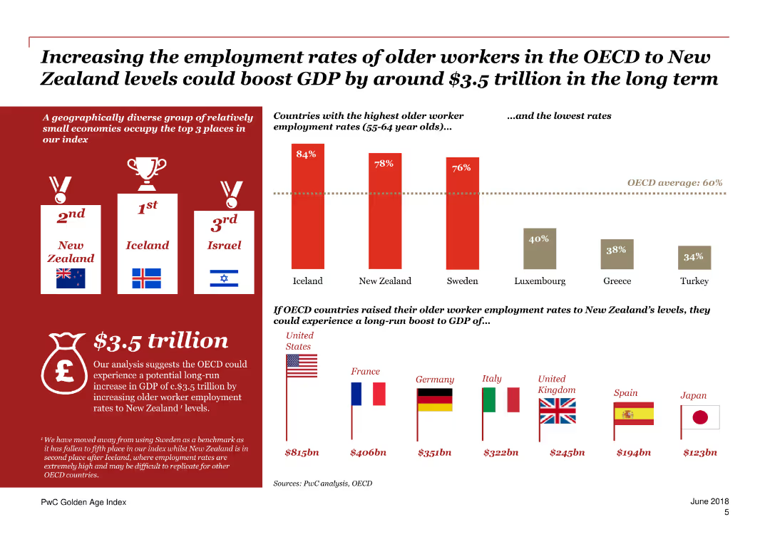
A combination of text and column charts discussing Germany's Golden Age Index ranking and key drivers.
Market Analysis and Trends
Government & Public Sector
Focuses on Germany's rise in the Golden Age Index due to incentives for longer work and higher retirement ages, and labor market reforms.
Germany, Golden Age Index, employment, incentives, retirement age, labor market reforms, drivers, older workers, policies, trends
Mixed Chart
PwC/Strategy&
Saved
Bar chart of estimated CAPEX needs by supply chain stage; color-coded by material type
Investment Analysis
Energy & Utilities
CAPEX estimates for battery material and cell production supply chain show investments between EUR 100–135 bn needed globally by 2030. Mining, refining, and precursor material production dominate investment requirements.
CAPEX, supply chain, lithium, nickel, cobalt, graphite, cell production
Single Chart
Roland Berger
Saved
The slide has column and line charts, and smaller column charts. The primary chart shows quarterly take-up and vacancy rates, with blue bars and a yellow line. On the right, two column charts display Grade A office vacancy in key markets and vacancy in weaker markets, distinguished by color gradations of blue and grey.
Operational Efficiency
Real Estate & Construction
This slide outlines improvements in office market occupancy, contrasting Grade A office vacancy against all office grades. It includes specific vacancy rates in weaker office markets. Real estate professionals can use this to assess market health or investment potentials in various office grades, especially when considering strategic property upgrades or marketing to reduce vacancy rates.
office market, occupancy, vacancy rates, Grade A, market comparison
Multiple Chart
Morgan Stanley
Saved
The slide presents a diagram of the industrial technology stack, illustrating various components and sample companies involved in the process-level, system integration, and instruments levels.
Competitive Landscape
Industrial & Manufacturing
The slide categorizes different companies and technologies involved in industrial automation, highlighting the complexity and diversity of the industrial technology stack.
industrial technology, stack, companies, components, process-level, system integration, instruments
Framework
LEK
Saved
This slide includes comparative data in blue bar charts and two columns with demographics and geographical segmentation. It provides a contrast in online spending between HVUs and non-HVUs in Vietnam. Source includes Bain analysis.
Market Analysis and Trends
Technology & Software
The slide compares online spending habits of high-value users (HVUs) to non-HVUs in Vietnam, useful for understanding consumer segmentation and targeting strategies in the digital economy.
Vietnam, High-Value Users, Consumer Spending, Digital Economy, Online Spend, Demographic Analysis, Geographic Segmentation, Market Research, Spending Habits
Multiple Chart
Bain
Saved
A line graph showing the global venture-investing market's growth from 1998 to 2017, marked by key events like company foundations and economic crises. Annotations provide context for significant points on the timeline.
Investment Analysis
Financial Services
The slide illustrates the growth trend of the global venture-investing market, with key historical points such as the dot-com crisis and subsequent recovery, and markers for the founding of major tech companies and their IPOs. It analyzes the resilience of the venture market in the face of global economic challenges and underlines the strong growth in deal values, particularly post-2003.
venture investing, growth, deal value, dot-com crisis, IPO, market trend
Mixed Chart
Oliver Wyman
Saved
A column chart comparing equity ownership percentages among senior leadership in Permian Resources, in black and green.
Financial Performance
Energy & Utilities
Discusses the alignment of interests between Permian Resources' management and shareholders, with details on equity ownership and compensation strategies.
shareholder, equity, management, Permian Resources, alignment
Mixed Chart
Barclays
Saved
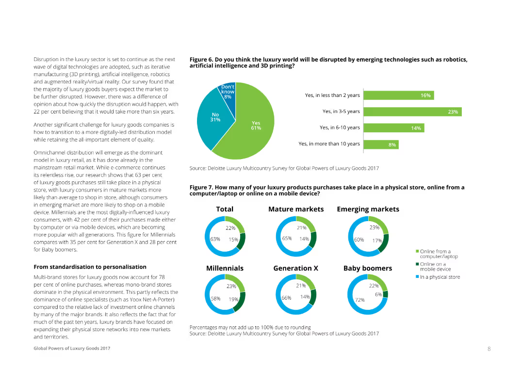
The slide uses a combination of stacked bar charts and text boxes to illustrate the importance of offline and online channels for luxury purchases. It shows channel usage trends from 2019 to 2021 and a sales breakdown in mainland China. The visual complexity is moderate with clear data presentation.
Market Analysis and Trends
Retail & E-commerce
This slide highlights the shifting consumer preferences between offline and online channels for luxury purchases. It shows historical trends and current channel usage, emphasizing the growing importance of online interactions.
channel preference, offline, online, luxury purchases, consumer behavior
Multiple Chart
BCG
Saved
The slide presents a column chart comparing regional data. It uses contrasting colors to differentiate between North America and the rest of the world across several I&D maturity levels. Textual analysis is provided on the side.
Strategic Planning
Professional Services
This slide provides insights into regional variations in I&D maturity levels, with a specific focus on North American perspectives versus global ones.
I&D, regional analysis, column chart, North America, global comparison, maturity levels
Single Chart
Accenture
Saved
Circular pie chart showing value distribution by truck tractor component (EUR%), with callouts for powertrain, cabin, chassis, systems/connectivity
Product and Service Analysis
Industrial & Manufacturing
The slide illustrates how value in a truck tractor is distributed across components. Powertrain holds the largest share (40–45%), followed by the cabin and chassis. Connectivity systems hold minimal value currently but are expected to grow. Value-add is analyzed by OEM vs. supplier, with trend indicators until 2030.
truck tractor, component value, powertrain, cabin, chassis, connectivity, OEM, supplier
Single Chart
Roland Berger
Saved
Contains graphs and bullet points with strategic goals.
Strategic Planning
Financial Services
Outlines strategic objectives for simpler, better, and more balanced approaches in investment banking.
Strategy, Investment Banking, Improvement, Goals, Simplification, Balance, Growth
Linear Flow
Barclays
Saved
The slide includes a column chart and a bar chart displaying historical market performance by type of occasion and type of consumption from 2016 to 2022. The chart uses different colors to distinguish categories and percentages.
Market Analysis and Trends
Hospitality & Tourism
The slide shows the growth of the travel sector and delivery services within the global foodservice market. It details the historical market performance and consumption trends, highlighting significant growth areas from 2016 to 2022.
Market growth, travel, delivery, consumption trends, foodservice market
Multiple Chart
Deloitte
Saved
The slide features a bar chart comparing traditional and digital marketing spend in the luxury sector. It also discusses the growing impact of pop-up stores and PR events in traditional marketing strategies.
Technology and Digital Transformation
Media & Entertainment
The slide indicates a significant shift from traditional to digital marketing spend in the luxury industry, with pop-up stores and PR events being the main growth drivers for traditional marketing channels.
traditional marketing, digital marketing, pop-up stores, PR events, luxury marketing
Multiple Chart
BCG
Saved
Bar chart of calendar year returns (2013–2023 YTD) with black and blue bars for portfolio vs. MSCI India IMI Index; right-side red dashed box showing annualized return since inception.
Financial Performance
Financial Services
Illustrates year-by-year net performance of Goldman Sachs India Equity Portfolio compared to the MSCI India IMI Index. The slide shows the portfolio outperforming in most years, highlighting consistency and resilience, and an annualized return since inception that beats the benchmark.
yearly performance, equity returns, MSCI India, alpha generation, GS portfolio, outperformance
Single Chart
Goldman Sachs
Saved
Two line charts compare policy rates in various economies with commentary text on the right. The y-axis shows percentage rates, and the x-axis shows months/years.
Regulatory and Compliance
Financial Services
The slide examines the pause in rate hikes by central banks across major economies, analyzing policy rates for the US, Euro area, UK, Japan, Australia, China, India, and Brazil.
Monetary policy, central banks, rate hikes, economic conditions, policy rates
Multiple Chart
Accenture
Saved
Bar and line chart comparing PE deal volume and value (2020–2024); values declining consistently; numbers labeled within bars.
Financial Performance
Financial Services
Tracks PE-backed M&A activity. PE deals declined by 11% in volume and 18% in value in 2024, reaching decade lows. Economic and geopolitical instability, plus foreign PE hesitancy, contributed to weaker market performance.
PE deals, private equity, deal value, deal volume, M&A, 2024
Single Chart
PwC/Strategy&
Saved
Contains multiple gears representing different economic indicators like unemployment rate, inflation, and GDP growth, alongside a map highlighting Namibia's geographical context.
Market Analysis and Trends
Government & Public Sector
Offers a comprehensive overview of Namibia's key economic indicators as of January 2018, useful for understanding the broader economic climate and its potential impacts on policy and investment decisions.
Economic, Statistics, GDP, Inflation, Map
Graphic
PwC/Strategy&
Saved
Column chart showing a slight increase from 5.1 to 5.2 between August 2021 and September 2022 in marketing leaders' effectiveness at demonstrating marketing's bottom-line impact to other C-suite members.
Customer and Market Segmentation
Professional Services
Discusses the effectiveness of marketing leaders in communicating the value of marketing strategies to other executives, showing a positive trend in their ability to link marketing efforts to company financials.
Marketing, Leadership, C-Suite, Communication, Bar Chart, Bottom-Line Impact, 2021-2022
Mixed Chart
Deloitte
Saved
Column chart detailing expenditure categories
Financial Performance
Hospitality & Tourism
Breaks down spending patterns among high-end tourists in Europe, emphasizing significant shares in culture, entertainment, and lodging.
spending, tourism, culture, entertainment, shopping
Single Chart
Bain
Saved
Previous
Next
If nothing, comes up, please save your slides first
Create a FREE account to continue browsing
Receive Instant Access to 1,000+ slides from companies like McKinsey, Google, and Goldman Sachs
First Name
Last Name
Email
Password
I agree to all
Terms & Privacy Policy
Thank you! Your submission has been received!
Oops! Something went wrong while submitting the form.
Have an account?
Sign in
Column Chart
Heatmap
Chevron
Org Chart
Infographic
Callouts
Timeline
List
Graphic
Picture
Process Flow
Diagram
Paragraph
Map
Table
Framework
Subtitle
Takeaway Box
Icon
Other Chart
Radar Chart
Waterfall Chart
Mekko Chart
Pie Chart
Scatter Plot
Line Chart
Bar chart
Bullet points