Create a FREE Account
Instant access to 1,000+ real slides from top companies like McKinsey, BCG, Goldman Sachs, Google and many more!
First Name
Last Name
Email
Password
I agree to all
Terms & Privacy Policy
Thank you! Your submission has been received!
Oops! Something went wrong while submitting the form.
Have an account?
Sign in
Library
Templates
Courses
Pricing
My Account
My Slides
My Templates
✦ AI
AI Prompt Library
AI Search
Sign in
Start Here
Logout
My Saved Slides
Utilizes a stacked area chart to depict the distribution of new COVID-19 cases across US regions from April to July 2020, colored by region.
Market Analysis and Trends
Healthcare & Pharmaceuticals
Presents the regional distribution of new COVID-19 cases in the US, showing how the case load has shifted from the Northeast to the Southern and Western states, providing insights into the dynamics of the pandemic’s domestic spread.
COVID-19, US, cases, regional, 2020
Single Chart
McKinsey
Saved
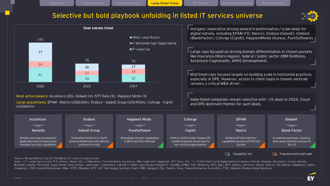
Column chart for deal volume by buyer type (2022–2024); lower third features company callouts; black and yellow theme with segmented insights; clean, bold visual language.
Mergers and Acquisitions
Technology & Software
This slide shows a nuanced M&A strategy among IT service providers, categorizing buyers into large caps, mid-small caps, and others. It highlights key players like Accenture, Globant, and Endava, and strategic themes such as domain expansion, vertical capabilities, and North American delivery enhancement. Deal volume is stable but more targeted.
IT services, M&A, listed companies, deal volume, strategic acquisition, buyer trends
Mixed Chart
EY
Saved
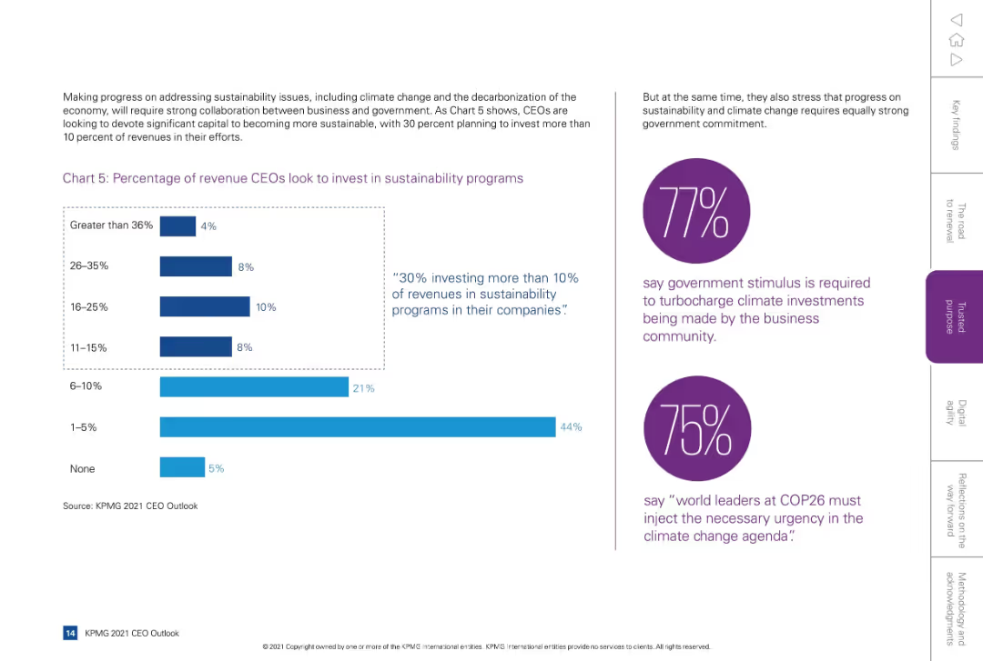
Split layout: left side with bar chart and supporting text, right side has two purple circular callouts with statistics and quotes.
Regulatory and Compliance
Environmental Services & Sustainability
Shows CEO intentions to invest revenue in sustainability programs, with 30% allocating more than 10%. Also emphasizes business-government collaboration on climate issues, highlighting expectations for government stimulus and leadership.
sustainability, revenue allocation, ESG, investment, climate, government
Mixed Chart
KPMG
Saved
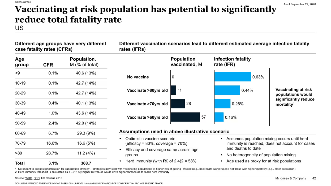
Dual-pane layout showing fatality rates by age group on the left, and vaccination impact scenarios on the right using bar charts. Text box below outlines assumptions.
Strategic Planning
Healthcare & Pharmaceuticals
This slide highlights the benefit of prioritizing high-risk populations for COVID-19 vaccination. It shows how vaccinating older age groups can substantially reduce infection fatality rates (IFRs), even with limited vaccine coverage and efficacy. The scenarios are based on realistic assumptions about herd immunity and demographics.
vaccination, fatality rate, COVID-19, high-risk, age group, population
Mixed Chart
McKinsey
Saved
Slide contains two columns, left column with text, right with a bar chart showing technology investment percentages
Technology and Digital Transformation
Financial Services
Discusses increased investments by wealth management firms in technology for compliance and client data management, highlighting growing trends.
digitization, investment, technology, compliance, data management, wealth management, financial services
Mixed Chart
Deloitte
Saved
Three line charts depict trends in NA Class 8 Truck, Brazilian truck and bus, and global light vehicle production from 2005 to 2019. Charts are on a green gradient background.
Industry Overview
Transportation & Logistics
Focuses on the production trends in heavy and light vehicles across North America and Brazil, showing growth in some areas while others decline, impacting industry analysis.
NAFTA, vehicles, production, trends, Brazil
Multiple Chart
Deutsche Bank
Saved
Contains a bar chart showing how companies plan to allocate resources gained from productivity improvements.
Financial Performance
Professional Services
Discusses how companies intend to invest or distribute profits gained from increased productivity, including reserves and acquisitions.
productivity, allocation, reserves, acquisitions, profits
Single Chart
Deloitte
Saved
The slide features two bar charts comparing loan and deposit figures across multiple quarters.
Financial Performance
Financial Services
Examines year-on-year and quarter-on-quarter changes in loan and deposit volumes within the bank's various divisions, providing insights into lending trends and deposit fluctuations.
loan development, deposit growth, banking, trends
Multiple Chart
Deutsche Bank
Saved
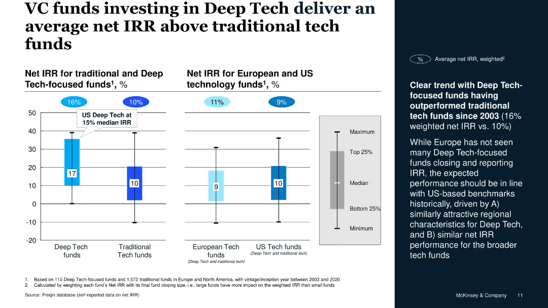
Vertical bar charts for IRR, segregated by fund type and geography, includes side commentary on trend data
Investment Analysis
Financial Services
The slide illustrates that Deep Tech-focused VC funds have historically outperformed traditional tech funds with a 16% weighted net IRR versus 10%, supported by Preqin data. U.S. Deep Tech shows a 15% median IRR.
net IRR, Deep Tech, VC funds, performance, US vs. Europe, investment returns
Mixed Chart
McKinsey
Saved
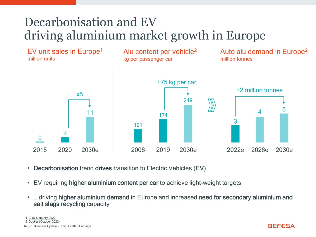
Three-column bar chart layout with annotations and summary bullet points below
Market Analysis and Trends
Industrial & Manufacturing
The slide illustrates how electric vehicle (EV) trends in Europe are increasing aluminium demand due to higher aluminium content per car and rising EV adoption.
EV, Aluminium, Market Growth, Europe, Decarbonisation, Lightweighting
Mixed Chart
Goldman Sachs
Saved
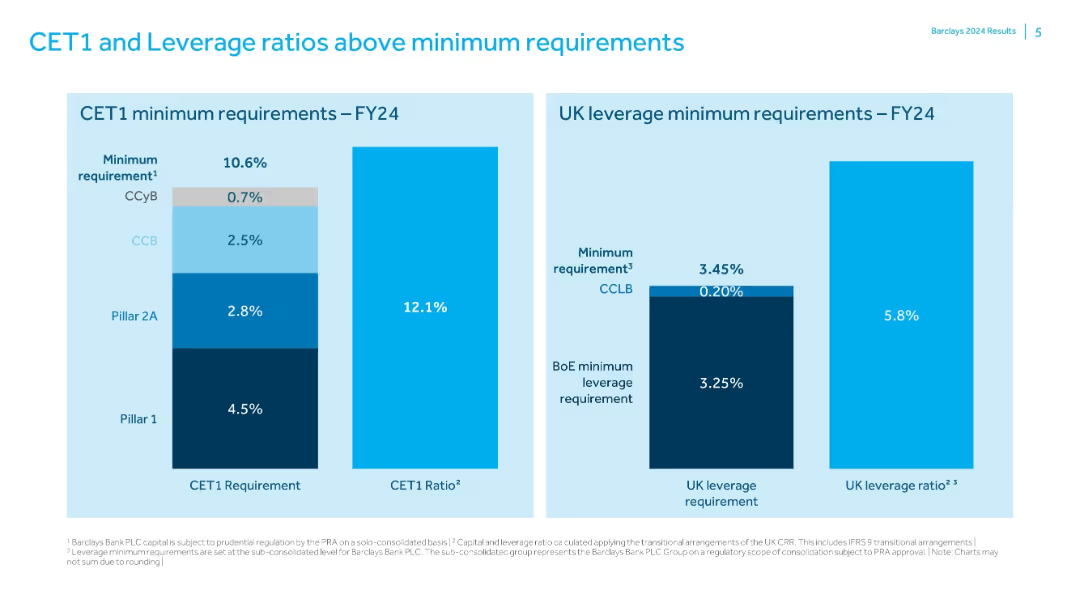
Two bar charts comparing Barclays' capital ratios to regulatory minimums; simple labeled format.
Risk Assessment and Management
Financial Services
Shows that Barclays exceeds FY24 minimum CET1 (10.6%) and UK leverage (3.45%) requirements with actual ratios of 12.1% and 5.8% respectively. Charts break down the components of regulatory minimums and the capital buffers in place.
CET1, leverage, regulatory capital, Barclays, risk management, capital ratio
Single Chart
Barclays
Saved
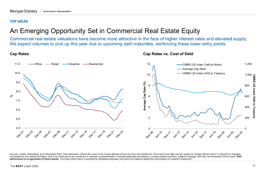
Two line charts showing cap rates for different property types and cap rates vs. cost of debt.
Market Analysis and Trends
Real Estate & Construction
This slide explores the opportunities in commercial real estate equity, highlighting the relationship between cap rates and the cost of debt across various sectors.
Commercial Real Estate, Cap Rates, Cost of Debt, Market Analysis, Opportunities
Multiple Chart
Morgan Stanley
Saved
Two line charts are presented: one showing government debt as a percentage of GDP and the other illustrating government interest payments as a percentage of GDP for the US, Eurozone, and UK.
Risk Assessment and Management
Government & Public Sector
The slide examines government debt levels and interest payment trends, useful for assessing fiscal sustainability and debt risk in major economies.
Government debt, interest payments, fiscal sustainability, GDP, risk management
Multiple Chart
JP Morgan
Saved
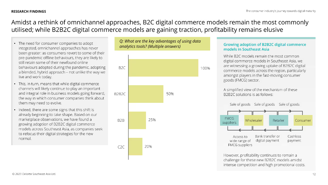
Features a vertical column chart showing the key advantages of data analytics tools with percentages for B2C, B2B2C, B2B, and C2C. Text boxes and an illustrative flowchart are present on the right.
Market Analysis and Trends
Retail & E-commerce
The slide compares the adoption of omnichannel approaches in retail, highlighting the rise of B2B2C models and their advantages in the Southeast Asia market.
omnichannel, B2C, B2B2C, retail, e-commerce, market analysis, data analytics, consumer behavior, Southeast Asia
Mixed Chart
Deloitte
Saved
Features column charts comparing purchasing behavior across different demographics.
Market Analysis and Trends
Retail & E-commerce
Explores purchasing trends for special edition luxury products, highlighting the strong market response in younger demographics and in China.
Purchasing trends, luxury products, special editions, demographics, younger consumers, China, consumer behavior
Multiple Chart
BCG
Saved
This slide includes a column chart comparing the holding of various stablecoins in 2022 and 2023, with specific percentages for each stablecoin listed.
Market Analysis and Trends
Financial Services
It details the types of stablecoins held by Canadians, including Binance USD and CAD Coin, noting changes in holding percentages from 2022 to 2023.
Stablecoins, VRCAs, 2023, 2022, holdings, Binance USD, CAD Coin, crypto assets
Multiple Chart
IPSOS
Saved
This slide displays a column chart tracking expenses from 2018 to 2019 in billions of dollars, highlighting overhead, revenue-related, and investment areas. The chart has a balance of dark and light blue tones, with green bars for positive changes and red for negative ones.
Financial Performance
Financial Services
The slide analyzes the expense trends for JPMorgan, showing an increase in overall expenses from 2018 to 2019 due to higher revenues and investments in technology and non-tech areas. A bar and column chart illustrates the changes in financial figures, such as overhead ratio and revenue-related expenses, offering insights into the financial planning and budgeting of the firm.
Expenses, Revenue, Investments, JPMorgan, Financial Analysis, Overhead Ratio, Bar Chart, Column Chart, Financial Planning
Single Chart
JP Morgan
Saved
A pie chart showing global market average responses comparing two actions to reduce individual greenhouse gas emissions: eating a vegetarian diet with some imported products vs. eating a locally produced diet including meat and dairy.
Market Analysis and Trends
Environmental Services & Sustainability
This slide contrasts public perceptions of the environmental impact of eating locally produced diets including meat and dairy versus vegetarian diets with some imported products, highlighting misconceptions about greenhouse gas emissions.
greenhouse gas emissions, diet choices, public perception, vegetarian diet, local diet, environmental impact, global market average
Mixed Chart
IPSOS
Saved
Two column charts show 3-year deposit CAGR and national retail deposit share, with Chase compared against industry and large banks. The slide has a clear visual distinction between Chase and its peers, using color coding to highlight differences.
Market Analysis and Trends
Financial Services
This slide analyzes the bank's deposit growth and market share relative to the industry, emphasizing the bank's outperformance in deposit CAGR and its ascension in retail deposit share rankings, evidencing competitive advantage and market influence.
Deposit growth, Market share, Competitive analysis, CAGR, Retail banking, Industry comparison
Multiple Chart
JP Morgan
Saved
Contains bullet points explaining industry-wide solvency ratios for Mexico, a table with top 10 Mexican life insurers' data, and column charts showing ratios.
Market Analysis and Trends
Financial Services
This slide analyzes the solvency ratios of Mexican life insurers, highlighting data inconsistencies, volatility, and proposing a subset for company data inclusion.
Mexico, solvency ratios, insurers, analysis, company data, financial services, market trends
Mixed Chart
Oliver Wyman
Saved
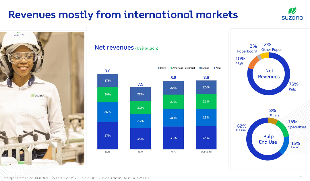
Split layout with left-side image of worker and right-side with stacked bar and donut charts; bold blue titles and clean grid layout on white background.
Financial Performance
Consumer Goods
This slide illustrates Suzano’s revenue distribution by geography and product. It highlights a strong international presence, with 75% of revenue coming from pulp. Regional revenue contributions are broken down with bar charts by year.
Revenue, International Markets, Pulp, Net Sales, Segments
Multiple Chart
Goldman Sachs
Saved
Map of Denmark, regional highlights, infographic style with icons and color coding.
Regulatory and Compliance
Government & Public Sector
Surveys regional focus on SDGs in Denmark, showing varying priorities such as climate action and economic growth.
Regional strategy, Denmark, SDGs, climate action, economic growth
Graphic
McKinsey
Saved
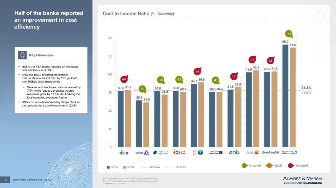
Bar chart showing individual bank C/I ratios for Q2 and Q3’24 with change indicators and a summary box on the left. Each bank's data is represented using color-coded bars and indicators for change direction.
Performance Metrics and KPIs
Financial Services
The chart highlights how various banks performed in terms of cost efficiency, with half showing improvement in their cost-to-income ratios. ANB and BALB had the worst deterioration. Key drivers include increased salaries, rent, and expansion efforts like SNB’s branch openings.
cost efficiency, banks, quarterly comparison, C/I ratio, SNB, ANB, BALB
Mixed Chart
Alvarez & Marsal
Saved
Detailed balance sheet with assets and liabilities breakdown, showing various categories like loans, derivatives, and deposits, along with coverage ratio.
Financial Performance
Financial Services
Comprehensive breakdown of UBS's balance sheet for 3Q23, detailing assets, liabilities, and equity with a focus on coverage ratio.
Balance sheet, assets, liabilities, equity, coverage ratio
Multiple Chart
UBS
Saved
Column chart depicting actions taken to manage lower income during COVID-19, comparing data from May 2020 and December 2020.
Financial Performance
Financial Services
Details the actions households took to manage lower incomes during the pandemic, with a focus on non-essential spending.
lower income, financial management, non-essential spending, COVID-19, household actions
Single Chart
IPSOS
Saved
Previous
Next
If nothing, comes up, please save your slides first
Create a FREE account to continue browsing
Receive Instant Access to 1,000+ slides from companies like McKinsey, Google, and Goldman Sachs
First Name
Last Name
Email
Password
I agree to all
Terms & Privacy Policy
Thank you! Your submission has been received!
Oops! Something went wrong while submitting the form.
Have an account?
Sign in
Column Chart
Heatmap
Chevron
Org Chart
Infographic
Callouts
Timeline
List
Graphic
Picture
Process Flow
Diagram
Paragraph
Map
Table
Framework
Subtitle
Takeaway Box
Icon
Other Chart
Radar Chart
Waterfall Chart
Mekko Chart
Pie Chart
Scatter Plot
Line Chart
Bar chart
Bullet points