Create a FREE Account
Instant access to 1,000+ real slides from top companies like McKinsey, BCG, Goldman Sachs, Google and many more!
First Name
Last Name
Email
Password
I agree to all
Terms & Privacy Policy
Thank you! Your submission has been received!
Oops! Something went wrong while submitting the form.
Have an account?
Sign in
Library
Templates
Courses
Pricing
My Account
My Slides
My Templates
✦ AI
AI Prompt Library
AI Search
Sign in
Start Here
Logout
My Saved Slides
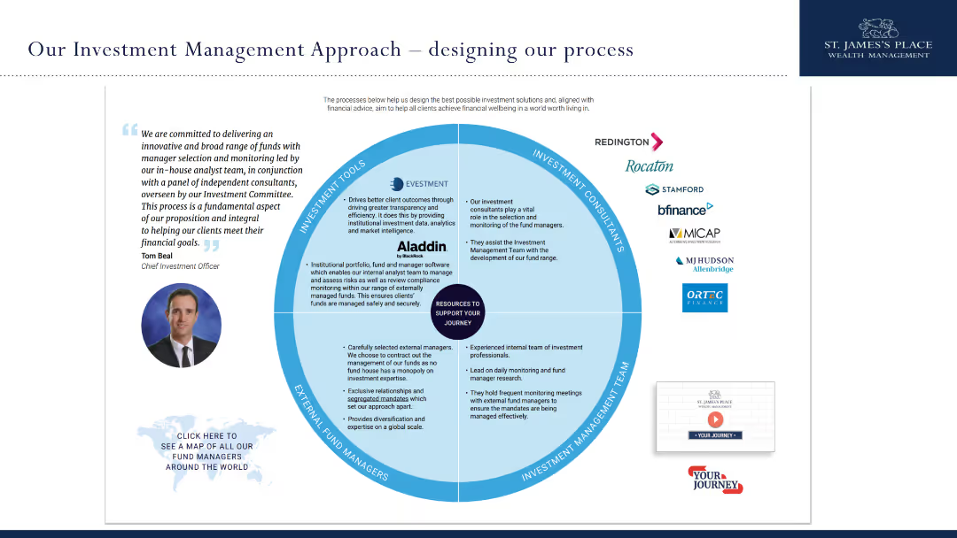
The slide has a circular diagram showing the different components of the investment management approach at St. James's Place.
Strategic Planning
Financial Services
It details the investment management process at St. James's Place, including tools, consultants, teams, and managers that contribute to delivering client financial goals.
investment, management, approach, St. James's Place, process
Diagram
Deloitte
Saved
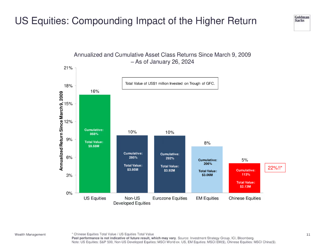
The slide shows a column chart comparing the annualized and cumulative returns of various equity markets since 2009, with US equities highlighted.
Financial Performance
Financial Services
The slide illustrates the superior performance of US equities compared to other markets, showing both annualized and cumulative returns to emphasize the compounding impact of higher returns.
US Equities, Returns, Performance, Market, Comparison
Single Chart
Goldman Sachs
Saved
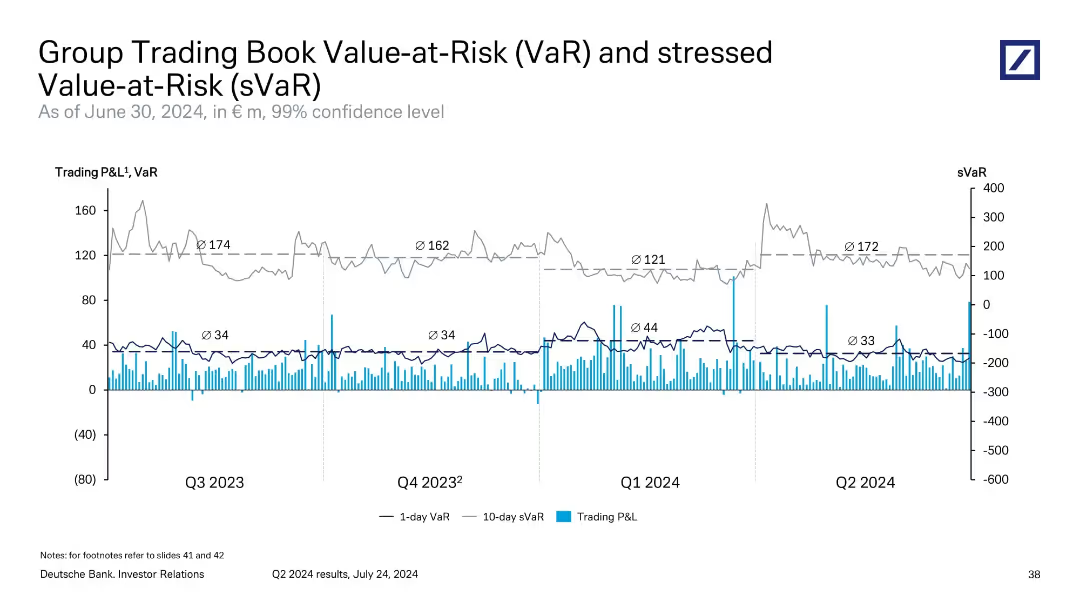
Line and bar graph combination showing daily VaR, stressed VaR, and trading P&L trends over four quarters.
Risk Assessment and Management
Financial Services
This slide illustrates the variability in Deutsche Bank’s trading book VaR and stressed VaR metrics. It highlights average VaR levels across recent quarters and compares them with actual daily trading performance. The bank uses these metrics to gauge market volatility and stress conditions for regulatory and internal risk purposes.
VaR, sVaR, market risk, trading P&L, risk management
Single Chart
Deutsche Bank
Saved
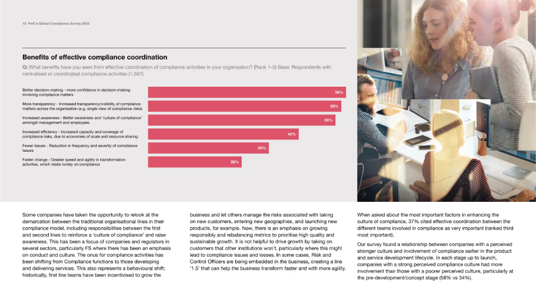
Left-aligned horizontal bar chart; supporting text beneath and on the right with imagery.
Operational Efficiency
Professional Services
Shows benefits of coordinated compliance such as transparency, awareness, efficiency, and fewer issues. Text emphasizes breaking down organizational silos and improving risk control via cultural and functional alignment.
transparency, agility, coordination, culture, risk management
Mixed Chart
PwC/Strategy&
Saved
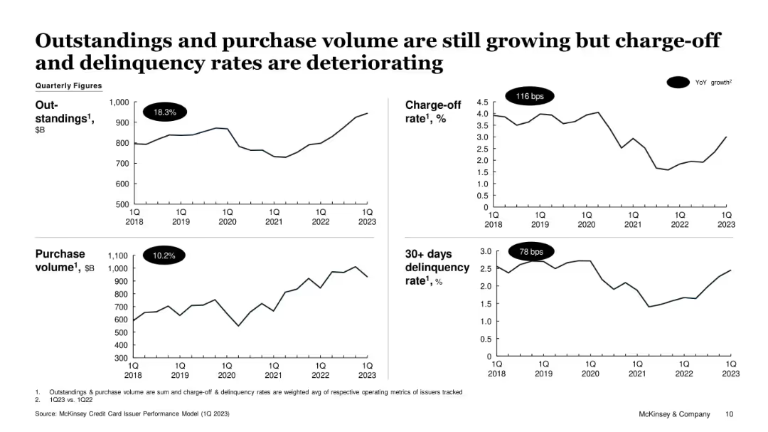
Four-panel line chart dashboard format; clear YoY labels for growth in key credit indicators
Performance Metrics and KPIs
Financial Services
The slide presents trends in credit metrics from 2018 to 2023. Despite 18.3% growth in outstandings and 10.2% growth in purchase volume, charge-off and 30+ day delinquency rates have risen significantly. This suggests increased consumer borrowing risks despite continued credit activity expansion.
credit cards, outstandings, delinquency, charge-off, purchase volume, consumer risk, McKinsey
Single Chart
McKinsey
Saved
This slide displays a bar chart with horizontal bars illustrating survey responses about remote working preferences among Millennials and Gen Z. The bars are color-coded for each group, accompanied by explanatory text on the left.
Market Analysis and Trends
Professional Services
The slide highlights survey findings on the growing preference for remote work among Millennials and Gen Z, with detailed insights into their views on work-life balance, productivity, and the desire to continue remote work post-pandemic. It provides valuable data for employers planning future work arrangements.
Remote Work, Millennials, Gen Z, Work-Life Balance, Survey
Multiple Chart
Deloitte
Saved
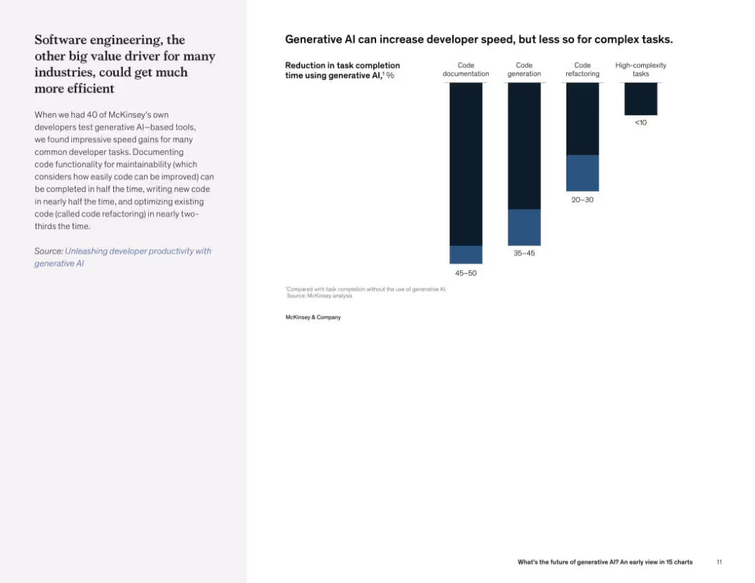
Two-column layout with text on left and vertical bar chart on right showing reduction in task completion time for various software tasks.
Operational Efficiency
Technology & Software
This slide outlines the efficiency improvements generative AI brings to software development, particularly in documentation and code generation. Gains are more limited for complex tasks.
developer productivity, generative AI, code documentation, code refactoring, software efficiency, task reduction
Mixed Chart
McKinsey
Saved
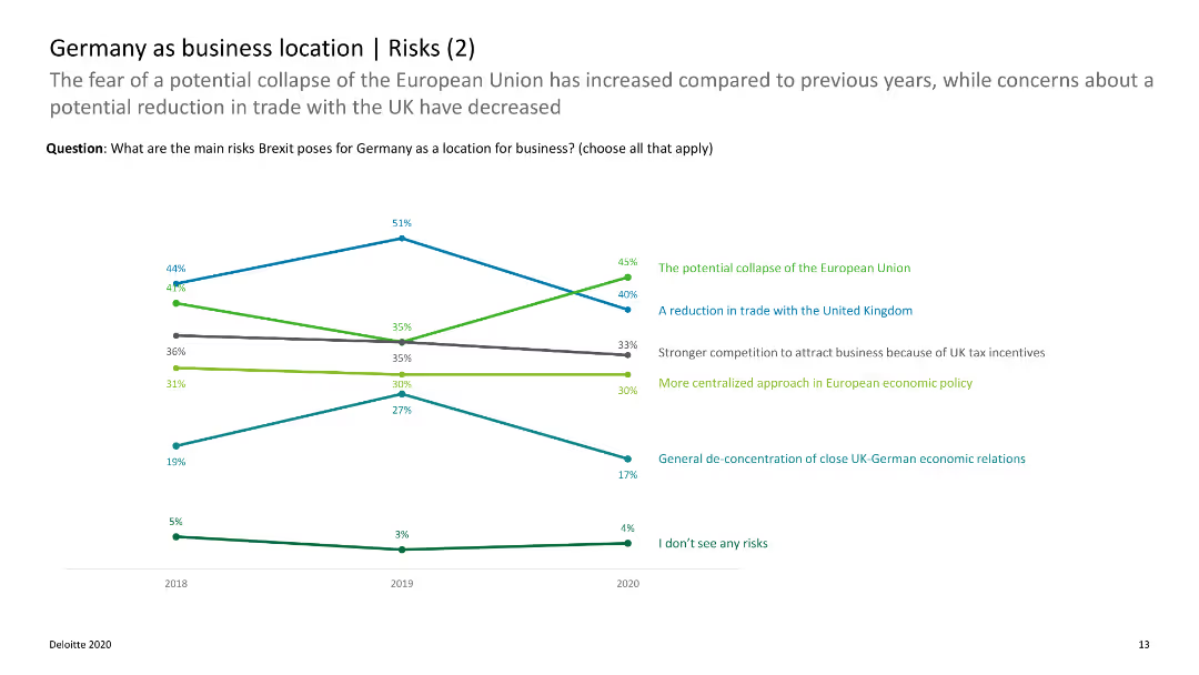
The slide features a line chart showing trends in the perceived risks of Brexit for Germany over time, with data on EU disintegration and trade concerns.
Risk Assessment and Management
Government & Public Sector
This slide shows how perceptions of Brexit risks for Germany have changed over time, focusing on issues like EU disintegration and trade. It helps in tracking risk perception trends.
Brexit, Germany, risk trends, EU disintegration, trade concerns
Single Chart
Deloitte
Saved
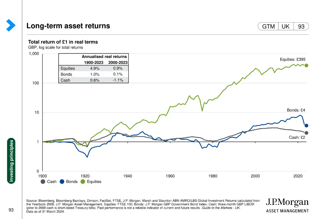
Line chart showing the real returns of cash, bonds, and equities over time.
Investment Analysis
Financial Services
Presents the historical real returns of different asset classes, aiding in long-term investment decisions.
Long-term returns, asset classes, real returns, cash, bonds, equities
Single Chart
JP Morgan
Saved
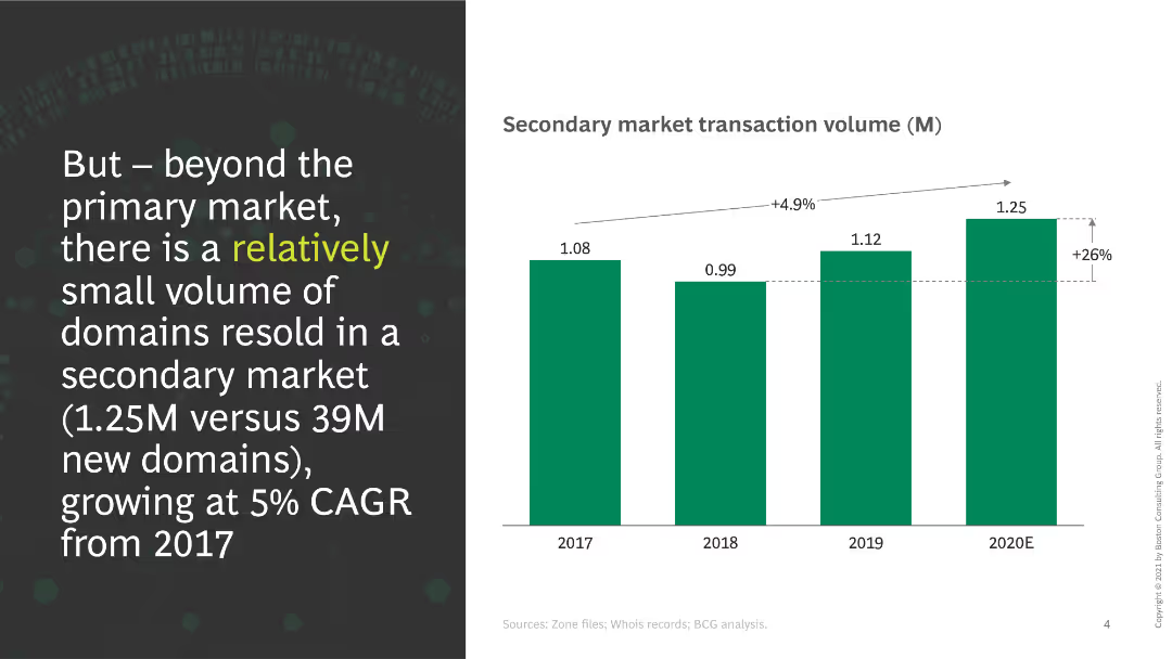
This slide shows a column chart indicating secondary market transaction volumes from 2017 to 2020E. A significant increase in transactions is noted, with a CAGR of 5%.
Market Analysis and Trends
Retail & E-commerce
The slide discusses the volume of domains resold in the secondary market, emphasizing the growth rate and the small volume compared to the primary market.
secondary market, transactions, growth, domains, volume, CAGR
Mixed Chart
BCG
Saved
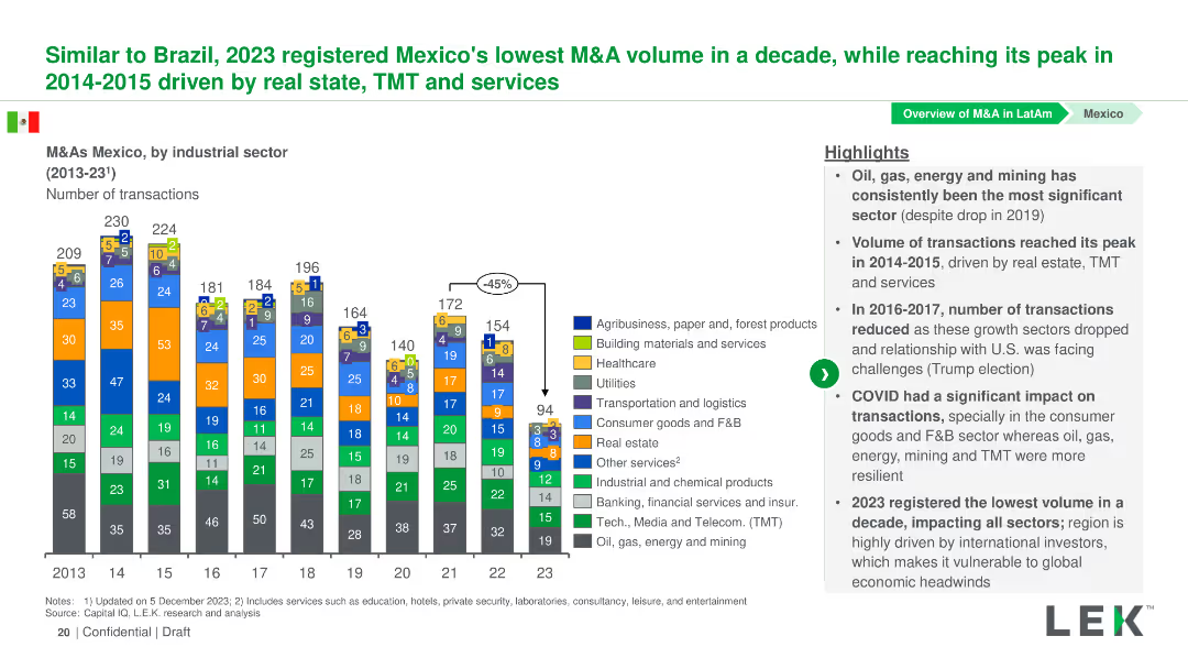
Column chart showing the number of M&A transactions by industrial sector in Mexico from 2013-2023. Sectors are color-coded and detailed in a legend.
Market Analysis and Trends
Financial Services
This slide presents the volume of M&A transactions in various industrial sectors in Mexico from 2013-2023, with an analysis of trends and significant changes.
Mexico, M&A, Industrial Sectors, Transactions, Trends
Mixed Chart
LEK
Saved
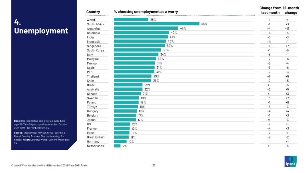
Bar chart ranked by country, showing % of people concerned with unemployment; includes monthly and yearly changes.
Market Analysis and Trends
Government & Public Sector
This slide visualizes unemployment as a global concern, ranked by country. South Africa leads with 66%, followed by Argentina and Colombia. It tracks month-over-month and 12-month shifts, showing evolving public sentiment on job insecurity.
unemployment, public concern, global trends, Ipsos, labor market, sentiment, survey, economic stress, job loss, perception
Single Chart
IPSOS
Saved
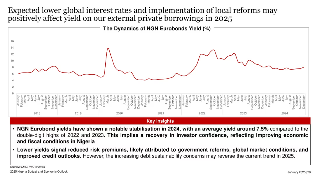
Line graph of Eurobond yields (2018–2024), illustrating volatility and recent stabilization.
Investment Analysis
Government & Public Sector
The slide reports stabilized Eurobond yields at around 7.5% in 2024, signaling improving investor confidence amid government reforms and favorable interest rates. However, rising debt risks may threaten this positive trend in 2025.
Eurobond, yield, interest rates, investor confidence, Nigeria, fiscal reforms
Mixed Chart
PwC/Strategy&
Saved
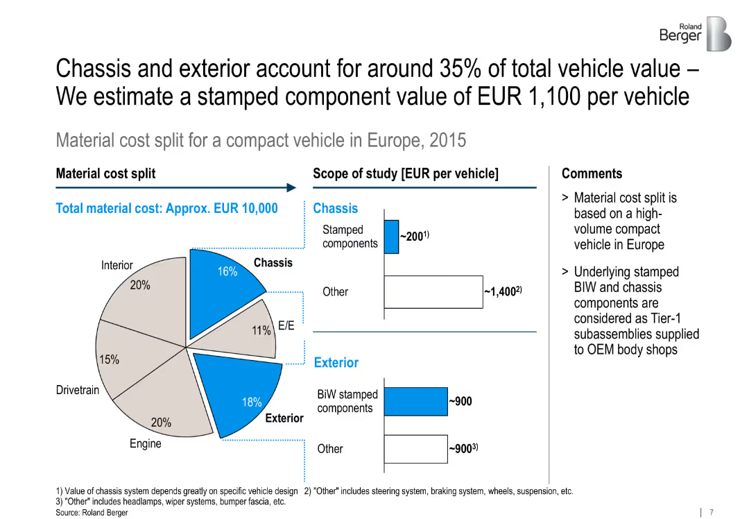
The slide follows a structured three-column layout describing methodology phases: "Trend analysis," "Market assessment," and "Impact on market players," each with bullet points and icons above the headers. On the right side, a shaded box contains "Sources" with bullet points listing data sources. The background is white with black and grey text. A Roland Berger logo appears in the upper right corner.
Market Analysis and Trends
Industrial & Manufacturing
This slide outlines the methodology used to analyze automotive trends and their implications for the stamped BIW (Body-in-White) and chassis component market. It breaks down the approach into three phases: identifying macro trends, estimating market size and segmentation, and analyzing competitive impact on key players. The slide also lists data sources including interviews, external providers, and desk research.
automotive trends, BIW, chassis components, market forecast, competitive landscape, hot stamping, macro trends, methodology, Roland Berger, market segmentation
Multiple Chart
Roland Berger
Saved
A bar graph highlights the percentage of women enrolled in tertiary education by region for 2018, using different shades to depict each region.
Market Analysis and Trends
Education & Training
This slide explores gender disparities in tertiary education enrollment by region as of 2018, noting that women have overtaken men in most areas. It discusses shifts in gender parity and its implications for global educational trends.
education, gender disparity, tertiary, 2018
Mixed Chart
Roland Berger
Saved
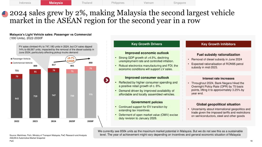
Dual-panel layout with a bar chart (2022–2030F) on the left comparing PV and CV sales, and side-by-side boxes for growth drivers/inhibitors on the right
Market Analysis and Trends
Industrial & Manufacturing
Highlights Malaysia's modest 2% growth in light vehicle sales in 2024, emphasizing strong passenger vehicle (PV) performance but a decline in commercial vehicle (CV) sales. Includes economic, policy, and consumer outlook drivers, as well as risks like fuel subsidy cuts and interest rate hikes.
Malaysia, light vehicle sales, CAGR, commercial vehicle, growth drivers, economic outlook, fuel subsidy, PV vs CV, automotive market, ASEAN
Mixed Chart
PwC/Strategy&
Saved
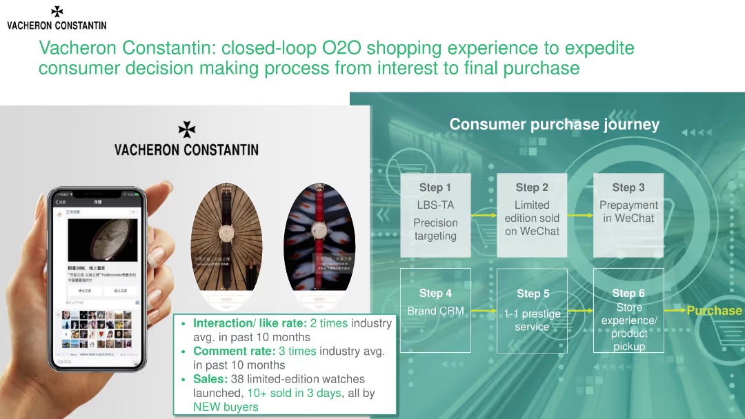
The slide illustrates a consumer purchase journey for Vacheron Constantin, highlighting steps from initial interest to final purchase and showcasing metrics for interaction and sales.
Technology and Digital Transformation
Consumer Goods
This slide details Vacheron Constantin's O2O (online-to-offline) shopping experience, focusing on the consumer purchase journey and key performance metrics such as interaction rates and sales.
consumer journey, O2O shopping, Vacheron Constantin, purchase process, interaction rates
Header Horizontal
BCG
Saved
Comprises a large pie chart detailing loan compositions across various sectors, color-coded for clarity. Key highlights provide insights into risk management and sector allocation.
Risk Assessment and Management
Financial Services
Provides an overview of the loan distribution by sector, highlighting the diversity and risk associated with different segments. It offers insights into risk management practices and strategic loan portfolio diversification within a financial institution.
loans, risk management, financial, diversification, sectors
Mixed Chart
Deutsche Bank
Saved
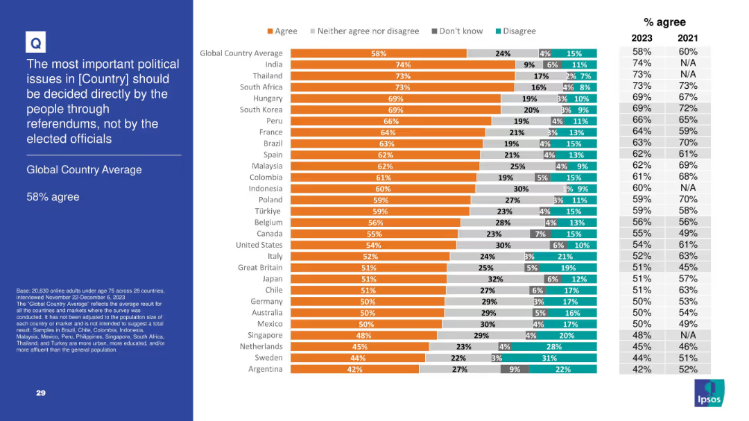
Slide presents bar chart and trend data on agreement with citizen-led decision-making via referendums; left panel contains title and global average.
Regulatory and Compliance
Government & Public Sector
This slide reveals a 58% global average agreeing that political decisions should be made directly by the people rather than elected officials. It illustrates global democratic participation attitudes, with India and Thailand expressing especially strong support for referendums. This trend supports a rise in interest toward direct democracy mechanisms over representative systems.
referendums, democracy, political reform, public decision, governance, Ipsos, civic engagement
Mixed Chart
IPSOS
Saved
This slide uses multiple color-coded column charts to depict podcast ad revenue share by industry category between 2021 and 2022. Each industry's revenue share is represented by two bars (for each year), with annotations for percentages.
Market Analysis and Trends
Media & Entertainment
Highlights the diversity in podcast ad revenue distribution by industry, showing growth in sectors like retail and stability in others. Useful for market analysis and understanding industry-specific advertising trends.
Podcast Advertising, Industry Distribution, Revenue Trends, Media
Mixed Chart
PwC/Strategy&
Saved
The slide has four sections: two bar charts, one column chart, and a textual explanation with graphs and diagrams.
Client Case Studies
Professional Services
Showcases benchmark results from the AEP feedback report, comparing participant performance across different metrics.
benchmarks, AEP, procurement, performance, comparison, feedback, bar charts, column chart, graphs, metrics
Multiple Chart
Kearney
Saved
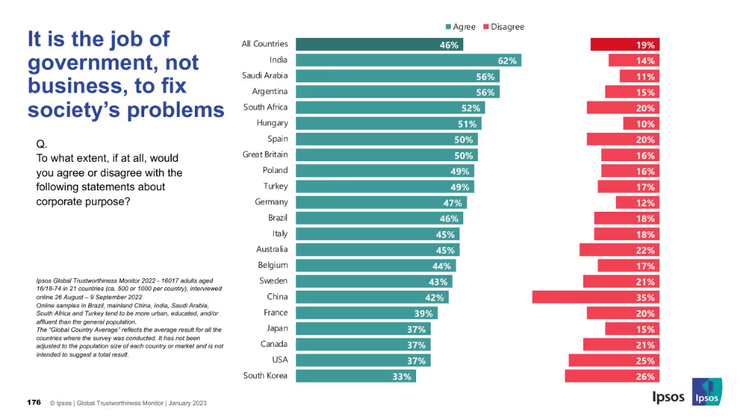
Bar chart layout, left-aligned title and survey question, horizontal bars comparing "Agree" vs "Disagree" percentages across countries
Market Analysis and Trends
Professional Services
This slide shows international survey results on whether people believe it is the government’s responsibility rather than businesses’ to solve societal issues. India has the highest agreement (62%), while South Korea has the lowest (33%).
government, business, responsibility, corporate purpose, Ipsos, survey, public opinion, agreement, disagreement, country comparison
Mixed Chart
IPSOS
Saved
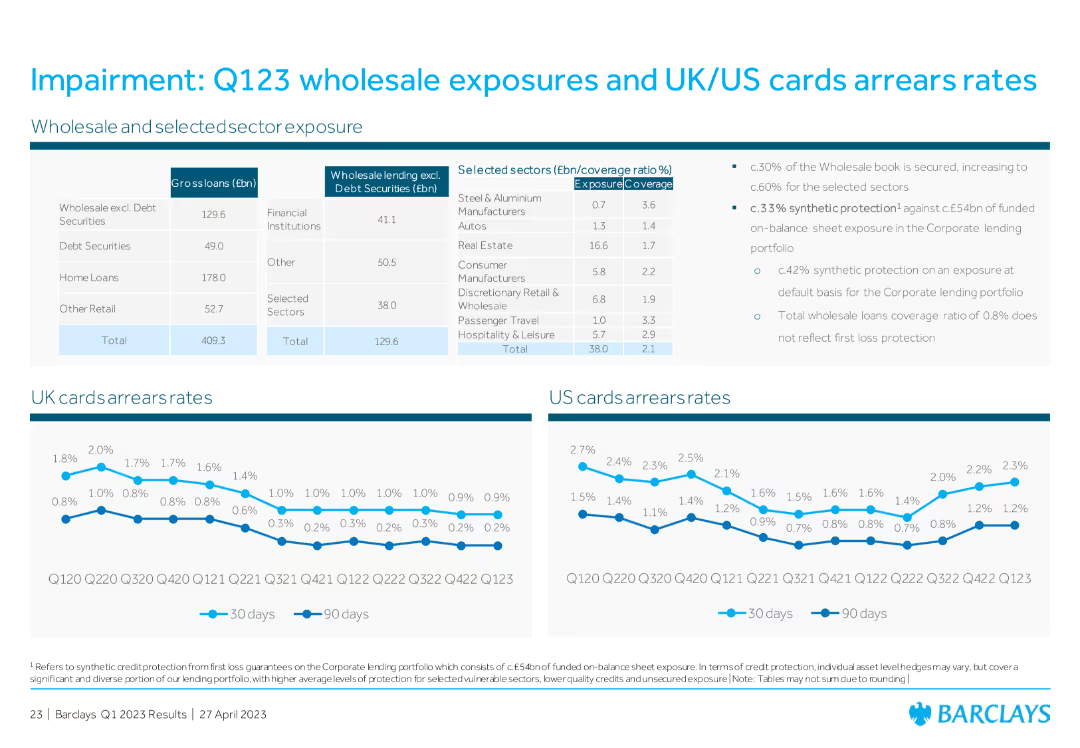
Table showing wholesale lending and selected sector exposure, with line graphs for UK and US cards arrears rates. Includes bullet points summarizing key exposure data.
Risk Assessment and Management
Financial Services
The slide details Q1 2023 wholesale exposures and arrears rates for UK and US cards, providing a comprehensive overview of financial exposures and credit risk assessments.
wholesale exposures, UK cards, US cards, arrears rates, credit risk assessment
Multiple Chart
Barclays
Saved
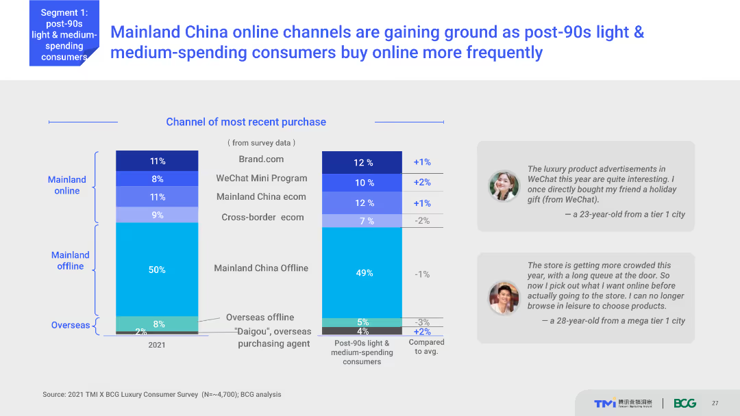
Column chart showing the most recent purchase channels for Mainland China and Overseas. The chart compares percentages between online and offline purchases in 2021. Text boxes with user quotes are placed beside the chart.
Market Analysis and Trends
Retail & E-commerce
Shows the shift in purchase behavior of post-90s light and medium-spending consumers in Mainland China towards online channels. Indicates the percentages of purchases through different online and offline channels.
Online shopping, consumer behavior, China, retail trends, WeChat Mini Program
Multiple Chart
BCG
Saved
Diagram with strategic business units around a central circle named 'Goldman Sachs' with dashed lines pointing to partner logos.
Investment Analysis
Technology & Software
Explores Goldman Sachs' business segments and strategic partnerships with tech companies like GitLab and Pensando.
innovation, Goldman Sachs, partnerships, business segments, tech companies, GitLab, Pensando
Framework
Goldman Sachs
Saved
Previous
Next
If nothing, comes up, please save your slides first
Create a FREE account to continue browsing
Receive Instant Access to 1,000+ slides from companies like McKinsey, Google, and Goldman Sachs
First Name
Last Name
Email
Password
I agree to all
Terms & Privacy Policy
Thank you! Your submission has been received!
Oops! Something went wrong while submitting the form.
Have an account?
Sign in
Column Chart
Heatmap
Chevron
Org Chart
Infographic
Callouts
Timeline
List
Graphic
Picture
Process Flow
Diagram
Paragraph
Map
Table
Framework
Subtitle
Takeaway Box
Icon
Other Chart
Radar Chart
Waterfall Chart
Mekko Chart
Pie Chart
Scatter Plot
Line Chart
Bar chart
Bullet points