Create a FREE Account
Instant access to 1,000+ real slides from top companies like McKinsey, BCG, Goldman Sachs, Google and many more!
First Name
Last Name
Email
Password
I agree to all
Terms & Privacy Policy
Thank you! Your submission has been received!
Oops! Something went wrong while submitting the form.
Have an account?
Sign in
Library
Templates
Courses
Pricing
My Account
My Slides
My Templates
✦ AI
AI Prompt Library
AI Search
Sign in
Start Here
Logout
My Saved Slides
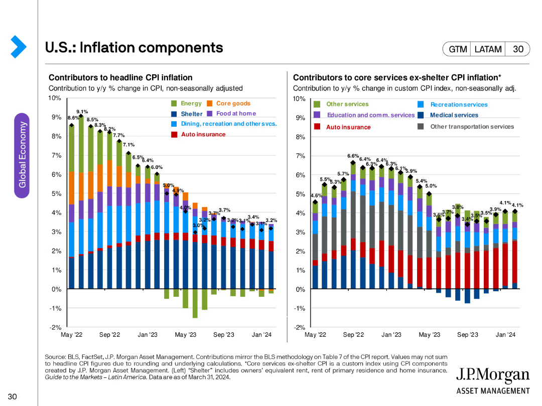
The slide includes two bar charts: one showing contributors to headline CPI inflation and another for core services ex-shelter CPI inflation, both broken down by various categories.
Market Analysis and Trends
Financial Services
This slide breaks down the components contributing to headline and core CPI inflation, offering a detailed view of inflationary pressures in the economy.
inflation, CPI, core services, economic analysis, price indices, headline CPI
Multiple Chart
JP Morgan
Saved
The slide has a title at the top, text in the middle, and a pie chart at the bottom showing the sense of belonging to the neighborhood.
Risk Assessment and Management
Government & Public Sector
Indicates that 77% of respondents feel they belong strongly to their neighborhood. The data is represented in a pie chart, showing varying degrees of belonging.
Neighborhood, Belonging, Survey, Community, Data
Mixed Chart
IPSOS
Saved
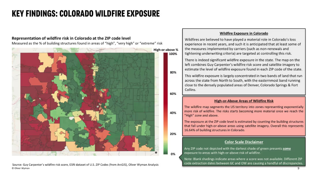
Left side features a color-coded ZIP code heat map of wildfire risk; right side contains descriptive text explaining the data and risk interpretation; uses red-green gradient with three text boxes for context and definitions.
Risk Assessment and Management
Environmental Services & Sustainability
This slide presents the wildfire exposure in Colorado at ZIP code level, identifying areas with high percentages of structures at significant wildfire risk. It highlights concentrated wildfire zones and their correlation with recent underwriting actions by insurers. About 16.6% of Colorado structures are in high-risk zones, influencing carrier decisions.
wildfire risk, ZIP code, building exposure, insurance, risk zones, high-risk areas, Colorado, wildfire impact, underwriting decisions
Mixed Chart
Oliver Wyman
Saved
The slide showcases a complex multi-column chart detailing digital service adoption percentages across different consumer groups. The chart is accompanied by explanatory notes and uses a color gradient of blue to differentiate between consumer segments.
Customer and Market Segmentation
Technology & Software
Presenting digital adoption percentages for various consumer demographics, this slide reveals patterns in the uptake of digital services, such as e-commerce and gaming. It’s a valuable resource for understanding the behaviors of affluent users versus other demographic groups, and for tailoring digital offerings to match these behaviors.
digital services, consumer behavior, adoption rates, affluent users, young natives, digital natives, comparative chart
Table
Bain
Saved
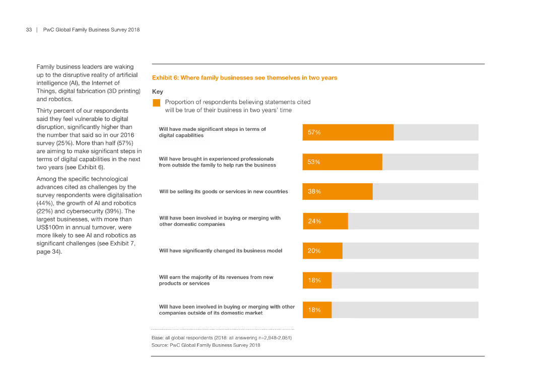
Contains a horizontal bar chart indicating various future expectations of family businesses over the next two years.
Market Analysis and Trends
Professional Services
This slide forecasts the strategic moves family businesses plan to make in the next two years, including digital advancements and market expansions.
family business, future planning, digital capabilities, market expansion, strategic moves
Mixed Chart
PwC/Strategy&
Saved
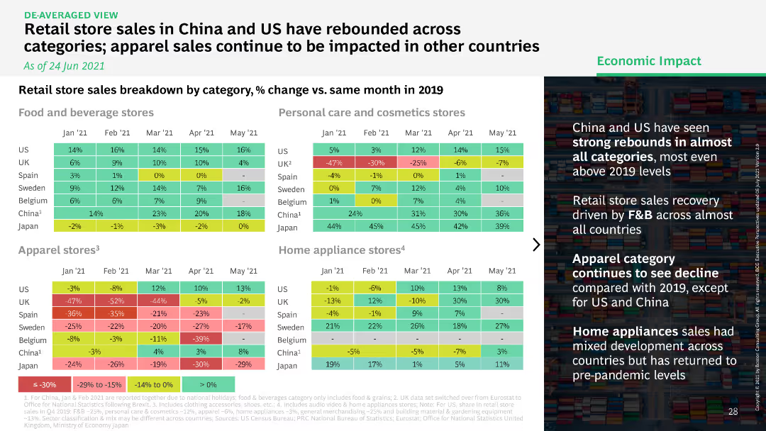
Heatmap comparing retail store sales by category in multiple countries, showing percentage change versus 2019.
Market Analysis and Trends
Retail & E-commerce
Highlights the rebound in retail store sales across categories in China and the US, while apparel sales in other countries continue to struggle.
retail store, sales rebound, categories, China
Table
BCG
Saved
This slide uses multiple icons to visually represent different facets of digital marketing proficiency, such as 'Test & Iterate' and 'Integrate Digital Data'. Each category has a corresponding percentage, clearly displayed in a simplistic, easy-to-understand format. The design is clean, using a consistent color theme and structured layout.
Technology and Digital Transformation
Technology & Software
Showcasing areas where digital marketing efforts are excelling, this slide provides a snapshot of current practices and their effectiveness. It's particularly useful for presentations on digital transformation strategies, helping identify strengths and potential areas for further development in marketing technology.
digital marketing, tech proficiency, strategy, performance metrics, transformation
Header Vertical
Deloitte
Saved
Horizontal bars showing agreement/disagreement about long-term optimism by country; ranked from highest to lowest agreement.
Market Analysis and Trends
Professional Services
The slide examines national outlooks on long-term future optimism in 2025, listing countries by percentage of respondents who agree. Lower global optimism is reflected compared to personal expectations.
long-term optimism, national outlook, survey results, future expectations, Ipsos, 2025, sentiment
Mixed Chart
IPSOS
Saved
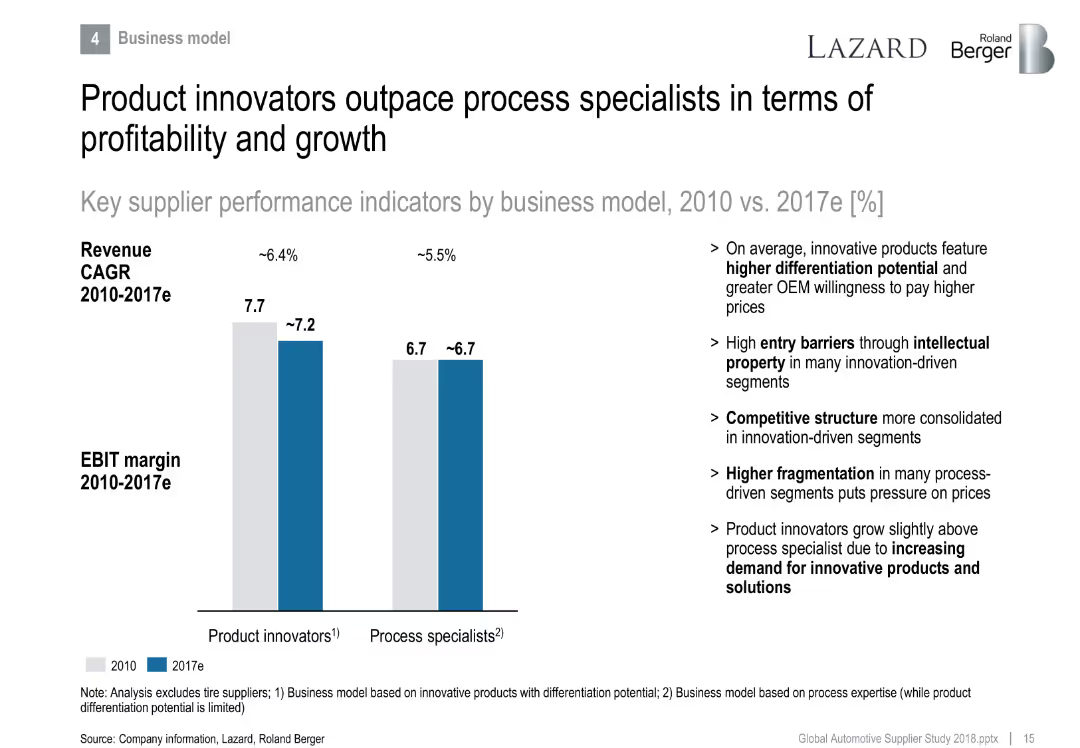
Side-by-side bar chart comparing product innovators vs. process specialists in EBIT margin and revenue CAGR.
Strategic Planning
Industrial & Manufacturing
Differentiates performance between product and process-focused suppliers. Product innovators lead in profitability due to differentiation and IP, while process specialists face fragmentation and pricing pressure.
product innovation, differentiation, process specialist, EBIT margin, growth, IP
Mixed Chart
Roland Berger
Saved
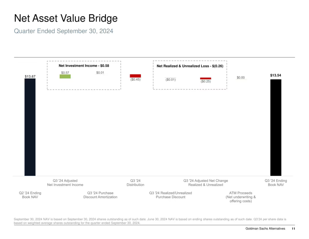
Bar chart "bridge" style; shows progression of NAV from start to end of quarter using segmented columns with color-coded gains and losses.
Financial Performance
Financial Services
The slide illustrates the change in Net Asset Value (NAV) for Q3 2024, detailing sources of gains and losses. It breaks down net investment income, realized/unrealized losses, and distributions, highlighting how the NAV declined slightly from $13.67 to $13.54 during the quarter due to negative market valuation adjustments.
NAV, investment income, unrealized loss, realized loss, distribution, equity performance, Q3 2024
Single Chart
Goldman Sachs
Saved
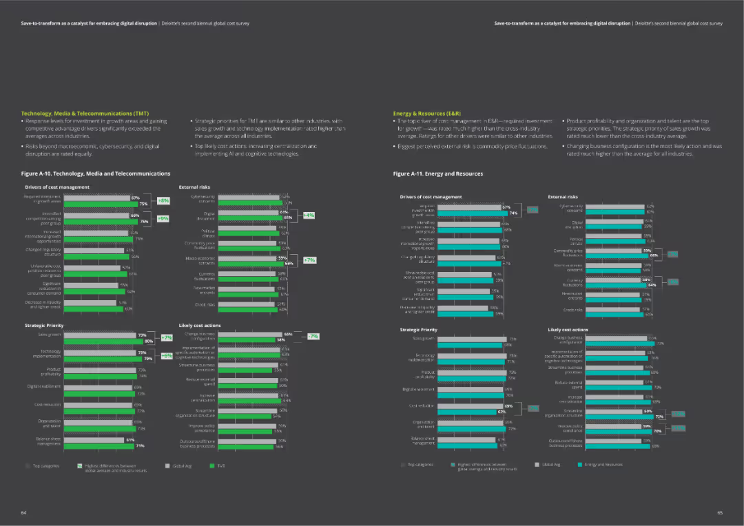
The slide includes two column charts comparing drivers of cost management, external risks, strategic priorities, and likely cost actions for Technology, Media & Telecommunications, and Energy & Resources.
Market Analysis and Trends
Professional Services
Provides detailed comparisons of cost management factors in TMT and Energy sectors. Useful for identifying key areas of focus and potential actions.
TMT, energy, cost drivers, risks, actions, priorities
Multiple Chart
Deloitte
Saved
Timeline showing the phases of Germany's hydrogen strategy from 2020-2050 with key targets for electrolysis capacity and infrastructure development.
Strategic Planning
Energy & Utilities
This slide covers the timeline and phases of Germany’s evolving hydrogen strategy, focusing on increasing production and infrastructure expansion.
Germany, hydrogen, strategy, timeline, 2020-2050, production, infrastructure
Mixed Chart
McKinsey
Saved
The slide features a column chart comparing average teller transactions per customer in 2014 and 2018, with a significant decrease shown. There's a large number on the right side highlighting a statistic, and three text blocks summarizing key points.
Market Analysis and Trends
Financial Services
The slide presents data showing a decrease in teller transactions per customer, emphasizing the importance of a physical bank presence despite growing self-service options. It is likely used to discuss customer behavior trends and branch strategy in the banking industry.
deposit growth, teller transactions, branches, self-service, customer behavior, physical network, banking, industry, household usage, flexibility
Mixed Chart
JP Morgan
Saved
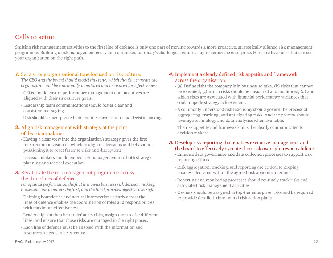
A text-heavy slide with numbered points outlining strategic actions for risk management, with a focus on organizational tone and risk culture.
Strategic Planning
Professional Services
Provides a detailed action plan for improving risk management, including setting organizational tone, aligning risk with strategy, and developing risk reporting.
Risk management, strategic planning, organizational tone, risk culture, action plan, reporting, alignment
Vertical Flow
PwC/Strategy&
Saved
A column chart comparing current online privacy concerns to one year ago across various global regions, indicating changes in concern levels.
Risk Assessment and Management
Technology & Software
The slide assesses the change in online privacy concerns over the past year in different regions, showing the percentage increase or decrease.
column chart, online privacy, concern, comparison, regions, survey, global
Single Chart
IPSOS
Saved
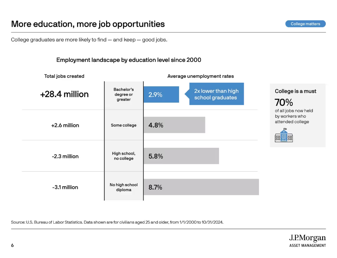
Vertical segmented graphic with job creation and unemployment stats by education level. Sidebar emphasizes importance of college.
Market Analysis and Trends
Education & Training
This slide outlines employment and unemployment rates since 2000 by education level. College graduates have gained more jobs and show lower unemployment. The takeaway is that higher education improves job security and access to employment.
employment stats, college impact, unemployment rates, education levels, labor market, job creation, job opportunities, workforce trends, higher education
Mixed Chart
JP Morgan
Saved
Uses icons and bullet points to represent 18 focus industries, with side panels discussing market strategies related to the innovation and green economy.
Industry Overview
Financial Services
Highlights the benefits of JPMorgan’s industry-specific coverage model, which enhances client value and risk management through specialized knowledge and sector-specific solutions.
Industry-Specific, Risk Management, Banking, Client Value, Innovation, Green Economy
Table
JP Morgan
Saved
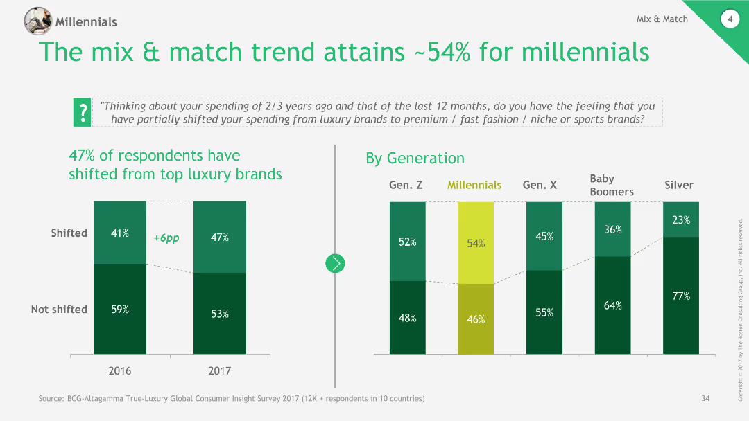
Column chart showing shift in spending from top luxury brands to premium, fast fashion, and niche brands among different generations.
Market Analysis and Trends
Retail & E-commerce
The slide discusses the trend of mix & match fashion, with millennials showing significant shifts in spending from luxury to other types of brands.
mix & match, millennials, spending trends, luxury, retail
Multiple Chart
BCG
Saved
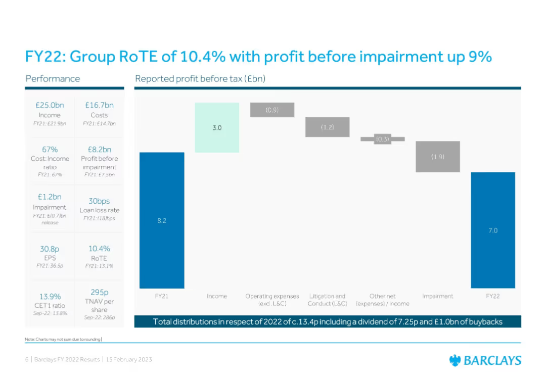
Bar chart + waterfall chart showing profit flow; left column of key performance metrics
Financial Performance
Financial Services
Summarizes Barclays’ FY22 performance with key metrics like income, costs, impairment, and RoTE. A waterfall chart outlines profit drivers and detractors from FY21 to FY22, providing transparency in financial movements.
RoTE, Profit, FY22, Barclays, Impairment, Earnings, EPS, Cost Ratio, Loan Loss
Single Chart
Barclays
Saved
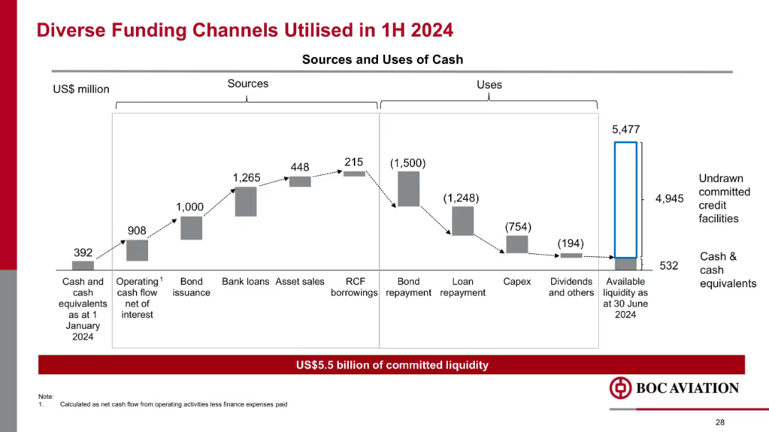
Waterfall chart showing sources and uses of cash; bar segments connected by dotted lines; blue/red emphasis
Corporate Finance and Valuation
Financial Services
Illustrates a detailed breakdown of funding sources (cash, operations, bonds, loans) and uses (repayments, capex, dividends) in 1H 2024. Highlights US$5.5B liquidity and strong cash flow management practices.
funding, liquidity, capex, bond repayment, debt, aviation finance, sources of cash, capital management
Mixed Chart
Goldman Sachs
Saved
Spider chart showing various services and offerings for entrepreneurs, categorized by Cash & Transacting, Ecosystem, Debt Financing, etc.
Product and Service Analysis
Financial Services
Outlines the suite of services offered by the bank to entrepreneurs, categorized into different areas such as cash management and financing.
Entrepreneur services, offering suite, cash management, debt financing, ecosystem
Single Chart
Credit Suisse
Saved
Introductory slide with text and small image thumbnails representing reports. Basic complexity.
Industry Overview
Professional Services
Introduction to a thought-leadership series about consumer trends in Southeast Asia by Meta and Bain & Co.
Southeast Asia, consumer trends, Meta, Bain
Pillar
Bain
Saved
This slide features two vertical column charts comparing the transfer intentions of first-gen versus continuing-gen students at community colleges, in shades of green.
Human Resources and Talent Management
Education & Training
The slide analyzes the transfer intentions of community college students, emphasizing the confidence levels between different student demographics.
community college, students, transfer, first-gen, intentions
Multiple Chart
BCG
Saved
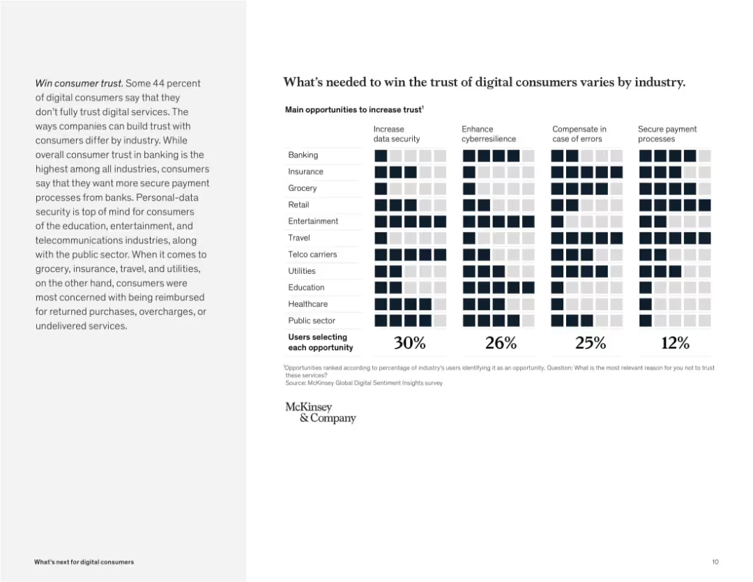
Grid chart with industries on the y-axis and trust factors on the x-axis. Icons filled based on user selections.
Human Resources and Talent Management
Technology & Software
The slide shows factors needed to increase trust in digital services, such as data security, error compensation, and secure payments. Each industry shows a different priority, emphasizing tailored approaches to building user trust.
trust, digital consumers, security, cybersecurity, industry variation, compensation, payment, McKinsey survey
Mixed Chart
McKinsey
Saved
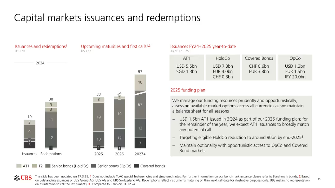
Stacked vertical bar charts with legends for types of bonds; columns separated by years (2024–2027+). Text on the right outlines issuances by type and currency, and a summary of the 2025 funding plan.
Strategic Planning
Financial Services
Provides an overview of UBS's capital market activities including past and upcoming bond issuances and redemptions, broken down by instrument type and maturity year. Details 2025 funding strategy including AT1 issuance goals and risk-adjusted market access approach.
bond issuance, redemption, 2025 funding, AT1, HoldCo, OpCo, UBS, markets
Mixed Chart
UBS
Saved
Previous
Next
If nothing, comes up, please save your slides first
Create a FREE account to continue browsing
Receive Instant Access to 1,000+ slides from companies like McKinsey, Google, and Goldman Sachs
First Name
Last Name
Email
Password
I agree to all
Terms & Privacy Policy
Thank you! Your submission has been received!
Oops! Something went wrong while submitting the form.
Have an account?
Sign in
Column Chart
Heatmap
Chevron
Org Chart
Infographic
Callouts
Timeline
List
Graphic
Picture
Process Flow
Diagram
Paragraph
Map
Table
Framework
Subtitle
Takeaway Box
Icon
Other Chart
Radar Chart
Waterfall Chart
Mekko Chart
Pie Chart
Scatter Plot
Line Chart
Bar chart
Bullet points