Create a FREE Account
Instant access to 1,000+ real slides from top companies like McKinsey, BCG, Goldman Sachs, Google and many more!
First Name
Last Name
Email
Password
I agree to all
Terms & Privacy Policy
Thank you! Your submission has been received!
Oops! Something went wrong while submitting the form.
Have an account?
Sign in
Library
Templates
Courses
Pricing
My Account
My Slides
My Templates
✦ AI
AI Prompt Library
AI Search
Sign in
Start Here
Logout
My Saved Slides
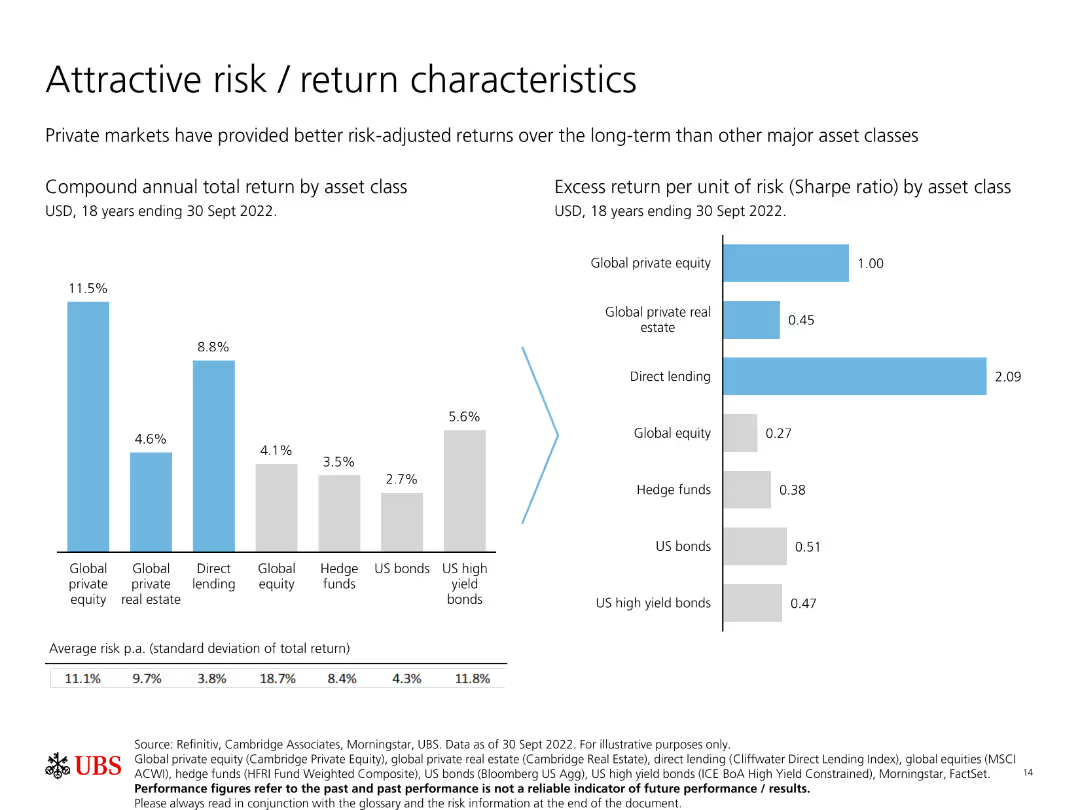
Features two bar charts: one showing compound annual total return by asset class, and another showing excess return per unit of risk (Sharpe ratio) by asset class.
Investment Analysis
Financial Services
Compares the risk and return characteristics of various asset classes, emphasizing how private markets provide better long-term risk-adjusted returns.
Risk, return, private markets, Sharpe ratio, asset classes
Multiple Chart
UBS
Saved
This slide presents column chart comparing current MREL/TLAC requirements with available capital resources, highlighted with clear, distinct colors for different types of capital. Key highlights discuss regulatory implications.
Regulatory and Compliance
Financial Services
Discusses the institution's capacity to meet and exceed regulatory capital requirements, providing a detailed view on the sufficiency of loss-absorbing capacity, and strategic planning implications for financial stability.
regulatory, capital, financial, stability, planning
Mixed Chart
Deutsche Bank
Saved
Column chart illustrating emissions reduction trajectories. Includes detailed text on the pathway's development and projected impact.
Market Analysis and Trends
Agriculture & Food Production
Presents a model for reducing on-farm emissions in Australian agriculture, outlining a conservative yet impactful approach to achieving net zero emissions.
Emissions Reduction, Agriculture, Carbon Abatement, Net Zero, Environmental Impact, Sustainability, Pathways
Mixed Chart
EY
Saved
Features bar graphs comparing the cost and value of nbn™ plans, with visuals illustrating user benefits, clear labeling, and explanatory text.
Financial Performance
Telecommunications
Demonstrates the financial value derived by users from the nbn™ network, detailing consumer surplus and its economic significance.
Financial Value, nbn, Consumer Surplus, Economic Impact, Telecommunications
Agenda
Accenture
Saved
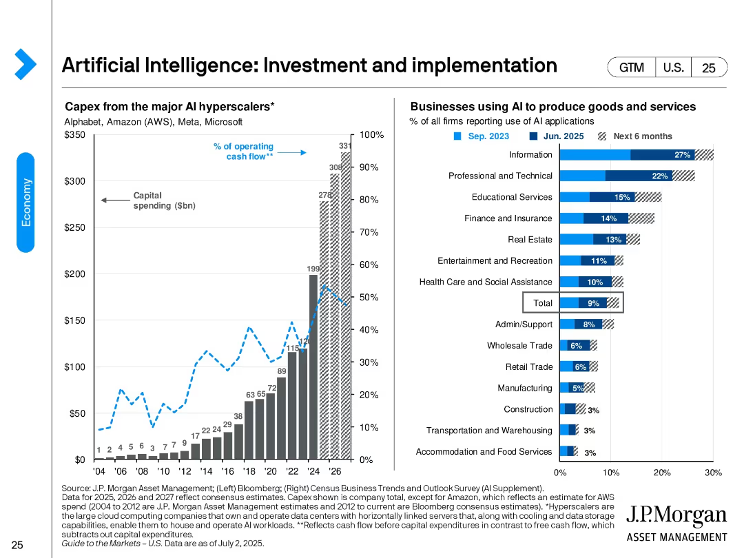
Split design. Left: bar and line chart showing capex by major AI hyperscalers from 2004 to projected 2026. Right: bar chart ranking industry AI adoption rates as of June 2025 and future intent.
Technology and Digital Transformation
Artificial Intelligence
Shows the surge in AI investment by major hyperscalers like AWS, Microsoft, and Alphabet. It also identifies sectors with highest AI adoption—led by Information and Professional Services—and expectations for broader deployment in the next 6 months.
AI investment, hyperscalers, technology adoption, AI implementation, industry adoption, digital transformation, capex, cloud
Multiple Chart
JP Morgan
Saved
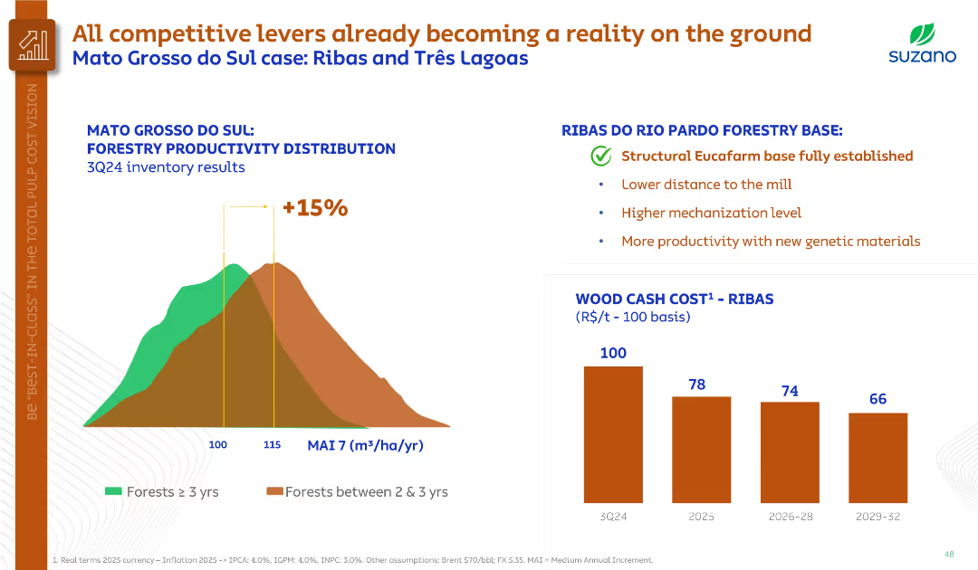
Histogram on forestry productivity, bullet points summarizing Ribas region benefits, and bar chart on wood cost.
Operational Efficiency
Agriculture & Food Production
Demonstrates forestry productivity improvements in Mato Grosso do Sul, highlighting the Ribas base’s structural advantages. Projects significant cost reduction in wood by 2029 through higher yields and mechanization.
forestry productivity, Ribas, genetic materials, cost reduction, MAI
Multiple Chart
Goldman Sachs
Saved
This slide illustrates the 'say-do' gap in consumer behavior with two bar graphs, juxtaposing declared intentions against actual purchasing behavior. The bars are color-coded to distinguish between different countries in the SEA region. The layout is well-organized, facilitating comparison.
Market Analysis and Trends
Environmental Services & Sustainability
Analyzing the discrepancy between consumers' sustainability intentions and their actual purchasing actions in the SEA region. The slide is applicable for discussions on consumer behavior, marketing strategies, and the challenges in promoting sustainable practices.
say-do gap, sustainability, SEA, consumer behavior, purchasing actions, marketing strategies
Multiple Chart
Bain
Saved
The slide includes screenshots of digital platforms and a pictogram representing remote advice. It's balanced with text on one side and images on the other, with a blue and white color theme.
Strategic Planning
Financial Services
Introduces a remote advice channel for mass-affluent clients, highlighting the human-led, digitally-enabled advisory services. It's designed to showcase a new digital strategy for offering low-cost advice to clients preferring digital engagement, highlighting its flexible and affordable platform.
Remote advice, Digital platform, Mass-affluent, Low-cost, Human-led
Graphic
JP Morgan
Saved
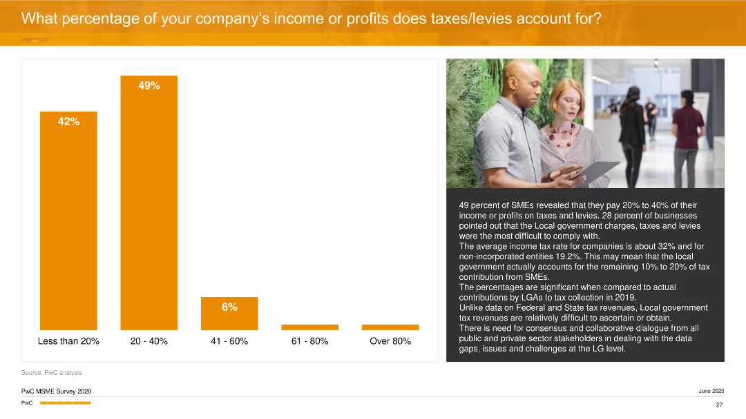
The slide includes a vertical column chart showing the percentage of income/profits taken up by taxes/levies. An image of a man with a tablet is on the right side.
Financial Performance
Financial Services
It discusses the percentage of income or profits that businesses allocate to taxes and levies, with 49% of SMEs paying between 20-40%. It also highlights the impact of local government charges on overall tax compliance.
Taxes, Income, Profits, Business, PwC
Mixed Chart
PwC/Strategy&
Saved
This slide features two tables and a detailed layout displaying various actions taken by companies in response to changes to third-party data. Contains percentage statistics and sector-specific data.
Market Analysis and Trends
Professional Services
Describes actions taken by companies post third-party cookie changes, segmented by economic sector, showcasing the business focus on enhanced data strategies.
data strategy, third-party data, innovation, marketing, customer engagement
Table
Deloitte
Saved
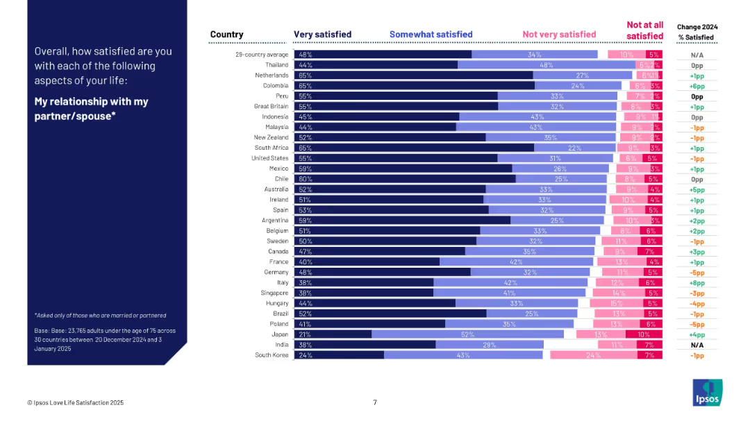
Bar chart with satisfaction levels by country for people in relationships; comparison between 2024 and 2025.
Human Resources and Talent Management
Professional Services
The slide analyzes how satisfied partnered individuals are with their relationships across 29 countries. It highlights countries like Thailand, Colombia, and the Netherlands at the top. The chart also tracks annual changes and provides insight into partner satisfaction globally.
relationship satisfaction, couples, emotional well-being, Ipsos, global comparison, survey, romantic life, 2025 data
Mixed Chart
IPSOS
Saved
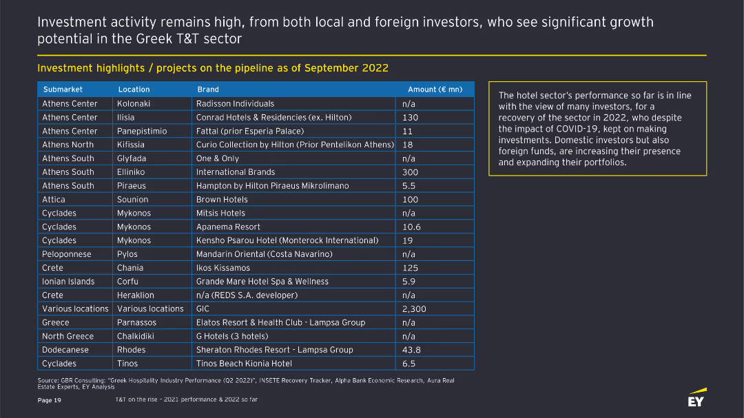
The slide contains a table listing various investment projects in the Greek T&T sector, detailing submarkets, locations, brands, and investment amounts. There is a text box on the right summarizing the hotel sector's performance.
Investment Analysis
Hospitality & Tourism
Highlights investment projects in the Greek T&T sector as of September 2022. It shows submarkets, locations, brands, and investment amounts. The text box explains the positive outlook for the hotel sector despite the impact of COVID-19.
Investment, Greek T&T, Projects, Hotels, COVID-19
Table
EY
Saved
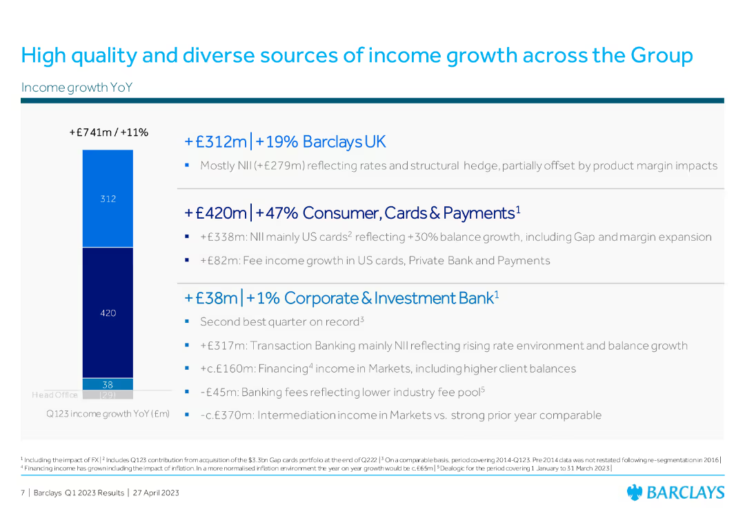
Column chart on the left showing income growth YoY, with three main income categories listed on the right with bullet points detailing contributions from Barclays UK, Consumer, and CIB.
Financial Performance
Financial Services
The slide showcases Barclays' income growth across various sectors: Barclays UK, Consumer Cards & Payments, and Corporate & Investment Bank, highlighting year-over-year increases.
income growth, Barclays UK, Consumer Cards, Corporate Investment Bank, financial performance
Mixed Chart
Barclays
Saved
Slide divided into two sections with multiple circular graphics and a bar chart in shades of blue showing growth in innovation economy revenue.
Technology and Digital Transformation
Financial Services
Showcases JPMorgan Chase & Co.'s strategy and unique assets designed to serve the venture capital ecosystem, with a focus on innovation and supporting startups.
Innovation, Strategy, Venture Capital, Financial Services, Growth
Mixed Chart
JP Morgan
Saved
The slide features a mix of table, logos, and textual content divided into sections labeled 'Mission', 'Investment principles', and 'Portfolio as at 2023'.
Investment Analysis
Financial Services
Discusses Barclays' Sustainable Impact Capital initiative focusing on investments in climate technology, including the investment principles and portfolio examples.
climate change, investment, technology, decarbonization, innovation, portfolio, sustainable, economic, impactful, strategic
Framework
Barclays
Saved
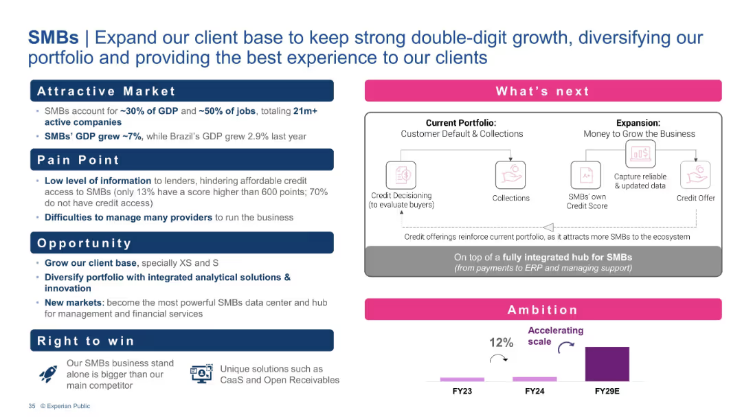
Pain-point/opportunity structure with market stats, a process diagram of Experian’s integrated hub, and an ambition chart.
Customer and Market Segmentation
Financial Services
This slide emphasizes the significance of SMBs in the economy and their challenges in accessing credit. Experian’s solution is a comprehensive data and financial hub, enabling expanded credit access and business growth, aiming for strong double-digit growth and market leadership.
SMBs, Credit access, Financial hub, Integrated solutions, GDP contribution, Data platform
Mixed Chart
Barclays
Saved
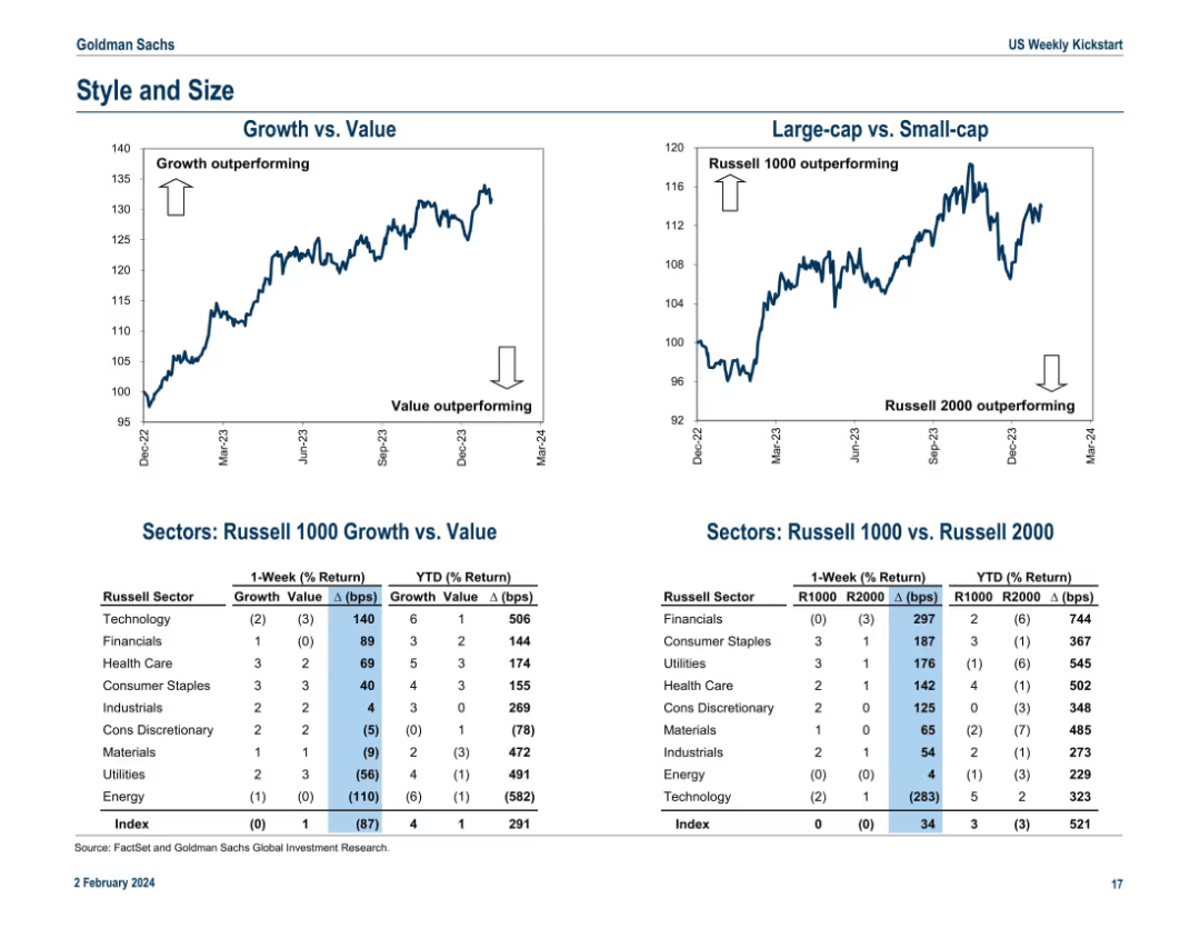
Dual line charts at the top for “Growth vs. Value” and “Large-cap vs. Small-cap.” Tables below show Russell sector performance by style (growth/value) and size (Russell 1000/2000) including 1-week and YTD % returns and basis point spreads.
Performance Metrics and KPIs
Financial Services
This slide analyzes style (growth vs. value) and size (large-cap vs. small-cap) performance. Growth stocks and large-caps are outperforming YTD. The lower tables quantify returns for various sectors by style and size exposure, offering a more nuanced performance assessment. It helps investors understand capital flow dynamics and market sentiment around size and value/growth preferences.
growth vs. value, large-cap, small-cap, Russell 1000, Russell 2000, sector returns, basis points, YTD performance, market style
Multiple Chart
Goldman Sachs
Saved
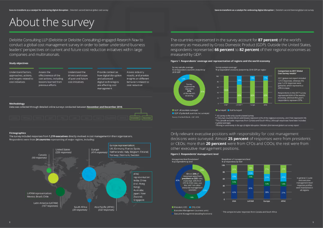
The slide provides an overview of a survey conducted by Deloitte, including objectives, methodology, and firmographics. It features various charts and maps showing the survey coverage and representation of different regions and economic sectors.
Market Analysis and Trends
Professional Services
This slide presents an overview of Deloitte's cost management survey, covering the survey's objectives, methodology, and demographic representation. It includes charts showing the survey coverage and firmographics of respondents across various regions.
survey, Deloitte, cost management, methodology, objectives
Multiple Chart
Deloitte
Saved
Features a bar chart listing top challenges faced by underwriters, including outdated systems, lack of information, and poor organization, with percentage impacts.
Risk Assessment and Management
Financial Services
Highlights the main challenges faced by insurance underwriters, such as inefficient systems and insufficient data, critical for assessing operational and risk management issues.
challenges, insurance, underwriters, risk management, inefficient systems, data accessibility, training needs
Mixed Chart
Accenture
Saved
Features images of automotive interiors and circular icons describing different technologies like advanced driver assistance and cloud services. Engaging and informative layout.
Technology and Digital Transformation
Technology & Software
Showcases Clarion's advanced cockpit solutions, focusing on user interface, safety, and connectivity enhancements, positioning these solutions at the forefront of automotive innovation.
cockpit, infotainment, safety, connectivity, automotive, innovation
Linear Flow
Deutsche Bank
Saved
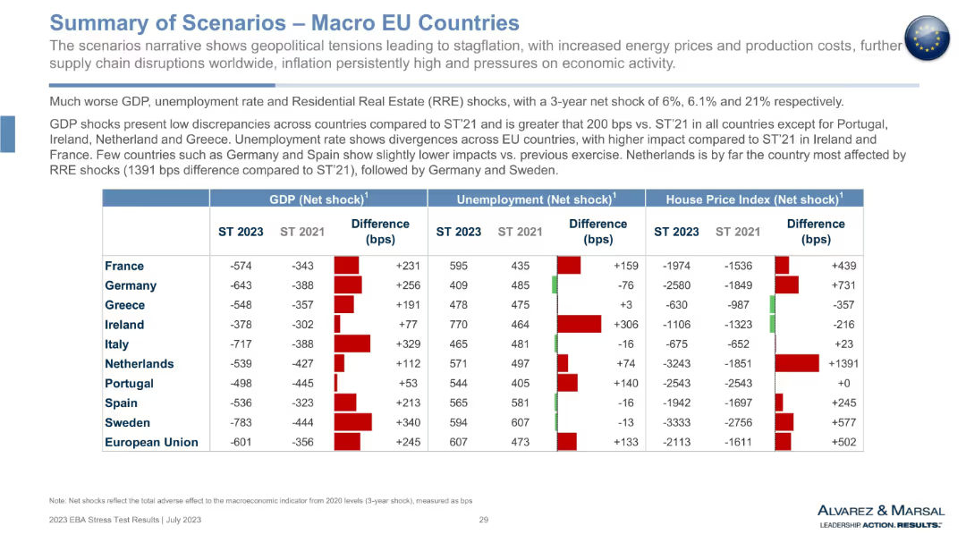
Large table with country rows and metrics columns for GDP, unemployment, and house price shocks. Red/green bar indicators show differences vs 2021.
Market Analysis and Trends
Government & Public Sector
This slide compares macroeconomic stress scenarios for EU countries in 2023 vs. 2021. It highlights GDP contraction, rising unemployment, and steep declines in house prices. Color-coded differences show the worsening of economic indicators, especially in countries like Netherlands and Sweden. It aids in evaluating systemic vulnerabilities across the EU.
macro scenarios, GDP shock, house price index, unemployment, EU economy, financial stress, comparative analysis, 2023 vs 2021
Mixed Chart
Alvarez & Marsal
Saved
Features images of mobile apps, icons for various banking services, and small statistical infographics showing customer engagement metrics.
Operational Efficiency
Financial Services
Outlines the breadth of banking services offered and highlights customer engagement, suitable for showcasing service diversity and adoption rates.
banking, services, customer engagement, operational, solutions, digital, mobile, security, payments, financial health
Header Vertical
JP Morgan
Saved
The slide contains a combination of icon-based bar charts and isometric illustrations. There are three key statistics presented with corresponding icons: a baby carriage, pencils, and desks. Colors are blue, grey, and green.
Customer and Market Segmentation
Education & Training
This slide highlights statistics regarding access to education and childcare services. It showcases specific deficits in education availability, such as adult education and childcare, using graphical representations to clearly communicate the data.
education, childcare, statistics, access, deficits
Single Chart
Deloitte
Saved
Column charts showing tax-equivalent yield and correlation with municipals.
Investment Analysis
Financial Services
Analysis of municipal bonds yields, assessing tax implications and correlations for investment choices.
Municipal Bonds, Tax-equivalent Yield, Correlation, Investment Choices, Bar Chart, Column Chart, Morgan Stanley, Market Monitor
Multiple Chart
Morgan Stanley
Saved
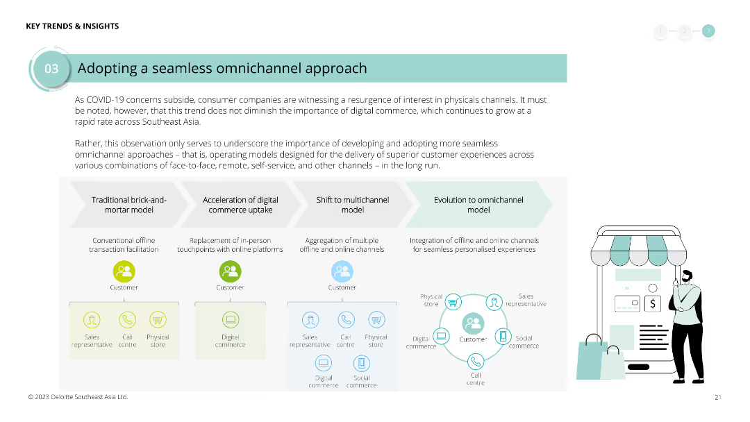
Diagram illustrating the evolution from traditional brick-and-mortar to omnichannel models, with text boxes explaining each phase. Icons represent various channels and stages.
Strategic Planning
Retail & E-commerce
Highlights the importance of developing seamless omnichannel approaches in the post-COVID era, detailing the steps from traditional models to integrated omnichannel experiences for customer satisfaction.
omnichannel, COVID-19, retail, e-commerce, digital commerce, customer experience, strategic planning, evolution
Linear Flow
Deloitte
Saved
Previous
Next
If nothing, comes up, please save your slides first
Create a FREE account to continue browsing
Receive Instant Access to 1,000+ slides from companies like McKinsey, Google, and Goldman Sachs
First Name
Last Name
Email
Password
I agree to all
Terms & Privacy Policy
Thank you! Your submission has been received!
Oops! Something went wrong while submitting the form.
Have an account?
Sign in
Column Chart
Heatmap
Chevron
Org Chart
Infographic
Callouts
Timeline
List
Graphic
Picture
Process Flow
Diagram
Paragraph
Map
Table
Framework
Subtitle
Takeaway Box
Icon
Other Chart
Radar Chart
Waterfall Chart
Mekko Chart
Pie Chart
Scatter Plot
Line Chart
Bar chart
Bullet points