Create a FREE Account
Instant access to 1,000+ real slides from top companies like McKinsey, BCG, Goldman Sachs, Google and many more!
First Name
Last Name
Email
Password
I agree to all
Terms & Privacy Policy
Thank you! Your submission has been received!
Oops! Something went wrong while submitting the form.
Have an account?
Sign in
Library
Templates
Courses
Pricing
My Account
My Slides
My Templates
✦ AI
AI Prompt Library
AI Search
Sign in
Start Here
Logout
My Saved Slides
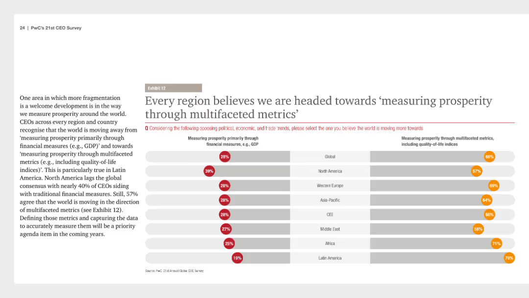
A column chart depicting regional perspectives on measuring prosperity through multifaceted metrics versus financial measures. Text provides context about global CEO opinions.
Market Analysis and Trends
Financial Services
CEOs across regions believe that measuring prosperity is moving towards multifaceted metrics including quality-of-life indices. The chart shows the percentage split between traditional financial measures and multifaceted metrics.
prosperity, metrics, CEOs, financial, regional
Multiple Chart
PwC/Strategy&
Saved
Features a mix of text and graphics, including percentages and diagrams, to highlight financial anxieties and the benefits of hybrid working for Gen Zs and millennials.
Operational Efficiency
Professional Services
The slide addresses the financial concerns of Gen Z and millennials, focusing on their exploration of new working models, including hybrid working, to improve their income. It presents survey data and highlights the benefits and preferences for these new working models.
Financial concerns, hybrid work, Gen Z, millennials, income
Multiple Chart
Deloitte
Saved
The slide contains a table and column charts showing leverage levels, drawdown percentages, and margin call data. Visual elements include a mix of text and numerical data in both tabular and graphical formats.
Risk Assessment and Management
Financial Services
The slide discusses how maintaining prudent levels of leverage can help avoid margin calls during significant market drawdowns, providing historical analysis data.
leverage, margin call, drawdown, financial risk, prudent levels
Mixed Chart
UBS
Saved
Two line charts comparing the percentage change in air passenger traffic and air freight from 2008 to 2019. Lines are color-coded red and blue on a green gradient background.
Market Analysis and Trends
Transportation & Logistics
Slide compares growth in global air passenger traffic, which remains positive, against air freight which fluctuates and is impacted negatively by trade issues.
air passenger, air freight, transportation, growth, trade
Single Chart
Deutsche Bank
Saved
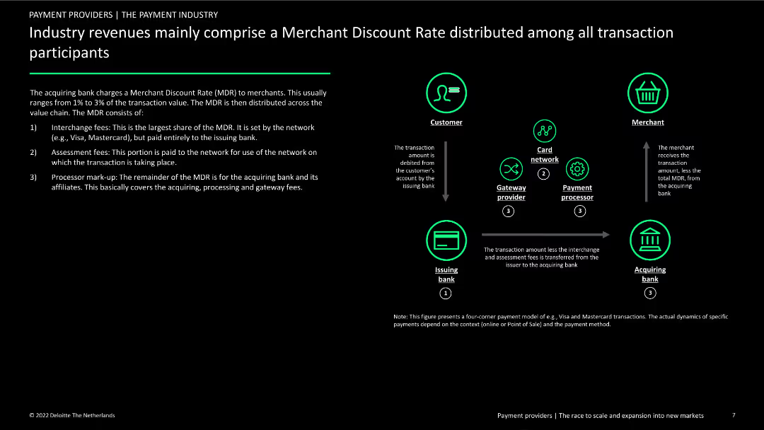
The slide describes the components of the Merchant Discount Rate (MDR) with a flow diagram showing how MDR is distributed among participants. Text details the breakdown of fees and the roles of different entities in the payment process.
Financial Performance
Financial Services
This slide provides an overview of the Merchant Discount Rate (MDR) in the payment industry, explaining how fees are distributed among banks, networks, and processors, and highlighting the financial implications for merchants and other stakeholders.
MDR, payment industry, fees, revenue distribution, roles
Diagram
Deloitte
Saved
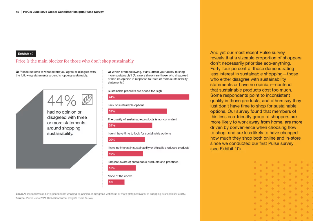
A line chart comparing the percentage of remote workers versus those working away from home who engage in sustainable shopping behaviors, such as buying eco-friendly products and checking for sustainability certifications.
Market Analysis and Trends
Consumer Goods
The slide analyzes the sustainable shopping behaviors of remote workers compared to those who work away from home, showing trends in eco-friendly purchasing and awareness of product sustainability.
sustainable behaviors, remote workers, eco-friendly, shopping habits, sustainability awareness
Mixed Chart
PwC/Strategy&
Saved
Combination of column charts for industry performance and a line graph for regional performance trends
Market Analysis and Trends
Financial Services
The slide provides an overview of regional PMI performance, comparing the US, Europe, and Asia, with a focus on financial conditions.
regional PMI, industry performance, US, Europe, Asia
Multiple Chart
Accenture
Saved
The slide includes a column chart showing APAC WM&C credit volume over different quarters. The layout is simple with blue and white colors and bulleted points on the right outlining key details.
Risk Assessment and Management
Financial Services
The slide explains the approach to credit growth in APAC WM&C through client selection and pricing discipline. It highlights credit volume growth, client deleveraging, and the composition of the loan book.
Credit Growth, Client Selection, Pricing Discipline, APAC, WM&C
Mixed Chart
Credit Suisse
Saved
The Comparative Slide juxtaposes the potential savings in materials and CO2 emissions if the world used Michelin tires, with comparative visuals such as the Statue of Liberty for scale. The use of comparison and statistical data effectively emphasizes Michelin's environmental benefits. The layout is visually engaging and informative, highlighting the impact of tire technology on sustainability.
Regulatory and Compliance
Industrial & Manufacturing
The slide contrasts the environmental benefits of using Michelin tires versus other brands, illustrating significant reductions in material use and CO2 emissions. It serves as a persuasive argument for Michelin's sustainability initiatives, aligning with global decarbonization goals and setting industry standards in product performance and eco-friendliness.
sustainability, materials, CO2 emissions, tires, environmental impact, Michelin, decarbonization, resource saving
Mixed Chart
Morgan Stanley
Saved
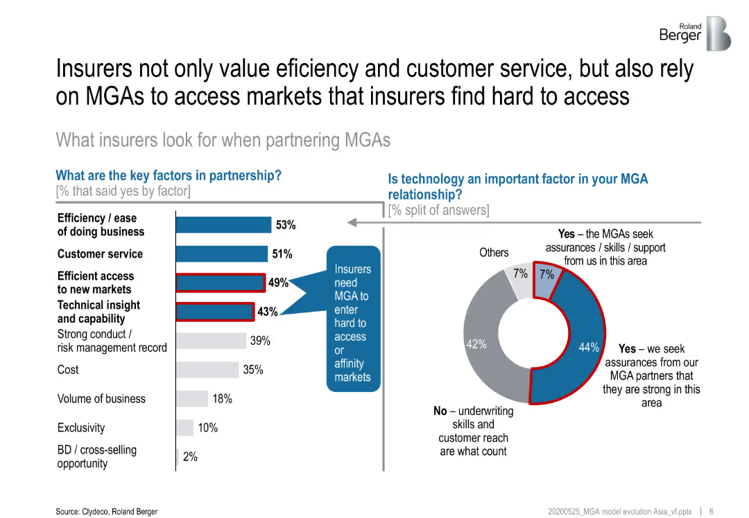
Bar chart showing the growth of MGAs relative to brokers in the UK from 2010 to 2019, highlighting a significant increase in the number of MGAs over the period.
Market Analysis and Trends
Financial Services
Examines the growth trends of Managing General Agents (MGAs) compared to brokers in the UK, showing a 41% increase in MGAs from 2010 to 2019.
MGA growth, brokers, UK, market trends, 2019
Multiple Chart
Roland Berger
Saved
Slide with a timeline showing the growth in internet users over three years. Each year is represented by a different size and colored circle, with numbers indicating user growth.
Market Analysis and Trends
Technology & Software
Provides a visual representation of internet user growth in Southeast Asia, showing the year-over-year increase. Used for discussing trends in digital adoption and the expanding internet user base.
Internet Users, Growth, SEA
Single Chart
Bain
Saved
This slide features a line chart comparing the cost of road freight per tonne-kilometre over various distances in Australia, the US, and France. Bullet points explain cost dynamics.
Market Analysis and Trends
Transportation & Logistics
It discusses the varying costs of road freight in Australia relative to the US and France, noting that Australia's costs are higher for short distances but become more competitive over longer distances.
road freight, cost, Australia, US, France, short haul, long haul
Mixed Chart
LEK
Saved
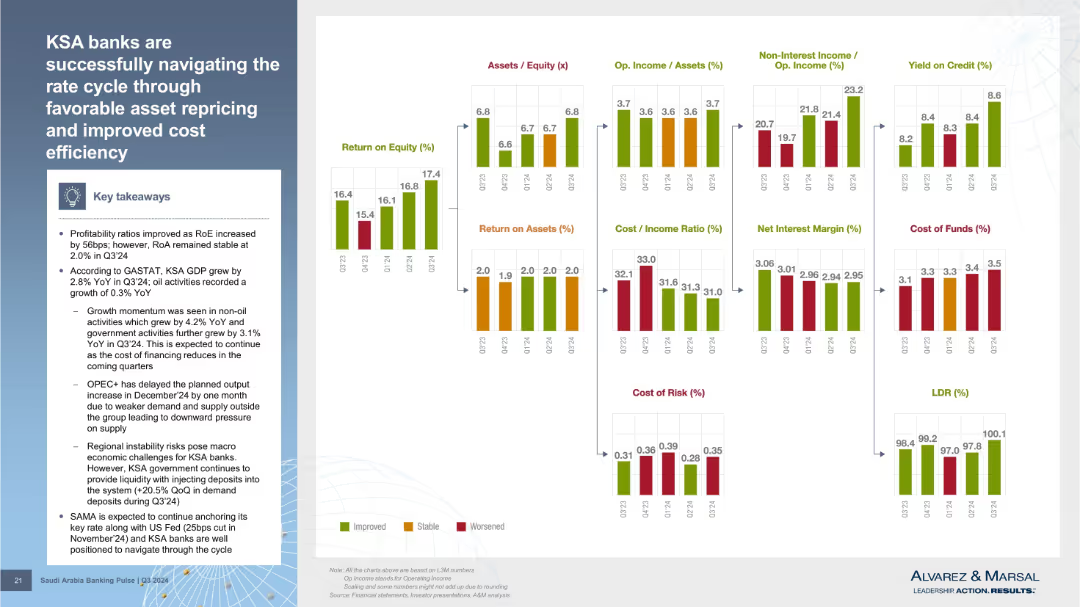
Multi-chart panel layout showing metrics like ROE, ROA, cost/income ratio, NIM, cost of funds, etc. Summary box on the left. Color-coded indicators show trends for each KPI.
Strategic Planning
Financial Services
Summarizes how KSA banks managed profitability during the interest rate cycle. ROE improved, while ROA remained stable. Various financial indicators such as NIM, yield, cost of funds, and LDR are displayed, supporting the overall narrative of resilience and adaptation.
interest rate, cost efficiency, asset repricing, profitability, LDR, NIM, yield
Mixed Chart
Alvarez & Marsal
Saved
Contains pie charts for CRE stress test results, column charts for loan modifications, and textual annotations.
Market Analysis and Trends
Financial Services
Details the scope of CRE under stress tests, loan risk management, and quarter-over-quarter changes in CRE loans and credit loss provisions. Used for financial trend analysis and risk management.
CRE, loans, stress test, risk management, Q3 2023
Multiple Chart
Deutsche Bank
Saved
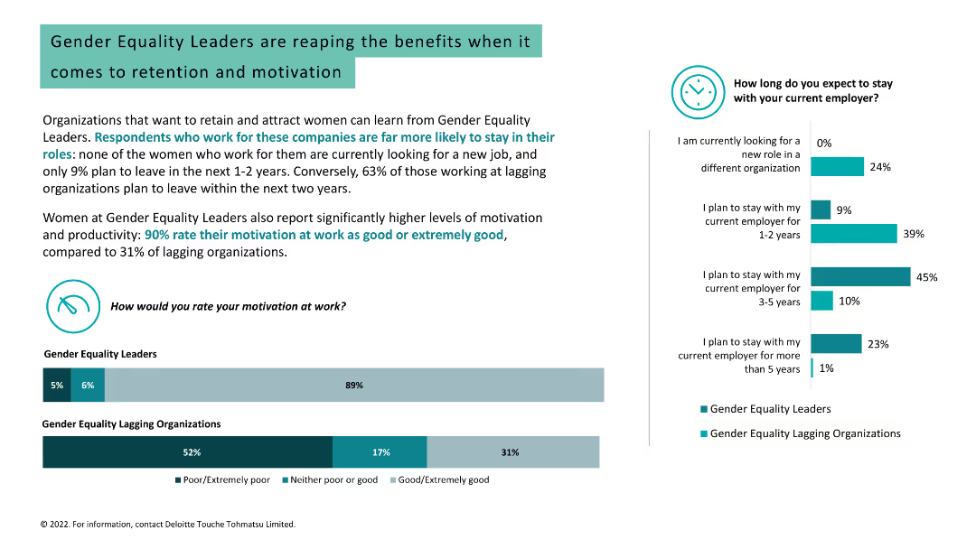
Column charts, text, and image. Data on motivation, retention, and job search intentions among women in gender equality leader vs. lagging organizations.
Human Resources and Talent Management
Professional Services
Highlights the higher retention and motivation levels among women working for gender equality leaders compared to lagging organizations.
gender equality, retention, motivation, job search, women, workplace, leadership, engagement, organization
Multiple Chart
Deloitte
Saved
A slide with a blend of icons and text, displayed on a dark background. Icons represent financial opportunity, hybrid cloud strategy, market growth, and security concerns, underscoring the slide's strategic message to leaders.
Technology and Digital Transformation
Technology & Software
Aimed at business leaders, the slide articulates why cloud computing is a pivotal area of technology to consider, with implications for cost savings, market growth, and security. It underscores the strategic significance of cloud services and hybrid approaches in the technological advancement of organizations.
Cloud Strategy, Market Growth, Security Concerns
Pillar
McKinsey
Saved
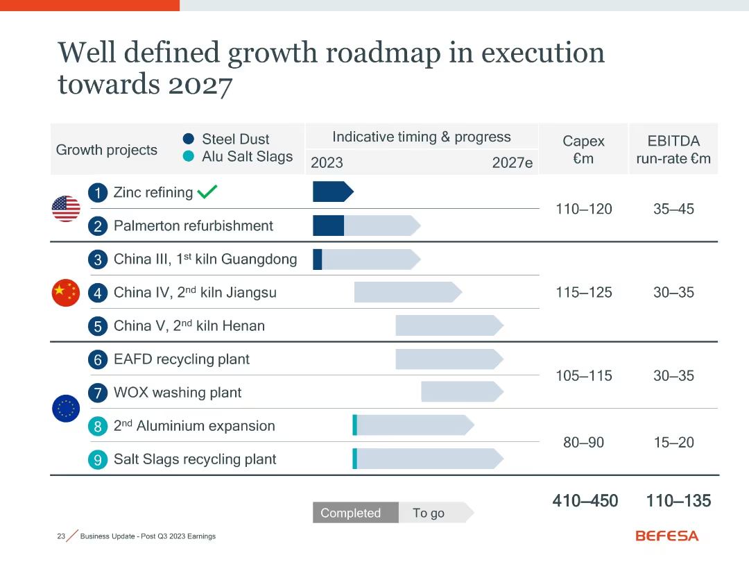
Identical layout as slide 18021; duplicate showing project timelines, status, Capex, and EBITDA across growth initiatives.
Strategic Planning
Industrial & Manufacturing
Repeats the visual and data of slide 18021: summarizing strategic initiatives through 2027, with emphasis on progress tracking and return expectations for steel dust and aluminum slag projects globally.
growth roadmap, strategy, Capex, recycling, aluminum, steel dust, 2027
Single Chart
Goldman Sachs
Saved
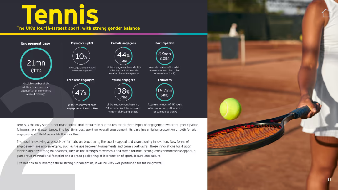
Similar format to slide 16166. Infographic panel on left, tennis photo on right. Yellow, black, and teal color scheme.
Customer and Market Segmentation
Media & Entertainment
Tennis ranks fourth in overall UK engagement and stands out for gender balance and younger audience appeal. Innovations in format and global positioning support its continued growth.
tennis, engagement, UK sport, gender balance, innovation, youth, participation
Mixed Chart
EY
Saved
The slide contains a bubble chart and various company logos with financial data. It is divided into two main sections, showing local execution platform and cooperation details.
Market Analysis and Trends
Financial Services
The slide highlights Credit Suisse's position in Investment Banking in Switzerland, showing execution platform details and cooperation with other divisions.
Investment Banking, Switzerland, market analysis, execution platform, cooperation
Mixed Chart
Credit Suisse
Saved
The slide features bar charts showing risks and opportunities percentages. Text boxes detail risks and opportunities, and a summary box highlights key takeaways.
Market Analysis and Trends
Healthcare & Pharmaceuticals
It shows survey results indicating a high need for repositioning in chemicals and pharma functions due to digitalization, focusing on sales, R&D, and innovation.
Digitalization, chemicals, pharma, risks, opportunities, sales, R&D, innovation
Multiple Chart
Roland Berger
Saved
This slide lists key points related to capital allocation optimization, using icons and short texts in bullet points. There's a small column chart comparing Group RoRWA percentages over time, with a projected mid-term goal. The visual is straightforward, with icons illustrating each bullet point, and uses a blue and grey color scheme. Santander's logo appears at the top, with a cogwheel icon indicating optimization.
Strategic Planning
Financial Services
The slide provides an overview of strategies for capital allocation to improve profitability, coupled with a chart showing historical and targeted RoRWA. It's suitable for financial planning and strategy meetings to discuss and plan for improved financial performance.
Capital Optimization, Profitability, RoRWA, Financial Strategy, Santander, Business Optimization, Allocation Strategies, Financial Improvement
Mixed Chart
Morgan Stanley
Saved
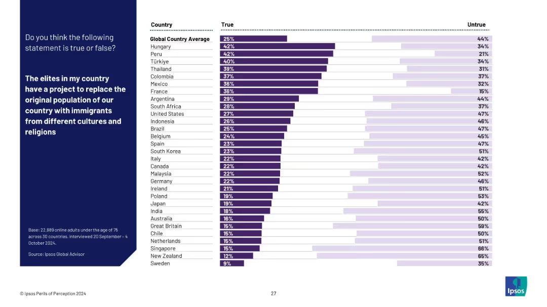
Horizontal bar chart ranking belief in the "replacement theory" – that elites aim to replace the native population with immigrants. Blue question panel, white background with ranked bars.
Regulatory and Compliance
Government & Public Sector
This chart visualizes belief in a conspiracy theory regarding immigration replacement. Countries like Hungary and Peru show high belief, while Nordic countries show low acceptance. Reflects public susceptibility to divisive narratives.
immigration, conspiracy theory, replacement belief, misinformation, national identity, survey, Ipsos, public trust, cultural tension
Mixed Chart
IPSOS
Saved
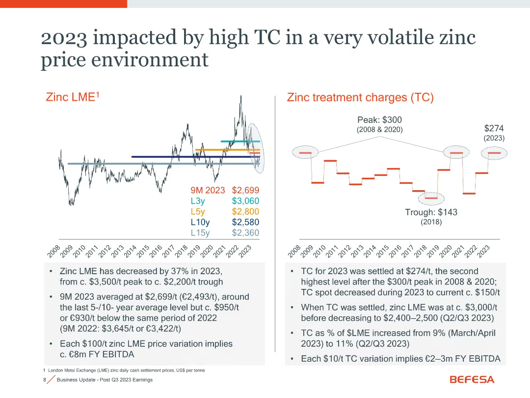
Dual-panel layout showing historical zinc LME trend and treatment charges (TC)
Risk Assessment and Management
Industrial & Manufacturing
Details the high treatment charges (TC) in 2023 alongside falling zinc prices. Notes that TC was settled at $274/t, second only to peak years. This combination negatively affects EBITDA.
zinc LME, treatment charge, volatility, risk, EBITDA impact
Multiple Chart
Goldman Sachs
Saved
Multiple column charts over three slides, showing global perspectives on the strength of organizational culture including purpose, leadership, and employee motivation.
Market Analysis and Trends
Professional Services
Examines the perceived strength of organizational cultures globally, focusing on leadership's effectiveness and employee connection to organizational goals.
organizational culture, leadership effectiveness, employee motivation, global perspectives
Single Chart
PwC/Strategy&
Saved
A column chart for Great Britain showing actions believed to reduce greenhouse gas emissions, ranked by perceived impact and CO2 saved. Bars are in varying shades of green.
Market Analysis and Trends
Environmental Services & Sustainability
This slide shows the ranking and perceived effectiveness of actions to reduce greenhouse gas emissions in Great Britain, emphasizing the gap between public perception and the actual CO2 savings potential.
greenhouse gas, emissions, public perception, Great Britain, impactful actions, CO2 savings, environmental impact
Mixed Chart
IPSOS
Saved
Previous
Next
If nothing, comes up, please save your slides first
Create a FREE account to continue browsing
Receive Instant Access to 1,000+ slides from companies like McKinsey, Google, and Goldman Sachs
First Name
Last Name
Email
Password
I agree to all
Terms & Privacy Policy
Thank you! Your submission has been received!
Oops! Something went wrong while submitting the form.
Have an account?
Sign in
Column Chart
Heatmap
Chevron
Org Chart
Infographic
Callouts
Timeline
List
Graphic
Picture
Process Flow
Diagram
Paragraph
Map
Table
Framework
Subtitle
Takeaway Box
Icon
Other Chart
Radar Chart
Waterfall Chart
Mekko Chart
Pie Chart
Scatter Plot
Line Chart
Bar chart
Bullet points