Create a FREE Account
Instant access to 1,000+ real slides from top companies like McKinsey, BCG, Goldman Sachs, Google and many more!
First Name
Last Name
Email
Password
I agree to all
Terms & Privacy Policy
Thank you! Your submission has been received!
Oops! Something went wrong while submitting the form.
Have an account?
Sign in
Library
Templates
Courses
Pricing
My Account
My Slides
My Templates
✦ AI
AI Prompt Library
AI Search
Sign in
Start Here
Logout
My Saved Slides
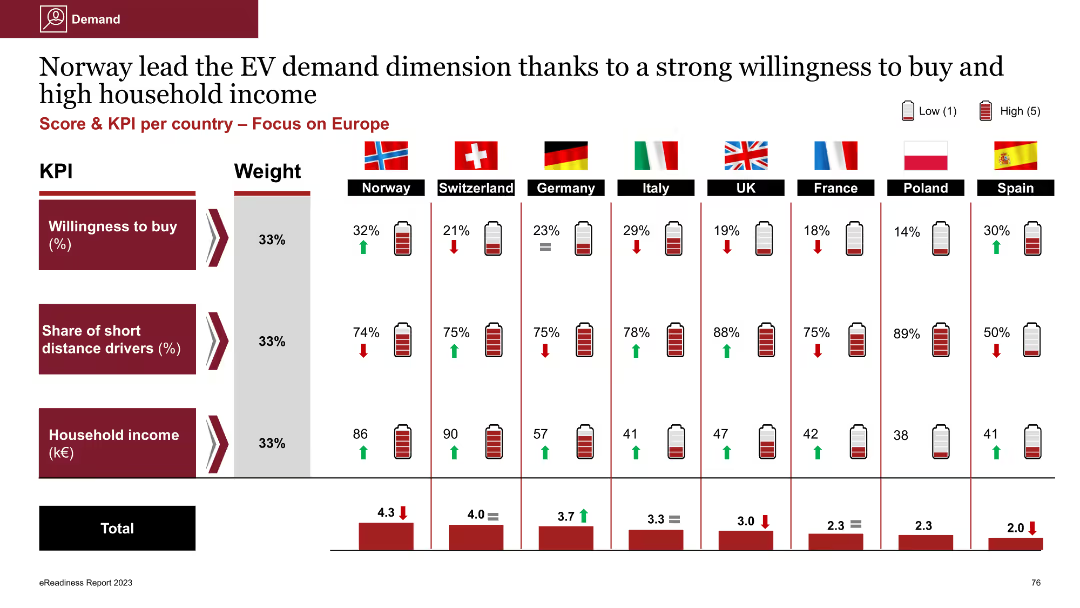
Column chart comparing government incentives across countries; dense with numerical data and battery icons
Market Analysis and Trends
Government & Public Sector
The slide compares government incentives for consumers across various countries using KPIs like grants, VAT exemptions, and tax reductions. China and Hong Kong offer the highest incentives, while India and UAE offer the lowest
government incentives, grants, VAT exemption, tax reduction, comparative analysis
Multiple Chart
PwC/Strategy&
Saved
This slide has bar graphs comparing the fintech lending market size in tier 2 and tier 3 cities with textual annotations for clarity.
Market Analysis and Trends
Financial Services
It assesses the growth of consumer lending within the digital space, informative for financial services and market trend analysis.
Fintech, lending, market growth, digital space, consumer behavior, tier 2, tier 3, market analysis
Mixed Chart
Kearney
Saved
The slide includes line graphs comparing CAC vs CO2 emissions from electricity generation for FCEV and BEV under different scenarios.
Regulatory and Compliance
Energy & Utilities
The slide analyzes the carbon abatement cost and CO2 emissions for fuel cell electric vehicles and battery electric vehicles, considering the impact of grid emissions on savings.
CAC, CO2, FCEV, BEV, emissions, savings
Mixed Chart
Kearney
Saved
This slide presents multiple column charts and tables detailing loans by segment and type, with a key highlights section on the right. The design is moderate, with clear visual divisions between sections.
Financial Performance
Financial Services
Provides a breakdown of loans and net interest income across business segments. Typically used in risk assessments, financial analysis, and investor briefings to illustrate credit distribution and interest income dynamics.
Loans, Net Interest Income, Global Banking, Asset Management
Multiple Chart
Goldman Sachs
Saved
Split-screen layout with a light green left section listing three tech pillars (each with icons and brief status) and a dark green right section listing four challenges in bullet format.
Market Analysis and Trends
Technology & Software
Highlights the early-stage development of the virtual experience, immersive tech devices, and Web3 infrastructure. It outlines their current adoption status and identifies major challenges such as lack of interconnection, immature business models, regulation gaps, and underutilized content.
virtual experience, metaverse, AR/VR, Web3, adoption, early market, tech challenges
Mixed Chart
BCG
Saved
The slide includes a radar chart showing capabilities and financial metrics like EBIT uplift, revenue uplift, and productivity uplift, similar to previous archetype slides.
Competitive Landscape
Industrial & Manufacturing
The slide analyzes the "Operators" archetype, comparing their digital capabilities and financial performance to the average, highlighting their strengths and areas for improvement.
Digital Archetypes, Operators, Performance, Digital Capabilities, Financial Metrics
Mixed Chart
Deloitte
Saved
A vertical column chart ranks the difficulty of compliance with various taxes and fees. An image of a man with glasses is featured on the right side.
Regulatory and Compliance
Financial Services
The slide examines the challenges MSMEs face in complying with different taxes, highlighting local government levies and company income tax as the most problematic. It discusses the reasons behind these difficulties.
Taxes, Compliance, MSMEs, Business, PwC
Mixed Chart
PwC/Strategy&
Saved
The slide features three overlapping circles (Venn diagram) with text blocks aligned vertically on the right. The text is clear and organized, with three main categories highlighted in bold: Enable People, Set New Targets, and Build Capabilities.
Organizational Structure and Change
Professional Services
Focuses on the necessity of putting people at the center of organizational transformations, specifically building new capabilities, setting new targets, and accountability. It discusses leadership commitment and engaging stakeholders.
Transformation, Leadership, Stakeholders, Accountability, Capabilities
Framework
Accenture
Saved
Left-aligned bullet points and a chart showing fintech investment trends in Singapore from 2018 to 2021.
Mergers and Acquisitions
Financial Services
Highlighting Singapore’s fintech landscape in H1’21, the slide discusses a $40B Grab SPAC deal, falling overall investment from H2’20, and increased attention to green finance. Deal activity chart included.
Singapore, SPAC, M&A, Fintech, Green Finance, Grab
Mixed Chart
KPMG
Saved
Features two vertical column charts displaying issuances and redemptions from 2023-2027+, alongside a list of recent funding activities.
Investment Analysis
Financial Services
Analyzes UBS Group AG's capital market activities, including bond issuances and redemptions, funding plans, and strategies for future issuances.
UBS, bonds, issuances, redemptions, funding, capital markets, investment, diversification, maturity
Mixed Chart
UBS
Saved
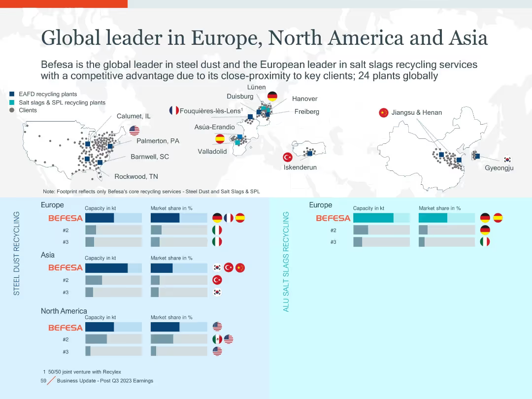
Bar chart of aluminium per car from 2006–2030e with explanatory bullet points; clean design with blue gradient bars
Market Analysis and Trends
Environmental Services & Sustainability
Shows steady rise in aluminium content per vehicle to meet lightweighting and electrification goals. Highlights impact on demand and implications for recycling and secondary metal processing.
aluminium, EV, light-weighting, electrification, vehicle materials, demand growth
Mixed Chart
Goldman Sachs
Saved
The slide presents a table with credit loss expenses and a column chart showing ECL coverage ratios. It uses a structured layout with clear data segmentation.
Financial Performance
Financial Services
It details credit loss expenses and impaired exposures, providing figures by business segment and the evolution of ECL coverage ratios over time.
credit loss, expenses, impaired, ECL, ratios, exposures, UBS, 2Q23, financial, release
Mixed Chart
UBS
Saved
Comprises two bar charts assessing the importance of geopolitical and macro factors in the US equity market. Each chart uses green, red, and teal colors to indicate investor sentiments.
Investment Analysis
Financial Services
Evaluates the key factors that investors consider critical for the US equity market, including interest rate policies and geopolitical risks, and how these perceptions influence market optimism.
US equity market, interest rates, geopolitical risks, investor sentiment
Multiple Chart
BCG
Saved
Two sections with text and images, each section describing different trends: pricing strategies and experience culture.
Market Analysis and Trends
Consumer Goods
Describes trends in new pricing strategies and the prioritization of consumer experiences in purchasing decisions.
Consumerism, pricing strategies, experience culture, trends
Mixed Chart
Deloitte
Saved
Horizontal bar chart segmented by gender, generation, income, and education on white background
Market Analysis and Trends
Government & Public Sector
The slide shows demographic breakdowns of global responses to unfair treatment of LGB individuals, categorized by gender, generation, household income, and education. Gen Z and females reported the highest perception of inequality.
demographics, inequality, LGB, Ipsos, Gen Z, gender, education, income, survey, 2023
Mixed Chart
IPSOS
Saved
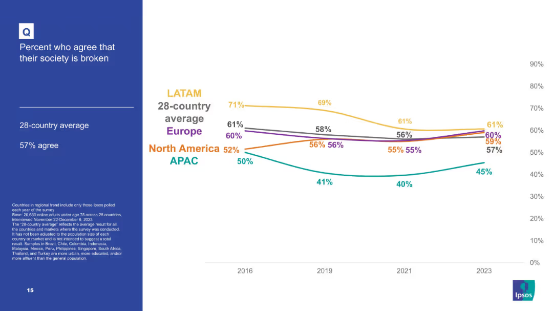
Line graph showing agreement trends from 2018 to 2023 across 7 gender equality topics; colored lines represent each statement.
Human Resources and Talent Management
Government & Public Sector
The slide depicts evolving attitudes from 2018–2023 on gender equality topics, revealing trends like increasing feminism and views on men’s roles in equality.
time trend, gender opinions, feminism rise, societal views, survey timeline, equality progress, Ipsos
Mixed Chart
IPSOS
Saved
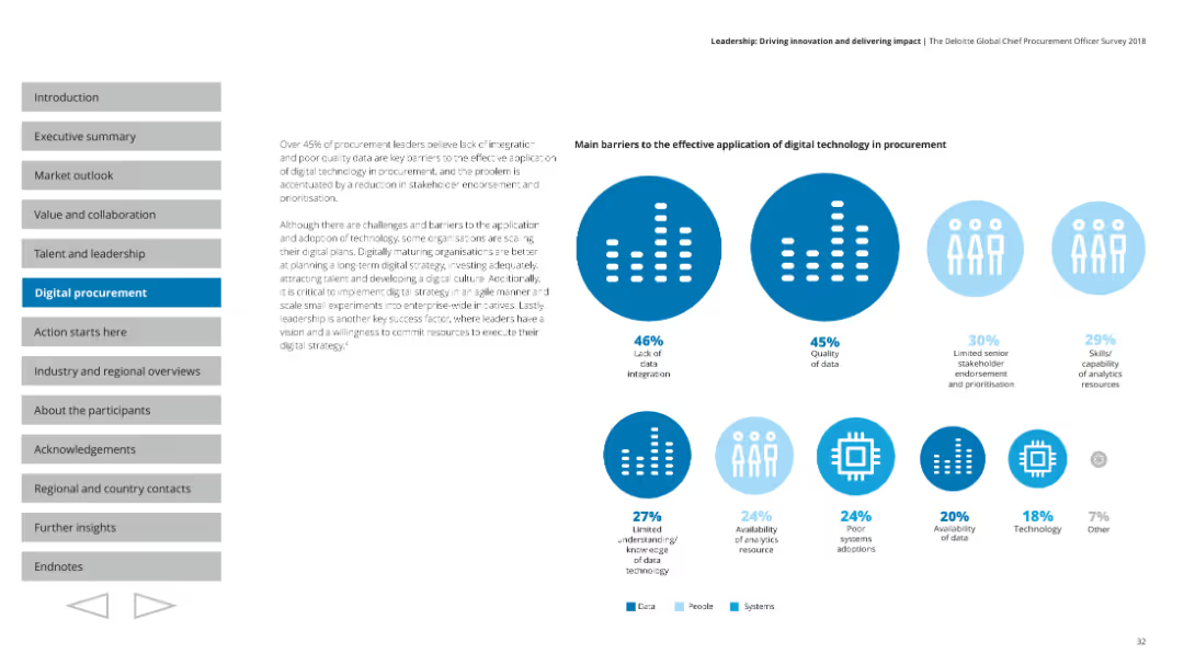
Left text-heavy with a quote and explanation; right contains a vertical bar chart comparing bottom and top quartile companies on use of telemetry and predictive analytics.
Performance Metrics and KPIs
Technology & Software
Describes how top-performing companies apply cognitive elements like telemetry and predictive analytics to automate processes. It shows these companies are twice as likely to use such technologies effectively.
automation, telemetry, predictive analytics, AI, architecture, digital core, performance
Mixed Chart
Accenture
Saved
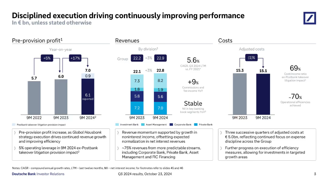
The slide displays bar charts of leverage exposure and risk-weighted assets over time, with detailed breakdowns and key highlights.
Financial Performance
Financial Services
It details Deutsche Bank's leverage exposure and risk-weighted assets, providing insights into different asset classes and risk metrics.
leverage exposure, risk-weighted assets, bar charts, asset classes, risk metrics, Deutsche Bank
Multiple Chart
Deutsche Bank
Saved
Top shows AuM development bar chart (YoY and QoQ), bottom features pie charts of AuM by asset class for 3 quarters.
Financial Performance
Financial Services
Analyzes changes in Asset Management AuM from Q3 2023 to Q3 2024, highlighting impact from market performance and FX. Pie charts show diversification across fixed income, equity, passive, and other asset classes.
AuM, Asset Management, FX, Market Performance, Fixed Income, Equity
Multiple Chart
Deutsche Bank
Saved
This slide features a complex set of column charts and a line graph showcasing data progression over multiple years, labeled FY19 to FY24, with various financial metrics displayed.
Financial Performance
Financial Services
The slide presents yearly increases in gross hedge income and projections for future years, highlighting trends in financial performance within a corporate finance context.
hedge, income, financial, trend, growth, GBP, FY19-FY24, Barclays UK, swap rate, equity
Multiple Chart
Barclays
Saved
Various column charts comparing financial performance metrics (ROIC, shareholder return, resilience index) between tech-forward companies and others. Text explains these performance advantages.
Performance Metrics and KPIs
Technology & Software
The slide compares the performance of tech-forward companies to their peers, highlighting superior financial metrics and resilience.
Tech-Forward, Performance, Financial Metrics, Resilience, Comparison
Multiple Chart
Accenture
Saved
This slide contains several columns and textual analysis divided into multiple sections. It uses a two-column layout with icons representing population and migration.
Market Analysis and Trends
Professional Services
This slide discusses strategies for entering growing markets, addressing older demographics, and using city developments as business opportunities. Intended for strategic business reviews.
population growth, market entry, older demographics, city development, strategic planning
Header Vertical
Roland Berger
Saved
This slide displays a line chart comparing the EM Equity Valuations to the U.S. using a Composite Valuation Indicator from 1990 to 2022, showing percentiles for reference.
Investment Analysis
Financial Services
The slide evaluates the attractiveness of emerging market equities compared to U.S. equities by analyzing valuation indicators over several decades.
EM Equity, U.S. Equity, Valuation Comparison, Investment Analysis, Composite Indicator, Market Trends, Financial Valuation, Equity Analysis
Single Chart
Morgan Stanley
Saved
Horizontal stacked bar chart by country with left-side “agree” percentages and right-side “disagree”. Title and question placed top left.
Market Analysis and Trends
Energy & Utilities
This slide assesses the sector's reliability and its ability to keep promises. China, Saudi Arabia, and India again show high agreement. Western countries remain more critical, with low trust in promises from oil & gas companies.
Reliability, Promises, Trust, Oil & Gas Sector, Global Opinions, Ipsos Survey, Accountability, Market Perception, Country Trends
Mixed Chart
IPSOS
Saved
A column chart illustrates the value of household investments in various ranges, comparing data from 2022 and 2023.
Market Analysis and Trends
Financial Services
It shows the distribution of household investment values among Canadians, comparing figures from 2022 and 2023.
Household, Investments, Value, Canadians, 2023, 2022, Column Chart, Financial, Trends
Single Chart
IPSOS
Saved
Previous
Next
If nothing, comes up, please save your slides first
Create a FREE account to continue browsing
Receive Instant Access to 1,000+ slides from companies like McKinsey, Google, and Goldman Sachs
First Name
Last Name
Email
Password
I agree to all
Terms & Privacy Policy
Thank you! Your submission has been received!
Oops! Something went wrong while submitting the form.
Have an account?
Sign in
Column Chart
Heatmap
Chevron
Org Chart
Infographic
Callouts
Timeline
List
Graphic
Picture
Process Flow
Diagram
Paragraph
Map
Table
Framework
Subtitle
Takeaway Box
Icon
Other Chart
Radar Chart
Waterfall Chart
Mekko Chart
Pie Chart
Scatter Plot
Line Chart
Bar chart
Bullet points