Create a FREE Account
Instant access to 1,000+ real slides from top companies like McKinsey, BCG, Goldman Sachs, Google and many more!
First Name
Last Name
Email
Password
I agree to all
Terms & Privacy Policy
Thank you! Your submission has been received!
Oops! Something went wrong while submitting the form.
Have an account?
Sign in
Library
Templates
Courses
Pricing
My Account
My Slides
My Templates
✦ AI
AI Prompt Library
AI Search
Sign in
Start Here
Logout
My Saved Slides
Provides a detailed case study of Jejak.in with photos, icons, and data points about their programs and achievements in forest conservation in Indonesia.
Market Analysis and Trends
Environmental Services & Sustainability
Slide presents a case study on Jejak.in's efforts in forest conservation using digital monitoring and carbon credits, suitable for discussions on technological impacts on environmental efforts.
Indonesia, forest conservation, Jejak.in, case study, carbon sequestration, digital monitoring, technology, carbon credits
Header Vertical
Bain
Saved
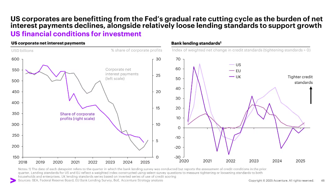
Two-panel graph: left = net interest payments as share of profits, right = bank lending standards index (US, EU, UK)
Financial Performance
Financial Services
The slide shows that US corporates benefit from the Fed's rate cuts, as net interest payments decrease significantly. Concurrently, bank lending standards remain relatively loose, especially compared to EU and UK conditions, supporting continued investment activity.
interest payments, US corporates, investment, lending standards, Fed policy, rate cuts
Multiple Chart
Accenture
Saved
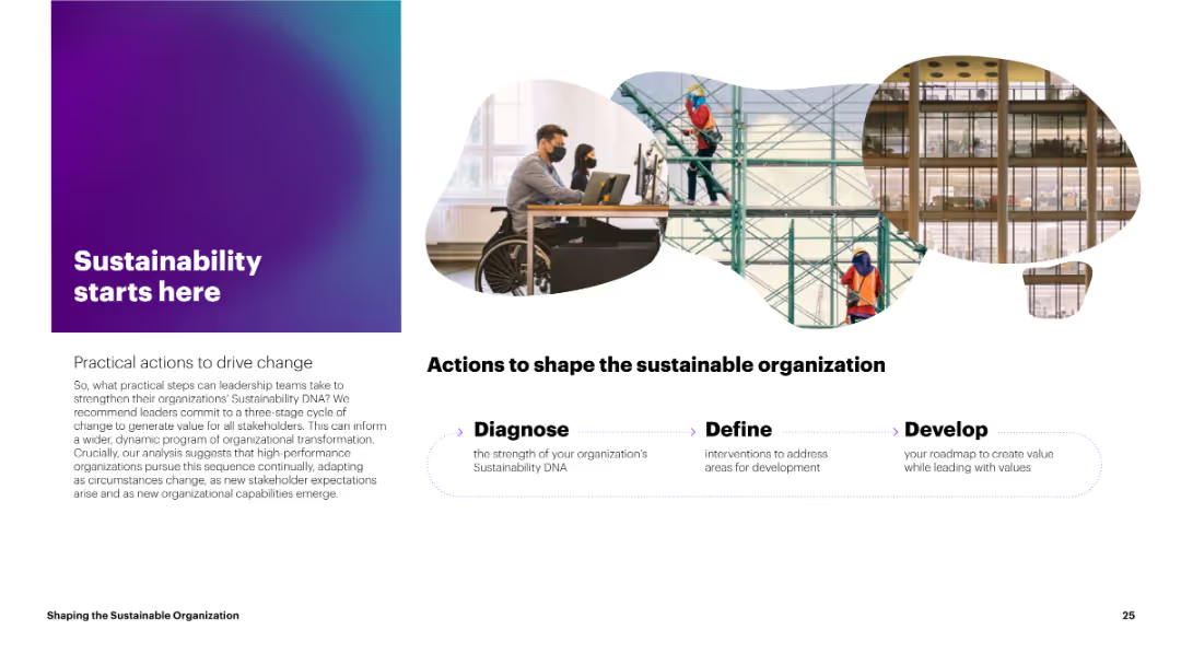
The slide includes a visually appealing gradient background with an image of professionals working, along with text outlining practical actions for sustainability. The layout is clean, with a balance of images and text.
Strategic Planning
Environmental Services & Sustainability
The slide outlines practical actions to drive change for strengthening sustainability in organizations. It emphasizes a three-stage cycle: Diagnose, Define, and Develop, aiming for continuous improvement and adaptation to new stakeholder expectations.
Sustainability, Actions, Change, Strategy, Improvement
Linear Flow
Accenture
Saved
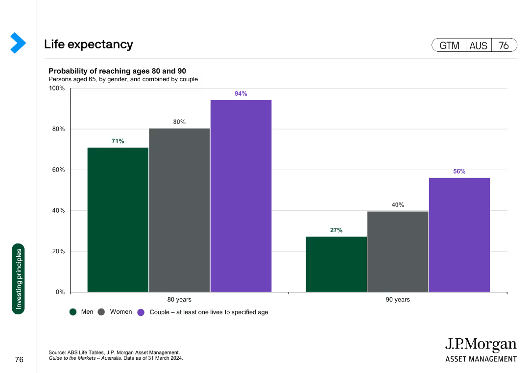
A column chart displaying the probability of men, women, and couples reaching ages 80 and 90. The bars represent the percentages for each group, with different colors for each category.
Market Analysis and Trends
Financial Services
The slide shows the probability of men, women, and couples reaching the ages of 80 and 90. It is used to illustrate longevity statistics relevant to financial planning.
Life expectancy, longevity, financial planning, retirement, demographics
Single Chart
JP Morgan
Saved
This slide contains a column chart showing global agreement levels on self-determination, with countries listed along the x-axis and percentages along the y-axis.
Market Analysis and Trends
Government & Public Sector
It presents data on the global consensus regarding the right to self-determination, emphasizing the importance of individuals working out their principles to guide decisions.
self-determination, global consensus, principles, agreement, column chart, countries, percentages
Multiple Chart
IPSOS
Saved
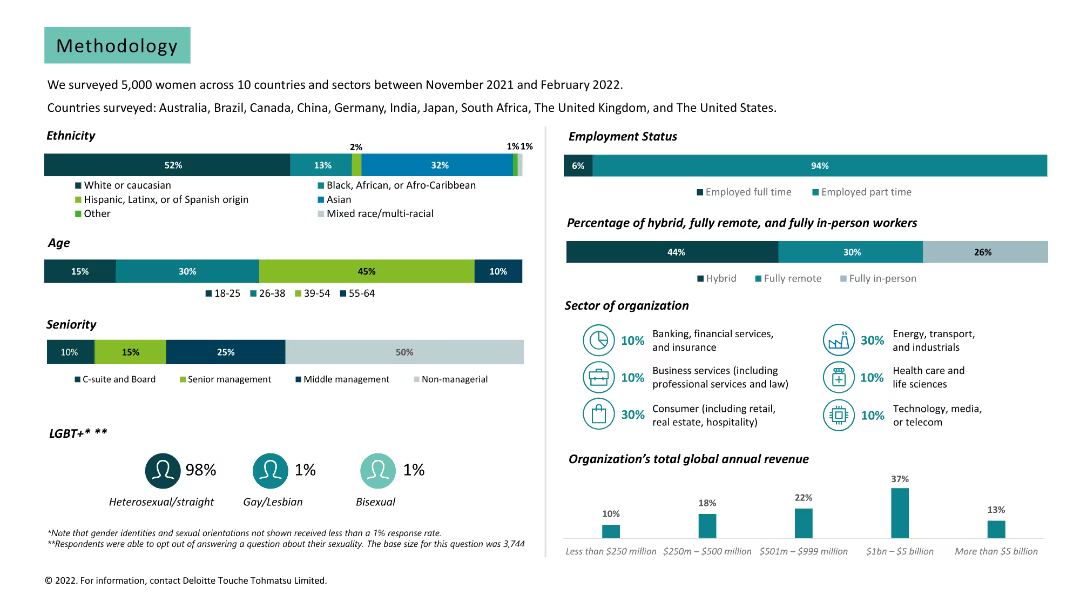
Various charts and text. Data on survey demographics, including ethnicity, age, seniority, employment status, and sector of organization.
Market Analysis and Trends
Professional Services
Provides detailed methodology of the survey, including participant demographics and organization details.
methodology, survey, demographics, ethnicity, age, seniority, employment status, sector, organization
Multiple Chart
Deloitte
Saved
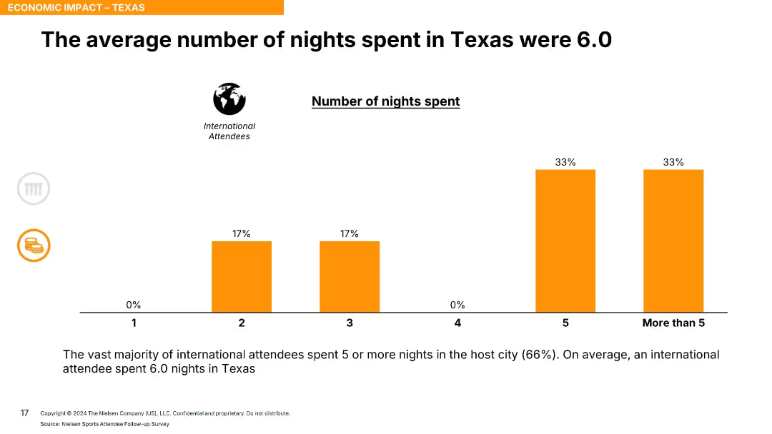
Bar chart with five categories (1–5+ nights) showing percentage breakdown, orange bars; simple design.
Market Analysis and Trends
Hospitality & Tourism
The slide outlines how long international attendees stayed in Texas, with 66% staying 5 or more nights and an average of 6 nights overall, suggesting a high level of extended tourism engagement.
duration of stay, tourism behavior, event impact, overnight stay, international visitors, average nights
Single Chart
Nielsen
Saved
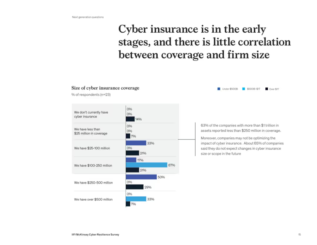
Stacked bar chart segmented by firm size showing coverage levels; with insight box on right side
Risk Assessment and Management
Financial Services
The slide presents survey results indicating that many firms, regardless of size, have low levels of cyber insurance coverage. 63% of firms with over $1 trillion in assets have less than $250M in coverage. Despite increasing risks, 65% of respondents do not foresee changes in coverage size or scope.
cyber insurance, coverage, risk, firm size, underinsured, survey, McKinsey, exposure, financial services
Mixed Chart
McKinsey
Saved
The slide features two column charts. The left chart shows the UK unemployment rate and wage growth over time. The right chart presents labor force participation rates for the US, Eurozone, and UK. The data is well-segmented and color-coded.
Market Analysis and Trends
Financial Services
This slide provides insights into the UK labor market, focusing on unemployment, wage growth, and labor force participation rates, essential for labor market analysis.
UK labor market, unemployment, wage growth, labor force participation, economic trends
Multiple Chart
JP Morgan
Saved
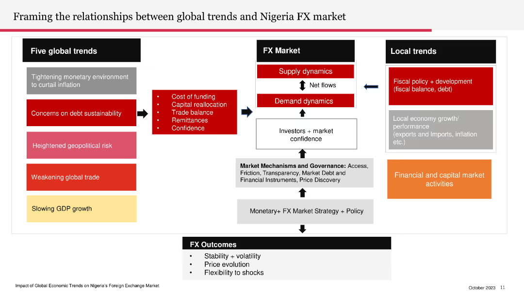
The slide contains a flowchart linking global trends to Nigeria’s FX market, local trends, and FX outcomes. The flowchart uses arrows and color-coded boxes to differentiate between different elements.
Market Analysis and Trends
Financial Services
The slide explains the impact of global trends on Nigeria's foreign exchange market, covering local fiscal policies and financial activities.
FX market, global trends, Nigeria, local trends, fiscal policy, financial activities
Diagram
PwC/Strategy&
Saved
Column charts displaying the composition of non-core and legacy assets by type and source, along with textual explanations.
Strategic Planning
Financial Services
This slide details the exit strategy for non-core and legacy assets, including governance, risk management, and reduction targets.
non-core, legacy, assets, UBS, Credit Suisse
Multiple Chart
UBS
Saved
Features a dark backdrop with flow charts and boxes outlining ROE simulation for 2022, including past averages and target ranges, as well as selective levers that impact ROE.
Investment Analysis
Financial Services
This slide is used to simulate return on equity (ROE) for the year 2022, showing past performance and future targets, and discussing various financial levers.
ROE, Simulation, Management, Growth, Solutions, Efficiency, Financial, Investment
Mixed Chart
Goldman Sachs
Saved
This slide contains a comparative table with two columns, comparing grain and cement supply chains with metrics such as size, growth, and supply chain costs.
Market Analysis and Trends
Agriculture & Food Production
The slide compares the grain and cement supply chains based on various metrics to show why they were selected for review, highlighting key differences.
Grain, Cement, Supply Chain, Comparison, Metrics
Multiple Chart
LEK
Saved
Two column charts showing Brent and WTI price estimates from banks and brokers. Each chart has consultant and bank/broker ranges with data points from 2020 to 2024.
Market Analysis and Trends
Energy & Utilities
This slide forecasts higher oil prices for Brent and WTI, with consultant ranges suggesting long-term sustainable prices. Provides average price per barrel estimates.
Oil, price, forecast, Brent, WTI, bank, broker, consultant, estimate, range
Multiple Chart
EY
Saved
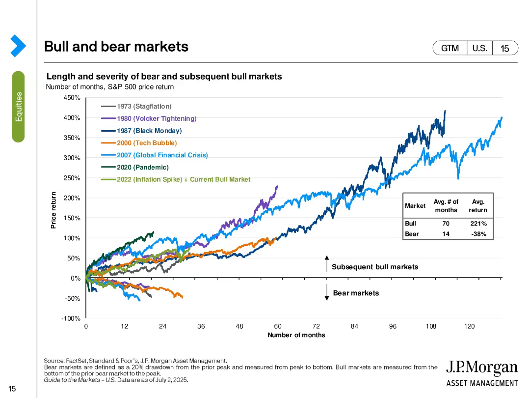
Line chart tracking the S&P 500’s performance in various historical bull and bear markets. Color-coded by major economic events.
Strategic Planning
Financial Services
The slide shows the price return trajectories of the S&P 500 in different market cycles including stagflation, tech bubble, GFC, and pandemic. It contrasts the length and return of bear vs. bull markets, with bull markets averaging 70 months and 221% return. The current bull market (since 2022) is included.
bull markets, bear markets, S&P 500, historical returns, market cycles, investment strategy, macroeconomic events, recovery
Single Chart
JP Morgan
Saved
Features a woman with a laptop and a red, techy backdrop. The slide details strategies for organizations to tackle digital transformation challenges.
Technology and Digital Transformation
Professional Services
Presents actions for businesses to ensure digital transformation success, emphasizing talent strategy, learning systems, and operational model alignment.
digital transformation, talent strategy, learning systems, operational model, agility
Boxed
Bain
Saved
This slide uses a linear graph and segmented bars to represent the recovery of different economic sectors post-lockdown. Each sector is symbolized by a different pattern (stripes for goods, dots for services), showing their recovery status in relation to pre-COVID levels.
Strategic Planning
Consumer Goods
Evaluates the recovery of consumer sectors post-COVID, highlighting which areas have returned to normal, are recovering, or still require significant time to bounce back. It provides insights into consumption trends and sector-specific recoveries.
consumption, recovery, COVID-19, economic sectors, trends, analysis
Single Chart
BCG
Saved
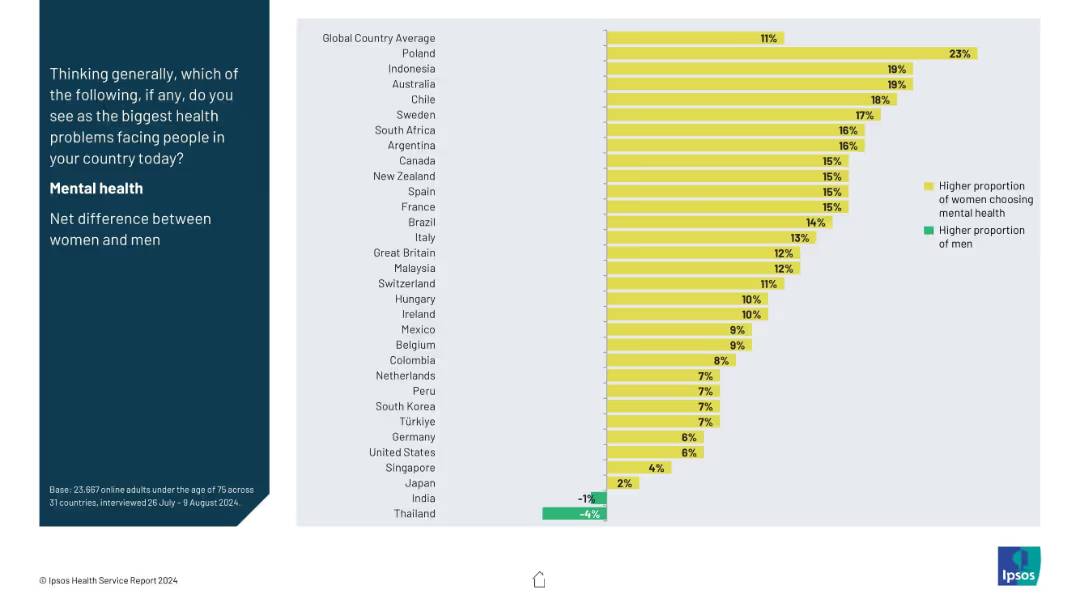
Split-panel layout with a vertical question prompt on the left in a dark blue block, and a horizontal bar chart on the right side using yellow and green bars.
Market Analysis and Trends
Healthcare & Pharmaceuticals
This slide shows the gender-based net difference in selecting mental health as the biggest health concern across countries. Yellow bars represent higher female concern, while green shows male. Poland leads with the highest female-male gap, while Thailand has a higher male concern rate.
mental health, gender gap, health perception, global comparison, survey
Mixed Chart
IPSOS
Saved
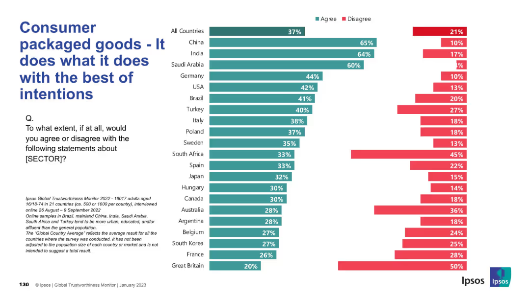
Horizontal bars showing perception of ethical intent; follows same format as previous charts; Ipsos branding and color scheme consistent.
Product and Service Analysis
Consumer Goods
This slide presents public sentiment on whether consumer packaged goods companies act with good intentions. Positive responses dominate in China, India, and Saudi Arabia. However, trust is notably lower in countries like Great Britain and France.
ethics, intent, consumer trust, product sector, international sentiment
Mixed Chart
IPSOS
Saved
Features a large column chart depicting the monthly development of STO funding volume across two years. Uses a red color palette for bars, with annotations for notable peaks and descriptions of specific STO events.
Regulatory and Compliance
Financial Services
Discusses the trends in STO funding over time, emphasizing key periods of growth and decline. It offers insights into the regulatory developments affecting the market and predicts the future relevance of STOs in the investment landscape, noting the importance of a stable regulatory infrastructure.
STOs, blockchain, funding trends, regulatory, 2018, 2019, growth, investment
Single Chart
PwC/Strategy&
Saved
Bar chart showing planned technology investments by family offices, with accompanying text on significance.
Technology and Digital Transformation
Financial Services
Highlights the technology investment plans of APAC family offices, emphasizing cybersecurity and IT hardware.
technology investments, APAC, family offices, cybersecurity, IT hardware
Mixed Chart
EY
Saved
Two charts: a line chart showing the 5-year rolling correlation between bonds and equities, and a bar chart displaying cumulative returns during market drawdowns.
Risk Assessment and Management
Financial Services
Highlights the protective role of bonds during large market drawdowns, despite positive correlations to equities, with a detailed historical performance analysis.
bonds, equities, correlation, market drawdowns, financial protection
Multiple Chart
Goldman Sachs
Saved
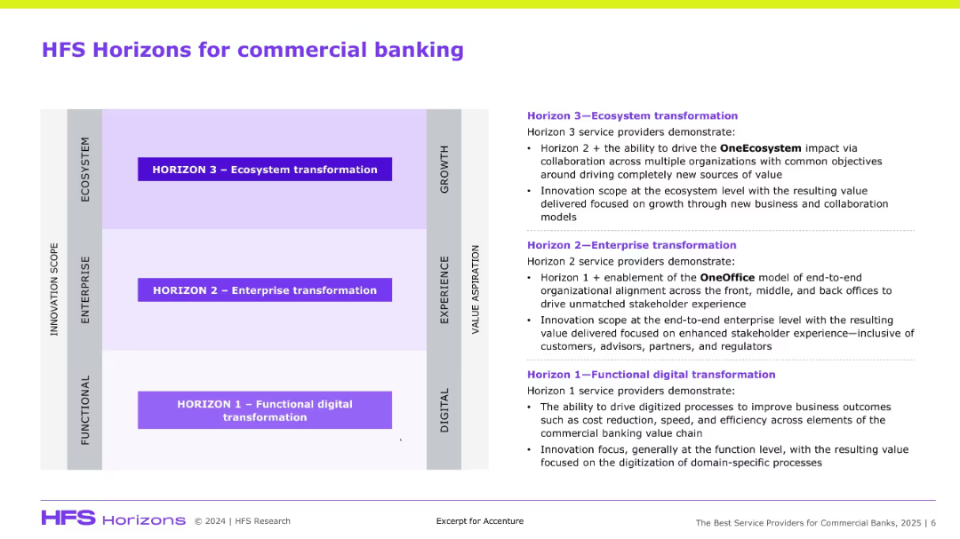
Matrix chart with three horizontal zones and detailed text explanation on the right side.
Technology and Digital Transformation
Financial Services
This slide presents a 3-tier model (Functional, Enterprise, Ecosystem transformation) explaining stages of digital maturity in commercial banking, with emphasis on value creation, innovation, and alignment.
HFS, commercial banking, digital transformation, ecosystem, innovation, OneOffice
Diagram
Accenture
Saved
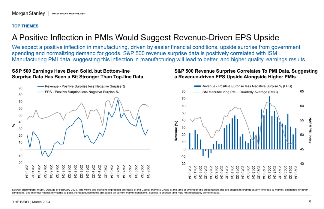
Two column charts comparing revenue positive surprises with negative surprises and ISM Manufacturing PMI data, indicating a relationship between PMI and revenue growth.
Financial Performance
Financial Services
The slide suggests that improvements in PMI data could drive revenue and EPS growth in the S&P 500. It shows historical data and correlation between PMI and revenue surprises.
PMI, EPS, S&P 500, Revenue, Correlation, Manufacturing, Financial Conditions, Growth
Multiple Chart
Morgan Stanley
Saved
The slide includes column charts showing the avoided CO₂ emissions and abatement costs for different energy sources and scenarios. It's visually clear and complex.
Regulatory and Compliance
Energy & Utilities
Discusses the necessary carbon pricing for methanation to be competitive with natural gas, presenting detailed CO₂ emissions and abatement cost analysis.
carbon cost, methanation, natural gas, CO₂ emissions, abatement cost, competitive pricing, regulatory analysis
Multiple Chart
Kearney
Saved
Previous
Next
If nothing, comes up, please save your slides first
Create a FREE account to continue browsing
Receive Instant Access to 1,000+ slides from companies like McKinsey, Google, and Goldman Sachs
First Name
Last Name
Email
Password
I agree to all
Terms & Privacy Policy
Thank you! Your submission has been received!
Oops! Something went wrong while submitting the form.
Have an account?
Sign in
Column Chart
Heatmap
Chevron
Org Chart
Infographic
Callouts
Timeline
List
Graphic
Picture
Process Flow
Diagram
Paragraph
Map
Table
Framework
Subtitle
Takeaway Box
Icon
Other Chart
Radar Chart
Waterfall Chart
Mekko Chart
Pie Chart
Scatter Plot
Line Chart
Bar chart
Bullet points