Create a FREE Account
Instant access to 1,000+ real slides from top companies like McKinsey, BCG, Goldman Sachs, Google and many more!
First Name
Last Name
Email
Password
I agree to all
Terms & Privacy Policy
Thank you! Your submission has been received!
Oops! Something went wrong while submitting the form.
Have an account?
Sign in
Library
Templates
Courses
Pricing
My Account
My Slides
My Templates
✦ AI
AI Prompt Library
AI Search
Sign in
Start Here
Logout
My Saved Slides
The slide contains text on the left side detailing sectors expected to drive growth, and a column chart on the right with 10 categories ranked by respondents. An image of a hiker is at the bottom.
Strategic Planning
Energy & Utilities
This slide presents survey results on sectors anticipated to boost Greece's growth, highlighting the rise in tourism and logistics, along with the increasing importance of healthcare and wellbeing.
sectors, growth, Greece, tourism, logistics, healthcare, wellbeing, survey
Mixed Chart
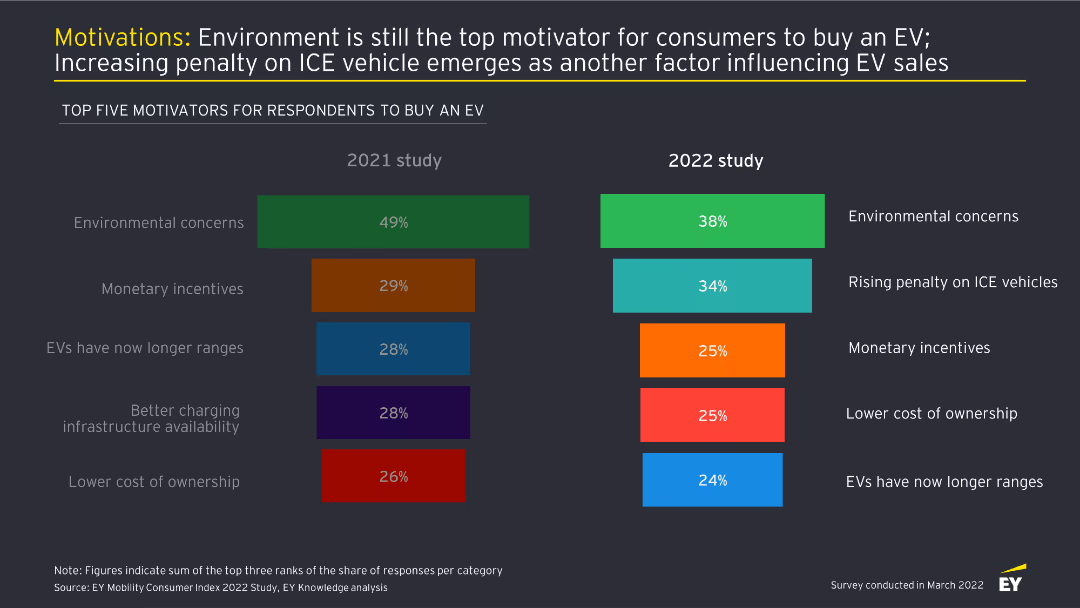
EY
Saved
A scatter plot chart illustrates the overlap of Procure-to-Pay, eSourcing, and Supplier Governance, highlighting tools like Ariba and Coupa. Key areas such as contract management, financial management, and risk management are detailed.
Operational Efficiency
Technology & Software
Describes the integration of contract management, supplier governance, and P2P systems, detailing functions and technologies used to streamline and enhance supplier interactions and compliance.
Contract, Management, Supplier, Governance, Integration
Diagram
Kearney
Saved
The slide features two column charts comparing 'Production Releases' and 'Improved App Ratings' over time, with annotations. On the right side, there's a text box listing awards and recognitions.
Financial Performance
Financial Services
Demonstrates increased agility in technology with a threefold increase in production releases and higher app ratings. It includes accolades such as innovation and model bank awards, implying industry recognition for technological advancements.
Agility, App Ratings, Awards, Recognition, Innovation, Technology
Single Chart
Goldman Sachs
Saved
Three-column comparison format with charts and tables about Millennials & Gen Z behavior and metrics.
Customer and Market Segmentation
Financial Services
Highlights strong engagement from Millennials & Gen Z with premium AXP cards, including high fee-paying rates and FICO scores, comparing favorably to other age groups and industry benchmarks.
millennials, gen Z, premium products, customer quality, fee-paying, FICO score, card demand
Mixed Chart
McKinsey
Saved
The slide presents a column chart showing the COVID stimulus as a percentage of GDP for various countries in 2020. Each column represents a different country with varying stimulus percentages.
Market Analysis and Trends
Financial Services
The slide compares the level of fiscal stimulus provided by different countries during the COVID-19 pandemic, highlighting the relatively lower stimulus in Asian and emerging markets.
COVID Stimulus, GDP, Fiscal Policy, Market Analysis, Economic Impact, Government Response, Comparative Analysis, Financial Services
Single Chart
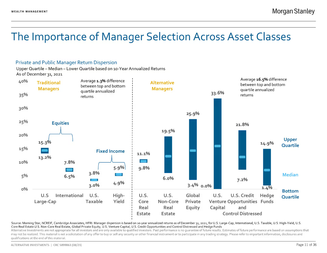
Morgan Stanley
Saved
The slide features a line chart comparing the share of nonrenewables and renewables in global power generation from 2000 to 2050. Additional information about accelerators and risks associated with this transition is provided on the side.
Market Analysis and Trends
Energy & Utilities
This slide highlights the increasing share of renewable energy in global power generation, predicting that by 2050, renewables will surpass nonrenewables significantly. It also discusses various factors that will accelerate or hinder this transition.
Renewables, Power, Generation, Transition, Forecast, Accelerators, Risks
Mixed Chart
EY
Saved
Horizontal bar charts comparing 30+ countries' likelihood perception on AI changing or replacing jobs, with country flags and percentage values.
Market Analysis and Trends
Artificial Intelligence
This slide presents global comparisons of opinions on whether AI will change or replace jobs in the next five years. It ranks countries based on perceived likelihood, highlighting global disparities.
AI, global comparison, job change, job replacement, perception, countries, survey data, Ipsos, horizontal bars
Multiple Chart
IPSOS
Saved
Slide features two line charts comparing changes in advertising spending and GDP over time. Text blocks provide contextual information and a global perspective on economic impacts on advertising.
Strategic Planning
Media & Entertainment
Analyzes the disproportionate impact of economic shocks on advertising spend compared to GDP, highlighting historical trends and predicting future behaviors in the advertising market.
Advertising, GDP, Economic Shock, Impact, Historical Trends, Future Prediction, Media, Global Perspective
Single Chart
Accenture
Saved
Similar layout with bar chart split by country. Green and red bars for agree/disagree; title on top left; Ipsos source and methodology noted.
Market Analysis and Trends
Energy & Utilities
This slide evaluates perceptions of leadership in the oil & gas sector. Leadership credibility is rated highest in China, India, and Saudi Arabia, while European countries show lower levels of agreement and higher disagreement.
Leadership, Oil & Gas, Ipsos, Trustworthiness, Global Opinion, Energy Sector, Management, Governance, Public Views, Country Trends
Mixed Chart
IPSOS
Saved
It contains a column chart and a dot matrix grid comparing asset flows across different products and channels, utilizing a diverse color code for quick visual differentiation.
Market Analysis and Trends
Financial Services
The slide compares total client asset flows by asset class, product, and region, showing a diversified financial platform's power and market position through clear data visualization.
Asset Flows, Diversification, Financial Platform, Market Position, Comparison, Asset Class, Products, Region, Channels
Mixed Chart
JP Morgan
Saved
A stacked bar chart showing the different types of fees reported by users when trading on crypto platforms, with a comparison between 2023 and 2022.
Pricing Strategies
Financial Services
This slide outlines the various fee structures encountered by users on crypto trading platforms, highlighting changes between 2023 and 2022.
Fees, crypto, trading, platforms, 2023, 2022, comparison
Mixed Chart
IPSOS
Saved
Five-category bar chart comparing impacts of GenAI on efficiency, profitability, revenue, and headcount by region
Performance Metrics and KPIs
Artificial Intelligence
This slide tracks measurable outcomes of GenAI adoption, including improved work efficiencies, profitability, and revenue. GCC firms report the highest gains in headcount, reflecting strong AI integration.
Efficiency, GenAI Impact, Headcount, Productivity, KPIs, AI Metrics, Regional Comparison
Mixed Chart
PwC/Strategy&
Saved
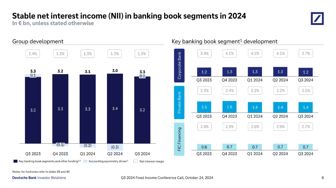
Three-column layout with bar charts under Pre-provision profit, Revenues, and Costs. Text boxes below charts summarize key takeaways. Uses consistent Deutsche Bank color palette and iconography.
Financial Performance
Financial Services
The slide highlights Deutsche Bank’s strong financial performance in FY 2024, showing increases in pre-provision profits, stable and growing revenues across divisions, and reduced adjusted costs. It emphasizes operational efficiencies, revenue stream stability, and targeted cost savings as key drivers of performance.
pre-provision profit, revenue, costs, efficiency, FY2024, Deutsche Bank, net interest, cost savings, financials, investor relations
Multiple Chart
Deutsche Bank
Saved
Text and bar chart showing top-mentioned actions for strengthening the aftermarket supply chain
Operational Efficiency
Industrial & Manufacturing
The slide discusses industry collaboration strategies such as supply agreements, integrated platforms, and analytics to enhance resilience. A bar chart ranks the most cited initiatives by executives, emphasizing long-term vendor agreements and digital supply chain improvements.
supply chain, partnerships, MRO, analytics, collaboration, resilience, planning
Mixed Chart
Accenture
Saved
Comprising a stacked column chart, this slide visually represents like-for-like DPU history with layers indicating operating DPU, fees in units, and capital top-up. Each column represents a year from 2018 to 2022, with a color-coding scheme and annotations for additional details. There's a legend explaining the components of the bars and a footnote defining like-for-like DPU.
Financial Performance
Financial Services
Provides a historical perspective on the Distribution Per Unit (DPU), indicating the company's financial performance and operational efficiency over a five-year period.
DPU Trends, Financial Performance, Operational Efficiency, Yearly Comparison, Capital Management, Fee Structure
Single Chart
Morgan Stanley
Saved
Multi-chart layout: pie charts, bar chart, and detailed text box on left.
Risk Assessment and Management
Financial Services
Provides an in-depth view of Deutsche Bank’s €35bn CRE loan portfolio, detailing risk categorization, geographic and sectoral exposure, and stress testing. Key stats include €28bn in higher risk loans, 64% LTV average, and €861m in cumulative CLPs. US CRE exposure and quarterly CLPs are visualized, emphasizing loan stress testing and sector distribution.
commercial real estate, CRE, loan stress test, US office, CLP, loan risk, loan-to-value, Deutsche Bank, Q1 2025, sector exposure
Multiple Chart
Deutsche Bank
Saved
Contains segmented column charts showing direct and indirect contributions of tourism to the GDP and employment in Europe.
Strategic Planning
Hospitality & Tourism
Examines the direct and indirect economic impacts of tourism in Europe, including contributions to GDP and employment figures.
Tourism, GDP, Employment, Economic impact, Europe
Mixed Chart
Bain
Saved
A bubble chart showing the human capital index vs. real GDP per capita and a bar chart showing the index of economic freedom by country.
Market Analysis and Trends
Financial Services
The slide compares countries' economic competitiveness through human capital indices and real GDP per capita, and presents an index of economic freedom scores for 2024.
economic competitiveness, human capital, GDP per capita, economic freedom, countries, financial analysis, indices, economic trends, development, financial insights
Multiple Chart
JP Morgan
Saved
The slide includes column charts showing the significance of talent risk to banks, with data on various aspects like talent being one of the most significant long-term risks.
Human Resources and Talent Management
Financial Services
This slide highlights the significance of talent risk in the banking industry, emphasizing the challenges in attracting and retaining talent, and the critical role of talent in operational resilience.
talent risk, banking, column charts, long-term risks
Mixed Chart
EY
Saved
This minimalistic slide displays three bullet points highlighting the session's main topics: How we define innovation, Innovation operating model, and Culture of innovation. It uses simple icons and text against a geometric background.
Strategic Planning
Professional Services
Introduces the key focus areas of the presentation on innovation. This slide sets the stage for discussions on defining innovation, exploring an innovation operating model, and fostering a culture of innovation within organizations. Useful for strategic sessions focused on organizational development and innovation management.
Innovation, strategic planning, organizational culture, innovation management
Agenda
McKinsey
Saved
Text-heavy left with stacked bar chart on right showing alliances since 2007.
Strategic Planning
Transportation & Logistics
The slide outlines strategic alliances in 2024 focused on digital and environmental goals, such as AI, blockchain, and robotics. It lists key joint ventures and shows a decline in total alliances over time, correlating with shifts in global GDP.
alliances, joint ventures, digital transformation, decarbonisation, freight, robotics, GDP
Mixed Chart
PwC/Strategy&
Saved
Vertical bar chart with countries ranked by optimism about future quality of life; includes side column with percentage difference from current life assessment.
Market Analysis and Trends
Professional Services
The slide ranks countries based on optimism regarding future quality of life. Colombia, India, and Argentina are the most optimistic, with Japan ranking lowest. It also shows the percentage point difference compared to their current quality of life, highlighting shifts in sentiment.
optimism, future quality of life, Ipsos, expectation, country sentiment, 2025, outlook, survey, global confidence
Mixed Chart
IPSOS
Saved
Column chart showing the planned rundown of risk-weighted assets over several years with a target for significant reduction.
Strategic Planning
Financial Services
Illustrates the reduction in risk-weighted assets excluding operational risk, outlining the approach for cost reduction and capital release.
rundown, risk-weighted, assets, cost, capital
Mixed Chart
UBS
Saved
This slide has two line charts: one showing the correlation between the yen and Japanese equities, and the other showing growth in nominal exports and earnings per share.
Market Analysis and Trends
Financial Services
The slide analyzes key performance drivers of Japanese equities, focusing on the correlation with the yen, and the impact of export growth and earnings per share, providing insights into factors influencing market performance.
Japan, performance drivers, yen correlation, equities, exports, earnings per share, market analysis, financial performance, investment insights, economic factors
Multiple Chart
JP Morgan
Saved
The slide displays a series of bar charts depicting the digital marketing maturity levels across various industries like financial services, retail.
Competitive Landscape
Media & Entertainment
Examines digital marketing maturity across different industries, highlighting significant variances in maturity levels.
industries, digital marketing, maturity, financial services, retail, comparison
Single Chart
BCG
Saved
Previous
Next
If nothing, comes up, please save your slides first
Create a FREE account to continue browsing
Receive Instant Access to 1,000+ slides from companies like McKinsey, Google, and Goldman Sachs
First Name
Last Name
Email
Password
I agree to all
Terms & Privacy Policy
Thank you! Your submission has been received!
Oops! Something went wrong while submitting the form.
Have an account?
Sign in
Column Chart
Heatmap
Chevron
Org Chart
Infographic
Callouts
Timeline
List
Graphic
Picture
Process Flow
Diagram
Paragraph
Map
Table
Framework
Subtitle
Takeaway Box
Icon
Other Chart
Radar Chart
Waterfall Chart
Mekko Chart
Pie Chart
Scatter Plot
Line Chart
Bar chart
Bullet points