My Account
My Slides
Search by Category
Companies
Slide Type
Use Case
Industry
Pricing
Templates
View All Templates
Download Template Slides
✦ AI
AI Prompt Library
AI Search
Feedback
Login
Logout
Get Started
Browse all Slides
Browse all Slides
Create a FREE Account
Instant access to 1,000+ real slides from top companies like McKinsey, BCG, Goldman Sachs, Google and many more!
First Name
Last Name
Email
Password
I agree to all
Terms & Privacy Policy
Thank you! Your submission has been received!
Oops! Something went wrong while submitting the form.
Have an account?
Sign in
Saved Slides
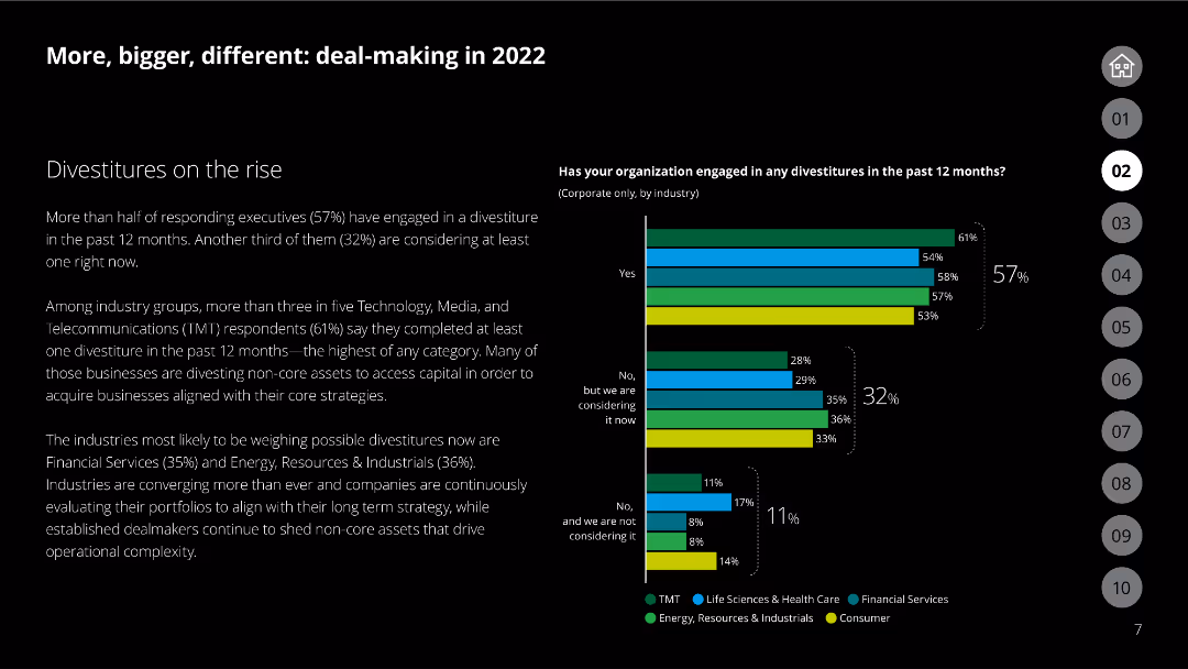
Column chart showing engagement in divestitures by industry, with categories like TMT, financial services, and energy
Mergers and Acquisitions
Financial Services
Discusses the rise in divestitures across various industries, emphasizing the strategic reasons behind these decisions.
Divestitures, industries, strategy, TMT, financial services
Mixed Chart
Deloitte
Saved
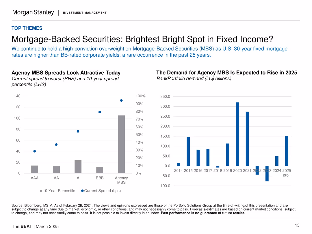
Two charts: left bar/point combo showing spreads and percentiles; right bar chart of bank demand. Light background, data-focused layout.
Investment Analysis
Financial Services
Highlights the attractiveness of agency MBS, with higher spreads than BB-rated corporates and strong historical percentile positioning. Demand is projected to rise significantly in 2025 after recent declines, signaling renewed institutional interest.
MBS, spreads, fixed income, mortgage rates, bank demand, agency bonds, yield, investment opportunity
Multiple Chart
Morgan Stanley
Saved
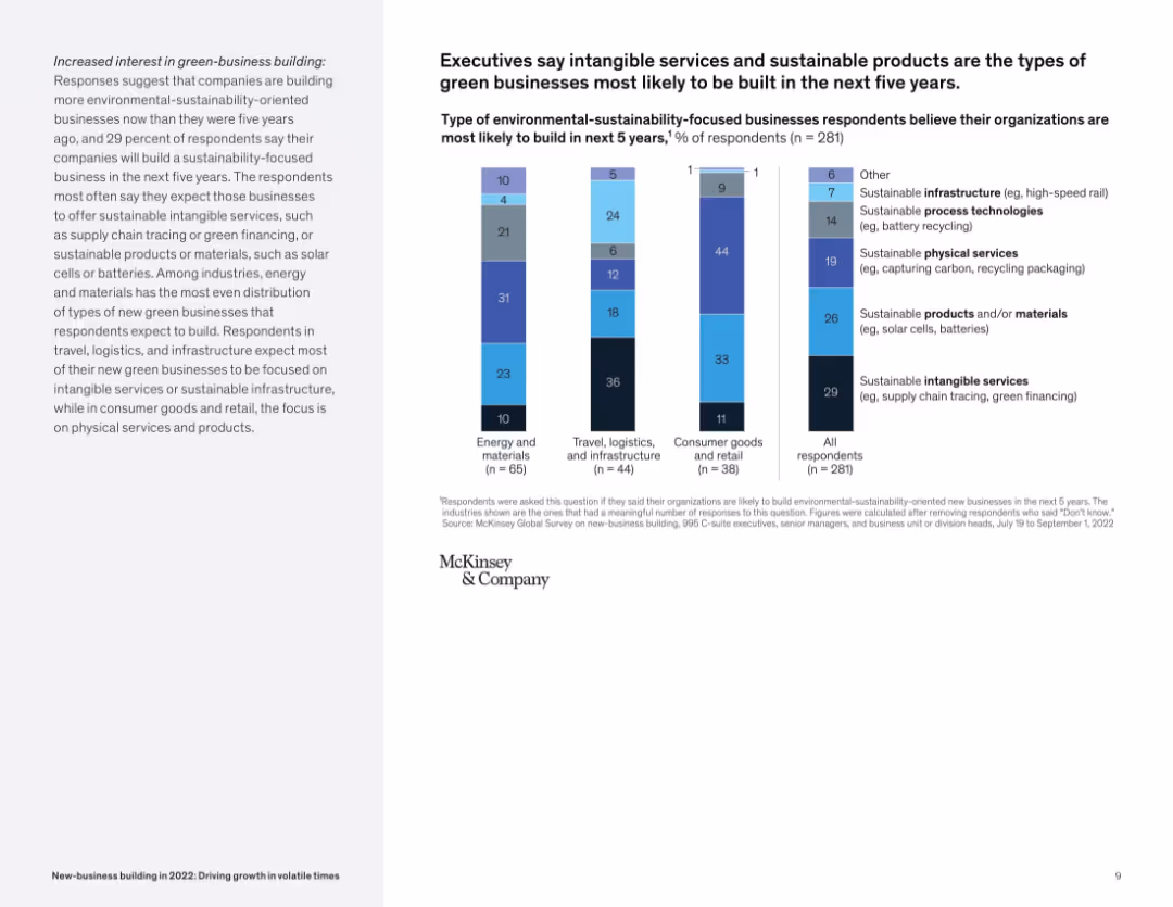
Vertical stacked bar chart of green-business types by industry, with explanatory sidebar; straightforward visual structure.
Market Analysis and Trends
Environmental Services & Sustainability
This slide focuses on expected green-business types in the next five years. Intangible services like green financing and sustainable products such as batteries are most likely to be built. It shows distinct preferences across industries.
green business, sustainability, new-business, renewable products, services, industry focus, environment
Mixed Chart
McKinsey
Saved
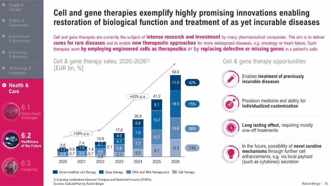
Stacked bar chart (left) with annotations and labels; icons and bullet list (right); gradient tones in therapy bars
Product and Service Analysis
Healthcare & Pharmaceuticals
This slide focuses on the cell and gene therapy market, forecasting rapid growth through 2026. It highlights opportunities in personalized medicine, long-lasting treatments, and potential cures. The chart breaks down sales by therapy type and projects strong annual growth in this emerging healthcare segment.
Cell Therapy, Gene Therapy, Innovation, Personalized Medicine, Forecast
Mixed Chart
Roland Berger
Saved
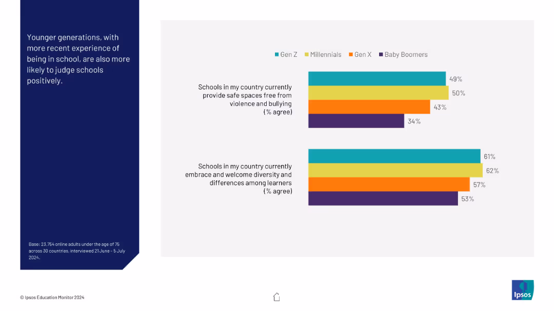
Two horizontal bar charts comparing Gen Z, Millennials, Gen X, and Boomers on school safety and diversity perceptions; color-coded by generation.
Market Analysis and Trends
Education & Training
This visual reveals generational differences in perceptions of school environments. Younger generations, especially Gen Z and Millennials, rate schools more positively than Gen X and Baby Boomers.
generational analysis, schools, diversity, education, safety, perceptions, Gen Z, Millennials, comparison
Mixed Chart
IPSOS
Saved
The slide has a four-point list on the left and a checklist comparing strategic criteria for M&A on the right. It uses a combination of check marks and cross marks to visually denote achievements or targets.
Strategic Planning
Financial Services
Outlines the company’s philosophy on capital allocation, prioritizing organic growth, dividends, strategic acquisitions, and share repurchases. The right side evaluates potential M&A opportunities against strategic goals, providing a clear decision-making framework.
Capital Allocation, Organic Growth, Dividends, M&A, Strategic Acquisitions, Share Repurchases
Boxed
Goldman Sachs
Saved
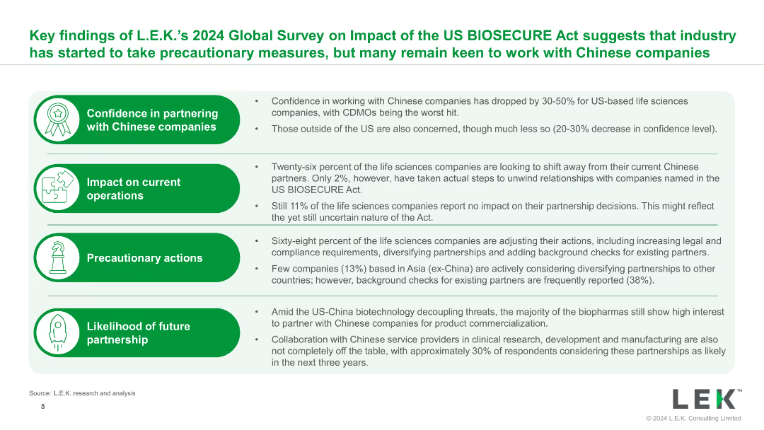
The slide uses bullet points and icons to present key findings from the 2024 Global Survey on the impact of the US BIOSECURE Act, with clear headings and supporting details.
Market Analysis and Trends
Healthcare & Pharmaceuticals
The slide summarizes key findings on the impact of the US BIOSECURE Act, highlighting changes in confidence, operational impacts, precautionary actions, and future partnership likelihoods.
BIOSECURE Act, survey, findings, impact, healthcare
Table
LEK
Saved
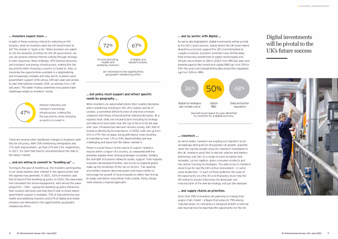
The slide features text and an image highlighting the importance of digital investments in the UK.
Technology and Digital Transformation
Technology & Software
This slide emphasizes the critical role of digital investments for the UK's future success, focusing on investor priorities, necessary policy support, and the importance of sectors like digital technologies, R&D, and data protection.
Digital Investment, UK, Future Growth, Technology
Multiple Chart
EY
Saved
Combines text with bar charts to highlight the differences in how highly resilient boards handle talent and culture-related issues.
Human Resources and Talent Management
Professional Services
The slide discusses the importance of prioritizing talent discussions, using data to drive insights, and overseeing DE&I initiatives, comparing highly resilient boards to less resilient ones.
talent management, DE&I, resilient boards, professional services, data insights, culture, bar charts
Multiple Chart
EY
Saved
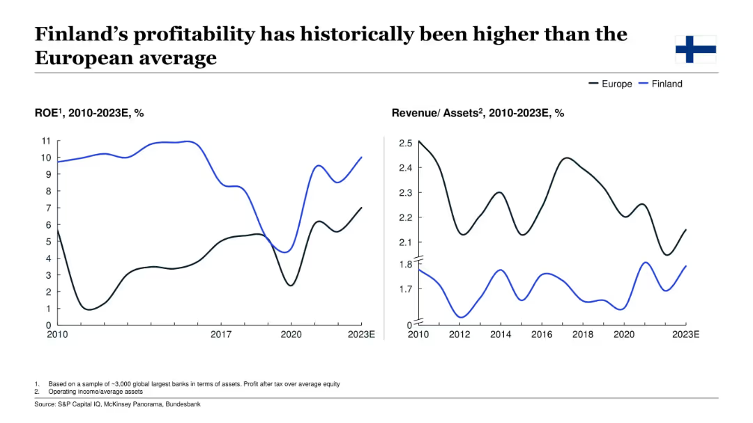
Dual line charts showing Finland’s ROE and revenue/assets from 2010–2023E, compared to the European average.
Financial Performance
Financial Services
This slide focuses on Finland’s bank performance, showing historically higher ROE versus the European average, though revenue/assets are lower. It underscores sustained profitability and offers insight into the structural dynamics of Finnish banking institutions.
Finland, profitability, ROE, revenue/assets, European banks, finance, historical trend
Multiple Chart
McKinsey
Saved
A scatter plot dominates the slide, comparing the CRE criticized asset ratio to other peers, paired with a detailed trend analysis table. The design is clean, with a blue and white theme, and includes textual explanations.
Market Analysis and Trends
Financial Services
Analyzes the bank's commercial real estate portfolio in relation to its peers, with a focus on criticized asset ratios and trends over recent years.
CRE portfolio, commercial real estate, asset ratios, peer comparison, trends
Mixed Chart
Goldman Sachs
Saved
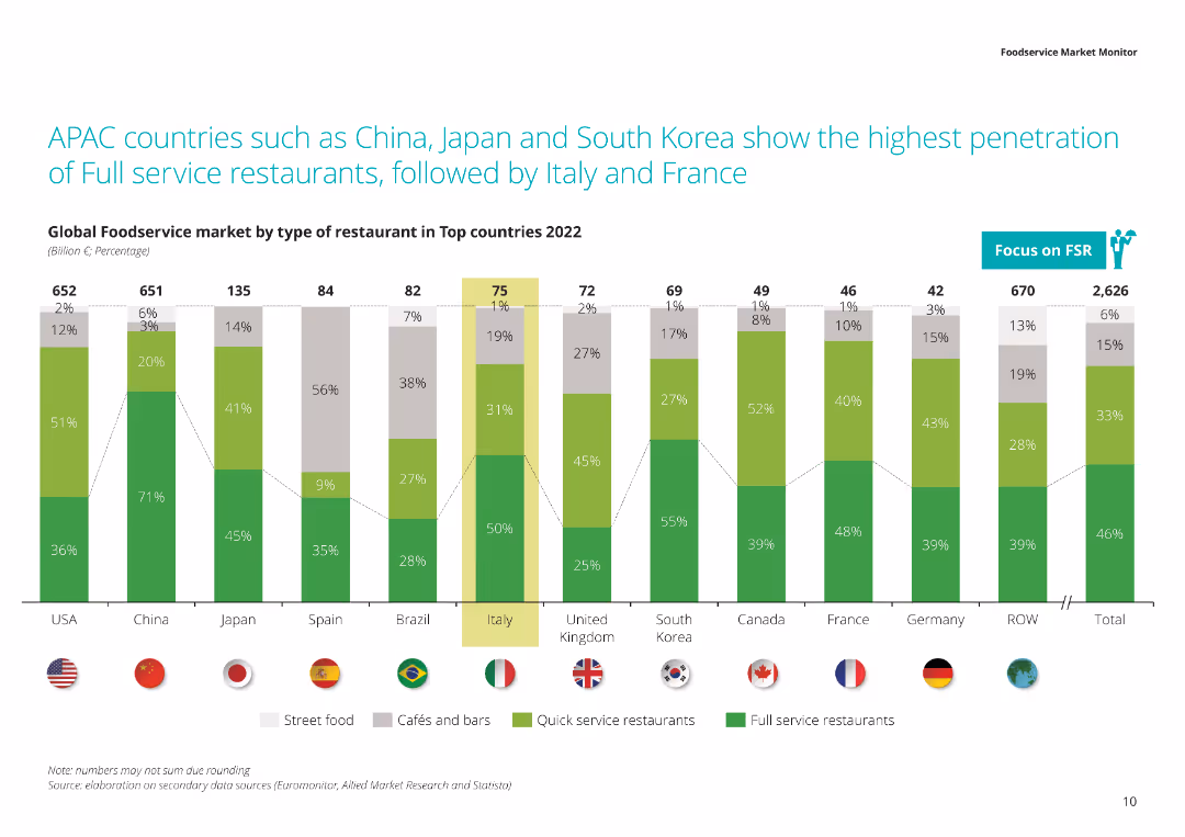
The slide shows a column chart with data on the market penetration of different types of restaurants (street food, cafés, quick service, full service) across top countries in 2022. Each country is represented by a flag.
Market Analysis and Trends
Hospitality & Tourism
This slide highlights the dominance of full-service restaurants in APAC countries compared to other regions. It shows the type of restaurants prevalent in each country and their market shares in 2022.
APAC, full service restaurants, market penetration, restaurant types, 2022 data
Single Chart
Deloitte
Saved
Line graph showing trends in sales revenue and profits over several years, with a focus on changes since the pandemic.
Financial Performance
Professional Services
Reviews the company's financial performance, emphasizing significant growth post-pandemic but noting recent declines.
sales, profits, pandemic impact, financial trends, company performance
Single Chart
Deloitte
Saved
6-panel layout including GDP, inflation (CPI/PCE), employment, current activity, economic surprises, and financial conditions. Consistent blue-white aesthetic and small-multiple layout.
Market Analysis and Trends
Government & Public Sector
A macroeconomic snapshot featuring GDP growth, inflation trends, jobless claims, and sentiment indicators like CAI, MAP, and FCI. These visuals provide insight into the broader economic backdrop for market expectations.
GDP, inflation, CPI, employment, economic surprise, CAI, FCI, macroeconomic trends
Multiple Chart
Goldman Sachs
Saved
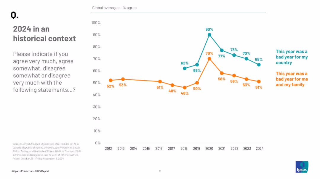
Line graph showing annual agreement trends from 2012 to 2024 for two statements, distinguished by color and labeled annotations.
Market Analysis and Trends
Professional Services
The slide shows longitudinal data on public agreement that 2024 was a bad year, both nationally and personally. Agreement levels have declined in recent years, peaking during 2020–2021, with 65% and 51% agreeing in 2024.
historical trends, public perception, 2024 reflection, sentiment analysis, Ipsos data, opinion tracking
Mixed Chart
IPSOS
Saved
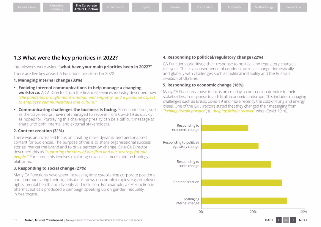
The slide features a list of key priorities for corporate affairs functions, including managing internal change, content creation, responding to social change, political/regulatory change, and economic change. It uses a professional layout with white and yellow colors.
Strategic Planning
Professional Services
This slide outlines the key priorities for corporate affairs functions in 2022, emphasizing areas like internal change management, content creation, and responses to social, political, and economic changes. It highlights the focus areas for corporate affairs directors.
corporate affairs, key priorities, internal change, content creation, social change, political change, economic change
Mixed Chart
Deloitte
Saved
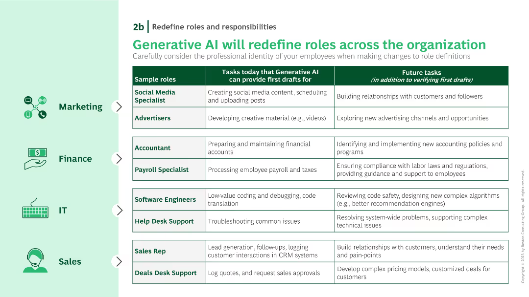
A table with three columns detailing current tasks, future tasks, and sample roles. Icons on the left side denote various industries like marketing, finance, IT, and sales.
Human Resources and Talent Management
Technology & Software
Details how generative AI will change roles across different departments, specifying tasks that AI will handle versus those requiring human oversight.
role changes, AI, future tasks, current tasks, departmental roles
Table
BCG
Saved
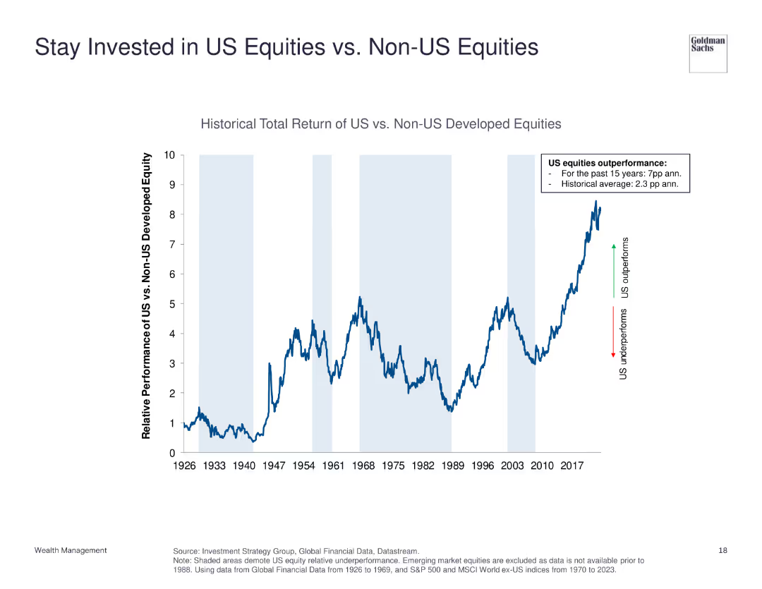
The slide features a line chart comparing the historical total return of US equities vs. non-US developed equities from 1926 to 2023. It shows periods of underperformance and outperformance with annotations for key trends.
Investment Analysis
Financial Services
This slide demonstrates the relative performance of US equities compared to non-US developed equities, emphasizing US equities' historical outperformance.
US equities, non-US equities, historical return, investment, performance comparison
Single Chart
Goldman Sachs
Saved
Slide features two column charts with the title "External threats" at the top. The left chart compares three business threats: labor shortages, inflation, and competition. The right chart shows cyberattacks over the past 6 months: payments fraud, business email compromise, and malware.
Market Analysis and Trends
Technology & Software
This slide presents a comparative analysis of the most significant external business threats and cyberattacks, focusing on labor shortages and payment fraud as major concerns. It is likely used to inform stakeholders about prevailing risks and to prioritize mitigation strategies.
external threats, labor shortages, inflation, competition, cyberattacks, payment fraud, email compromise, malware
Multiple Chart
JP Morgan
Saved
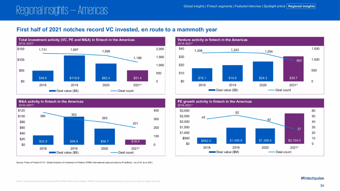
Four quadrant charts showing deal values and counts for different investment types (VC, PE, M&A, Total) in the Americas; clean, blue and purple color coding
Financial Performance
Financial Services
The Americas fintech market saw record VC investment in H1 2021 across multiple segments. Each quadrant displays historical deal value and deal count for Total, Venture, M&A, and PE activity, highlighting notable spikes in PE growth activity ($2.75B) and venture activity ($30.7B).
VC activity, fintech, PE growth, M&A, deal volume, Americas, 2021 trends, financial metrics
Multiple Chart
KPMG
Saved
Dominated by large column charts, this slide visually compares customer, deposit balance, loan/card balance, and revenue growth over a three-year period. The use of contrasting colors highlights the growth in each segment.
Financial Performance
Financial Services
It communicates the progress of the firm’s digital banking services, reflecting on the expansion in customer numbers, deposit and loan balances, and revenue, showing substantial growth since inception.
digital banking, customer growth, deposit balance, revenue growth
Multiple Chart
Goldman Sachs
Saved
Simplified journey map with percentages, showing the online preference at each stage of the purchase journey.
Customer and Market Segmentation
Retail & E-commerce
Breakdown of the consumer purchase journey, focusing on the online preference in the decision-making process.
purchase journey, consumer behavior, online preference, retail
Multiple Chart
Bain
Saved
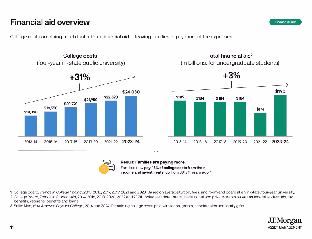
Two vertical bar charts comparing college costs and total financial aid over time. Summary box notes shifting burden to families.
Financial Performance
Education & Training
This slide highlights how college costs have risen 31% over 10 years, while financial aid increased only 3%. Families now bear a larger share of expenses, with 48% of college costs covered from income and investments compared to 38% a decade ago.
financial aid, rising costs, student burden, tuition trends, aid gap, college expenses, cost growth, funding shortfall, family responsibility
Multiple Chart
JP Morgan
Saved
The slide is divided into two vertical sections with headers in dark blue. Each section has a thematic icon and contains text blocks describing company case studies. Page number is at the bottom right.
Client Case Studies
Financial Services
This slide presents two case studies related to sustainable finance: one focusing on clean energy through a partnership with BlocPower, and the other on community empowerment with the National Urban League. The slide details the company's contributions and solutions, such as providing equity and debt financing, and is suitable for demonstrating the impact and scope of the presenter's sustainable finance initiatives in real-world applications.
Case Studies, Clean Energy, Community, Finance, Equity, Debt, Empowerment, Sustainability
Table
Goldman Sachs
Saved
Features column charts and icons representing various contact channels used in customer service, with emphasis on digital and traditional methods. The slide is well-organized with a modern design, employing light blue and green colors.
Technology and Digital Transformation
Telecommunications
Highlights the current usage and investment trends in different customer service channels, particularly in digital transformation. Offers valuable insights for telecommunications and service-oriented companies looking to enhance customer interaction through technological advancements.
contact channels, customer service, digital transformation, investment trends, telecommunications
Multiple Chart
Deloitte
Saved
Previous
Next
If nothing, comes up, please save your slides first
Create a FREE account to continue browsing
Receive Instant Access to 1,000+ slides from companies like McKinsey, Google, and Goldman Sachs
First Name
Last Name
Email
Password
I agree to all
Terms & Privacy Policy
Thank you! Your submission has been received!
Oops! Something went wrong while submitting the form.
Have an account?
Sign in
Column Chart
Heatmap
Chevron
Org Chart
Infographic
Callouts
Timeline
List
Graphic
Picture
Process Flow
Diagram
Paragraph
Map
Table
Framework
Subtitle
Takeaway Box
Icon
Other Chart
Radar Chart
Waterfall Chart
Mekko Chart
Pie Chart
Scatter Plot
Line Chart
Bar chart
Bullet points