Create a FREE Account
Instant access to 1,000+ real slides from top companies like McKinsey, BCG, Goldman Sachs, Google and many more!
First Name
Last Name
Email
Password
I agree to all
Terms & Privacy Policy
Thank you! Your submission has been received!
Oops! Something went wrong while submitting the form.
Have an account?
Sign in
Library
Templates
Courses
Pricing
My Account
My Slides
My Templates
✦ AI
AI Prompt Library
AI Search
Sign in
Start Here
Logout
My Saved Slides
The slide contains two column charts and a pie chart depicting customer engagement through various banking channels and related transaction statistics.
Financial Performance
Financial Services
Presents the bank's omnichannel service model, emphasizing the balance between self-service transactions and branch visits, highlighting digital and in-branch engagement.
omnichannel, banking, customer engagement, digital transactions, branch services, self-service, multi-channel, financial services, transaction statistics
Multiple Chart
JP Morgan
Saved
Shows a column chart depicting the growth in assets under management for thematic equity funds, alongside a list of fund offerings and key differentiators.
Product and Service Analysis
Financial Services
The slide presents the launch and growth of a thematic equity fund family, emphasizing fund performance and the strategic approach to equity selection.
Thematic Equity, Fund Family, Assets Under Management, Equity Funds, Performance
Mixed Chart
Credit Suisse
Saved
Displays comparative data on the average study hours per week for students in Nigerian boarding schools before and after solar power implementation, using column charts for visual comparison.
Strategic Planning
Education & Training
Evaluates the impact of improved power supply on study hours in Nigerian schools, illustrating a significant increase in study time due to better lighting conditions enabled by solar power, linking this to potential academic performance improvements.
education, solar power, Nigeria, study hours, boarding schools, academic performance, lighting
Single Chart
BCG
Saved
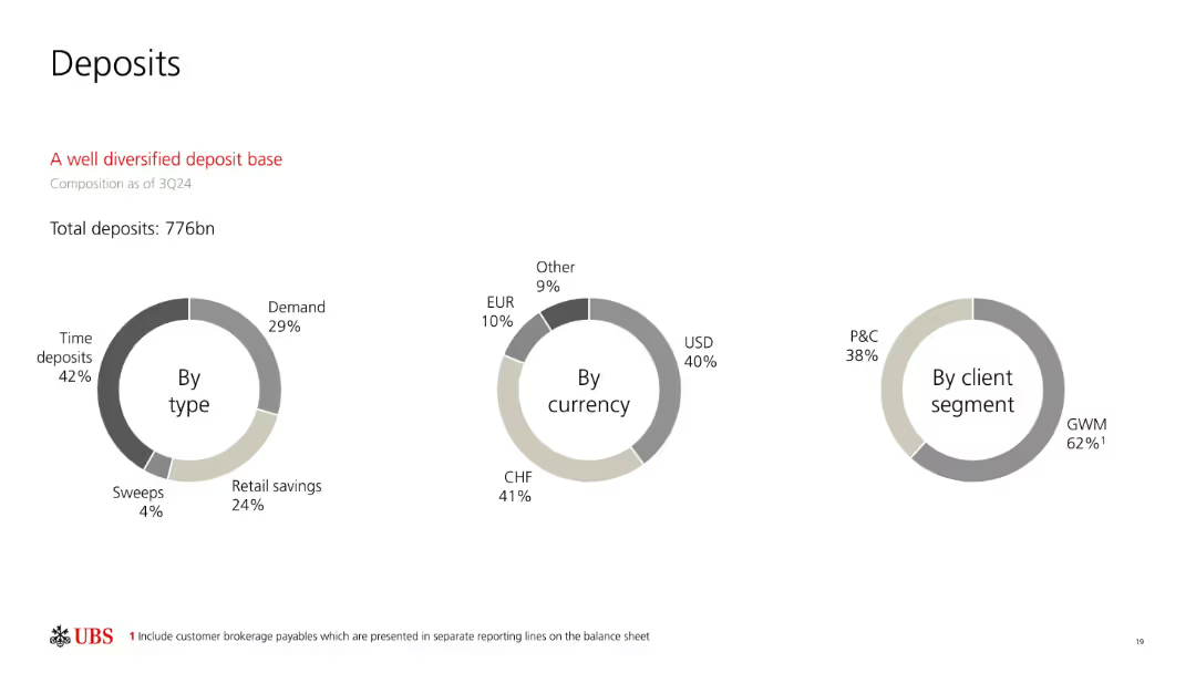
Three donut charts labeled "By type," "By currency," and "By client segment" using neutral tones; red subheading for emphasis.
Customer and Market Segmentation
Financial Services
This slide shows the composition of UBS’s deposit base as of 3Q24. Deposits total 776bn, broken down by type (e.g., time deposits), currency (e.g., CHF, USD), and client segment (e.g., GWM and P&C). The visual underscores diversification across key categories.
deposit mix, time deposits, demand deposits, client segments, CHF, USD, diversified, banking, 3Q24
Single Chart
UBS
Saved
Includes column charts showing population growth in more and less developed regions from 2020 to 2050, highlighting the significant growth expected in the least developed areas.
Market Analysis and Trends
Government & Public Sector
Discusses the distribution of future population growth with a specific focus on developing countries. It highlights the challenges and potential impacts on global development, poverty, and resource distribution.
development, population growth, poverty, resources, demographics
Multiple Chart
Roland Berger
Saved
Features a line chart comparing the growth indices of GDP, exports, and FDI from 2015 to 2030, with annotations on forecasted trends. The chart is supported by bullet-pointed annotations for clarity.
Market Analysis and Trends
Financial Services
Slide predicts growth trends in GDP, exports, and FDI up to 2030, emphasizing the ongoing increase despite controversies in globalization. Useful for financial forecasting and economic strategy meetings.
GDP, exports, FDI, forecasts, globalization
Multiple Chart
Roland Berger
Saved
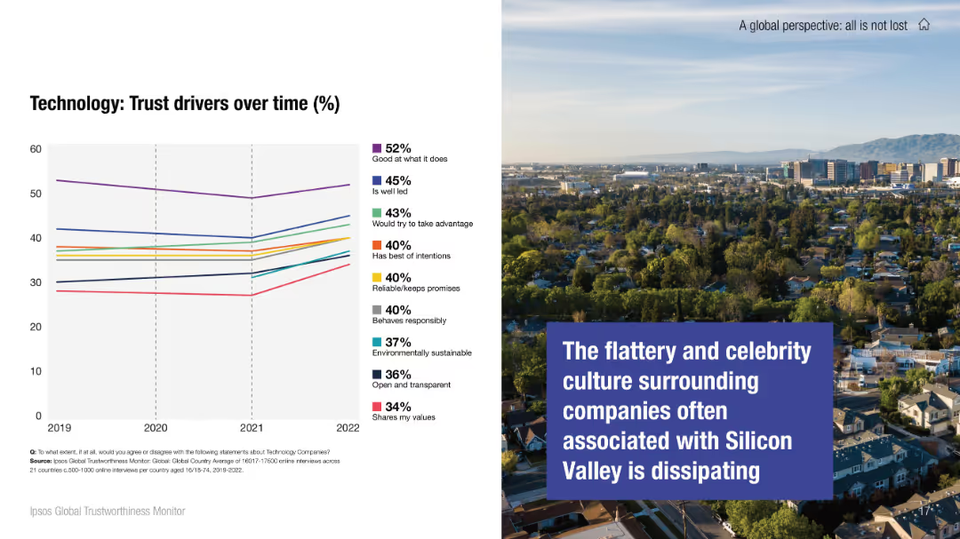
Left half shows a trust driver chart for technology sector; right side features an image with bold text on changing perception of Silicon Valley culture.
Market Analysis and Trends
Technology & Software
This slide tracks how public trust drivers for technology companies have changed over time, focusing on aspects like leadership and responsibility. A narrative image emphasizes the fading glamour around Silicon Valley, suggesting a cultural shift in how tech companies are viewed.
technology sector, trust perception, Silicon Valley, corporate behavior, trend analysis, public trust, values
Mixed Chart
IPSOS
Saved
The slide features a hexagon-shaped diagram with six colored segments, each representing a foundational aspect to address in digital policy-making, like 'Data and Privacy' and 'Work and Wage effects'.
Strategic Planning
Technology & Software
It stresses the importance of certain foundational aspects in digital transformations, such as cybersecurity and skill gaps. This slide is apt for presentations on digital strategy, policy-making, or discussing the broad implications of digitization on society.
digital foundations, policy-making, cybersecurity, data privacy, skill gaps, diagram
Diagram
McKinsey
Saved
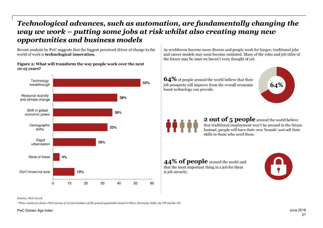
A mix of text and a bar chart, mainly in red and white.
Market Analysis and Trends
Government & Public Sector
Estimates the risk of job automation for older workers across various countries, emphasizing the importance of policy measures to reduce this risk.
automation, jobs, risk, older workers, policy measures, countries, trends, employment, economic analysis, future
Multiple Chart
PwC/Strategy&
Saved
This slide features two bar charts showing the approach to purchasing standardization by country and by hospital type, with top selections highlighted.
Operational Efficiency
Healthcare & Pharmaceuticals
This slide analyzes the procurement strategies of hospitals, emphasizing the trend towards selecting preferred suppliers for specific procedures or products.
procurement processes, purchasing standardization, preferred supplier, hospital strategies, regional comparison
Multiple Chart
LEK
Saved
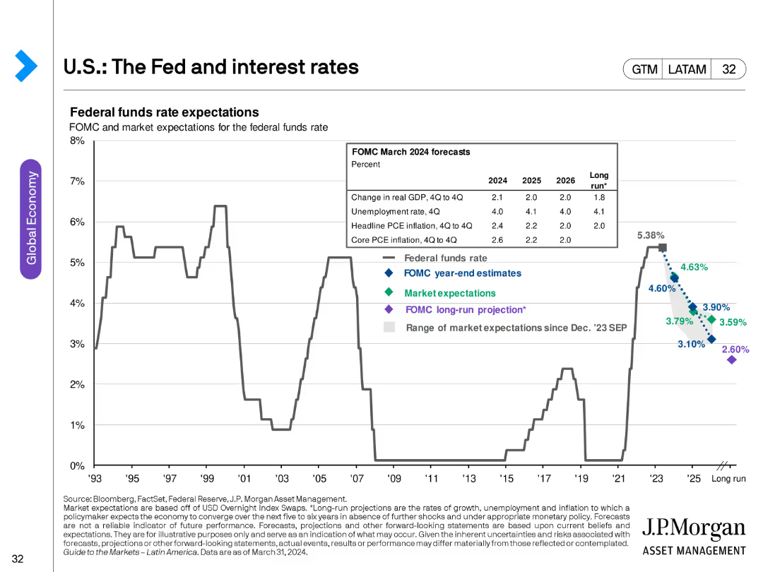
The slide contains a line chart showing federal funds rate expectations from FOMC and market projections, with historical data for context.
Market Analysis and Trends
Financial Services
This slide analyzes expectations for the federal funds rate, providing insights into monetary policy projections and their implications for the economy.
interest rates, Fed, FOMC, market projections, monetary policy, economic forecast
Single Chart
JP Morgan
Saved
Diagram slide with icons representing the four key segments of the value chain in agriculture, accompanied by brief descriptions.
Strategic Planning
Agriculture & Food Production
Describes the agriculture value chain's four key segments, suggesting varied investment opportunities across each segment.
value chain, agriculture, investment opportunities, segmentation, input providers, services
Table
EY
Saved
Column chart displaying issuances and redemptions, followed by a table listing details of 9M23 issuances such as ISIN, instrument, currency, and more.
Financial Performance
Financial Services
Provides detailed information on bond issuances by UBS in the first nine months of 2023, including specific data for analysis.
Issuances, Bonds, Financial Data, UBS, 2023
Mixed Chart
UBS
Saved
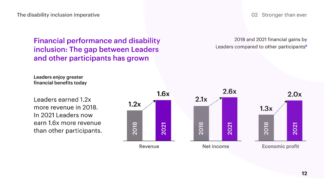
The slide features column charts comparing the financial gains of Disability Inclusion Leaders to other participants in 2018 and 2021, with commentary on the increasing gap.
Human Resources and Talent Management
Professional Services
The slide discusses the growing financial benefits for Disability Inclusion Leaders, showing higher revenue, net income, and economic profit over time compared to other participants.
disability inclusion, financial performance, revenue growth, comparison, leaders
Multiple Chart
Accenture
Saved
The slide features a large blue and red column chart representing CCB revenue, and a smaller area chart for net interest income. It has a clean design with annotations explaining financial figures.
Financial Performance
Financial Services
The slide analyzes financial growth, displaying CCB revenue changes and net interest income projections, aiming to inform about financial health and future expectations.
financial growth, CCB revenue, net interest income, column chart, area chart, projections, annotations, financial analysis
Single Chart
JP Morgan
Saved
Column charts and key statistics displayed clearly, with additional small bar chart showing the FICO score distribution.
Financial Performance
Financial Services
Analyzes home equity loans and changes over quarters with FICO score distribution, aiding financial institutions in assessing loan performance and customer creditworthiness within the home equity market.
Home Equity, Loans, FICO, Trends, Finance
Multiple Chart
Morgan Stanley
Saved
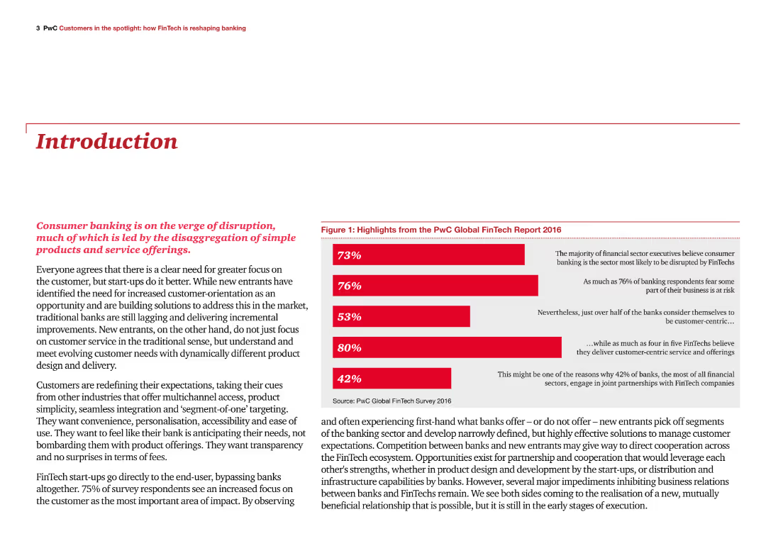
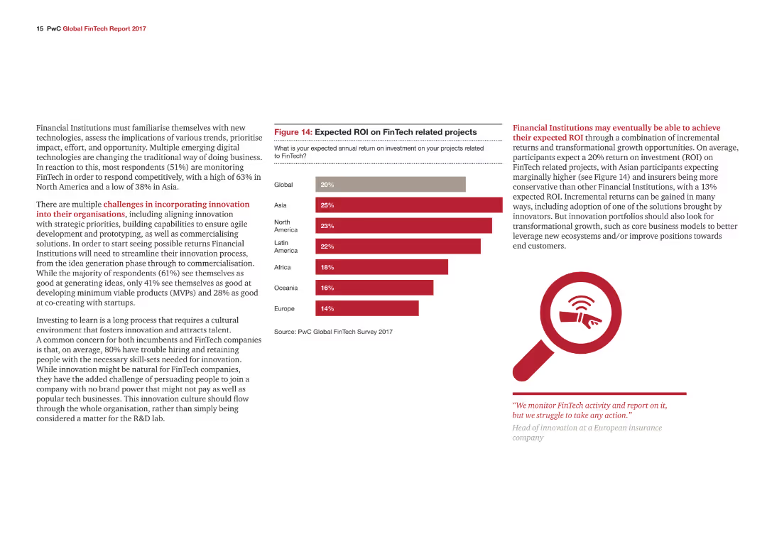
The slide has a title at the top, a paragraph of text, and a column chart on the right summarizing key highlights from the PwC Global FinTech Report 2016. The chart bars are in red, indicating different percentages.
Industry Overview
Financial Services
The slide introduces the report on how FinTech is reshaping banking, highlighting the disruptive impact on consumer banking and the importance of customer-centric approaches in the industry.
FinTech, banking, disruption, customer-centric, highlights
Mixed Chart
PwC/Strategy&
Saved
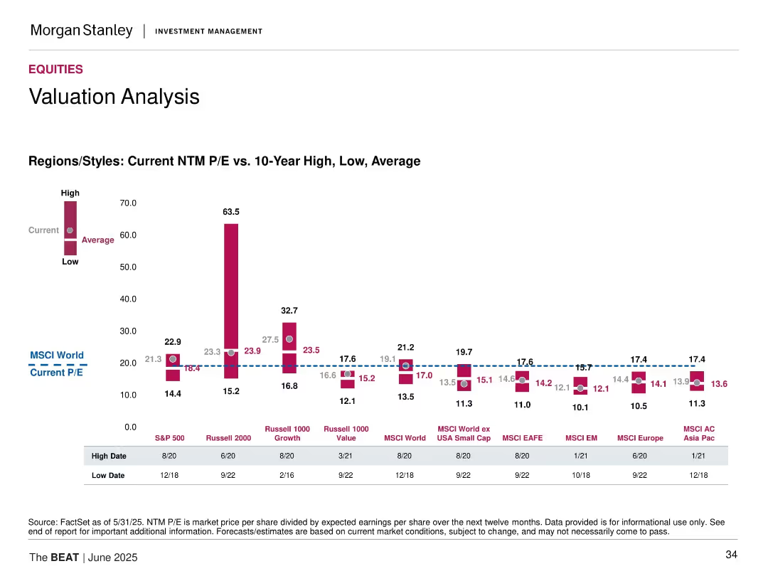
Bar graph of current vs. historical P/E ratios across global regions/styles, including high, low, and average.
Market Analysis and Trends
Financial Services
Compares current forward P/E ratios to 10-year highs/lows/averages for equity markets including S&P 500, Russell 2000, MSCI EM, EAFE, and Asia Pacific.
P/E ratio, valuation, equities, global markets, historical comparison, Russell, MSCI, earnings, valuation metrics
Mixed Chart
Morgan Stanley
Saved
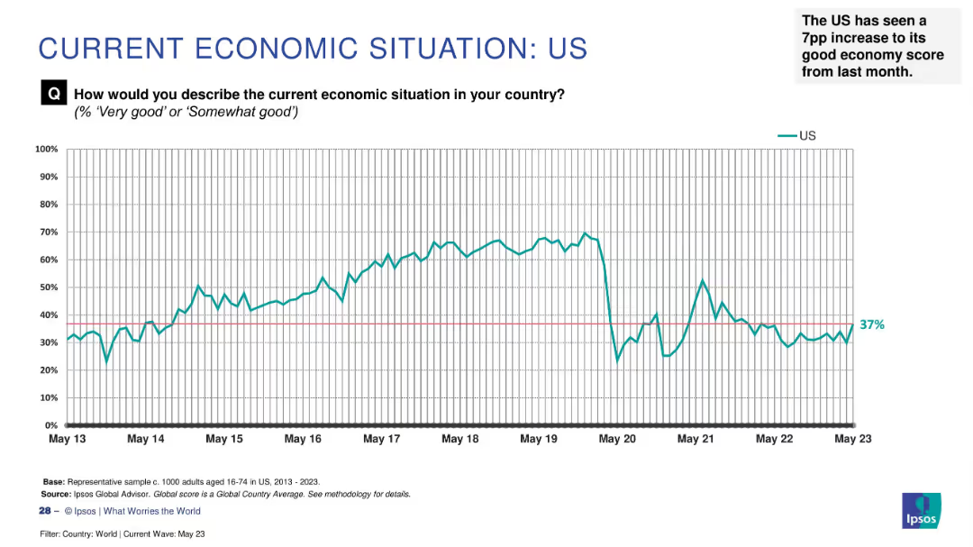
Line graph on white background charting US economic sentiment from May 2013 to May 2023, with annotation.
Market Analysis and Trends
Government & Public Sector
The slide presents long-term survey data on how US citizens perceive their national economy. Sentiment peaked between 2015–2019, declined in 2020, and recovered slightly to 37% by May 2023. It notes a 7 percentage point rise from the prior month.
US economy, trend, perception, Ipsos, 2023, sentiment, increase, historical data, survey
Single Chart
IPSOS
Saved
Bar charts comparing average GDP growth contributions by multifactor productivity and average patents granted by country and year between 2000-2007 and 2010-2019.
Technology and Digital Transformation
Technology & Software
This slide compares the contributions of multifactor productivity to GDP growth and the number of patents granted across different countries. It highlights the productivity paradox where innovations are rising, but productivity contributions to GDP growth are declining.
Productivity, GDP Growth, Patents, Innovation
Multiple Chart
Roland Berger
Saved
A radial bar chart illustrating the resurgence of procurement risk, alongside text detailing significant market risks.
Market Analysis and Trends
Professional Services
Analyzes procurement risk levels and significant market risks, offering insights into how these are managed.
procurement risk, market risks, analysis, management, trends
Multiple Chart
Deloitte
Saved
Includes a flow diagram illustrating the CCS value chain, from CO2 capture to transport and storage, with text explanations for each stage.
Regulatory and Compliance
Energy & Utilities
Describes the carbon capture and storage (CCS) process, detailing the stages from capturing CO2 emissions to transporting and storing them, emphasizing abatement technologies.
Carbon capture, storage, CCS, CO2 emissions, value chain
Linear Flow
Kearney
Saved
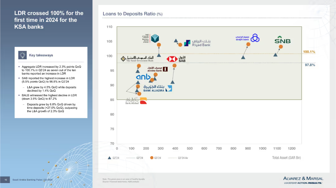
Left column outlines findings; right is a scatter plot comparing total assets vs. loan-to-deposit ratio for banks, with performance markers.
Risk Assessment and Management
Financial Services
Details Q3’24 increase in Loan-to-Deposit Ratio (LDR), crossing 100%. Visual comparison of banks’ asset sizes and LDR positions shows liquidity strength or risk exposure.
LDR, liquidity risk, total assets, Q3’24, KSA banks, deposit ratio, financial stress, risk indicators, balance sheet
Mixed Chart
Alvarez & Marsal
Saved
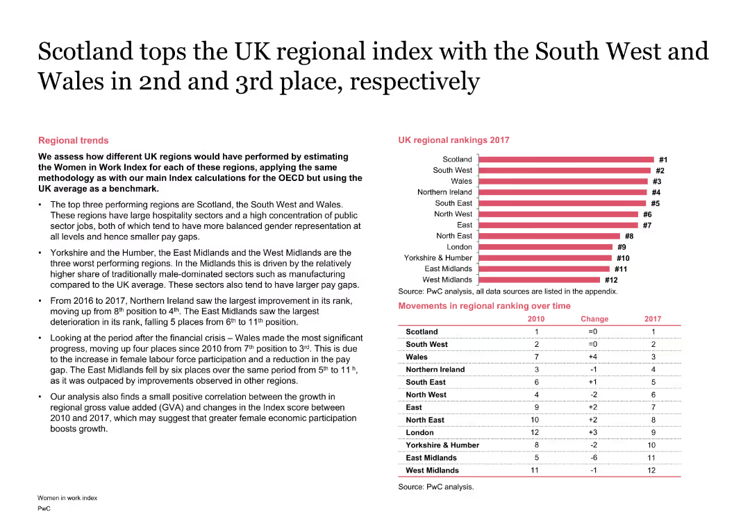
The slide combines text with a column chart showing the regional rankings within the UK. It highlights changes over time with a table and discusses the performance of different regions.
Market Analysis and Trends
Financial Services
It analyzes the regional rankings within the UK on the Women in Work Index, highlighting the top-performing regions like Scotland and factors contributing to their performance.
Scotland, Regional, Index, UK, Performance, Ranking
Mixed Chart
PwC/Strategy&
Saved
The slide features three pie charts detailing the type of companies, origin of participants, and type of respondents in the survey, with different colors and sections.
Market Analysis and Trends
Financial Services
The slide provides demographic details about the participants of the FinTech survey, including company types, regional distribution, and roles of respondents.
Participant profile, Demographics, Survey, FinTech, Analysis
Mixed Chart
PwC/Strategy&
Saved
Previous
Next
If nothing, comes up, please save your slides first
Create a FREE account to continue browsing
Receive Instant Access to 1,000+ slides from companies like McKinsey, Google, and Goldman Sachs
First Name
Last Name
Email
Password
I agree to all
Terms & Privacy Policy
Thank you! Your submission has been received!
Oops! Something went wrong while submitting the form.
Have an account?
Sign in
Column Chart
Heatmap
Chevron
Org Chart
Infographic
Callouts
Timeline
List
Graphic
Picture
Process Flow
Diagram
Paragraph
Map
Table
Framework
Subtitle
Takeaway Box
Icon
Other Chart
Radar Chart
Waterfall Chart
Mekko Chart
Pie Chart
Scatter Plot
Line Chart
Bar chart
Bullet points