Create a FREE Account
Instant access to 1,000+ real slides from top companies like McKinsey, BCG, Goldman Sachs, Google and many more!
First Name
Last Name
Email
Password
I agree to all
Terms & Privacy Policy
Thank you! Your submission has been received!
Oops! Something went wrong while submitting the form.
Have an account?
Sign in
Library
Templates
Courses
Pricing
My Account
My Slides
My Templates
✦ AI
AI Prompt Library
AI Search
Sign in
Start Here
Logout
My Saved Slides
A column chart showing changes in total ad-supported television reach for different user categories between January 2021 and January 2022.
Market Analysis and Trends
Media & Entertainment
The slide shows a decline in the potential weekly reach of ad-supported TV, with significant growth in SVOD only users, highlighting a shift in viewing patterns.
ad-supported TV, reach, SVOD, users, decline
Mixed Chart
Nielsen
Saved
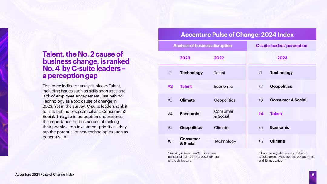
The slide contrasts the analysis of business disruption causes with C-suite leaders' perceptions, showing a perception gap, particularly in the importance of talent.
Strategic Planning
Professional Services
The slide highlights a perception gap between the actual causes of business disruption and C-suite leaders' perceptions, emphasizing the need for businesses to prioritize talent to tap into new technologies effectively.
business change, C-suite perception, disruption causes, talent, technology
Table
Accenture
Saved
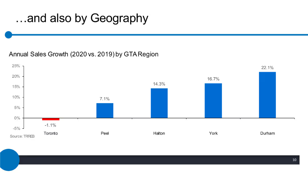
Column chart displaying annual sales growth by GTA region, with bars representing different regions such as Toronto, Peel, Halton, York, and Durham.
Market Analysis and Trends
Real Estate & Construction
The slide compares the annual sales growth percentages for different regions within the GTA between 2020 and 2019. Toronto shows a decline, while other regions show positive growth.
GTA, sales growth, annual comparison, regions, 2020 vs 2019, Toronto, Peel, Halton, York, Durham
Single Chart
IPSOS
Saved
The slide features a timeline chart showing the political attractiveness curve for CCUS policies from 1996 to 2020, including significant events and milestones.
Regulatory and Compliance
Government & Public Sector
The slide depicts the political support trajectory for CCUS policies from 1996 to 2020. It highlights key events, policy milestones, and shifts in support over time, showing how political attitudes towards CCUS have evolved and the impact of various external factors on this support.
CCUS, political support, timeline, policies
Single Chart
Kearney
Saved
Features a complex matrix assessing strategic capabilities against priorities, using icons and color coding to enhance readability.
Operational Efficiency
Professional Services
Analyzes current organizational capabilities versus strategic importance to prioritize initiatives and prepare for new business realities, aiding leaders in decision-making.
Strategic planning, Capability assessment, Business strategy, Leadership
Header Vertical
BCG
Saved
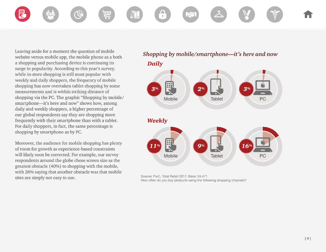
Text with pie charts showing the frequency of shopping by mobile, tablet, and PC on a daily and weekly basis. Highlights the rise of mobile shopping.
Market Analysis and Trends
Retail & E-commerce
The slide explores the prevalence of mobile shopping, comparing it to tablet and PC usage, indicating a trend towards increased mobile shopping. Useful for analyzing shopping trends.
mobile, shopping, trends, frequency, device
Multiple Chart
PwC/Strategy&
Saved
Table displaying spot returns vs. USD and EUR for various developed market currencies. Includes a line chart of the U.S. Dollar Index performance over time.
Market Analysis and Trends
Financial Services
The slide analyzes currency performance and yields for developed markets, comparing spot returns against USD and EUR, and showcasing historical U.S. Dollar Index performance.
currency, performance, yields, developed, market
Mixed Chart
Morgan Stanley
Saved
Features several graphs and icons depicting ethical concerns in AI, with global data presented to show variations in public perception.
Technology and Digital Transformation
Technology & Software
Addresses the ethical challenges AI faces, such as decision-making transparency and bias. It provides statistical insights into public perceptions and concerns across different countries.
AI ethics, transparency, public perception, bias, global insights
Multiple Chart
BCG
Saved
Contains a process diagram of dark fermentation, supported by text descriptions of the biochemical reactions involved, along with pros, cons, and key feature estimates.
Technology and Digital Transformation
Energy & Utilities
Describes dark fermentation as a method of hydrogen production from organic matter, detailing the biochemical reactions, process steps, and advantages and disadvantages.
Hydrogen, dark fermentation, biochemical reactions, organic matter, production process
Diagram
Kearney
Saved
The slide has a balanced comparative layout with a mix of column charts and text explanations, contrasting past and current performance metrics for home lending.
Performance Metrics and KPIs
Financial Services
Highlights the high-quality customer focus of JPMorgan Chase's Home Lending business, detailing improvements in experience, productivity, and financial health.
Home lending, customer experience, productivity, financial health, JPMorgan Chase
Multiple Chart
JP Morgan
Saved
Bar chart detailing the changes in operating margin from FY 2021 to FY 2022, with factors such as COVID-19 impact, gross margin, payroll, and overheads contributing to the changes.
Financial Performance
Financial Services
The slide analyzes the change in operating margin over a year, breaking down the contributing factors and showing net gains and losses from various impacts like COVID-19 and payroll adjustments.
operating margin, financial analysis, COVID-19 impact, payroll, overheads
Multiple Chart
IPSOS
Saved
The slide features column charts that contrast private funding values and deal counts, set against a clear white background.
Investment Analysis
Financial Services
This slide examines the digital economy's investment landscape, emphasizing the increase in deal values and activities over recent years.
private funding, digital economy, investment landscape, deal count, economy boom
Single Chart
Bain
Saved
Slide features multiple charts: a pie chart showing consumer opinions on vehicle ownership, and bar charts reflecting agreement levels on transportation convenience.
Market Analysis and Trends
Transportation & Logistics
The slide presents consumer opinions on vehicle ownership due to shared transportation use, and their views on the convenience of changing transportation modes.
Transportation, consumer opinions, vehicle ownership, convenience, shared transportation
Multiple Chart
Deloitte
Saved
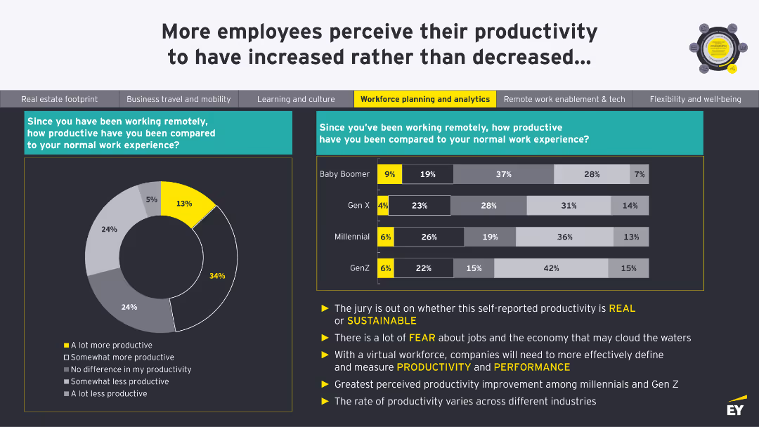
A donut chart showing productivity levels since remote work began. A column chart compares productivity across Baby Boomer, Gen X, Millennial, and Gen Z generations.
Human Resources and Talent Management
Professional Services
This slide shows perceptions of productivity changes since remote work began, comparing different generations. It questions the sustainability of self-reported productivity.
Productivity, Remote Work, Generations, Performance, Sustainability
Multiple Chart
EY
Saved
Column chart showing average views on official accounts, image of smartphone usage
Market Analysis and Trends
Media & Entertainment
Discusses the effectiveness of brand accounts on WeChat for engaging consumers
Digital Marketing, Brand Engagement, WeChat, Views
Single Chart
BCG
Saved
The slide presents three line charts showing the enrollment distribution percentages across three health plans (AmeriHealth Caritas, NH Healthy Families, Well Sense) over several fiscal years. The table below provides specific distribution percentages. The focus is on market share impact.
Regulatory and Compliance
Healthcare & Pharmaceuticals
Analyzes the impact of performance incentives on health plan market share, showing enrollment distribution changes for various health plans in the Medicaid program.
Medicaid, health plan, performance, market share
Multiple Chart
Alvarez & Marsal
Saved
Two sets of vertical column charts comparing the returns of S&P 500 and MSCI World index sectors over different time periods (1 month, YTD, 1 year). Sectors include Communication Services, Discretionary, Staples, Energy, etc.
Market Analysis and Trends
Financial Services
Compares sector-wise returns for the S&P 500 and MSCI World indices over different time periods. Useful for analyzing sector performance and making informed investment decisions.
index sectors, S&P 500, MSCI World, sector analysis, return analysis, time periods
Multiple Chart
Morgan Stanley
Saved
The slide features a world map highlighting Ipsos' global offices and operations.
Market Analysis and Trends
Professional Services
The slide showcases Ipsos' global reach with offices in 90 countries and operations in over 130 countries.
global coverage, local understanding, Ipsos, offices, operations, countries
Graphic
IPSOS
Saved
The slide presents a graph comparing carbon abatement costs (CAC) versus CO2 emissions from electricity generation for different countries.
Market Analysis and Trends
Energy & Utilities
The slide analyzes the cost-effectiveness of FCEV buses powered by wind versus grid-powered BEV buses in terms of carbon abatement costs and CO2 emissions from electricity generation.
FCEV, BEV, wind, grid, carbon abatement
Mixed Chart
Kearney
Saved
Simple design with a title followed by five key themes represented in a row of colored blocks with text labels.
Market Analysis and Trends
Government & Public Sector
Conveys the company's sustainability and financial objectives, suitable for stakeholder briefings or CSR reports.
Purpose, Sustainability, Growth, Empowerment, Responsibility
Text Only
Goldman Sachs
Saved
This slide features a horizontal bar chart comparing agreement and disagreement levels on government action against climate change across global markets.
Market Analysis and Trends
Government & Public Sector
Highlights public opinion on government action regarding climate change, showing a high level of agreement that inaction is failing citizens.
climate change, government, public opinion, global, action
Multiple Chart
IPSOS
Saved
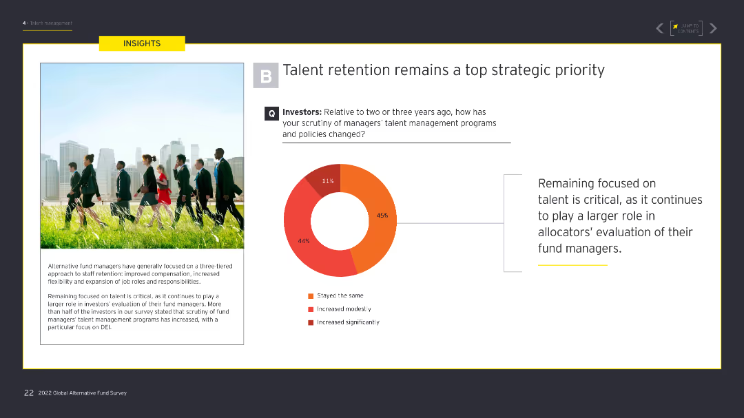
The slide contains a donut chart showing the level of scrutiny investors have on managers' talent management programs. The left side has an image of professionals walking in a park. The donut chart uses shades of red and orange to indicate different levels of scrutiny.
Human Resources and Talent Management
Financial Services
The slide emphasizes the increased focus on talent retention among investors, showing that scrutiny of talent management programs has grown significantly over the past few years, reflecting its strategic importance.
Talent retention, investor scrutiny, DEI, talent management, strategic priority
Mixed Chart
EY
Saved
The slide includes a bar chart comparing the usage of various social media platforms (Facebook, Instagram, Twitter, YouTube, Snap, LinkedIn) between non-winners and winners. Bars are vertically oriented with labeled percentages.
Market Analysis and Trends
Media & Entertainment
This slide discusses the role of social media platforms like Facebook and Instagram in effective campaigns, highlighting differences in platform usage between winners and non-winners.
social media, Facebook, Instagram, effective campaigns, bar chart
Mixed Chart
IPSOS
Saved
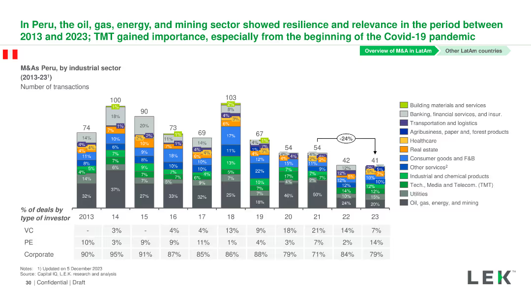
Column chart showing the number of M&A transactions by industrial sector in Peru from 2013-2023. Sectors are color-coded and detailed in a legend.
Market Analysis and Trends
Financial Services
This slide presents M&A transactions in Peru from 2013-2023, highlighting the resilience and relevance of the oil, gas, energy, and mining sectors.
Peru, M&A, Industrial Sectors, Transactions, Trends
Mixed Chart
LEK
Saved
Introductory slide with text and small image thumbnails representing reports. Basic complexity.
Industry Overview
Professional Services
Introduction to a thought-leadership series about consumer trends in Southeast Asia by Meta and Bain & Co.
Southeast Asia, consumer trends, Meta, Bain
Pillar
Bain
Saved
Previous
Next
If nothing, comes up, please save your slides first
Create a FREE account to continue browsing
Receive Instant Access to 1,000+ slides from companies like McKinsey, Google, and Goldman Sachs
First Name
Last Name
Email
Password
I agree to all
Terms & Privacy Policy
Thank you! Your submission has been received!
Oops! Something went wrong while submitting the form.
Have an account?
Sign in
Column Chart
Heatmap
Chevron
Org Chart
Infographic
Callouts
Timeline
List
Graphic
Picture
Process Flow
Diagram
Paragraph
Map
Table
Framework
Subtitle
Takeaway Box
Icon
Other Chart
Radar Chart
Waterfall Chart
Mekko Chart
Pie Chart
Scatter Plot
Line Chart
Bar chart
Bullet points