Create a FREE Account
Instant access to 1,000+ real slides from top companies like McKinsey, BCG, Goldman Sachs, Google and many more!
First Name
Last Name
Email
Password
I agree to all
Terms & Privacy Policy
Thank you! Your submission has been received!
Oops! Something went wrong while submitting the form.
Have an account?
Sign in
Library
Templates
Courses
Pricing
My Account
My Slides
My Templates
✦ AI
AI Prompt Library
AI Search
Sign in
Start Here
Logout
My Saved Slides
Line chart showing the growth of a USD100 investment in various asset classes, adjusted for inflation, from 1993 to 2024.
Investment Analysis
Financial Services
This slide presents the long-term returns of different asset classes, illustrating the growth of a USD100 investment over time across various asset categories.
asset classes, returns, investment, inflation, growth
Single Chart
JP Morgan
Saved
This slide contains a column chart comparing the expected changes in holiday preferences, focusing on domestic and no-fly holidays, across various global markets. The chart uses three color bars to represent "More," "About the same," and "Less."
Market Analysis and Trends
Hospitality & Tourism
The slide presents survey findings indicating that domestic and no-fly holidays will remain popular post-pandemic, comparing responses from multiple global markets.
holidays, travel, no-fly, domestic, market trends
Multiple Chart
IPSOS
Saved
The slide includes a map of Europe highlighting various Power-to-gas projects, along with a table detailing project names, production capacities, storage and injection methods, end-use applications, and budgets.
Investment Analysis
Energy & Utilities
This slide presents an overview of ongoing Power-to-gas projects in Europe, showcasing their objectives, capacities, and funding. It aims to demonstrate the viability and investment potential of Power-to-gas technology.
P2G projects, Europe, investment, hydrogen, technology viability
Graphic
Kearney
Saved
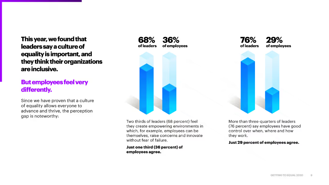
The slide features a column chart showing factors that would increase trust in pharmaceutical companies, with a textual description.
Market Analysis and Trends
Healthcare & Pharmaceuticals
This slide discusses factors that can build trust in pharmaceutical companies, such as communication clarity and reduced medication costs.
pharma trust, communication clarity, medication costs, transparency, patient trust
Mixed Chart
Accenture
Saved
Left side features a vertical bar chart showing US small business card spend (2010–2023), while the right side includes two circular infographics showing AXP spend share for 2019 and 2023.
Financial Performance
Financial Services
The slide outlines the US small business card spending trend and highlights American Express’ increasing share, rising from 45.8% in 2019 to 47.1% in 2023, despite pandemic-related volatility.
CAGR, small business, card spend, AXP, market share, volatility, growth, pandemic impact, Nilson Report
Single Chart
McKinsey
Saved
Slide divided into two sections with multiple circular graphics and a bar chart in shades of blue showing growth in innovation economy revenue.
Technology and Digital Transformation
Financial Services
Showcases JPMorgan Chase & Co.'s strategy and unique assets designed to serve the venture capital ecosystem, with a focus on innovation and supporting startups.
Innovation, Strategy, Venture Capital, Financial Services, Growth
Mixed Chart
JP Morgan
Saved
Slide features multiple pie charts and icons, highlighting executives' views on climate change and its urgency. Colors are green and black.
Regulatory and Compliance
Environmental Services & Sustainability
Details executives' perceptions of climate change's severity and the optimism for effective response, highlighting increased awareness and urgency.
climate change, executives, perceptions, urgency, optimism, regulatory, compliance, environmental sustainability
Multiple Chart
Deloitte
Saved
This slide features two tables and a detailed layout displaying various actions taken by companies in response to changes to third-party data. Contains percentage statistics and sector-specific data.
Market Analysis and Trends
Professional Services
Describes actions taken by companies post third-party cookie changes, segmented by economic sector, showcasing the business focus on enhanced data strategies.
data strategy, third-party data, innovation, marketing, customer engagement
Table
Deloitte
Saved
A content slide with text and a bar chart illustrating the survey results indicating high levels of expected disruption in asset management and insurance sectors. It shows the percentage of respondents from different sectors who anticipate significant disruption.
Market Analysis and Trends
Financial Services
This slide explores the anticipated disruption in the asset management and insurance sectors due to FinTech. It presents survey findings to show how these industries are expected to change, highlighting differing perceptions between industry insiders and other respondents.
FinTech, disruption, asset management, insurance, survey results, industry impact, bar chart
Mixed Chart
PwC/Strategy&
Saved
Two charts: one displays UK real wage growth with a forecast, and the other shows UK mortgages exposed to higher rates categorized by fixed and floating rates.
Risk Assessment and Management
Financial Services
The slide focuses on the sensitivity of the UK economy to interest rate changes, detailing real wage growth trends and the exposure of UK mortgages to higher rates. Used for economic impact analysis and risk assessment.
Interest rate, wage growth, mortgages, UK
Multiple Chart
JP Morgan
Saved
Similar layout to 19471: left with text summary, right with two bar charts comparing generations
Market Analysis and Trends
Media & Entertainment
The slide illustrates minimal generational differences in satisfaction with love and romantic lives. Baby Boomers are slightly more satisfied in love; Millennials lead slightly in romantic/sex life satisfaction.
generations, Gen Z, Millennials, Boomers, sex life, satisfaction, survey, bar chart, age
Mixed Chart
IPSOS
Saved
This slide consists of several small graphics representing different financial contributions, alongside percentage comparisons for two consecutive years. The slide is visually balanced, with easy-to-understand icons and clear text descriptions.
Market Analysis and Trends
Financial Services
It outlines the shift in employee contributions to various savings and debt repayment plans, potentially serving as a discussion starter for financial planning trends and HR benefits design in the context of economic changes.
savings contributions, financial planning, employee behavior
Boxed
Goldman Sachs
Saved
Contains a complex comparative chart tracking percentage changes in visits and stay duration against a restriction stringency index.
Market Analysis and Trends
Retail & E-commerce
Analyzes the impact of lifting restrictions on retail footfall across various markets, highlighting how consumer behavior has changed in comparison to pre-event levels.
Retail footfall, Market analysis, Restriction stringency, Consumer behavior, Comparative chart, Visits duration, Global impact, Grocery & Pharmacy
Mixed Chart
Accenture
Saved
The slide features a pie chart showing app usage during outdoor activities and a column chart detailing the purposes of app usage, such as tracking activities and recording performance data. Text sections add context.
Technology and Digital Transformation
Technology & Software
The slide examines the use of apps by outdoor enthusiasts, highlighting the main purposes for app usage, including tracking activities, recording routes, and measuring heart rates, based on survey data.
app usage, digital tools, outdoor activities, tracking, performance data
Multiple Chart
Deloitte
Saved
Grid heatmap comparing Services, Manufacturing, Consumer Spending, Employment, and CPI Inflation across countries and months. Color-coded scale visualizes relative activity/momentum.
Market Analysis and Trends
Financial Services
A color-coded economic snapshot across global regions shows stronger services momentum in India and sluggish manufacturing across Europe. The heatmap allows visual comparison of economic indicators like CPI, employment, and consumer spending as of January 2025.
Economic Momentum, Heatmap, India, CPI, Employment, Services, Manufacturing, Consumer Spending, Regional Analysis
Single Chart
Accenture
Saved
Complex slide with a flow diagram indicating the direction of decision-making across teams in a 'Nerve Center'.
Strategic Planning
Professional Services
Details the workflow and decision-making structure within a 'Nerve Center' and its application in crisis management.
workflow, strategic moves, workforce protection, supply chain, customer support, financial stabilization, decision-making
Diagram
McKinsey
Saved
Slide has horizontal bar charts comparing responses from various countries and a pie chart for overall results, with percentages highlighted.
Market Analysis and Trends
Financial Services
The slide presents survey results on expectations for the US Senate to pass a treaty implementing Pillar One by 2023, with a detailed breakdown by country.
survey, bar charts, pie chart, treaty, countries
Multiple Chart
Deloitte
Saved
Column chart depicting agreement levels by different age groups that they need to do more for their mental well-being, with color-coded segments showing various levels of agreement.
Customer and Market Segmentation
Healthcare & Pharmaceuticals
Focuses on the challenges of mental health across age groups, emphasizing that younger individuals feel a more acute need to address mental well-being compared to older age groups.
mental health, age groups, challenges, survey, agreement
Mixed Chart
IPSOS
Saved
A bar chart showing risk scores across various markets and years, with textual content on the left describing the context of digital commerce challenges and operational difficulties.
Market Analysis and Trends
Technology & Software
Explores the impact of digital technologies on operational issues in digital commerce, with specific data on various risks such as crime, logistics, and trade across different markets.
digital commerce, operational risk, technology, market analysis, logistics, trade, crime, consumer risk, operational difficulties, mitigation
Mixed Chart
Accenture
Saved
Uses column chart to depict portfolio loans over time, with a color differentiation between average and period-end. Also, includes a bar chart for FICO score distribution.
Market Analysis and Trends
Real Estate & Construction
Evaluates the residential mortgage portfolio, showing historical loan amounts and current credit score distribution. Typically used by lenders and investors to understand the risk profile and trends in the residential mortgage sector.
Mortgage, Residential, Credit, Analysis, Trends
Multiple Chart
Morgan Stanley
Saved
This slide displays a column chart and a line graph. The column chart shows half-yearly rent reversion percentages, and the line graph tracks portfolio occupancy rates over time. The colors in the bar graph correlate with the periods shown on the x-axis. The line graph is superimposed to demonstrate the relationship between occupancy and rent reversion. There's also a note clarifying the occupancy calculation.
Financial Performance
Real Estate & Construction
Examines the portfolio's performance in terms of occupancy rates and rent reversion, suggesting high levels of retention and positive financial trends.
Portfolio Occupancy, Rent Reversion, Asset Management, Performance Analysis, Tenant Retention, Financial Indicators
Single Chart
Morgan Stanley
Saved
Three circular donut charts representing CAPEX breakdown for 1Q25, 2024, and 2025e; each segment color-coded by category (sustaining, land, projects, etc.).
Strategic Planning
Consumer Goods
This slide outlines Suzano’s capital expenditure plans by year and category, indicating major investments in sustaining operations and the Cerrado project. It emphasizes planned infrastructure and environmental allocations.
CAPEX, Investment, Forecast, Cerrado, Sustaining
Single Chart
Goldman Sachs
Saved
This slide shows a title, two column charts displaying trial lengths for FCoA and FCC, and a pie chart depicting reserved judgments delivery time. It uses red and orange hues with clear labels and a note on trial length comparison.
Regulatory and Compliance
Government & Public Sector
It breaks down the trial lengths for matters heard in FCoA and FCC, the percentage of reserved judgments delivered within three months, and highlights the significant difference in trial lengths between the two courts.
FCoA, FCC, trial lengths, reserved judgments, case management, legal proceedings
Multiple Chart
PwC/Strategy&
Saved
The slide features two column charts comparing data from 2018 and 2019 with annotations, along with a text block providing additional context.
Operational Efficiency
Financial Services
Showcases the impact of digital account openings on customer acquisition and the resultant decrease in marketing costs, underlining the effectiveness of digital strategies in finance.
Digital Acquisition, Marketing Costs, Finance, Account Openings, Cost Efficiency
Multiple Chart
JP Morgan
Saved
This slide contains a line chart showing the share of total U.S. imports from Canada, China, and Mexico, alongside a column chart with real GDP projections for various countries.
Market Analysis and Trends
Financial Services
The slide compares the U.S. import shares from major trading partners and projects GDP growth for 2023 and 2024-2025 for the U.S. and other countries. It emphasizes Mexico overtaking China as the largest source of U.S. imports and presents the U.S. economic strength as a key global player amidst shifting trade balances. This slide can be used for global economic analysis and forecasting.
imports, GDP, Mexico, China, trade shifts
Multiple Chart
JP Morgan
Saved
Previous
Next
If nothing, comes up, please save your slides first
Create a FREE account to continue browsing
Receive Instant Access to 1,000+ slides from companies like McKinsey, Google, and Goldman Sachs
First Name
Last Name
Email
Password
I agree to all
Terms & Privacy Policy
Thank you! Your submission has been received!
Oops! Something went wrong while submitting the form.
Have an account?
Sign in
Column Chart
Heatmap
Chevron
Org Chart
Infographic
Callouts
Timeline
List
Graphic
Picture
Process Flow
Diagram
Paragraph
Map
Table
Framework
Subtitle
Takeaway Box
Icon
Other Chart
Radar Chart
Waterfall Chart
Mekko Chart
Pie Chart
Scatter Plot
Line Chart
Bar chart
Bullet points