Create a FREE Account
Instant access to 1,000+ real slides from top companies like McKinsey, BCG, Goldman Sachs, Google and many more!
First Name
Last Name
Email
Password
I agree to all
Terms & Privacy Policy
Thank you! Your submission has been received!
Oops! Something went wrong while submitting the form.
Have an account?
Sign in
Library
Templates
Courses
Pricing
My Account
My Slides
My Templates
✦ AI
AI Prompt Library
AI Search
Sign in
Start Here
Logout
My Saved Slides
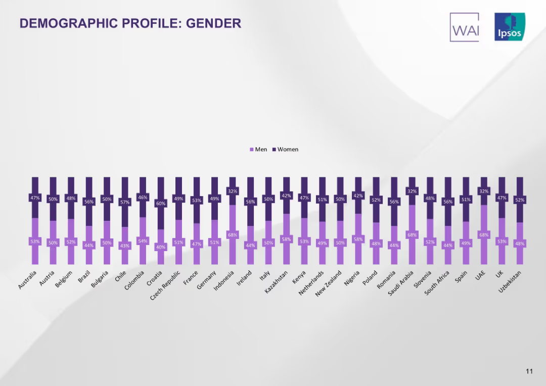
Double vertical bar chart showing male/female participation rates per country. Purple color scheme on white background.
Customer and Market Segmentation
Healthcare & Pharmaceuticals
The slide displays gender distribution of survey respondents per country. Most countries have near-equal participation, though some (e.g., Saudi Arabia, UAE) have a female majority.
gender profile, demographics, country comparison, male vs female, survey base, tobacco study, Ipsos
Single Chart
IPSOS
Saved
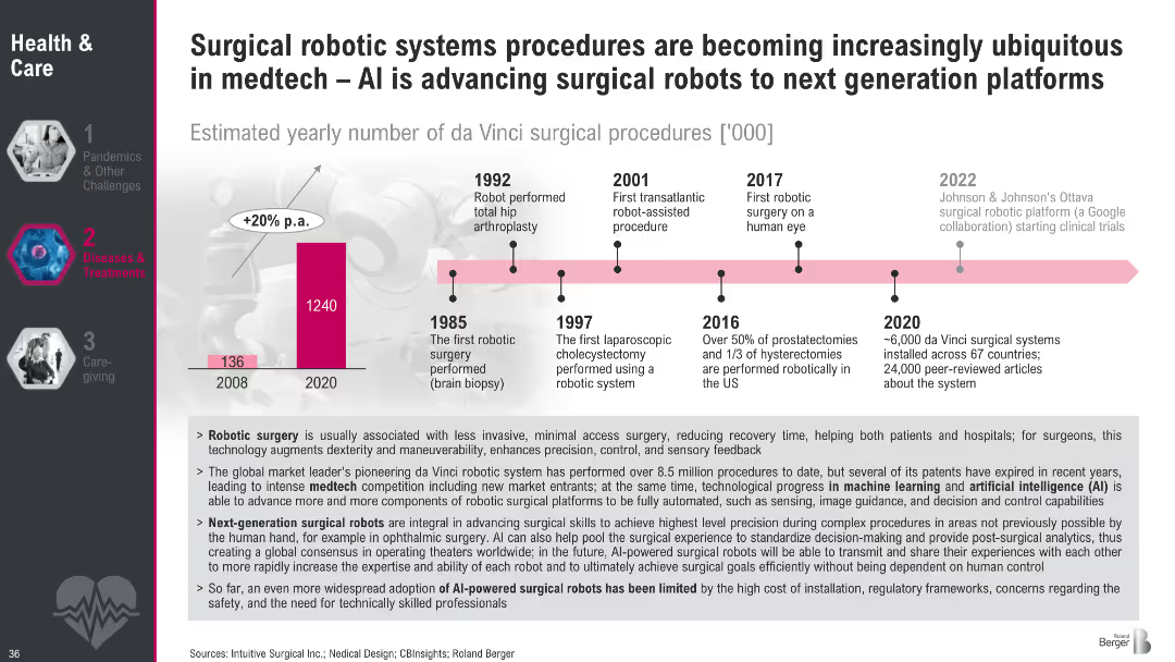
Timeline-based design with key milestones from 1985 to 2022 and a vertical bar chart comparing robotic surgeries in 2008 vs. 2020. Bottom section uses bullet points for explanations.
Technology and Digital Transformation
Healthcare & Pharmaceuticals
The slide details the evolution and impact of robotic surgery, particularly via the da Vinci system, and highlights how AI is transforming medtech. It emphasizes benefits such as precision, reduced recovery time, and ongoing innovation. Key milestones and usage stats underline the fast-growing adoption of surgical robotics.
robotic surgery, AI, medtech, da Vinci, medical devices, surgical robotics, healthcare technology, innovation timeline
Mixed Chart
Roland Berger
Saved
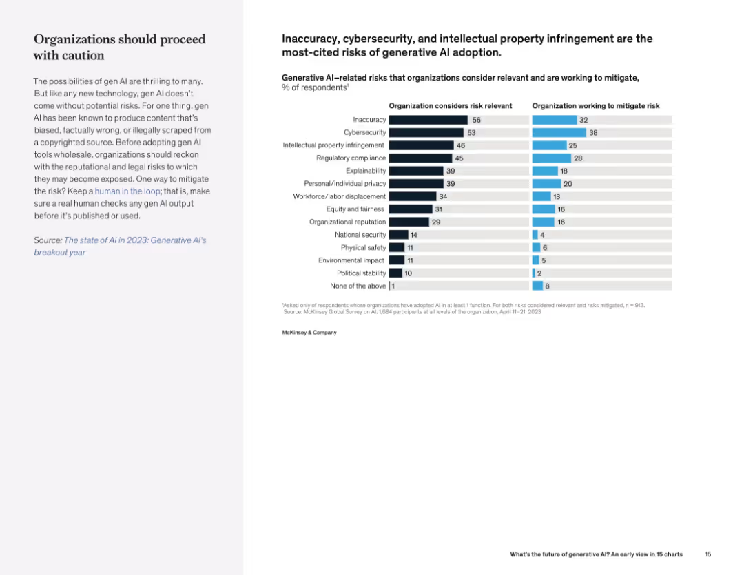
Split layout with text on left and dual horizontal bar chart on right showing perceived risks and mitigation efforts.
Risk Assessment and Management
Artificial Intelligence
Organizations cite content inaccuracy, cybersecurity, and IP risks as major concerns in adopting generative AI. There is a notable gap between risk awareness and active mitigation.
AI risk, cybersecurity, IP infringement, organizational risk, mitigation, compliance
Mixed Chart
McKinsey
Saved
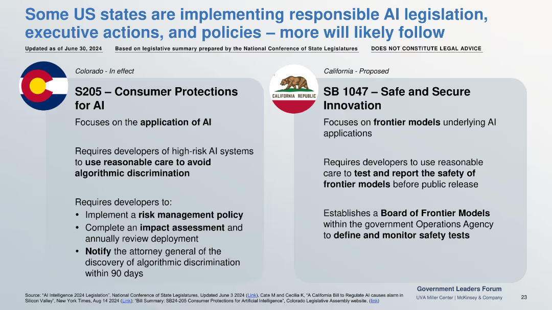
Two-column comparison of enacted (Colorado) and proposed (California) AI laws, each with regulatory focus and developer requirements.
Regulatory and Compliance
Government & Public Sector
Focuses on U.S. state-level AI laws. Colorado mandates discrimination risk controls in AI applications; California proposes safety testing and oversight for frontier models.
US AI law, frontier models, algorithmic bias, risk policy, S205, SB1047
Pillar
McKinsey
Saved
Slide includes two pie charts with color contrasts comparing age groups.
Customer and Market Segmentation
Government & Public Sector
Analyzes age demographics of refugees with data from a survey and official statistics.
refugees, age demographics, segmentation, statistics
Multiple Chart
Deloitte
Saved
Features four rounded rectangles, each with a heading and a short text blurb beneath it. The slide is divided into quadrants representing different aspects of work structure and delivery.
Organizational Structure and Change
Professional Services
Encourages thinking about work delivery, organization, employee experience, and enabling work. Useful for initiating discussions on organizational changes needed for the future of work.
Organizational Change, Work, Structure, Planning
Pillar
Deloitte
Saved
The slide features text, percentage data, and column charts showing the development of ChatGPT policies and discussions on generative AI risks at the executive level.
Regulatory and Compliance
Technology & Software
This slide discusses the development of acceptable use policies for ChatGPT and the board-level discussions on generative AI risks, including percentages of organizations with policies in place.
ChatGPT, Policies, IT Leaders, Generative AI, Risk Management
Multiple Chart
Gartner
Saved
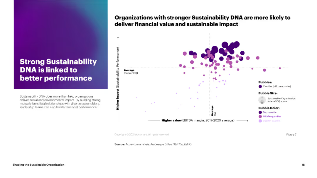
This slide features a bubble chart linking sustainability performance scores to EBITDA margins for various companies. The bubbles are color-coded by quartile and vary in size.
Strategic Planning
Environmental Services & Sustainability
The slide demonstrates that organizations with stronger sustainability DNA tend to achieve better financial performance, linking higher sustainability scores to improved EBITDA margins.
sustainability, performance, EBITDA, bubble chart, quartiles
Mixed Chart
Accenture
Saved
Visuals include bar charts detailing investments in built environment and solar/wind energy with corresponding icons and project examples.
Investment Analysis
Environmental Services & Sustainability
Analyzes infrastructure fund investments, emphasizing built environment and renewable energy sectors.
infrastructure, investment, built environment, renewable energy
Mixed Chart
Bain
Saved
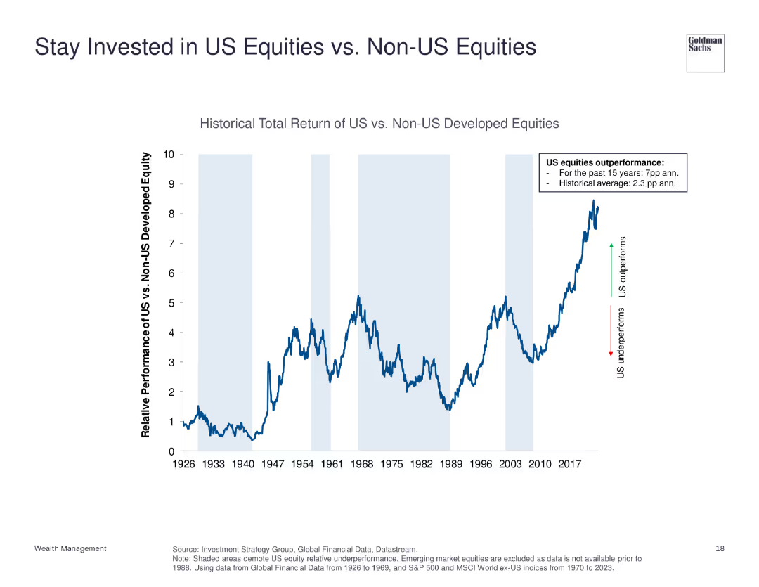
The slide features a line chart comparing the historical total return of US equities vs. non-US developed equities from 1926 to 2023. It shows periods of underperformance and outperformance with annotations for key trends.
Investment Analysis
Financial Services
This slide demonstrates the relative performance of US equities compared to non-US developed equities, emphasizing US equities' historical outperformance.
US equities, non-US equities, historical return, investment, performance comparison
Single Chart
Goldman Sachs
Saved
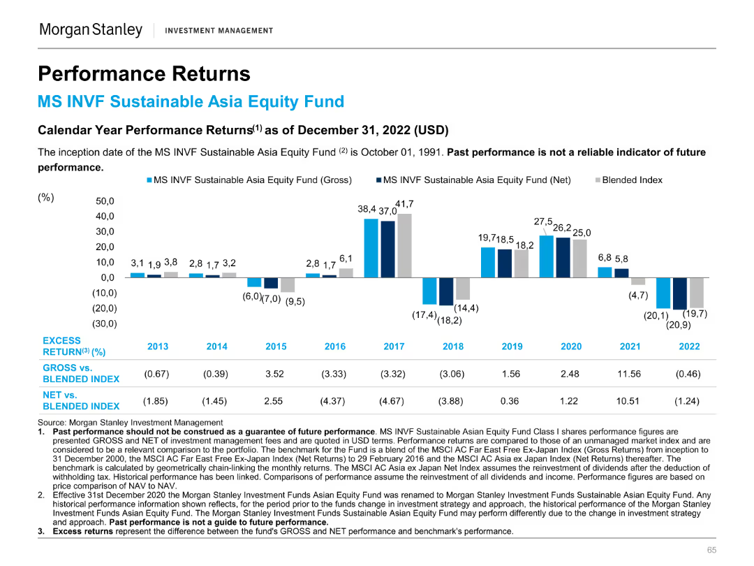
Column chart illustrating calendar year performance returns of the MS INVF Sustainable Asia Equity Fund.
Financial Performance
Financial Services
Highlights annual performance returns, comparing the fund's gross and net returns to a blended index from 2013 to 2022.
Annual, performance, returns, fund, equity
Mixed Chart
Morgan Stanley
Saved
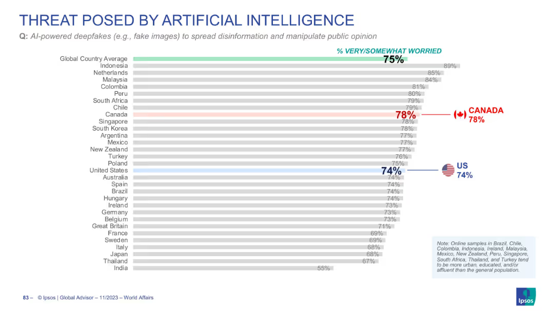
Horizontal bar chart displaying concern over AI-powered deepfakes
Risk Assessment and Management
Artificial Intelligence
Public concern about deepfakes as a tool for disinformation is high globally (75%). Canada (78%) and the US (74%) also show significant concern on this issue.
AI deepfakes, disinformation, public opinion, global perception, misinformation
Single Chart
IPSOS
Saved
Slide contains several vertical column charts, comparing different financial metrics such as Earnings Growth, P/E ratio, ROE, and Dividend Yield of the S&P 500.
Financial Performance
Financial Services
This slide is designed for financial professionals assessing short-term investment performance, with detailed comparison across key financial metrics of the S&P 500 index.
S&P 500, Financial Analysis, ROE, P/E Ratio, Dividend Yield, Earnings Growth, 1-Month Return, Column Chart
Multiple Chart
Morgan Stanley
Saved
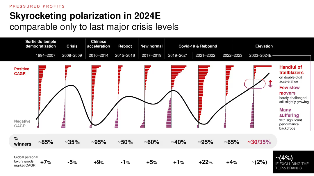
Time series chart comparing market polarization across 9 time periods; color-coded bars show brand CAGR distributions; highlights of top vs. struggling brands.
Financial Performance
Consumer Goods
The luxury sector is experiencing one of the most polarized periods since major economic crises. While a few brands thrive with double-digit growth, a majority are underperforming, contributing to a market CAGR decline (~2%) excluding top 5 players.
brand performance, CAGR, polarization, market trend, historical comparison, economic cycles
Single Chart
Bain
Saved
Features an extensive flowchart diagram with different financial services offered by the firm, divided by client needs, and includes some numerical data points.
Organizational Structure and Change
Financial Services
Details the comprehensive offerings by the firm to support clients during IB transactions and the depth of relationships.
Collaboration, Franchise, Client Support, IB Transactions, Services Offering, Commercial Banking
Table
JP Morgan
Saved
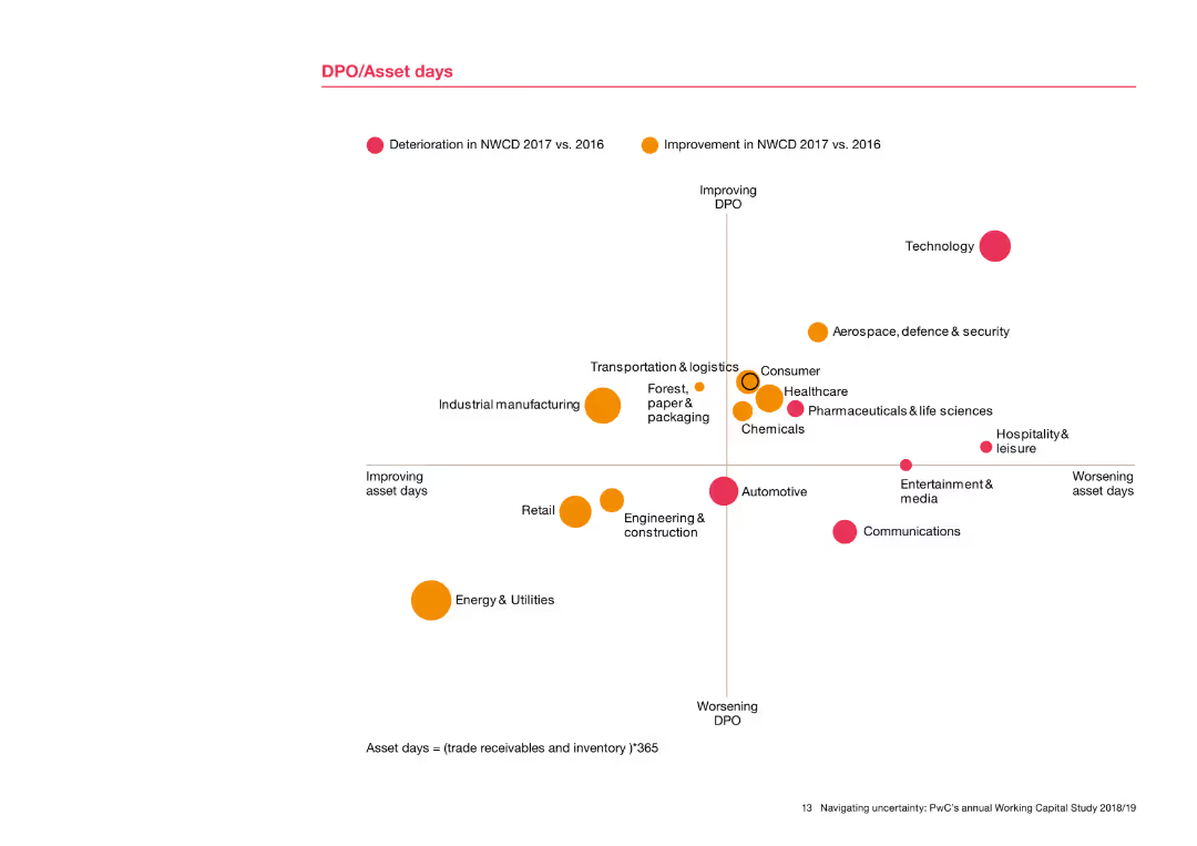
The slide includes a scatter plot showing DPO (Days Payable Outstanding) against asset days for various industries. Dots are color-coded to indicate improvement or deterioration from 2016 to 2017. Industries are labeled around the dots, providing a clear comparison of performance.
Risk Assessment and Management
Financial Services
This slide presents a detailed analysis of DPO and asset days across industries, showing trends in payables and asset management. The scatter plot visualizes how different sectors have improved or worsened in these metrics, offering insights into risk management and operational efficiency.
DPO, asset days, scatter plot, industry comparison, performance trends, risk management
Single Chart
PwC/Strategy&
Saved
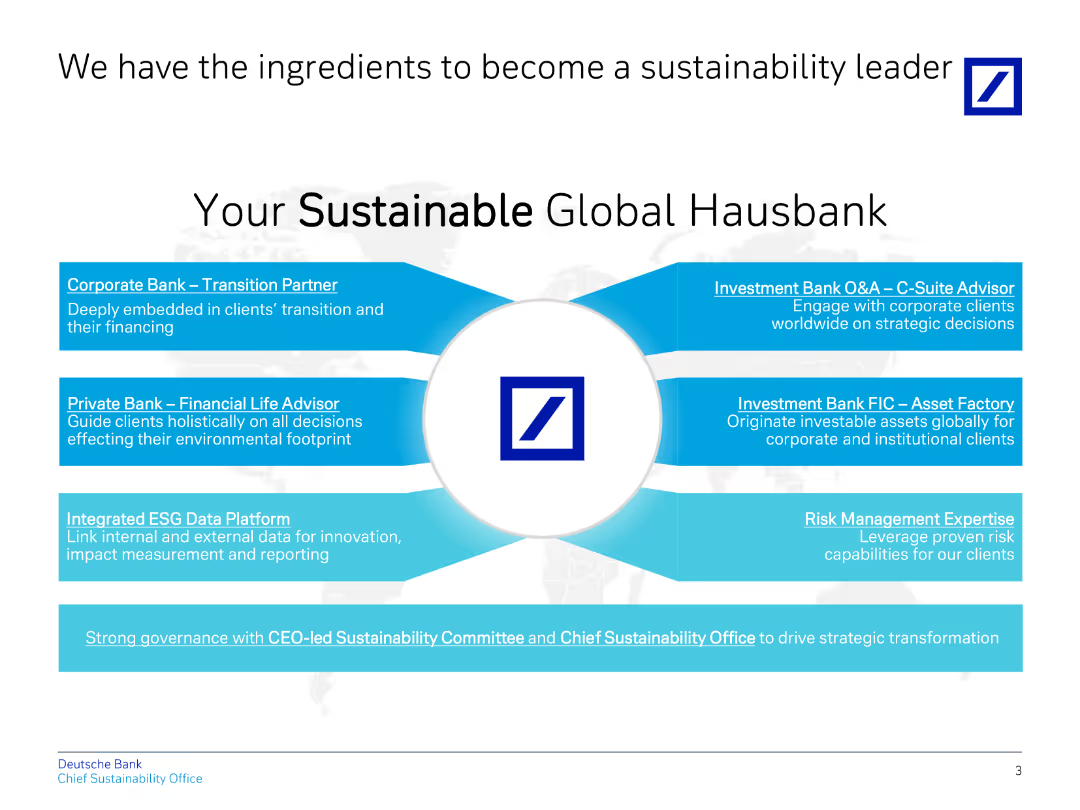
The slide features a central image with several surrounding labels detailing key components for sustainability leadership.
Strategic Planning
Financial Services
Presents the components Deutsche Bank believes are necessary to become a sustainability leader, including various banking segments.
sustainability, leadership, components, strategy, ESG
Diagram
Deutsche Bank
Saved
A graphically intensive slide that presents a colorful chart depicting future energy consumption trends, balanced with descriptive text to the side.
Technology and Digital Transformation
Energy & Utilities
The slide projects future trends in the global energy mix, with a focus on the growing role of electricity and hydrogen. The chart and accompanying text highlight key findings, such as the expected increase in the share of these energy sources, driven by technological advancements and policy measures. It offers a visual representation of the data discussed in the report, making complex projections more accessible and emphasizing the shift towards cleaner energy sources.
Energy Trends, Electricity, Hydrogen, Future Projections
Mixed Chart
McKinsey
Saved
The slide contains four doughnut charts illustrating attitudes towards ESG risks and opportunities among investors. Accompanied by bullet points, each chart is encircled by a yellow ring indicating percentage agreement. The slide's background is white with minimal design elements to emphasize the data.
Market Analysis and Trends
Financial Services
This slide evaluates the economic impacts and challenges related to ESG (Environmental, Social, and Governance) factors in investment decisions. It highlights that a significant percentage of investors consider ESG risks important and expect companies to integrate ESG targets into executive pay, despite potential impacts on short-term profitability.
ESG, Investors, Risks, Opportunities, Executive Pay, Profitability, Doughnut Chart
Multiple Chart
PwC/Strategy&
Saved
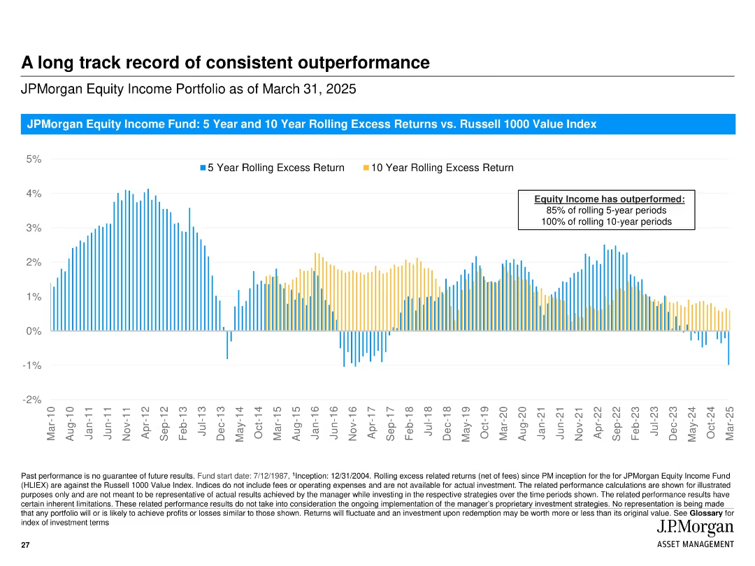
Vertical bar chart showing rolling 5- and 10-year excess returns over time; consistent visual style with blue and yellow colors and timeline from 2010 to 2025.
Financial Performance
Financial Services
Demonstrates JPMorgan Equity Income Fund’s consistent outperformance relative to the Russell 1000 Value Index across rolling 5- and 10-year periods, highlighting success in long-term strategies.
excess returns, rolling periods, outperformance, equity income, Russell 1000, performance history, consistency, fund analysis
Single Chart
JP Morgan
Saved
Contains column charts detailing JP Morgan's market share by product and sector from 2017 to 2021, alongside strategic pillars for business growth.
Strategic Planning
Financial Services
Analyzes JP Morgan's market share strategy by product and sector, emphasizing their leadership and strategic positioning. The slide discusses four key strategic pillars focused on industry specialization, digital platforms, and regional coverage, aiming to enhance market presence and client service in diverse sectors.
market share, strategy, growth, sector
Multiple Chart
JP Morgan
Saved
This slide includes a horizontal bar chart displaying growth rates for various E&M segments from 2019 to 2024. Each bar is color-coded for different regions (India and Global), with segments like OTT video and VR exhibiting the highest growth. The design is straightforward with clear labels for easy comprehension.
Market Analysis and Trends
Media & Entertainment
Analyzes growth rates across different E&M segments, with a particular focus on high-growth areas such as OTT and VR, indicating potential investment or development areas. It serves to guide decisions on where businesses might focus their resources to capitalize on rapid market changes, especially in the context of emerging technologies in media.
growth rates, E&M segments, OTT, VR, market
Single Chart
PwC/Strategy&
Saved
Slide shows column charts comparing GDP, IT & Business Services, and Accenture's CAGR across different fiscal years, using shades of purple.
Financial Performance
Technology & Software
This slide illustrates Accenture’s growth compared to general economic indicators like GDP and sector-specific growth in IT and Business Services, highlighting the company's strong market performance.
growth, GDP, IT, services, CAGR, Accenture, market performance, economic, sector-specific, comparison
Multiple Chart
Accenture
Saved
A minimalistic design with the title text prominently displayed against a light blue geometric background.
Investment Analysis
Financial Services
This slide presents the fiscal year and quarter, highlighting its purpose as an investor presentation. It is used to set the context for the financial information that will follow.
Fiscal, Quarter, Investor, Presentation, Financial
Title
Booz Allen Hamilton
Saved
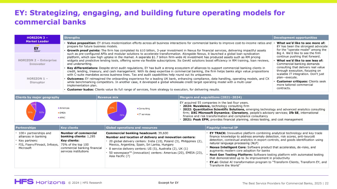
Dense information slide with multiple boxes: strengths, development, clients, revenue mix, operations, and M&A. Top section emphasizes positioning on HFS Horizon model.
Organizational Structure and Change
Financial Services
The slide positions EY as a top-tier digital transformation partner for commercial banks, citing strengths like value proposition, client kudos, and delivery footprint. It outlines EY’s investments, partnerships, and IP. Development suggestions include improving scalable IT and commercial customization. The slide supports EY’s leadership in financial services consulting.
EY, banking, modernization, Nexus, partnerships, M&A, GenAI, revenue mix
Mixed Chart
Accenture
Saved
Previous
Next
If nothing, comes up, please save your slides first
Create a FREE account to continue browsing
Receive Instant Access to 1,000+ slides from companies like McKinsey, Google, and Goldman Sachs
First Name
Last Name
Email
Password
I agree to all
Terms & Privacy Policy
Thank you! Your submission has been received!
Oops! Something went wrong while submitting the form.
Have an account?
Sign in
Column Chart
Heatmap
Chevron
Org Chart
Infographic
Callouts
Timeline
List
Graphic
Picture
Process Flow
Diagram
Paragraph
Map
Table
Framework
Subtitle
Takeaway Box
Icon
Other Chart
Radar Chart
Waterfall Chart
Mekko Chart
Pie Chart
Scatter Plot
Line Chart
Bar chart
Bullet points