Create a FREE Account
Instant access to 1,000+ real slides from top companies like McKinsey, BCG, Goldman Sachs, Google and many more!
First Name
Last Name
Email
Password
I agree to all
Terms & Privacy Policy
Thank you! Your submission has been received!
Oops! Something went wrong while submitting the form.
Have an account?
Sign in
Library
Templates
Courses
Pricing
My Account
My Slides
My Templates
✦ AI
AI Prompt Library
AI Search
Sign in
Start Here
Logout
My Saved Slides
The slide compares traditional B2C start-ups' expansion into B2B SME services with example cases and a graphical representation of their original and expanded service offerings.
Market Analysis and Trends
Financial Services
The slide outlines the strategic growth of B2C start-ups into adjacent B2B SME services, providing cases like Gojek and Shopee as examples. It's suitable for analyzing how B2C companies are diversifying into the B2B space to capture additional market segments and enhance value propositions.
B2C, B2B, Expansion, SME Services, Market Strategy, Start-ups
Linear Flow
Kearney
Saved
Three line charts showing trends over years in digitalization, network capacity, and spend on network modernization.
Technology and Digital Transformation
Telecommunications
Visualizes the growth in digitalization and network capacity alongside increased spending on network modernization over time.
digitalization, network capacity, investment trends, technology growth, network modernization, data transmission
Mixed Chart
Accenture
Saved
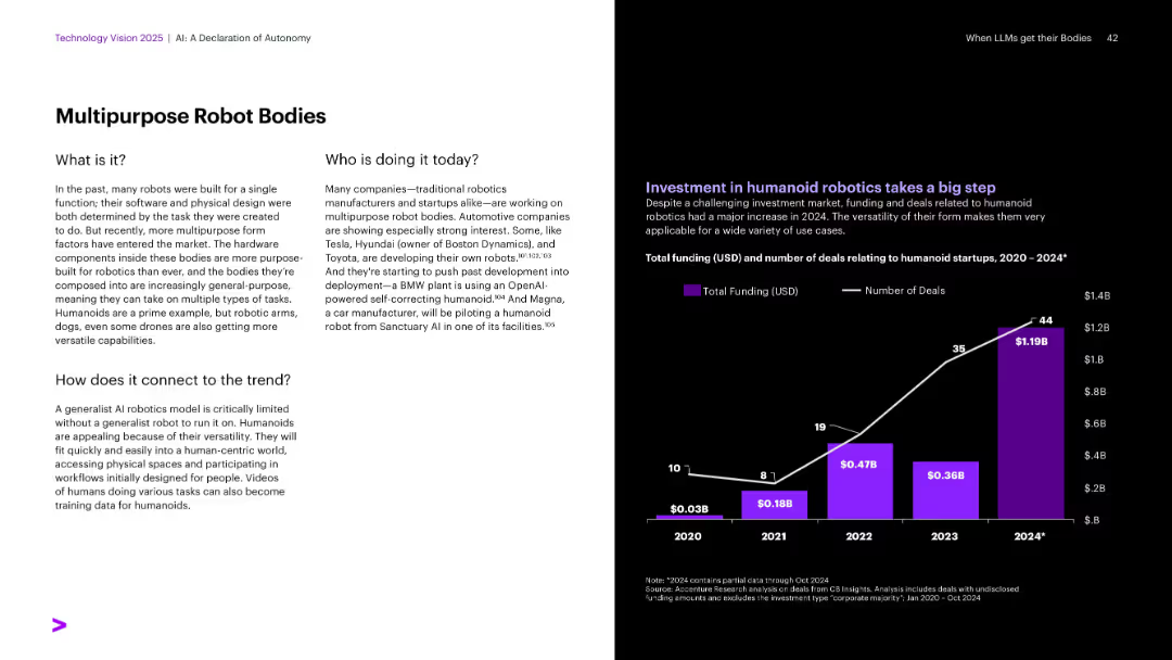
Textual explanation on white background left; chart on funding and deals in purple and white on the right.
Technology and Digital Transformation
Industrial & Manufacturing
Highlights the trend of general-purpose robot bodies, moving beyond task-specific designs. Automakers like Tesla and Toyota are developing humanoids. Investment in humanoid robotics has surged, with 2024 seeing the largest funding and number of deals, indicating strong market interest.
Humanoids, multipurpose robots, Tesla, Toyota, robotics investment
Mixed Chart
Accenture
Saved
A structured diagram categorizes the bank's divisions into five focused areas with additional descriptive text.
Organizational Structure and Change
Financial Services
This slide outlines the bank’s divisional reorganization into five focused areas, aimed at streamlining operations and enhancing efficiency.
restructuring, divisions, organizational, business model, efficiency
Diagram
Barclays
Saved
Comprises a large pie chart detailing loan compositions across various sectors, color-coded for clarity. Key highlights provide insights into risk management and sector allocation.
Risk Assessment and Management
Financial Services
Provides an overview of the loan distribution by sector, highlighting the diversity and risk associated with different segments. It offers insights into risk management practices and strategic loan portfolio diversification within a financial institution.
loans, risk management, financial, diversification, sectors
Mixed Chart
Deutsche Bank
Saved
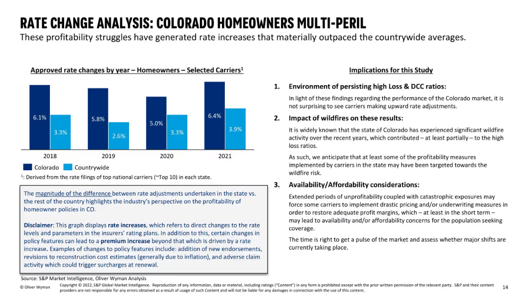
Left side contains a vertical bar chart of rate changes for Colorado vs countrywide from 2018–2021; right side provides a three-point summary on implications; blue and black text emphasizes main findings.
Pricing Strategies
Financial Services
This slide analyzes how persistent underwriting losses have led to rate increases that outpace national averages in Colorado. It explores the implications, including wildfire impact and affordability concerns. Emphasis is placed on the structural market response and insurer behavior.
rate analysis, homeowners insurance, pricing, Colorado, DCC ratio, wildfire impact, affordability, underwriting, premium increase
Mixed Chart
Oliver Wyman
Saved
Line charts showing US y/y average hourly earnings and inflation, and real consumption expenditures and disposable income trends.
Market Analysis and Trends
Consumer Goods
Shows how growth in real disposable income sustains consumer spending, even as the labor market cools.
disposable income, consumer spending, earnings, inflation, consumption, line chart, US economy, labor market, income trends
Multiple Chart
EY
Saved
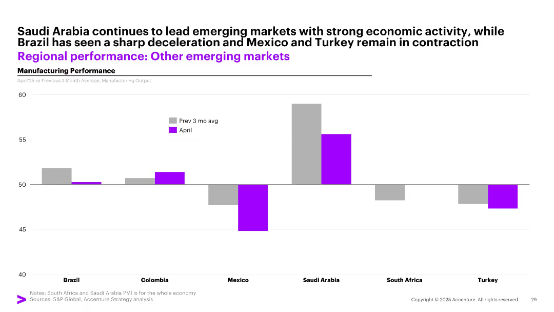
Bar chart with side-by-side bars (gray for past 3-month avg and purple for April) showing manufacturing output in 6 emerging markets.
Performance Metrics and KPIs
Industrial & Manufacturing
The slide highlights varying manufacturing momentum across emerging markets. Saudi Arabia leads with high output, while Brazil shows deceleration, and Mexico and Turkey remain in contraction.
emerging markets, manufacturing, Saudi Arabia, Brazil, contraction, April, comparison, economic activity
Single Chart
Accenture
Saved
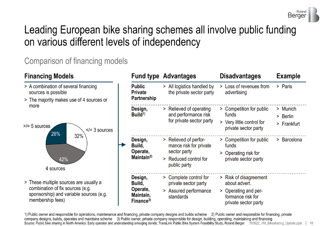
Split layout: left pie chart of financing model distribution, right table comparing fund types; advantages, disadvantages, and examples listed
Investment Analysis
Transportation & Logistics
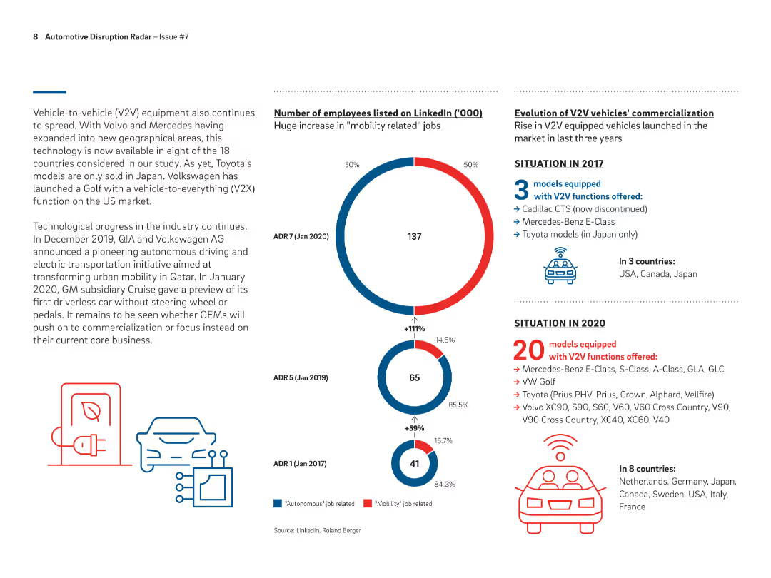
The slide categorizes various financing models used in European bike-sharing schemes, showing a mix of public-private partnerships and government-led models. Each model is evaluated for pros and cons with city examples.
financing models, bike sharing, PPP, public funds, investment, Europe, urban mobility
Mixed Chart
Roland Berger
Saved
Bubble chart showing venture capital investment trends in mobility platforms and transport technology from 2016 to 2019, with a comparison to AI investment.
Investment Analysis
Financial Services
Analyzes the trends in venture capital investments in mobility and transport technology, highlighting a decline in mobility investment and an increase in AI investment.
venture capital, mobility platforms, transport technology, AI
Mixed Chart
Roland Berger
Saved
Light background with yellow title banner, text-heavy content, and a bubble chart comparing 2023 IPO markets with the 5-year average.
Market Analysis and Trends
Financial Services
This slide examines the rise of new IPO markets like Indonesia, Malaysia, and Turkey, while traditional markets like Hong Kong face challenges. It includes a bubble chart visualizing IPO market performance relative to the 5-year average.
IPO markets, high-growth, traditional markets, performance, 2023
Mixed Chart
EY
Saved
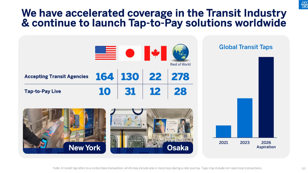
Grid and bar chart layout with flag indicators and tap-to-pay adoption stats, plus transport images.
Technology and Digital Transformation
Transportation & Logistics
Focused on the adoption of tap-to-pay transit solutions globally, the slide lists agencies across countries and growth in transit taps. It highlights major cities like New York and Osaka, underlining ongoing innovation in payment tech.
tap-to-pay, transit, agencies, contactless payments, Amex, transportation, digital payment, global adoption
Mixed Chart
McKinsey
Saved
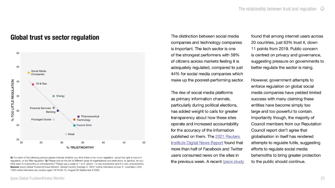
Split layout: left has a scatter plot mapping trust vs perception of under-regulation; right side contains analysis of distinctions between social media and tech regulation.
Risk Assessment and Management
Professional Services
This slide presents a scatter plot analyzing the relationship between sector trust and perceived need for regulation. It reveals that low-trust sectors (e.g., social media, oil & gas) are also viewed as under-regulated. Narrative explains growing concerns over governance and transparency.
trust vs regulation, risk analysis, public governance, sector perception, social media, oil & gas, scatter chart
Mixed Chart
IPSOS
Saved
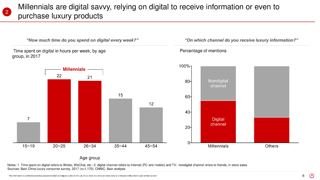
This slide features bar charts displaying the time spent on digital platforms by different age groups and the channels through which they receive luxury information. It highlights the digital engagement of Millennials compared to other age groups.
Market Analysis and Trends
Retail & E-commerce
The slide highlights the digital savviness of Millennials, showing how they rely heavily on digital platforms for receiving information and purchasing luxury products. It presents data on the average hours spent online per week and the preference for digital channels over non-digital ones for luxury information.
Digital engagement, Millennials, luxury products, online behavior, digital platforms, consumer information, purchasing habits, age groups
Multiple Chart
Bain
Saved
A vertical column chart comparing the costs of different steel production methods, including hydrogen-based methods, with detailed cost components for each method.
Market Analysis and Trends
Energy & Utilities
The slide analyzes the economic viability of hydrogen-based steel production compared to established alternatives, using a detailed cost comparison for various production routes.
hydrogen, steel production, cost comparison, economic viability, chart, established methods, alternatives
Single Chart
Kearney
Saved
The slide shows pie charts illustrating the allocation of assets in original and leveraged portfolios.
Investment Analysis
Financial Services
This slide provides an example of implementing portfolio leverage, detailing asset allocation changes before and after leveraging.
portfolio leverage, asset allocation, investment strategy, pie charts, leverage
Multiple Chart
UBS
Saved
Visualizes application timelines using horizontal bars across a timeline from 2020 to 2040, detailing stages like pilot starts and full ramp-ups.
Operational Efficiency
Energy & Utilities
Shows the anticipated domestic rollout of hydrogen applications in sectors like refining and transport.
hydrogen, domestic, application, rollout, mining, trucks, fertilizers
Multiple Chart
McKinsey
Saved
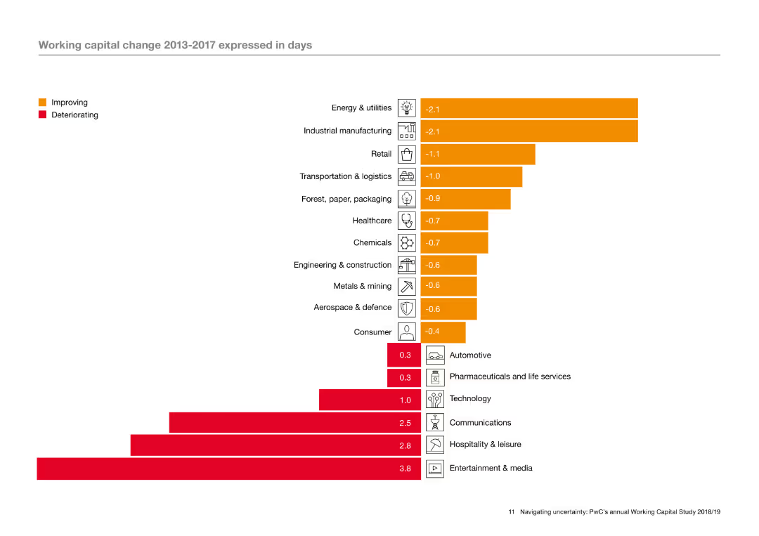
The slide features a column chart with horizontal bars indicating working capital change in various industries from 2013 to 2017. The bars are color-coded to show improving and deteriorating metrics. Icons representing different industries are aligned on the left of the chart.
Operational Efficiency
Industrial & Manufacturing
The slide analyzes working capital changes across different industries over a five-year period, using a column chart to illustrate which industries have seen improvements or deteriorations. The analysis highlights trends in operational efficiency within these sectors.
Working capital, operational efficiency, industry trends, improvement, deterioration, column chart
Single Chart
PwC/Strategy&
Saved
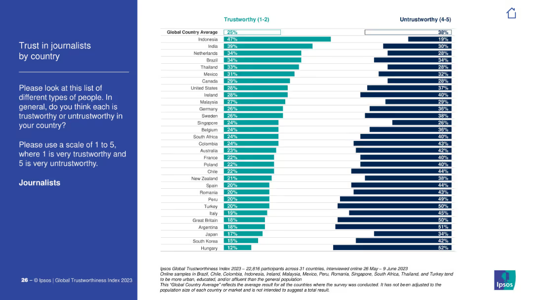
Left panel describes the survey question, right has horizontal bars split between "trustworthy" and "untrustworthy" scores by country.
Market Analysis and Trends
Media & Entertainment
Trust in journalists varies widely; Indonesia and India top the trust ratings, while Hungary and South Korea rank lowest. Global average trust is 25%.
journalism, public opinion, trust, countries, Ipsos, reporters, news, global sentiment
Mixed Chart
IPSOS
Saved
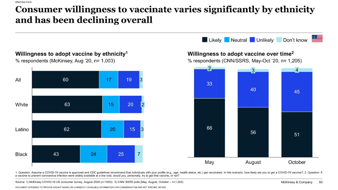
Split chart layout: left side shows willingness by ethnicity; right side shows willingness trend from May to Oct 2020.
Customer and Market Segmentation
Healthcare & Pharmaceuticals
This slide explores how willingness to receive a COVID-19 vaccine varies across ethnic groups and over time. It shows a decline in vaccine acceptance from May to October 2020 and highlights differences in likelihood to vaccinate among Black, Latino, and White populations. Insights support targeted communication strategies.
vaccine hesitancy, ethnicity, public opinion, COVID-19, trends, adoption
Multiple Chart
McKinsey
Saved
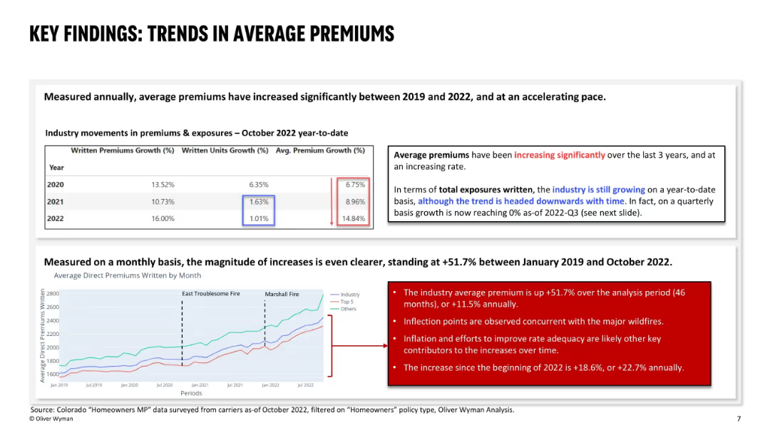
Upper section shows a yearly premium growth table; bottom section has a line chart showing monthly premium trends; highlights notable fire events and uses red callout boxes to emphasize observations.
Pricing Strategies
Financial Services
This slide analyzes significant increases in average premiums between 2019 and 2022, both annually and monthly. It links major premium spikes to wildfire events, inflation, and insurer efforts to restore rate adequacy. Premiums rose +51.7% overall in the period, with sharper increases in 2022 alone.
premium growth, rate adequacy, wildfires, inflation, pricing trends, homeowners, Colorado, insurance, premium trend analysis
Mixed Chart
Oliver Wyman
Saved
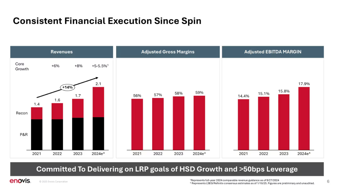
Three bar charts aligned horizontally: Revenue, Gross Margin, EBITDA Margin. Clear data visualization.
Financial Performance
Healthcare & Pharmaceuticals
Highlights Enovis’s financial performance since its spin-off, showing revenue growth, improving gross margins, and expanding EBITDA margins from 2021 to projected 2024. Emphasizes alignment with long-range planning (LRP) goals.
revenue growth, margins, EBITDA, core growth, performance, spin-off, long-range planning
Mixed Chart
JP Morgan
Saved
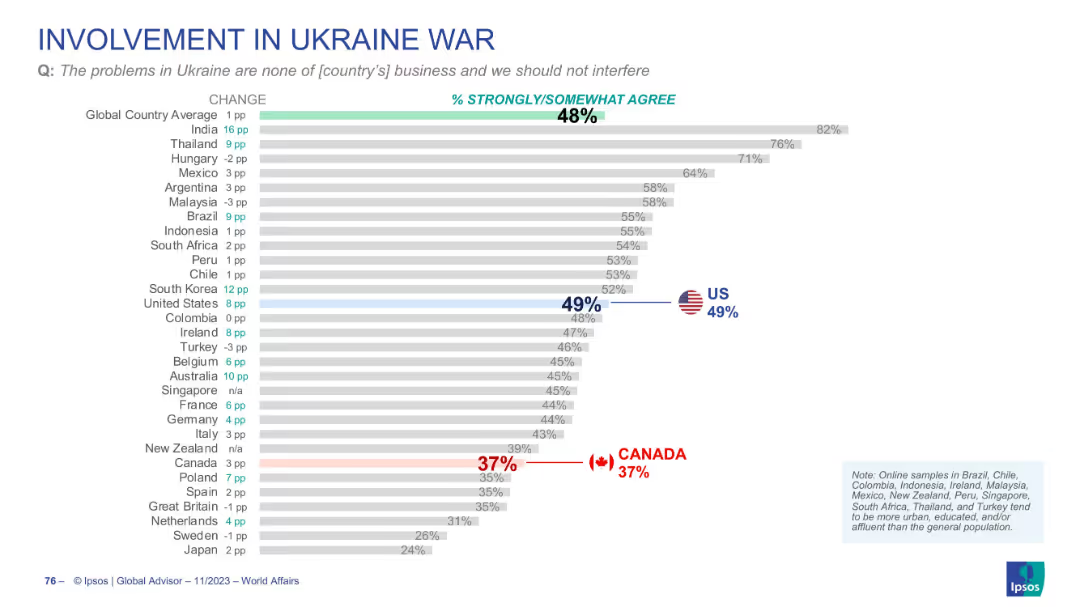
Bar chart ranking countries by agreement with the idea that Ukraine is not their country’s business. US and Canada marked; layout consistent.
Strategic Planning
Government & Public Sector
This slide measures sentiment that the Ukraine conflict is none of the country’s business. Global agreement is 48%, with 49% in the US and only 37% in Canada. It suggests public division over foreign policy involvement.
Ukraine, foreign policy, public opinion, global affairs, Ipsos
Single Chart
IPSOS
Saved
The slide features column charts and text blocks. The left side shows employee support for vaccination policies by region, and the right side presents global vaccination intent.
Risk Assessment and Management
Professional Services
Explores employee preferences for mandatory vaccinations for safe return to work, including regional differences and overall support levels.
vaccination, safe return, survey, regional differences, employee preferences
Multiple Chart
EY
Saved
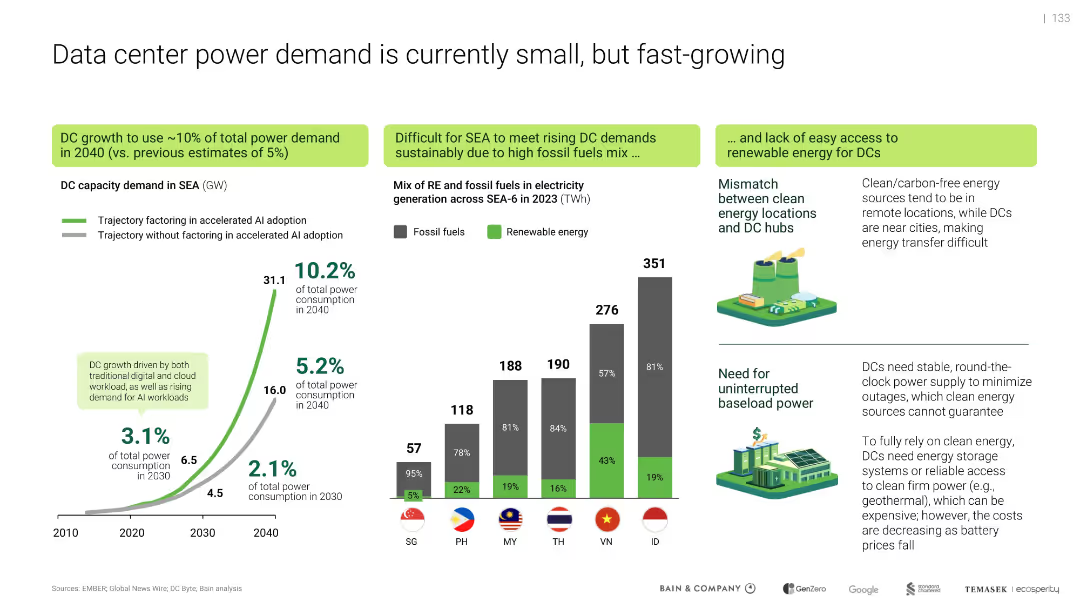
Multi-section layout with graphs, illustrations, and color-coded callouts
Strategic Planning
Technology & Software
Projects that data center energy demand in SEA could reach 10% of total power use by 2040, driven by AI. Emphasizes mismatch between renewable sources and data center locations, and the need for uninterrupted power. Highlights current reliance on fossil fuels and challenges of clean energy integration.
AI, power demand, renewable energy, fossil fuels, data center growth, energy mismatch, SEA-6, baseload power
Multiple Chart
Bain
Saved
Previous
Next
If nothing, comes up, please save your slides first
Create a FREE account to continue browsing
Receive Instant Access to 1,000+ slides from companies like McKinsey, Google, and Goldman Sachs
First Name
Last Name
Email
Password
I agree to all
Terms & Privacy Policy
Thank you! Your submission has been received!
Oops! Something went wrong while submitting the form.
Have an account?
Sign in
Column Chart
Heatmap
Chevron
Org Chart
Infographic
Callouts
Timeline
List
Graphic
Picture
Process Flow
Diagram
Paragraph
Map
Table
Framework
Subtitle
Takeaway Box
Icon
Other Chart
Radar Chart
Waterfall Chart
Mekko Chart
Pie Chart
Scatter Plot
Line Chart
Bar chart
Bullet points