Create a FREE Account
Instant access to 1,000+ real slides from top companies like McKinsey, BCG, Goldman Sachs, Google and many more!
First Name
Last Name
Email
Password
I agree to all
Terms & Privacy Policy
Thank you! Your submission has been received!
Oops! Something went wrong while submitting the form.
Have an account?
Sign in
Library
Templates
Courses
Pricing
My Account
My Slides
My Templates
✦ AI
AI Prompt Library
AI Search
Sign in
Start Here
Logout
My Saved Slides
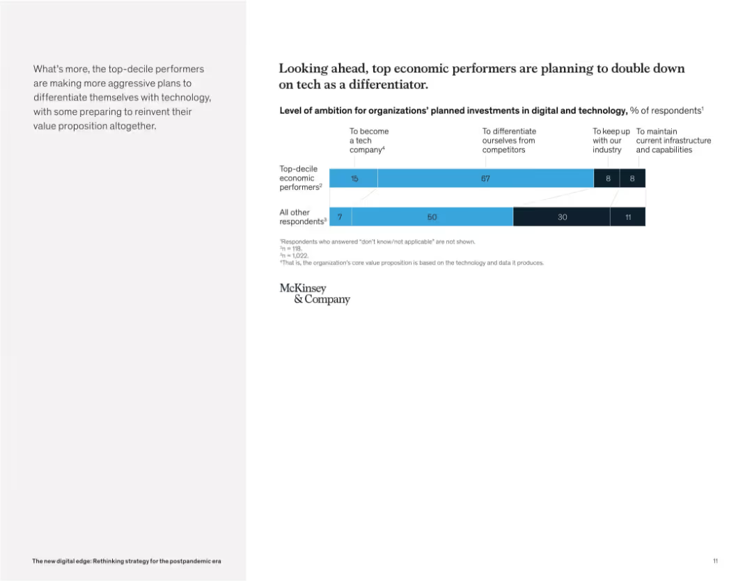
Clean layout with bar chart on the right and narrative paragraph on the left. Categories show ambition levels for tech investment.
Strategic Planning
Technology & Software
This slide reveals that top-performing companies are more likely to pursue aggressive technology strategies. The majority aim to differentiate themselves with tech or even become tech companies, unlike others who prioritize infrastructure maintenance.
digital strategy, tech differentiation, future investment, ambition, business transformation, technology leaders, innovation, McKinsey
Mixed Chart
McKinsey
Saved
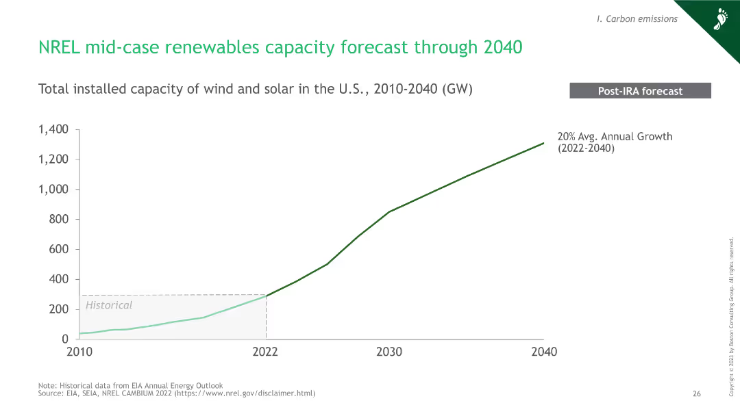
A line chart showing the forecasted growth of renewable energy capacity in the U.S. from 2010 to 2040.
Market Analysis and Trends
Energy & Utilities
This slide forecasts the growth of wind and solar capacity in the U.S. through 2040, indicating a 20% average annual growth rate post-IRA.
hydrogen, renewables, capacity, forecast, 2040
Single Chart
BCG
Saved
The slide includes a world map with highlighted regions and text boxes indicating market size and growth rates.
Market Analysis and Trends
Education & Training
Highlights the private K-12 market growth with enrollment numbers and CAGR between 2015 and 2019.
K-12, private market, enrollment, growth, global
Mixed Chart
LEK
Saved
The slide includes column charts showing the budget outlook for medium-size and large-size public hospitals over the last three years, current year, and next three years.
Financial Performance
Healthcare & Pharmaceuticals
This slide details the budget outlook for public hospitals in APAC, comparing medium-size and large-size facilities. It highlights budget deficit and surplus trends over a three-year period.
public, hospitals, budget, outlook, financial
Multiple Chart
LEK
Saved
Contains two column charts comparing the effectiveness of cost reduction efforts across North America, Europe, and Asia. The slide uses shades of green and dark gray, with percentages and brief textual descriptions.
Risk Assessment and Management
Industrial & Manufacturing
Analyzes the effectiveness of past cost reduction strategies across different global regions, highlighting the temporary nature of cost savings and the varying impacts on business growth.
cost reduction, global strategy, North America, Europe, Asia
Multiple Chart
BCG
Saved
A bar chart showing the percentage of services procurement spend across various industries. Each bar is colored differently, representing sectors like insurance, financial services, and telecommunications.
Industry Overview
Professional Services
Analyzes the proportion of services procurement spending in different sectors, showing higher spend in industries like insurance and financial services compared to sectors like construction or consumer products.
Procurement, Services, Industry, Spend, Analysis
Single Chart
Kearney
Saved
A comparative analysis layout showing potential profit losses for Asian and Chinese BEV manufacturers under different market scenarios. Utilizes color coding for clarity.
Risk Assessment and Management
Transportation & Logistics
Focuses on the challenges facing Asian and Chinese manufacturers in the BEV market, detailing the risk of significant profit losses under slow electrification scenarios and potential gains in more favorable conditions.
BEV, Asian OEMs, Chinese OEMs, profit loss, risks
Table
BCG
Saved
Two bar charts displaying MMIS spend and cost savings opportunities over fiscal years, with detailed explanatory text boxes. Dense layout.
Regulatory and Compliance
Government & Public Sector
Review of MMIS contract costs and potential cost savings for the state, emphasizing shifting enhancement costs to vendors in future MMIS contracts.
MMIS, Costs, Savings, Fiscal Year, Contract
Multiple Chart
Alvarez & Marsal
Saved
Slide displays two 2D scatter plots comparing 'Leaders' and 'Laggards' in strategic investments across various business areas. Color-coded dots represent different strategies such as M&A, digital capabilities, and ESG practices.
Competitive Landscape
Retail & E-commerce
This slide illustrates the strategic investment differences between industry leaders and laggards in areas like digital expansion and sustainability, emphasizing the gap in competitive strategy.
investment, strategy, digital, sustainability, leaders, laggards, competitive, business, ESG, M&A
Multiple Chart
Deloitte
Saved
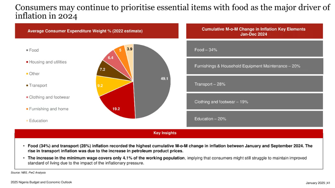
Pie chart of 2022 expenditure weights; bar-style panel of 2024 inflation contributors; insights below in red.
Market Analysis and Trends
Consumer Goods
Highlights that food and transport costs drove inflation in 2024. Consumers focused on essential items, and the new minimum wage had limited impact, covering just 4.1% of the workforce. Inflationary pressure likely to continue shaping spending behavior in 2025.
inflation, consumer spending, food, transport, minimum wage, Nigeria, 2024, price pressure, essential goods
Mixed Chart
PwC/Strategy&
Saved
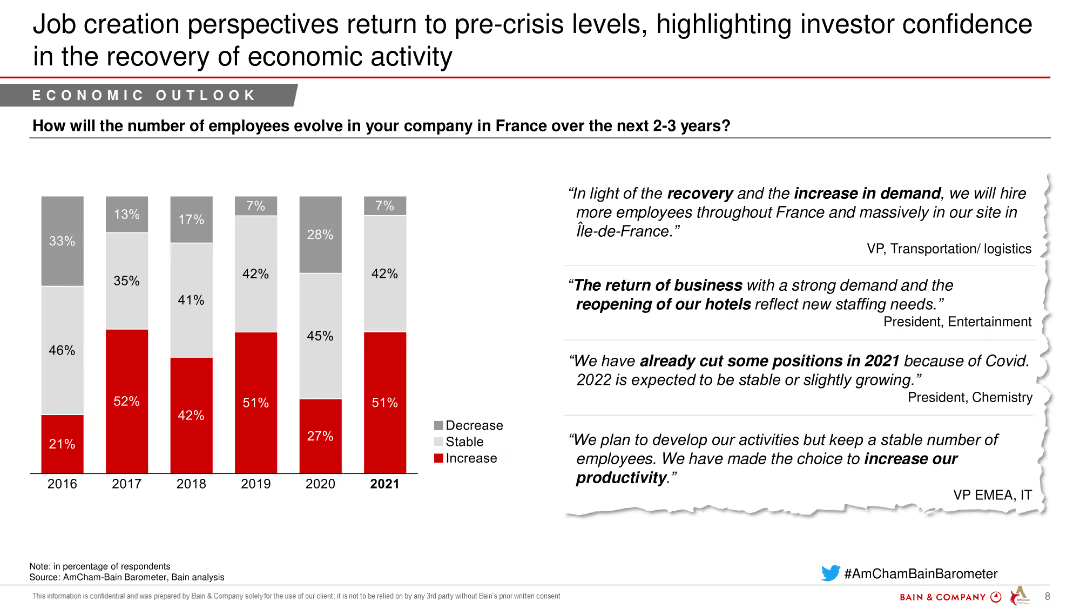
The slide features a column chart showing the percentage of companies expecting a decrease, stability, or increase in employee numbers from 2016 to 2021. On the right, there are quotes from industry leaders.
Market Analysis and Trends
Transportation & Logistics
This slide highlights the recovery in job creation perspectives in France over the next 2-3 years, with a focus on increased hiring in the transportation and logistics sector.
Job creation, Economic recovery, Employee trends, Transportation, Logistics
Mixed Chart
Bain
Saved
This slide includes a line graph illustrating the percentage of fixed debt over time, alongside a stacked column chart detailing debt maturity and composition for upcoming years. The chart uses shades of blue, yellow, and green, with a red line graph.
Corporate Finance and Valuation
Financial Services
The slide details the composition and maturity of fixed debt, with an emphasis on no debt maturity until 4Q 2024. It could be utilized in presentations to financial analysts or investors looking at debt management strategies, interest rate impacts on corporate finance, and long-term financial planning.
fixed debt, maturity, hedged rate, financial planning, corporate finance
Single Chart
Morgan Stanley
Saved
Features a line graph showing the relationship between broadband speed and GDP changes. Graph is color-coded to illustrate different time periods and predicted impacts, accompanied by a detailed legend and textual insights on the left.
Market Analysis and Trends
Technology & Software
Highlights statistical findings on broadband's effect on GDP from historical data and projected future trends. Compares these results to other international studies.
GDP, broadband, statistics, projections, line graph
Mixed Chart
Accenture
Saved
Line chart showing the global risks landscape for technological risks, plotting impact versus likelihood.
Technology and Digital Transformation
Technology & Software
The slide presents a global risk assessment for technological advancements, highlighting the perceived risks and their impact versus likelihood. It focuses on the different risk perceptions between generations, particularly regarding tech advances, digital power concentration, and digital inequality.
Technological Risk, Risk Perception, Innovations
Mixed Chart
Roland Berger
Saved
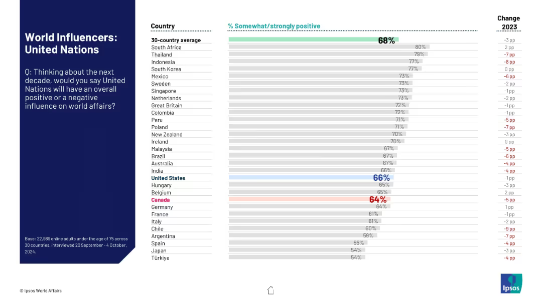
Similar bar chart as previous slides; evaluates public opinion on whether the UN will have a positive impact in global affairs in the coming decade.
Strategic Planning
Government & Public Sector
The slide reflects global confidence in the United Nations’ future influence, comparing sentiment across 30 countries and highlighting changes in approval from the prior year. The UN is benchmarked against the average.
United Nations, global governance, public trust, influence perception, strategic role, world affairs, Ipsos
Mixed Chart
IPSOS
Saved
The slide features a vertical column chart illustrating the progress towards a 15% return on CET1 capital by 2026.
Financial Performance
Financial Services
This slide describes the target of achieving a 15% RoCET1, outlining steps and expected financial outcomes.
RoCET1, CET1 capital, financial targets, cost savings, capital returns
Mixed Chart
UBS
Saved
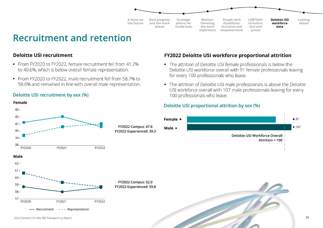
Line charts showing recruitment trends by sex over FY2020 to FY2022, and horizontal bar chart for proportional attrition by sex in FY2022.
Human Resources and Talent Management
Professional Services
It examines Deloitte USI's recruitment and retention trends over three fiscal years, highlighting gender differences in attrition rates.
workforce, recruitment, retention, Deloitte, gender, FY2022, line chart, bar chart
Multiple Chart
Deloitte
Saved
This slide is divided into two sections: the top section is labeled "The 'cool' part" with a 70% share of conversations, and the bottom section is labeled "The 'hard' part" with a 30% share of conversations. It includes icons and a purple shaded area representing an iceberg.
Industry Overview
Technology & Software
The slide compares state-of-the-art AI use cases with foundational capabilities, emphasizing that organizations often focus more on advanced use cases while neglecting essential foundational elements.
AI, use cases, technology, foundation, organization
Header Vertical
Kearney
Saved
A bar chart comparing sources of anxiety and stress among Millennials and Gen Z, with categories such as family welfare, financial future, and job prospects.
Market Analysis and Trends
Professional Services
This slide analyzes the primary sources of anxiety and stress among Millennials and Gen Z, comparing various factors like family welfare and financial future.
Anxiety, stress, Millennials, Gen Z, comparison, sources, family welfare, financial future, job prospects
Mixed Chart
Deloitte
Saved
The slide features a bar chart showing the economic impact of each GTA home sale, with various categories such as professional services, renovations, and general household purchases.
Market Analysis and Trends
Real Estate & Construction
This slide concludes with the economic benefits of home sales, highlighting the different areas where each sale contributes financially.
economic impact, home sales, GTA, financial benefits, bar chart, professional services
Single Chart
IPSOS
Saved
Comprises a central circular diagram surrounded by color-coded segments that detail various business units and their contributions. Bullet points next to the diagram summarize competitive advantages and firmwide partnerships.
Competitive Landscape
Financial Services
Outlines how JPMC's diverse platform across different banking and financial services sectors generates competitive advantage and client value, backed by a global brand and robust technology infrastructure.
competitive advantage, firmwide partnerships, JPMC, strategic planning, financial services, global footprint, technology infrastructure
Diagram
JP Morgan
Saved
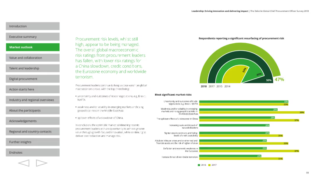
Features a column chart showing procurement strategies used to deliver value, with accompanying textual insights.
Strategic Planning
Professional Services
Explores procurement strategies over the next 12 months, focusing on consolidation, cost reduction, and collaboration.
procurement, value delivery, strategies, collaboration, cost reduction
Multiple Chart
Deloitte
Saved
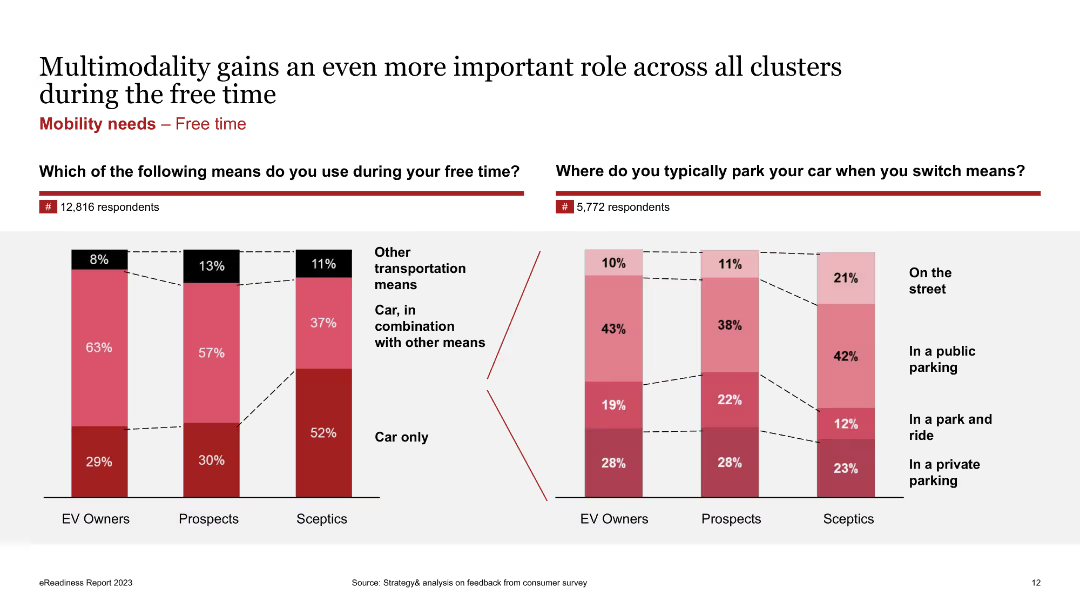
Column charts showing the usage of transportation means during free time and parking preferences among EV owners, prospects, and skeptics.
Market Analysis and Trends
Transportation & Logistics
Shows survey results on transportation means used during free time and typical parking locations when switching means.
Multimodality, EV owners, free time, parking, transportation, survey
Multiple Chart
PwC/Strategy&
Saved
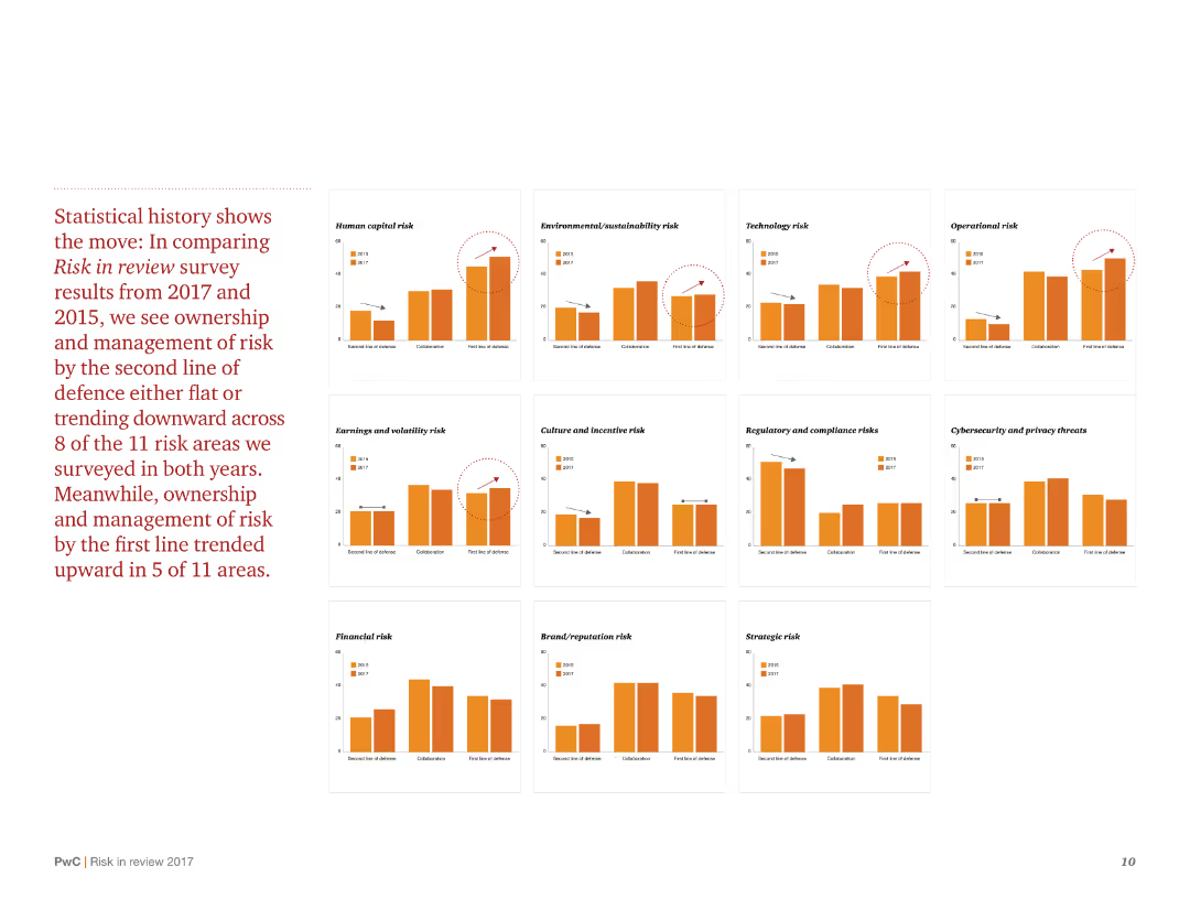
The slide contains multiple column charts comparing risk management trends between 2017 and 2015. It uses a grid layout with clear labels and minimal text to explain each chart.
Risk Assessment and Management
Consumer Goods
The slide compares historical data on risk management across various categories, highlighting trends and changes over time. It shows whether the management of different types of risks has improved, remained stable, or declined.
Risk management, historical data, trends, survey comparison, 2017 vs 2015
Multiple Chart
PwC/Strategy&
Saved
This slide presents a column chart showing a progressive increase over four years with an upward arrow, two pie charts with percentages, and bullet point descriptions. The color scheme includes blue and grey tones with minimal text, facilitating a clear visual representation of data. The pie charts are simplistic, using contrasting colors to highlight different segments.
Market Analysis and Trends
Industrial & Manufacturing
The slide portrays the company's growing order book over the years, emphasizing the current year's strong momentum. It details the portion of the order book dedicated to zero-emission vehicles and the geographical diversification of orders. It could be used in a strategy meeting or investor briefing to highlight commercial success and future opportunities, particularly in the sustainable and global markets.
Momentum, Order Book, Zero-Emission Vehicles, Geographical Diversification, Column Chart, Pie Chart, Industrial, Sustainable
Multiple Chart
Goldman Sachs
Saved
Previous
Next
If nothing, comes up, please save your slides first
Create a FREE account to continue browsing
Receive Instant Access to 1,000+ slides from companies like McKinsey, Google, and Goldman Sachs
First Name
Last Name
Email
Password
I agree to all
Terms & Privacy Policy
Thank you! Your submission has been received!
Oops! Something went wrong while submitting the form.
Have an account?
Sign in
Column Chart
Heatmap
Chevron
Org Chart
Infographic
Callouts
Timeline
List
Graphic
Picture
Process Flow
Diagram
Paragraph
Map
Table
Framework
Subtitle
Takeaway Box
Icon
Other Chart
Radar Chart
Waterfall Chart
Mekko Chart
Pie Chart
Scatter Plot
Line Chart
Bar chart
Bullet points