Create a FREE Account
Instant access to 1,000+ real slides from top companies like McKinsey, BCG, Goldman Sachs, Google and many more!
First Name
Last Name
Email
Password
I agree to all
Terms & Privacy Policy
Thank you! Your submission has been received!
Oops! Something went wrong while submitting the form.
Have an account?
Sign in
Library
Templates
Courses
Pricing
My Account
My Slides
My Templates
✦ AI
AI Prompt Library
AI Search
Sign in
Start Here
Logout
My Saved Slides
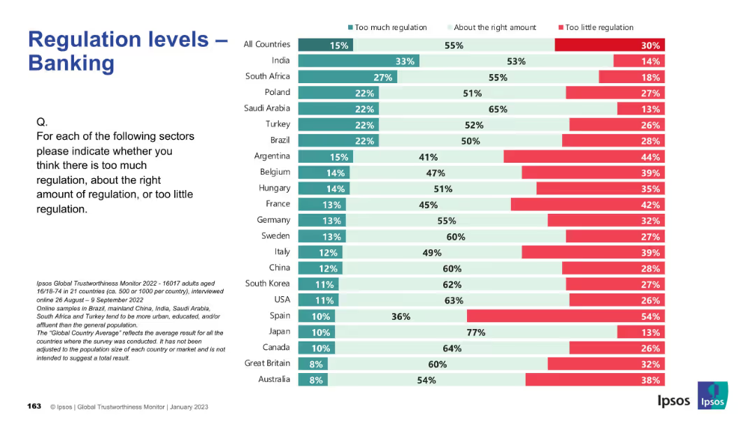
Standard layout and colors; bar chart showing global and country-specific sentiment on banking regulation.
Regulatory and Compliance
Financial Services
This slide presents public opinion on the regulation of the banking sector. Overall, most respondents believe the level of regulation is about right, but Argentina, France, and Belgium reflect greater concern over insufficient regulation. Japan and Canada exhibit the highest levels of perceived regulatory adequacy.
banking, finance, regulation, compliance, public sentiment, Ipsos, governance, financial sector, oversight, global survey
Mixed Chart
IPSOS
Saved
Slide with a mix of tables and column charts along with text panels. It shows divisional revenues and key financial statistics like revenues, costs, profits, and balance sheet data. Colors are mainly blue and white, with a clear division of data.
Financial Performance
Financial Services
Analyzing Deutsche Bank's financial performance for Q4 2023, highlighting changes in divisional revenues and key financial metrics such as profit and costs. Aimed at providing a detailed quarterly financial summary to stakeholders.
Q4 2023, financial highlights, revenue, costs, banking
Mixed Chart
Deutsche Bank
Saved
Contains a bar chart comparing the importance of AI applications in risk management and ethics.
Risk Assessment and Management
Technology & Software
Analyzes the critical AI applications for managing risks and improving AI ethics in businesses.
AI, risk management, ethics, applications, importance
Single Chart
PwC/Strategy&
Saved
Slide presents data in a hybrid format with both pie charts and text blocks, detailing asset management and growth in various regions.
Market Analysis and Trends
Financial Services
Details the offerings of Barclays' Private Bank and Wealth Management, highlighting its services across different regions and customer segments, and emphasizing its growth in managed assets.
wealth management, private banking, assets, growth
Multiple Chart
Barclays
Saved
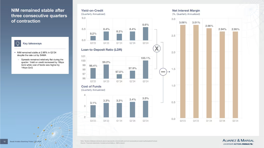
Left column features key takeaways; right contains small stacked bar charts for yield on credit, LDR, CoF, and NIM trends. Clean, modular layout.
Performance Metrics and KPIs
Financial Services
Discusses Net Interest Margin (NIM) stability in Q3’24. Shows relationships between yield on credit, loan-to-deposit ratio, and cost of funds using visual breakdowns.
NIM, yield, cost of funds, LDR, interest margin, Q3’24, SAMA, bank metrics, credit spreads
Multiple Chart
Alvarez & Marsal
Saved
Detailed map of Edinburgh highlighting key areas with clusters of high-growth tech companies. Uses color coding to differentiate various types of organizations like universities and tech hubs.
Market Analysis and Trends
Technology & Software
Maps the concentration of tech companies and supporting infrastructure in Edinburgh, detailing the strategic importance of its central districts and peripheral areas for tech growth.
Edinburgh, tech companies, map
Graphic
Barclays
Saved
Contains a text description of natural H2 production sources, a map highlighting Mali, and key features of the Bourakebougou field.
Market Analysis and Trends
Energy & Utilities
Discusses various natural sources of hydrogen production discovered in different geological settings, with a focus on the Bourakebougou field in Mali.
Natural hydrogen, production sources, geology, Mali, Bourakebougou field
Graphic
Kearney
Saved
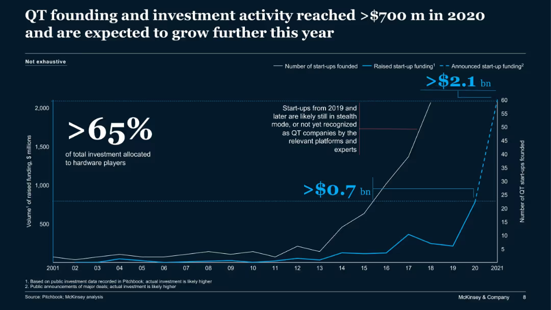
Line chart showing trends in QT start-up funding and number of start-ups from 2001 to 2021, with annotations for stealth and hardware players.
Sales and Business Development
Artificial Intelligence
This slide tracks growth in quantum technology (QT) funding and start-up activity, highlighting over $700M in 2020 and projections for continued growth, particularly in hardware-focused investments.
QT, quantum tech, start-ups, funding, venture capital, hardware, McKinsey
Single Chart
McKinsey
Saved
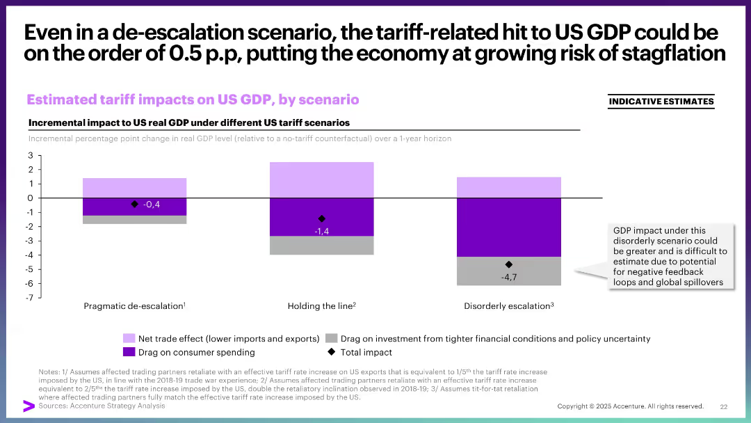
Three stacked bar graphs showing GDP impact under three tariff scenarios, using color-coded segments and a highlighted total impact point. Includes a side note and legend.
Market Analysis and Trends
Financial Services
This slide analyzes the estimated impact of tariffs on US GDP under three scenarios—pragmatic de-escalation, holding the line, and disorderly escalation. The visual emphasizes that even the mildest scenario could negatively impact GDP and highlights increased risk under more aggressive trade policies.
GDP, tariffs, US economy, stagflation, trade policy, scenarios, impact, de-escalation, escalation
Single Chart
Accenture
Saved
Contains column chart and pie charts detailing the financing versus intermediation in industry wallet composition, using blue tones.
Investment Analysis
Financial Services
Showcases opportunities for revenue growth in FICC financing by presenting current market positions and potential revenue increases.
FICC, client financing, industry wallet, revenue growth, market analysis, intermediation, financial services
Multiple Chart
Goldman Sachs
Saved
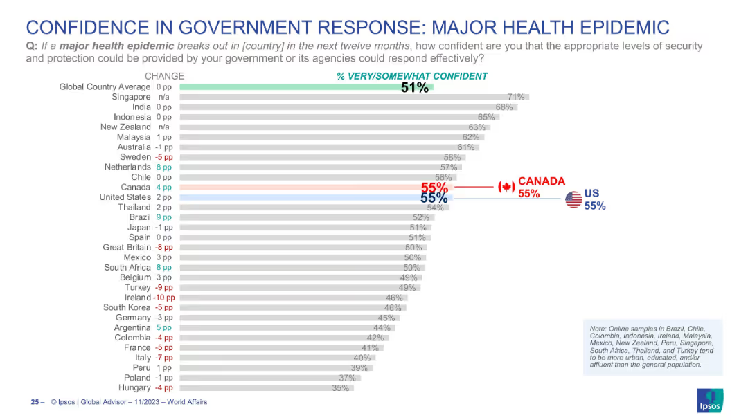
Bar chart visualizing public confidence in national government responses to health epidemics; Canada and US are marked clearly.
Regulatory and Compliance
Healthcare & Pharmaceuticals
The slide represents how confident citizens are in their government’s ability to respond to a major health epidemic. The global average of confidence is 51%, with both the US and Canada showing 55%. It sheds light on public trust in institutional crisis management and preparedness, particularly after the COVID-19 experience.
epidemic response, public confidence, government trust, healthcare, preparedness, Canada, USA, Ipsos
Single Chart
IPSOS
Saved
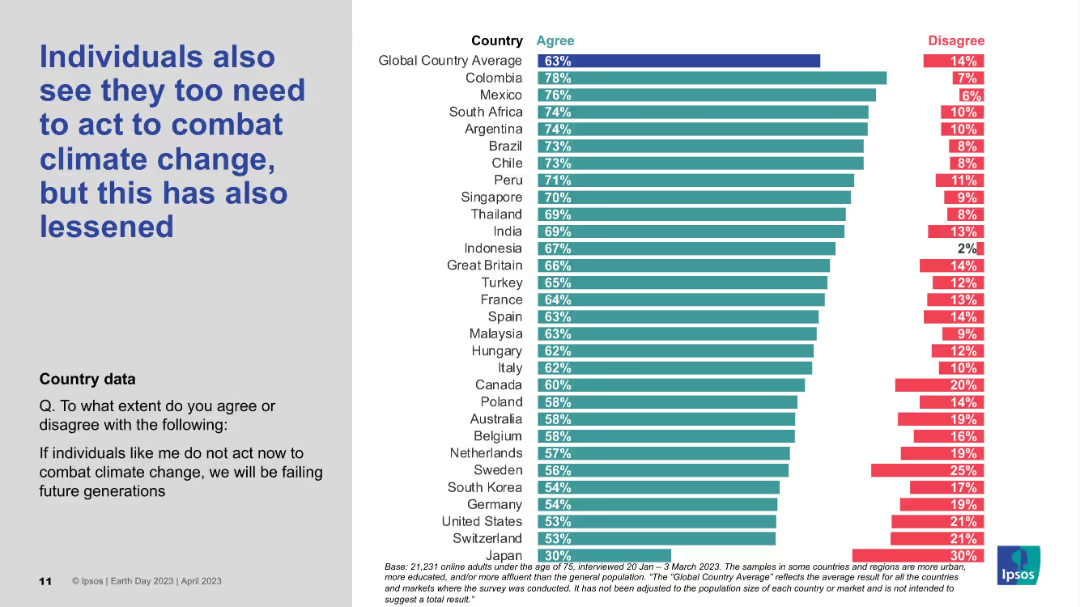
Vertical bar chart by country, measuring agreement/disagreement on individual responsibility; styled like previous slides.
Strategic Planning
Environmental Services & Sustainability
The data reflects decreasing belief that individuals must take personal action to address climate change. Despite the decline, countries like Colombia, Mexico, and South Africa still report strong agreement, while Japan shows the lowest individual sense of duty.
Personal responsibility, Climate perception, Ipsos survey, Individual action, Global data
Mixed Chart
IPSOS
Saved
Consists of a flow chart and additional graphics explaining Barclays' methodology for tracking and setting targets for financed emissions, aligned with the Paris Agreement.
Investment Analysis
Financial Services
Provides an overview of Barclays' approach to calculating financed emissions, including the methodologies used and the specific activities targeted for emission reduction across its portfolios.
financed emissions, Paris Agreement, methodology, sustainability, banking, investment analysis
Linear Flow
Barclays
Saved
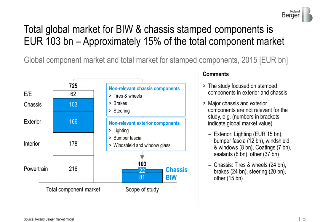
Bar chart showing breakdown of total component market and scope of BIW/chassis stamped components; comments explain exclusions
Investment Analysis
Industrial & Manufacturing
Defines the market scope for BIW and chassis stamped components, valued at EUR 103 bn in 2015. Excludes irrelevant chassis/exterior parts and focuses on relevant segments for detailed analysis.
BIW, chassis, stamped components, market size, EUR 103 bn, exterior, global component market
Mixed Chart
Roland Berger
Saved
Two line charts: one showing US household liquid savings by income quintile, and the other displaying US credit card delinquency rates by income group, highlighting growing disparities in consumer financial health.
Market Analysis and Trends
Consumer Goods
The slide analyzes the widening disparities in consumer financial health, showing that higher-income groups have substantial savings while lower-income groups face increasing credit card delinquencies and depleted savings.
Consumer Health, Spending, Savings, Delinquency, Financial Disparities
Multiple Chart
Accenture
Saved
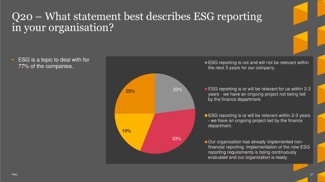
The slide displays a pie chart depicting the relevance of ESG reporting in organizations. Statements include whether ESG reporting is or will be relevant within the next 2-3 years, whether there is an ongoing project, and whether non-financial reporting has already been implemented. The chart uses various colors to represent different responses. A brief text section summarizes the importance of ESG for most companies.
Regulatory and Compliance
Financial Services
This slide presents survey data on the relevance and implementation of ESG reporting in organizations, indicating that a significant number of companies find ESG reporting important or have ongoing projects in this area. It provides insights into current compliance trends and future directions.
ESG reporting, compliance, finance, regulatory, trends
Single Chart
PwC/Strategy&
Saved
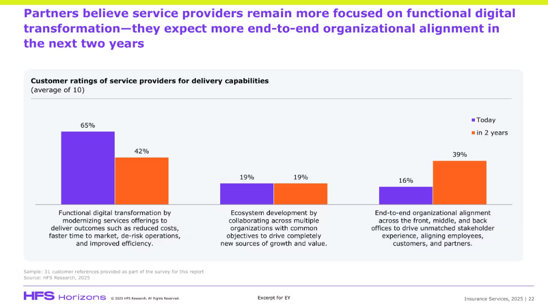
Similar bar chart format to previous slide but focused on partner perceptions; compares current and future priorities in service delivery.
Customer and Market Segmentation
Financial Services
Partners echo a sentiment similar to clients, indicating a strong current focus on cost-efficient transformation but predicting growth in end-to-end organizational alignment and ecosystem-based collaboration. The shift highlights strategic evolution in partner expectations of service delivery, aiming for deeper stakeholder integration.
Partner ratings, transformation, ecosystem, alignment, efficiency, service expectations
Single Chart
EY
Saved
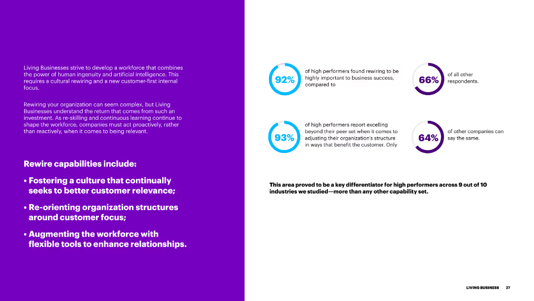
The slide features a purple background on the left and text on the right, with blue circular progress indicators. It discusses the importance of rewiring capabilities for better customer relevance.
Organizational Structure and Change
Government & Public Sector
This slide outlines the rewiring capabilities necessary for businesses to enhance customer relevance, including fostering a customer-focused culture and restructuring organizational frameworks.
rewiring, capabilities, customer relevance, culture, organizational structure
Multiple Chart
Accenture
Saved
Includes a textual section and a dot matrix chart that visually represents the level of agreement with statements regarding regulation and collaboration in AI. The design is clean, with green dots signifying the percentage agreement.
Regulatory and Compliance
Government & Public Sector
The slide highlights the desire for more government regulation and global collaboration on AI technologies. It presents data showing a significant majority of business leaders advocating for these measures to manage the unique risks of generative AI, raising concerns about leaving regulation solely to individual organizations.
AI, regulation, collaboration, government, leaders, risks, technology
Mixed Chart
Deloitte
Saved
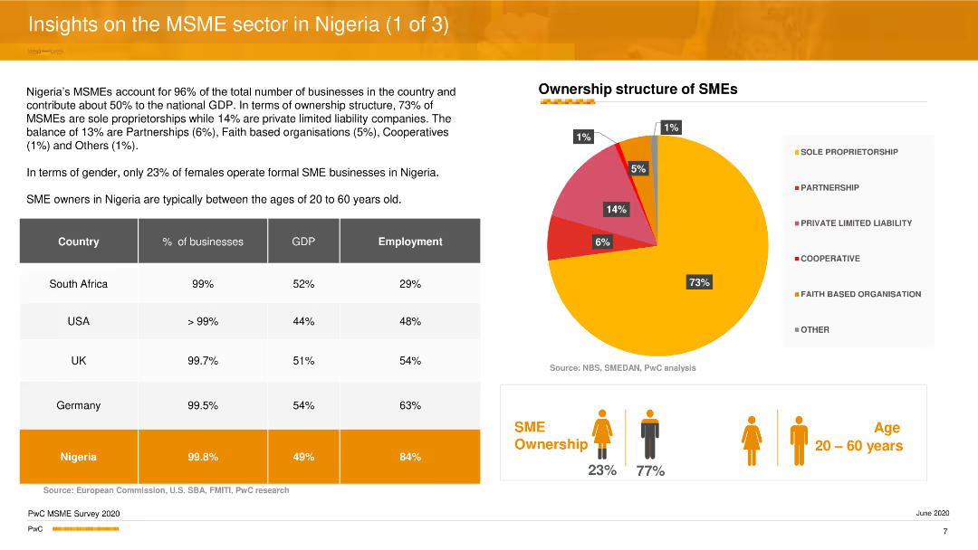
The slide features a pie chart showing the ownership structure of MSMEs in Nigeria, and a comparative table listing statistics on MSMEs in Nigeria versus other countries. Additional icons and text summarize key insights about gender distribution and age demographics of SME owners.
Industry Overview
Professional Services
The slide provides an overview of the MSME sector in Nigeria, highlighting the ownership structure, gender distribution, and age demographics of SME owners. It compares Nigerian MSMEs with those in other countries and discusses their contribution to the economy in terms of GDP and employment.
MSME sector, Nigeria, ownership structure, gender distribution, economic contribution
Mixed Chart
PwC/Strategy&
Saved
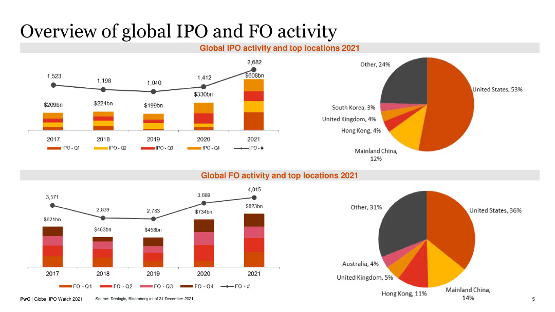
Contains two line charts showing historical IPO and FO activity with accompanying pie charts for top locations in 2021. Text blocks provide summary insights.
Financial Performance
Financial Services
It provides an overview of global IPO and FO activities over recent years, highlighting top regions and growth trends for 2021.
Global IPO, FO Activity, Historical Trends, Top Locations, 2021 Overview
Multiple Chart
PwC/Strategy&
Saved
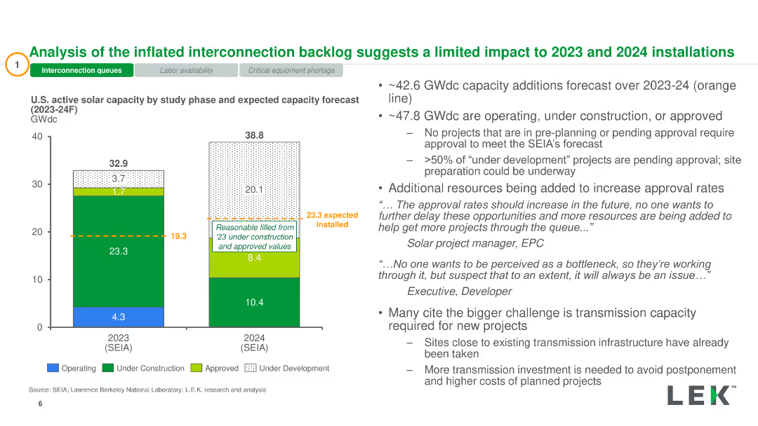
Two stacked bar charts showing U.S. active solar capacity by study phase for 2023 and 2024. Accompanied by bullet points with additional analysis.
Market Analysis and Trends
Energy & Utilities
Analysis of U.S. solar capacity growth and interconnection backlog impacts on future installations, including capacity additions and approval rates.
Solar Capacity, Interconnection, Backlog, Installation, Approval Rates
Mixed Chart
LEK
Saved
Visually segmented grid layout with four numbered blocks on a digital-tech style background.
Organizational Structure and Change
Healthcare & Pharmaceuticals
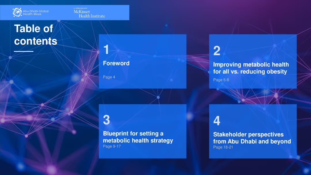
Lists four main sections of a report related to metabolic health and strategic planning. Each box provides section title and page range. Provides a clear overview for navigating the document.
table of contents, strategy, healthcare, metabolic health, report
Agenda
McKinsey
Saved
Features comparative pie charts showing revenue breakdowns, efficiently comparing data pre- and post-acquisition.
Mergers and Acquisitions
Financial Services
Analyzes the geographical revenue impact of Faurecia's acquisition of Clarion, highlighting the strategic benefits and increased market presence in Asia, particularly with Japanese OEMs.
acquisition, revenue, market presence, Asia, automotive, OEMs
Multiple Chart
Deutsche Bank
Saved
The slide has two line charts. The left chart shows U.S. real estate cap rates and 10-year U.S. Treasury yield from 1Q82 to 4Q23. The right chart presents the cap rate spreads over the same period.
Market Analysis and Trends
Real Estate & Construction
The slide analyzes the relationship between U.S. real estate cap rates and the 10-year U.S. Treasury yield, providing insights into investment yields and spreads over time. It's valuable for investors seeking to understand cap rate trends and their implications.
cap rates, Treasury yield, investment analysis, real estate, spreads, historical data
Multiple Chart
JP Morgan
Saved
Previous
Next
If nothing, comes up, please save your slides first
Create a FREE account to continue browsing
Receive Instant Access to 1,000+ slides from companies like McKinsey, Google, and Goldman Sachs
First Name
Last Name
Email
Password
I agree to all
Terms & Privacy Policy
Thank you! Your submission has been received!
Oops! Something went wrong while submitting the form.
Have an account?
Sign in
Column Chart
Heatmap
Chevron
Org Chart
Infographic
Callouts
Timeline
List
Graphic
Picture
Process Flow
Diagram
Paragraph
Map
Table
Framework
Subtitle
Takeaway Box
Icon
Other Chart
Radar Chart
Waterfall Chart
Mekko Chart
Pie Chart
Scatter Plot
Line Chart
Bar chart
Bullet points