My Account
My Slides
Search by Category
Companies
Slide Type
Use Case
Industry
Pricing
Templates
View All Templates
Download Template Slides
✦ AI
AI Prompt Library
AI Search
Feedback
Login
Logout
Get Started
Browse all Slides
Browse all Slides
Create a FREE Account
Instant access to 1,000+ real slides from top companies like McKinsey, BCG, Goldman Sachs, Google and many more!
First Name
Last Name
Email
Password
I agree to all
Terms & Privacy Policy
Thank you! Your submission has been received!
Oops! Something went wrong while submitting the form.
Have an account?
Sign in
Saved Slides
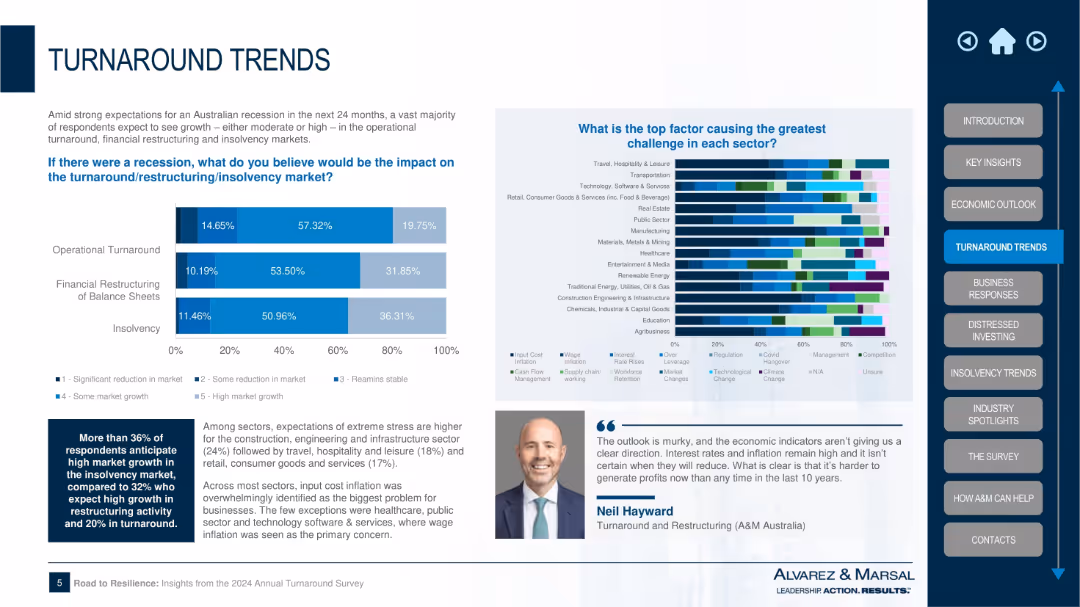
Dual-section layout with bar chart on recession impact across three restructuring areas and a multicolor stacked bar on sector-specific challenges; textual summary and expert quote included.
Strategic Planning
Professional Services
This slide discusses the potential impact of a recession on three key areas: operational turnaround, financial restructuring, and insolvency. It also identifies the top challenges for various sectors, with cost inflation being the most cited issue. The chart reveals significant stress expectations in construction, hospitality, and retail sectors.
recession impact, turnaround, insolvency, restructuring, sector stress, Alvarez & Marsal, inflation, market challenges, Australia
Multiple Chart
Alvarez & Marsal
Saved
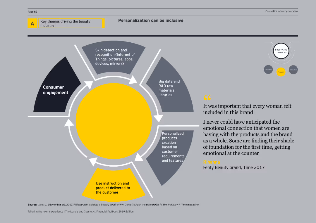
Features a diagram depicting consumer engagement, skin detection, big data, personalized products, and delivery mechanisms for inclusive personalization.
Market Analysis and Trends
Consumer Goods
Explores the role of personalization in the beauty industry, emphasizing inclusive approaches and advanced technological applications.
personalization, inclusivity, consumer engagement, skin detection, big data, beauty products, innovation, cosmetics, diagram, market analysis
Linear Flow
EY
Saved
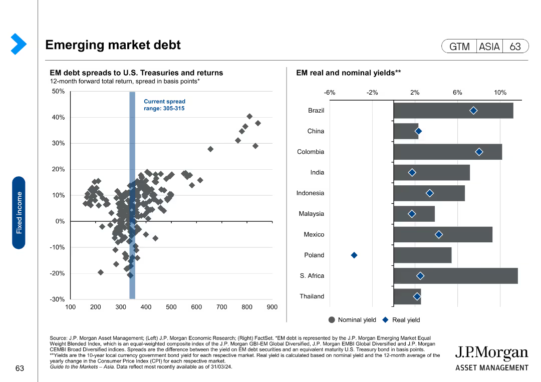
The slide shows a scatter plot of EM debt spreads and returns, and a bar chart of EM real and nominal yields.
Market Analysis and Trends
Financial Services
The slide provides an analysis of emerging market debt, highlighting spreads to U.S. Treasuries and real versus nominal yields in various countries.
emerging markets, debt spreads, nominal yields, real yields, financial analysis
Multiple Chart
JP Morgan
Saved
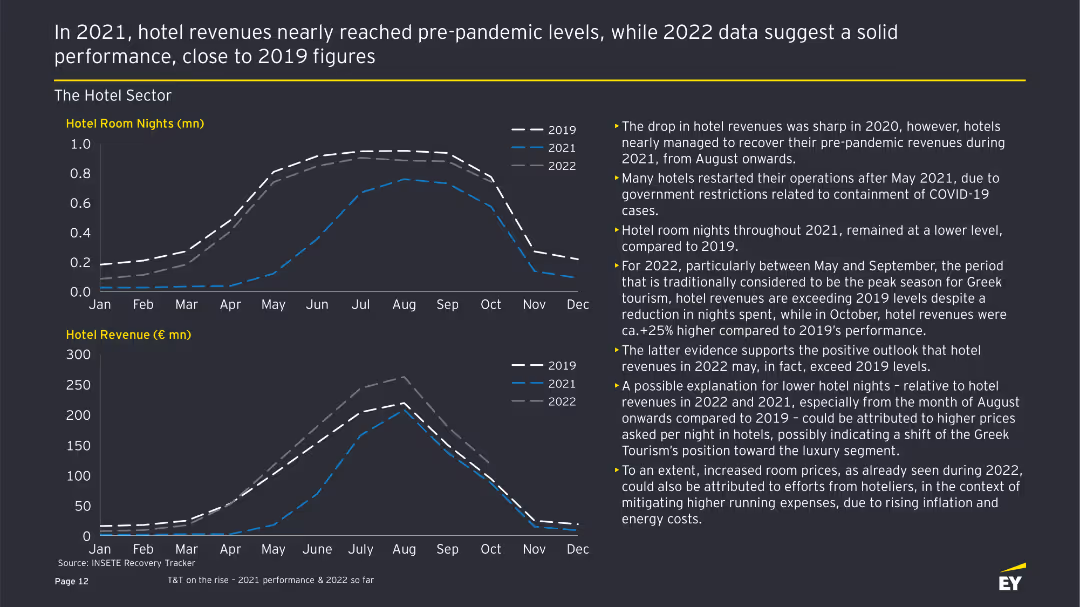
The slide features two line charts showing hotel room nights and revenue from 2019 to 2022, with accompanying text highlighting trends and performance.
Financial Performance
Hospitality & Tourism
This slide provides an analysis of the Greek hotel sector's performance, comparing room nights and revenue across different years, emphasizing recovery and growth trends.
Hotel performance, room nights, revenue analysis, financial performance, tourism trends
Multiple Chart
EY
Saved
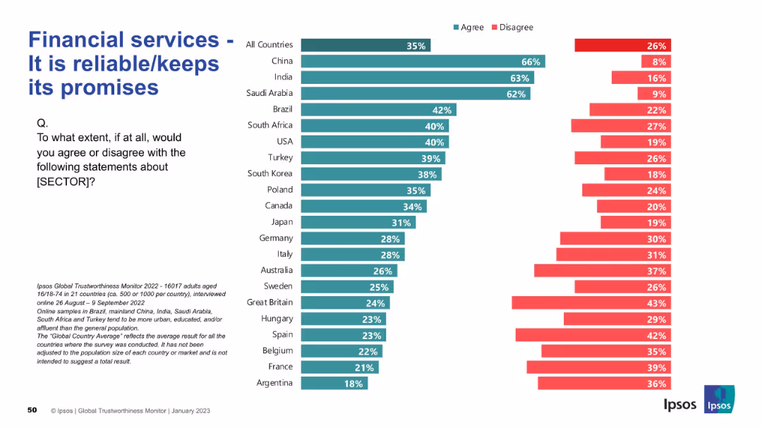
Bar chart format as with previous slides; left-aligned text and question; strong visual consistency
Strategic Planning
Financial Services
This slide assesses whether financial services are seen as reliable. China, India, and Saudi Arabia show high levels of agreement, while France, Argentina, and Belgium are among the least trusting. The global average is 35%.
reliability, promises, financial trust, countries, agreement, Ipsos, perception, strategic
Mixed Chart
IPSOS
Saved
Graphically rich slide with column charts depicting capital usage and developments in regulatory capital efficiency, alongside explanatory texts and arrows for emphasis.
Strategic Planning
Financial Services
Details the bank's strategic adjustments in capital management aimed at enhancing long-term shareholder value and financial stability through sustainable investments and efficiency improvements.
capital management, long-term value, financial stability, shareholder value, regulatory efficiency
Mixed Chart
Deutsche Bank
Saved
Displays a column chart indicating the median CO2 capture capacities of projects (in Mtpa) by region and status (in development, operational, completed, cancelled).
Strategic Planning
Energy & Utilities
Projects significant growth in the size of CCUS projects globally. Provides insights into the future capacities and development of various regions' CCUS initiatives.
CCUS, project size, growth, future development, CO2 capture, regional analysis, strategic planning, trends
Mixed Chart
Kearney
Saved
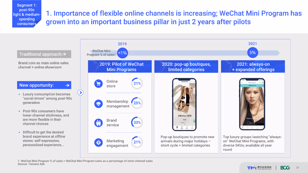
Timeline chart showing the growth of WeChat Mini Programs from 2019 to 2021. Includes key milestones like the introduction of pop-up boutiques and expanded offerings. Text explains the significance of these developments.
Technology and Digital Transformation
Retail & E-commerce
Discusses the growing importance of flexible online channels like WeChat Mini Programs for luxury brands. Shows the timeline of their implementation and growth, highlighting key milestones and their impact on business.
WeChat Mini Programs, online channels, luxury brands, digital transformation, business growth
Mixed Chart
BCG
Saved
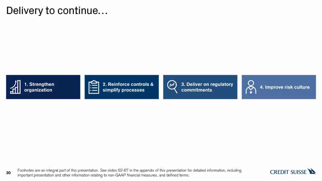
Horizontal bar chart with icons representing four steps: Strengthen organization, Reinforce controls, Deliver on commitments, and Improve risk culture.
Strategic Planning
Financial Services
The slide details the ongoing delivery strategy, focusing on strengthening organization, reinforcing controls, delivering on regulatory commitments, and improving risk culture.
delivery, strategy, organization, controls, commitments
Linear Flow
Credit Suisse
Saved
This slide showcases a global map highlighting major FoodTech hubs worldwide with detailed annotations and icons representing various regions.
Industry Overview
Agriculture & Food Production
Discusses the global distribution of FoodTech hubs, emphasizing the strengths and innovations of different regions, including the role of academic and governmental support in fostering these ecosystems.
FoodTech, global hubs, innovation, startups, academic support
Graphic
Accenture
Saved
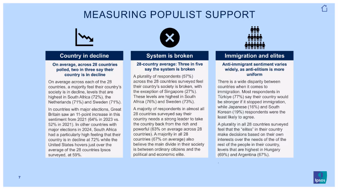
Three-column text slide with icons and bold subheadings over light blue background.
Market Analysis and Trends
Government & Public Sector
This slide outlines findings related to populist sentiment. It categorizes beliefs into three pillars: country in decline, broken systems, and views on immigration and elites. Key figures from 28-country averages support insights on political unrest.
populism, elite distrust, societal decline, Ipsos data, global opinion, political perception, immigration sentiment, broken system
Pillar
IPSOS
Saved
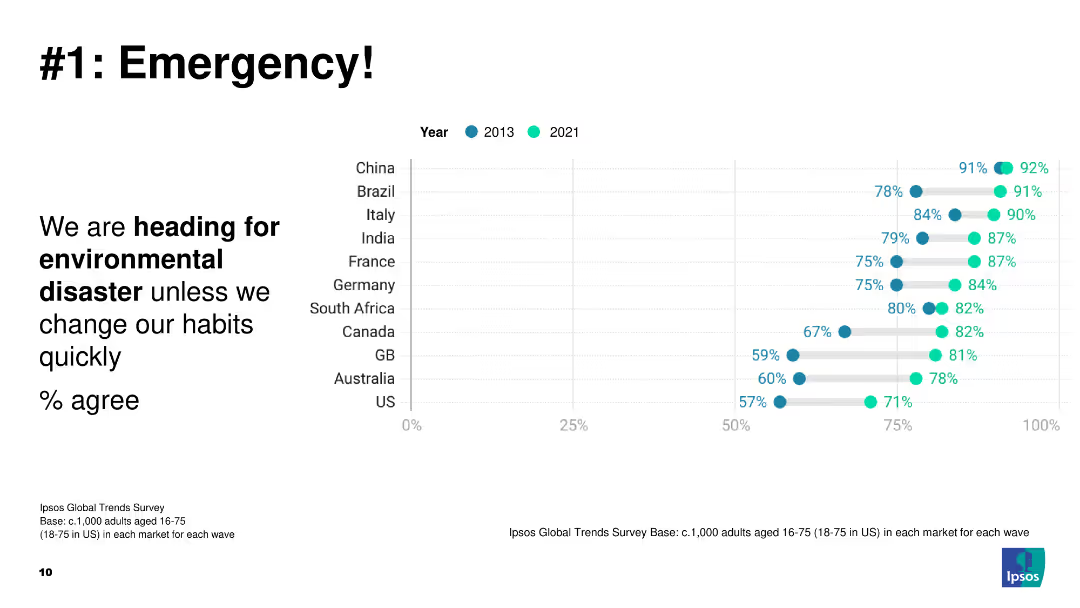
A dot plot showing the percentage of people agreeing that we are heading for environmental disaster unless habits change, comparing data from 2013 and 2021 across several countries.
Risk Assessment and Management
Environmental Services & Sustainability
The slide presents a critical view of global perceptions regarding environmental disaster. It compares data from 2013 and 2021, highlighting the urgency and growing awareness of the need for environmental action.
environmental disaster, global awareness, risk management, perception change, comparative data
Mixed Chart
IPSOS
Saved
The slide uses a comparative layout to illustrate three subsectors of industrial automation: Process Industry Automation, Discrete (Factory) Automation, and Warehouse Automation.
Market Analysis and Trends
Industrial & Manufacturing
The slide explains the different types of industrial automation and their applications across various end-industries, such as automotive, healthcare, and e-commerce.
industrial automation, subsectors, process industry, discrete automation, warehouse automation, end-industries
Diagram
LEK
Saved
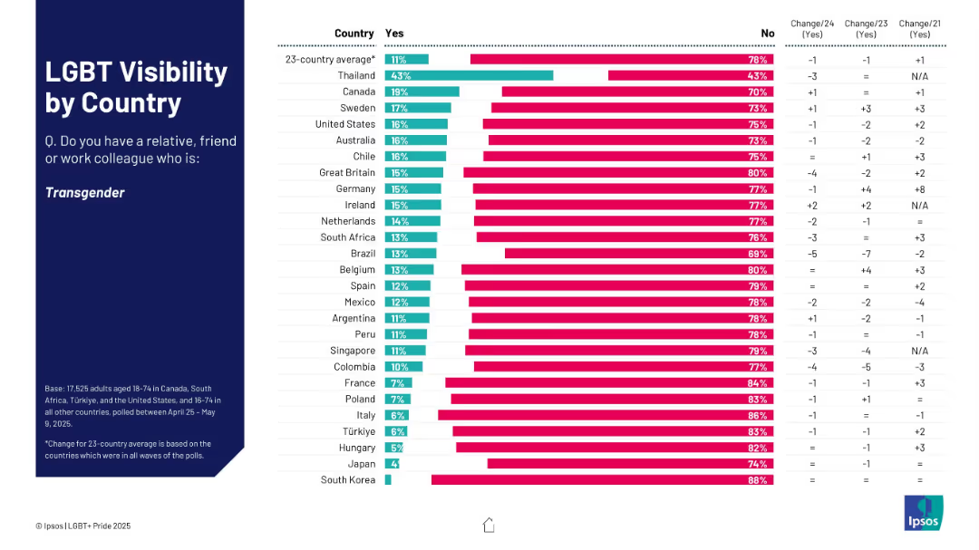
Bar chart showing % who know someone transgender; ranked by country with yes/no breakdown.
Market Analysis and Trends
Government & Public Sector
This slide assesses how many respondents know a transgender person, broken down by country. Thailand shows the highest visibility; South Korea and Japan the lowest. Change data is also displayed.
transgender, visibility, country ranking, social awareness, Ipsos survey
Mixed Chart
IPSOS
Saved
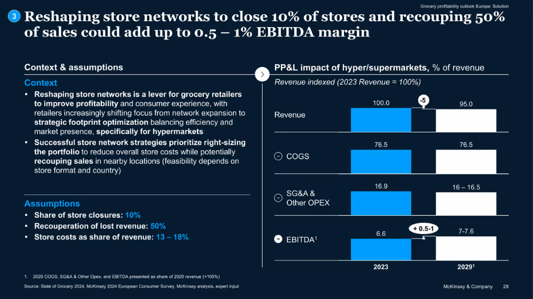
Context and assumptions on left; bar chart on right comparing 2023 and 2029 cost components. EBITDA uplift is marked with arrows.
Operational Efficiency
Retail & E-commerce
Proposes store network reshaping (10% closure) with 50% sales recouped to drive 0.5–1% EBITDA uplift. Assumptions on cost reduction and efficiency gains included.
store optimization, EBITDA, cost reduction, footprint, hypermarkets
Mixed Chart
McKinsey
Saved
The slide features a column chart showing potential annual increase in main banks' revenue per customer across nine countries, indicating additional banking and non-FS revenue. The layout includes a key takeaway box and explanatory text.
Market Analysis and Trends
Financial Services
The slide analyzes the potential revenue increase for banks through product and channel integration. It highlights a 20% uplift in revenue per customer, with country-specific details.
revenue, banking, integration, multiplier effect, financial services, customer advocacy, market analysis
Mixed Chart
Accenture
Saved
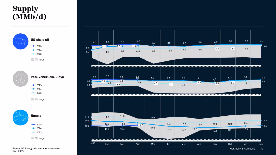
Panel chart for US shale, Iran/Venezuela/Libya, and Russia; shows 2023–2025 data with 5Y range overlay.
Operational Efficiency
Energy & Utilities
This slide presents oil production trends from specific geopolitical regions. US shale shows steady growth, while Iran/Venezuela/Libya and Russia remain relatively stable.
Shale Oil, Geopolitical Supply, Russia, Iran, Venezuela, Libya, Crude Oil
Mixed Chart
McKinsey
Saved
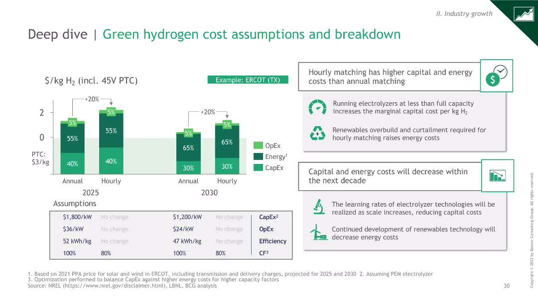
Column charts comparing OpEx, Energy, and CapEx for annual vs hourly matching in 2025 and 2030. Includes text boxes with insights on cost assumptions and learning rates.
Technology and Digital Transformation
Energy & Utilities
Column charts comparing OpEx, Energy, and CapEx for annual vs hourly matching in 2025 and 2030. Includes text boxes with insights on cost assumptions and learning rates.
This slide analyzes green hydrogen cost assumptions, focusing on the differences in costs between annual and hourly matching. It highlights key insights and future cost reductions.
Mixed Chart
BCG
Saved
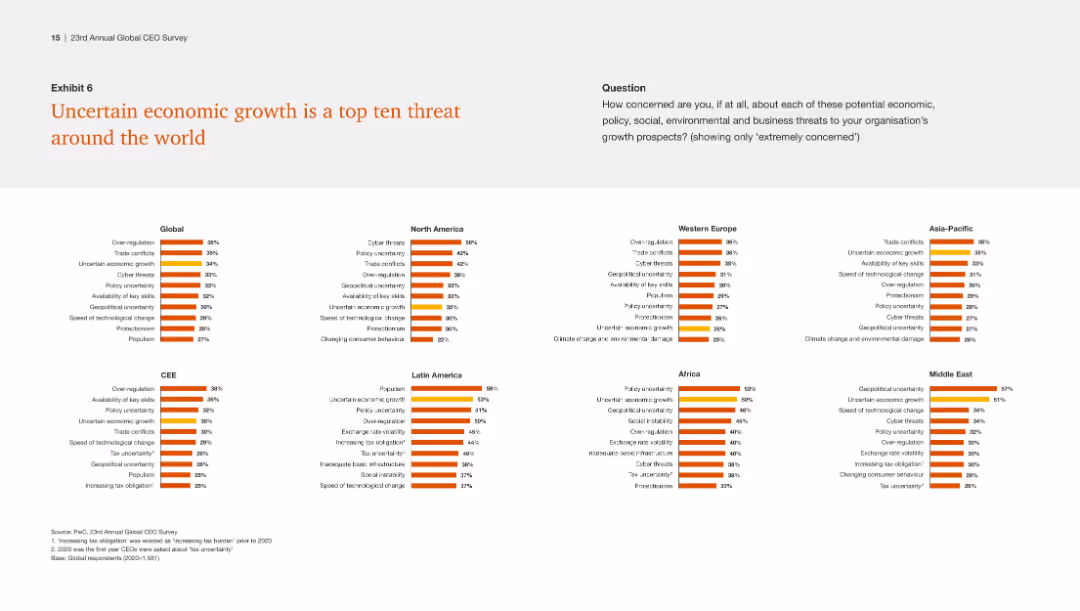
The slide includes multiple small column charts showing the top threats by region, emphasizing uncertain economic growth as a consistent top threat globally.
Risk Assessment and Management
Financial Services
This slide identifies uncertain economic growth as a prevalent threat across various regions, highlighting the need for global strategies to mitigate this risk.
Economic growth, global threats, regional analysis, uncertainty, strategy
Multiple Chart
PwC/Strategy&
Saved
The slide contains two column charts. The left chart shows the contribution to UK real GDP growth by different sectors. The right chart displays UK Purchasing Managers' Indices (PMI) over time. The charts are detailed and use various colors to distinguish data categories.
Market Analysis and Trends
Financial Services
The slide analyzes the UK's GDP growth and business activity through sector contributions and PMI trends, essential for economic analysis and business strategy.
UK GDP, business surveys, PMI, sector growth, economic analysis
Multiple Chart
JP Morgan
Saved
This slide has a column chart showing revenue from 2017 to 2021, a table for market leadership, and various text annotations. The layout is balanced between visual data and descriptive information.
Financial Performance
Financial Services
Highlights J.P.Morgan's revenue growth and leadership positions in the Treasury Services sector, despite challenges such as price compression.
Revenue, Treasury Services, Market Share, Leadership, Growth, Financial Services, J.P.Morgan
Mixed Chart
JP Morgan
Saved
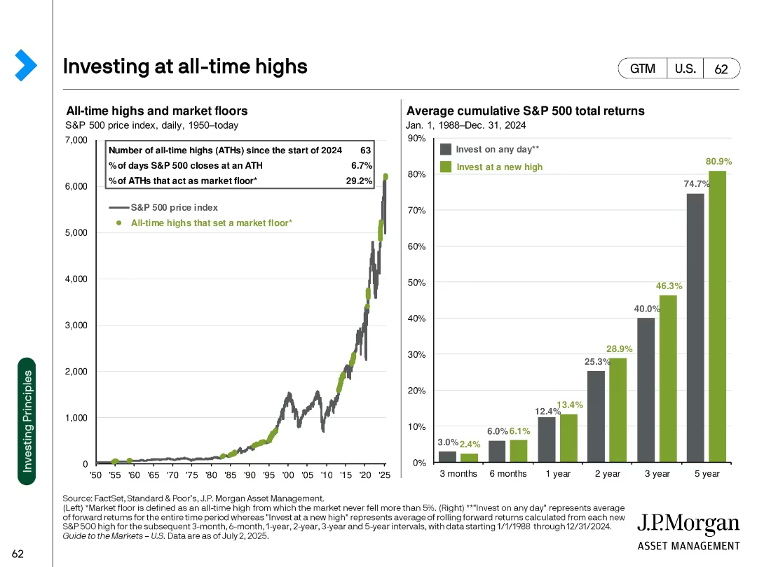
Two-panel slide with a line chart (S&P 500 index) and a bar chart (return ranges)
Market Analysis and Trends
Financial Services
Examines implications of investing at market all-time highs, using S&P 500 data. Highlights that investing at highs still yields strong long-term returns on average.
market timing, S&P 500, all-time highs, forward returns, historical performance, investment behavior, risk, long-term gains
Multiple Chart
JP Morgan
Saved
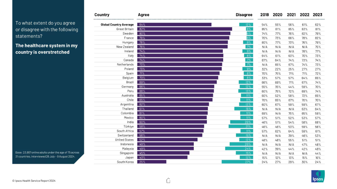
Bar chart comparing agreement and disagreement percentages with the statement across countries; time trend shown at right.
Risk Assessment and Management
Healthcare & Pharmaceuticals
This slide explores public sentiment about healthcare system capacity. Countries like the UK, Sweden, and France report very high agreement that systems are overstretched. The chart helps identify systemic pressure points globally.
overstretched healthcare, system capacity, perception, strain, survey
Mixed Chart
IPSOS
Saved
This slide includes a box plot and a column chart showing the distribution of average daily time spent on search engines. Two tables provide detailed statistics about the time and proportion of online time spent on search engines.
Market Analysis and Trends
Technology & Software
The slide presents information on the average daily time spent on Search Engines, with detailed statistics including mean, median, and percentile distributions, based on data from Ipsos Iris Clickstream Data.
Search Engines, Daily Time, Statistics, Box Plot, Column Chart
Mixed Chart
IPSOS
Saved
The slide includes a bar chart showing government industrial policy commitments and a line chart depicting increasing net debt as a percentage of GDP for advanced economies.
Regulatory and Compliance
Government & Public Sector
The slide discusses the impact of industrial policies on government finances, highlighting spending commitments and the resulting fiscal sustainability challenges in advanced economies.
industrial policy, government spending, fiscal sustainability, GDP, debt
Multiple Chart
Accenture
Saved
Previous
Next
If nothing, comes up, please save your slides first
Create a FREE account to continue browsing
Receive Instant Access to 1,000+ slides from companies like McKinsey, Google, and Goldman Sachs
First Name
Last Name
Email
Password
I agree to all
Terms & Privacy Policy
Thank you! Your submission has been received!
Oops! Something went wrong while submitting the form.
Have an account?
Sign in
Column Chart
Heatmap
Chevron
Org Chart
Infographic
Callouts
Timeline
List
Graphic
Picture
Process Flow
Diagram
Paragraph
Map
Table
Framework
Subtitle
Takeaway Box
Icon
Other Chart
Radar Chart
Waterfall Chart
Mekko Chart
Pie Chart
Scatter Plot
Line Chart
Bar chart
Bullet points