Create a FREE Account
Instant access to 1,000+ real slides from top companies like McKinsey, BCG, Goldman Sachs, Google and many more!
First Name
Last Name
Email
Password
I agree to all
Terms & Privacy Policy
Thank you! Your submission has been received!
Oops! Something went wrong while submitting the form.
Have an account?
Sign in
Library
Templates
Courses
Pricing
My Account
My Slides
My Templates
✦ AI
AI Prompt Library
AI Search
Sign in
Start Here
Logout
My Saved Slides
Slide contains multiple column charts showing financial metrics from 2021 to 2023 with projections for 2026.
Financial Performance
Financial Services
Highlights key financial targets and progress of a financial institution over several years.
financials, targets, projections, banking, metrics
Multiple Chart
Barclays
Saved
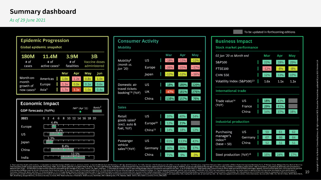
The slide features a comprehensive dashboard with metrics on epidemic progression, consumer activity, and business impact. It uses a dark background with colorful data points for clarity.
Performance Metrics and KPIs
Healthcare & Pharmaceuticals
The summary dashboard provides an overview of various metrics, including epidemic progression, economic impact, consumer activity, and business performance as of June 2021.
dashboard, metrics, epidemic, economic impact, business performance
Mixed Chart
BCG
Saved
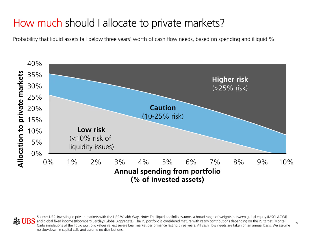
A column chart showing allocation to private markets based on risk levels. The chart categorizes risks into Low risk, Caution, and Higher risk with a smooth gradient background.
Investment Analysis
Financial Services
The slide explains the allocation of investments to private markets based on annual spending and risk levels. It helps investors understand potential liquidity risks.
Allocation, Risk, Private Markets, Spending, Liquidity
Single Chart
UBS
Saved
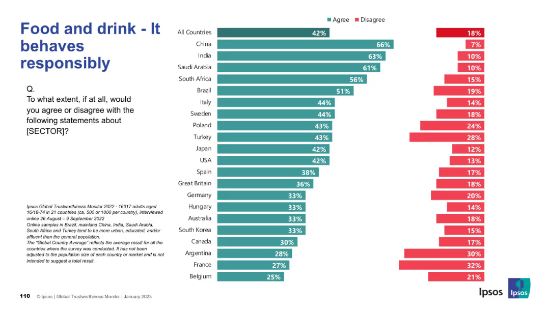
Split bar chart by country with “Agree” and “Disagree” percentages in teal and red; left-aligned question text.
Market Analysis and Trends
Consumer Goods
This slide shows the level of public agreement across countries with the statement that the food and drink sector behaves responsibly. It features a comparative bar chart of 21 countries showing agreement and disagreement rates.
trustworthiness, food sector, behavior, global opinions, Ipsos, consumer perceptions, responsibility, countries, chart, bar comparison
Mixed Chart
IPSOS
Saved
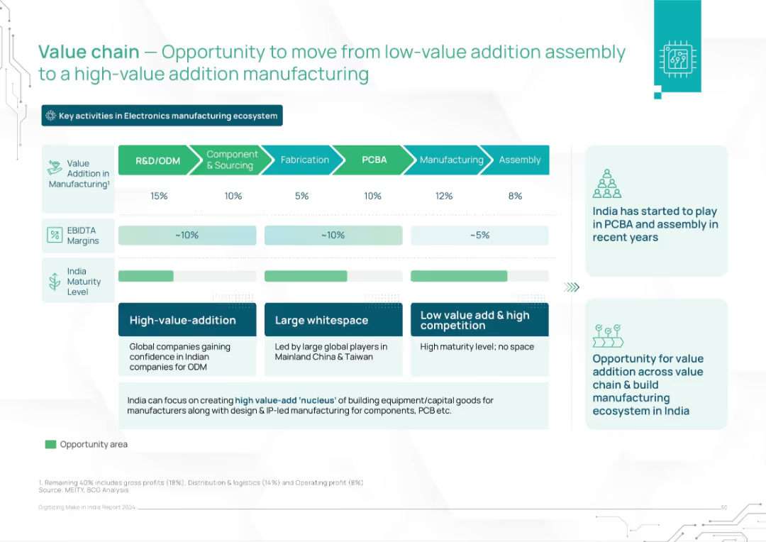
Horizontal value chain layout across 6 stages, with value addition, EBITDA, and maturity level indicators. Includes strategic suggestions.
Operational Efficiency
Consumer Goods
The slide analyzes the electronics manufacturing value chain and highlights India's positioning and whitespace. It promotes a shift from low-margin assembly to high-value activities like R&D and PCBA, suggesting targeted capacity building.
value chain, manufacturing, PCBA, India, electronics, value addition, margins, strategy, ODM
Mixed Chart
BCG
Saved
The slide presents a data-driven layout with bullet points, icons, and statistics to showcase the capabilities in digital-underwriting and data analytics.
Technology and Digital Transformation
Financial Services
Describes JPMorgan Chase's data assets and their applications in digital-underwriting, credit line increases, and fraud detection to improve efficiency and customer experience.
Digital-underwriting, data analytics, fraud detection, efficiency, customer experience
Pillar
JP Morgan
Saved
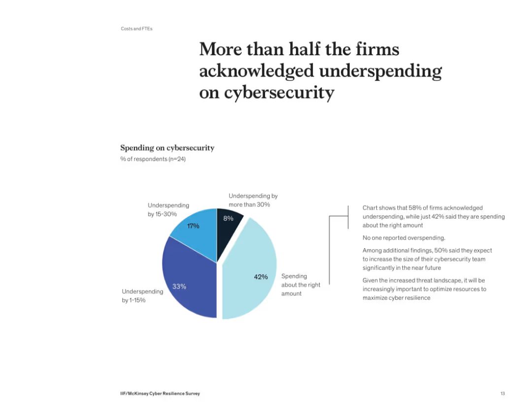
Donut-style pie chart showing distribution of cybersecurity spending levels. Supporting text on the right details implications of underinvestment.
Risk Assessment and Management
Financial Services
58% of firms admit they’re underspending on cybersecurity, with no firm reporting overspending. Many plan to grow their cybersecurity teams. The slide underscores the need to optimize security investments to align with growing threats and reduce risk exposure.
cybersecurity, budget, spending, underinvestment, risk, survey, financial firms
Mixed Chart
McKinsey
Saved
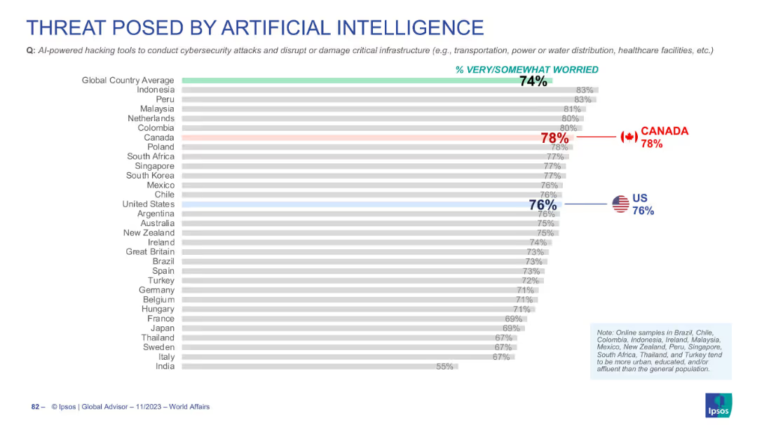
Horizontal bar chart ranking countries' concerns over AI-powered hacking tools
Risk Assessment and Management
Artificial Intelligence
Survey data highlighting global concern (74%) about AI-driven cybersecurity threats. Canada and the US show above-average levels of concern at 78% and 76% respectively.
AI hacking, cybersecurity, critical infrastructure, global survey, public worry
Single Chart
IPSOS
Saved
Incorporates icons and split arrows to visualize proposed changes in tax regulations for 2018, focusing on manufacturing, economic zones, and individual tax brackets.
Regulatory and Compliance
Government & Public Sector
Details proposed tax amendments in Namibia and their expected revenue impacts, essential for stakeholders in policy-making and fiscal planning. The slide outlines changes aimed at enhancing revenue through adjustments in tax structures.
Tax, Amendments, Revenue, Policy, Law
Framework
PwC/Strategy&
Saved
A comparative slide with vertical bars showing data over time and a diagram explaining 'value,' supported by clear text annotations and monetary figures.
Technology and Digital Transformation
Telecommunications
Discusses the increasing value that users derive from the nbn™ network over the years, including explanations of the calculations and implications for consumer choices.
nbn, Market Value, Consumer Choice, Analysis, Economic Trends
Multiple Chart
Accenture
Saved
Features a detailed process flow diagram of the H₂ value chain, highlighting upstream, midstream, and downstream opportunities for carbon fiber vessels.
Strategic Planning
Industrial & Manufacturing
The slide identifies strategic opportunities for carbon fiber vessels within the H₂ value chain, covering storage, transportation, and end-use markets.
H₂, Carbon Fiber Vessels, Value Chain, Opportunities, Storage
Linear Flow
Roland Berger
Saved
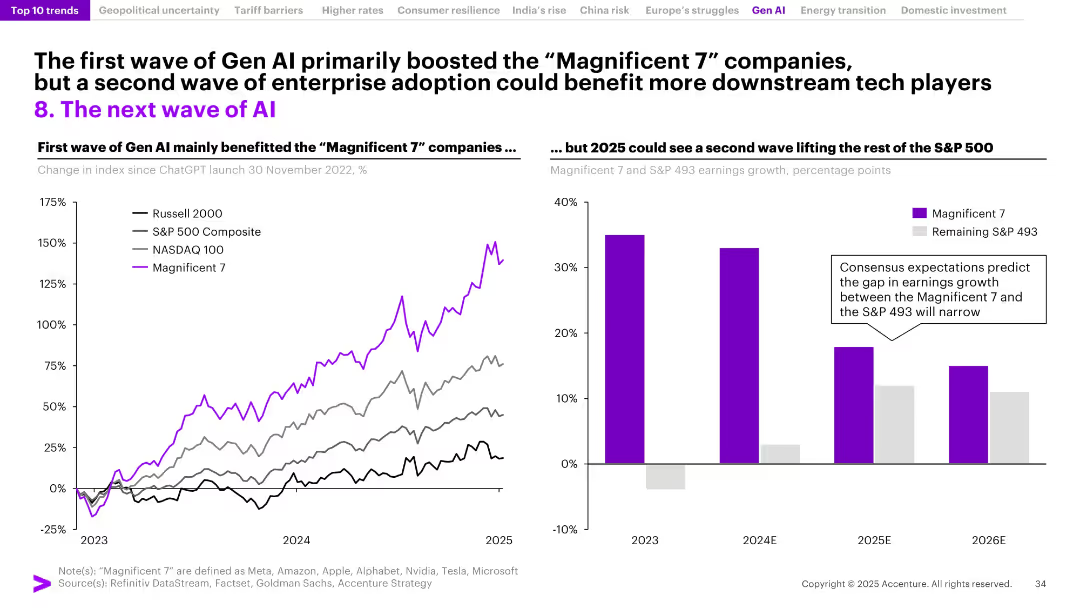
Two-part layout: left graph of index growth post-Gen AI launch; right bar chart comparing Magnificent 7 vs. S&P 493 earnings growth.
Technology and Digital Transformation
Artificial Intelligence
This slide contrasts the Gen AI-driven boom of the Magnificent 7 stocks with forecasts for broader adoption. It suggests that while early gains were concentrated in tech giants, enterprise AI adoption in 2025 may distribute benefits more evenly across the S&P 500.
Gen AI, Magnificent 7, S&P 500, earnings growth, stock indices, enterprise AI, adoption wave, technology sector, market trends
Multiple Chart
Accenture
Saved
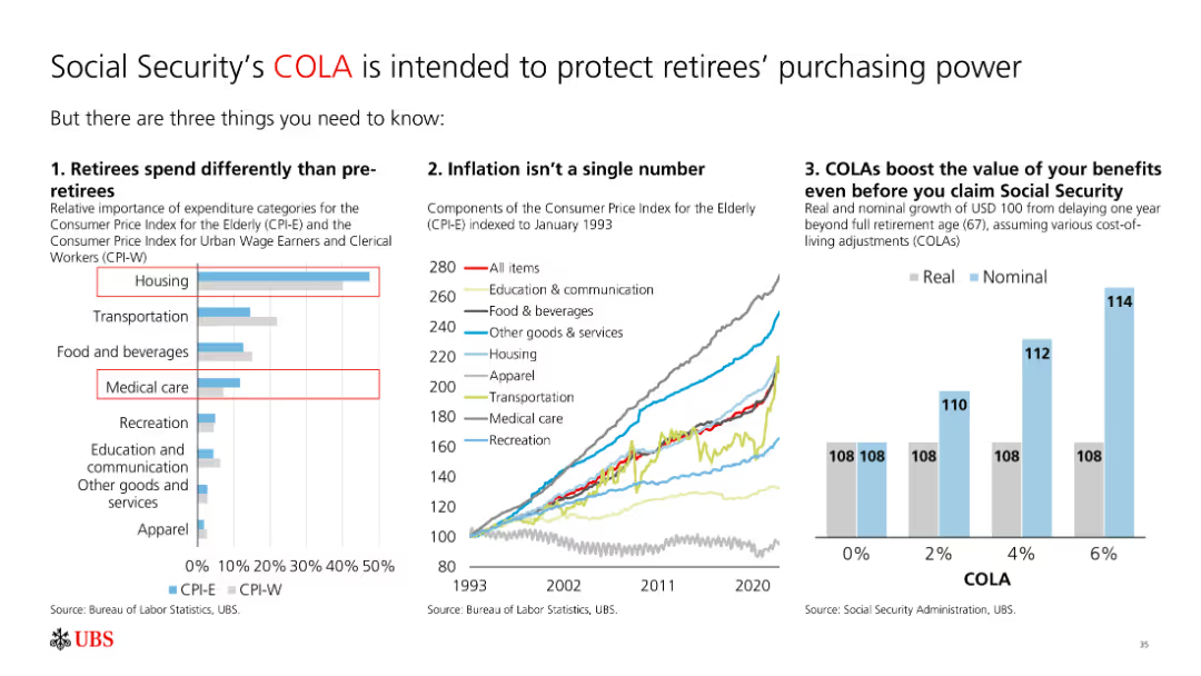
The slide features a bar chart, a line chart, and a column chart. It includes text and multiple visual elements like charts and graphs, making it moderately complex.
Regulatory and Compliance
Financial Services
The slide explains how cost-of-living adjustments (COLA) protect retirees' purchasing power by showing differences in spending, inflation impact, and benefits growth.
COLA, retirees, inflation, spending, benefits, purchasing power
Multiple Chart
UBS
Saved
The slide displays a column chart comparing the personal luxury goods market by geography and consumer nationality between 2016 and 2017. It uses color distinctions in red and gray to represent different areas and consumer groups, highlighting shifts in market compositions and growth rates.
Market Analysis and Trends
Consumer Goods
Examines growth in the personal luxury goods market, detailing shifts by geographical and consumer nationality perspectives from 2016 to 2017. Emphasizes the accelerating purchases in regions and among different consumer bases, particularly noting the substantial growth among Chinese consumers.
luxury goods, market growth, geographical analysis, consumer trends
Multiple Chart
Bain
Saved
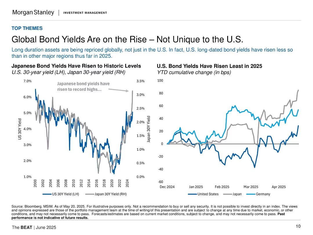
Two line charts comparing Japanese and U.S. bond yields; minimalist layout with dual-axis and legend.
Market Analysis and Trends
Financial Services
This slide analyzes global long-duration bond repricing, emphasizing that U.S. yields have risen less than in Japan or Germany. Charts show rising yields and cumulative changes across regions in 2025.
bond yields, U.S., Japan, Germany, interest rates, global market, long-term bonds, 2025, Morgan Stanley, inflation
Multiple Chart
Morgan Stanley
Saved
Includes a column chart forecasting asset tokenization market size from FY23B to FY30F, categorized by asset types. Text on the right provides demand and supply insights for investing in tokenized assets.
Technology and Digital Transformation
Financial Services
Explores the potential value of asset tokenization to blockchains, with market forecasts and insights into the demand and supply dynamics of investing in tokenized assets.
tokenization, blockchain, market forecast, demand, supply
Mixed Chart
EY
Saved
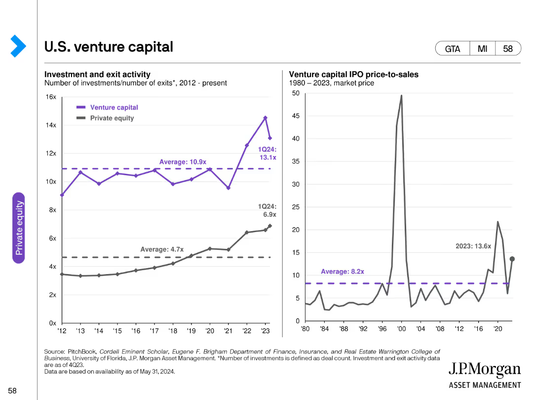
The slide features two line charts: one showing venture capital investment and exit activity, and the other depicting IPO price-to-sales ratios over time.
Investment Analysis
Financial Services
It provides a detailed analysis of U.S. venture capital activities, highlighting investment and exit trends as well as IPO price-to-sales ratios.
venture capital, U.S., investments, exits, IPO, price-to-sales, trends, financial, data analysis
Multiple Chart
JP Morgan
Saved
The slide shows a column chart under the title "Family law application breakdown, ('000) 2016-17". It contains a legend explaining the colors representing different types of applications for FCC and FCoA. At the bottom, the source is referenced as PwC with the date of April 2018.
Regulatory and Compliance
Government & Public Sector
The slide analyzes different types of family law applications and their distribution between FCC and FCoA, with emphasis on the caseload and order types processed by each court. The column chart illustrates the predominance of divorce applications in the FCC and consent orders in the FCoA.
family law, caseload, applications, orders, FCC, FCoA, column chart, PwC, analysis
Mixed Chart
PwC/Strategy&
Saved
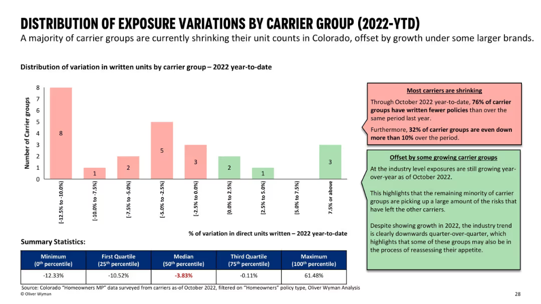
Bar chart grouped by unit variation ranges; supported by color-coded comments and summary stats at the bottom.
Risk Assessment and Management
Financial Services
Analyzes changes in written units by carrier groups in 2022. Most carriers are shrinking, with 76% reducing exposure, while a few are growing. A summary table shows statistics like median and quartile values for unit variation percentages.
insurance carriers, exposure variation, market trends, growth vs shrinkage
Mixed Chart
Oliver Wyman
Saved
A dense slide featuring charts, circular diagrams, and statistical data. Colors are used to differentiate various financial services sectors, with blue tones dominating.
Market Analysis and Trends
Financial Services
This slide shows the market share growth in different sectors of financial services, emphasizing the company's leading position in the market.
market share, financial services, client-centric, growth, data, charts, competitive, statistics
Diagram
JP Morgan
Saved
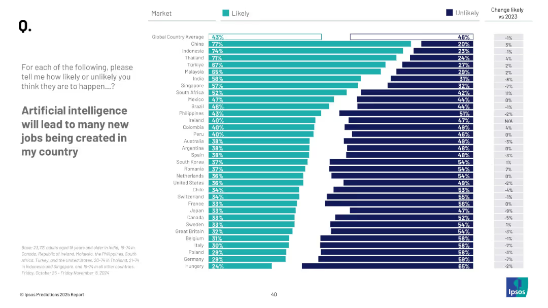
Horizontal bar chart; teal for "Likely", navy for "Unlikely"; countries listed with % values; right column shows change vs 2023
Market Analysis and Trends
Artificial Intelligence
This slide presents public opinion data from 29 countries on whether AI will create new jobs domestically. It ranks countries by perceived likelihood, with a global average of 43% likely.
AI, employment, public perception, survey, Ipsos, job creation, 2025 prediction, workforce, innovation, optimism
Mixed Chart
IPSOS
Saved
This slide displays three bar graphs comparing Fifth Third's performance metrics with peers, including ROTEC, ROA, and efficiency ratio. A textual sidebar outlines the significance of these metrics, with color coding to highlight Fifth Third's ranking. The layout is organized to facilitate direct comparison between the company and its competitors.
Financial Performance
Financial Services
The slide evaluates Fifth Third's profitability metrics, placing it within the top quartile among peers. The focus is on adjusted metrics for ROTEC, ROA, and efficiency ratio, with historical comparisons to indicate progress. This slide is useful for presentations to investors or internal stakeholders, detailing the bank's competitive financial health and operational efficiency.
Profitability, Metrics, Comparison, ROTEC, ROA, Efficiency Ratio, Financial Health, Operational Efficiency, Financial Services
Multiple Chart
Goldman Sachs
Saved
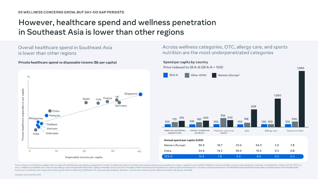
Left: scatter plot of healthcare spend vs. disposable income; Right: bar chart comparing spend per category by region; a table summarizes annual per capita spend.
Financial Performance
Healthcare & Pharmaceuticals
Illustrates how Southeast Asia lags in healthcare and wellness spending compared to regions like Western Europe. The data shows that categories like OTC, allergy care, and sports nutrition are underpenetrated. Aims to highlight the market opportunity for growth in these sectors.
healthcare spend, disposable income, wellness penetration, OTC, SEA
Multiple Chart
Bain
Saved
Donut chart showing market share by country/region in the ICT industry for 2021, alongside a column chart projecting global ICT spending from 2021 to 2023.
Technology and Digital Transformation
Technology & Software
The slide highlights the importance of a mature ICT industry as a foundation for technological innovation. It shows the market share of different regions in the ICT sector and projects an increase in global ICT spending, emphasizing the role of ICT in economic development.
ICT Industry, Market Share, Global Spending
Multiple Chart
Roland Berger
Saved
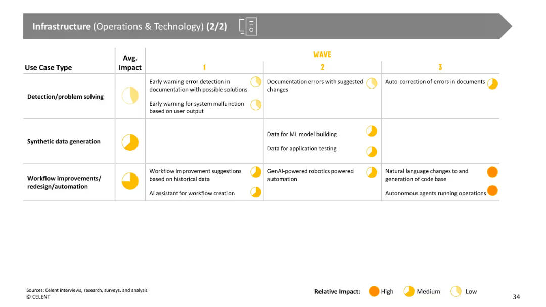
Continuation of prior slide with tabular use case categories and impact levels, using yellow circles to represent impact.
Operational Efficiency
Financial Services
Further categorizes infrastructure-related GenAI use cases like error detection, synthetic data generation, and workflow automation. Emphasis is placed on the projected impact and the timeline of adoption in different waves.
error detection, synthetic data, workflow, automation, GenAI, infrastructure
Single Chart
Oliver Wyman
Saved
Previous
Next
If nothing, comes up, please save your slides first
Create a FREE account to continue browsing
Receive Instant Access to 1,000+ slides from companies like McKinsey, Google, and Goldman Sachs
First Name
Last Name
Email
Password
I agree to all
Terms & Privacy Policy
Thank you! Your submission has been received!
Oops! Something went wrong while submitting the form.
Have an account?
Sign in
Column Chart
Heatmap
Chevron
Org Chart
Infographic
Callouts
Timeline
List
Graphic
Picture
Process Flow
Diagram
Paragraph
Map
Table
Framework
Subtitle
Takeaway Box
Icon
Other Chart
Radar Chart
Waterfall Chart
Mekko Chart
Pie Chart
Scatter Plot
Line Chart
Bar chart
Bullet points