Create a FREE Account
Instant access to 1,000+ real slides from top companies like McKinsey, BCG, Goldman Sachs, Google and many more!
First Name
Last Name
Email
Password
I agree to all
Terms & Privacy Policy
Thank you! Your submission has been received!
Oops! Something went wrong while submitting the form.
Have an account?
Sign in
Library
Templates
Courses
Pricing
My Account
My Slides
My Templates
✦ AI
AI Prompt Library
AI Search
Sign in
Start Here
Logout
My Saved Slides
Horizontal bar chart showing top-rated service provider attributes based on client scoring. Orange bars highlight top metrics.
Human Resources and Talent Management
Artificial Intelligence
The slide presents client feedback on AADA providers, scoring highest in service delivery and account management. It also highlights strengths in partnerships, innovation, and talent attraction—reinforcing provider credibility.
service quality, AADA providers, client score, talent, delivery, management, partnerships
Single Chart
KPMG
Saved
Two-part slide: revenue mix bar charts and loan growth bar chart with net write-off rates; clear segmentation between fee and interest revenue
Market Analysis and Trends
Financial Services
This slide presents a stable revenue mix dominated by spend and fee revenues (80%) through 2023, alongside growth in card member loans. It underscores the low net write-off rates, illustrating sound credit performance even with lending expansion.
revenue mix, card loans, fee-based products, interest income, credit quality, write-off rates
Multiple Chart
McKinsey
Saved
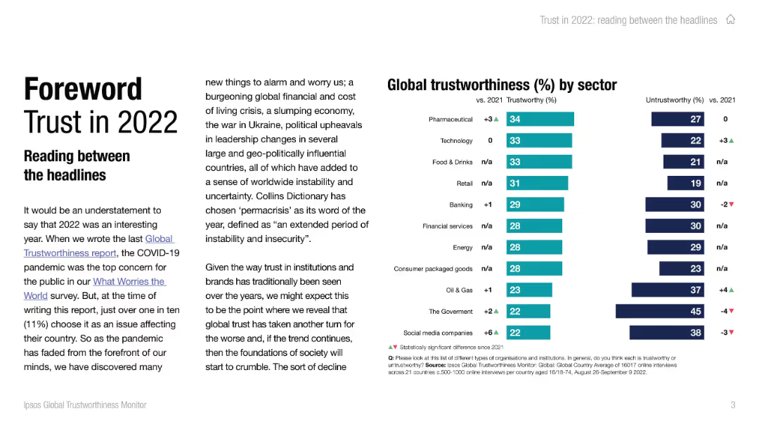
Ipsos-standard slide design. Countries' scores are shown in horizontal bars comparing trust and distrust in business leaders.
Strategic Planning
Professional Services
The slide provides a global comparison of trust in business leaders. Indonesia scores highest, Japan and Hungary lowest. Most countries show more distrust than trust.
CEOs, business leaders, executive trust, public opinion, Ipsos, country comparison, leadership
Mixed Chart
IPSOS
Saved
Column charts and tables showing NII contributions and impacts over time. Uses green, blue, and grey colors for data segmentation.
Financial Performance
Financial Services
This slide details the expected NII contributions from Non-Core and swaps, providing medium-term outlook and potential impacts on net interest margin (NIM).
NII, Non-Core, swaps, contributions, NIM
Mixed Chart
Barclays
Saved
A data-heavy slide, it showcases a comparison of online activity incidence with color-coded bars, highlighting the low digital activity levels across sectors.
Market Analysis and Trends
Technology & Software
This slide analyzes the incidence of various online activities in metropolitan versus non-metropolitan areas, illustrating a stark contrast in digital adoption.
online activity, digital adoption, e-commerce, payments, food delivery, metropolitan, non-metropolitan
Table
Kearney
Saved
The slide includes a column chart illustrating company turnover ranges. The most common range is 30-100 million EUR, followed by 100-250 million EUR.
Market Analysis and Trends
Financial Services
This slide reveals that nearly a quarter of responses came from companies with turnover between 30 and 100 million EUR, with 20% between 100-250 million EUR.
Turnover, Financial, Column Chart, PwC, Survey, 2022, CFOs
Mixed Chart
PwC/Strategy&
Saved
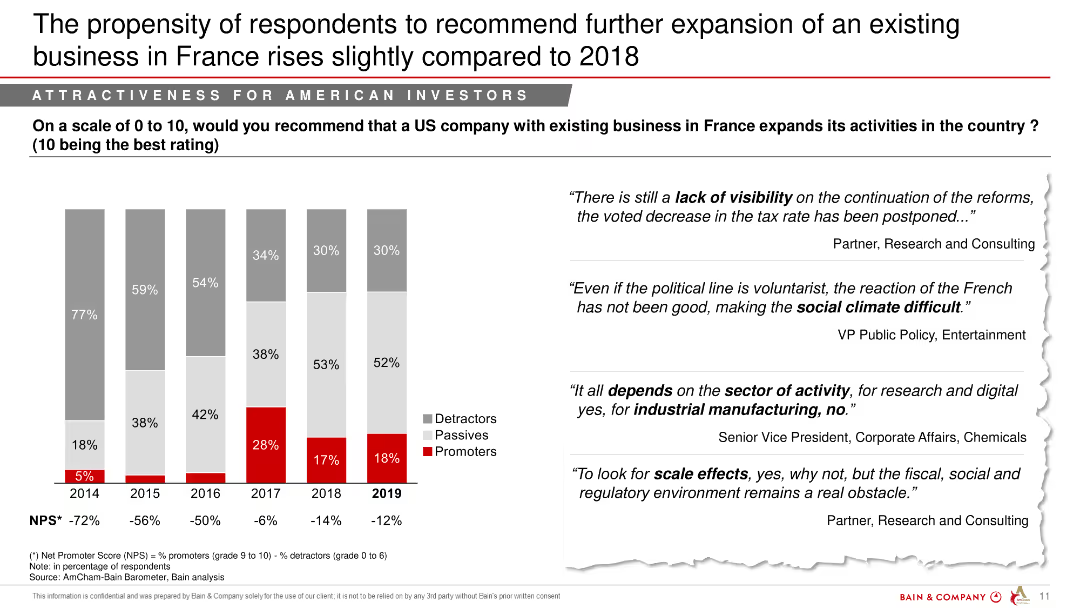
The slide presents a statement on talent recruitment priorities with an arrow pointing towards the statistic that 87% of companies prefer cultural fit. It features a bar graph with percentages of respondents and statements on recruitment strategies. The design uses contrasting colors to distinguish between different categories of responses.
Human Resources and Talent Management
Professional Services
This slide addresses a contradiction in recruitment strategy where a significant majority of companies favor cultural fit over innovative thinking. It uses a bar graph to depict responses of all participants, and includes direct quotes from companies explaining their approach towards balancing cultural fit and diversity of thought in their hiring processes.
talent recruitment, cultural fit, disruptive thinking, company strategy, hiring, innovation, survey
Text Only
Kearney
Saved
A multi-bar column chart shows the percentage of mortgages in forbearance by type, with a time series comparison from 2020 to 2023.
Risk Assessment and Management
Financial Services
Assesses mortgage-backed securities (MBS) risk by highlighting the sharp reduction in forbearance rates since the pandemic, valuable for financial risk managers.
MBS, forbearance, mortgages, pandemic, risk, reduction, securities, financial, management
Single Chart
Morgan Stanley
Saved
Horizontal bar chart ranking belief in the "replacement theory" – that elites aim to replace the native population with immigrants. Blue question panel, white background with ranked bars.
Regulatory and Compliance
Government & Public Sector
This chart visualizes belief in a conspiracy theory regarding immigration replacement. Countries like Hungary and Peru show high belief, while Nordic countries show low acceptance. Reflects public susceptibility to divisive narratives.
immigration, conspiracy theory, replacement belief, misinformation, national identity, survey, Ipsos, public trust, cultural tension
Mixed Chart
IPSOS
Saved
This slide presents pie charts and donut charts detailing equity and lending investments, using colors to distinguish between sectors and asset classes. The information is well-organized, making it visually accessible.
Investment Analysis
Financial Services
The slide illustrates the diversification and categorization of assets in equity and lending investments. It provides a breakdown by industry, asset class, and region, offering a detailed overview for investment analysis and decision-making processes within asset management.
Asset mix, Equity investments, Lending, Investment analysis, Asset management
Multiple Chart
Goldman Sachs
Saved
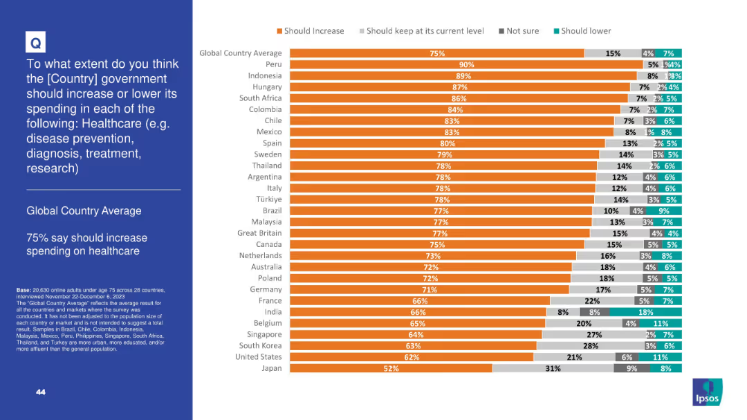
Horizontal bar chart displaying concern over AI-powered deepfakes
Risk Assessment and Management
Artificial Intelligence
Public concern about deepfakes as a tool for disinformation is high globally (75%). Canada (78%) and the US (74%) also show significant concern on this issue.
AI deepfakes, disinformation, public opinion, global perception, misinformation
Single Chart
IPSOS
Saved
The slide contains a scatter plot showing the correlation between talent pool maturity and progress in upskilling programs across different regions.
Human Resources and Talent Management
Professional Services
The slide reveals that regions with more developed talent pools see less progress in upskilling initiatives, indicating a potential complacency or other barriers.
Upskilling, talent pools, regional comparison, scatter plot, progress
Mixed Chart
PwC/Strategy&
Saved
Matrix categorizing 9 innovations by adoption level and impact; use case examples on right
Technology and Digital Transformation
Real Estate & Construction
A framework ranking 9 construction innovations by adoption and type of impact. Highlights that widely adopted tools favor control over productivity, with sporadic adoption of high-impact technologies like AI and robotics.
construction tech, innovation, adoption, AI, IoT, productivity control
Mixed Chart
McKinsey
Saved
A column chart displaying the probability of men, women, and couples reaching ages 80 and 90. The bars represent the percentages for each group, with different colors for each category.
Market Analysis and Trends
Financial Services
The slide shows the probability of men, women, and couples reaching the ages of 80 and 90. It is used to illustrate longevity statistics relevant to financial planning.
Life expectancy, longevity, financial planning, retirement, demographics
Single Chart
JP Morgan
Saved
Includes a projection bar chart of GHG emissions from generators up to 2030, segmented by residential, commercial, and industrial contributions, in a clear and straightforward visual format.
Regulatory and Compliance
Environmental Services & Sustainability
Projects future greenhouse gas emissions from generators in Nigeria, providing insights for policy and infrastructure planning to mitigate these emissions.
GHG projections, 2030, Nigeria, policy planning, emissions mitigation
Single Chart
BCG
Saved
Similar three-part bar chart showing support for increased, maintained, or decreased government education spending.
Strategic Planning
Education & Training
A high percentage of respondents globally (69% average) support increasing education spending. Peru, Colombia, and Mexico lead with over 85%. Japan and South Korea show lower support, possibly due to existing systems or differing priorities.
education, government spending, schools, universities, job training, opinion, investment, Ipsos
Mixed Chart
IPSOS
Saved
Map-focused slide with minimal text, showing wildfire risk areas overlaid on a geographic map of Colorado. Emphasis on populated corridors.
Risk Assessment and Management
Environmental Services & Sustainability
Displays the eastern wildfire risk band in Colorado, emphasizing how close it runs to densely populated areas such as Denver and Colorado Springs. This visual highlights the spatial risk proximity between wildfire-prone zones and urban populations.
Colorado, wildfire, risk map, population, Denver, Colorado Springs, GIS
Graphic
Oliver Wyman
Saved
The slide features a column chart comparing current and future engagement channels and a quote on the right.
Technology and Digital Transformation
Financial Services
The slide discusses the shift towards digital engagement in wealth management, with a focus on future preferences for digital channels.
Digital engagement, Financial Services, Technology, Future trends, Channels
Mixed Chart
Deloitte
Saved
Bar chart of top five external factors influencing viability, with accompanying narrative on right; top section uses orange and gray color palette
Regulatory and Compliance
Technology & Software
The slide identifies the main external challenges facing Middle East businesses—particularly regulatory changes and rising costs—and the internal need to adapt through innovation and strategic decisions.
Regulation, Economic Viability, Disruptive Technology, Strategic Planning, Cost Pressures, Compliance
Mixed Chart
PwC/Strategy&
Saved
The slide includes a bubble chart ranking trends in the banking industry by importance and likelihood to respond. Text on the left discusses the focus on B2B solutions and their impact on business clients.
Sales and Business Development
Financial Services
The slide highlights the importance of B2B solutions in the FinTech industry, ranking various trends and emphasizing the need for banks to adopt these solutions to improve operations and client engagement.
FinTech, B2B solutions, trends, business clients, engagement
Mixed Chart
PwC/Strategy&
Saved
Column charts and stats about income levels and sources of financial support for refugees.
Financial Performance
Government & Public Sector
Reviews financial conditions of refugees and the support they receive.
refugees, income, financial support, Poland
Multiple Chart
Deloitte
Saved
Slide includes column charts showing trends in print and digital newspaper display revenues from 2003 to 2019.
Financial Performance
Media & Entertainment
Analyzes the trends in newspaper advertising revenue, noting the substantial decline in print and the slight offset by digital gains.
print media, digital gains, advertising revenue, newspaper, trend analysis, decline, media market, revenue analysis, print vs digital
Multiple Chart
Accenture
Saved
Features comparative column charts for 'Orders and Backlog', 'Revenues', 'EBITA', and 'FOCF' across multiple years, emphasizing trends and performance with the exclusion of Aerostructures. Includes textual annotations with key takeaways.
Strategic Planning
Financial Services
The slide illustrates a historical performance comparison, highlighting achievements and trends that align with or exceed expectations, emphasizing a strategic outlook for future business decisions.
Performance, Revenue, EBITA, FOCF, Historical Data, Business Results, Trend Analysis, Strategic Outlook, Defence, Government
Multiple Chart
Goldman Sachs
Saved
A creatively-designed column chart showing preferences of highly skilled workers for future employment with local versus multinational companies.
Human Resources and Talent Management
Professional Services
Evaluates employment preferences of highly skilled workers, highlighting a shift towards local companies over multinationals.
Employment preferences, skilled workers, local vs multinational, talent management
Mixed Chart
Accenture
Saved
The slide contains two charts: a line chart on the left showing UK GDP from Q4 2019 to Q4 2023, and another line chart on the right displaying 12-month inflation and Bank of England interest rate trends.
Market Analysis and Trends
Financial Services
The slide provides an analysis of the UK's economic performance, noting a 0.3% GDP decline in Q4 2023, steady CPI at 4% in January, and the Bank of England's policy rate at 5.25%. It is used to assess economic health and monetary policy impact.
UK GDP, inflation, interest rate, Bank of England, economic performance
Multiple Chart
McKinsey
Saved
Previous
Next
If nothing, comes up, please save your slides first
Create a FREE account to continue browsing
Receive Instant Access to 1,000+ slides from companies like McKinsey, Google, and Goldman Sachs
First Name
Last Name
Email
Password
I agree to all
Terms & Privacy Policy
Thank you! Your submission has been received!
Oops! Something went wrong while submitting the form.
Have an account?
Sign in
Column Chart
Heatmap
Chevron
Org Chart
Infographic
Callouts
Timeline
List
Graphic
Picture
Process Flow
Diagram
Paragraph
Map
Table
Framework
Subtitle
Takeaway Box
Icon
Other Chart
Radar Chart
Waterfall Chart
Mekko Chart
Pie Chart
Scatter Plot
Line Chart
Bar chart
Bullet points