Create a FREE Account
Instant access to 1,000+ real slides from top companies like McKinsey, BCG, Goldman Sachs, Google and many more!
First Name
Last Name
Email
Password
I agree to all
Terms & Privacy Policy
Thank you! Your submission has been received!
Oops! Something went wrong while submitting the form.
Have an account?
Sign in
Library
Templates
Courses
Pricing
My Account
My Slides
My Templates
✦ AI
AI Prompt Library
AI Search
Sign in
Start Here
Logout
My Saved Slides
The slide presents two complex scatter plots comparing industry performance and stability. It uses color-coded dots for different industries and banks.
Competitive Landscape
Financial Services
This visual comparison is used to showcase long-term earnings growth and stability within the banking sector, highlighting the company's superior performance.
earnings growth, stability, industry comparison, banks
Multiple Chart
JP Morgan
Saved
This slide features bar charts and line graphs analyzing historical and projected KPIs for luxury companies, including sales growth, EBITDA margins, and capex ratios.
Financial Performance
Consumer Goods
The slide provides a historical analysis and forward-looking view of key performance indicators for luxury companies, examining trends in sales, margins, and capital expenditures.
KPI analysis, luxury companies, financial performance, sales growth, EBITDA margin
Multiple Chart
EY
Saved
Line chart tracking the S&P 500’s performance in various historical bull and bear markets. Color-coded by major economic events.
Strategic Planning
Financial Services
The slide shows the price return trajectories of the S&P 500 in different market cycles including stagflation, tech bubble, GFC, and pandemic. It contrasts the length and return of bear vs. bull markets, with bull markets averaging 70 months and 221% return. The current bull market (since 2022) is included.
bull markets, bear markets, S&P 500, historical returns, market cycles, investment strategy, macroeconomic events, recovery
Single Chart
JP Morgan
Saved
Historical timeline line chart for Japan; sentiment remains low; includes baseline marker at 11%.
Market Analysis and Trends
Financial Services
Japan's economic sentiment has consistently remained low, now at 11%. The chart shows little change in perception over the past several years, post-2019 dip.
Japan, economic perception, long-term decline, Ipsos, low sentiment, public opinion, macroeconomic trend, 2024
Mixed Chart
IPSOS
Saved
Horizontal bar chart showing agreement/disagreement percentages by country regarding investment in climate measures during economic hardship. Change from 2023 included.
Market Analysis and Trends
Environmental Services & Sustainability
This slide illustrates global sentiment on delaying climate investments due to economic constraints. India leads in agreement (67%), indicating greater economic prioritization over climate action. The data reveals varying levels of urgency or resistance to climate spending depending on national economic outlooks.
climate investment, economic hardship, climate policy, public opinion, country comparison, environmental spending, Ipsos, Earth Day, green economy
Mixed Chart
IPSOS
Saved
The slide includes a header, a background image, and two sections: a text block on the left and a bar chart on the right. The bar chart compares survey responses on the desire for control over personal health data versus the desire for personalized advice, using different colors for levels of agreement and disagreement.
Technology and Digital Transformation
Technology & Software
Explores the tension between privacy and personalization in health data management. The bar chart displays survey data on people's preferences for controlling personal health data versus receiving personalized health advice, showing varying levels of agreement and disagreement.
Privacy, personalization, health data, survey, preferences
Mixed Chart
IPSOS
Saved
Line charts illustrate risk values over time. Complex visual with high detail, intended for a technically savvy audience.
Risk Assessment and Management
Financial Services
Explains trading risk metrics over time, essential for understanding market risk and investment decisions.
trading risk, market analysis, VaR, sVaR, investment decisions
Single Chart
Deutsche Bank
Saved
The slide uses a column chart to depict Australian residential work from FY07 to FY25, showing actuals and projections in three scenarios. It includes explanatory text boxes and scenario legends.
Market Analysis and Trends
Real Estate & Construction
Examines the resilience and sensitivity of residential construction work in Australia, comparing historical data to future projections and highlighting economic impacts.
Australia, residential, projections, economic impacts, construction
Mixed Chart
Deloitte
Saved
Horizontal bar chart comparing age groups (18–34, 35–54, 55+) across key issues.
Customer and Market Segmentation
Government & Public Sector
This slide illustrates generational differences in issue prioritization. Younger groups focus more on education and housing, while older respondents are more concerned with immigration and inflation.
age segmentation, education, immigration, inflation, Ipsos
Mixed Chart
IPSOS
Saved
The slide features a table with bar charts showing demographic and mobility differences among EV sceptics in APAC, EMEA, and North America. The layout is clean with distinct color coding for each region.
Market Analysis and Trends
Transportation & Logistics
The slide provides a comparative analysis of demographics and mobility needs among EV sceptics across different regions, based on a survey of 4,108 respondents. It aims to highlight regional variations in EV adoption barriers.
EV sceptics, regional differences, demographics, mobility needs, survey data
Multiple Chart
PwC/Strategy&
Saved
The slide features a white background with a column chart comparing the market value of vitamins and dietary supplements in North America from 2014 to 2018.
Market Analysis and Trends
Healthcare & Pharmaceuticals
This slide compares the market value and growth trends of vitamins and dietary supplements in North America, highlighting key insights and CAGR.
Vitamins, dietary supplements, North America, market value, growth, CAGR, healthcare, pharmaceuticals, trends
Mixed Chart
PwC/Strategy&
Saved
Contains text blocks and images showcasing infrastructure and activities in Switzerland's food sector.
Market Analysis and Trends
Agriculture & Food Production
Highlights Switzerland's role as a leader in food and nutrition, focusing on corporate and academic contributions.
Switzerland, innovation, food, academia, corporates
Header Horizontal
Accenture
Saved
Uses pie charts and column charts in blue tones. Visualizes complex financial data about asset levels and movements.
Risk Assessment and Management
Financial Services
Details the uncertainty in asset valuation and changes in level 3 assets and liabilities, with focus on risk management.
Level 3 assets, liabilities, financial risk, valuation, asset management, financial reporting
Multiple Chart
Deutsche Bank
Saved
Horizontal bar graph ranks confidence in governmental ability to protect personal safety; Canada at 50%.
Risk Assessment and Management
Government & Public Sector
This chart reflects public confidence in government protection of personal safety. Canada’s rating is at the 30-country average (50%), while the U.S. shows higher trust at 57%.
personal safety, security, confidence, perception, government trust, Canada, U.S., Ipsos, 2024, survey
Mixed Chart
IPSOS
Saved
Complex heat maps for yearly asset class returns, color-coded, with a key at the bottom. High data density with multiple time series.
Investment Analysis
Financial Services
Analysis of yearly performance of various asset classes, indicating potential investment decisions. Suitable for financial analysts or investors looking at market trends.
Performance, Assets, Heat Map, Financial, Analysis, Investment, Trends, Color-coded, Yearly, Data
Table
Morgan Stanley
Saved
The slide features a line chart showing sales index evolution from 2015 to 2019, with CAGR values and EBITDA percentage changes.
Market Analysis and Trends
Retail & E-commerce
Reviews sales performance in the fashion and luxury market from 2015 to 2019, highlighting growth rates and profitability trends over the years.
sales, performance, market, fashion, luxury, CAGR, EBITDA, growth, profitability
Mixed Chart
Deloitte
Saved
Timeline chart showing the growth of WeChat Mini Programs from 2019 to 2021. Includes key milestones like the introduction of pop-up boutiques and expanded offerings. Text explains the significance of these developments.
Technology and Digital Transformation
Retail & E-commerce
Discusses the growing importance of flexible online channels like WeChat Mini Programs for luxury brands. Shows the timeline of their implementation and growth, highlighting key milestones and their impact on business.
WeChat Mini Programs, online channels, luxury brands, digital transformation, business growth
Mixed Chart
BCG
Saved
Slide displays a column chart and line chart comparing sales volume and material margins from 2020 to Q2 2023. Sales volumes are represented in thousands of barrels per day across two categories: specialty products and fuels & asphalt.
Financial Performance
Energy & Utilities
Provides a summary of financial performance for SPS in Q2, showing sales volume and material margins. It also discusses factors affecting performance, such as market conditions and production issues due to weather.
sales volume, financial performance, energy, market conditions, material margins, Q2
Multiple Chart
Barclays
Saved
Three-part layout: a stacked bar chart for regulatory capital requirement, a current capital structure bar, and a capital maturity profile showing AT1 and Tier 2 maturity timelines.
Corporate Finance and Valuation
Financial Services
Barclays outlines its well-managed capital structure, breaking down its CET1, AT1, and Tier 2 capital layers and maturity profiles. It highlights regulatory requirements, headroom levels, and future capital instrument call/maturity expectations through 2027+.
capital structure, AT1, Tier 2, maturity profile, Barclays
Multiple Chart
Barclays
Saved
Slide includes two pie charts with color contrasts comparing age groups.
Customer and Market Segmentation
Government & Public Sector
Analyzes age demographics of refugees with data from a survey and official statistics.
refugees, age demographics, segmentation, statistics
Multiple Chart
Deloitte
Saved
The slide shows a column chart with data on the market penetration of different types of restaurants (street food, cafés, quick service, full service) across top countries in 2022. Each country is represented by a flag.
Market Analysis and Trends
Hospitality & Tourism
This slide highlights the dominance of full-service restaurants in APAC countries compared to other regions. It shows the type of restaurants prevalent in each country and their market shares in 2022.
APAC, full service restaurants, market penetration, restaurant types, 2022 data
Single Chart
Deloitte
Saved
Dual chart layout showing willingness to substitute US products under tariff scenarios (left) and reasons for substitution (right); bar and stacked bar visuals; implications in side panel.
Strategic Planning
Retail & E-commerce
The slide shows that European consumers are highly likely to substitute US products if tariffs are imposed, mainly due to brand preference rather than price. This trend signals reputational risk for US brands and opportunity for localized EU branding.
EU tariffs, substitution, brand preference, pricing, reputation risk, US products
Multiple Chart
Accenture
Saved
Light beige background with infographic layout; price diagram and side-by-side stacked bar charts.
Risk Assessment and Management
Media & Entertainment
Compares influencer spending share across platforms from 2021 to 2022. Emphasizes influencer pricing (¥0.5–¥1.5/view), risks of endorsements, and rising prominence of platforms like Douyin and RED.
influencer pricing, campaign ROI, WeChat, Douyin, KOC, endorsements, cost strategy
Mixed Chart
McKinsey
Saved
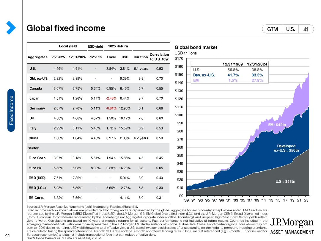
Dual-bar chart format comparing current vs. 12 months ago bond yields for developed and emerging markets. Uses consistent color scheme and gridlines for clarity.
Financial Performance
Financial Services
This slide compares 10-year sovereign bond yields from developed and emerging markets, highlighting significant yield differences and recent trends. It allows insight into relative monetary policy stances and investor return expectations across regions.
sovereign yields, emerging markets, developed markets, bond returns, interest rates, yield trends, 10-year, rate comparisons
Multiple Chart
Morgan Stanley
Saved
The slide features a table comparing consumer spending trends in goods and services across the US, UK, Germany, and France. Categories include groceries, motor vehicles, and fuel among others. Color-coded cells indicate changes.
Market Analysis and Trends
Consumer Goods
This slide shows consumer spending trends by goods and services in the US and Europe, emphasizing a shift towards services with notable rebounds in car sales. The table format helps compare changes across countries over the last six months and the latest monthly changes.
consumer spending, US, Europe, trends, goods, services
Multiple Chart
Accenture
Saved
Previous
Next
If nothing, comes up, please save your slides first
Create a FREE account to continue browsing
Receive Instant Access to 1,000+ slides from companies like McKinsey, Google, and Goldman Sachs
First Name
Last Name
Email
Password
I agree to all
Terms & Privacy Policy
Thank you! Your submission has been received!
Oops! Something went wrong while submitting the form.
Have an account?
Sign in
Column Chart
Heatmap
Chevron
Org Chart
Infographic
Callouts
Timeline
List
Graphic
Picture
Process Flow
Diagram
Paragraph
Map
Table
Framework
Subtitle
Takeaway Box
Icon
Other Chart
Radar Chart
Waterfall Chart
Mekko Chart
Pie Chart
Scatter Plot
Line Chart
Bar chart
Bullet points