Create a FREE Account
Instant access to 1,000+ real slides from top companies like McKinsey, BCG, Goldman Sachs, Google and many more!
First Name
Last Name
Email
Password
I agree to all
Terms & Privacy Policy
Thank you! Your submission has been received!
Oops! Something went wrong while submitting the form.
Have an account?
Sign in
Library
Templates
Courses
Pricing
My Account
My Slides
My Templates
✦ AI
AI Prompt Library
AI Search
Sign in
Start Here
Logout
My Saved Slides
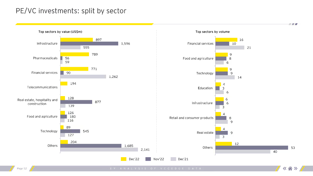
Contains column charts comparing top sectors by value and volume of PE/VC investments for different months. Uses grey, purple, and yellow colors. Visual complexity is moderate.
Market Analysis and Trends
Financial Services
Analyzes the distribution of PE/VC investments across various sectors by value and volume, highlighting key investment areas. Important for sector analysts and investors.
PE, VC, investments, sectors, value, volume
Multiple Chart
EY
Saved
This slide focuses on the "Green" aspect of sustainability targets, with a large section of text and a pie chart on the left side illustrating the allocation of a $285 billion fund across various criteria like "Renewable Transportation" and "Energy Efficiency". The right side features a coastal wind farm image.
Financial Performance
Government & Public Sector
Outlining the "Green" component of JPMorgan Chase's $2.5 trillion sustainable development target, the slide emphasizes investments in renewable transportation and energy efficiency. The pie chart offers a visual breakdown of fund allocation, while the image of the wind farm provides a tangible example of such investments. This slide could be presented to stakeholders to showcase the firm's dedication to environmental sustainability.
green, sustainable development, renewable energy, energy efficiency, investment, pie chart, JPMorgan Chase
Mixed Chart
JP Morgan
Saved
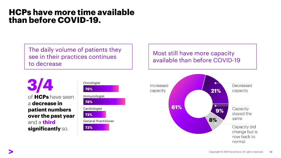
The slide has a white background with text and a donut chart on the right showing the change in patient volume. The left side contains text discussing the availability of HCPs.
Market Analysis and Trends
Healthcare & Pharmaceuticals
This slide highlights that HCPs have more available time due to a decrease in patient numbers during COVID-19, with detailed statistics on the change in patient volume by specialty.
HCPs, patient volume, COVID-19, availability, time, healthcare, decrease, capacity, specialty
Multiple Chart
Accenture
Saved
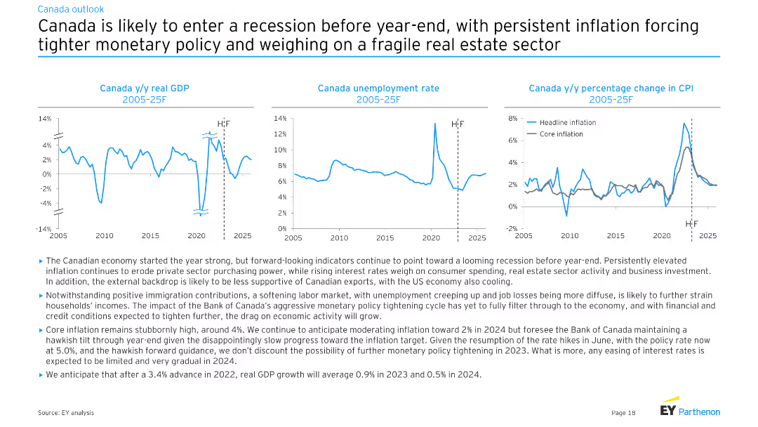
The slide features three line charts showing Canada’s y/y real GDP, unemployment rate, and y/y percentage change in CPI from 2005 to 2025F. The charts highlight both historical data and forecasts.
Market Analysis and Trends
Financial Services
This slide projects a looming recession for Canada by the end of the year, driven by persistent inflation and tighter monetary policy, with impacts on GDP, unemployment, and CPI.
Canada, recession, GDP, unemployment, inflation
Multiple Chart
EY
Saved
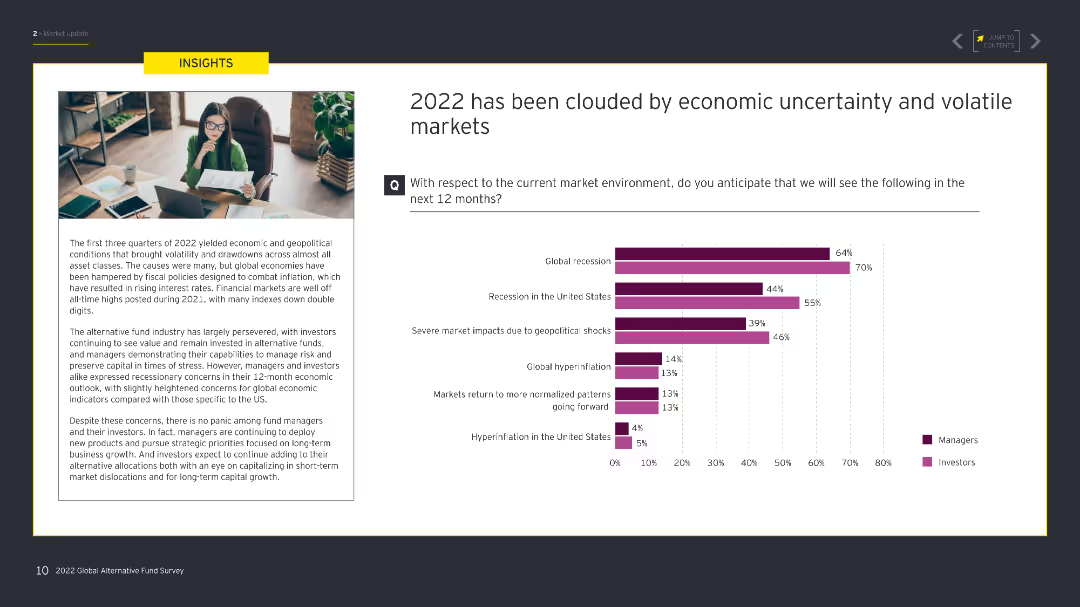
The slide contains a text box on the left detailing economic conditions, and on the right, a column chart with data comparing managers' and investors' expectations for various economic scenarios.
Risk Assessment and Management
Financial Services
This slide discusses the economic uncertainty and volatility in 2022, including expectations for recession, geopolitical shocks, and market normalization, segmented by managers and investors.
economic uncertainty, volatility, recession, market, managers, investors
Mixed Chart
EY
Saved
The slide features a large column chart on the left, a central section with color-coded contributing factors, and a final column chart on the right, providing a clear comparison of overhead ratios over time.
Operational Efficiency
Financial Services
Demonstrates the improvement in the overhead ratio at JPMorgan Chase & Co., driven by various factors, meant for showcasing efficiency gains to investors.
overhead ratio, efficiency, revenue growth, JPMorgan, investment, expense
Single Chart
JP Morgan
Saved
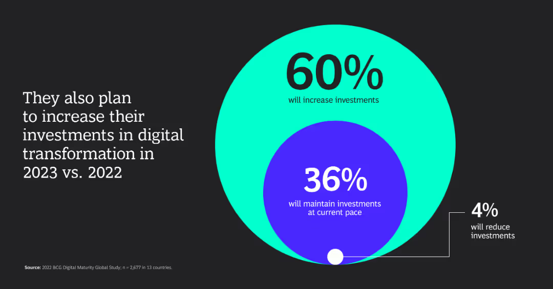
The slide features a large circle chart with segmented percentages indicating plans to increase, maintain, or reduce investments.
Investment Analysis
Financial Services
The slide shows that 60% of companies plan to increase their investments in digital transformation in 2023 compared to 2022.
investments, digital transformation, percentage, 2023, 2022
Diagram
BCG
Saved
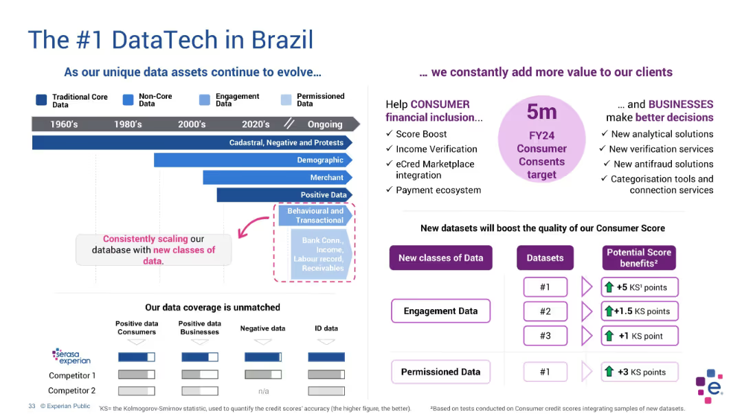
Horizontal timeline with evolving data types on the left, text highlights and comparison chart on right
Product and Service Analysis
Technology & Software
This slide emphasizes Experian’s evolution in Brazil from core to permissioned data. It details ongoing expansion in data classes and use cases such as fraud detection and credit scoring, with a comparison of competitors’ data capabilities.
Brazil, data evolution, Experian, ID data, permissioned data, analytics
Mixed Chart
Barclays
Saved
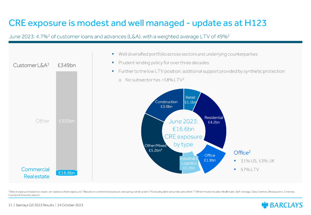
Features a pie chart illustrating CRE exposure by type and a vertical bar chart showing customer loans and advances. The layout is straightforward and data-centric.
Risk Assessment and Management
Real Estate & Construction
The slide discusses the modest and well-managed exposure to Commercial Real Estate (CRE), with detailed breakdowns of exposure types and prudent lending policies.
CRE, exposure, real estate, customer loans, advances, prudent lending, portfolio, diversification
Multiple Chart
Barclays
Saved
The slide has a column chart and text. The chart depicts familiarity with blockchain technology among respondents.
Technology and Digital Transformation
Financial Services
The slide explores blockchain technology, its potential impact, and the level of familiarity among industry participants.
Blockchain, technology, trends, familiarity, financial services
Mixed Chart
PwC/Strategy&
Saved
With accompanying text and a circular chart illustrating marketing data strategy shifts.
Market Analysis and Trends
Technology & Software
Discusses the shift in marketing strategies towards first-party data, emphasizing the competitive advantage and strategic importance in high-growth companies.
marketing, data, strategy, first-party, high-growth, technology, cookies, GDPR, digital, transformation
Mixed Chart
Deloitte
Saved
Pie chart and a bar chart detailing plans for refining shared services center footprints over the next three years.
Operational Efficiency
Professional Services
Details strategies and plans for optimizing the footprint of shared services centers, highlighting cost and talent factors.
shared services, footprint refinement, pie chart, bar chart, optimization
Multiple Chart
Deloitte
Saved
A column chart shows the trend of rail ridership over the years, highlighting specific years with significant changes, providing a clear visual of ridership trends.
Industry Overview
Transportation & Logistics
Focuses on the significant decline in rail ridership over several years, offering insights into potential causes and implications for the transportation industry.
rail ridership, decline, transportation industry, trend analysis
Single Chart
BCG
Saved
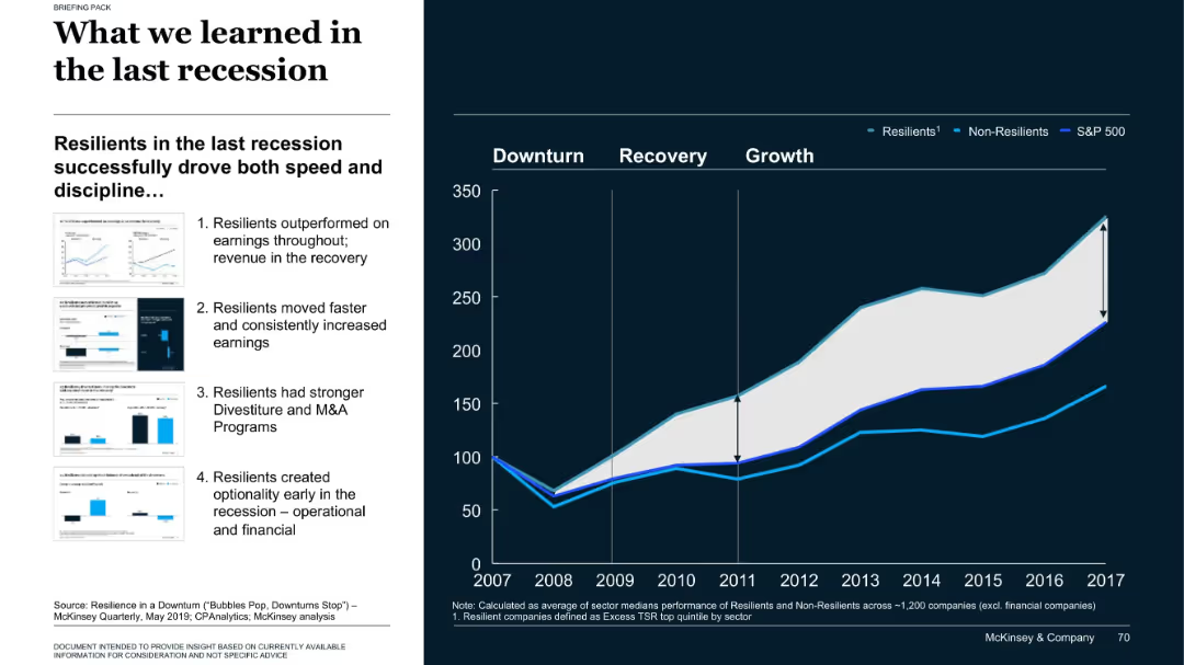
Left side text and thumbnails; right side line chart comparing company performance categories post-2008
Strategic Planning
Professional Services
The slide compares resilient vs. non-resilient companies during the 2008 recession, showing how resilient firms recovered faster and achieved higher long-term returns. Four key behaviors are outlined on the left that contributed to resilience.
recession, resilience, M&A, company performance, S&P 500
Mixed Chart
McKinsey
Saved
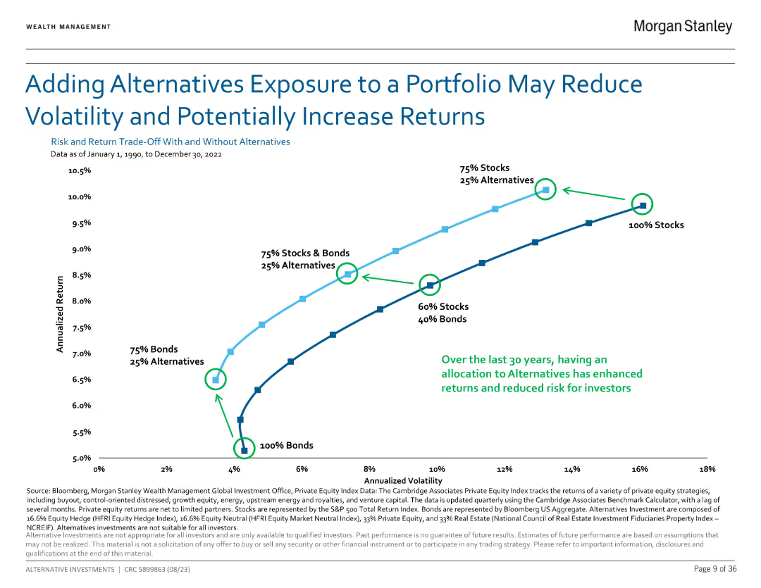
Line chart showing the impact of adding alternatives to a portfolio on risk and returns from 1990 to 2022.
Investment Analysis
Financial Services
Demonstrates how alternatives can reduce portfolio volatility and potentially increase returns over 30 years.
Alternatives, portfolio, risk, returns
Single Chart
Morgan Stanley
Saved
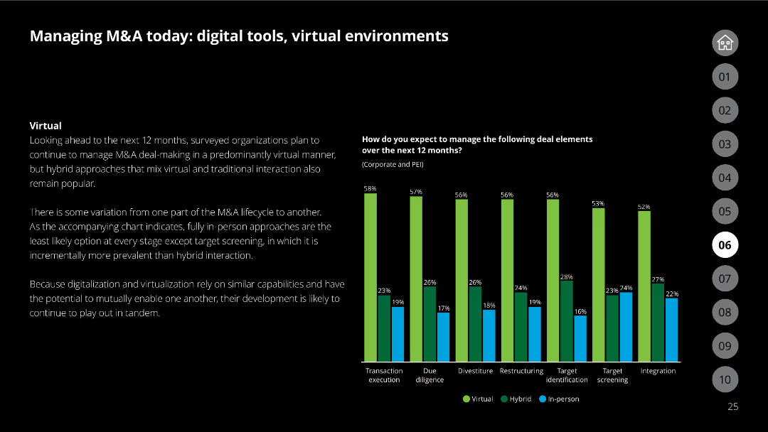
The slide has a black background, text discussing virtual management of M&A, and a column chart comparing deal element management methods (virtual, hybrid, in-person) for the next 12 months.
Mergers and Acquisitions
Financial Services
Covers how organizations plan to manage M&A deals in the next year, highlighting the use of virtual and hybrid approaches for different deal elements based on survey results.
M&A, virtual management, deal elements, survey results, hybrid approach
Mixed Chart
Deloitte
Saved
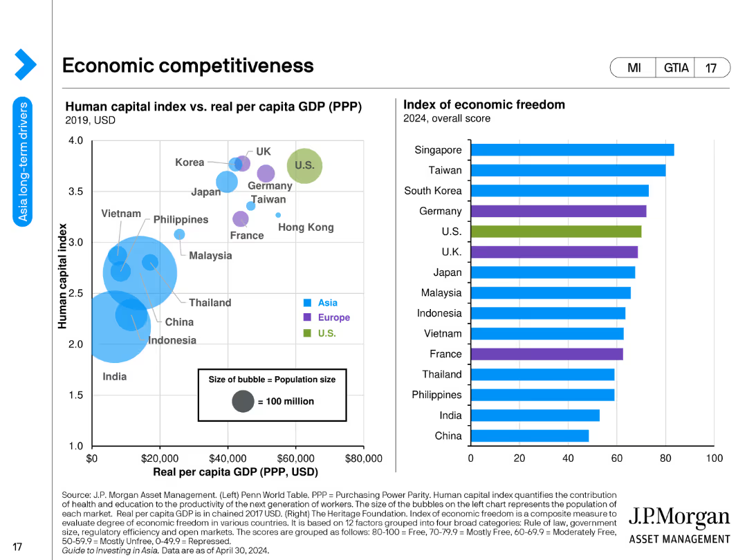
A bubble chart showing the human capital index vs. real GDP per capita and a bar chart showing the index of economic freedom by country.
Market Analysis and Trends
Financial Services
The slide compares countries' economic competitiveness through human capital indices and real GDP per capita, and presents an index of economic freedom scores for 2024.
economic competitiveness, human capital, GDP per capita, economic freedom, countries, financial analysis, indices, economic trends, development, financial insights
Multiple Chart
JP Morgan
Saved
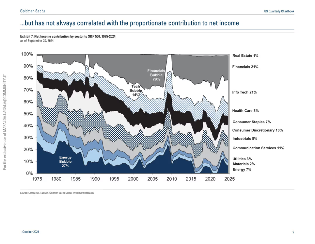
Similar streamgraph as previous slide but shows net income contribution by sector instead of market cap.
Industry Overview
Financial Services
This slide contrasts sector market capitalization with net income contribution over time, showing that dominance in market cap doesn't always translate to proportional profitability. It reveals discrepancies during bubbles and highlights the underperformance or overperformance of certain sectors relative to their size.
net income, sector comparison, S&P 500, market cap, profitability, energy, tech
Single Chart
Goldman Sachs
Saved
The slide features multiple visualizations, including a line graph for daily exceptions, a pie chart for open exceptions per department, and various data tables showing exceptions by category and aging analysis.
Operational Efficiency
Energy & Utilities
The slide provides insights into managing business exceptions, displaying data on daily exceptions, departmental exceptions, and aging analysis of open exceptions, helping in operational decision-making.
Business, Exceptions, Management, Analysis, Operational
Multiple Chart
EY
Saved
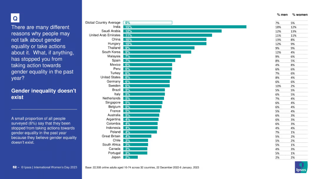
Bar chart showing denial of gender inequality as a barrier to action; countries ordered by response rates; contextual info on left in blue box.
Market Analysis and Trends
Government & Public Sector
The slide highlights the share of respondents who believe gender inequality doesn’t exist, with India showing the highest (15%). The global average is 6%. Gender-specific responses are also noted.
gender denial, survey data, awareness, equality, Ipsos, global differences
Mixed Chart
IPSOS
Saved
Multiple sections, logos, screenshots, mixed layouts
Technology and Digital Transformation
Technology & Software
Outlines Deloitte's CAI solutions and partnerships
Deloitte, CAI, TrueServe, NVIDIA
Framework
Deloitte
Saved
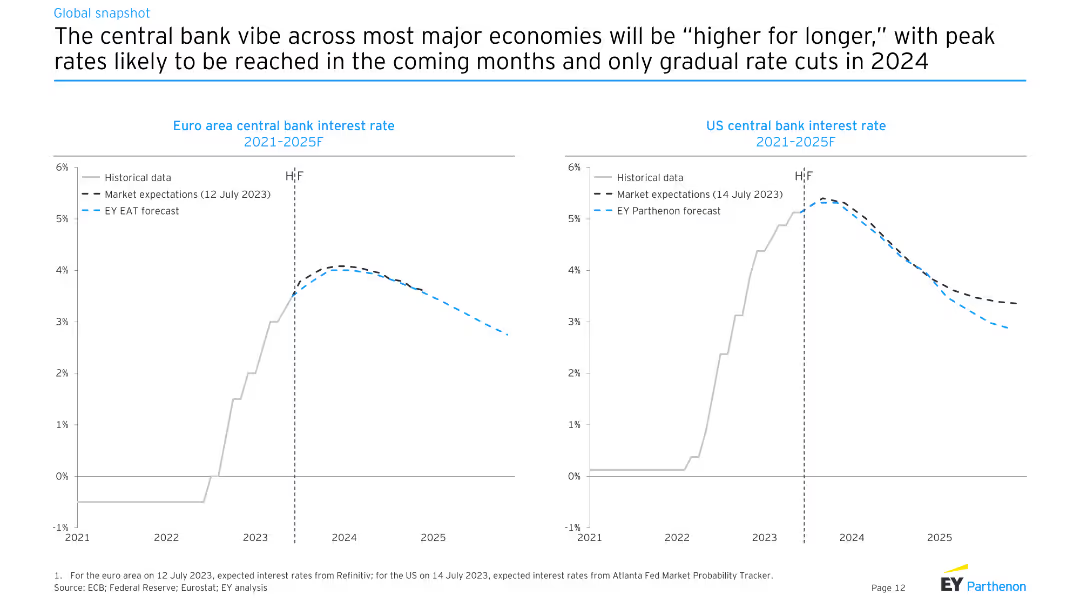
The slide features line charts comparing historical and expected future central bank interest rates for the Euro area and the US from 2021 to 2025F. Different lines represent historical data, market expectations, and EY Parthenon forecasts.
Market Analysis and Trends
Financial Services
The slide discusses the likelihood of higher central bank interest rates for longer periods in major economies, with projections showing gradual rate cuts starting in 2024.
central bank, interest rates, Euro area, US, forecasts
Multiple Chart
EY
Saved
A column chart showing the percentage of companies with tech-fluent C-suite and board members. Text elaborates on the importance of tech-savvy leadership in addressing business challenges.
Organizational Structure and Change
Technology & Software
The slide emphasizes the significance of having tech-fluent leadership in the C-suite and board, supported by a column chart comparing tech mindset metrics.
Tech Mindset, Leadership, C-suite, Board, Business Challenges
Mixed Chart
Accenture
Saved
The slide contains two columns with bulleted text, a chart titled "FIGURE 2: ROLE CLUSTERS OFFER A UNIQUE LENS ON EVOLVING WORK PATTERNS", and a section with a detailed explanation.
Market Analysis and Trends
Technology & Software
The slide discusses the impact of intelligent technologies on job roles, skill demands, and automation, emphasizing the reconfiguration of roles and the emergence of new patterns in work.
Automation, Workforce, Technology, Skills, Roles
Header Horizontal
Accenture
Saved
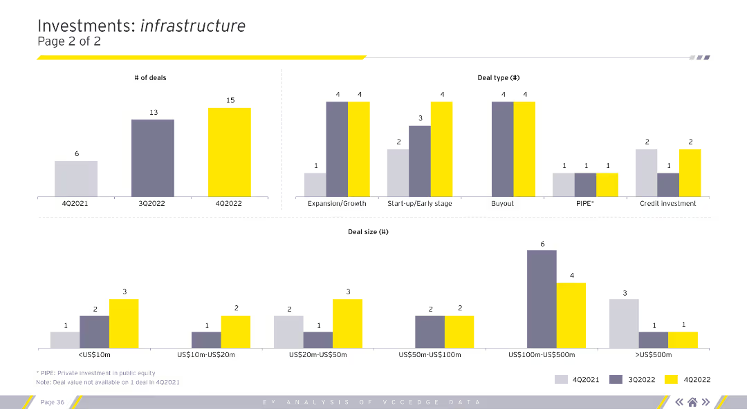
The slide includes column charts illustrating the number of deals, deal types, and deal sizes within the infrastructure sector across various quarters. Each chart is color-coded by quarter.
Market Analysis and Trends
Financial Services
This slide continues the infrastructure investment analysis, highlighting the number of deals and their types and sizes, enhancing the understanding of quarterly investment patterns in infrastructure.
Infrastructure deals, number of deals, deal types
Multiple Chart
EY
Saved
Previous
Next
If nothing, comes up, please save your slides first
Create a FREE account to continue browsing
Receive Instant Access to 1,000+ slides from companies like McKinsey, Google, and Goldman Sachs
First Name
Last Name
Email
Password
I agree to all
Terms & Privacy Policy
Thank you! Your submission has been received!
Oops! Something went wrong while submitting the form.
Have an account?
Sign in
Column Chart
Heatmap
Chevron
Org Chart
Infographic
Callouts
Timeline
List
Graphic
Picture
Process Flow
Diagram
Paragraph
Map
Table
Framework
Subtitle
Takeaway Box
Icon
Other Chart
Radar Chart
Waterfall Chart
Mekko Chart
Pie Chart
Scatter Plot
Line Chart
Bar chart
Bullet points