Create a FREE Account
Instant access to 1,000+ real slides from top companies like McKinsey, BCG, Goldman Sachs, Google and many more!
First Name
Last Name
Email
Password
I agree to all
Terms & Privacy Policy
Thank you! Your submission has been received!
Oops! Something went wrong while submitting the form.
Have an account?
Sign in
Library
Templates
Courses
Pricing
My Account
My Slides
My Templates
✦ AI
AI Prompt Library
AI Search
Sign in
Start Here
Logout
My Saved Slides
Left: stacked bar charts of income by business line across quarters; Right: table on inorganic activity; blue-themed visuals
Strategic Planning
Financial Services
This slide summarizes Q424 income trends and inorganic activity. Income fell 61% YoY, with declines in several segments. The right panel outlines three major M&A activities, detailing their P&L impact, RWA, RoTE impact, and CET1 ratio effects. Completion dates are noted for each transaction.
Q4 income, head office, inorganic activity, acquisitions, P&L impact, RWA
Mixed Chart
Barclays
Saved
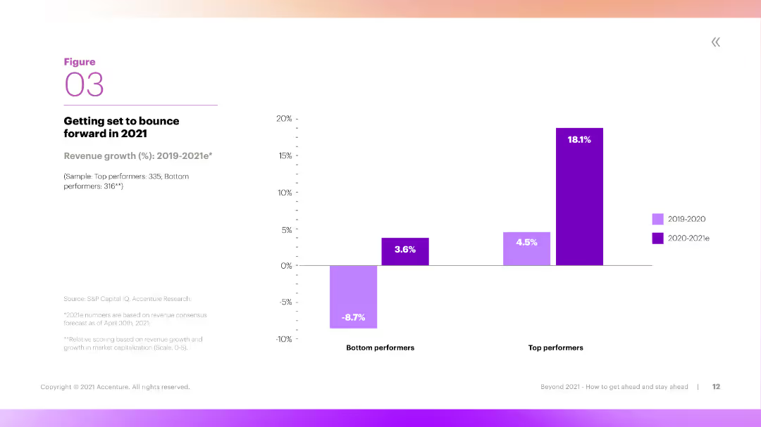
Left side graph showing GDP recovery curves; right side contains economic data for China, US, Eurozone, and World.
Financial Performance
Government & Public Sector
A best-case scenario where the virus is contained and economic growth returns quickly. The chart compares GDP index recovery for major economies and highlights minimal GDP contraction for China with faster recovery compared to the US and Europe.
A3, growth, GDP, virus contained, recovery, economic rebound, China, US, Eurozone, scenario
Mixed Chart
McKinsey
Saved
This slide displays a column chart with global GDP growth projections from 2020 to 2024 across different countries, including the US, Euro area, UK, Japan, China, India, Brazil, Australia, and South Africa.
Market Analysis and Trends
Financial Services
The slide provides a global economic snapshot, forecasting GDP growth trends across major economies, emphasizing the expected slowdown in 2023 and gradual recovery by 2024.
GDP, global, growth, forecast, economy, 2023, 2024
Multiple Chart
EY
Saved
A central black board with sections radiating outwards details client priorities and sustainable finance offerings, alongside a narrative of client solutions on the right.
Client Case Studies
Financial Services
Highlights a case study on sustainable finance, showing client priorities and the firm’s sustainable offerings in various business sectors.
Sustainable, Finance, Investment, Asset, Wealth, Management, Solutions, Client
Table
Goldman Sachs
Saved
Text-heavy slide with a central image of a diagram showing collaboration obstacles, surrounded by text boxes detailing specific hurdles in financial institutions and fintech cooperation.
Risk Assessment and Management
Financial Services
Details various obstacles to collaboration between financial institutions and fintechs, including speed bumps, process barriers, and differing expectations and experiences.
fintech, cooperation, obstacles, financial institutions, process barriers, expectations, industry experience, collaboration, hurdles, risk management
Diagram
Deloitte
Saved
Four-tile layout with icons and captions outlining urgent reasons for SEA to act on green transition; soft green gradient background.
Strategic Planning
Environmental Services & Sustainability
Lays out four reasons why Southeast Asia must act now on decarbonization: short timelines, actionable steps, economic growth synergy, and geopolitical support. Emphasizes urgency and achievability.
SEA, decarbonization, urgency, opportunity, strategic timing, green transition
Pillar
Bain
Saved
The slide includes a line chart showing the growth of blockchain project volume over several years, with a breakdown of services offered in a box on the right.
Market Analysis and Trends
Technology & Software
This slide illustrates the growth in blockchain project volume, emphasizing a steady increase over time, though not at the high rate of the previous fiscal year, with services like development and advisory.
blockchain, project volume, growth trends, development services, advisory services
Single Chart
EY
Saved
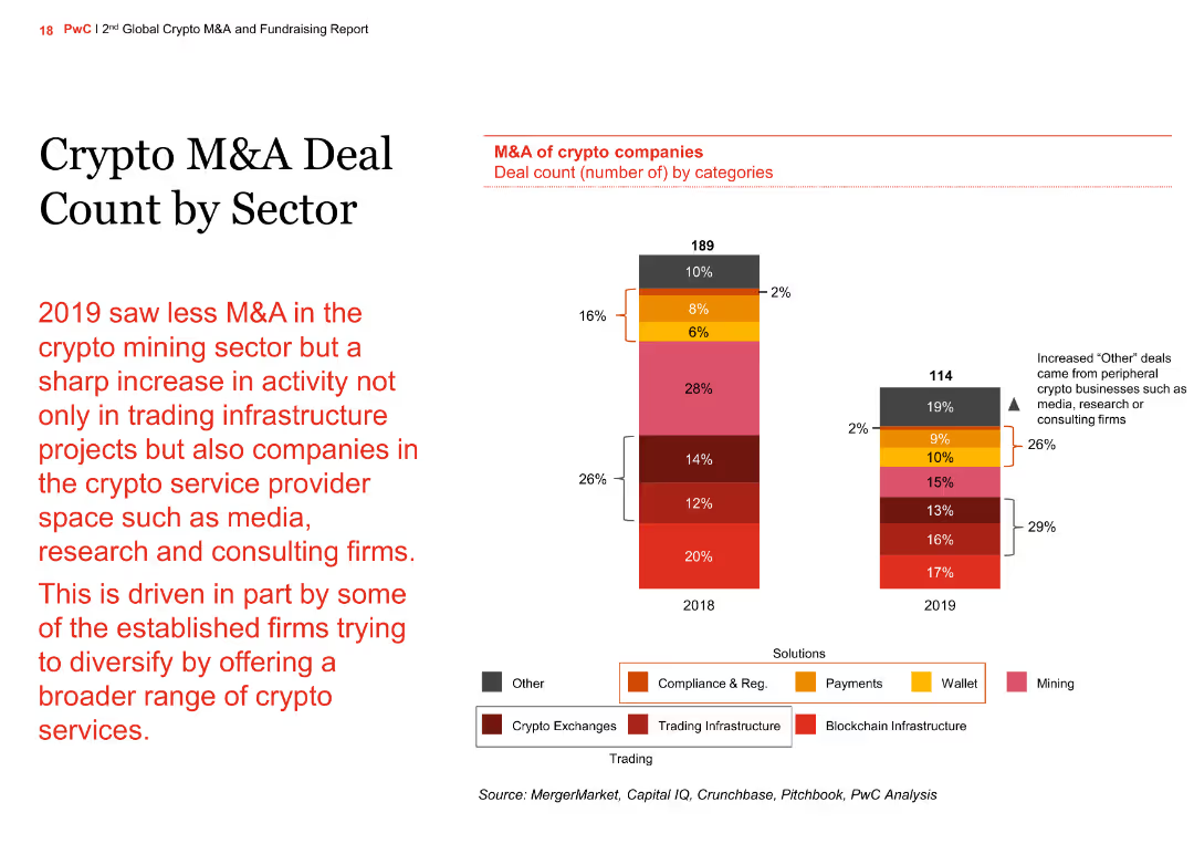
Stacked bar chart (2020–2024) segmented by M&A category; muted red, orange, and yellow colors; value axis on left.
Strategic Planning
Financial Services
Shows the composition of M&A deal value across categories excluding venture capital. Domestic strategic and PE deals saw a significant decline in 2023–24, with PE dropping 18%. Foreign strategic and outbound activity remains limited.
M&A categories, PE, strategic buyers, outbound deals, 2024, deal value
Single Chart
PwC/Strategy&
Saved
A U.S. map showing the 2020 Electoral College results by state with red and blue colors, along with a table listing the tightest races in key states.
Market Analysis and Trends
Government & Public Sector
Highlights the importance of swing states in determining the U.S. presidency, showing the electoral votes and margins in critical states from the 2020 election.
Swing States, Electoral College, Presidency, 2020, Key States
Graphic
JP Morgan
Saved
White background with multiple text sections and bar charts showing credit cost distribution over time. Important quotes highlighted.
Market Analysis and Trends
Environmental Services & Sustainability
Analyzes the increasing demand for carbon credits, rising costs, and the implications for future pricing and supply dynamics.
demand increase, carbon credits, supply costs
Multiple Chart
EY
Saved
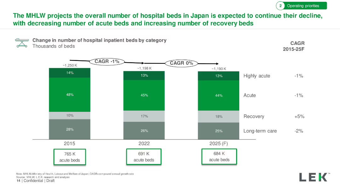
Features a blue column chart indicating the percentage of users increasing food delivery frequency, with additional insights in text format.
Market Analysis and Trends
Retail & E-commerce
Analyzes the food delivery sector, showing the surge in user frequency and the competitive landscape. This slide is essential for businesses operating in or entering the food delivery market, providing data to strategize on customer retention and market entry.
Food Delivery, User Growth, Market
Mixed Chart
Bain
Saved
Line graph with annotations showing trends from 2015–2025, labeled inflection points, simple layout, purple theme.
Market Analysis and Trends
Professional Services
This slide analyzes global supply chain pressure trends over the past decade, highlighting key geopolitical and pandemic-related events that have influenced pressure points. It indicates that early 2025 pressures are relatively unaffected.
Supply chain, global index, COVID-19, Russia-Ukraine, trade restrictions, inflation
Single Chart
Accenture
Saved
Slide packed with bullet points and circular icons to denote statistical data, focusing on planned corporate actions to navigate 2023 uncertainties, includes a quote for emphasis.
Market Analysis and Trends
Professional Services
Details strategic actions that companies plan to take in 2023 to address macro uncertainties, highlighting prioritized areas.
corporate strategy, 2023, planning, uncertainties
Multiple Chart
BCG
Saved
The slide features a two-dimensional matrix with companies plotted based on their analyst and customer scores. It's divided into zones like "Solution Leader" and "Value Leader". Each company is represented by a circle, with varying sizes indicating the company's positioning strength. The graph is overlaid with a red outline grouping certain companies as leaders.
Market Analysis and Trends
Technology & Software
This slide illustrates the competitive landscape in the Contract Lifecycle Management (CLM) industry as of Q3, 2018. It categorizes companies into different leadership zones based on performance metrics like customer and analyst scores, helping to analyze market trends and company positions.
CLM, market analysis, leadership, performance metrics, companies, competitive landscape, 2018, technology
Single Chart
Kearney
Saved
Grid of six statistic-based info-boxes on a dark blue background, each containing a percentage figure and icon, with minimal text explaining educational attitudes and perceptions.
Industry Overview
Education & Training
The slide provides a snapshot of global perceptions of education systems, tech’s impact, and social media concerns. It shows generational and geographic variances in confidence in education, curriculum quality, and views on childhood challenges.
education, perception, curriculum, technology, social media, quality, generational views
Multiple Chart
IPSOS
Saved
A table with three columns detailing current tasks, future tasks, and sample roles. Icons on the left side denote various industries like marketing, finance, IT, and sales.
Human Resources and Talent Management
Technology & Software
Details how generative AI will change roles across different departments, specifying tasks that AI will handle versus those requiring human oversight.
role changes, AI, future tasks, current tasks, departmental roles
Table
BCG
Saved
The slide presents a column chart at the bottom with data from three different years, comparing Clorox's employee engagement levels to industry standards, using blue shades for different years and green for benchmarks. The design is clear and straightforward.
Human Resources and Talent Management
Professional Services
Discusses Clorox's employee engagement scores relative to fast-moving consumer goods companies and high-performing global companies, showing a trend of improvement and superior performance. Useful for HR presentations and management reviews.
employee engagement, HR management, Clorox, industry comparison
Mixed Chart
Barclays
Saved
Left: Line graph showing EU capital formation by government/private. Right: Stacked bar chart of EU vs US investment priorities. Text boxes and implication callouts.
Market Analysis and Trends
Financial Services
The slide contrasts public vs private sector investment in the EU, noting government-led growth. It also compares EU and US investment priorities for 2024, highlighting EU’s focus on replacement and innovation under tighter regulatory and financing constraints.
EU, investment, capex, government, private sector, replacement, priorities
Multiple Chart
Accenture
Saved
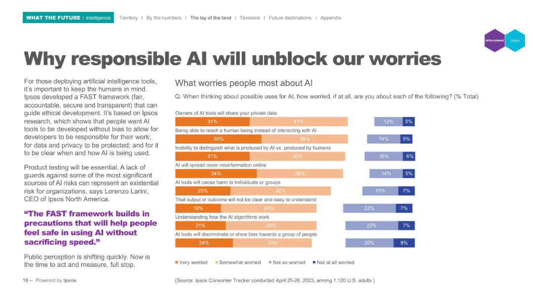
Horizontal bar chart comparing 31 countries' agreement rates on political alienation. Right-hand column includes multi-year trend comparisons.
Market Analysis and Trends
Government & Public Sector
This slide focuses on political alienation across countries. Agreement is highest in Peru, South Africa, and Chile, with sentiment increasing in many countries. Japan saw a 29pp rise since 2016, indicating growing distrust in traditional political institutions.
political alienation, distrust, Ipsos, traditional parties, public opinion, international trends, populism
Mixed Chart
IPSOS
Saved
Horizontal bar chart ranked by agreement level; colors show agree/neutral/disagree; dark blue sidebar with bold prompt text
Market Analysis and Trends
Government & Public Sector
This slide presents public perceptions of immigrants taking jobs from natives across 31 countries. It categorizes responses into agree, neutral, and disagree, and includes change data from 2016 to 2025. Agreement levels are highest in Thailand and lowest in Sweden and Germany.
job displacement, immigration perception, native workers, public opinion, global attitudes, employment, Ipsos, xenophobia
Mixed Chart
IPSOS
Saved
The slide has a dark background with a highlighted yellow text box containing a quote. It includes a question and four circular charts with percentages showing responses.
Technology and Digital Transformation
Healthcare & Pharmaceuticals
The slide discusses Australian consumers' openness to personalized medicine, genetic testing, and non-urgent care in retail locations, using wearables, and sensors.
Technology-enhanced care, personalized medicine, genetic testing, wearables, Australia
Mixed Chart
EY
Saved
Balanced layout with emissions chart, investment options, capital flow challenges, and case study. Emphasizes visuals and consistent iconography for nature-based solutions.
Regulatory and Compliance
Environmental Services & Sustainability
This slide addresses the importance of conserving tropical forests and peatlands in SEA, representing 22% of SEA emissions. It shows midterm emissions reduction potential of ~60%. Investment suggestions include supporting local stakeholders and tech startups focused on land restoration. A case study of the SCeNe² Coalition highlights coalition-driven regional efforts funded by Google’s philanthropy arm.
forests, peatlands, conservation, emissions, SCeNe², NBS, land restoration, SEA
Multiple Chart
Bain
Saved
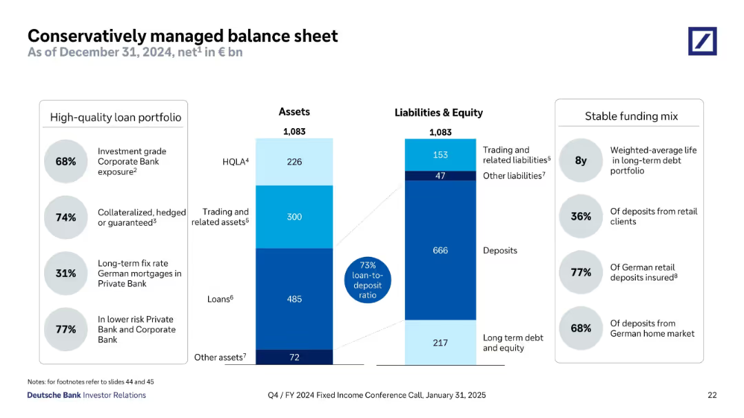
Bar charts and text blocks; displays revenue CAGR, CIR, RoTE, CET1 ratio with supporting commentary
Performance Metrics and KPIs
Financial Services
A snapshot of Deutsche Bank’s KPIs including CIR, RoTE, and CET1 ratio through Q1 2025. It tracks progress toward 2025 targets, showcasing strong revenue CAGR and improved cost/income ratio.
KPIs, RoTE, CIR, CET1 ratio, revenue CAGR, Deutsche Bank, performance targets, Q1 2025
Multiple Chart
Deutsche Bank
Saved
Vertical grouped bar chart showing 2024 vs 2018 agreement rates across countries regarding social media misinformation.
Market Analysis and Trends
Media & Entertainment
This slide analyzes how perceptions of social media’s role in misinformation have evolved in 22 countries. Agreement increased in several nations, though some like Malaysia and Japan saw decreases.
social media, misinformation, perception change, Ipsos, survey, trend analysis, digital trust
Mixed Chart
IPSOS
Saved
Vertical bar chart by country showing % agree/disagree on banning under-14s from social media in/outside school
Regulatory and Compliance
Education & Training
This slide presents opinions by country on whether children under 14 should be restricted from social media both inside and outside school. Most countries show majority agreement, especially France, Indonesia, and Colombia.
social media, children, regulation, under-14, school policy, bans, country opinion
Mixed Chart
IPSOS
Saved
Previous
Next
If nothing, comes up, please save your slides first
Create a FREE account to continue browsing
Receive Instant Access to 1,000+ slides from companies like McKinsey, Google, and Goldman Sachs
First Name
Last Name
Email
Password
I agree to all
Terms & Privacy Policy
Thank you! Your submission has been received!
Oops! Something went wrong while submitting the form.
Have an account?
Sign in
Column Chart
Heatmap
Chevron
Org Chart
Infographic
Callouts
Timeline
List
Graphic
Picture
Process Flow
Diagram
Paragraph
Map
Table
Framework
Subtitle
Takeaway Box
Icon
Other Chart
Radar Chart
Waterfall Chart
Mekko Chart
Pie Chart
Scatter Plot
Line Chart
Bar chart
Bullet points