Create a FREE Account
Instant access to 1,000+ real slides from top companies like McKinsey, BCG, Goldman Sachs, Google and many more!
First Name
Last Name
Email
Password
I agree to all
Terms & Privacy Policy
Thank you! Your submission has been received!
Oops! Something went wrong while submitting the form.
Have an account?
Sign in
Library
Templates
Courses
Pricing
My Account
My Slides
My Templates
✦ AI
AI Prompt Library
AI Search
Sign in
Start Here
Logout
My Saved Slides
The slide contains several data blocks with statistics on employer and workforce sentiments regarding returning to work post-pandemic. It includes bar charts and text descriptions to explain the trends.
Market Analysis and Trends
Professional Services
The slide examines trends in workforce and employer sentiments about returning to work after the pandemic. It highlights key statistics, such as the percentage of CEOs expecting remote work to continue and workers' preferences for remote work. This data is critical for planning future workplace strategies and policies.
Workforce, Employer Sentiment, Remote Work, Trends, Statistics
Mixed Chart
Deloitte
Saved
Displays maps of Africa from 2015-2019 with data points indicating female participation in the program.
Strategic Planning
Government & Public Sector
Tracks the change in country representation and female participation in the program over five years.
participation, trends, Africa, women, analysis
Graphic
Accenture
Saved
Column chart depicting agreement levels by different age groups that they need to do more for their mental well-being, with color-coded segments showing various levels of agreement.
Customer and Market Segmentation
Healthcare & Pharmaceuticals
Focuses on the challenges of mental health across age groups, emphasizing that younger individuals feel a more acute need to address mental well-being compared to older age groups.
mental health, age groups, challenges, survey, agreement
Mixed Chart
IPSOS
Saved
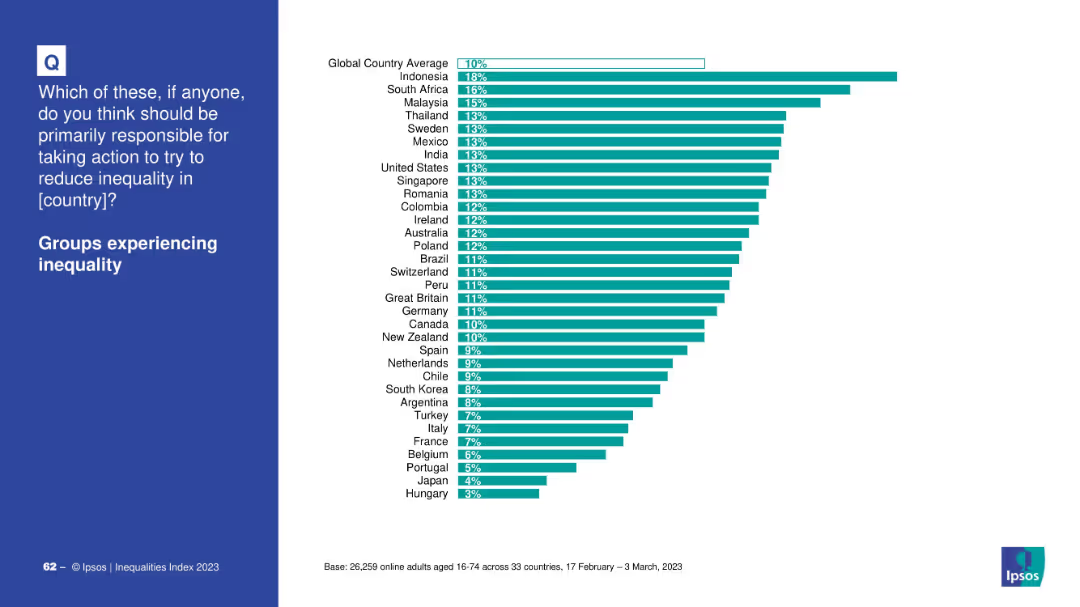
Country ranking bar chart showing support for responsibility among affected groups.
Market Analysis and Trends
Government & Public Sector
This chart illustrates how people from different countries think groups experiencing inequality should be primarily responsible. Indonesia ranks highest; Hungary lowest.
affected groups, inequality, country opinions, responsibility, Ipsos, bar chart, global ranking
Mixed Chart
IPSOS
Saved
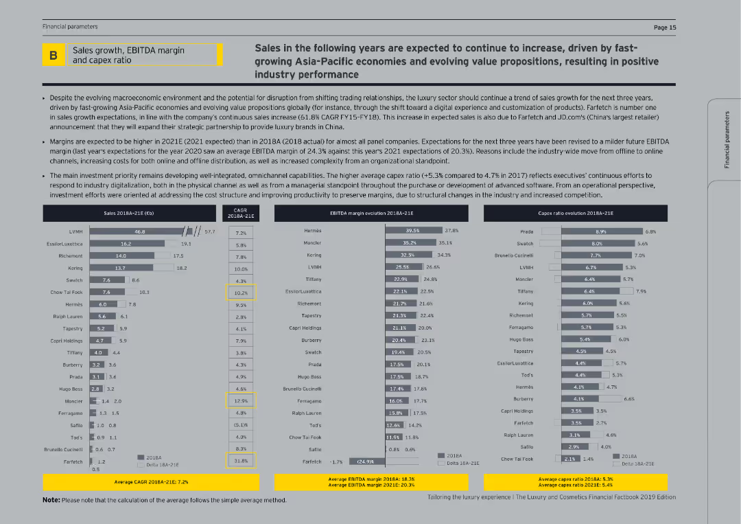
This slide contains tables and bar charts displaying sales growth, EBITDA margin, and capex ratio for luxury companies over time.
Financial Performance
Consumer Goods
The slide analyzes the financial performance of luxury companies, focusing on sales growth, EBITDA margins, and capital expenditure ratios, highlighting trends and future expectations.
Sales growth, EBITDA margin, capex ratio, luxury companies, financial performance
Multiple Chart
EY
Saved
This slide provides an overview of the investment landscape in Italy, using maps to depict the distribution and growth of startups, along with future market predictions.
Market Analysis and Trends
Technology & Software
Discusses the current and projected state of the startup ecosystem in Italy, emphasizing investment trends, challenges, and the growth potential within the European Union.
startups, Italy, investment, innovation, EU market, growth potential
Graphic
Bain
Saved
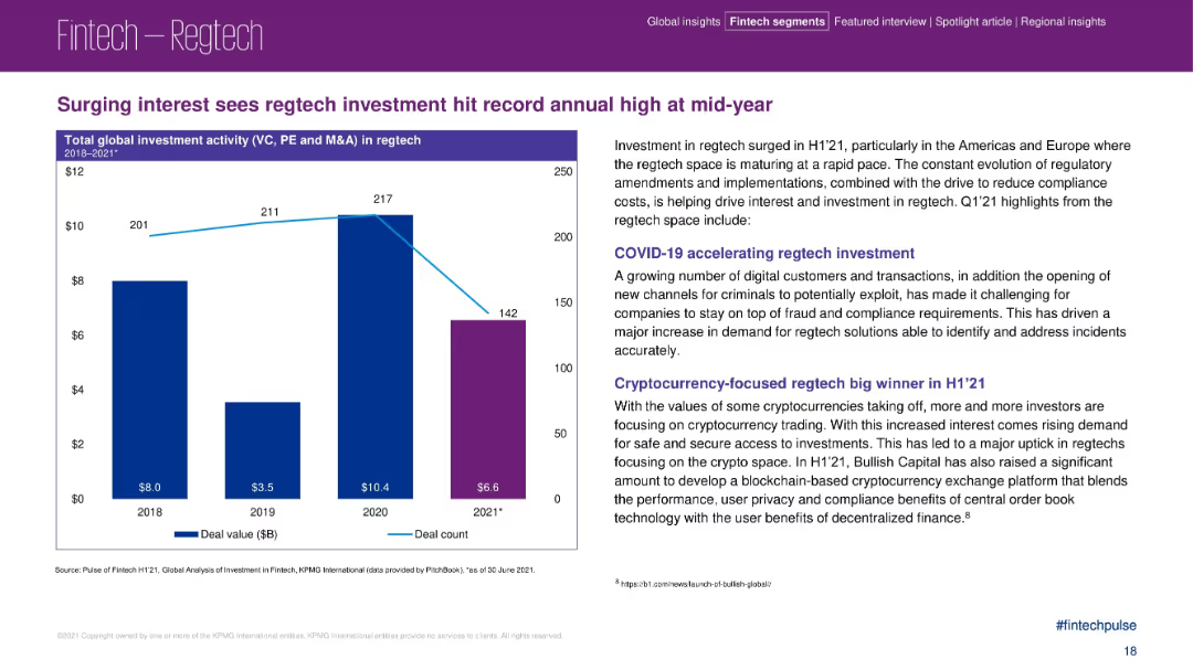
Bar chart on the left showing investment growth, paired with detailed insights on the right.
Risk Assessment and Management
Financial Services
This slide highlights a rise in regtech investment in H1 2021, particularly in the Americas and Europe. It attributes growth to regulatory changes, fraud prevention needs, and cryptocurrency-focused regtech. It also examines pandemic-driven digital transformation.
regtech, fintech compliance, digital fraud, cryptocurrency, investment surge, H1 2021
Mixed Chart
KPMG
Saved
Slide features column charts and statistical data on partnership growth, deal numbers, and discount rates within the debt collection market.
Risk Assessment and Management
Financial Services
Highlights the success of the "Limpa Nome" marketplace in Brazil, showcasing its effectiveness in debt negotiation and financial recovery for consumers.
debt negotiation, financial recovery, Brazil, marketplace, Limpa Nome
Multiple Chart
Barclays
Saved
The slide presents six column charts showcasing the year-to-date (YTD) performance of the S&P 500 index in terms of earnings growth, P/E ratio, ROE, market cap, beta, and dividend yield.
Performance Metrics and KPIs
Financial Services
This slide offers a YTD performance analysis of the S&P 500 index, highlighting key financial metrics such as earnings growth, P/E ratio, and ROE for the current year.
S&P 500, YTD analysis, earnings growth, P/E ratio, financial metrics
Multiple Chart
Morgan Stanley
Saved
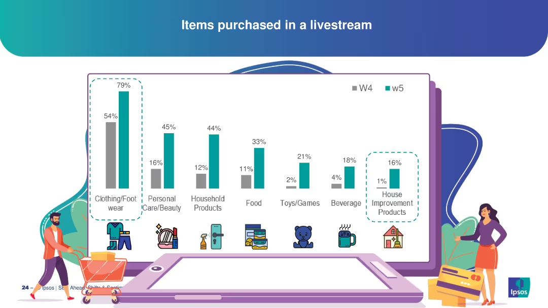
This slide features multiple vertical bar charts showing different categories of items purchased through livestreams. Each category is represented with icons and distinct colors, providing a clear visual comparison.
Market Analysis and Trends
Retail & E-commerce
The slide details various items purchased via livestreams, with clothing/footwear being the most popular at 79%, followed by personal care/beauty, household products, and others. It provides insight into consumer preferences and behavior in the livestream shopping context.
consumer behavior, livestream shopping, purchase categories, retail trends, e-commerce
Single Chart
IPSOS
Saved
Featuring a central circular diagram labeled 'Connected Commerce,' this slide juxtaposes consumer benefits against brand partnerships. It utilizes icons and brand logos to visually support the textual data.
Market Analysis and Trends
Financial Services
This slide communicates the benefits of a financial platform for both consumers and partnering brands, indicating a market-leading position with key statistics and affiliations.
platform, consumers, brands, partnerships, commerce
Table
JP Morgan
Saved
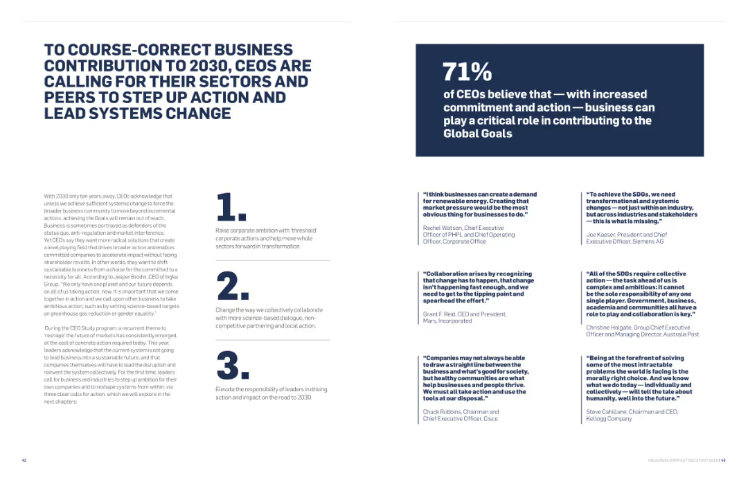
The slide includes a combination of text and highlighted numbers and points. It also features quotes from various CEOs.
Strategic Planning
Government & Public Sector
The slide emphasizes the need for increased commitment and action from businesses to meet the global goals by 2030, highlighting key areas of focus and CEO perspectives.
Business Contribution, 2030 Goals, Strategic Planning, System Change, CEO Perspectives, Government
Header Horizontal
Accenture
Saved
Contains bar charts comparing practices of high- vs. low-outcome organizations. Uses shades of green.
Operational Efficiency
Technology & Software
Focuses on AI operational best practices and their impact on organizational outcomes, detailing specific strategies like ROI tracking and AI model lifecycle strategies.
operational, AI, practices, outcomes, strategies
Mixed Chart
Deloitte
Saved
This slide contrasts two sets of data visualizations: a bar graph showcasing the shift in payment method preferences on the right, and detailed explanatory text on the left. The design is clean and the visualizations are easy to interpret.
Customer and Market Segmentation
Financial Services
Analyzes the growing preference for contactless payment methods, particularly e-wallets, over traditional cash transactions among Southeast Asian consumers, highlighting the influence of societal shifts on payment behaviors.
contactless payments, e-wallets, consumer trends, cash transactions, Southeast Asia, payment methods, digital payments, societal shifts
Multiple Chart
Bain
Saved
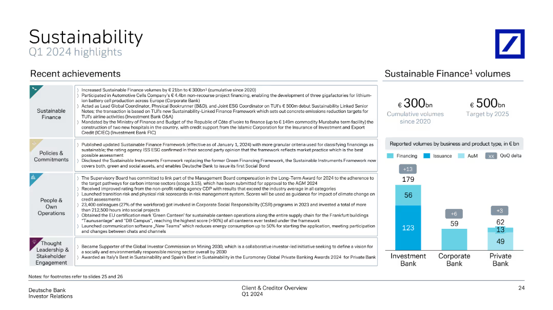
The slide features a clean layout with four sections, each marked with a distinct icon. The right side displays a column chart comparing sustainable finance volumes.
Operational Efficiency
Financial Services
The slide highlights Deutsche Bank's recent sustainability achievements, including increased sustainable finance volumes, updated policies, and social initiatives.
Sustainability, finance, policy, operations, engagement, Q1 2024, achievements, sustainable finance, corporate social responsibility, ESG
Mixed Chart
Deutsche Bank
Saved
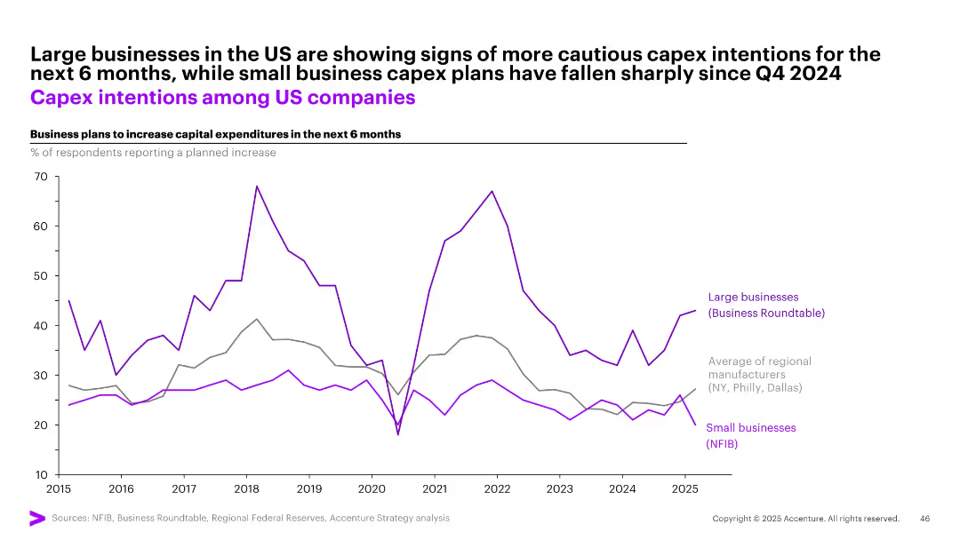
Single line graph with three trend lines comparing capex plans (large biz, small biz, regional avg); Y-axis = % increase intentions
Strategic Planning
Professional Services
This chart illustrates US business intentions to increase capital expenditures over the next 6 months. Large businesses remain cautious but stable in their plans, while small business capex intentions have dropped sharply since late 2024. Regional manufacturers also show flat-to-declining trends.
capex, US business, investment, large firms, small business, expenditure plans, intentions
Single Chart
Accenture
Saved
Slide with a column chart comparing podcast ad revenue shares by content genre from 2020 to 2021, highlighting top genres like News, Comedy, and Society & Culture.
Market Analysis and Trends
Media & Entertainment
Reviews the popularity and revenue generation of different podcast genres, noting significant growth in ad revenue for sports post-COVID.
Podcast, Genres, Revenue, Trends, Sports
Single Chart
PwC/Strategy&
Saved
Contains a large red and black pie chart with labels, detailing the percentage split between tax and non-tax revenue, accompanied by three colored triangles representing different non-tax revenue sources.
Regulatory and Compliance
Government & Public Sector
This slide visually differentiates the proportions of tax and non-tax revenue for a fiscal year, highlighting major sources like administrative fees and entrepreneurial income.
tax, revenue, non-tax, administrative fees, entrepreneurial, finance, government, analysis, proportion, sources
Mixed Chart
PwC/Strategy&
Saved
The slide features a title, a column chart with bar segments in different colors representing various financial data points over quarters. Annotations and a legend explain the components, such as regulatory requirements and organic capital generation.
Financial Performance
Financial Services
Illustrates the growth in organic capital and CET1 ratio, providing financial projections and potential uses of excess capital. Utilized in financial analysis or investor presentations to showcase financial strength and forecasting.
capital, CET1 ratio, projections, finance, organic growth, regulatory, assessment, RWA, dividends, strategy
Single Chart
JP Morgan
Saved
This slide is visually dense with a large column chart showing expansion market revenue over time and its CAGR. The chart is complemented by statistical data points and a map outline. Textual content is minimal, focusing on numerical growth representation, making it suitable for audiences interested in financial growth patterns.
Financial Performance
Financial Services
The slide presents a financial overview of a middle market expansion strategy, highlighting the consistent growth in revenue over several years. The visual focus is a column chart depicting rising figures with a target projection, supported by data on clients, loans, and deposits, emphasizing a steady increase in business performance.
middle market, expansion, revenue, growth, clients, CAGR, bankers, financial analysis, loans, deposits
Single Chart
JP Morgan
Saved
The slide includes column charts comparing data from different years.
Investment Analysis
Financial Services
Shows the growth of the Global Private Bank by comparing the number of hires, training hours, and advisor revenue contribution across years.
Private Bank, Growth, Hires, Training
Multiple Chart
JP Morgan
Saved
The slide has a map highlighting market shares in building construction and civil engineering across different regions, with percentages and icons for different sectors.
Industry Overview
Real Estate & Construction
Used to communicate the company’s market strength in urban development to investors or stakeholders.
Market Position, Construction, Engineering, Urban Development, Mapping, Shares, Regions
Multiple Chart
Goldman Sachs
Saved
Three-column layout with a pie chart of total workforce distribution, bar charts for technology and operations, and text descriptions of workforce distribution and reinvestment opportunities.
Human Resources and Talent Management
Professional Services
The slide presents an analysis of workforce distribution and opportunities for reinvestment, emphasizing the mix of employees and externals in technology and operations.
workforce, reinvestment, distribution, technology, operations
Multiple Chart
Credit Suisse
Saved
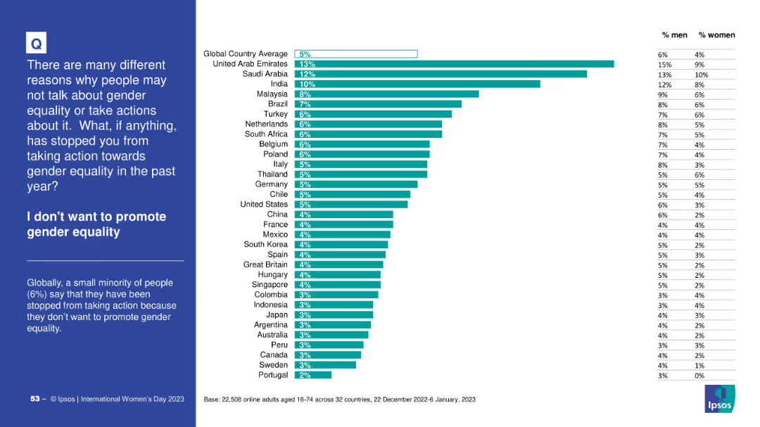
Consistent bar chart format showing reluctance to promote gender equality; left side has title and summary; gender breakdown on the right.
Strategic Planning
Government & Public Sector
This slide presents the proportion of respondents who deliberately chose not to promote gender equality. The global average is 5%, with UAE and Saudi Arabia higher. Gender differences are subtle but present.
resistance, opposition, gender equality, promotion, Ipsos, country variation
Mixed Chart
IPSOS
Saved
Column chart showing average annual wheat exports by destination region for Australia, Canada, and Ukraine, with text discussing competition in key export markets.
Competitive Landscape
Agriculture & Food Production
The slide analyzes competition in wheat export markets, comparing Australia's export destinations to those of Canada and Ukraine and highlighting competitive pressures.
wheat exports, competition, Australia, Canada, Ukraine
Mixed Chart
LEK
Saved
Previous
Next
If nothing, comes up, please save your slides first
Create a FREE account to continue browsing
Receive Instant Access to 1,000+ slides from companies like McKinsey, Google, and Goldman Sachs
First Name
Last Name
Email
Password
I agree to all
Terms & Privacy Policy
Thank you! Your submission has been received!
Oops! Something went wrong while submitting the form.
Have an account?
Sign in
Column Chart
Heatmap
Chevron
Org Chart
Infographic
Callouts
Timeline
List
Graphic
Picture
Process Flow
Diagram
Paragraph
Map
Table
Framework
Subtitle
Takeaway Box
Icon
Other Chart
Radar Chart
Waterfall Chart
Mekko Chart
Pie Chart
Scatter Plot
Line Chart
Bar chart
Bullet points