Create a FREE Account
Instant access to 1,000+ real slides from top companies like McKinsey, BCG, Goldman Sachs, Google and many more!
First Name
Last Name
Email
Password
I agree to all
Terms & Privacy Policy
Thank you! Your submission has been received!
Oops! Something went wrong while submitting the form.
Have an account?
Sign in
Library
Templates
Courses
Pricing
My Account
My Slides
My Templates
✦ AI
AI Prompt Library
AI Search
Sign in
Start Here
Logout
My Saved Slides
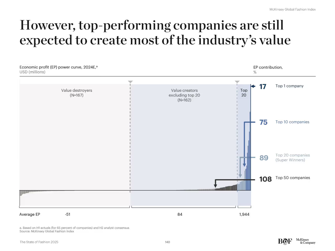
Wide bar chart resembling a power curve distribution with annotations. Horizontal layout. The chart groups companies by economic profit tiers and illustrates percentage contributions for top-performing brackets.
Financial Performance
Retail & E-commerce
Despite the narrowing EP gap, the top 20 companies (Super Winners) are still projected to deliver the majority of industry economic profit in 2024. The top 10 will account for 75% and the single top company for 17% of EP. The rest, including 167 value destroyers, generate below-average or negative EP.
super winners, economic profit, EP curve, top companies, fashion, value destroyers, retail performance
Single Chart
McKinsey
Saved
A dark background with column charts showing future technology trends in healthcare, with white and yellow text.
Technology and Digital Transformation
Healthcare & Pharmaceuticals
It predicts future trends such as digital health monitoring, hospital-at-home models, and virtual hospitals.
future technology, healthcare, digital trends, survey, England
Mixed Chart
EY
Saved
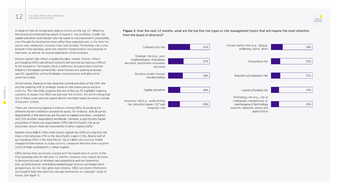
The slide has a column chart listing the top emerging risks for CROs, with text explaining the results. The right side highlights the opinions of respondents from different regions.
Risk Assessment and Management
Financial Services
The slide outlines emerging risks identified by CROs, including cybersecurity, geopolitical risks, and environmental risks, and their impact on the insurance industry.
emerging risks, CRO, insurance, geopolitical, environmental
Multiple Chart
EY
Saved
Bar chart with various response categories regarding the effectiveness of performance management systems.
Human Resources and Talent Management
Professional Services
Showcases different perceptions towards current performance management systems in organizations.
perceptions, performance, management, effectiveness, systems
Single Chart
PwC/Strategy&
Saved
The slide uses vertical bar charts to compare the top five concerns deterring EV adoption over three years (2021, 2022, 2023), each with different colors.
Market Analysis and Trends
Transportation & Logistics
This slide identifies the main concerns preventing consumers from buying EVs, such as lack of charging stations, limited range, and high purchase costs, across different years.
EV concerns, charging stations, purchase cost, range anxiety, consumer deterrents
Multiple Chart
EY
Saved
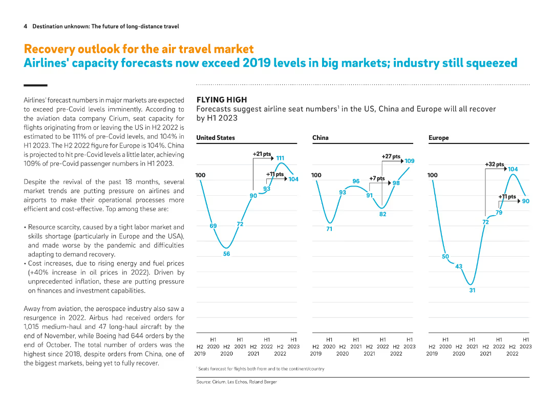
Full-slide with three line graphs on seat capacity forecasts and accompanying explanation of airline and aerospace trends. Emphasizes post-Covid recovery in the US, China, and Europe.
Strategic Planning
Transportation & Logistics
Forecasts suggest airline seat capacities will exceed 2019 levels by H1 2023. The slide also highlights industry pressures such as resource scarcity, labor shortages, and rising fuel costs. Aerospace orders have rebounded, especially in the US and Europe.
Airline capacity, post-Covid recovery, seat forecast, labor shortages, fuel prices, aerospace orders, air travel market
Multiple Chart
Roland Berger
Saved
The slide features a title, two complex column charts comparing quarterly financial results, and a detailed text section highlighting key points in bullet format.
Financial Performance
Financial Services
This slide presents a comparative financial analysis of consumer and wealth management revenues over different quarters. It is used to highlight year-over-year growth and other financial metrics like net revenues and credit loss provisions.
Financial, Wealth Management, Quarterly Analysis, Growth, Net Revenue, Credit Loss, Management Fees, Consumer Banking, Revenue Highlights
Multiple Chart
Goldman Sachs
Saved
Shows a grey column chart comparing the company's dividend yield to peers, marked by a green horizontal line for the average and a special highlight for recent growth.
Financial Performance
Consumer Goods
Discusses the company’s consistent dividend growth over the years, contrasting it with the industry average to highlight its strength in returning shareholder value.
dividends, growth, comparison, shareholder value, industry average
Single Chart
Barclays
Saved
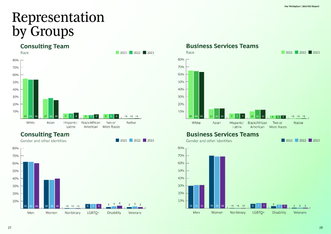
The slide features column charts depicting representation by groups, comparing consulting teams and business services teams across different races and identities for the years 2021, 2022, and 2023.
Customer and Market Segmentation
Professional Services
The slide compares the representation of various races and identities within consulting and business services teams over three years.
representation, consulting, business services, race, identity
Multiple Chart
BCG
Saved
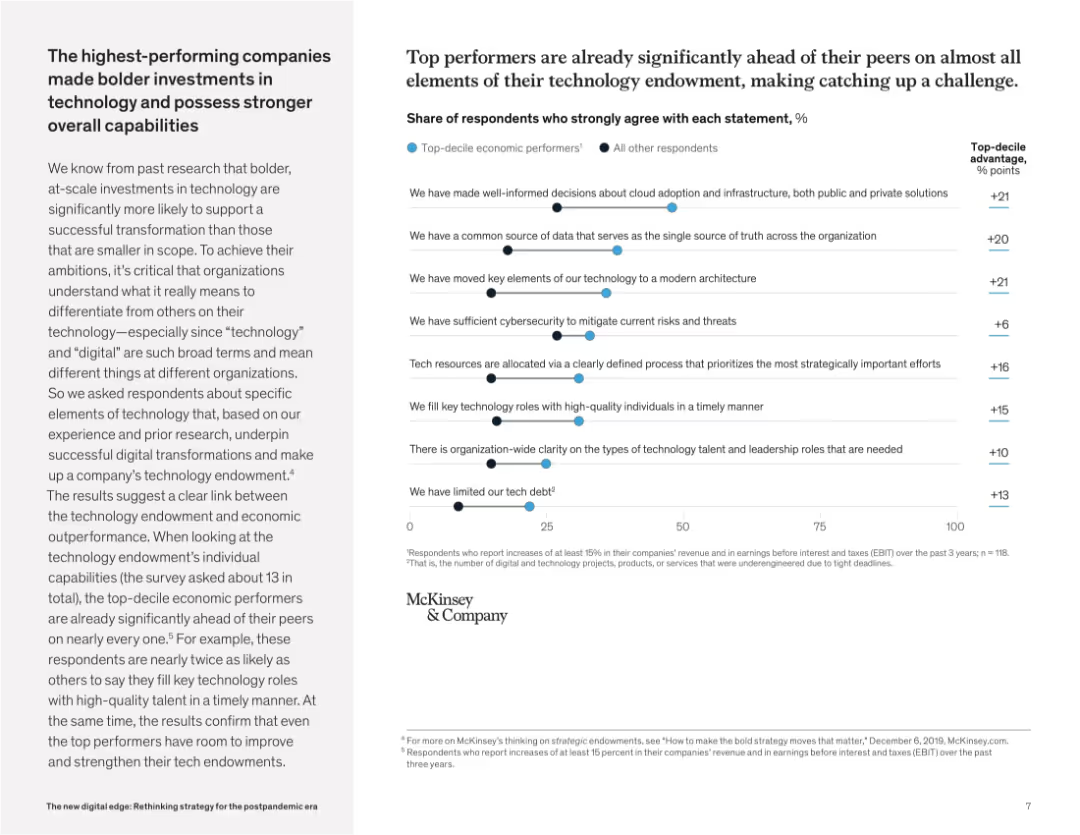
Right-aligned multi-bar chart compares top performers with others across tech-endowment attributes. Left side explains methodology and results.
Performance Metrics and KPIs
Technology & Software
This slide highlights that top-performing companies outperform peers in nearly every technology capability, from architecture decisions to tech role clarity. The insights stress how bold, large-scale tech investments underpin superior business performance.
tech endowment, top performers, digital capabilities, architecture, cybersecurity, cloud strategy, talent clarity, transformation
Mixed Chart
McKinsey
Saved
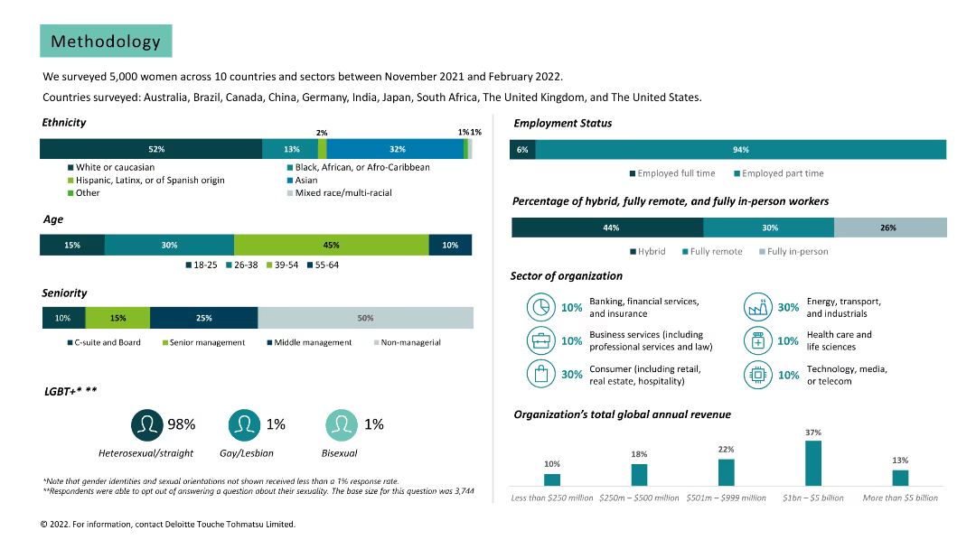
Various charts and text. Data on survey demographics, including ethnicity, age, seniority, employment status, and sector of organization.
Market Analysis and Trends
Professional Services
Provides detailed methodology of the survey, including participant demographics and organization details.
methodology, survey, demographics, ethnicity, age, seniority, employment status, sector, organization
Multiple Chart
Deloitte
Saved
Slide presents bar charts and descriptive text on a gradient background. The chart illustrates responses regarding speed, scope, and scale of transformation during uncertain times.
Operational Efficiency
Technology & Software
Discusses how companies in Growth Markets adapt to rapid changes and manage multiple transformations simultaneously. Useful for operational strategy sessions and discussions on business agility.
agility, transformation, Growth Markets, business strategy, operations management
Mixed Chart
Accenture
Saved
The slide displays a combination of text and a column chart. The chart illustrates the job loyalty trend from 2016 to 2021, highlighting differences between millennials and Gen Z with green and blue bars respectively. The slide is clean and uses color effectively to differentiate data points.
Human Resources and Talent Management
Technology & Software
The slide investigates job loyalty trends among millennials and Gen Z, noting a peak in 2020 and subsequent decline. A bar chart compares the percentage of those likely to stay with their current employer versus seeking new opportunities, shedding light on workforce dynamics and talent retention strategies.
Job Loyalty, Millennials, Gen Z, Trends, Workforce Dynamics, Bar Chart, Talent Retention, Employment Trends
Mixed Chart
Deloitte
Saved
Diagrams showing the integration of various types of credit data to enhance financial inclusion, with clear visual representation of data relationships.
Industry Overview
Financial Services
Explains how Experian integrates various data types to enhance credit visibility and predictability, aiming to improve financial inclusion with new analytical tools.
financial inclusion, credit data, analytics, visibility, predictability
Diagram
Barclays
Saved
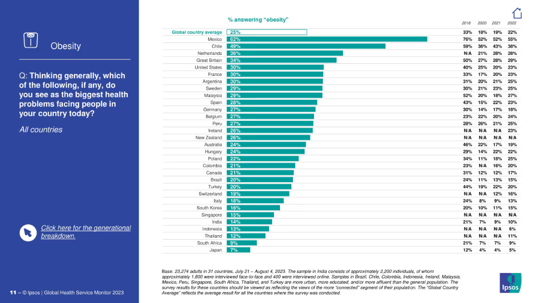
Split layout: Left side has a blue background with a question and icon; right side contains a horizontal bar chart with data by country.
Market Analysis and Trends
Healthcare & Pharmaceuticals
The slide displays a global survey identifying obesity as a major health concern. It shows the percentage of people in various countries who consider obesity a top health issue, with Mexico and Chile ranking highest.
obesity, global health, survey, Ipsos, health concerns, country comparison, bar chart, Mexico, Chile, awareness
Mixed Chart
IPSOS
Saved
Displays diagrams and lists integrating circular intelligence into business operations, with focus areas like "Target & Performance Management" and "Measure & Monitor."
Technology and Digital Transformation
Environmental Services & Sustainability
Highlights how integrating circular intelligence can drive business value across various operational aspects. This slide is particularly useful for discussions on implementing circular strategies in business processes, enhancing data integration, and driving operational efficiencies.
Circular economy, Business intelligence, Data integration, Operational efficiency, Performance management, Sustainability, Technology integration, Business drivers, Monitoring, Reporting
Linear Flow
Accenture
Saved
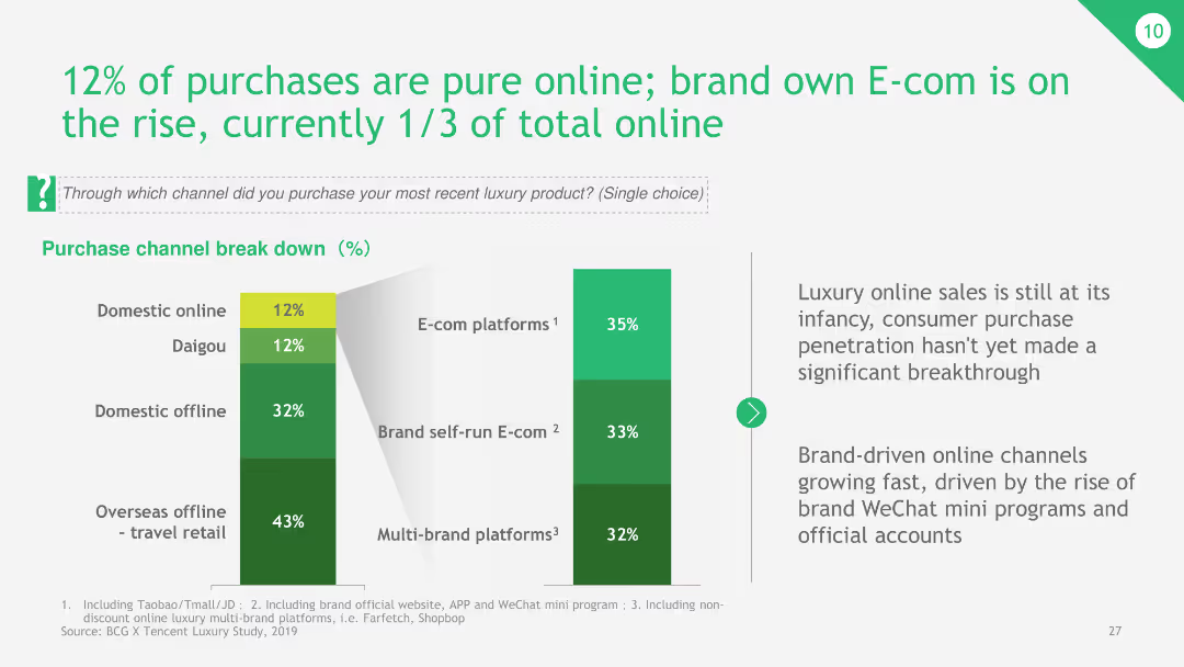
The slide presents a bar chart showing the breakdown of purchase channels, focusing on online sales, including brand self-run E-commerce platforms and multi-brand platforms.
Market Analysis and Trends
Retail & E-commerce
The slide reveals that 12% of luxury product purchases are online, with a growing share of brand-run E-commerce platforms. It highlights the emerging trend of online luxury shopping and the significant role of brand-owned platforms.
online purchases, E-commerce, luxury products, brand platforms, multi-brand platforms
Multiple Chart
BCG
Saved
A multi-line graph depicts the spread of CLOs against various ratings, contrasting these with underlying loan spreads.
Risk Assessment and Management
Financial Services
This slide evaluates CLO volatility relative to underlying loans, providing insights for risk management in securitized credit.
CLOs, volatility, loans, risk, securitized credit, spreads, management, analysis, ratings
Single Chart
Morgan Stanley
Saved
Diagrams and textual descriptions detail the workings of the eFishery platform, illustrating interactions between technology and aquaculture.
Product and Service Analysis
Agriculture & Food Production
Explains the eFishery platform’s role in enhancing aquaculture through technology, focusing on sustainability and efficiency, relevant for stakeholders in agriculture and technology.
eFishery, aquaculture, technology, sustainability, diagrams, platform, service analysis, agriculture, interaction
Framework
Bain
Saved
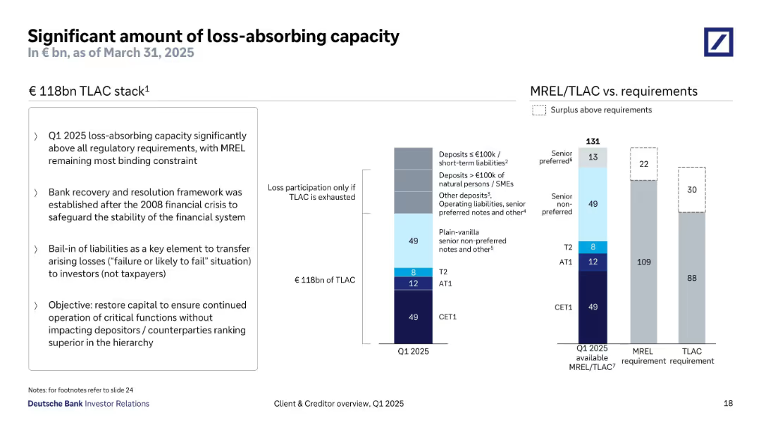
Split into three sections: left text box with bullet points, center TLAC breakdown bar chart, right MREL/TLAC requirement vs. actual chart. Clean and structured with consistent typography and muted color palette.
Risk Assessment and Management
Financial Services
Highlights Deutsche Bank’s €118bn TLAC stack as of Q1 2025, well above regulatory requirements. Emphasizes the importance of bail-in capital, regulatory compliance post-2008, and the preservation of senior claims in the capital hierarchy.
TLAC, MREL, bail-in, financial stability, capital stack, regulation
Multiple Chart
Deutsche Bank
Saved
The slide features a bar chart on the left showing the share of global CO2 emissions by country and a column chart on the right showing global CO2 emissions per capita.
Market Analysis and Trends
Environmental Services & Sustainability
It presents the distribution of CO2 emissions by country and compares per capita emissions, offering insights into the global contributions to greenhouse gas emissions.
CO2 emissions, global warming, environmental impact, greenhouse gases, country comparison, per capita emissions, J.P. Morgan, climate data, sustainability, carbon footprint
Multiple Chart
JP Morgan
Saved
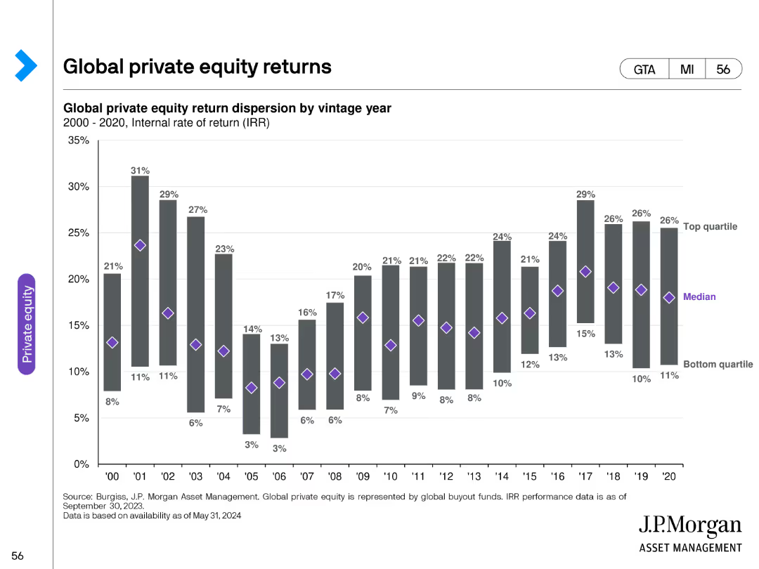
The slide features a bar chart depicting global private equity return dispersion by vintage year, with clear demarcations for top quartile, median, and bottom quartile.
Financial Performance
Financial Services
It offers insights into global private equity returns, presenting return dispersion by vintage year and highlighting performance differences among quartiles.
private equity, global, returns, vintage year, performance, dispersion, data analysis, financial
Single Chart
JP Morgan
Saved
The slide presents a balanced combination of text, icons, and a Venn diagram. The icons represent different business areas, while the diagram depicts the intersection of energy policies and current events.
Industry Overview
Energy & Utilities
This slide offers an overview of Seatruim's strategic focus on offshore renewables, new energy, and cleaner solutions, utilizing a Venn diagram to illustrate market positions and energy policy impacts. It could be used to outline the company's market strategy in the energy sector.
Energy, Renewables, Transition, Strategy, Market, Offshore
Pillar
Morgan Stanley
Saved
Slide with various column charts showing past and planned issuances and redemptions of financial instruments.
Strategic Planning
Financial Services
Plans and reviews issuance strategies for 2024, detailing amounts and types of instruments, aligned with financial goals.
issuance, finance, planning, bonds, securities, strategy
Multiple Chart
Deutsche Bank
Saved
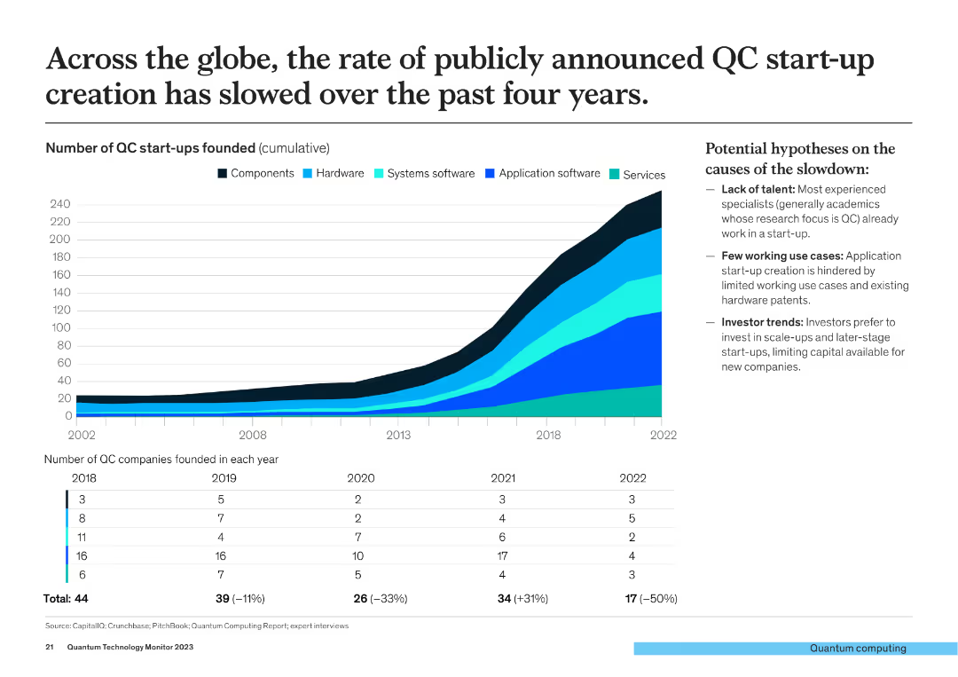
The slide includes a cumulative line chart showing the number of QC start-ups founded (2002-2022) and a column chart detailing the number of QC companies founded per year from 2018-2022.
Market Analysis and Trends
Financial Services
This slide discusses the global slowdown in the creation of QC start-ups over the past four years, with data on the cumulative and annual number of start-ups founded.
QC start-ups, global slowdown, start-up creation, quantum computing, market trends
Mixed Chart
McKinsey
Saved
Previous
Next
If nothing, comes up, please save your slides first
Create a FREE account to continue browsing
Receive Instant Access to 1,000+ slides from companies like McKinsey, Google, and Goldman Sachs
First Name
Last Name
Email
Password
I agree to all
Terms & Privacy Policy
Thank you! Your submission has been received!
Oops! Something went wrong while submitting the form.
Have an account?
Sign in
Column Chart
Heatmap
Chevron
Org Chart
Infographic
Callouts
Timeline
List
Graphic
Picture
Process Flow
Diagram
Paragraph
Map
Table
Framework
Subtitle
Takeaway Box
Icon
Other Chart
Radar Chart
Waterfall Chart
Mekko Chart
Pie Chart
Scatter Plot
Line Chart
Bar chart
Bullet points