Create a FREE Account
Instant access to 1,000+ real slides from top companies like McKinsey, BCG, Goldman Sachs, Google and many more!
First Name
Last Name
Email
Password
I agree to all
Terms & Privacy Policy
Thank you! Your submission has been received!
Oops! Something went wrong while submitting the form.
Have an account?
Sign in
Library
Templates
Courses
Pricing
My Account
My Slides
My Templates
✦ AI
AI Prompt Library
AI Search
Sign in
Start Here
Logout
My Saved Slides
Features a pie chart showing the percentage of people using Generative AI for work, with a bar chart for specific purposes like personal, work, and education.
Market Analysis and Trends
Technology & Software
Highlights the adoption of Generative AI tools in professional contexts, estimating the number of users and their application areas.
Generative AI, workplace adoption, professional use, technology impact, user statistics
Mixed Chart
Deloitte
Saved
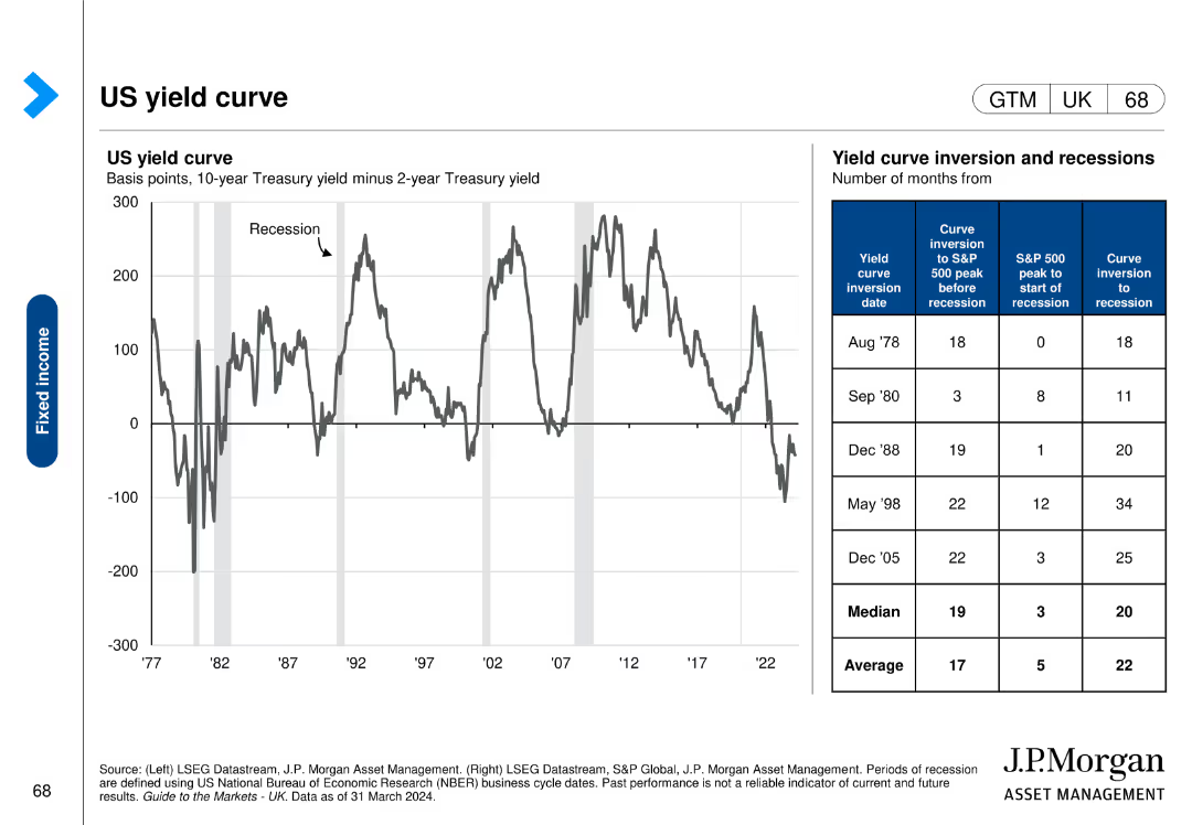
This slide includes a line chart showing the US yield curve over time and a table detailing yield curve inversion dates and subsequent economic events.
Risk Assessment and Management
Financial Services
The slide analyzes the US yield curve and its inversions, providing insights into economic risks and the timing of recessions, useful for risk management.
US, yield curve, inversion, recessions, economic events, risk assessment, management
Mixed Chart
JP Morgan
Saved
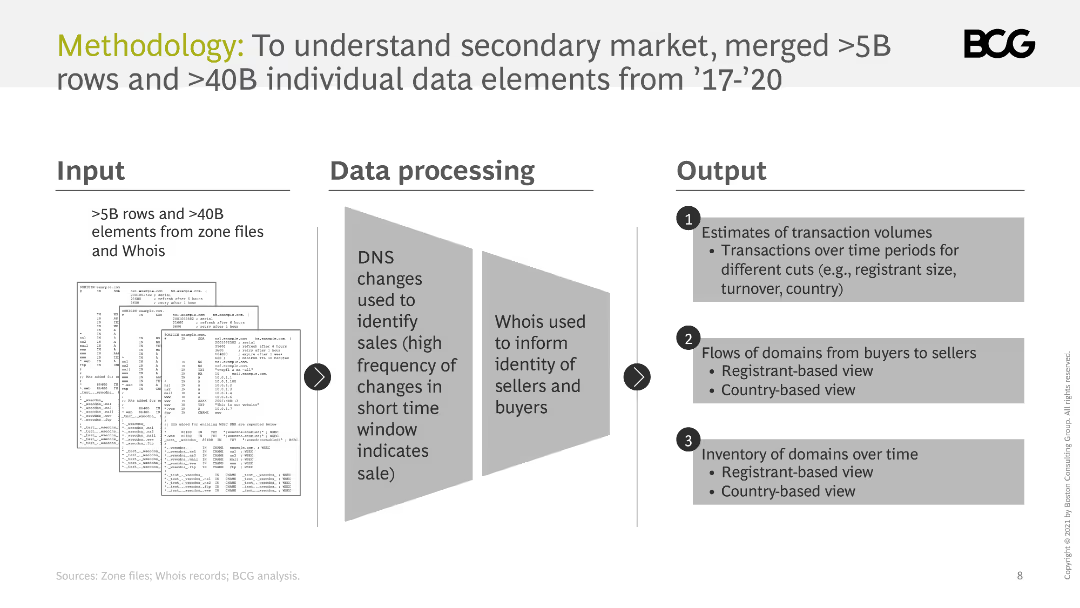
The slide outlines the methodology for understanding the secondary market, including inputs, data processing, and outputs. It uses diagrams to illustrate the process.
Technology and Digital Transformation
Professional Services
It describes the methodology used to analyze the secondary market, including data sources, processing techniques, and the types of outputs generated.
methodology, data processing, secondary market, analysis, inputs, outputs
Linear Flow
BCG
Saved
Includes column charts and bar graphs detailing the growth and segmentation of SEA’s carbon market, highlighted with annotations for clarity.
Market Analysis and Trends
Environmental Services & Sustainability
Analyzes the growth trends of the voluntary carbon market in SEA, emphasizing forestry credits and future projections, useful for investors and policy makers in environmental sectors.
SEA, carbon market, growth, voluntary, forestry credits, projections, column charts, bar graphs, annotations, investment
Multiple Chart
Bain
Saved
Text with three column charts showing cross-border deal volumes (outbound, inbound, and Middle East) from fiscal years 2021 to 2023.
Mergers and Acquisitions
Financial Services
Provides data on cross-border M&A deal volumes, showing outbound, inbound, and regional trends, and emphasizing the resilience of the Middle East market.
M&A, cross-border, deal volume, outbound, inbound, Middle East, fiscal, years, market
Mixed Chart
PwC/Strategy&
Saved
The slide features wave graphics and icons to discuss the advantages of quantum communication. The content is arranged in a clear, linear fashion, with color differentiation aiding in distinguishing between the different sections and points made on the slide.
Technology and Digital Transformation
Technology & Software
This slide delves into the benefits and aspirations of quantum communications over traditional methods, focusing on enhanced security and computational power. It serves to inform on the potential applications and breakthroughs that quantum communications might offer in various fields.
Quantum Communications, Security, Computing Power
Header Horizontal
McKinsey
Saved
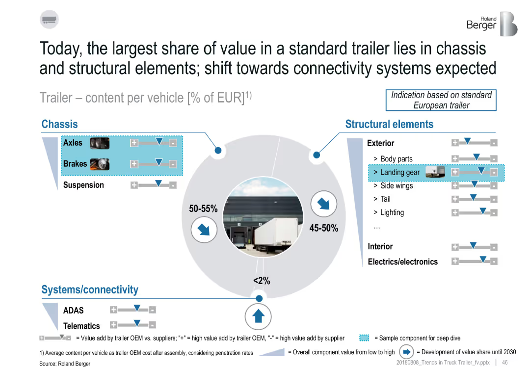
Circular pie chart with breakdown of trailer value share by component group; includes callouts for chassis, structural, and connectivity systems
Product and Service Analysis
Transportation & Logistics
The slide shows that trailer value is mostly concentrated in the chassis (50–55%) and structural elements (45–50%), while connectivity systems like ADAS and telematics are minimal (<2%). Value trends are shown for specific components such as landing gear and brakes, with future development indicators.
trailer components, chassis, structural elements, ADAS, value share, landing gear, telematics
Single Chart
Roland Berger
Saved
A pie chart showing company size distribution and a world map indicating surveyed countries. Text lists respondent demographics and industries.
Market Analysis and Trends
Professional Services
The slide presents the demographic breakdown of a survey, including company size, industries, and geographical distribution of the respondents.
Demographics, Survey, Company Size, Industries, Global Distribution
Mixed Chart
Accenture
Saved
A column chart showcases commercial work done in Australia from FY07 to FY25 with actual data and projections. The chart includes annotations and a legend explaining scenario colors.
Market Analysis and Trends
Real Estate & Construction
Analyzes the growth trends in the Australian commercial sector, projecting future activities and the influence of economic changes on market conditions.
commercial, Australia, growth trends, projections, economic changes
Mixed Chart
Deloitte
Saved
The slide contains four colored boxes with lists, headlines in blue, and subtext. A header sentence spans the top, with a footer sentence below.
Industry Overview
Financial Services
Presents four pillars of a diversified business model, positioning for market outperformance, and foundational principles.
Diversified franchise, client franchises, principles, shareholder value, business practices
Table
JP Morgan
Saved
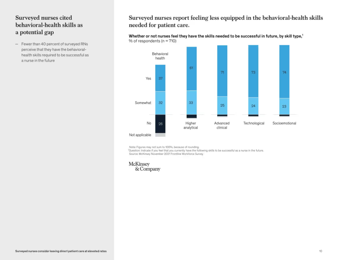
Vertical bar graph showing self-perceived skill gaps by skill type; left-side text summary
Organizational Structure and Change
Healthcare & Pharmaceuticals
This slide reveals that many nurses feel underprepared in behavioral-health skills compared to other domains like technological or clinical capabilities. Only 37% of nurses feel confident in their behavioral health skills, pointing to a critical development area for future readiness.
skills gap, behavioral health, workforce training, nursing education, competency assessment, professional development
Mixed Chart
McKinsey
Saved
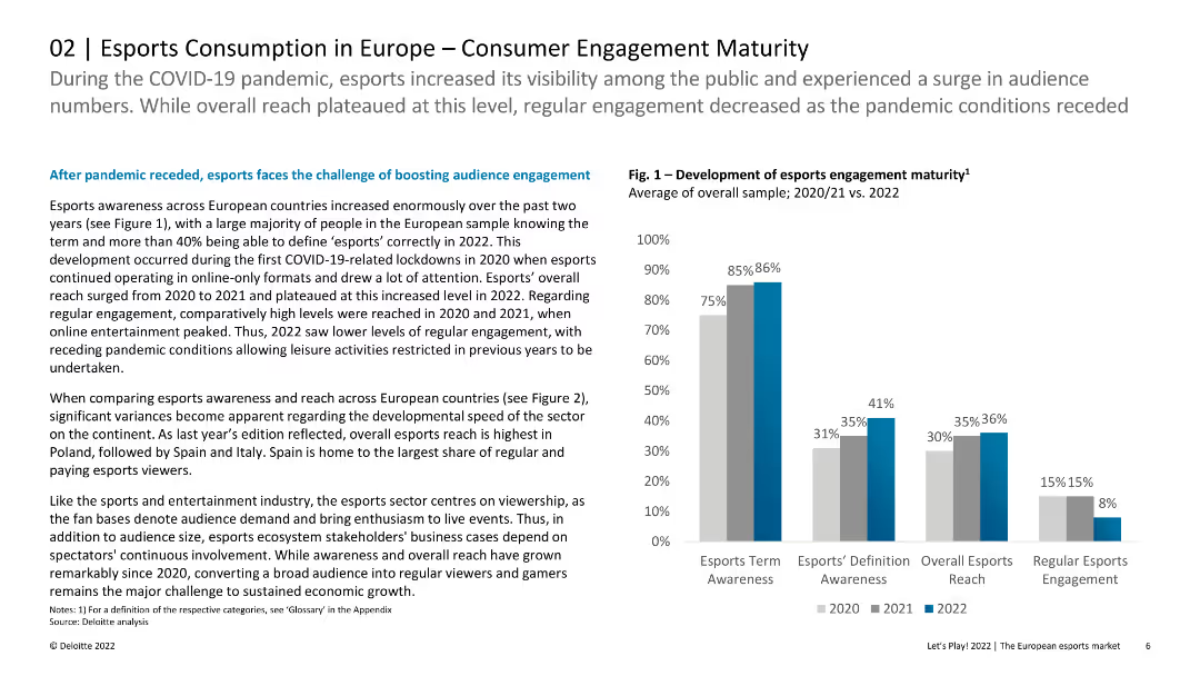
Column chart showing the development of esports engagement maturity over three years, with varying levels of awareness and engagement.
Market Analysis and Trends
Media & Entertainment
Analyzes the growth and engagement levels in esports across Europe, highlighting the increased awareness and reach over the past few years.
esports, engagement, maturity, Europe, awareness, reach, growth
Mixed Chart
Deloitte
Saved
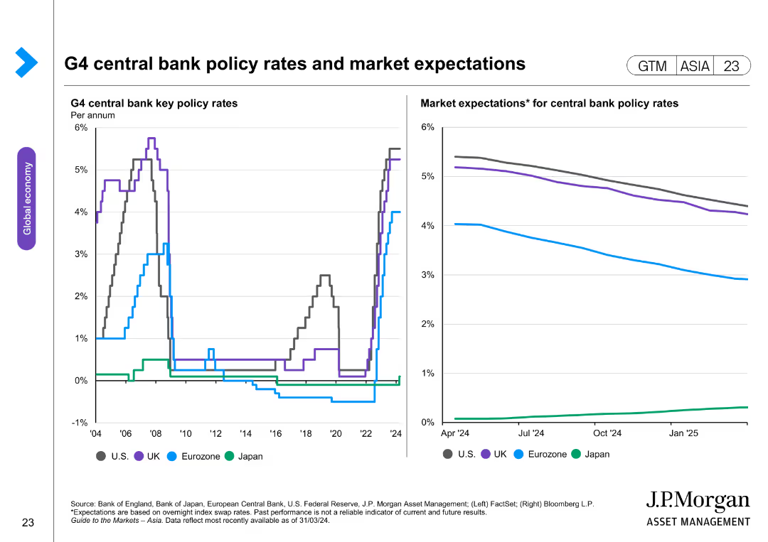
The slide features two line charts. The left chart displays key policy rates of G4 central banks (US, UK, Eurozone, Japan) over time. The right chart shows market expectations for these policy rates, with forecasted trends.
Market Analysis and Trends
Financial Services
The slide provides an analysis of G4 central bank policy rates and market expectations, highlighting monetary policy trends. It is used for financial market analysis and strategic planning.
G4 central banks, policy rates, market expectations, US, UK, Eurozone, Japan, monetary trends, financial analysis
Multiple Chart
JP Morgan
Saved
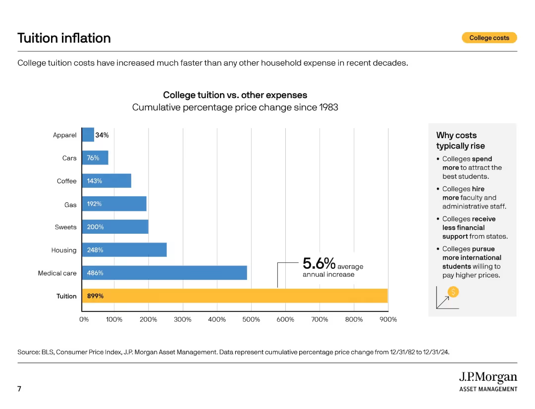
Vertical bar chart comparing cumulative price increases for tuition and other expenses since 1983. Sidebar explains cost drivers.
Market Analysis and Trends
Education & Training
This slide shows that tuition has increased by 899% since 1983—far outpacing other household costs. The sidebar details reasons for rising costs such as staffing, student competition, and reduced state funding.
tuition inflation, cost drivers, education costs, CPI, historical trends, household expenses, financial planning, college spending, cost comparison
Mixed Chart
JP Morgan
Saved
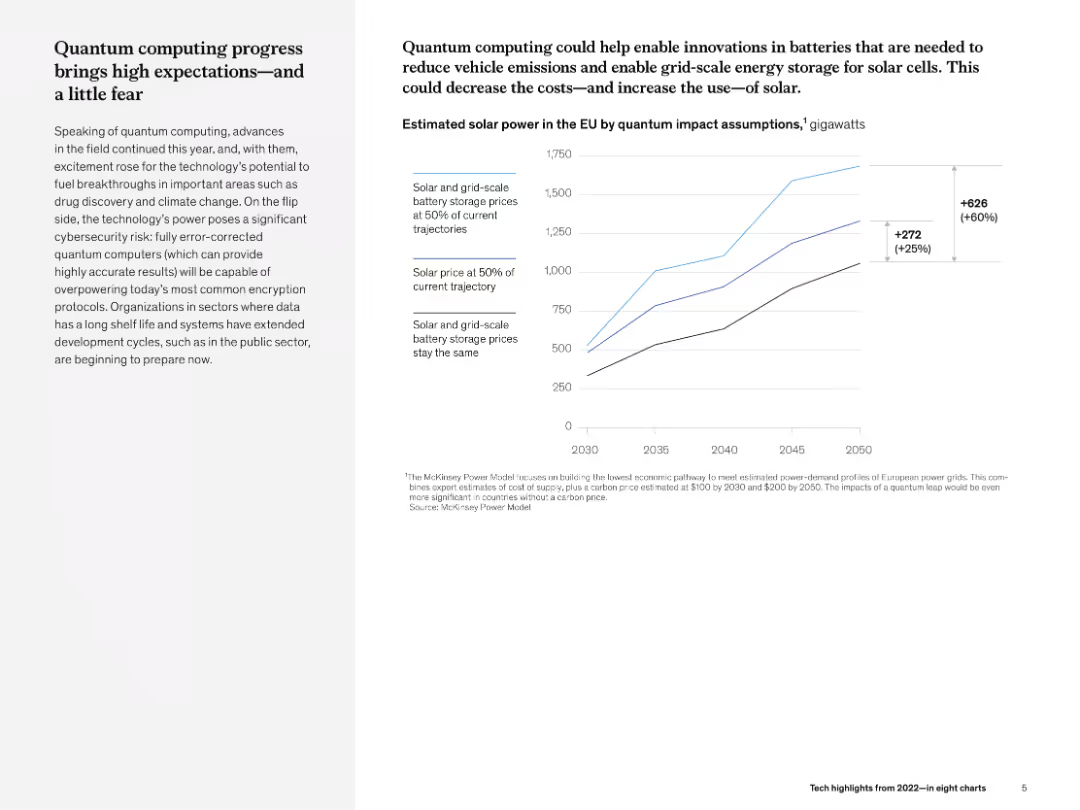
Left text column with narrative and right line chart showing future solar energy impact under quantum assumptions.
Technology and Digital Transformation
Environmental Services & Sustainability
The slide details the potential of quantum computing in energy optimization, especially in solar energy and storage. The chart projects power capacity under different assumptions, showing a 60% increase with quantum breakthroughs.
quantum computing, solar power, energy storage, sustainability, projections, McKinsey
Mixed Chart
McKinsey
Saved
Depicts Lenovo's evolution with a central graphic highlighting core modernization areas and financial milestones, complemented by a clear layout with purple and white design elements.
Market Analysis and Trends
Technology & Software
This slide reflects on Lenovo's transformation through continuous innovation in technology and processes. It illustrates Lenovo's journey from a hardware-centric company to an intelligent solutions provider, highlighting strategic areas such as supply chain and IT transformation.
Lenovo, core modernization, enterprise reinvestment, market penetration, intelligent solutions, ERP overhaul, IT model redesign, supply chain, finance transformation
Diagram
Accenture
Saved
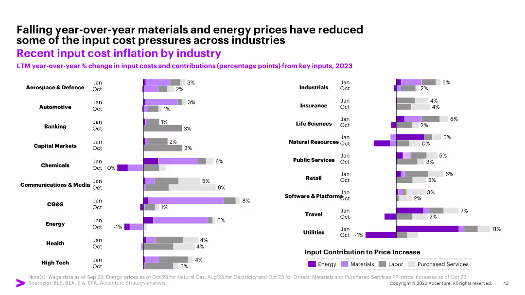
The slide includes a bar chart showing year-over-year changes in input costs and contributions from key inputs for various industries, with a legend explaining the colors.
Financial Performance
Industrial & Manufacturing
The slide details the input cost inflation by industry, highlighting the contributions of energy, materials, and labor to overall cost changes.
input costs, inflation, industry, energy, materials
Multiple Chart
Accenture
Saved
Displays a comparison of H2 vessel types by application and geography for 2023 and 2030, highlighting the expected dominance of Type IV vessels.
Technology and Digital Transformation
Energy & Utilities
Discusses the anticipated dominance of Type IV H2 vessels by 2030, focusing on their application in mobility and infrastructure and various pressure levels.
Type IV vessels, H2 storage, dominance, application, geography, mobility, infrastructure, pressure levels, 2030
Table
Roland Berger
Saved
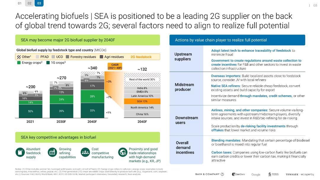
SEA is positioned to be a leading 2G supplier
Technology and Digital Transformation
Energy & Utilities
Technology and Digital Transformation
Describes how SEA can become a major 2G biofuel supplier by 2040. Details feedstock supply projections and value chain actions needed for success, including regulations, investment, and market development.
Mixed Chart
Bain
Saved
A bar extends across the slide, segmented into various client categories with associated market sizes and wealth management share, presented in a clear, hierarchical manner. The design is simple with a blue color scheme.
Financial Performance
Financial Services
Details the firm's market approach for different client segments across the wealth spectrum, from ultra-high net worth to mass affluent, indicating potential for market expansion.
Wealth Spectrum, Client Segmentation, Market Share
Table
Goldman Sachs
Saved
The slide features a dark blue color scheme with a line chart comparing Goldman Sachs and U.S. Peer Average BVPS growth over a 10-year period, and a bar chart showing GS's outperformance in 3, 5, and 10-year spans. There's a bullet point list on the left outlining capital management philosophy.
Financial Performance
Financial Services
This slide presents Goldman Sachs' prudent capital management over the years, highlighting significant returns of capital, net income, and growth in BVPS compared to its peers, likely used in financial reviews or investor presentations.
Capital management, BVPS, financial growth, performance, Goldman Sachs
Multiple Chart
Goldman Sachs
Saved
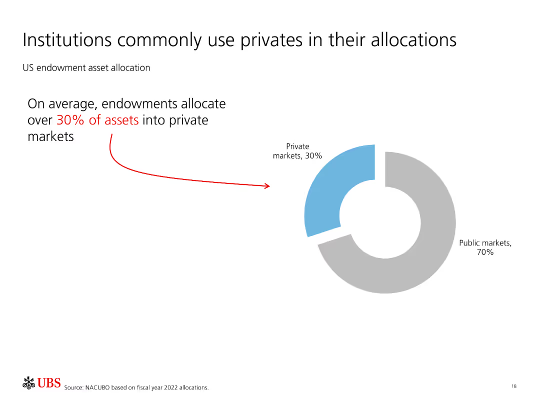
Features a pie chart showing US endowment asset allocation with 30% in private markets and 70% in public markets.
Investment Analysis
Financial Services
Indicates that institutions, particularly endowments, allocate a significant portion of their assets (30%) to private markets, demonstrating confidence in their performance.
Institutions, private markets, asset allocation, endowments, investment strategy
Mixed Chart
UBS
Saved
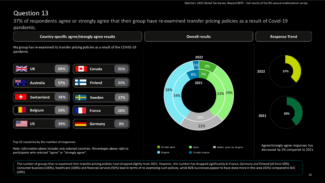
This slide presents country-specific results using bar charts and a donut chart for overall results. It includes country flags and percentages.
Risk Assessment and Management
Financial Services
The slide displays survey results on the re-examination of transfer pricing policies due to COVID-19. It shows country-specific and overall responses, comparing results from 2021 to 2022.
COVID-19, transfer pricing, survey, financial services, policy re-examination
Multiple Chart
Deloitte
Saved
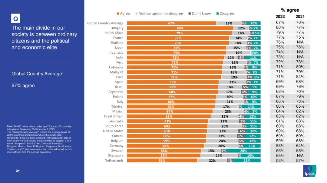
Typical format with bar chart showing percent agreement by country; right-hand trend columns comparing 2021 and 2023 data.
Market Analysis and Trends
Government & Public Sector
This slide focuses on societal polarization, particularly the belief in a fundamental divide between ordinary people and elites. With 67% agreement globally, the data reflect significant class tension or alienation. Countries like Hungary and South Africa show the highest levels of agreement, suggesting strong populist sentiment in those regions.
polarization, society, elite, citizens, populism, division, inequality, Ipsos
Mixed Chart
IPSOS
Saved
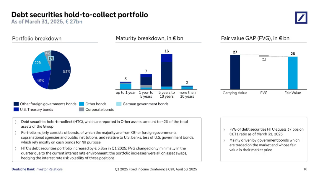
Three visualizations: pie chart (portfolio breakdown), bar chart (maturity), and a bar showing fair value vs carrying value (FVG). Each chart uses consistent color codes. Summary and highlights on the bottom and right.
Investment Analysis
Financial Services
This slide details Deutsche Bank's €27bn hold-to-collect (HTC) bond portfolio. Majority holdings are other foreign government and supranational agency bonds. Most maturities fall within 5–10 years. Fair value gap is minimal (€1bn), reflecting low mark-to-market risk. The slide emphasizes increased portfolio size this quarter, primarily from asset swaps, with negligible FVG changes. It also notes HTC assets account for ~2% of the bank's total assets.
HTC portfolio, government bonds, maturity breakdown, fair value gap, bond investment, NII, supranational
Multiple Chart
Deutsche Bank
Saved
Previous
Next
If nothing, comes up, please save your slides first
Create a FREE account to continue browsing
Receive Instant Access to 1,000+ slides from companies like McKinsey, Google, and Goldman Sachs
First Name
Last Name
Email
Password
I agree to all
Terms & Privacy Policy
Thank you! Your submission has been received!
Oops! Something went wrong while submitting the form.
Have an account?
Sign in
Column Chart
Heatmap
Chevron
Org Chart
Infographic
Callouts
Timeline
List
Graphic
Picture
Process Flow
Diagram
Paragraph
Map
Table
Framework
Subtitle
Takeaway Box
Icon
Other Chart
Radar Chart
Waterfall Chart
Mekko Chart
Pie Chart
Scatter Plot
Line Chart
Bar chart
Bullet points