Create a FREE Account
Instant access to 1,000+ real slides from top companies like McKinsey, BCG, Goldman Sachs, Google and many more!
First Name
Last Name
Email
Password
I agree to all
Terms & Privacy Policy
Thank you! Your submission has been received!
Oops! Something went wrong while submitting the form.
Have an account?
Sign in
Library
Templates
Courses
Pricing
My Account
My Slides
My Templates
✦ AI
AI Prompt Library
AI Search
Sign in
Start Here
Logout
My Saved Slides
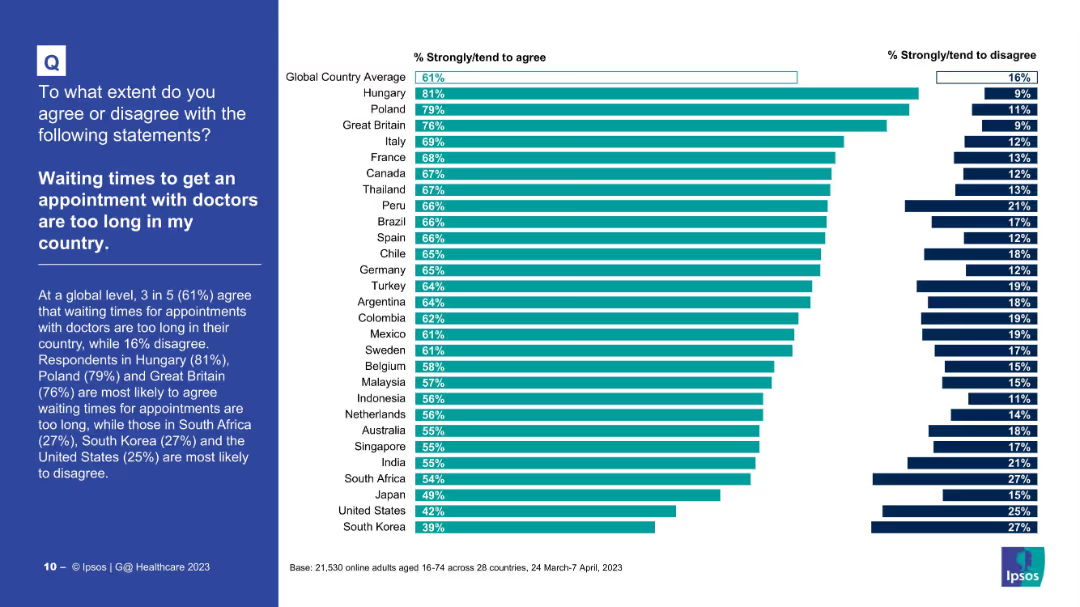
Horizontal bar chart indicating perceived exploitation potential of the food sector; disagreement on right side.
Risk Assessment and Management
Consumer Goods
The chart shows how much consumers across different countries believe the food and drink sector would exploit them if given the chance. A higher percentage in some countries indicates skepticism and perceived opportunism.
exploitation, trust, consumer risk, food industry, public perception, Ipsos, countries, bar chart, opinion, survey
Mixed Chart
IPSOS
Saved
Includes several line graphs showing predicted infection paths under different immunity and infection rate scenarios, annotated for clarity and comparison.
Strategic Planning
Healthcare & Pharmaceuticals
Analyzes potential COVID-19 infection trajectories for Austria under various public health response scenarios, aiding in policy decision-making and strategy adjustment.
COVID-19, Austria, scenario analysis, infection rates, public health response, policy planning
Multiple Chart
McKinsey
Saved
The slide has four charts: two column charts showing real GDP and inflation, a line chart for international reserves, and another for Argentina's economic data.
Market Analysis and Trends
Financial Services
This slide provides an overview of Argentina's economic situation, including real GDP changes, inflation rates, and international reserves data up to March 2024.
Argentina, economic snapshot, GDP, inflation, reserves, economic data
Multiple Chart
JP Morgan
Saved
Two column charts comparing the prevalence of computer skills in developing and developed countries, showing the population with no computer skills and with standard computer skills.
Technology and Digital Transformation
Technology & Software
This slide highlights the digital divide caused by unequal technological advancements and diffusion. It compares the prevalence of computer skills in developing and developed countries, emphasizing the need for inclusive technology and equitable access to new innovations.
Digital Divide, Computer Skills, Technological Inequality
Mixed Chart
Roland Berger
Saved
The slide is an advanced visual complexity level with multiple charts, including a central comparative list differentiating examples of technologies, expected outcomes, benefits, and risks in bioengineering.
Market Analysis and Trends
Technology & Software
Discusses potential disruptions in chemicals, materials, and energy due to bioengineering, showing financial impact forecasts and contrasting benefits vs. risks.
bioengineering, chemicals, energy, risks, benefits, materials, sustainability, disruption, forecast, impact
Text Only
McKinsey
Saved
A line graph illustrating transaction growth with milestones beneath, detailing the development and integration phases of real-time payments, with text annotations.
Strategic Planning
Financial Services
Used to present the growth and strategic rollout of real-time payment services in the U.S., including key use cases and the acceleration phase, useful for illustrating market adoption and product development strategies.
Real-Time Payments, Growth, Strategy, Integration, U.S. Market
Mixed Chart
JP Morgan
Saved
Contains a detailed map of Nigeria showing application distribution across states and geopolitical zones, accompanied by a structured table.
Strategic Planning
Government & Public Sector
Detailed analysis of the distribution of applications within Nigeria, breaking down numbers and percentages by state and geopolitical zones.
Nigeria, applications, distribution, geopolitical, analysis
Mixed Chart
Accenture
Saved
Pie charts showing percentages of employees declining jobs based on environmental and diversity views; text discussing this trend.
Regulatory and Compliance
Professional Services
Discusses the increasing importance of alignment with personal beliefs on environmental and diversity issues in job acceptance decisions.
environmental responsibility, diversity views, job acceptance, employee beliefs, corporate values, DEI, sustainability
Multiple Chart
BCG
Saved
Four pie charts showing the current percentage of time spent on different tasks. Each chart is labeled with a task and its corresponding percentage
Operational Efficiency
Financial Services
This slide asks about current time allocation for tasks like data processing, analysis, forecasting, and decision-making within finance departments.
time allocation, data processing, analysis, forecasting, decision-making
Single Chart
PwC/Strategy&
Saved
Two column charts showing UK headline inflation breakdown and UK goods and services inflation from Jan '21 to Jan '24 and 1989 to 2024 respectively. Different colors represent core services, core goods, food, alcohol, tobacco, etc.
Market Analysis and Trends
Financial Services
This slide provides a detailed analysis of UK inflation trends, showing the breakdown of headline inflation by various components and comparing goods and services inflation over time. Used for inflation trend analysis and forecasting.
Inflation, UK, headline, goods, services, trends
Multiple Chart
JP Morgan
Saved
Bar chart comparing GenAI productivity impact in EUR across sectors
Investment Analysis
Artificial Intelligence
Shows estimated GenAI-driven productivity impact by sector, highlighting high-tech, retail, and banking as top contributors, and noting EUR 15–20B stake for wealth and asset management.
productivity impact, sector, EUR billion, industry, GenAI, value
Single Chart
McKinsey
Saved
Three segmented bar charts comparing agreement levels to sustainability-related behavior, right sidebar summarizes findings
Customer and Market Segmentation
Consumer Goods
Approximately 21% of consumers now actively seek sustainability information and discuss it more with others. 12% even consider sustainability when choosing employers, signaling growing integration into both personal and professional decisions.
sustainability, consumer engagement, employer choice, information seeking, private behavior, professional relevance, attitude shift, McKinsey, Germany
Mixed Chart
McKinsey
Saved
Features a map of the UK with key points listed about market growth, emphasizing the UK's strengths such as regulatory environment and London as a financial centre.
Market Analysis and Trends
Financial Services
The slide argues for the strategic timing of expanding financial operations in the UK, emphasizing national economic resilience, strong regulatory frameworks, and London’s role as a global financial hub, supporting a strategic business decision for market expansion.
UK Market, Growth, Strategy, Financial Hub
Graphic
Barclays
Saved
A content slide featuring text on the left and a column chart on the right. The chart shows expected changes in FTE risk management professionals over the next five years.
Human Resources and Talent Management
Financial Services
The slide discusses the projected increase in risk management resources in banks' first and second lines of defense, highlighting expected headcount changes.
resources, FTE, risk management, first line, second line
Multiple Chart
EY
Saved
Features a series of block graphs outlining key financial targets over time.
Strategic Planning
Financial Services
Sets specific financial targets for the next three years, including RoTE, income, and loan loss rates.
financial, targets, 2026, planning, RoTE
Table
Barclays
Saved
This slide uses a content layout with a process flow diagram and a detailed table outlining reasons for IV-E ineligibility and related processes. The layout is moderately detailed with a balance of text and visual elements.
Financial Performance
Government & Public Sector
Slide features a flowchart of the fiscal specialist unit process and a table of reasons for IV-E ineligibility with solutions.
Details the fiscal process for identifying funding and overcoming ineligibility issues, providing a flowchart and a table with next steps to address common problems.
Linear Flow
Alvarez & Marsal
Saved
Slide presents three columns titled Environment, Social, Governance each with icons and associated initiatives, emphasizing Barclays' achievements and goals in ESG.
Strategic Planning
Financial Services
Highlights Barclays' ESG strategies and achievements, recognizing its status as the Best Bank for ESG in the UK by Euromoney, with detailed descriptions of initiatives across all ESG dimensions.
ESG, best practices, governance, social responsibility, environmental policy, awards
Pillar
Barclays
Saved
Multiple column charts showing growth in different financial services areas, complemented by textual analysis on the right.
Market Analysis and Trends
Financial Services
Demonstrates growth across home loans, deposits, and funds on the banking platform, with an emphasis on business banking loans and vehicle financing. It’s designed for market trend analysis and business development strategies, providing a visual representation of the company's expansion in these sectors.
banking, growth, trends, funds, loans
Multiple Chart
Morgan Stanley
Saved
Similar to the previous slide, this one is divided into five sections, each with a percentage and icon. It summarizes findings related to growth experiences, delayed payments, reliance on online resources, and the impact of AI and IoT on business growth.
Market Analysis and Trends
Professional Services
The slide continues the presentation of survey findings from MSMEs in Nigeria, focusing on growth experiences, the impact of delayed payments, reliance on digital resources, and future technological impacts on business growth. It highlights key statistics and provides a detailed overview of current and future challenges.
survey findings, MSMEs, Nigeria, business growth, delayed payments, technology impact
Multiple Chart
PwC/Strategy&
Saved
Two side-by-side line charts comparing LCOE ranges and averages for Wind—Onshore and Solar PV—Utility from 2009–2024.
Market Analysis and Trends
Energy & Utilities
The slide illustrates historical trends in the Levelized Cost of Energy (LCOE) for onshore wind and utility-scale solar PV. While prices dropped significantly from 2009 to 2020, recent years show slight increases and a narrowing range, reflecting market and supply chain dynamics.
LCOE, wind energy, solar PV, renewable energy, historical trends, pricing, market, CAGR
Multiple Chart
Roland Berger
Saved
This slide features a vertical bar chart (column chart) comparing the percentage of consumers in different countries who prefer hybrid-electric, battery-electric, or other alternative powertrains in their next vehicle for the years 2017 and 2018.
Market Analysis and Trends
Energy & Utilities
The slide shows that China has the highest percentage of consumers interested in alternative powertrains, followed by Japan, Korea, Southeast Asia, and India. It highlights the growth in interest from 2017 to 2018.
consumer interest, alternative powertrain, hybrid-electric, battery-electric, column chart, market trends, energy, consumer preferences
Single Chart
Deloitte
Saved
A triangular diagram showing various services EY offers to private equity clients. Categories include Funds, Strategy and Transaction Services, and Portfolio Services.
Organizational Structure and Change
Professional Services
This slide outlines the range of services provided by EY to private equity clients, covering areas like fund assurance, buy and sell side advisory, tax, and legal services.
EY, services, private equity, advisory, portfolio
Framework
EY
Saved
Key statistics related to AI/Gen-AI impacts in the banking sector, including CAGR, adoption rates, and revenue generation. Simple layout with text and icons.
Technology and Digital Transformation
Financial Services
Summarizes key figures on AI and Gen-AI in banking, highlighting adoption rates, revenue impact, and productivity improvements.
AI, Gen-AI, banking, adoption, revenue
Header Horizontal
Kearney
Saved
This slide features bar charts comparing carbon emissions across different regions using both accounting methods. The bar charts are displayed side-by-side, with clear labels and distinct color coding for consumption-based and production-based emissions.
Market Analysis and Trends
Government & Public Sector
The slide compares regional carbon emissions under production-based and consumption-based accounting methods, highlighting the differences in reported emissions. It underscores how consumption-based accounting reveals higher emissions for regions like the US and EU due to their imported goods, advocating for more comprehensive emissions tracking.
Carbon Emissions, Accounting, Regional Comparison, Consumption, Production
Multiple Chart
EY
Saved
Contains column charts, tables, and detailed text sections with highlighted statistics. Uses red and yellow colors to differentiate SPAC IPO activities and data.
Market Analysis and Trends
Financial Services
Highlights US SPAC IPO activities for 2021, including key statistics, trends, sector performances, and an outlook on the SPAC market and its future.
US, SPAC, IPO, 2021 activity, market highlights, trends, sectors, performance, acquisitions, outlook
Multiple Chart
EY
Saved
Previous
Next
If nothing, comes up, please save your slides first
Create a FREE account to continue browsing
Receive Instant Access to 1,000+ slides from companies like McKinsey, Google, and Goldman Sachs
First Name
Last Name
Email
Password
I agree to all
Terms & Privacy Policy
Thank you! Your submission has been received!
Oops! Something went wrong while submitting the form.
Have an account?
Sign in
Column Chart
Heatmap
Chevron
Org Chart
Infographic
Callouts
Timeline
List
Graphic
Picture
Process Flow
Diagram
Paragraph
Map
Table
Framework
Subtitle
Takeaway Box
Icon
Other Chart
Radar Chart
Waterfall Chart
Mekko Chart
Pie Chart
Scatter Plot
Line Chart
Bar chart
Bullet points