Create a FREE Account
Instant access to 1,000+ real slides from top companies like McKinsey, BCG, Goldman Sachs, Google and many more!
First Name
Last Name
Email
Password
I agree to all
Terms & Privacy Policy
Thank you! Your submission has been received!
Oops! Something went wrong while submitting the form.
Have an account?
Sign in
Library
Templates
Courses
Pricing
My Account
My Slides
My Templates
✦ AI
AI Prompt Library
AI Search
Sign in
Start Here
Logout
My Saved Slides
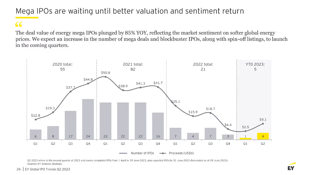
The slide features a column chart showing the number of mega IPOs and their proceeds from Q1 2020 to YTD 2023, with a focus on energy sector IPOs.
Market Analysis and Trends
Financial Services
This slide analyzes the trend of mega IPOs, particularly in the energy sector, noting a significant decline in deal value and an expectation for future increases as market sentiment improves.
IPO, mega deals, valuation, sentiment, energy
Single Chart
EY
Saved
Contains vertical column charts showing the number of spinouts from Manchester universities, with descriptions of notable spinouts.
Industry Overview
Education & Training
Discusses spinouts from Manchester universities, focusing on their number, active status, and contributions to technology and clinical diagnostics.
Manchester, universities, spinouts, innovation, University of Manchester, Salford University, technology transfer, academic impact, healthcare sector, wastewater treatment
Mixed Chart
Barclays
Saved
The slide features two column charts showing TNAV movements per share. The first chart details quarter-on-quarter movements, while the second shows year-to-date movements with various financial components like dividends, share buyback, and others illustrated.
Financial Performance
Financial Services
This slide presents the TNAV per share movements with breakdowns of different contributing factors over quarterly and yearly timelines, providing insights into the financial stability and shareholder value adjustments over time.
TNAV, financial stability, dividends, share buyback
Multiple Chart
Barclays
Saved
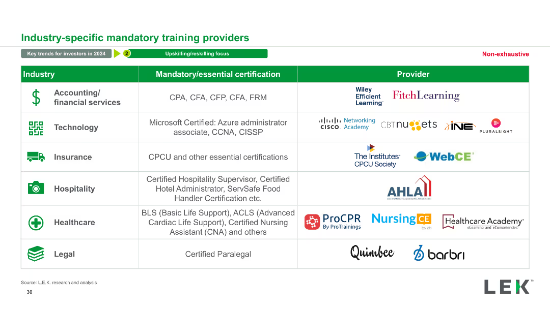
The slide presents a table with three columns: Industry, Mandatory/essential certification, and Provider. Various industries are listed along with corresponding certifications and providers. It includes logos of providers and icons for each industry.
Operational Efficiency
Professional Services
This slide details mandatory certifications for various industries and the corresponding providers. It serves as a resource for understanding industry-specific training requirements.
Mandatory, Certification, Provider, Industry, Training, Education, Professional Services, Qualifications, Skills, Compliance
Table
LEK
Saved
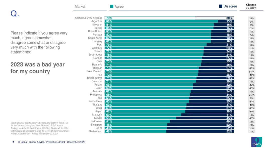
Horizontal bar chart showing country-level agreement with the statement, ranked by agreement level, with % change vs 2022.
Market Analysis and Trends
Professional Services
This slide provides a country-level breakdown of the percentage of people agreeing that 2023 was a bad year for their country. Argentina ranks highest at 88%, and Japan lowest at 30%.
global opinion, country ranking, 2023, bad year, Ipsos, sentiment, international comparison, bar chart
Mixed Chart
IPSOS
Saved
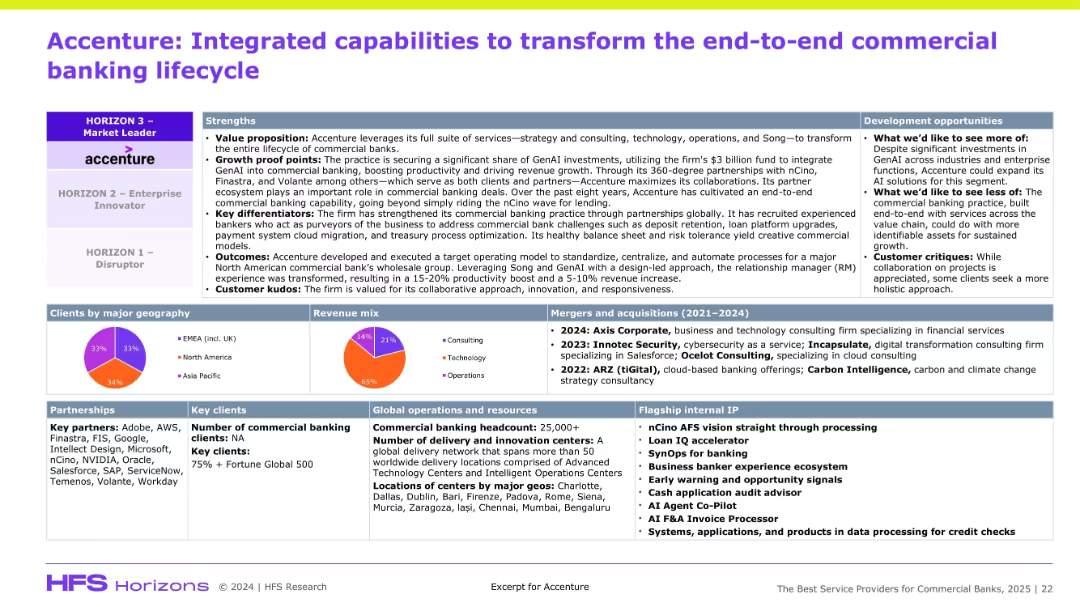
Dense slide divided into multiple boxed sections: strengths, clients by geography, revenue mix, partnerships, acquisitions, internal capabilities, and flagship IP. Uses colorful pie charts and icons with a corporate report-style layout.
Product and Service Analysis
Professional Services
The slide details Accenture’s strategic capabilities in commercial banking, emphasizing GenAI integration, ecosystem partnerships, revenue sources, and operational footprint. It highlights Accenture’s positioning as a market leader, key acquisitions, and its geographic and technological depth in banking services.
Accenture, Commercial Banking, GenAI, Partnerships, Revenue Mix, Strategy, M&A, Flagship IP, Digital, Operations
Mixed Chart
Accenture
Saved
Includes a stacked chart displaying the levelized cost of hydrogen production over time, comparing different methods.
Financial Performance
Energy & Utilities
Analyzes how incentives impact the cost-effectiveness of hydrogen production methods, useful for financial planning in energy markets.
hydrogen production, cost analysis, incentives, energy market, financial planning, green energy
Multiple Chart
BCG
Saved
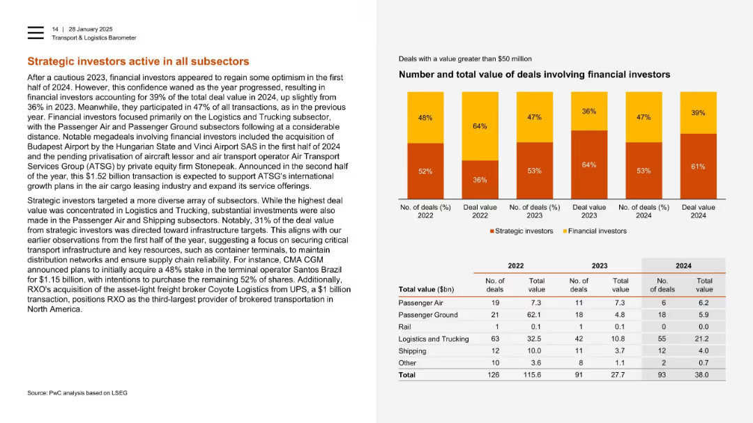
Two-column layout with a stacked bar chart and deal count/value table by subsector at the bottom.
Investment Analysis
Transportation & Logistics
Financial investors regained confidence in 2024, accounting for a larger share of deal value. Focus was on logistics, trucking, and infrastructure, with notable deals in terminal operations and freight brokerage. Investment data is broken down by subsector.
strategic investors, infrastructure, trucking, transport, private equity, financial investors, deal breakdown
Mixed Chart
PwC/Strategy&
Saved
Utilizes a scatter plot chart with textual and numeric data to discuss global phenomena impacts, incorporating color-coded risk levels for clarity.
Risk Assessment and Management
Financial Services
Discusses various global risks perceived by executives and their expected impacts on businesses, with a focus on economic factors.
risk assessment, executives, global phenomena, impact
Mixed Chart
BCG
Saved
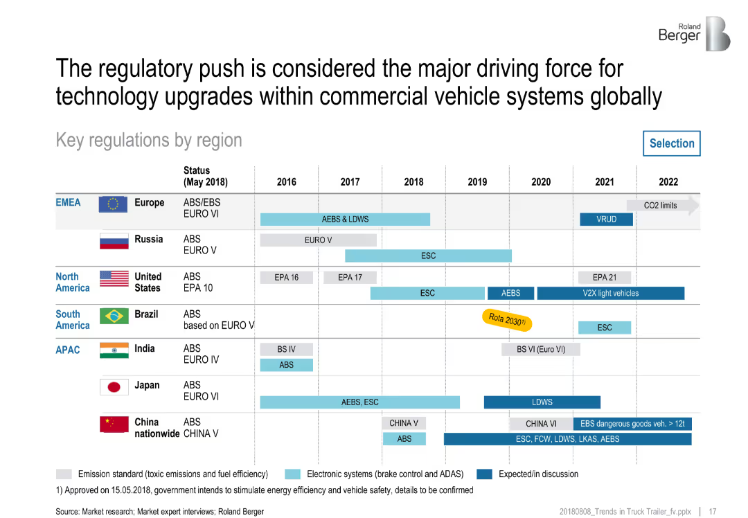
Region-wise horizontal bar chart across years showing emission and safety regulations; uses color codes for regulation types
Regulatory and Compliance
Transportation & Logistics
This slide summarizes regulatory timelines and changes from 2016–2022 across global regions. It includes emission standards and safety systems (e.g., AEBS, LDWS), noting the role of regulation in driving commercial vehicle technology improvements worldwide.
regulations, emissions, safety systems, EMEA, APAC, North America, technology compliance, vehicle systems
Table
Roland Berger
Saved
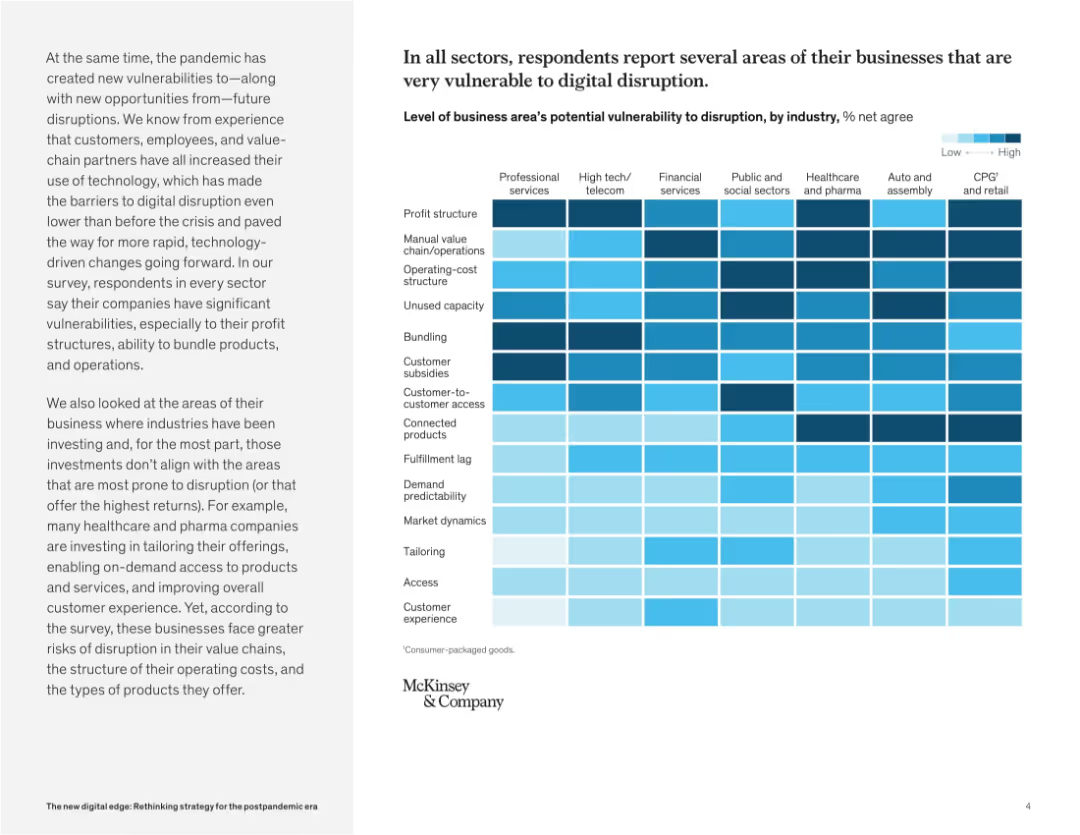
Heatmap chart dominates the right side, showing digital vulnerability levels by business area and industry. Left panel provides context and insights.
Risk Assessment and Management
Technology & Software
This slide presents a heatmap revealing how vulnerable different industries are to digital disruption. Profit structures, customer access, and bundling are common weak points. The chart emphasizes where companies may face operational or structural threats.
digital disruption, business risk, vulnerability, industry comparison, technology impact, customer access, operations, transformation
Mixed Chart
McKinsey
Saved
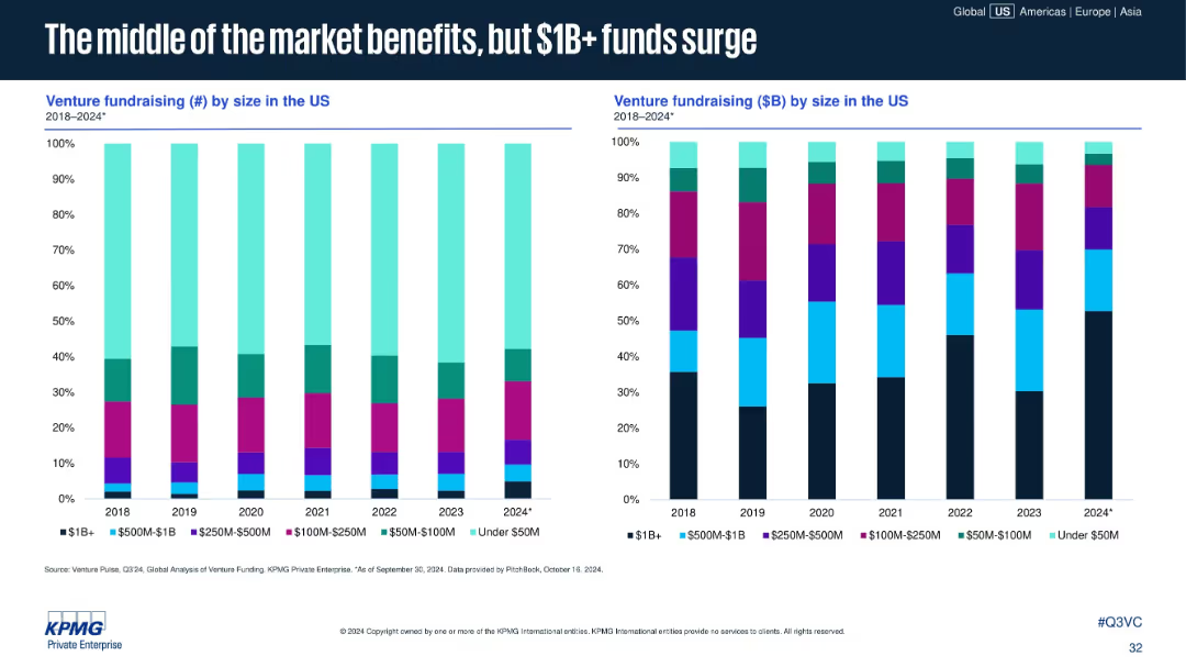
Two stacked bar charts: left shows fundraising count by size; right shows fundraising amount ($B) by size. Categories include <$50M to $1B+.
Investment Analysis
Financial Services
Larger VC funds ($1B+) are gaining share in both count and capital raised, even as mid-sized funds see stable or slight increases. Smaller funds under $50M continue to shrink in both volume and total capital raised.
large funds, $1B+ fundraising, venture capital, fund size, mid-market funds, capital allocation, US fundraising, 2024 trends
Multiple Chart
KPMG
Saved
Combination of text blocks, circular diagrams, and national icons. Color-coded to distinguish between different themes such as energy security and economic needs.
Strategic Planning
Energy & Utilities
Discusses the challenges faced by governments in balancing energy security, economic stability, and decarbonization goals in the wake of global events.
energy security, economic stability, decarbonization, government priorities, Ukraine conflict
Diagram
Bain
Saved
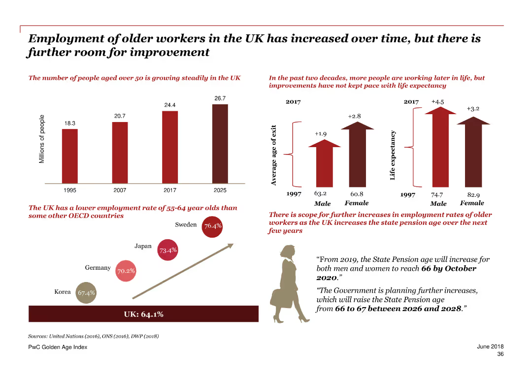
The slide features multiple graphs showing trends in the employment rates of older workers in the UK over time, compared to other OECD countries. It also includes life expectancy data and projections for future employment trends.
Market Analysis and Trends
Government & Public Sector
The slide provides an overview of the increasing employment rates of older workers in the UK, comparing them to other OECD countries. It highlights the growing number of older workers and suggests areas for further improvement.
employment trends, older workers, UK, OECD, life expectancy, future projections, employment rates
Multiple Chart
PwC/Strategy&
Saved
This slide displays column charts with data points illustrating the growth in digital financial services. A consistent blue color theme is used for the charts, set against a white backdrop. The text and numerical data are neatly aligned, facilitating a clear understanding of the depicted trends.
Financial Performance
Financial Services
The content emphasizes the anticipated growth of digital financial services by 2025, focusing on payments, investment, and lending. It details how digitalization, especially in lending and investments, will drive this growth, likely via digital banks and fintech initiatives. Useful for investors and financial analysts to identify trends and growth areas in digital financial services.
digital financial services, growth, digitalization, investments, lending
Multiple Chart
Bain
Saved
The slide displays a column chart depicting semi-annual EBITDA over multiple years. It includes a large blue circle highlighting a recent increase, with a clear and simple layout focusing on financial performance.
Financial Performance
Financial Services
This slide presents the EBITDA growth over the years, highlighting strong earnings growth, particularly in the most recent period. It's designed to communicate financial health and performance trends to stakeholders.
EBITDA, growth, financial performance, mining, earnings, profitability
Single Chart
Morgan Stanley
Saved
A single, large pie chart divided into segments representing different asset classes, supplemented by a side list detailing the types of investments within each class, set against a white and blue backdrop.
Financial Performance
Financial Services
This slide positions the firm among the top 5 alternative asset managers, breaking down their $320bn in alternative assets by type and emphasizing their full asset class capabilities.
Asset Management, Alternatives, Ranking, Capabilities
Single Chart
Goldman Sachs
Saved
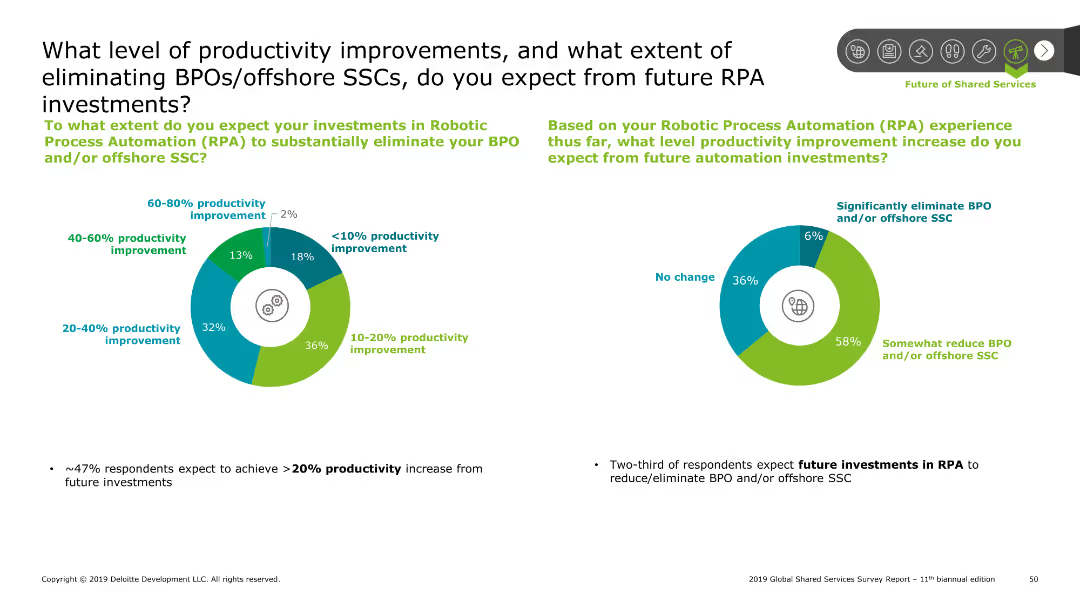
Features two pie charts displaying productivity improvements and the extent of BPO/offshore SSC elimination expectations.
Operational Efficiency
Professional Services
Explores the expected productivity improvements and reduction in Business Process Outsourcing (BPO) or offshore SSCs due to future Robotic Process Automation (RPA) investments.
productivity, improvements, BPO, SSC, RPA, investments, automation
Multiple Chart
Deloitte
Saved
Features a column chart comparing cost base targets from 2022 to 2025 and bullet points summarizing key actions executed and priorities for 2023.
Operational Efficiency
Financial Services
Summarizes cost reduction measures taken in 4Q22 and outlines priorities for 2023 to maintain expense discipline and operational efficiency.
cost transformation, expense reduction, priorities, operational efficiency, financial targets
Mixed Chart
Credit Suisse
Saved
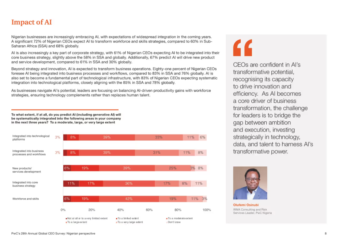
Bar chart showing predicted AI integration in five business areas. Right side contains explanatory paragraph and an executive quote. Red gradient color palette.
Technology and Digital Transformation
Professional Services
This slide illustrates Nigerian CEOs’ expectations of AI becoming a core part of business strategy, workforce transformation, and product development. It emphasizes high integration in business processes and technology platforms, underlining the growing relevance of AI in long-term planning and operations.
AI impact, Nigeria, integration, business strategy, workflows, generative AI
Mixed Chart
PwC/Strategy&
Saved
This slide presents two line charts showing the long-term and recent market performance of the waste management and environmental services sectors, compared to the S&P 500 Index.
Financial Performance
Environmental Services & Sustainability
The slide analyzes the market performance of waste management and environmental services sectors, highlighting their recovery from COVID-19 impacts and long-term growth trends, with detailed financial data and comparative analysis.
Market performance, COVID-19 recovery, environmental services, waste management, financial analysis, S&P 500, long-term growth
Multiple Chart
LEK
Saved
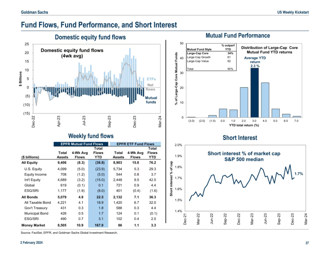
Divided into five segments: bar charts, fund performance histogram, line chart on short interest, and tables with flow data. Dense but organized presentation of capital movement trends.
Performance Metrics and KPIs
Financial Services
This slide summarizes current trends in equity and bond fund flows, mutual fund returns, and short interest levels. It tracks investor positioning and sentiment across asset classes with weekly and YTD data, along with S&P 500 short interest as a percentage of market cap.
fund flows, mutual funds, short interest, equity flows, ETF, performance
Multiple Chart
Goldman Sachs
Saved
Shows a flow diagram connecting parts of the presentation with business divisions and technology booths, illustrating the overall strategy and value delivery process.
Technology and Digital Transformation
Financial Services
This slide describes how business divisions and corporate functions use technology to deliver client value, detailing the role of technology booths in the digital transformation process.
business divisions, corporate functions, technology, client value, profitability, technology booths, digital transformation, strategy, value delivery
Diagram
Credit Suisse
Saved
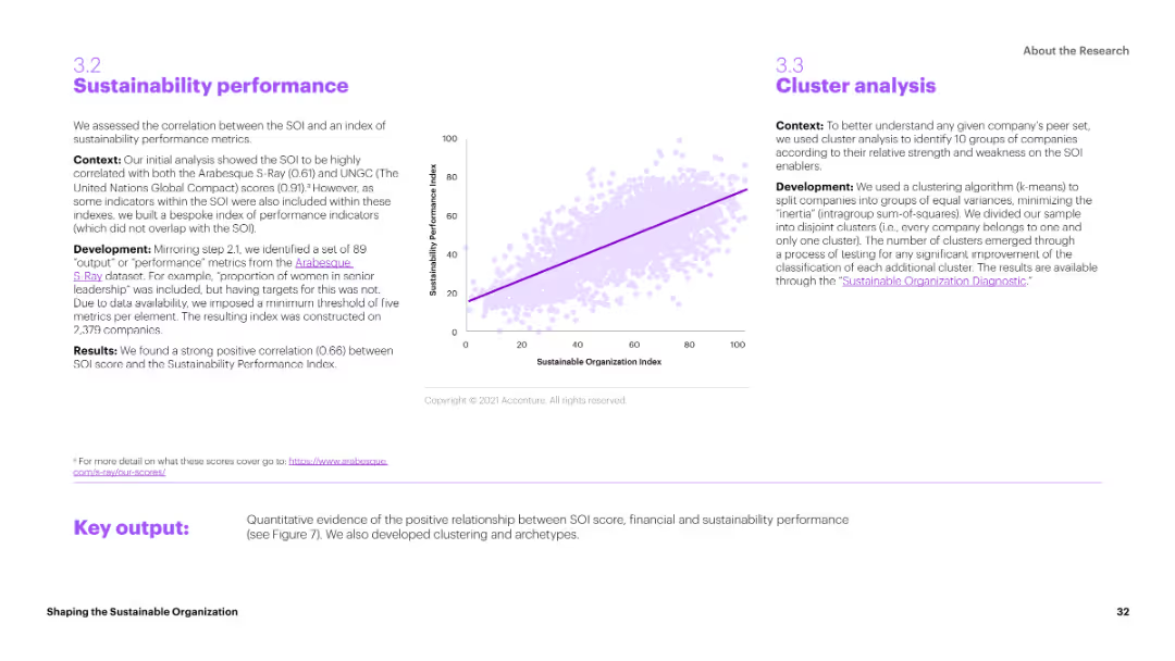
The slide includes a scatter plot correlating Sustainability Organization Index (SOI) scores with sustainability performance metrics. The layout is data-driven, with clear axis labels and a trend line indicating the correlation.
Performance Metrics and KPIs
Environmental Services & Sustainability
The slide assesses the correlation between the SOI and an index of sustainability performance metrics. It shows a strong positive correlation, suggesting that higher SOI scores are associated with better sustainability performance.
Sustainability, Performance, SOI, Metrics, Correlation
Mixed Chart
Accenture
Saved
This slide is highly graphical, featuring a mix of a cycle diagram and pyramid diagram in bright purple and green, with four data-driven boxes presenting key statistics related to automotive market penetration and behaviors.
Market Analysis and Trends
Financial Services
This slide illustrates how Experian's distribution platform can integrate with automotive data to drive new revenue streams, focusing on consumer behavior and expansion potential within the auto industry.
automotive, revenue, data integration, consumer behavior, expansion potential
Multiple Chart
Barclays
Saved
Previous
Next
If nothing, comes up, please save your slides first
Create a FREE account to continue browsing
Receive Instant Access to 1,000+ slides from companies like McKinsey, Google, and Goldman Sachs
First Name
Last Name
Email
Password
I agree to all
Terms & Privacy Policy
Thank you! Your submission has been received!
Oops! Something went wrong while submitting the form.
Have an account?
Sign in
Column Chart
Heatmap
Chevron
Org Chart
Infographic
Callouts
Timeline
List
Graphic
Picture
Process Flow
Diagram
Paragraph
Map
Table
Framework
Subtitle
Takeaway Box
Icon
Other Chart
Radar Chart
Waterfall Chart
Mekko Chart
Pie Chart
Scatter Plot
Line Chart
Bar chart
Bullet points