Create a FREE Account
Instant access to 1,000+ real slides from top companies like McKinsey, BCG, Goldman Sachs, Google and many more!
First Name
Last Name
Email
Password
I agree to all
Terms & Privacy Policy
Thank you! Your submission has been received!
Oops! Something went wrong while submitting the form.
Have an account?
Sign in
Library
Templates
Courses
Pricing
My Account
My Slides
My Templates
✦ AI
AI Prompt Library
AI Search
Sign in
Start Here
Logout
My Saved Slides
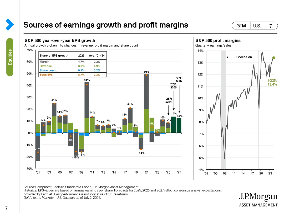
Bar and line charts showing EPS growth components and historical profit margins. EPS is broken down by margin, revenue, and share count changes.
Performance Metrics and KPIs
Financial Services
The slide illustrates the breakdown of S&P 500 EPS growth in 2025, emphasizing margins as the largest contributor (4.7%). It also includes a line chart tracking profit margins over time, highlighting a recent level of 13.4% in Q1 2025. Forecasts for EPS and margins through 2027 are included.
EPS growth, profit margin, revenue, share count, S&P 500, forecast, earnings, financial performance, historical trends
Multiple Chart
JP Morgan
Saved
US map in hexagonal tile format; color coded by case rates; comparison of Oct 01 and Nov 01, 2020; arrows show progression.
Risk Assessment and Management
Healthcare & Pharmaceuticals
This slide illustrates the change in US state-level COVID-19 cases over a month using a hex map. Each tile’s color shows incidence rate per 100k people, highlighting the geographical shifts in case burden over 30 days.
COVID-19, US states, incidence rate, map, time comparison, healthcare, McKinsey
Single Chart
McKinsey
Saved
The slide has a clear, two-column layout with a title at the top. The left side features bullet points discussing credit risk outlook with blue highlights for key phrases. The right side shows a table labeled 'Net Charge-off Guidance' with columns for years and rows for different loan types.
Market Analysis and Trends
Financial Services
The slide details the outlook on credit normalization, highlighting strong consumer balance sheets and expectations for normalization of delinquency rates and charge-offs in various loan categories.
credit, normalization, liquidity, delinquency, charge-off rates, consumer behavior, financial outlook, loan categories
Table
JP Morgan
Saved
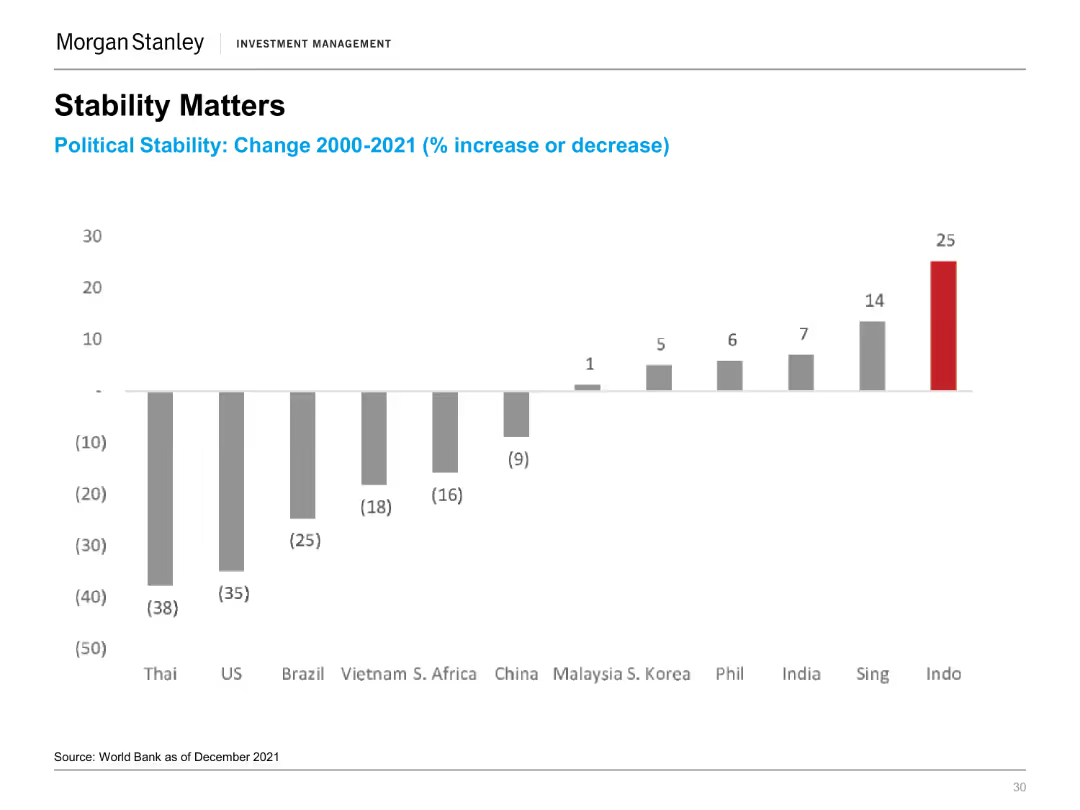
A column chart showing political stability changes (% increase or decrease) from 2000-2021 for various countries, with Indonesia having the highest increase.
Risk Assessment and Management
Financial Services
The slide highlights the importance of political stability, showing changes in stability across countries, with a focus on Indonesia's significant improvement.
Political Stability, Indonesia, Risk Management, Global Comparison, Stability Trends
Single Chart
Morgan Stanley
Saved
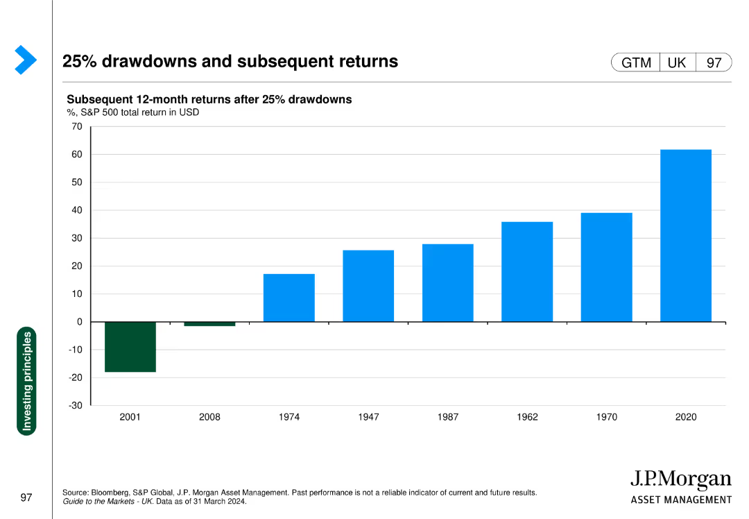
The slide shows a column chart with subsequent 12-month returns after 25% drawdowns in the S&P 500, with specific years highlighted for comparison.
Investment Analysis
Financial Services
This slide demonstrates the performance of the S&P 500 following major drawdowns, providing insights into market recovery patterns.
drawdowns, S&P 500, subsequent returns, market recovery, investment analysis
Single Chart
JP Morgan
Saved
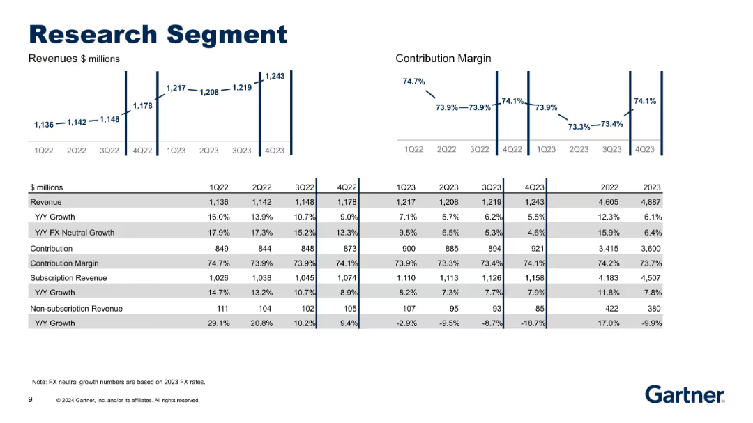
Bar and line charts with tabular financial data; left side features revenue metrics while the right shows contribution margin trends.
Performance Metrics and KPIs
Technology & Software
This slide breaks down the Research segment's quarterly and yearly revenue, contribution, and margin metrics from 1Q22 to 4Q23. It highlights stable growth in subscription revenues with declining non-subscription revenue and presents FX-neutral metrics.
Research, Revenue, Contribution, FX Neutral Growth, Subscription
Multiple Chart
Gartner
Saved
Pie chart showing high quality credit portfolio distribution and strategies for risk management.
Investment Analysis
Financial Services
Details the diversification of Credit Suisse’s portfolio and approaches to enhance risk management.
diversification, portfolio, risk management, credit quality, investment strategies
Mixed Chart
Credit Suisse
Saved
Features a column chart on the left showing global electric vehicle sales and market penetration, and a bar chart on the right showing the mineral content of EVs vs. conventional cars.
Market Analysis and Trends
Transportation & Logistics
It presents data on the growth of electric vehicle sales globally and the mineral requirements compared to conventional vehicles, indicating trends in the EV market.
electric vehicles, market penetration, mineral content, EV vs conventional cars, transportation, J.P. Morgan, sustainability, market trends, automotive industry, green technology
Multiple Chart
JP Morgan
Saved
Bold purple background with split columns of explanatory text and a large circular stat.
Technology and Digital Transformation
Financial Services
Introduces the report’s purpose, highlighting banks’ experimentation with AI agents and challenges in scaling. Emphasizes opportunity to realize efficiencies and sets up a structured framework for adopting AI tools.
AI agents, banking, generative AI, personalization, challenges, transformation, adoption framework
Mixed Chart
KPMG
Saved
This slide features a line chart comparing the likelihood of homeowners listing their homes for sale over several years. It uses two lines: one for very/somewhat likely (purple) and another for very likely (orange).
Market Analysis and Trends
Real Estate & Construction
The slide analyzes survey data on the likelihood of homeowners listing their homes for sale, indicating trends in seller behavior and market sentiment.
likelihood, listing home, survey, seller behavior, market sentiment
Single Chart
IPSOS
Saved
The slide is divided into two columns, with a headline across the top. The left column provides a brief introduction to quantum computing's potential impact, while the right column lists applications with associated icons representing different quantum computing use cases, such as simulation and optimization.
Technology and Digital Transformation
Technology & Software
This slide illustrates the potential disruptions quantum computing could create in various sectors by detailing specific applications. It serves as a crucial educational tool for understanding the broad implications of quantum computing in fields like drug discovery and finance, highlighting the need for extensive research and development.
Quantum Computing, Disruption, Simulation, Optimization, Algebra
Header Vertical
McKinsey
Saved
Title at the top with three bar graphs beneath it depicting the proportion of online purchases, and a bold prediction on the right.
Market Analysis and Trends
Retail & E-commerce
Analyzes the expected persistence of e-commerce habits post-pandemic, with data on the anticipated increase in online purchases.
e-commerce trends, online shopping, consumer predictions, data analysis, pandemic aftermath
Single Chart
Accenture
Saved
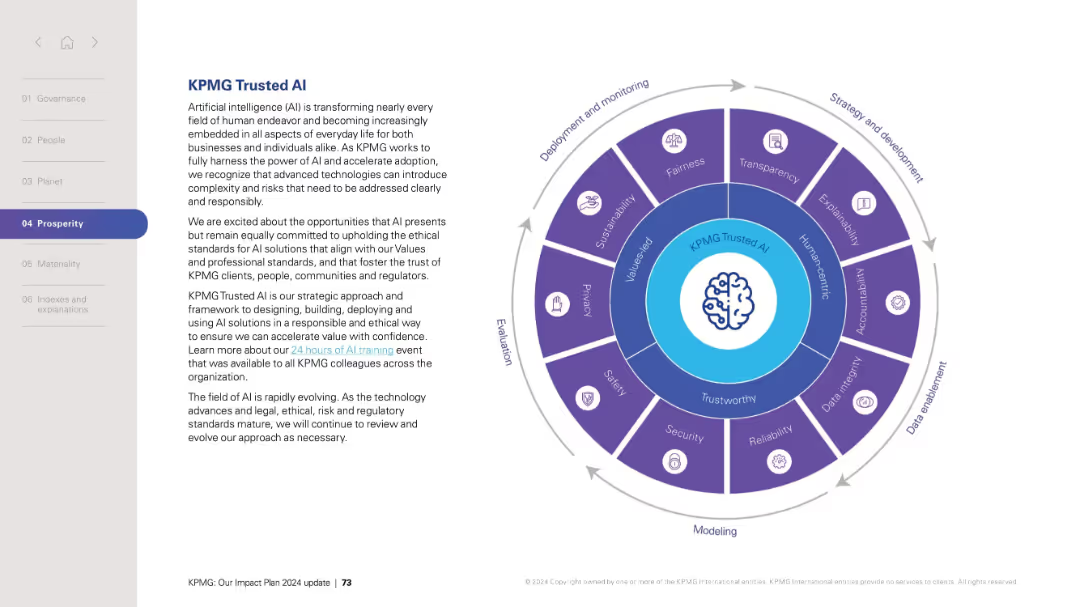
Left-aligned text with circular infographic on the right displaying AI ethics dimensions and stages of AI lifecycle.
Technology and Digital Transformation
Artificial Intelligence
Describes KPMG’s strategic approach to developing and deploying trustworthy AI systems. Emphasizes ethical AI, fairness, transparency, safety, and sustainability. The circular diagram segments AI development into phases and principles. This slide outlines a framework for responsible AI implementation aligned with corporate values and governance.
AI, ethics, responsible AI, trust, governance, deployment, fairness, transparency, safety, KPMG
Vertical Flow
KPMG
Saved
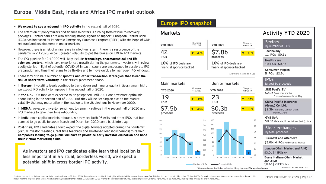
Contains a mix of bullet points, column charts, and data tables. The slide is densely packed with information, featuring various sections for different regions and industries.
Market Analysis and Trends
Financial Services
Provides an outlook on IPO markets in Europe, Middle East, India, and Africa for 2020, highlighting expected trends, market activities, and sector performance in various regions.
IPO, market outlook, Europe, Middle East, India, Africa
Multiple Chart
EY
Saved
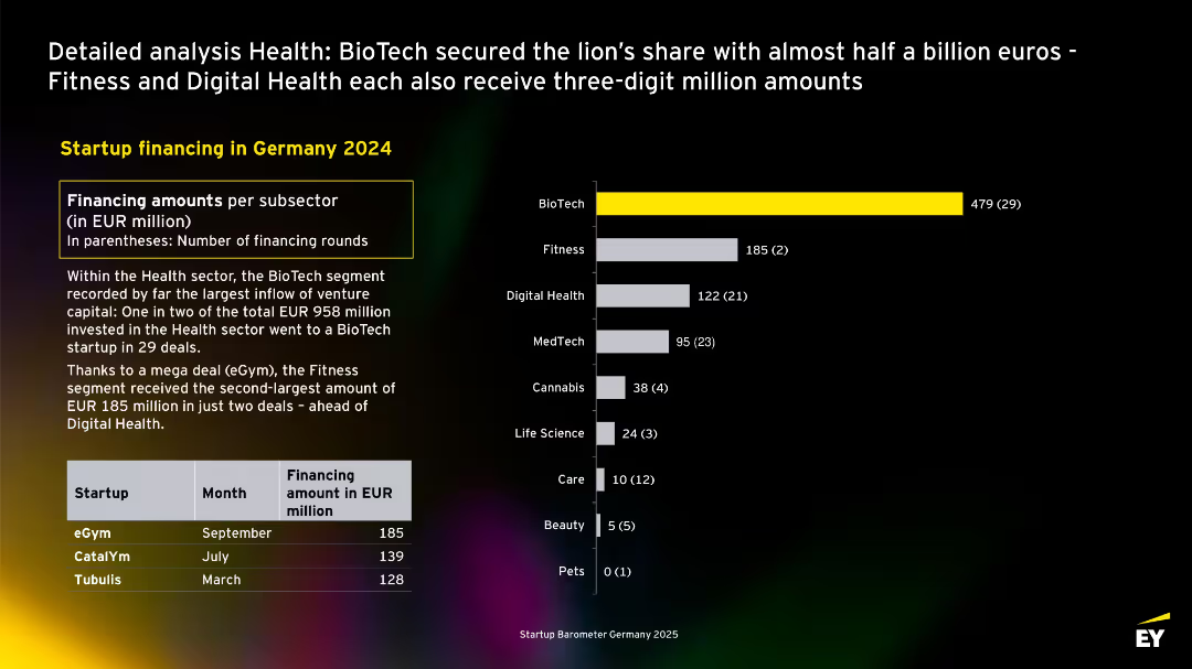
Horizontal bar chart with financing by health subsector. BioTech clearly leads. Summary explains investment concentration and mentions major deals. Includes funding table.
Product and Service Analysis
Healthcare & Pharmaceuticals
Examines health sector startup financing in Germany in 2024. BioTech dominates with €479M raised in 29 deals. Fitness and Digital Health follow due to large single deals. The slide presents a deep dive into health segment investments.
health, biotech, fitness, digital health, Germany, sector funding, eGym, CatalYm
Mixed Chart
EY
Saved
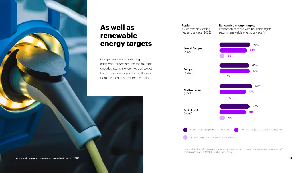
The slide contains a column chart on the right showing the proportion of companies setting renewable energy targets by region.
Strategic Planning
Environmental Services & Sustainability
The slide discusses the adoption of renewable energy targets by companies as part of their broader net zero strategies, with regional breakdowns.
renewable energy, targets, net zero, overall sample, Europe, North America, rest of world, public targets
Mixed Chart
Accenture
Saved
The slide features two column charts showing the value that ESG projects bring to companies over time, comparing increased revenue and brand credibility across different time spans (less than 1 year, 2-5 years, 5-10 years, and 10+ years).
Market Analysis and Trends
Environmental Services & Sustainability
This slide emphasizes the long-term financial benefits of ESG initiatives, showing how companies with mature ESG programs see increased revenue and brand credibility over various time periods. It highlights the importance of sustained ESG efforts for long-term gains.
ESG, revenue, brand, long-term, benefits
Multiple Chart
Kearney
Saved
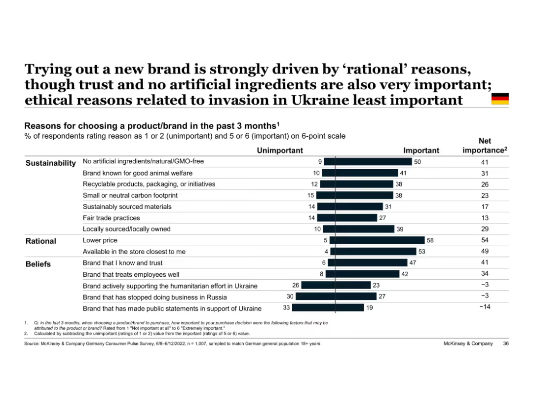
Vertical bar chart with two-part segments (unimportant vs important); grouped by theme (e.g., beliefs)
Market Analysis and Trends
Consumer Goods
Highlights top reasons German consumers tried new brands, with rational factors like price and store availability ranking highest, followed by sustainable and belief-driven factors. Ukraine war-related factors least influential.
rational decision-making, sustainability, trust, Ukraine, brand choice, Germany, ethical purchasing, consumer reasons
Single Chart
McKinsey
Saved
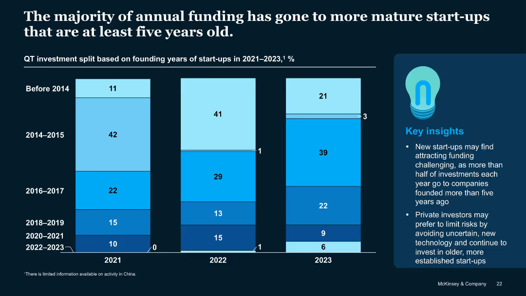
Stacked vertical bar chart showing funding split by start-up founding year across 2021–2023
Investment Analysis
Artificial Intelligence
Most QT investments go to start-ups older than five years, with declining shares for younger firms. The trend suggests investor caution toward early-stage or recently founded start-ups, particularly those formed post-2020.
Start-up Age, Founding Year, Funding Trends, QT Investment, Investor Bias
Mixed Chart
McKinsey
Saved
Contains a column chart that compares SACU receipts over three fiscal years, with each year represented by a column colored in orange.
Regulatory and Compliance
Government & Public Sector
Analyzes the SACU receipts from previous, current, and projected fiscal years, providing insights into economic trends and regional financial contributions. This information is crucial for assessing economic health and regional cooperation within the Southern African Customs Union.
SACU, Receipts, Budget, Forecasting, Economic analysis
Single Chart
PwC/Strategy&
Saved
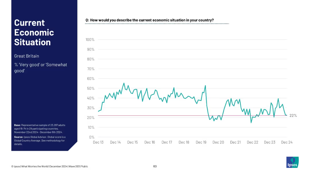
Timeline chart for Great Britain; shows fluctuation and recent dip; pink baseline at 22%.
Market Analysis and Trends
Financial Services
Great Britain’s economic sentiment is at 22%, showing considerable variability since 2013. The chart indicates a recent dip, reinforcing a low economic outlook.
UK, Great Britain, Ipsos, sentiment analysis, timeline, economic perception, 2024 low, public opinion, volatility
Mixed Chart
IPSOS
Saved
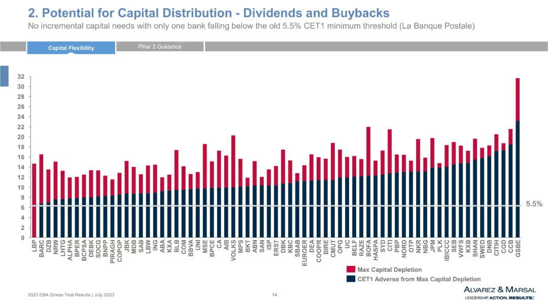
Bar chart comparing max capital depletion and CET1 adverse from depletion across multiple banks, with a 5.5% threshold line. Red and navy blue colors represent different data sets.
Strategic Planning
Financial Services
This chart shows the capital depletion and remaining CET1 capital for numerous European banks under adverse scenarios. It highlights potential for dividend distributions and buybacks, with only one bank falling below the CET1 threshold. The visual reveals bank-specific resilience and risk-adjusted capital strength.
capital distribution, CET1, stress test, dividends, buybacks, banks, EBA, capital depletion, financial resilience, CET1 threshold
Single Chart
Alvarez & Marsal
Saved
Slide has a large title at the top with a blue background. It features three sets of column charts with vertical bars, comparative financial data points for different years, and textual annotations providing insights on revenue, EPS, and ROTE.
Market Analysis and Trends
Financial Services
This slide showcases year-to-date performance with a focus on revenue, earnings per share, and return on tangible equity. Annotations provide context to the data, emphasizing increased client activity and market share growth. It's suitable for business reviews and strategic meetings.
client activity, market share, revenue, EPS, ROTE, performance analysis, financial comparison, growth strategy, year-to-date, business review
Multiple Chart
Goldman Sachs
Saved
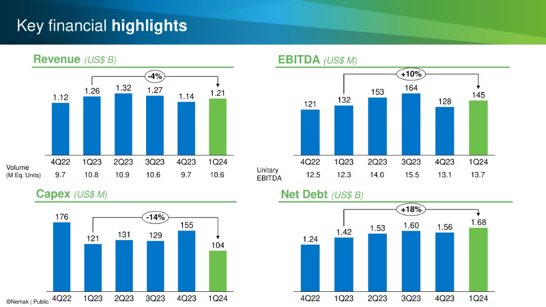
Four quadrant bar chart layout; metrics for Revenue, EBITDA, Capex, and Net Debt shown with color-coded bars
Financial Performance
Industrial & Manufacturing
This slide highlights quarterly performance metrics: revenue, EBITDA, capex, and net debt from Q4 2022 to Q1 2024. Trends and percentage changes are clearly marked to emphasize performance fluctuations and financial trajectory.
Revenue, EBITDA, Capex, Net Debt, Financials, Quarterly, Performance, Manufacturing, Metrics, Trends
Single Chart
Barclays
Saved
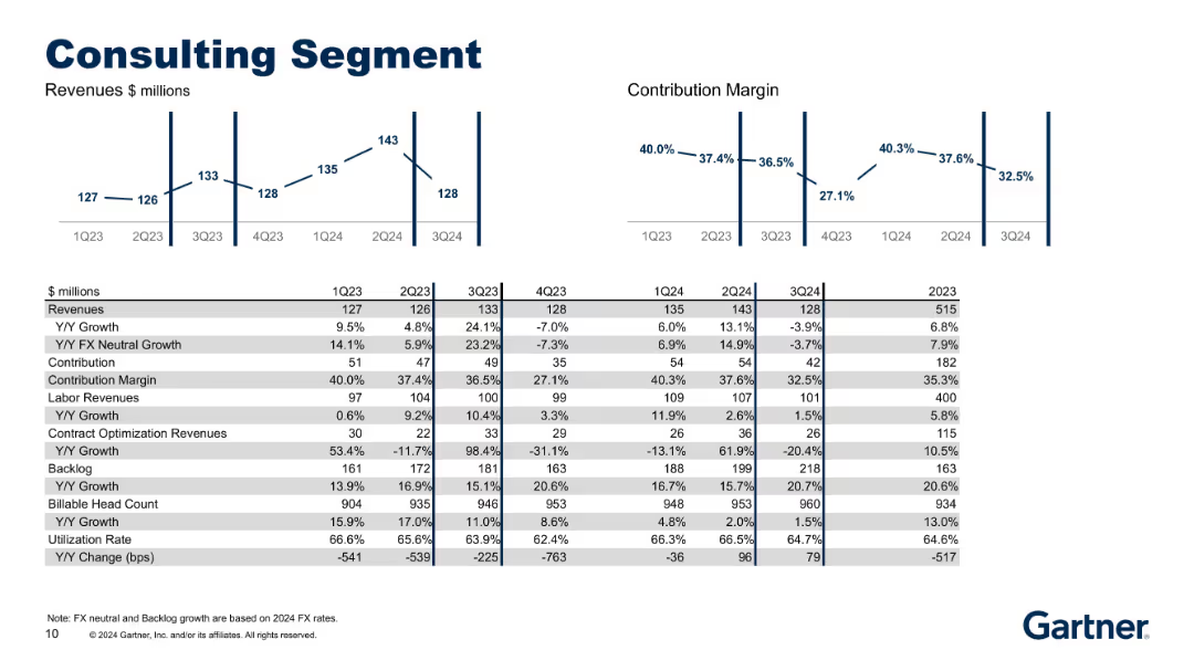
Updated from 18624, includes 1Q24–3Q24. Same layout with revenue/margin charts and operational data such as backlog and utilization.
Product and Service Analysis
Professional Services
Most recent financial and operational overview of the Consulting segment. Allows tracking of momentum and efficiency, with insights into headcount, backlog strength, and revenue distribution between labor and optimization services.
consulting, revenue, backlog, utilization, labor, FX-neutral growth
Multiple Chart
Gartner
Saved
Previous
Next
If nothing, comes up, please save your slides first
Create a FREE account to continue browsing
Receive Instant Access to 1,000+ slides from companies like McKinsey, Google, and Goldman Sachs
First Name
Last Name
Email
Password
I agree to all
Terms & Privacy Policy
Thank you! Your submission has been received!
Oops! Something went wrong while submitting the form.
Have an account?
Sign in
Column Chart
Heatmap
Chevron
Org Chart
Infographic
Callouts
Timeline
List
Graphic
Picture
Process Flow
Diagram
Paragraph
Map
Table
Framework
Subtitle
Takeaway Box
Icon
Other Chart
Radar Chart
Waterfall Chart
Mekko Chart
Pie Chart
Scatter Plot
Line Chart
Bar chart
Bullet points