Create a FREE Account
Instant access to 1,000+ real slides from top companies like McKinsey, BCG, Goldman Sachs, Google and many more!
First Name
Last Name
Email
Password
I agree to all
Terms & Privacy Policy
Thank you! Your submission has been received!
Oops! Something went wrong while submitting the form.
Have an account?
Sign in
Library
Templates
Courses
Pricing
My Account
My Slides
My Templates
✦ AI
AI Prompt Library
AI Search
Sign in
Start Here
Logout
My Saved Slides
Displays a world map illustrating major global drybulk trade routes with lines and symbols representing different commodities.
Market Analysis and Trends
Transportation & Logistics
Analyzes the global trade routes for drybulk commodities, highlighting strategic locations and trade volumes which are essential for logistic and strategic planning in the shipping industry.
global trade, shipping routes, logistics, drybulk commodities
Graphic
Deutsche Bank
Saved
A comprehensive slide with multiple data points arranged in a structured layout, predominantly using blue and white colors.
Market Analysis and Trends
Financial Services
Provides an overview of strategic objectives and strengths in payments, lending, and commerce. The slide is meant for illustrating the company's position and future directions in key business areas, highlighting objectives like maintaining a payments franchise and capturing a market share in lending.
Payments, Lending, Commerce, Market share, Strategic objectives
Table
JP Morgan
Saved
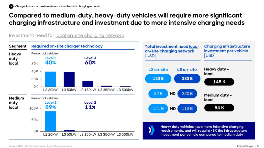
Dual bar charts for required charger levels by vehicle type, investment amount by segment, and cost per vehicle. Structured with blue-themed charts and callouts.
Technology and Digital Transformation
Transportation & Logistics
This slide contrasts the infrastructure needs of heavy-duty vs. medium-duty electric vehicles. It shows that heavy-duty fleets require higher-capacity chargers and more infrastructure investment, with significantly higher per-vehicle cost.
charging, infrastructure, EV, heavy-duty, investment, medium-duty, technology, fleet, Level 2, Level 3
Mixed Chart
Roland Berger
Saved
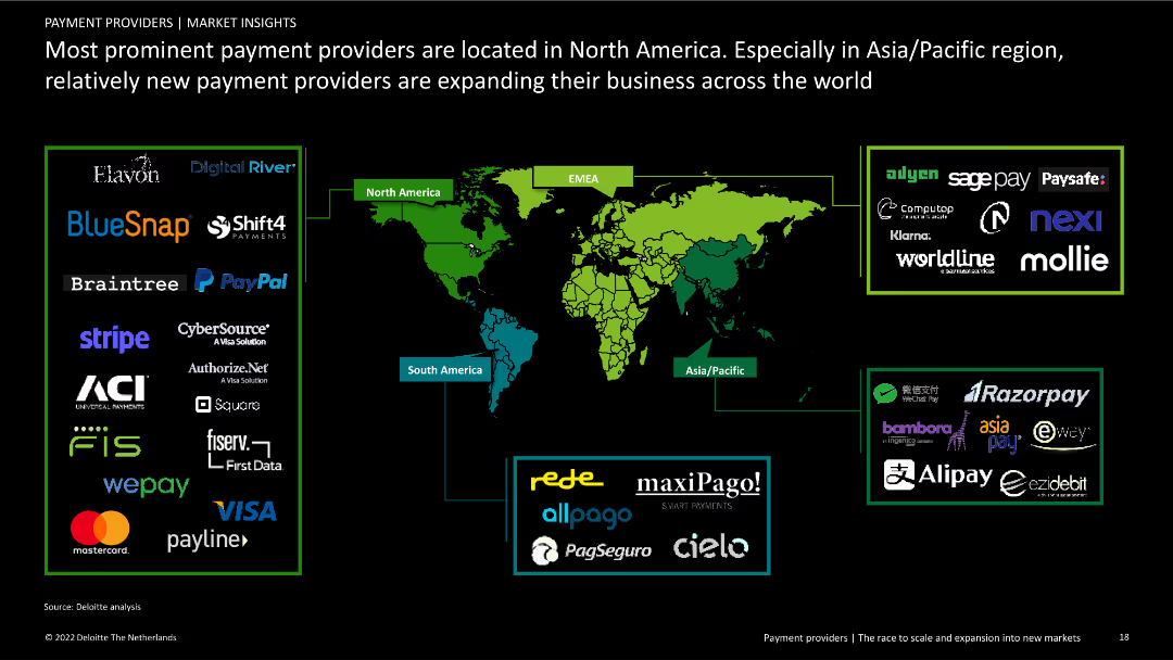
Contains a world map highlighting major payment providers by region, including logos of prominent companies. Includes text explaining regional differences and expansions.
Competitive Landscape
Financial Services
Overview of the geographical distribution of major payment providers, emphasizing the concentration in North America and expansion activities in Asia/Pacific and other regions.
payment providers, North America, global distribution, competitive landscape, financial services, regional analysis, company expansion, market overview
Graphic
Deloitte
Saved
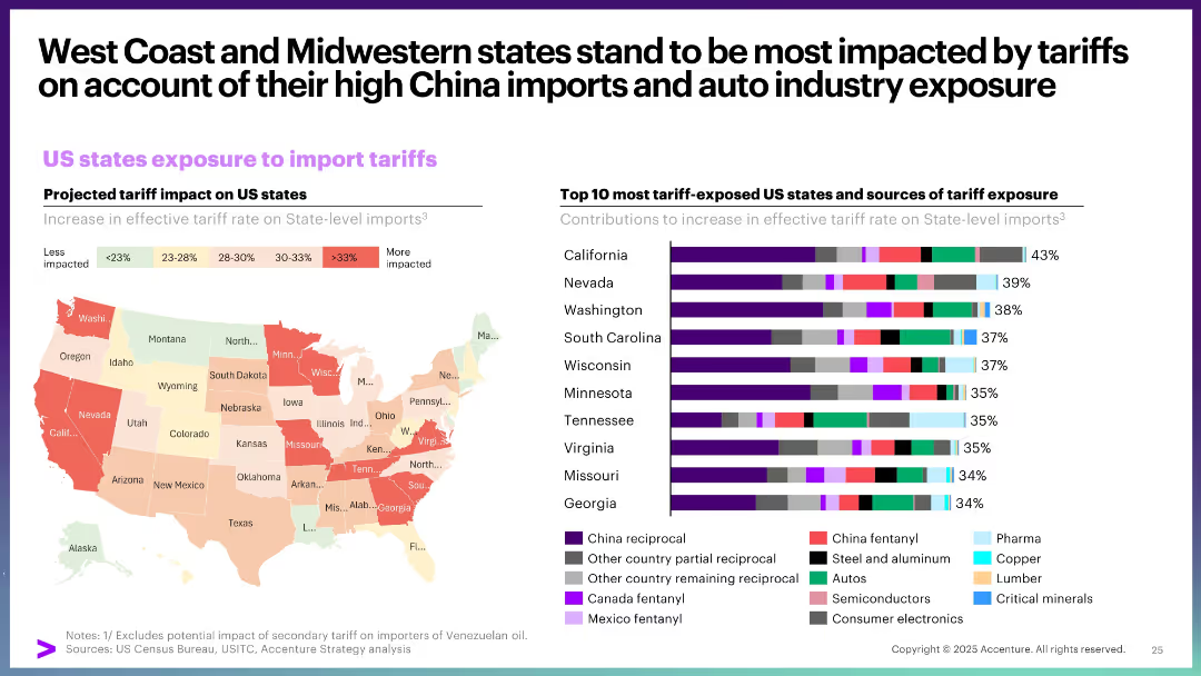
Choropleth map showing state-level tariff exposure, paired with a bar chart listing top 10 exposed states and their sources of exposure.
Strategic Planning
Government & Public Sector
This slide details how different US states are exposed to import tariffs, with West Coast and Midwestern states being the most vulnerable. It attributes this to high China import volumes and auto industry dependence, visualized through a heat map and stacked bar chart.
US states, import tariffs, exposure, auto industry, China trade, regional impact
Multiple Chart
Accenture
Saved
The slide is divided into three main sections: Diversity, Equity, Inclusion, each represented with icons and color blocks. It includes bar charts and statistical data points highlighting various aspects of DEI implementation challenges and status across companies. The layout is structured with a mix of graphics and text to provide a clear visualization of the data.
Organizational Structure and Change
Professional Services
This slide presents the current state of DEI programs, illustrating their growth but also the narrow focus so far. It discusses the challenges in leadership representation, fairness in corporate practices, and inclusive cultures within organizations. The statistics aim to shed light on the effectiveness and reach of these programs within the corporate environment.
DEI, corporate strategy, leadership, inclusion, equity, diversity, statistical analysis, business strategy
Pillar
BCG
Saved
Has stacked column charts detailing the share of Gross Transaction Value (GTV) by payment methods, showing trends over time.
Market Analysis and Trends
Financial Services
Analyzes the shift in payment method preferences, emphasizing the growth of digital payments and the decline of cash usage. It is relevant for payment processors and fintech companies looking to understand consumer behavior trends and capitalize on digital payment solutions.
Digital Payments, Trends, GTV
Mixed Chart
Bain
Saved
Featuring column charts and bar charts, the slide displays the likelihood of purchasing crypto assets within the next 12 months, comparing data from 2023 and 2022, and showing demographics of responses.
Market Analysis and Trends
Financial Services
The slide analyzes the purchase intent of Canadians regarding crypto assets over the next year, with a focus on how likelihood has changed from 2022 to 2023, including demographic insights.
purchase intent, crypto assets, next 12 months, demographics, comparison
Mixed Chart
IPSOS
Saved
The slide features column charts comparing the levelized cost of energy for methanation with other energy sources across different years and scenarios. Detailed visual.
Financial Performance
Energy & Utilities
Assesses the cost projections of methanation compared to biogas and injection, highlighting potential uncompetitiveness by 2030 using detailed financial data.
methanation, levelized cost, energy, biogas, injection, 2030, financial projections, cost comparison
Multiple Chart
Kearney
Saved
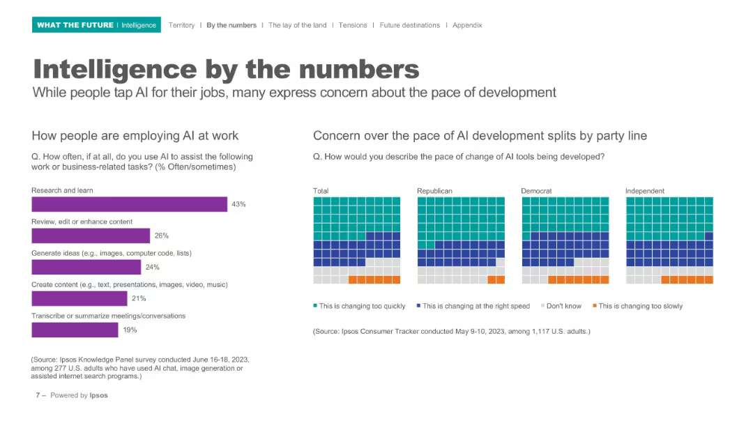
Left bar chart for work-related AI usage, right grid matrix for political view comparison; minimalistic layout.
Operational Efficiency
Artificial Intelligence
Demonstrates how people are using AI at work (e.g., research, content editing, summarizing). Also shows concern levels over AI’s development pace, broken down by political affiliation.
workplace AI, political views, research, productivity, AI development, Ipsos, pace of change
Multiple Chart
IPSOS
Saved
This slide features a world map with highlighted cities and corresponding icons that denote specific water supply challenges. There are bullet points with percentage statistics for each city, indicating problems like pollution, water use inefficiency, and infrastructure issues. It includes data visualizations like icons and a simple color code to represent various data points about water accessibility and issues in megacities like Mexico City, Buenos Aires, Nairobi, Kolkata, Karachi, and Shanghai.
Market Analysis and Trends
Environmental Services & Sustainability
The slide presents a comparison of water-related challenges faced by megacities across the globe. It highlights issues such as pollution, water use inefficiency, and inadequate infrastructure, providing a clear snapshot of major urban water management challenges.
water supply, pollution, megacities, infrastructure, sanitation, global health, urban planning, sustainability, resource management, water accessibility
Graphic
Roland Berger
Saved
Includes a line graph showing data growth over years and a smartphone interface. Visual elements are in purple and blue, with clear textual annotations.
Strategic Planning
Financial Services
Explores how Experian plans to use consumer data to enhance personalization features in its services, including new ways for consumers to share their data, impacting credit scores and financial offerings.
data growth, personalization, consumer data, credit scores, financial services
Multiple Chart
Barclays
Saved
White background with purple text boxes listing factors for considering a platform strategy
Strategic Planning
Technology & Software
The slide provides a list of factors companies should consider when evaluating a platform strategy
Platform Strategy, Considerations, Industry Dynamics, Technology Capabilities, Ecosystem
Single Chart
Accenture
Saved
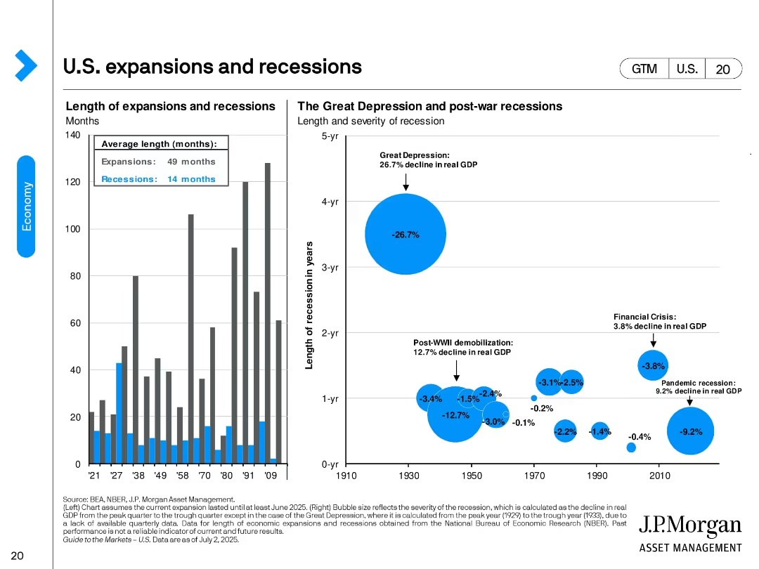
Two-panel design. Left: bar chart showing duration of U.S. expansions vs. recessions. Right: bubble chart comparing size and duration of major recessions by real GDP decline. Key events like the Great Depression are visually emphasized.
Industry Overview
Financial Services
This slide provides historical context on U.S. economic cycles, highlighting average durations (expansions: 49 months, recessions: 14 months). It visualizes the severity of downturns such as the Great Depression and the 2008 Financial Crisis.
expansions, recessions, GDP decline, Great Depression, historical economy, NBER, economic cycle, recovery duration
Multiple Chart
JP Morgan
Saved
Uses a pie chart and a bar graph to show investment deal values in SEA, with a focus image of a woman using a smartphone.
Investment Analysis
Technology & Software
Presents data on regional investment dominance with a focus on Singapore and Indonesia, and the growth in fintech investments.
Investment Focus, Fintech, Southeast Asia, Singapore, Indonesia, Market Share, Growth Analysis
Multiple Chart
Bain
Saved
The slide visually connects leadership, middle management, and teams with arrows and icons in a flowchart-like format, using a blue and teal color scheme to highlight text areas.
Organizational Structure and Change
Professional Services
Highlights the crucial role of middle management in shaping team culture and providing feedback, suitable for discussions on organizational behavior and change management.
middle management, team culture, organizational behavior, change management, feedback, leadership
Diagram
Kearney
Saved
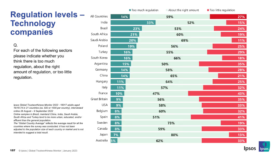
Consistent layout; country ranking by views; colors indicate opinions on regulation sufficiency.
Regulatory and Compliance
Technology & Software
This slide captures opinions on whether technology companies are properly regulated. The majority believe regulation levels are appropriate, but countries like Argentina and France indicate concerns about underregulation, while India and Brazil lean toward thinking there’s too much.
tech industry, regulation, public opinion, Ipsos, governance, compliance, digital policy, international, oversight, perception
Mixed Chart
IPSOS
Saved
The slide has a color-coded, segmented arrow graphic that illustrates various contributions of the Tempest program. The design is professional, using a mix of red, black, and white color scheme with clear, bold fonts and highlighted numerical data. The layout is moderately dense with text and graphical elements.
Industry Overview
Government & Public Sector
This slide provides an overview of the Tempest programme’s economic impact, job creation, and regional contribution from 2021 to 2050. It is used to demonstrate the significance of a government defense project in terms of economic and employment benefits.
Tempest programme, GDP contribution, employment, economic impact, long-term value, productivity, regional benefits
Diagram
PwC/Strategy&
Saved
Consists of multiple bar charts comparing factors influencing employee turnover.
Human Resources and Talent Management
Professional Services
Offers insights into the drivers of employee turnover, valuable for developing effective retention strategies.
Employee Turnover, Retention Strategies, Job Satisfaction, HR Management, Workforce Analysis
Single Chart
PwC/Strategy&
Saved
Two large numeric points on the right, a simple text box on the left, and a bright purple background. The design is clean and segmented with bold text for easy reading.
Strategic Planning
Telecommunications
This slide serves as an introduction, highlighting the key values and essentialities of the nbn™ network, setting the stage for the discussion to follow.
nbn network, introduction, essential tasks, enriching activities, presentation, connectivity, digital value, network importance
Agenda
Accenture
Saved
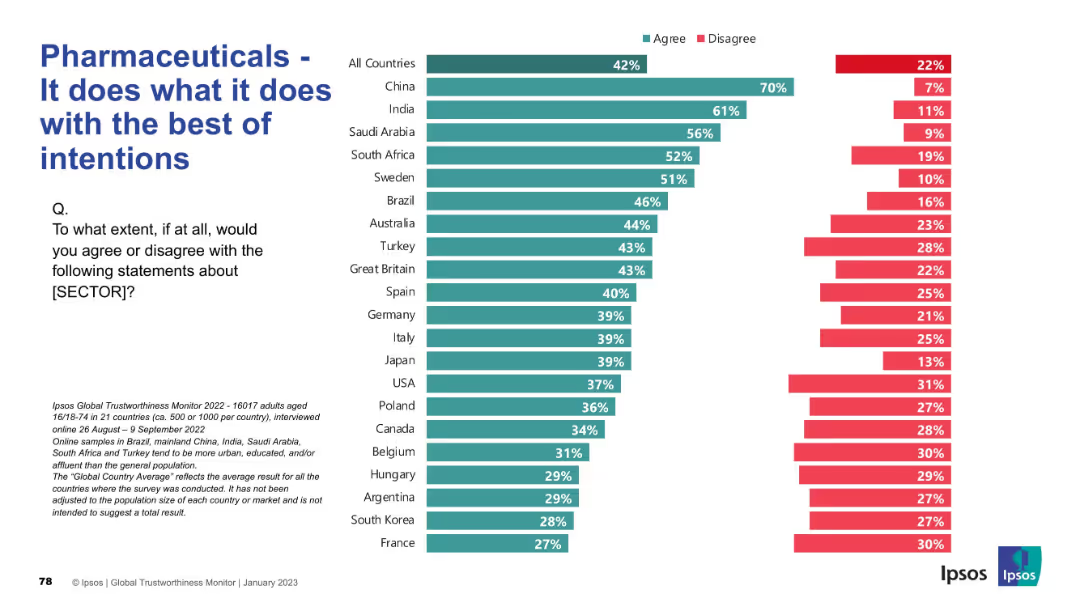
Bar chart ranked by country showing agreement/disagreement levels. Left panel has question and explanation; right has agreement levels in teal and disagreement in red.
Market Analysis and Trends
Healthcare & Pharmaceuticals
This slide evaluates whether people believe the pharmaceutical sector acts with good intentions. Agreement is highest in China and India, but falls significantly in countries like France and South Korea. Distrust appears prevalent in many Western countries.
intentions, public opinion, trust, ethics, pharmaceuticals, Ipsos, sector image, survey, reputation, healthcare
Mixed Chart
IPSOS
Saved
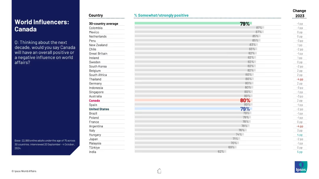
Standard Ipsos layout with ranked horizontal bars; shows 30-country perception of Canada's influence on world affairs over the next decade.
Strategic Planning
Government & Public Sector
This slide ranks global perceptions of Canada’s potential positive influence in world affairs over the next decade. Canada ranks high, with comparison to the 30-country average and change from previous year shown.
global influence, Canada, public opinion, world affairs, strategic perception, international relations, Ipsos ranking, soft power
Mixed Chart
IPSOS
Saved
Column chart representing the dry powder of SEA funds over years with two key point bullets on the right. The background is white, and the text is predominantly blue and black.
Investment Analysis
Financial Services
Illustrates venture capital funds' remaining investment in the SEA region with $15B, emphasizing a continued but cautious approach amidst economic downturns.
venture capital, SEA, investment, economic downturn, dry powder, cautious approach, funding, startups
Mixed Chart
Bain
Saved
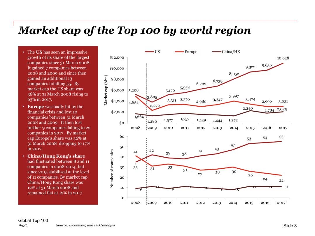
Line charts showing the market cap of top 100 companies by region over time, with annotations and comparison of the US, Europe, and China/Hong Kong.
Market Analysis and Trends
Financial Services
Analyzes the market capitalization of the top 100 companies by region, highlighting the growth in the US share, the impact of the financial crisis on Europe, and trends in China/Hong Kong.
Market cap, top 100, regions, US, Europe, China, financial crisis, growth, trends, comparison
Multiple Chart
PwC/Strategy&
Saved
A line chart showing historical CO2 concentrations, highlighting significant increases over millennia and recent years.
Regulatory and Compliance
Environmental Services & Sustainability
Offers historical context for current CO2 levels, underscoring the urgency in addressing climate change for policy makers and environmental planners.
CO2 levels, climate change, environmental policy, historical data, sustainability
Single Chart
BCG
Saved
Previous
Next
If nothing, comes up, please save your slides first
Create a FREE account to continue browsing
Receive Instant Access to 1,000+ slides from companies like McKinsey, Google, and Goldman Sachs
First Name
Last Name
Email
Password
I agree to all
Terms & Privacy Policy
Thank you! Your submission has been received!
Oops! Something went wrong while submitting the form.
Have an account?
Sign in
Column Chart
Heatmap
Chevron
Org Chart
Infographic
Callouts
Timeline
List
Graphic
Picture
Process Flow
Diagram
Paragraph
Map
Table
Framework
Subtitle
Takeaway Box
Icon
Other Chart
Radar Chart
Waterfall Chart
Mekko Chart
Pie Chart
Scatter Plot
Line Chart
Bar chart
Bullet points