Create a FREE Account
Instant access to 1,000+ real slides from top companies like McKinsey, BCG, Goldman Sachs, Google and many more!
First Name
Last Name
Email
Password
I agree to all
Terms & Privacy Policy
Thank you! Your submission has been received!
Oops! Something went wrong while submitting the form.
Have an account?
Sign in
Library
Templates
Courses
Pricing
My Account
My Slides
My Templates
✦ AI
AI Prompt Library
AI Search
Sign in
Start Here
Logout
My Saved Slides
Same structure as slide 16648 but illustrates the high-end cost estimates for the same energy technologies.
Performance Metrics and KPIs
Energy & Utilities
Complements the previous slide by illustrating high-end LCOE estimates, revealing the cost variability in energy generation technologies. Highlights upper-bound costs influenced by regional and technological factors across renewable and conventional sources.
high LCOE, energy cost, renewables, fossil fuels, operating cost, capital intensity
Single Chart
Roland Berger
Saved
Showcases column charts comparing the capabilities of industry leaders against their peers, with a focus on resilience, optimism, and performance metrics during uncertainties.
Investment Analysis
Financial Services
Highlights how companies with strong resilience capabilities tend to outperform their industry peers in terms of total shareholder returns and operational effectiveness, particularly in times of macroeconomic challenges.
resilience, industry comparison, shareholder returns, macroeconomic challenges
Multiple Chart
BCG
Saved
Professionally designed slide featuring text, a photograph of a woman working on a computer, and a graph. The use of circular shapes and a blue-green color scheme creates a visually cohesive and focused layout.
Technology and Digital Transformation
Healthcare & Pharmaceuticals
Addresses the stigma surrounding menopause, illustrating the percentage of women who work through menopausal symptoms and their comfort level in discussing these in a workplace context.
menopause, workplace, stigma, health challenges, discussion comfort, symptoms
Single Chart
Deloitte
Saved
Waterfall bar chart with labeled segments showing CET1 ratio movements from Q424 to Q125
Financial Performance
Financial Services
Illustrates the movement in Barclays' CET1 ratio from Q424 to Q125, highlighting positive and negative contributors such as attributable profit, share buybacks, and RWA changes, ending at 13.9%.
CET1, capital ratio, profit, RWA, share buyback, FX, Q125
Single Chart
Barclays
Saved
The slide balances text with a set of illustrative icons. It is organized into four sections, each with headers and bullet points.
Financial Performance
Financial Services
The slide highlights the target for Return on Tangible Common Equity (ROTCE), and how various strategies contribute to achieving this financial goal.
ROTCE, target, financial goals, strategy, common equity, icons, JPMorgan
Table
JP Morgan
Saved
Two bar-line combo charts: left tracks corporate VC participation; right shows first-time VC financings. Timeline spans 2018–Q3 2024.
Sales and Business Development
Financial Services
First-time venture financings are projected to slightly outpace 2023, although deal count is trending down. Corporate VC activity remains volatile, peaking in 2021 and stabilizing in 2024.
corporate VC, first-time funding, venture capital, 2024 forecast, startup investment, funding trends, early-stage companies
Multiple Chart
KPMG
Saved
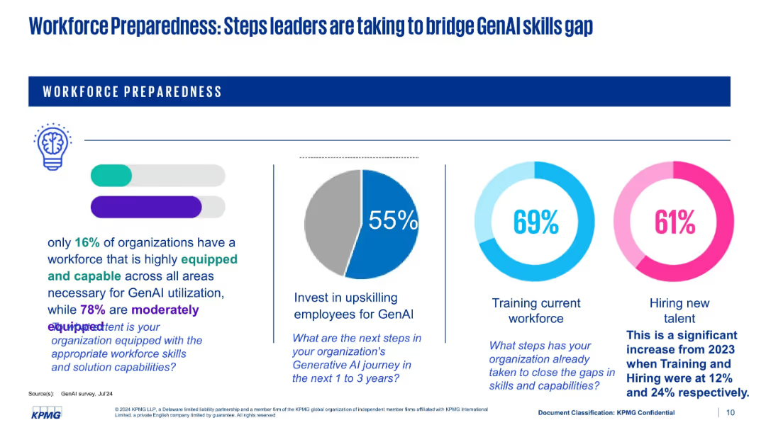
Three-part layout with icon-based headers, three data visualizations (bar chart, line graph, pie chart). Strong purple highlights and white space separate sections clearly.
Strategic Planning
Financial Services
Identifies domestic investment drivers such as GenAI, energy capex, and reshoring. Uses data visualizations to support claims around AI funding, clean energy demand, and supply chain diversification strategies.
GenAI, reshoring, clean energy, capex, investment, supply chains, diversification
Multiple Chart
Accenture
Saved
The slide contains a column chart showing learning loss in different countries, and a column chart comparing NAEP test scores for Mathematics and Reading from 2019 to 2023.
Strategic Planning
Education & Training
This slide analyzes the learning gaps caused by COVID-19, presenting data on learning loss across countries and trends in US NAEP test scores for Math and Reading.
Learning, Gap, COVID-19, Test Scores, Education, Analysis, Trends, Data, Recovery, Impact
Multiple Chart
LEK
Saved
Bar chart showing the changes in the number of jobs due to one additional robot in the manufacturing sector, by income level of country.
Market Analysis and Trends
Technology & Software
The slide examines the impact of automation and robotics on employment, focusing on the manufacturing sector. It shows how each additional robot affects job numbers in high-income, average, and low-income countries, highlighting the greater substitutive effect in low-income countries.
Automation, Robotics, Manufacturing, Job Loss
Mixed Chart
Roland Berger
Saved
A column chart depicting EV-buying intent across different countries with percentage change from 2022. The US and Nordics sections are highlighted with text boxes.
Market Analysis and Trends
Transportation & Logistics
The slide analyzes the increase in EV-buying intent across various countries, driven by government incentives, price cuts, and lower cost of ownership.
EV-buying intent, geographies, government incentives, price cuts, ownership cost
Mixed Chart
EY
Saved
Continuation of the previous slide with another 16-panel grid layout of line charts. Includes industry groups like Transportation, Materials, Media, and Utilities. Each chart notes top 3 stocks in the group with YTD return.
Competitive Landscape
Financial Services
This continuation slide presents relative industry group performance vs. the S&P 500, focusing on sectors such as Transportation, Food & Tobacco, and REITs. Highlighted performers include UNP, KO, and META. The charts emphasize structural performance differences across industries and help detect winners and laggards among large-cap stocks.
REITs, META, UNP, KO, industry trends, relative performance, S&P 500, materials, transportation, utilities
Multiple Chart
Goldman Sachs
Saved
A scatter plot showing yield/duration for various loans and credit types, alongside a column chart comparing 10-year correlation with U.S. Treasuries.
Investment Analysis
Financial Services
This slide analyzes the yield and duration of various loans and credit securities, along with their correlation to U.S. Treasuries, providing insight into rate risk and credit exposure strategies.
yield, duration, credit exposure, U.S. Treasuries, rate risk
Multiple Chart
Morgan Stanley
Saved
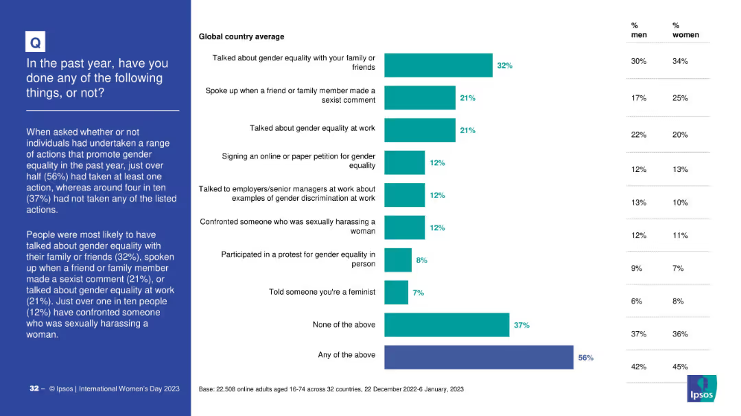
Two line charts comparing month-by-month concern levels and national sentiment trends over 12 months
Market Analysis and Trends
Professional Services
This slide tracks how public concerns and sentiment about national direction have changed over a year. Inflation shows a consistently high concern. The majority (62%) still feel their countries are on the wrong track, though the “right direction” metric has slightly improved over time.
trend, sentiment, inflation, inequality, year-over-year
Multiple Chart
IPSOS
Saved
Similar format as previous slide; charts for revenues and margins; data table includes attendees and events.
Performance Metrics and KPIs
Technology & Software
This slide presents detailed performance metrics for Gartner’s Conferences segment, highlighting revenue trends, growth in events and attendance, and contribution margins. It reflects recovery and growth from past volatility.
conferences, revenue, attendees, events, contribution margin, growth, FX neutral, KPIs, Gartner
Multiple Chart
Gartner
Saved
The slide features a line chart showing trends in the perceived risks of Brexit for Germany over time, with data on EU disintegration and trade concerns.
Risk Assessment and Management
Government & Public Sector
This slide shows how perceptions of Brexit risks for Germany have changed over time, focusing on issues like EU disintegration and trade. It helps in tracking risk perception trends.
Brexit, Germany, risk trends, EU disintegration, trade concerns
Single Chart
Deloitte
Saved
The slide contains a column chart displaying group income (£bn) excluding the impact of over-issuance of securities from Q319 to Q323. There is a breakdown of financial impacts for different divisions on the right side.
Financial Performance
Financial Services
The slide reports a 2% year-over-year decrease in Barclays' group income for Q323, providing a detailed financial impact analysis for various divisions such as Barclays UK, Consumer, Cards & Payments, and Corporate & Investment Bank.
income, YoY, Q323, Barclays UK, divisions
Mixed Chart
Barclays
Saved
Slide with multiple bar charts comparing sectors.
Financial Performance
Technology & Software
Compares marketing analytics spending across different firm sizes and industry sectors, highlighting the variations in budget allocation.
Marketing, Analytics, Budget, Comparison, Industry Sectors, Firm Size, Bar Charts, Allocation, Spending
Multiple Chart
Deloitte
Saved
Features a bar graph showing the percentage of respondents agreeing strongly with the statement regarding agreed values and purpose, segmented by region.
Strategic Planning
Professional Services
This slide emphasizes the importance of agreed values and purpose within companies, with data segmented by geographic region to show regional differences.
agreed values, purpose, regional differences, company culture, strategic alignment
Multiple Chart
PwC/Strategy&
Saved
This slide features a line graph over time, showing trends in investor priorities related to business capabilities and EPS guidance. It's a data-driven layout with a focus on chronological changes and comparison.
Strategic Planning
Financial Services
Shows how investor priorities have shifted over the past year regarding business capabilities and EPS guidance, useful for strategic planning and performance evaluation.
Business Capabilities, EPS Guidance, Investor Priorities, Trend Analysis, Corporate Strategy, Long-term Focus, Performance Evaluation, Investment Trends, Strategic Development, Guidance Compliance
Single Chart
BCG
Saved
This slide includes a line chart showing the advertised primary retail market prices for Dot-Com domains from 2012 to 2020. It uses different colors to differentiate between new domain registrations and renewals, with annotations explaining price trends.
Pricing Strategies
Telecommunications
The slide analyzes the advertised primary retail market prices for Dot-Com domains, noting that renewal prices have increased since 2017 while new domain prices have remained stable. It provides insights into pricing stability and recent trends.
Dot-Com domains, pricing, renewals, new registrations, price trends
Mixed Chart
BCG
Saved
The slide presents a diagram comparing the wheat supply chain costs between Australia and Ukraine, with detailed annotations on cost components and findings.
Operational Efficiency
Transportation & Logistics
The slide evaluates the cost differences in the wheat supply chains of Australia and Ukraine, noting that Australia's costs are higher despite Ukraine's longer transport distances and older infrastructure.
Supply chain costs, Australia, Ukraine, transportation, logistics, wheat supply chain, cost comparison, operational efficiency
Single Chart
LEK
Saved
Dual-section layout: left side shows awareness stats with bar charts; right side displays usage stats for virtual fashion and identity with similar bar charts. Background includes a blurred virtual fashion image.
Customer and Market Segmentation
Consumer Goods
Shows growing awareness and usage of digital wallets, crypto, NFTs, AR/VR among luxury consumers, especially in South Korea, India, and Brazil. 1/5 have purchased virtual fashion or used crypto. Usage breakdown includes virtual payments, avatar creation, and VR try-ons.
luxury, NFTs, virtual fashion, consumer tech, awareness, usage trends, VR, crypto
Single Chart
BCG
Saved
Horizontal bar chart showing agreement across countries that media prioritizes profit over truth, with neutral/disagree splits and ranking.
Market Analysis and Trends
Media & Entertainment
The slide reveals skepticism toward mainstream media, with 67% of global respondents agreeing that media prioritizes money over truth. Japan (63%) ranks above average, while countries like Peru and South Africa show the highest agreement.
media, truth, profit, skepticism, public trust, Ipsos, journalism, populism, 2025, perception
Mixed Chart
IPSOS
Saved
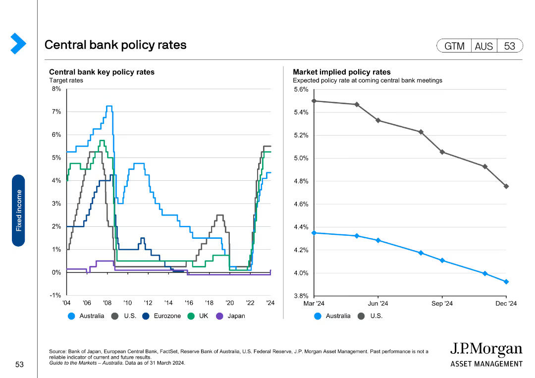
The slide contains a mixed chart with a horizontal bar chart on the left showing commodity prices and a matrix on the right displaying annual returns by commodity type from 2019 to 2024.
Market Analysis and Trends
Energy & Utilities
This slide compares commodity prices and historical returns, providing insights into market trends and performance across different commodity types.
commodity prices, market trends, historical returns, performance analysis, energy
Mixed Chart
JP Morgan
Saved
Features a complex diagram showing the interconnected elements of the procurement value chain, including arrows and blocks.
Strategic Planning
Professional Services
Explains the complexity and interconnectedness of modern procurement value chains with detailed breakdowns of each element.
procurement, value chain, complexity, interconnected, diagram, analytics, management, strategy, operations
Diagram
Kearney
Saved
Previous
Next
If nothing, comes up, please save your slides first
Create a FREE account to continue browsing
Receive Instant Access to 1,000+ slides from companies like McKinsey, Google, and Goldman Sachs
First Name
Last Name
Email
Password
I agree to all
Terms & Privacy Policy
Thank you! Your submission has been received!
Oops! Something went wrong while submitting the form.
Have an account?
Sign in
Column Chart
Heatmap
Chevron
Org Chart
Infographic
Callouts
Timeline
List
Graphic
Picture
Process Flow
Diagram
Paragraph
Map
Table
Framework
Subtitle
Takeaway Box
Icon
Other Chart
Radar Chart
Waterfall Chart
Mekko Chart
Pie Chart
Scatter Plot
Line Chart
Bar chart
Bullet points