Create a FREE Account
Instant access to 1,000+ real slides from top companies like McKinsey, BCG, Goldman Sachs, Google and many more!
First Name
Last Name
Email
Password
I agree to all
Terms & Privacy Policy
Thank you! Your submission has been received!
Oops! Something went wrong while submitting the form.
Have an account?
Sign in
Library
Templates
Courses
Pricing
My Account
My Slides
My Templates
✦ AI
AI Prompt Library
AI Search
Sign in
Start Here
Logout
My Saved Slides
Column chart with bars in different colors representing various types of video game revenue from 2014 to 2023.
Market Analysis and Trends
Media & Entertainment
This slide presents the growth of the global video game industry, with projections showing significant revenue increases driven by various gaming segments.
video game industry, revenue growth, global market, 2019-2023
Single Chart
PwC/Strategy&
Saved
This slide is dense with text and icons representing various financial metrics. There is a central graphic that connects different components, including market share and revenue details, indicating growth over time. The color scheme is consistent with the company branding.
Financial Performance
Financial Services
This slide evaluates the success of different financial franchises within a major bank, comparing market share and revenue growth over a decade. Key performance metrics are displayed, emphasizing the company's strong market position and growth in various financial sectors. This serves as a financial performance summary and may be used to attract investors or as part of an annual report.
Financial Franchise, Market Share, Revenue Growth, Performance Metrics, Banking, Investment, Client Assets, Market Positioning
Framework
JP Morgan
Saved
This slide features a column chart comparing the current NTM P/E ratios vs. 10-Year High, Low, and Average for various indices such as S&P 500, Russell 2000, MSCI World, etc. The chart includes data points for high, current, and low P/E ratios.
Financial Performance
Financial Services
The slide provides a valuation analysis by comparing current NTM P/E ratios with historical highs, lows, and averages for different market indices.
Valuation analysis, NTM P/E, indices, S&P 500, Russell 2000
Mixed Chart
Morgan Stanley
Saved
The slide includes a line chart showing CEO confidence levels about their organization's three-year growth prospects, with lines representing "somewhat confident" and "very confident".
Strategic Planning
Financial Services
It emphasizes a cautious outlook among CEOs regarding their organization's three-year growth prospects, with confidence levels fluctuating over the years.
CEO confidence, three-year prospects, cautious outlook, strategic planning, line chart, PwC, CEO Survey, confidence levels
Single Chart
PwC/Strategy&
Saved
Combination of bar charts and tables showing Tier 1 capital ratios and USD liquidity access arrangements
Risk Assessment and Management
Financial Services
This slide compares banking sector capitalization in APAC with the US, detailing central bank FX liquidity programs.
bank capitalization, APAC, liquidity, FX swap, US
Mixed Chart
Accenture
Saved
Bar chart by country showing how likely respondents believe in global temperature rise.
Market Analysis and Trends
Environmental Services & Sustainability
This slide ranks countries by belief in rising global temperatures. Indonesia, Portugal, and Singapore lead with the strongest concerns. Overall, 81% globally expect temperature increases, showing strong consensus across markets.
global warming, temperature, climate perception, Ipsos, environmental concern, 2024
Mixed Chart
IPSOS
Saved
World map with highlighted regions (USA, UK, Germany, India). Arrows connect these regions to investment details. Contains logos and funding amounts.
Investment Analysis
Education & Training
Highlights significant PE/VC funding in India's edtech sector, showing major investments from global investors in companies like Heuristix Digital and NxtWave.
investment, India, edtech, PE/VC funding, global investors, 2023
Graphic
LEK
Saved
Features multiple column charts showing projections for the decline in demand for oil, gas, and coal, as well as growth in solar and wind capacities by 2050.
Market Analysis and Trends
Energy & Utilities
The slide emphasizes the necessity for rapid decline in fossil fuel demand and significant growth in renewable energy sources to achieve the 1.5°C Pathway.
fossil fuels, renewable energy, demand decline, solar, wind
Multiple Chart
McKinsey
Saved
Single orange line graph (1999–2025) with annotations for key peaks and troughs (e.g. 2008 crash, 2022 peak); major events labeled.
Market Analysis and Trends
Government & Public Sector
Focuses on the public's perception of the economy as a top issue, highlighting spikes during major economic or political events. Shows historical high (2008) and recent peak (2022).
economy, Ipsos, public concern, financial crisis, political events, UK, trends
Single Chart
IPSOS
Saved
The slide presents multiple column charts detailing aspects of procurement processes and technology areas with the most business impact in the next two years.
Technology and Digital Transformation
Professional Services
Discusses the reduction in impact across areas except for the increased impact of Robotic Process Automation (RPA) on business processes.
Technology impact, business, RPA, analytics, future trends
Multiple Chart
Deloitte
Saved
Stacked bar chart tracking number of mega-deals (> US$1bn) from 2015 to 2024 by buyer type; declining trend visible; segment colors match categories.
Performance Metrics and KPIs
Financial Services
Tracks annual number of mega-deals by type. 2024 saw only 39, the lowest in a decade. Industrial, technology, and energy sectors dominated. Many were state-owned enterprise-driven, reflecting weak private mega-deal activity.
mega-deals, US$1bn, deal count, strategic buyers, SOEs, sectors
Single Chart
PwC/Strategy&
Saved
Column chart comparing nominal GDP growth, earnings growth, and equity market returns for various regions from 2004 to 2023, shown in annualized percentages.
Financial Performance
Financial Services
Reviews economic growth, earnings, and equity market returns across different regions over a 19-year period, highlighting key growth metrics and performance.
economic growth, earnings, returns, GDP, column chart, financial performance, regional analysis, historical data
Single Chart
JP Morgan
Saved
Scatter plot with P2G Spread vs. Excess Capital, divided into four quadrants. Each dot represents a bank. Median lines mark division axes.
Strategic Planning
Financial Services
This scatter plot visualizes the tradeoff between banks' excess capital and P2G spread. It categorizes institutions into four zones—highlighting strengths and vulnerabilities in capital flexibility and resilience. The layout helps stakeholders identify which banks are well-positioned for distributions and which may face regulatory constraints.
P2G spread, excess capital, stress test, capital resilience, quadrant chart, CET1, financial strength, risk-adjusted performance
Single Chart
Alvarez & Marsal
Saved
This slide features multiple charts including a pie chart and bar chart, and a text section summarizing the data.
Market Analysis and Trends
Financial Services
The slide presents data from a survey profiling investors by wealth level, generation, region, and gender.
investors, survey, wealth, generation, region, gender, financial services
Multiple Chart
Deloitte
Saved
The slide has two line charts. The first chart shows Tier 1 risk-based capital ratios by bank asset size from 1996 to 2023. The second chart depicts primary market sources of financing for broadly syndicated loans from 1999 to 2022.
Market Analysis and Trends
Financial Services
This slide provides an analysis of U.S. bank capital ratios and the sources of financing for syndicated loans, giving insights into the stability and funding sources in the credit market.
banks, credit market, capital ratios, syndicated loans, U.S. market
Multiple Chart
JP Morgan
Saved
The slide presents a column chart showing ASX 200 Index intra-year declines versus calendar year returns, with calendar year returns as gray bars and intra-year declines as red dots.
Financial Performance
Financial Services
Compares the annual returns and intra-year declines of the ASX 200 Index over 30 years, highlighting that annual returns were positive in 22 out of 30 years.
ASX 200, returns, declines, financial performance, annual returns, intra-year, column chart
Single Chart
JP Morgan
Saved
Column charts showing initial recognition dates for credit cards and average lifetime used for ECL calculation, with commentary explaining variance among banks.
Financial Performance
Financial Services
Analyzes the initial recognition dates for credit cards and the average lifetime used by banks for ECL calculation, showing variations in practice and methods used.
ECL, credit cards, measurement, banks, recognition, average lifetime, calculation, variance, methods
Multiple Chart
EY
Saved
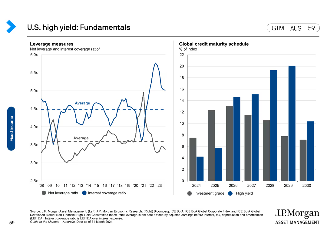
This slide contains two column charts with a text box on the side explaining the targets and capital deployment strategies.
Corporate Finance and Valuation
Financial Services
Discusses capital ratio targets and allocation strategies, aimed at financial strategists and investors.
capital targets, CET1 ratio, capital allocation, dividends
Mixed Chart
JP Morgan
Saved
Features horizontal bar charts for country-specific results and column charts for overall results on tax transparency strategy adoption.
Market Analysis and Trends
Financial Services
It shows the percentage of respondents with a strategy for tax transparency tested with senior leadership, broken down by country.
survey, bar charts, tax transparency, strategies
Multiple Chart
Deloitte
Saved
Bar chart focused on Nordics’ deal volumes by industry from 2001–H1 2024; industry segments are color-coded; growth/decline rates shown.
Market Analysis and Trends
Financial Services
Nordics transaction volumes fell by 47% in 2023, driven by declines across most sectors. However, digital solutions and business services remained dominant. The only sectors with YoY growth were MedTech/life sciences and pharma. The long-term growth leader was automotive. The chart segments deal volume by industry, showing trends and relative contributions to overall volume.
Nordics, private equity, industry trend, transactions, decline, MedTech, digital solutions, logistics
Single Chart
Roland Berger
Saved
Contains two line charts showing S&P 500 and US 10-year Treasury returns around the end of Fed hiking cycles, with data from various periods highlighted.
Market Analysis and Trends
Financial Services
The slide explores the impact of Fed hiking cycles on equity and bond returns, providing historical data to understand market reactions to interest rate changes.
Fed hiking, equity returns, bond returns, S&P 500, Treasury
Multiple Chart
JP Morgan
Saved
A slide with a dark blue theme containing two column charts showing the evolution of market and credit RWAs from 2015 to 2019, along with bullet points outlining the company's risk management culture, processes, and oversight.
Risk Assessment and Management
Financial Services
It communicates Goldman Sachs' approach to risk management, detailing changes in risk-weighted assets and the infrastructure supporting risk management processes, valuable for presentations on corporate risk policies or compliance training.
Risk management, RWAs, market, credit, Goldman Sachs
Multiple Chart
Goldman Sachs
Saved
Slide contains multiple horizontal bars showing percentages of Lloyd’s capital providers by source and location.
Risk Assessment and Management
Financial Services
Discusses the diverse sources of Lloyd's capital, with a focus on the contributions by the Bermudian and UK insurance industries, among others. Highlights unexpected sources.
Capital, Providers, Insurance, International, Sources
Single Chart
PwC/Strategy&
Saved
Two-column layout with text on the left and a heatmap chart on the right, indicating AI impact across industries and business functions. Blue gradient indicates impact intensity.
Strategic Planning
Artificial Intelligence
This slide illustrates the projected productivity impact of generative AI across various industries and business functions. It shows that marketing and sales are likely to benefit most, with tech and banking poised for even greater gains due to software acceleration.
productivity, generative AI, business functions, industry impact, marketing, sales, software, high tech, banking, heatmap
Table
McKinsey
Saved
This slide includes stacked column charts showing China's real GDP contribution by component, and line charts displaying household deposits and loans, consumer income, and wealth effect.
Market Analysis and Trends
Financial Services
The slide analyzes China's economic components, including GDP contribution, household financial behavior, and consumer confidence, providing insights into economic health and trends in China.
China, economy, GDP, household deposits, household loans, consumer income, wealth effect, economic trends
Multiple Chart
JP Morgan
Saved
Previous
Next
If nothing, comes up, please save your slides first
Create a FREE account to continue browsing
Receive Instant Access to 1,000+ slides from companies like McKinsey, Google, and Goldman Sachs
First Name
Last Name
Email
Password
I agree to all
Terms & Privacy Policy
Thank you! Your submission has been received!
Oops! Something went wrong while submitting the form.
Have an account?
Sign in
Column Chart
Heatmap
Chevron
Org Chart
Infographic
Callouts
Timeline
List
Graphic
Picture
Process Flow
Diagram
Paragraph
Map
Table
Framework
Subtitle
Takeaway Box
Icon
Other Chart
Radar Chart
Waterfall Chart
Mekko Chart
Pie Chart
Scatter Plot
Line Chart
Bar chart
Bullet points